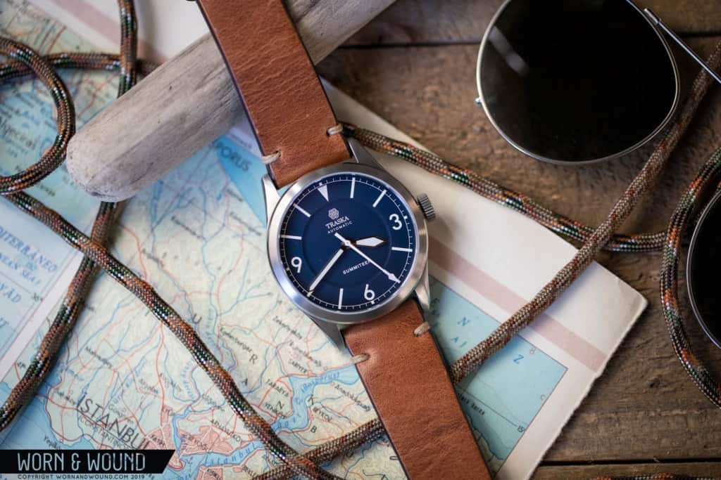
Review: the Traska Summiteer

Traska is part of a new wave of value-driven micro-brands. Alongside the likes of Lorier, Nodus, and Boldr, they are young, both in terms of company and owner age, on or ahead of the trends, social media savvy, and design-focused. Their first release, the Freediver, was very well received by enthusiasts. Though hardly a new concept, this vintage-inspired dive watch managed to have a unique look. It was balanced, restrained, and mature. Not what you always find on a freshman effort.

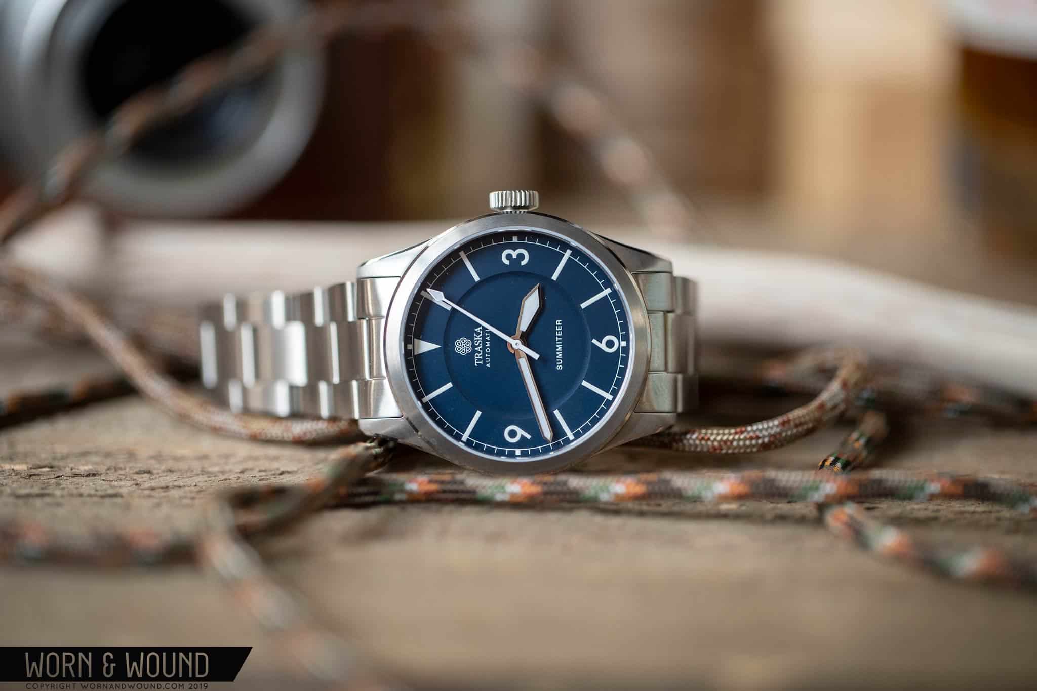
For their next line, Traska announced the Summiteer, an explorer-style watch with a keen graphic sensibility and a scratch-resistant case. In a smart move, they didn’t follow up a dive watch with another dive watch, rather going for a more general every day/sport/tool watch. This let them flex their creative muscles in a different way, while also saying a bit about the direction their brand will go. Once again, they managed to create a timepiece that has a maturity to it that I admire. It’s not an impulsive design, rather one that you can tell in the subtleties of the proportions, typography, and case detailing, took time and consideration.

Now, I’ll plainly admit that I find 1016 Explorers to be near perfection in all regards except pricing (sigh). The simplified index, mix of type and graphic elements, nimble size, ability to dress up or down – forget about it. So, when I see a watch that draws on that icon, without copying it, I tend to be interested. Needless to say, when I saw the Summiteer pop up in my IG feed, I was immediately excited. It had the right elements to trigger my 1016-response, yet enough of its own personality to be its own thing. And, perhaps more importantly, while speaking to a mid-century watch, feels and looks like a modern watch. No vintage pastiche here.
Advertisement
$500

Review: the Traska Summiteer

Case
Scratch-resistant steel
Movement
Miyota 9039
Dial
Midnight Blue
Lume
Yes
Lens
Sapphire
Strap
Steel Bracelet
Water Resistance
100m
Dimensions
38 x 46mm
Thickness
10mm
Lug Width
20mm
Crown
screw-down
Warranty
Yes
Price
$500

Case

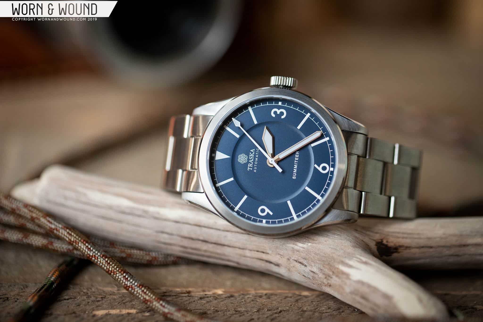
Let’s start with the case. At 38 x 46 x 10mm it’s spot on for an everyday sport watch. 38mm watches are so much more common now than a few years ago, that this just feels like the new normal for an external-bezel-free watch. It doesn’t seem “small for the sake of being vintage,” rather it feels appropriate. This is of course speaking for my wrist. Before getting to the design, it’s worth noting that Traska decided to put a scratch-resistant coating on the watch, bringing the surface effectively to 1200 vickers. That’s several times harder than standard steel and will make the Summiteer much harder to scuff up. That, plus 100m water resistance, make this a functional watch on top of one with good looks, which never hurts.

The design is pretty straight forward and brought to life by good finishing. The mid-case has slab-sides that taper into medium-thick lugs. A well-executed polished bevel separates the horizontally brushed case sides and radially brushed top lug-surfaces. The bezel, which is relatively thin allowing for an expansive dial, is radially brushed, but features a polished chamfer. This is the kind of detail that really brings the case to life. Lastly, the lugs are drilled, always a plus.

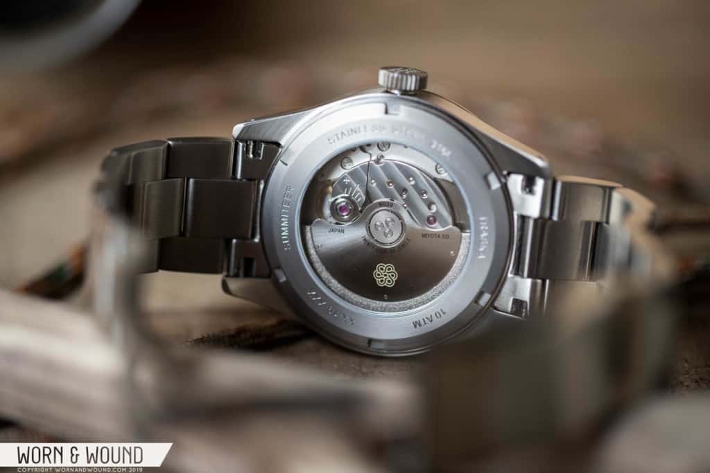
The crown at three is screw-down, and features a 7 x 3mm cylindrical head that is offset from the case by about 1mm. It’s a nice looking crown with Traska’s spiral/flower logo design etched on the outside surface, that is easy to grasp and turn, aided by the 1mm gap. This is a small, but effective detail that gives the Summiteer its own look. Flipping it over, you’ll find a display window showing off the Miyota 9039 movement. This is basically the 9015 with no date, so no phantom-stop on the crown.

Dial

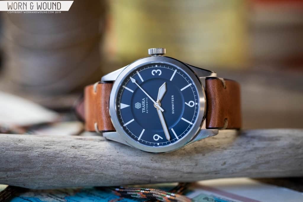
The dial of the Summiteer is where it gets all of its personality. Seen here in Midnight Blue, it is also available in Sage Green and Charcoal black. Not a bad choice in the group, the dark, inky Midnight Blue called out to me. Blue dials are far from rare at this point, but not all are created equal. It’s a complicated color. It can easily become too bright and garish, too purple or green, too metallic or dull.

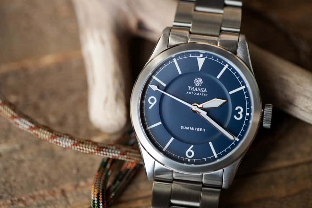
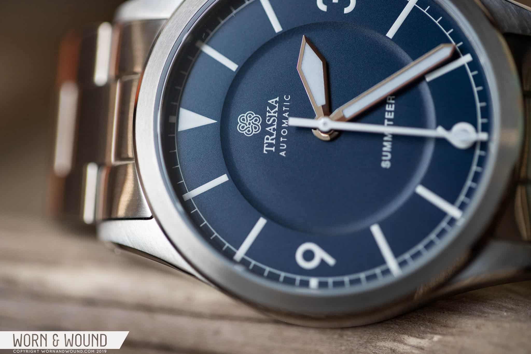
Traska found one of the nicest blues I’ve seen to date. It’s very dark, but you won’t mistake it for black. It’s deep and rich, with just a touch of green giving it some depth. It’s not sunray, thankfully (nothing against sunray blue, just seen a lot of it), and while closer to matte has a subtle, silky luster. It’s just the right blue, and when paired with all white indexes, as it is here, creates a classic, sharp look.

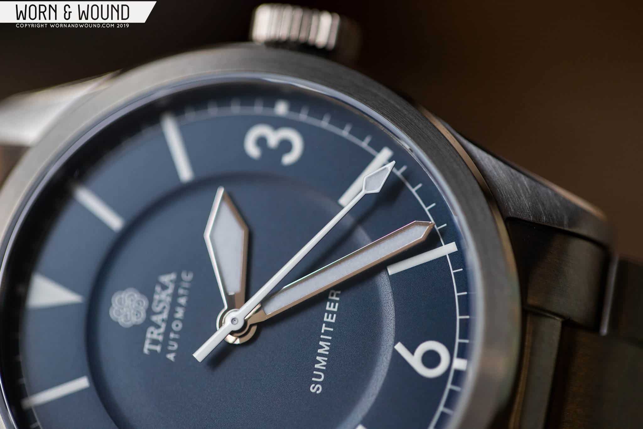
The main index is what you’d expect on an explorer-style watch, with large numerals at three, six and nine, a triangle at twelve, and rectangular markers in between. That’s basically what defines the look. Traska didn’t shy away from this, but did tweak the elements to be their own. The rectangles are long and thin, reaching from the edge of the dial in to a sunken central area of the dial. The triangle too is long and thin reaching to the lower area. The numerals are tall, in a modern type that is very clean and clear. They aren’t overly stylized, nor bland, but give the watch a contemporary attitude.

The primary index is also encircled by a border with a minute/second index of fine lines. The larger rectangles break through the border creating markers at intervals of five, save at the cardinal points where small squares are added. This was a smart design feature as it gives everything a consistent flow, and emphasizes the rectangles in a way that is different than a typical explorer dial. My favorite detail, however, is the sunken area in the middle I’ve referred to. This gentle dip is marked by a smooth, radiused drop and a crisp upper edge. As a purely physical detail, it does a lot for the dial, balancing out the empty space in a clever way.

For hands, Traska smartly avoided the Mercedes-type explorers are known for, instead going for the mil-sub set of a Roman sword for the hour and a fence for the minute. They are well-sized for the dial, with the hour running along the inside edge of the sunken area, and the minute hitting the outer border of the main index. They are purposeful, easy to read, and attractive enough, but I will say this is one detail on the watch that I feel could have used a little more imagination. It’s easy to fall back on conventions as they get the job done, but in this instance, other similar details were cleverly reimagined.

The second hand, however, feels a bit more original for the format. It’s a tapering stick with a lumed arrow tip. It’s a bit thicker and bolder than you’d expect, drawing attention. It’s also rendered in all white, where the hour and minutes are polished steel, standing out the most amongst the three. On the Sage Green and Charcoal Black dials, the seconds is actually a bright, contrast color, so clearly Traska intended for the seconds to be emphasized. Functionally, I’m not sure why, but visually it works.

Straps and Wearability

The Summiteer comes mounted to a tapering oyster-style bracelet. Not the most original, but it was well-tuned for the watch. First, it tapers 4mm, from 20 – 16, giving it a slender and comfortable profile. For the clasp, they went with two-button pushed mechanism that keeps the claps relatively small. Also, the inside of the clasp is decorated with perlage, which is pretty unexpected. It’s a good addition to the watch for the price, though honestly, with the blue dial, I’m more likely to wear it on a brown leather strap.

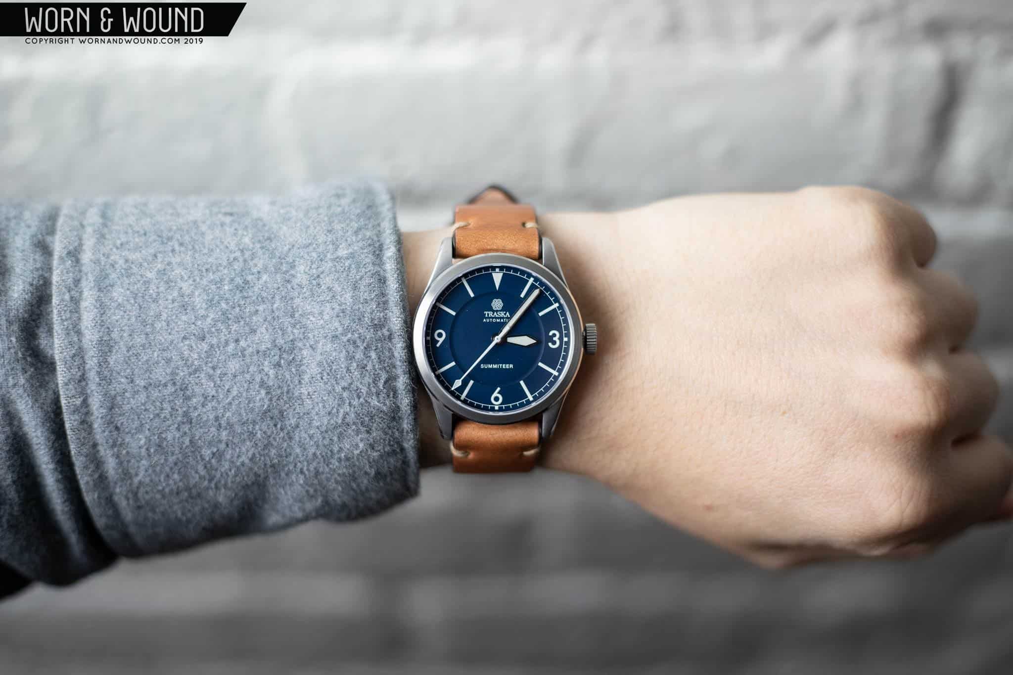
On the wrist, it should come as no surprise, but a 38 x 46 x 10mm watch wears ridiculously well. On my 7” wrist, it was basically perfect. Small enough to fit in all dimensions. Thin enough to slip under a shirt or jacket, and be comfortable all day. Yet, thanks to the wide dial and substantial lugs, it doesn’t read small by any means. It’s actually quite beefy and sporty looking in a very appealing way.

I also felt the watch really came to life off of the bracelet. This is a personal preference, for sure, but I’m not always a fan of bracelets because I find endlinks, plus the matching materials, tend to obfuscate the geometry and finishing of a case. With the Summiteer, once on leather, the polished bevels and chamfers on the case popped more, and the lugs felt bolder and more masculine. Additionally, by putting it on brown leather, the blue of the dial became more pronounced. But, with any watch, you find the way that best suits you to wear it, this was just the way for me.

Conclusion

The only thing left to cover is the price. The Summiteer comes in at an astoundingly fair and affordable $500. Honestly, I wrote half this review before realizing the case was effectively 1200 Vickers (ok, ok, I didn’t read the fine print at first) and I thought the price was great for the quality, finishing, movement and design before I knew that. Now that I am aware, the price seems incredible. As I said in the beginning, Traska is part of a new wave of micro-brands that are really achieving great things.

I think that is partially because both them and the factories have learned a lot from the brands that proceeded and still work alongside them, like Halios, Raven, and Autodromo. The levels of fit and finish on $300 – $500 dollar watches is amazing these days because brands pushed and pushed factories while trying to keep prices at a tolerable point. Now they’ve darn near mastered it, and the watches are remarkable for it.

And I don’t mean to take anything away from Traska, or any other brand, by saying that. It still takes great design, QC and communication to get something made well. After all, the world’s best finishing doesn’t matter on an ugly watch no one wants. The Traska Summiteer succeeds on all fronts and comes in at a very reasonable price. So, if you’ve wanted something in the vein of an explorer or are looking for a good everyday sports watch, the Summiteer should be high on your list.
Traska
Summiteer on Kickstarter

Images from this post:
Related Reviews
Zach is the Co-Founder and Executive Editor of Worn & Wound. Before diving headfirst into the world of watches, he spent his days as a product and graphic designer. Zach views watches as the perfect synergy of 2D and 3D design: the place where form, function, fashion and mechanical wonderment come together.
wornandwound zsw
Tags: