Review: Tudor Black Bay Chrono Steel & Gold

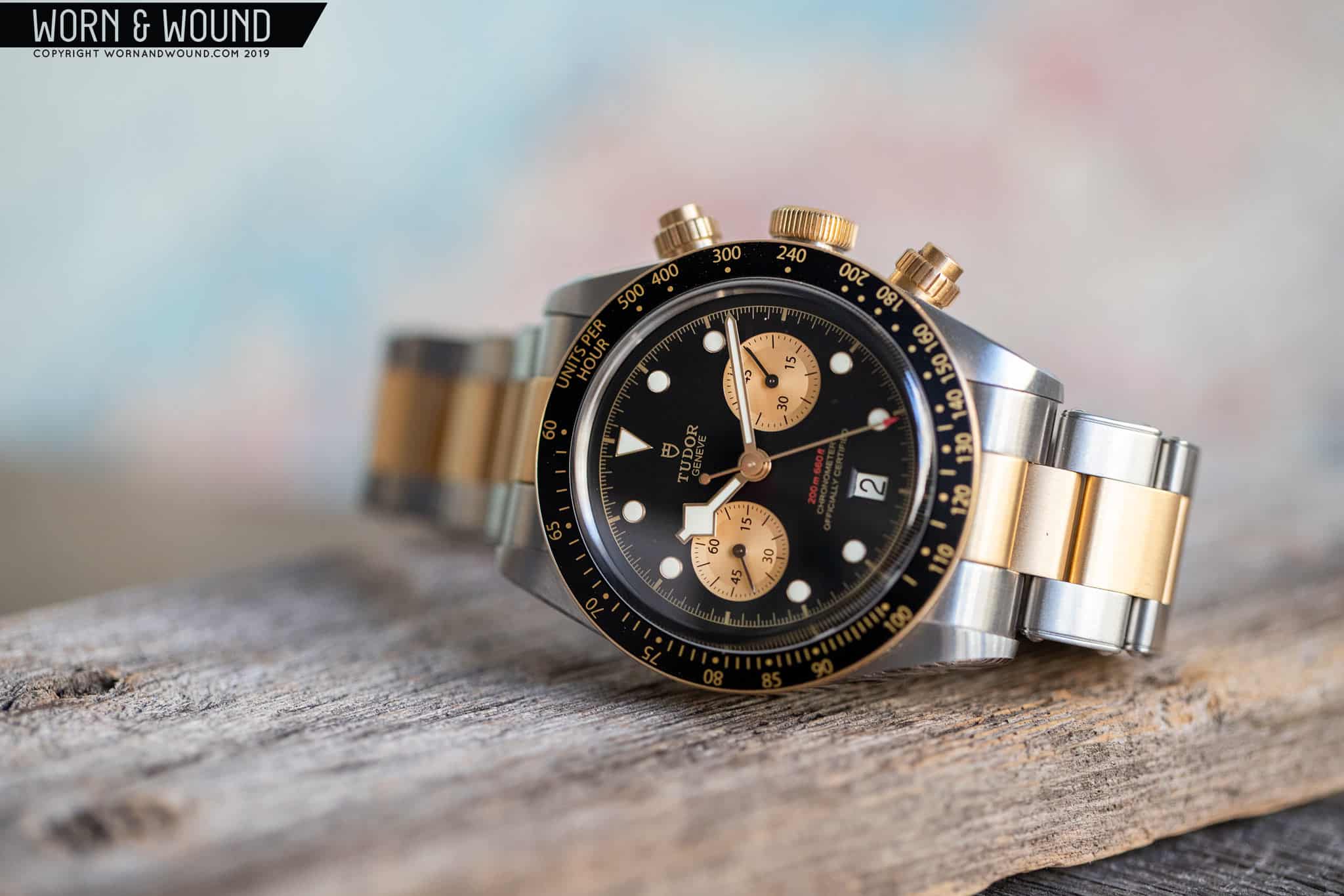
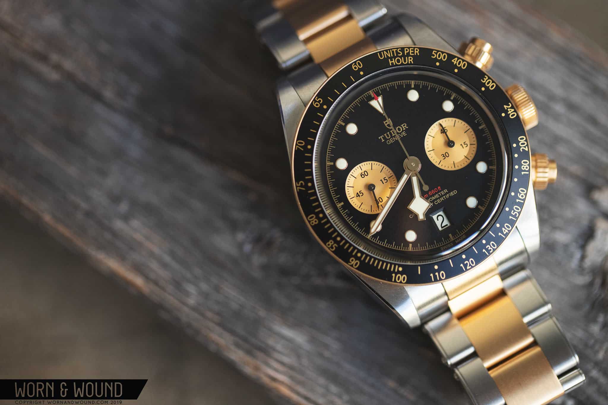
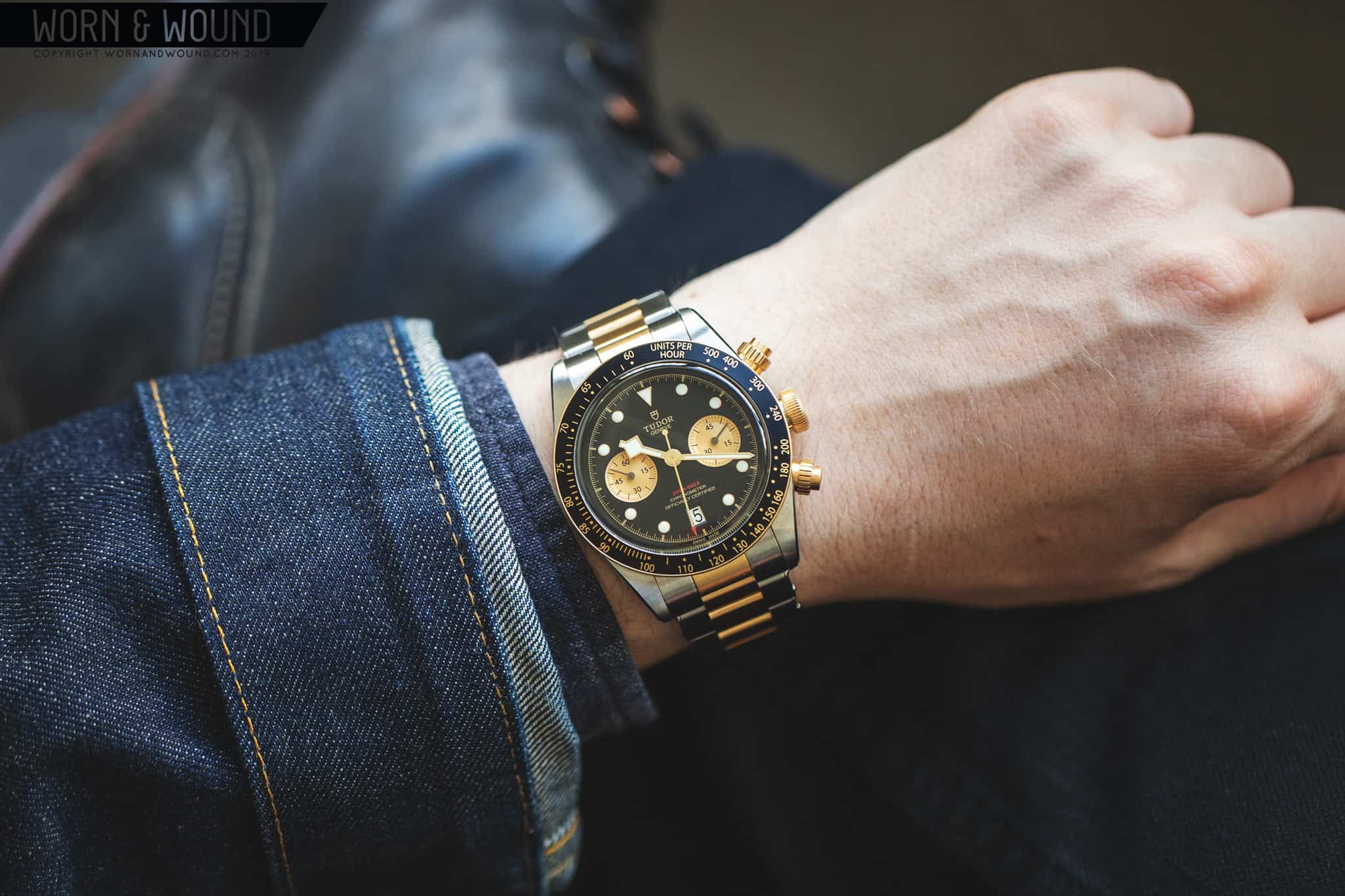
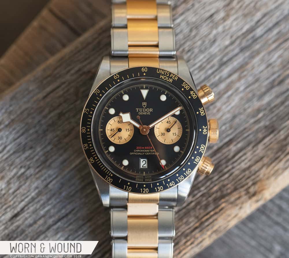
Baselworld 2019 was a memorable one for Tudor. Whereas the previous year they released the most adored watch of Basel (see our review of the Black Bay 58 here), this year they released the most controversial, the Black Bay P01. Much has been said about the polarizing P01 — too much probably — but if there was one thing that can be agreed upon, it’s that the P01 stole the spotlight from Tudor’s other releases. So today, I’m going to be reviewing what I think was the actual highlight from Tudor’s Baselworld 2019 releases, the Black Bay Chrono S&G (steel and gold).

The Black Bay Chrono S&G has style to spare

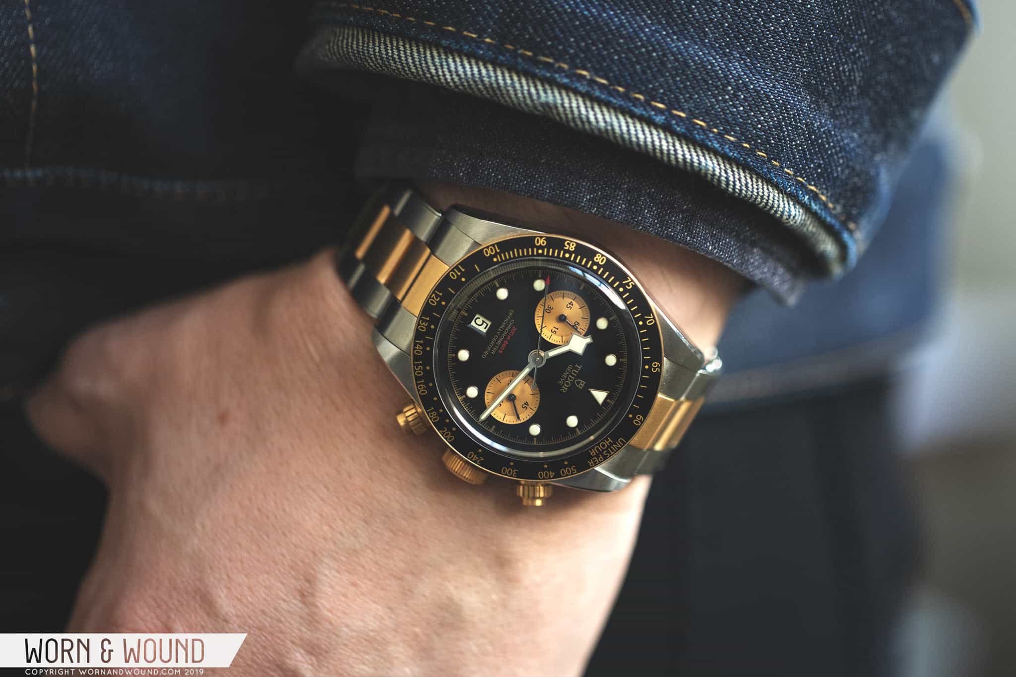
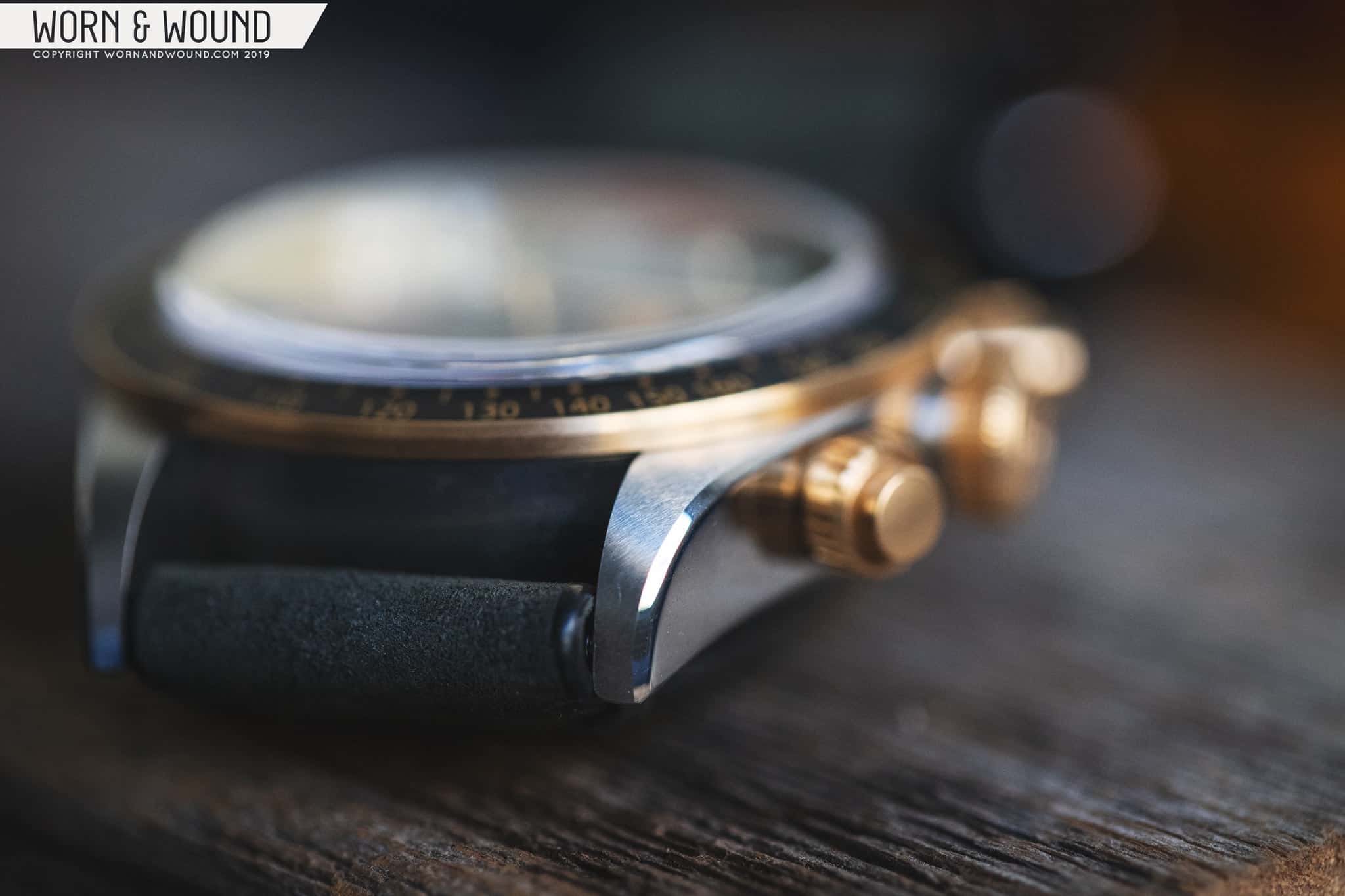
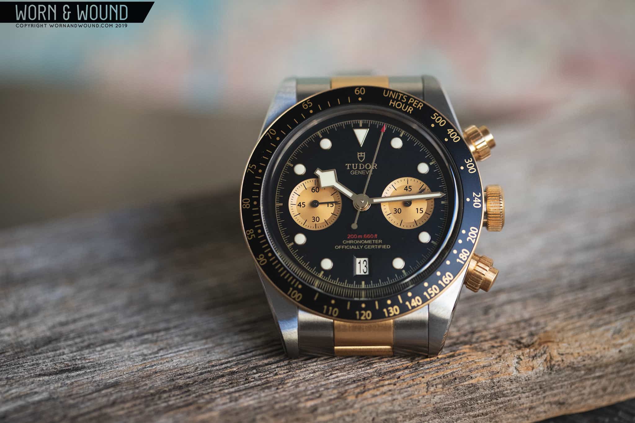
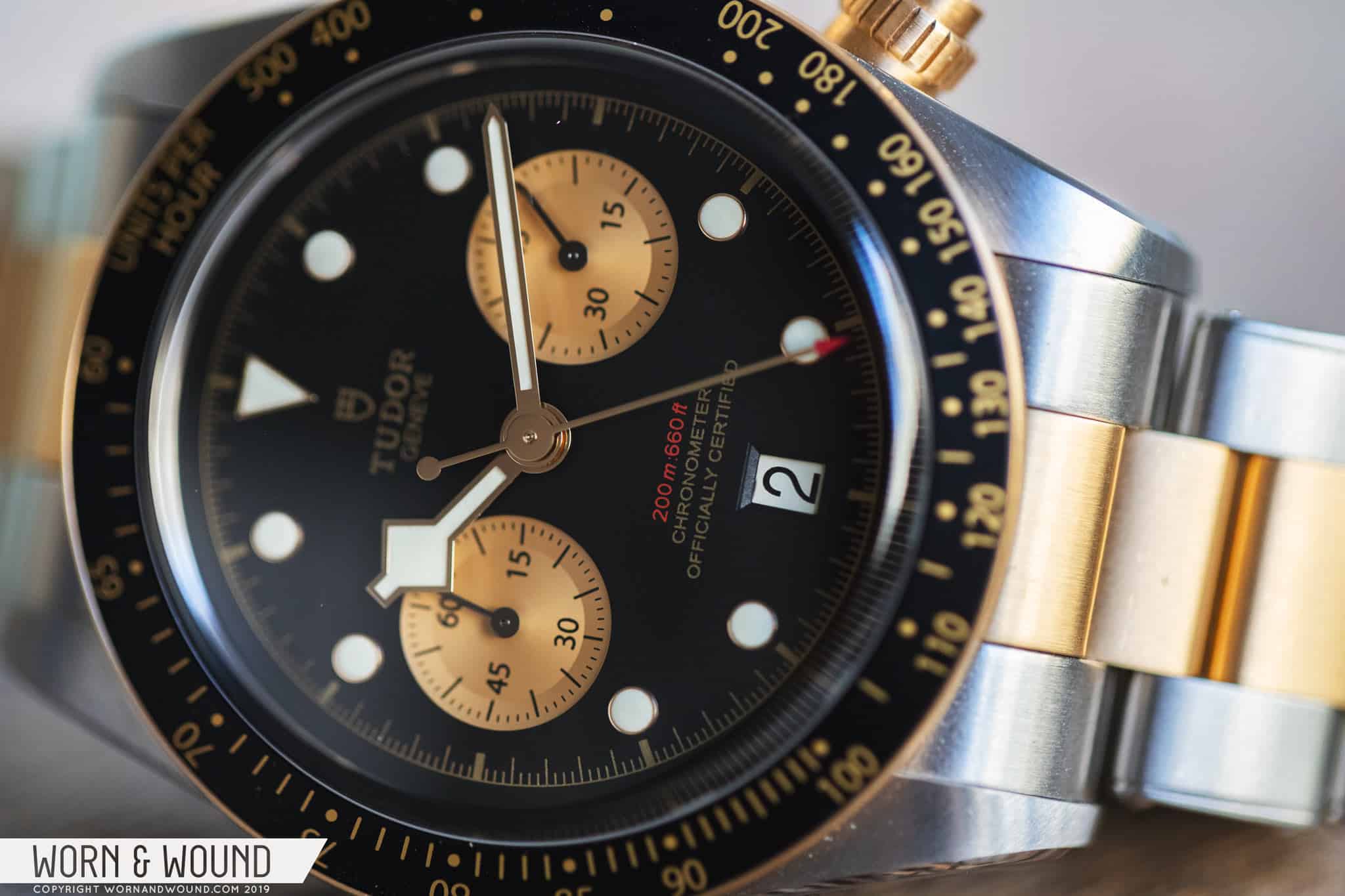
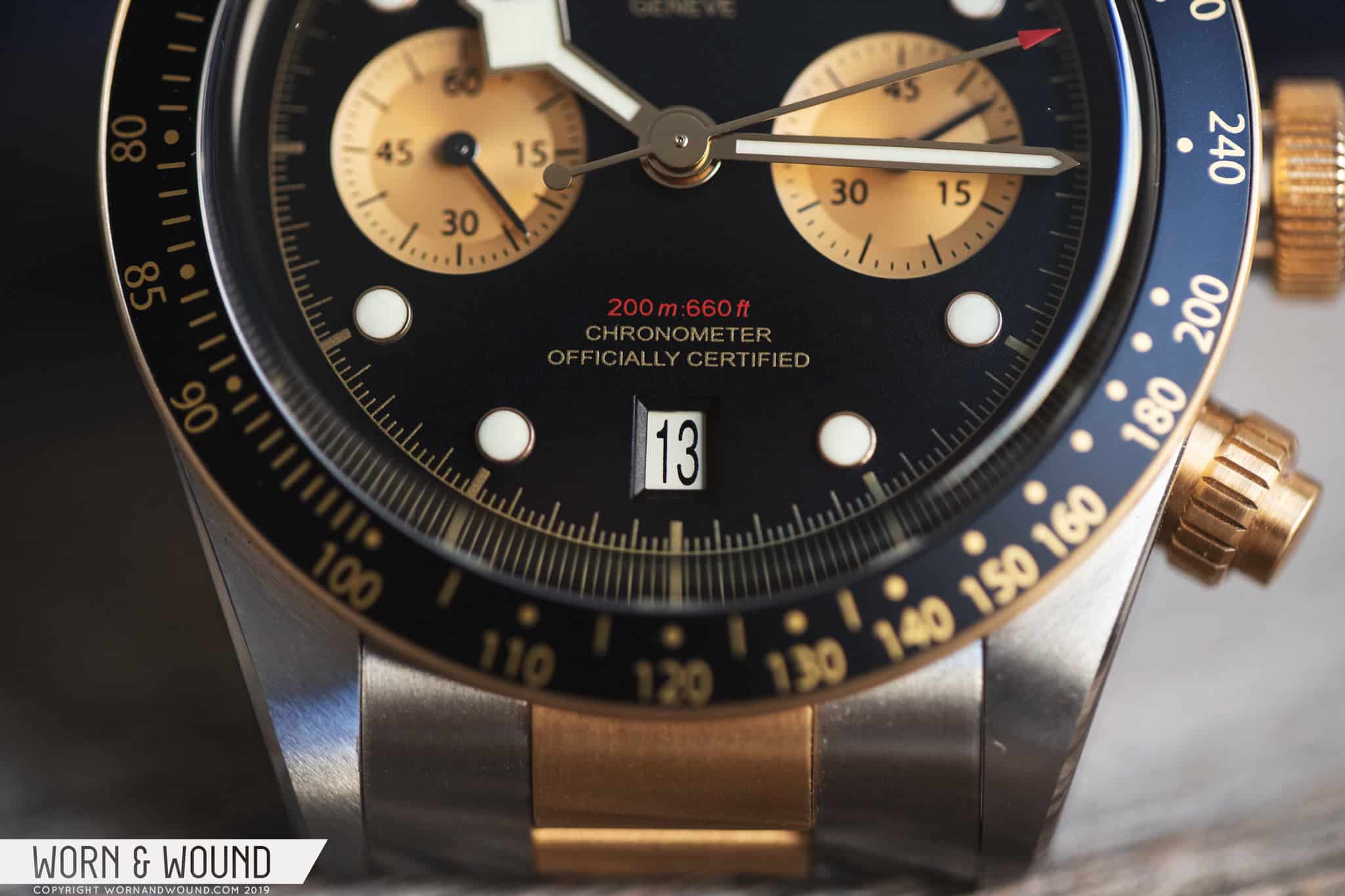
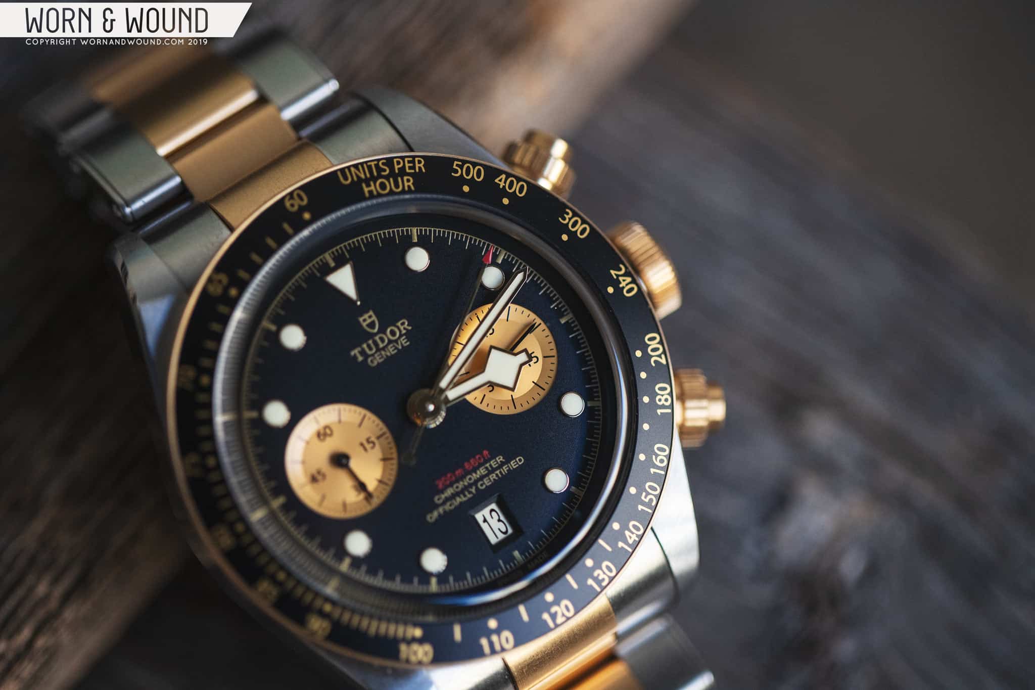
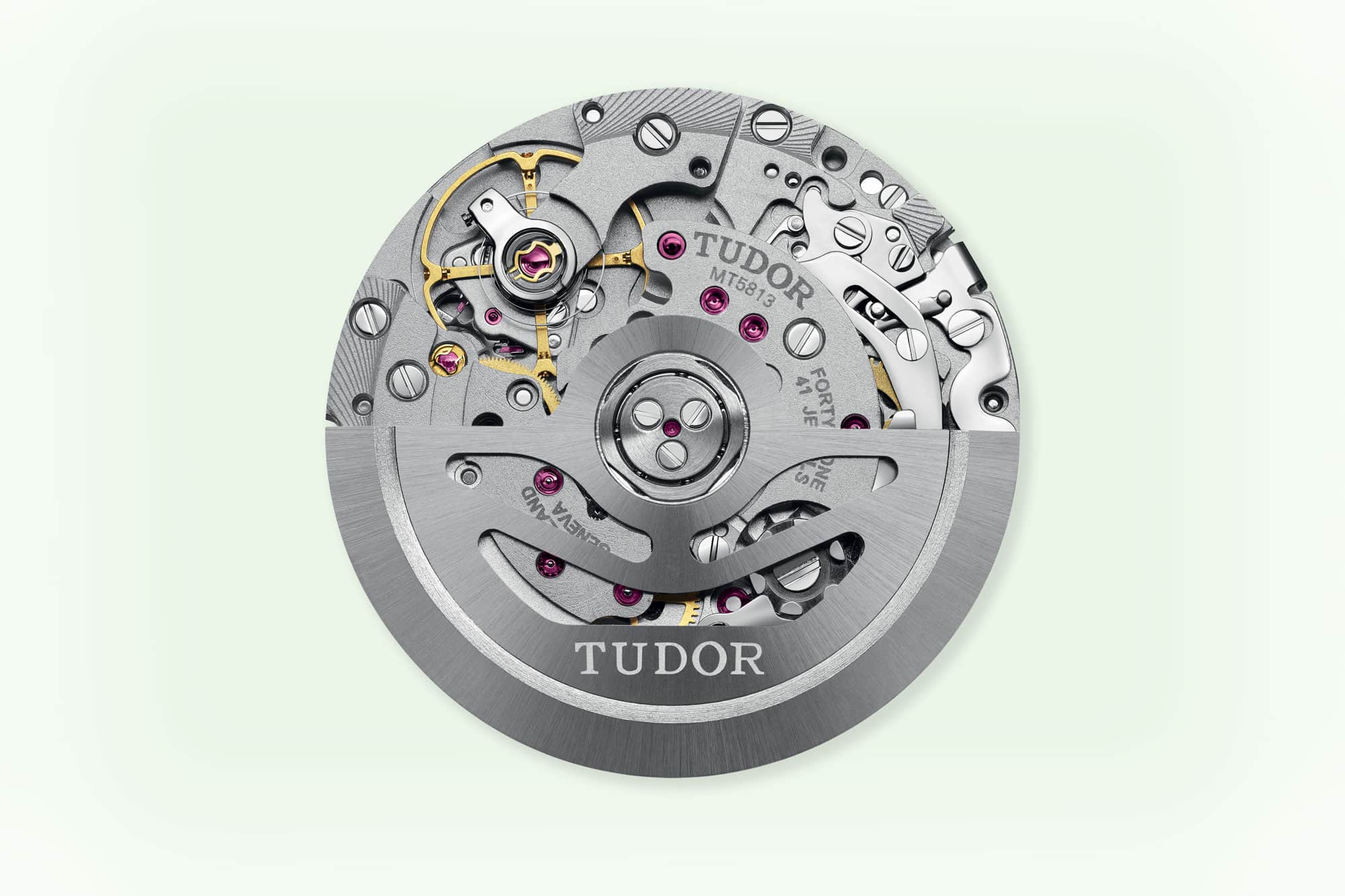
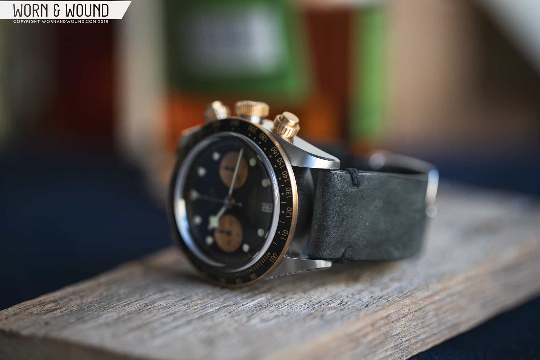
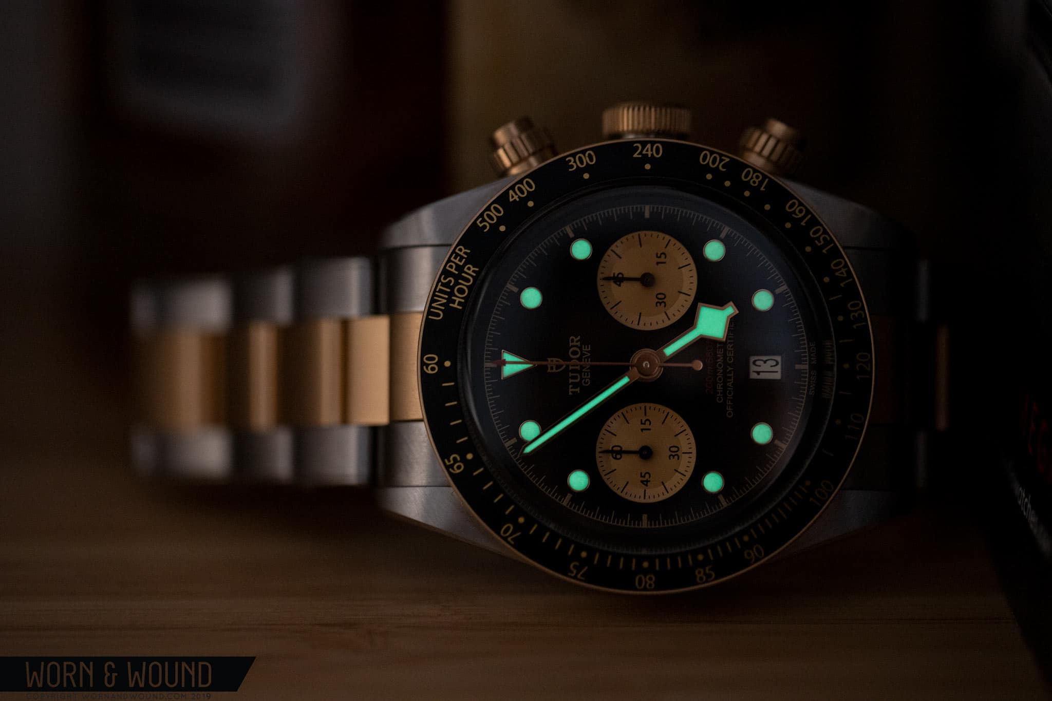
In 2017, Tudor first released the Black Bay Chrono. It was met with a mixed response. On one hand, Tudor used the watch as an avenue to debut their new chronograph movement, the MT5813, which was made in collaboration with Breitling as part of a technology exchange between the two brands. This was a surprise, but an exciting one as the caliber, which I’ll get more into later, has a great feature set. On the other hand, the watch mixes the diver DNA of the Black Bay with a fixed tachy bezel, resulting in a watch with an odd identity and one that didn’t quite click with the purist crowd. Then there’s also the snowflake hour hand, which obscures the minute sub-dial.

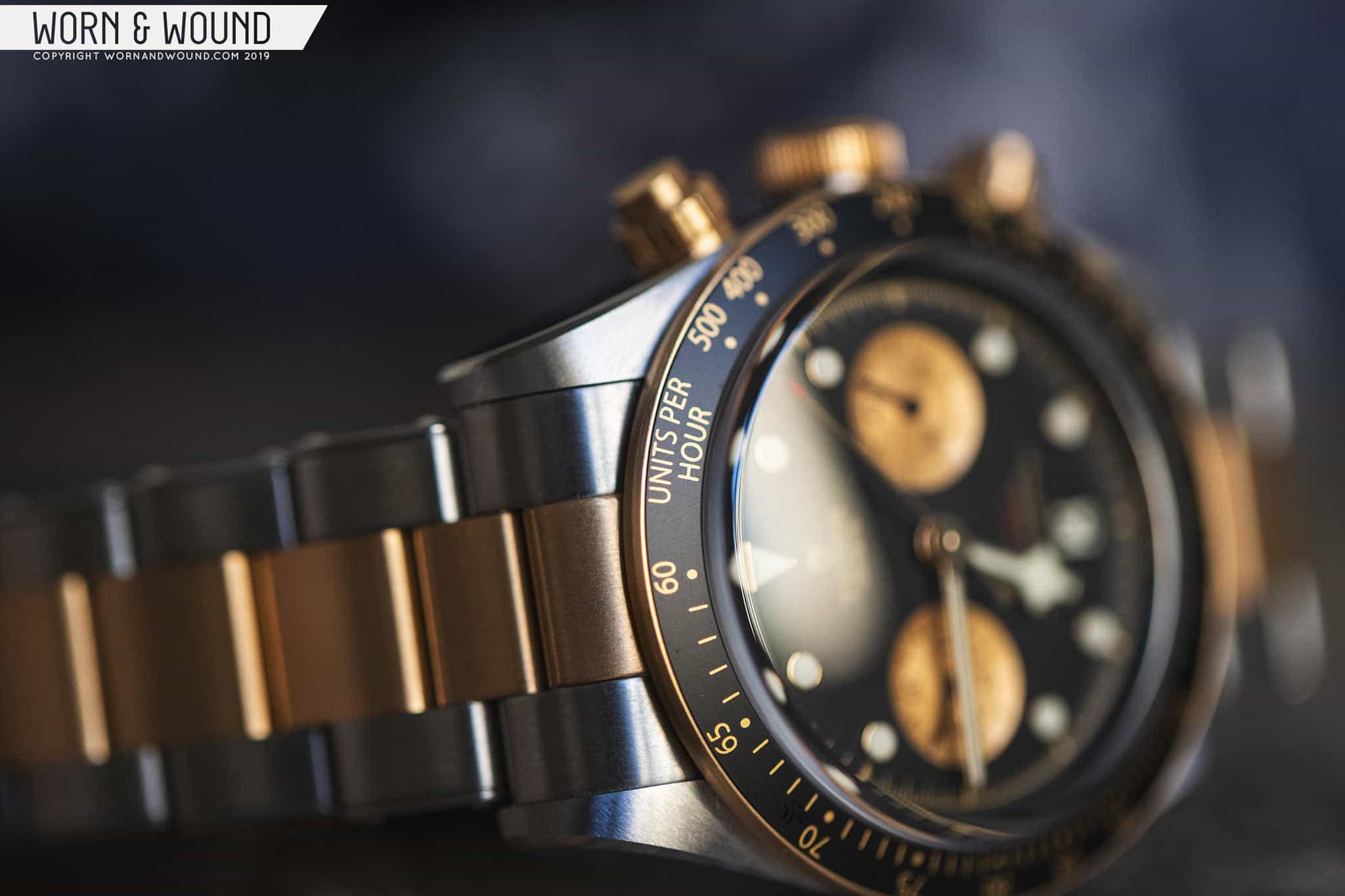
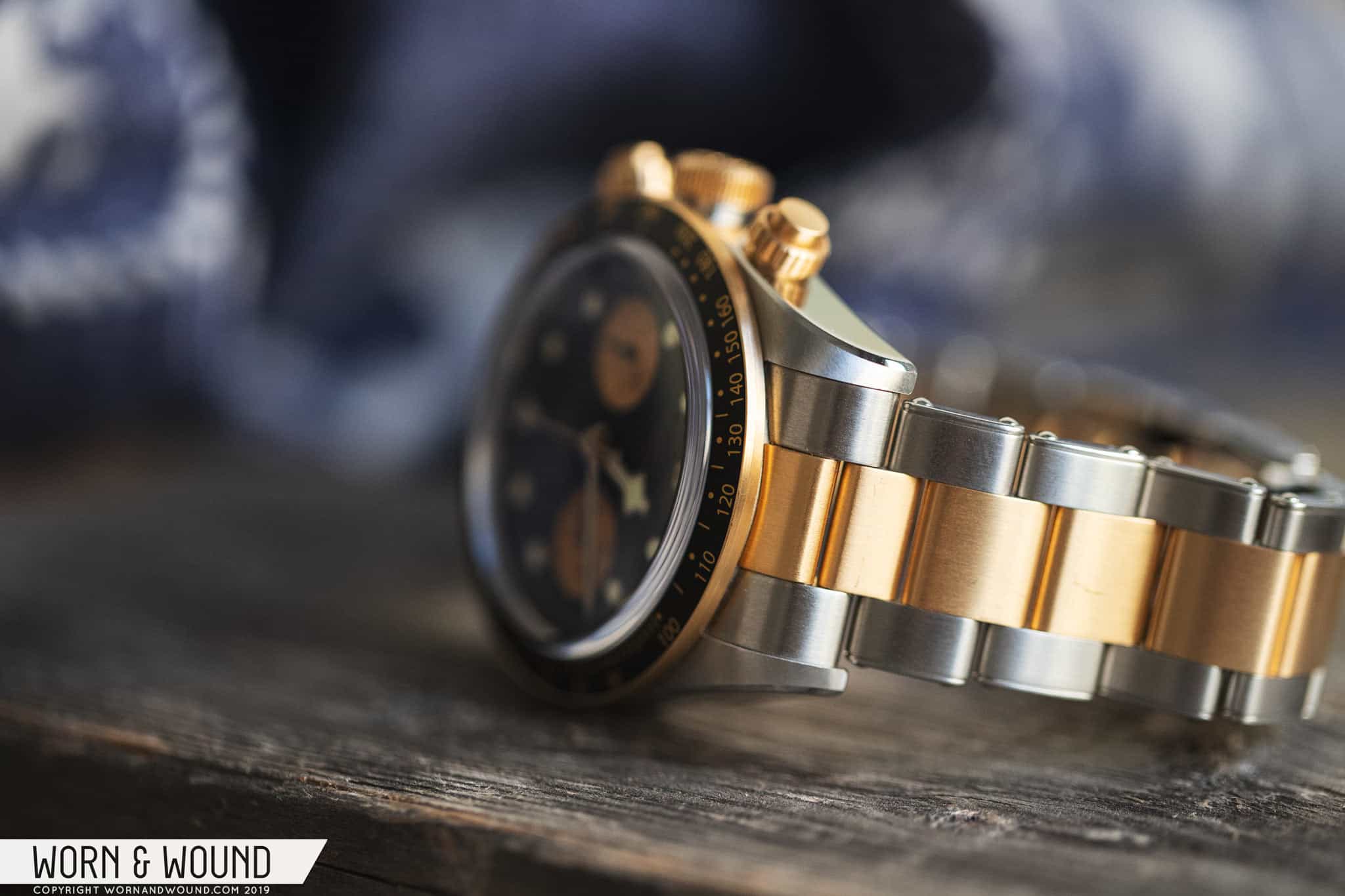
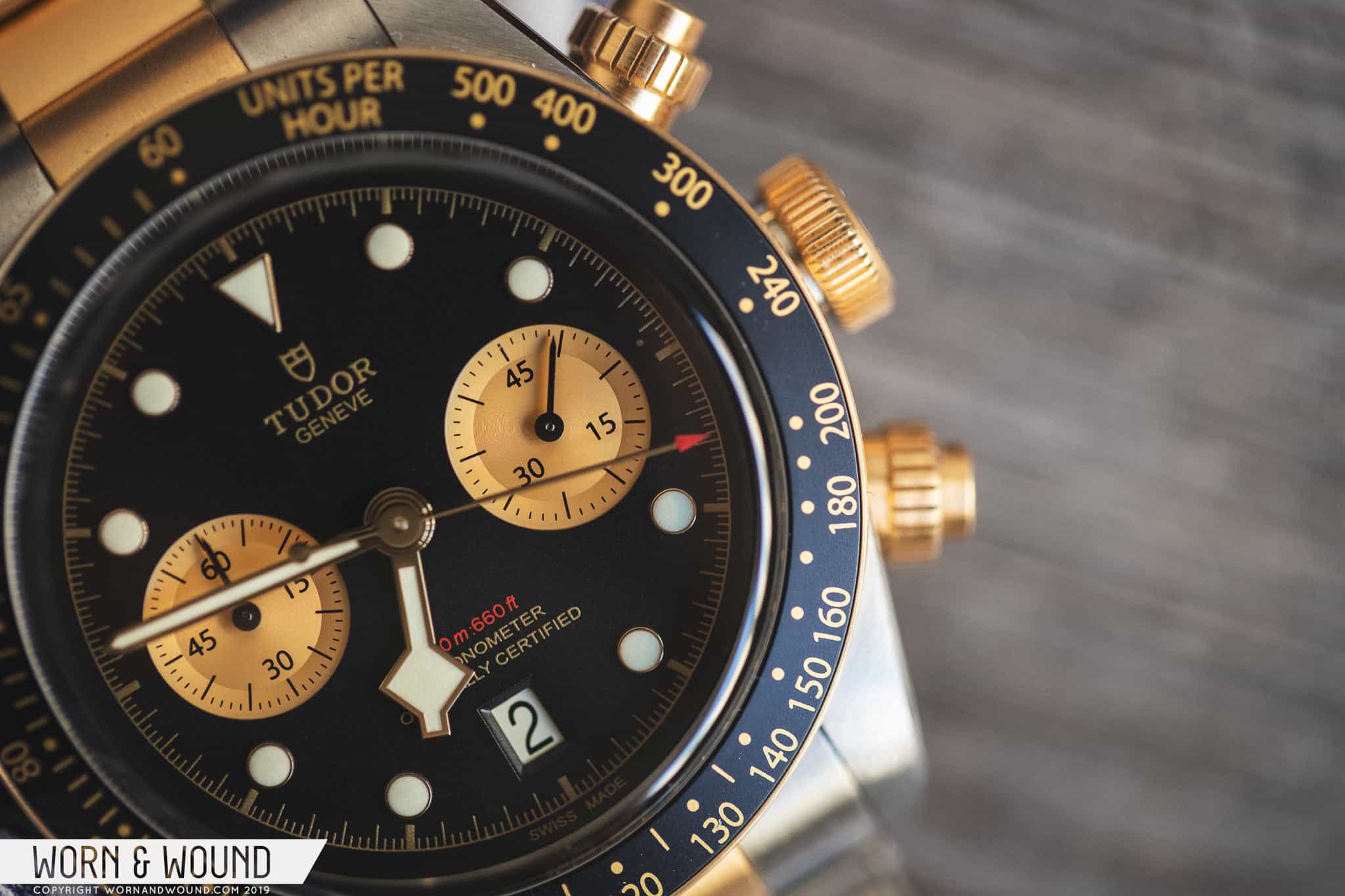
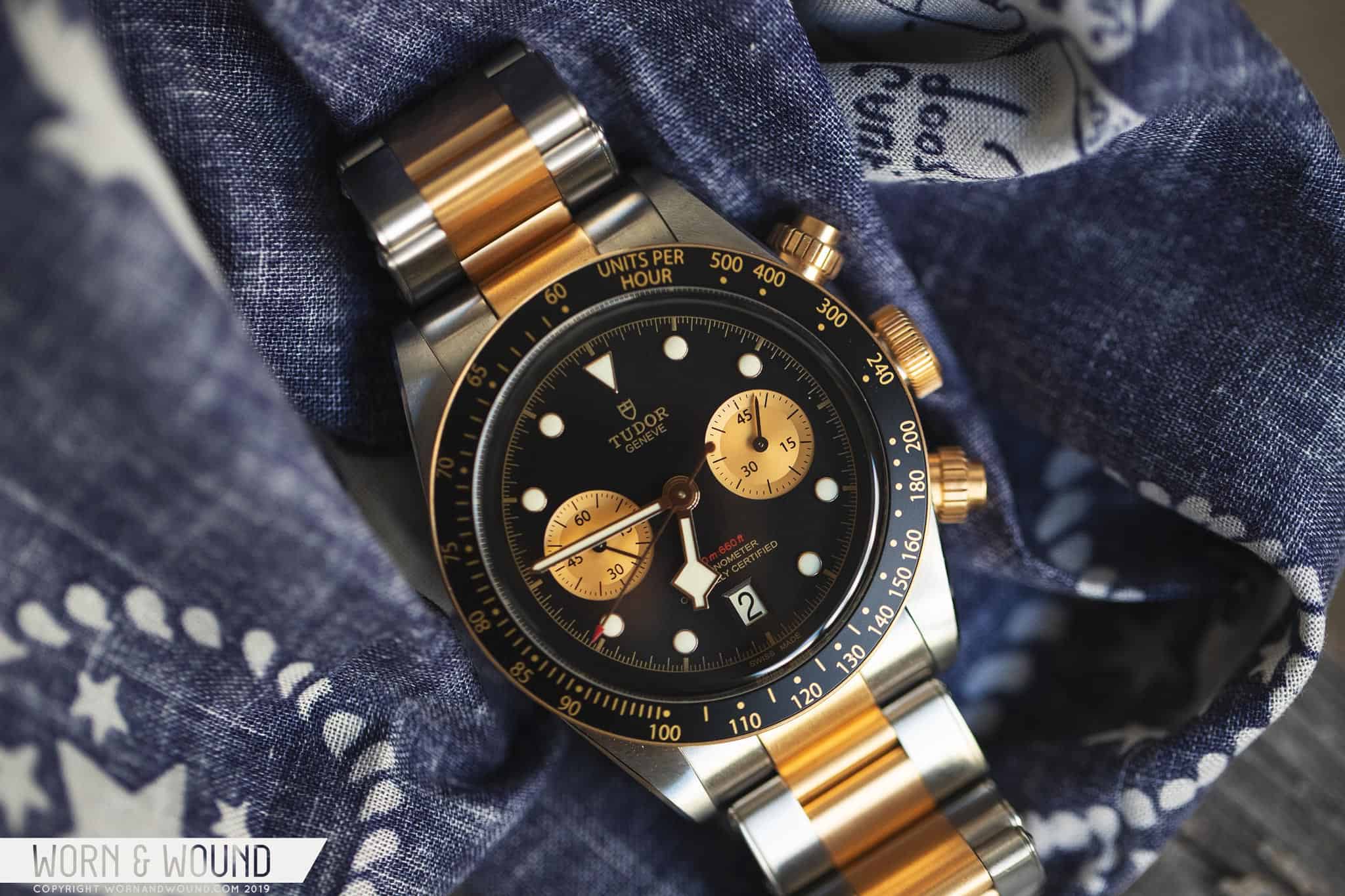
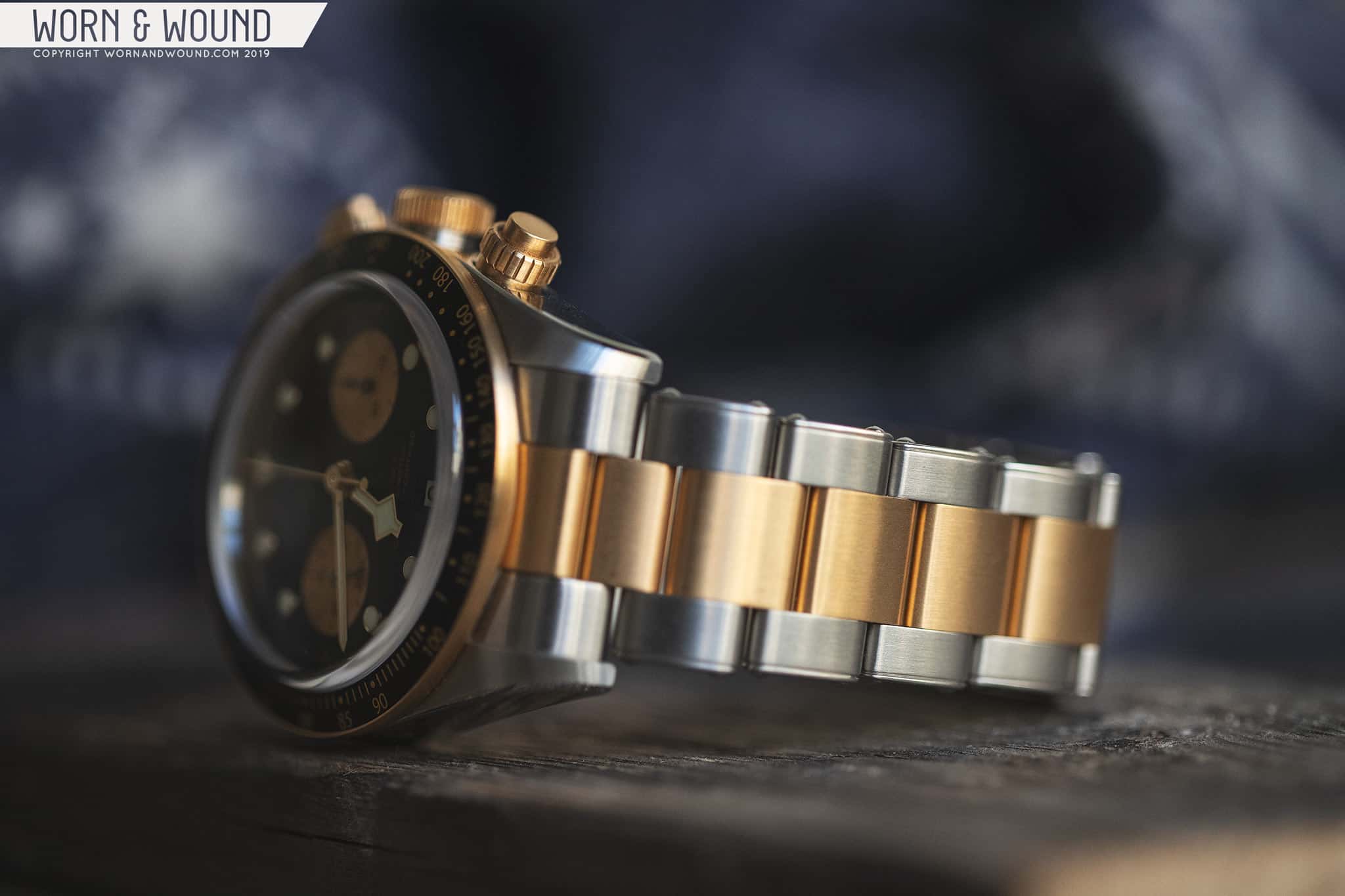
Fast forward two years and Tudor brings out the S&G model. Now with contrasting sub-dials and two-tone elements abound — including actual solid gold components — it’s a much more attention-grabbing piece. Whereas two-tone watches can air on being dressier than their steel counterparts, the Black Bay Chrono utilizes the mix of metal to increase its attitude, and as I said in our podcast back from Basel, it makes the watch sleazy-cool in just the right way. Tudor also refined the case, bringing down the height slightly. The hour hand is still the same snowflake, however, and I’ll get into that below.

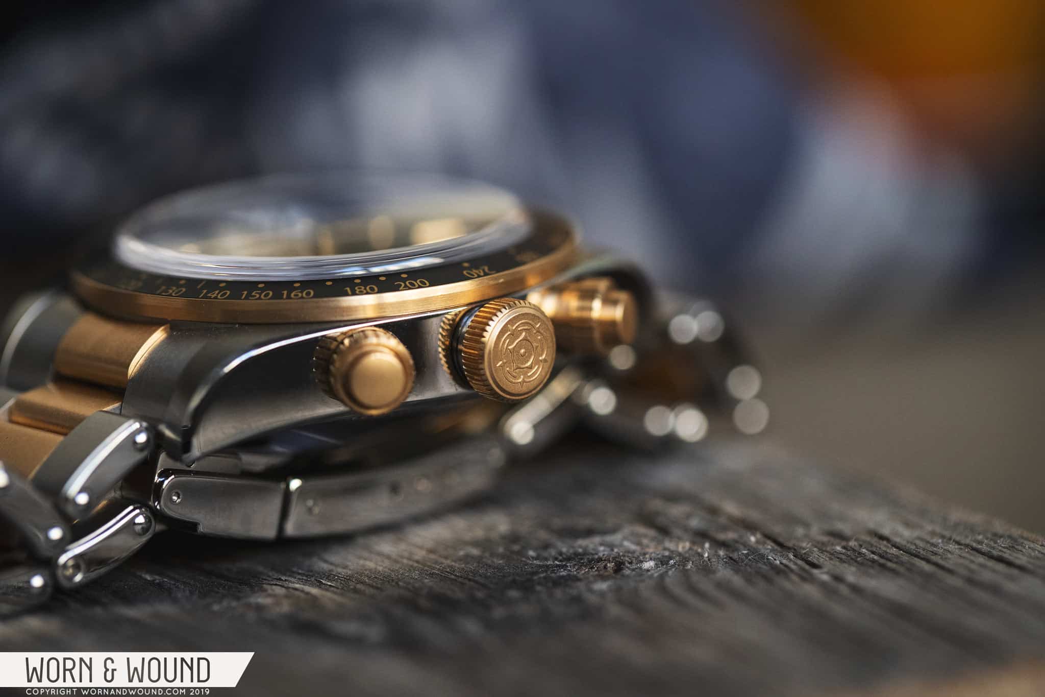
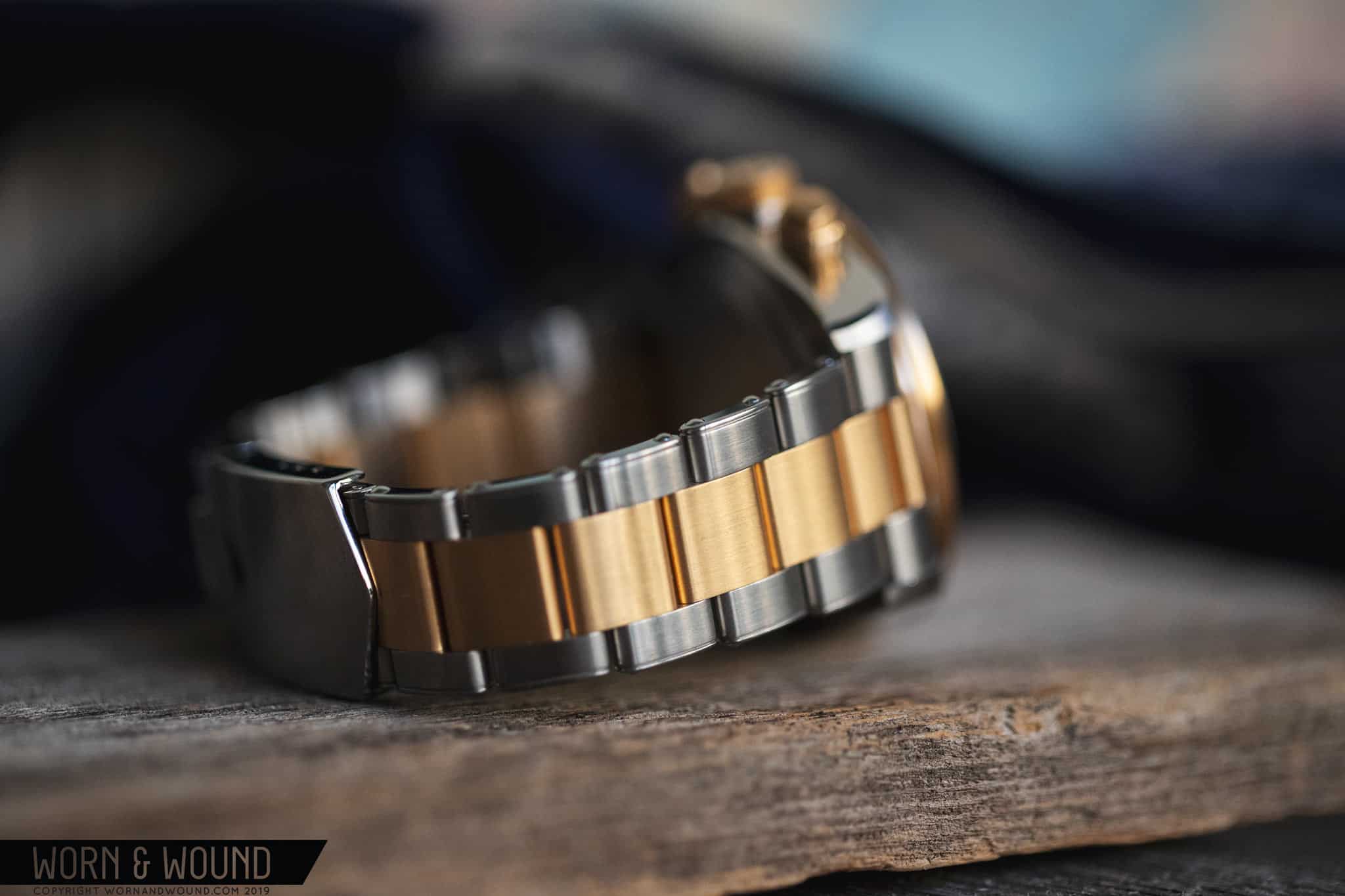
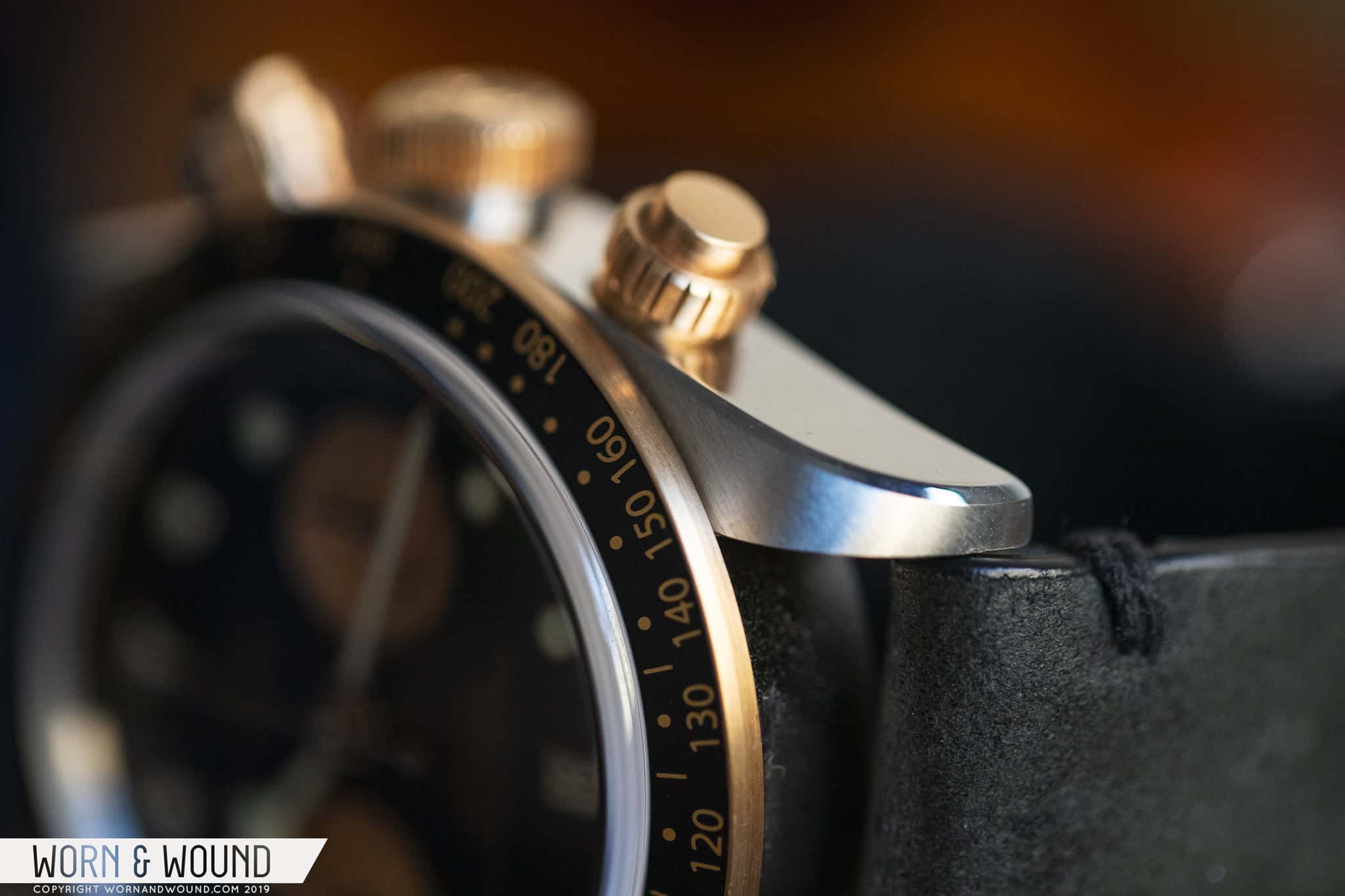
With the addition of a solid gold bezel and pushers and a capped-gold crown — where the crown is basically wrapped in gold, which is far thicker than any plating — the base price of the Black Bay Chrono S&G (BB Chrono going forward) is significantly, but not unexpectedly, higher than the steel model, starting at $5,600 on leather or fabric (versus $4,775 for the all-steel model). The two-tone bracelet then features solid-gold on the endlinks and capped-gold center links, bringing the price up to $6,800. While I believe less is more when it comes to price tags and gold, I’ll be reviewing the model with the bracelet because of availability.

Advertisement
$6800

Review: Tudor Black Bay Chrono Steel & Gold

Case
Steel and Gold
Movement
Tudor MT5813
Dial
Black
Lume
Yes
Lens
Domed Sapphire
Strap
Bracelet
Water Resistance
200m
Dimensions
41 x 50mm
Thickness
14.5mm
Lug Width
22mm
Crown
Screw-down
Warranty
Yes
Price
$6800

Case

In the past, I’ve had a love/hate relationship with the BB 41 case, which I’ve rehashed a few times already in past Black Bay reviews, but the long and short of it is that I always felt the height of the watch was exaggerated by the case’s slab sides. Even though it always looks good from above, the watch just feels too big and too tall on the wrist. The BB Chrono uses largely the same case, coming in at 41 x 50 x 14.5mm (including the crystal), which actually makes it a touch thinner than the BB 41! It too has slab sides, though the bottom edge is a bit more rounded than I recall it being on other BB cases, and this aids in it feeling less tall. But the biggest difference is a psychological one.

“units per hour” is a nice, vintage touch

I’m a chronograph guy. I just really like them. Sub-dials, column-wheels, cams, pushers — they just do it for me. The majority of the watches I’ve owned have been chronographs. This includes Lemania 5100 chronos, several 7750s, a 6139 and 6138, a cal. 11, a cal. 863, ST19s, and others I’m likely forgetting. Most of them, particularly the more contemporary models, have been sizable watches, and if not big in diameter, then certainly in thickness. To me, 14-16mm is normal territory for an automatic chronograph, so the BB Chrono just seems on par with what it should be. Is it thick? Yeah, but it just doesn’t bother me the way a three-hand watch in the same case does, and like I wrote above, it’s actually a touch thinner than that watch!

Like the size, the design remains largely the same as the BB41. You’ll find thick lugs with exceptional angled brushing, a razor-sharp bevel running along the lug edges, and tall polished slab sides. On the right side is the wide, but flat, screw-down crown rendered in gold-capped steel. The offset crown-tube here is steel (it’s black on the steel variant) and the Tudor rose is featured on the outside surface. I’ve said it before and I’ll say it again, this is one of the best tactile crowns on the market.

Gleams of gold
beautifully finished bevels
Gold crown and pushers

At 2:00 and 4:00 are solid-gold, screw-down pushers. This is in keeping with historical Tudor and Rolex models, but I have mixed feelings on screw-down pushers in general. I appreciate that they prevent accidental chrono actuation, particularly underwater, but I don’t think that it’s such a significant concern in everyday life that a whole system is needed to prevent that from happening, especially when they ultimately make a chronograph more inconvenient to use because you have to stop, unscrew the collar, and then push, which could make you miss the moment you intended to time. Then, when unscrewed, they look kind of sloppy, particularly on the BB as you can see a large gap where the collar fits into the case. And from an aesthetic standpoint, they are typically quite large, and at times they can feel out of proportion, which I think they verge on being here.

Because the pushers and collars are made of solid gold, there is a bit too much gold on the right side of the watch for me. Since there are two pieces here, and the watch is S&G by name, it would have been great to see them mix it up and perhaps go with a steel or black pusher inside a gold collar, or vice versa. It’s not a deal-breaker, especially when paired with a more toned down strap, but it’s a detail that I think could be improved on.

Mind the gap (sorry)

Sitting on top of the case is a fixed, solid-gold bezel with a black and gold anodized aluminum insert. It’s very attractive, with a distinctly vintage feel and a bit of a John Player Special vibe. The fact that it’s solid gold just gives it a bit of extra swagger. Though fixed bezels are a pretty standard feature on many chronographs, those of the dive variety tend to have rotating uni-directional bezels, hence some people’s issue with the BB Chrono in the first place. Conceptually, it’s understandable to be irked by this. It’s a line of “dive” watches, yet this element is clearly styled after automotive-themed watches. This is further emphasized and put into contrast by the applied dive markers and signature snowflake/Submariner hand, not to mention the “200m~600ft” on the dial.

That said, the Black Bay line is in many ways more about style than function, and the reality is that all the aforementioned elements come together to make an aesthetically appealing watch. Would a turning bezel paired with a fixed tachymeter on a chapter ring have been a better “hybrid” option? Yeah, but that’s not what we got. The fact is, you’re probably not diving with this watch or timing laps for that matter, so enjoy it for what it is — a stylish luxury watch with a slight identity issue.

Dial

If you were to imagine a two-register chronograph version of the Black Bay dial, you’d basically get exactly what the BB Chrono is. It’s not surprising, but it works and looks good. They’ve tweaked a lot of little details to make it balanced, but all said and done, it’s more or less the Black Bay with sizable sub-dials at 3:00 and 9:00.

The dial surface is matte black and gently domed. The hour index consists of applied markers with lume-fill, skipping 3:00 and 9:00 for sub-dials and 6:00 for the date window. Because they jump the cardinal points, there are no rectangular markers, only circular ones, and a triangle at 12:00. While I don’t think the rectangular markers could literally have fit here, with them absent a defining feature of the Black Bay/Submariner look is gone. This furthers the sort of identity crisis feeling of the BB Chrono. It just feels like something is missing.

The gold sub-dials really pop

The proportions of these markers have changed quite a bit from the Black Bay proper, reducing in size by a noticeable degree, especially the triangle. This goes towards achieving balance against the sub-dials, giving everything a little extra breathing room. Around the outer edge of the dial is a printed index for the minutes and chrono seconds in a dark, burnt-gold color.

At 3:00 and 9:00 you’ll find the 45-minute counter and active seconds, respectively. 45 minutes is a weird number of minutes to count, and I honestly don’t know why there ever were 45-minute chronographs. After some digging, there seems to be no good answer, with some people saying it was simply a modification made at some point to increase the duration a chronograph could record, and others saying it was designed to time the halves of soccer matches. Regardless, Tudor uses it because it refers to their historical models. I personally would have liked it to be a 60-minute counter since that’s actually more useful, but so it goes.

Balanced and handsome
six o’clock date
The gold makes the watch

For the BB Chrono S&G, Tudor made the smart decision of using contrast sub-dials executed in flat gold-tone. The color is an interesting choice and one that I think works very well. They could have gone metallic gold, which probably would have been a bit too much, and the color they landed on has an almost vintage feel — like it was once metallic and maybe got matte with age. Beyond that, the fact that the sub-dials are contrasting against the dial goes a long way towards the overall balance of the dial. The original felt a bit too empty with matching black sub-dials, and perhaps a bit too subtle as well. This is a watch that needs a little attitude and having those two golden eyes staring back out at you does the trick.

The date window at 6:00 was a good choice. It obviously wouldn’t have fit at three, and I was glad to see they didn’t squeeze it in between 4:00 and 5:00. 6:00 is balanced and though you lose a marker for it, aesthetically it’s the right choice. That said, the date itself looks a bit underwhelming. The text is thin and black on a white surface. I’m not sure what should have been done here — perhaps a warmer-colored surface, or a different typeface, but something to give it a little more personality would have been nice. It just looks oddly “stock” to me.

The BB Chrono features a modified set of snowflake hands for the hour and minute. While I don’t have another Black Bay in front of me to compare it to, based on images, the hands look a bit thinned out, particularly the minute, which is now narrower than the hour hand at its base. The second hand is a thin stick with a small, red-arrow tip. All of the hands are gold-toned.

After the bezel, the snowflake hour hand is the biggest point of contention on the BB Chrono. Though an iconic hand, it wasn’t designed for a chronograph, and is therefore in untested waters, so to speak. It’s big, and as such it blocks a decent amount of the dial underneath. Normally, this doesn’t matter, but on a chronograph, it means that for certain hours either the 45-minute counter or the active seconds will be largely obscured. There is no dancing around it and no conditional ways to make it better — it’s simply a fact. That doesn’t make them entirely unfunctional (it’s honestly more of a concern with the minute counter), but it certainly can hinder their use here and there.

Total Eclipse of the sub-dial

This is an odd situation, to be honest. It’s a flaw, but one that Tudor clearly thinks is not fatal or worth addressing. Would the hands from the “Only Watch” Black Bay One have been better? Much, but that was a one-off, and Tudor is clearly trying to establish the snowflake as synonymous with the Black Bay line. So, if you’re concerned with these type of details or actually use the chronograph often, the BB Chrono might simply not be for you. If you’re more about the overall aesthetic of chronographs or having a complex timepiece than you are function, then you probably won’t care.

Advertisement

The Tudor Caliber MT5813

The BB Chrono S&G isn’t just looks; inside the watch there’s an incredible, feature-packed movement. As I wrote in the intro, Tudor and Breitling partnered for a sort of caliber trade. Tudor got the MT5813, a modified version of Breitling’s B01 chronograph, and Breitling got a version of Tudor’s MT5612 movement for their own use. The B01 is not new, but Tudor’s modifications give it a modern spin and a feature set that is hard to rival at the price point (under $5,000 for the steel model).

The MT5813 is a 41-jewel, column-wheel chronograph with a vertical clutch that features a 70-hour power reserve and a frequency of 28,800 bph. Like Tudor’s other manufacture calibers, the MT5813 has a silicon hairspring, a freesprung balance, and a bi-directional winding rotor. As per Tudor’s spec, the minute counter is also altered to the aforementioned 45-minute duration. Lastly, the movement is a COSC-certified chronometer.

note the column wheel under the rotor

That’s a lot of movement, and barring the fact that it’s not elaborately finished, the aforementioned features are more on par with what you’d find in a modern Daytona than other chronographs around $5,000. Omega, IWC, Heuer, and even Breitling come close, but don’t check all of the boxes. In terms of finishing, while the movement is hidden behind a solid case-back, you’ll find it’s in the same style as their three-hand movements. No Côtes de Genève, polished bevels, or perlage. Rather, bridges are blasted, levers are tumbled, and there is some machine engraved spiraling. I personally think it’s kind of cool looking since it’s different and more machine-like than the standard types of finish.

Bracelet

The BB Chrono S&G comes on one of three strap options: a vintage-leather bund, a black fabric strap, or a two-tone rivet bracelet. For those unfamiliar with the Black Bay rivet bracelet, it’s genuinely one of the nicest bracelets I’ve tried. It’s a not-overly-fancy, three-link/oyster style bracelet with a stepped 4mm taper and rivet-plated sides. It adjusts with single-sided screws, so you can do it at your desk with ease, and it has a fantastically machined clasp with three micro-adjustment settings. It’s just a solid, well-executed bracelet, and I loved it on the BB 58 and BB 41. In two-tone, however, it’s just too much gold for my liking.

Too much gold, or just right?

The entire stripe of middle links are gold-capped, with the end-links featuring solid hunks of gold. It’s all brushed, which tempers it a tiny bit, but there’s no way around the sheer surface area of gold. Since this watch is sporty at its core, and the gold adds to the attitude rather than the opulence, it begins to overtake what makes the watch work so well. In terms of quality, it’s still top-notch. Looking at a removed link, you can see how thick the gold is, and they aren’t skimping. Should you need to refinish in the future, you can do it, but you can also save yourself $1,200 by going for one of the other strap options.

Advertisement

Wearability

Like its three-handed sibling, the BB Chrono is a sizeable, but very wearable watch. From above, the 41mm case has a bold, masculine presence that looks good on my 7” wrist. The 50mm lug-to-lug is still within the range that fits comfortably as well. As far as the height goes, I’ll stand by what I said earlier. It’s tall, but it’s an automatic chronograph, so that is just to be expected. Do the polished slab sides help? No, but with the additional complexity of the pushers, tachymeter, sub-dials, etc, it’s just less offensive. And at the end of the day, it’s comfortable.

41 works for a sporty chrono
Gray leather tames the watch a bit, while making the gold accents pop

And moreover, the watch just looks really good on the wrist. It’s a compliment machine if that’s what you’re into. The mix of black and gold exudes style, swagger, and just the right amount of something else. Something a bit more sordid, a bit nefarious, but tamed. This is a watch that aches to be worn with black jeans, a leather jacket, and a worn-out t-shirt. Sure, you can pull it off with a blazer and khakis, but it’s more at home with clothes you’d wear to a Judas Priest concert. And if you’re like me, you’d ditch the bracelet, even if it’s very nice, for black or gray leather. The more you emphasize the black aspects of the watch, the more the gold elements pop, and the more attitude the watch has.

Conclusion

With Tudor trying to make a Black Bay for everyone, a chronograph was a logical addition to the line. It tops the collection out in terms of price, complexity, and machismo. That said, the conceptual execution is a bit off. While I think the diver/chrono argument is an anal one that will likely only matter to enthusiasts, it’s not wrong. I, too, like things to have a logic to them, and when brands lose sight of what that logic is, I find the watch suffers. A tachymeter bezel on a dive watch doesn’t really make sense. An hour hand that covers sub-dials on a chronograph is an obvious flaw. It seems clear that Tudor decided to go for style over substance with the Black Bay Chrono, but they nailed the style end of things so well that in this instance I can forgive the other issues.

The Black Bay Chrono S&G is a very good looking watch that is a lot of fun to wear. It’s the kind of watch that you might buy to scratch an itch for a chronograph with vintage-style or test the waters with gold or excess, but it’s still boasting al tasteful amount of bravado. The flaws mentioned don’t matter when there’s a smile on your face every time you look at your wrist, and, in my case at least, that was more or less the reaction. Plus, it’s beautifully-made and features one hell of a movement. As a chronograph fan, the words “column-wheel, vertical-clutch, chronometer chronograph with a silicon hairspring, freesprung balance, and 70 hours of power reserve” are truly a pleasure to say. The fact that I’m not talking about a $20,000 watch makes them all the more joyful.

With that said, the BB Chrono S&G is not cheap with a starting price of $5,600, but it does represent a decent value within the market right now and in comparison to its competitors. Sure, solid gold components jack up the price quite a bit and aren’t really necessary for the aesthetic they are going for, but they do add to the cool factor, and it’s pretty uncommon to find solid-gold anything on the pages of Worn & Wound, making it a more unique offering in our book. If you can get over the bezel and hour hand issues, have the cash and the inclination, then I can assure you this is a watch you’ll enjoy quite a bit. Tudor

Advertisement
Images from this post:
Related Reviews
Zach is the Co-Founder and Executive Editor of Worn & Wound. Before diving headfirst into the world of watches, he spent his days as a product and graphic designer. Zach views watches as the perfect synergy of 2D and 3D design: the place where form, function, fashion and mechanical wonderment come together.
wornandwound zsw
Categories: