Richardt & Mejer Signature Review

The term “Scandinavian design” is used with such frequency, it tends to get thrown around without much thought. It’s right up there with “Bauhaus” and “minimal”… bringing something vague to mind without necessarily being well-defined. Chances are, you have something in your home that qualifies (especially if you shop at Ikea). That’s partially because it’s hard to define exactly, encompassing the design aesthetics of several countries and countless designers and objects. Roughly, it brings to mind modern objects, namely furniture and home goods, that while minimal and restrained, are emotive and even playful. Objects that are never garish or ornate, nor too stark or strict. At certain times lines flow, while at others they are sharp and angular. The end result isn’t that of a brutal object, but rather something with personality and character.

RICHARDT+MEJER_STRAP_1In watches, Scandinavian design is a less used expression, though many brands certainly qualify. Skagen immediately comes to mind, perhaps being the most well known and ubiquitous. On a smaller scale are brands like TID, who worked with Sweden-based design studio Form Us With Love to create a softer-stylish military-esque watch, and Hygge, who are actually a hybrid of Scandinavian and Japanese sensibilities.

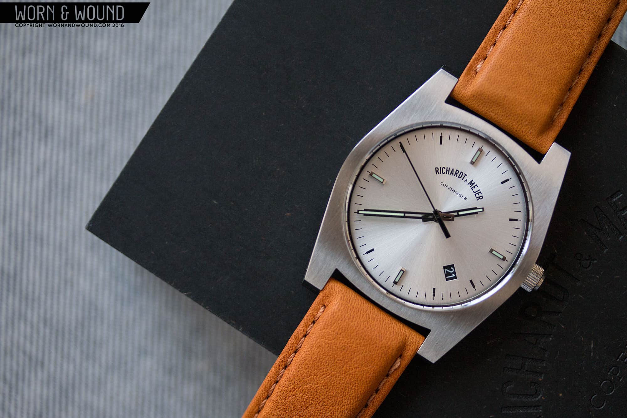
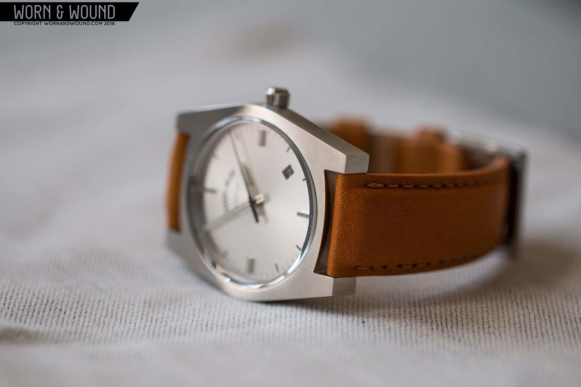
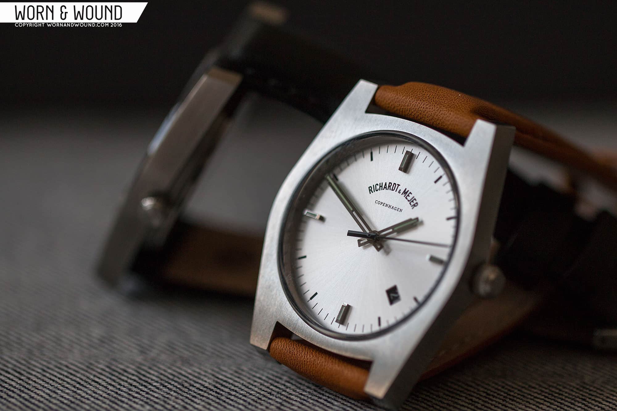
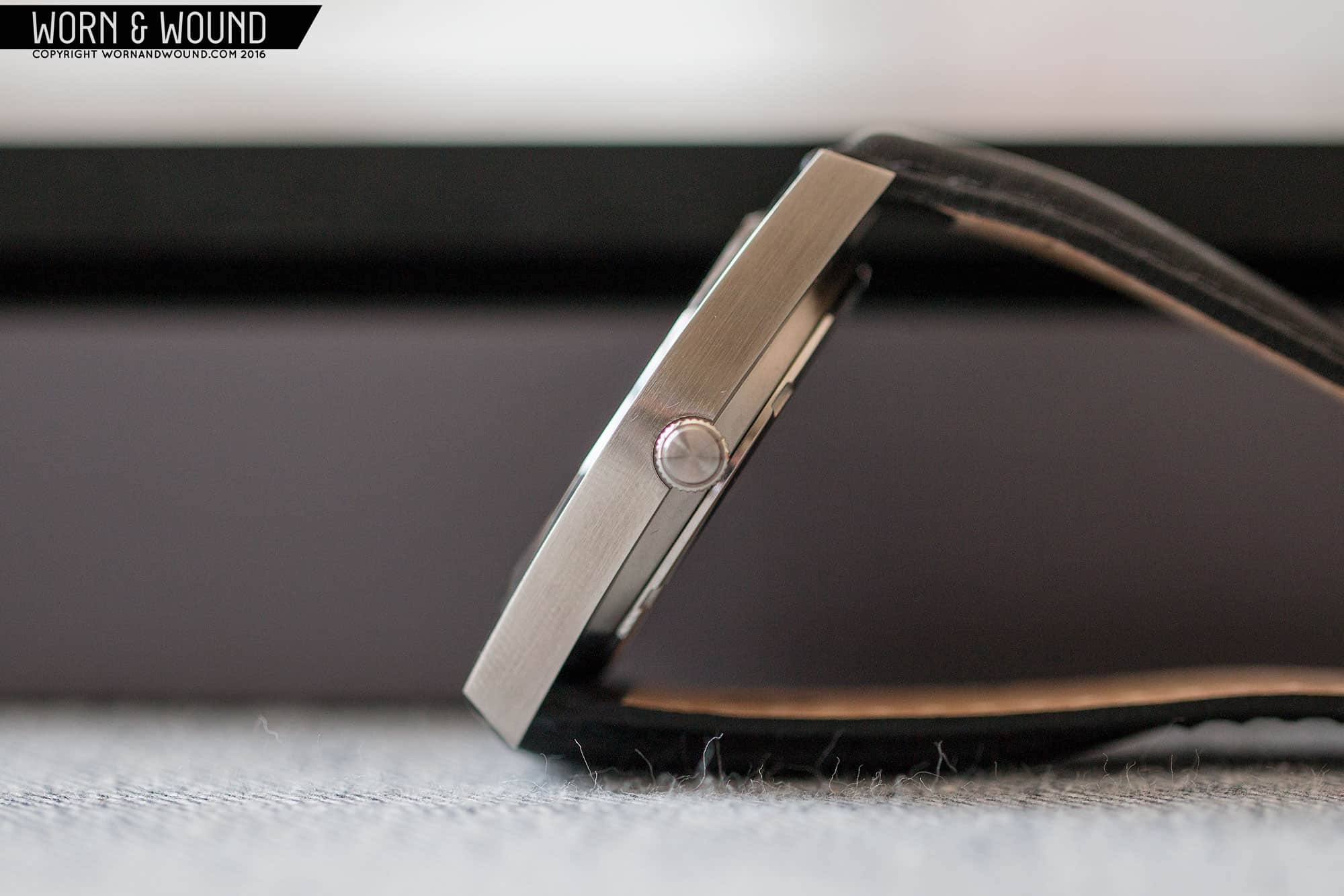
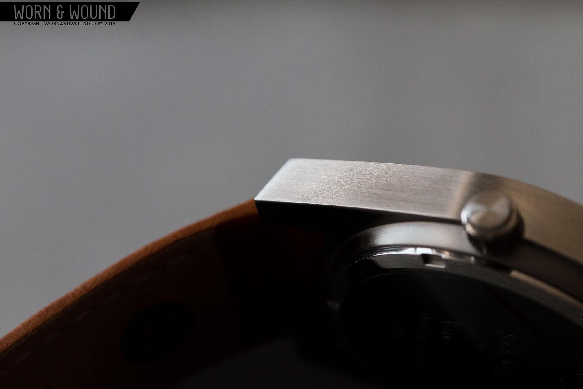
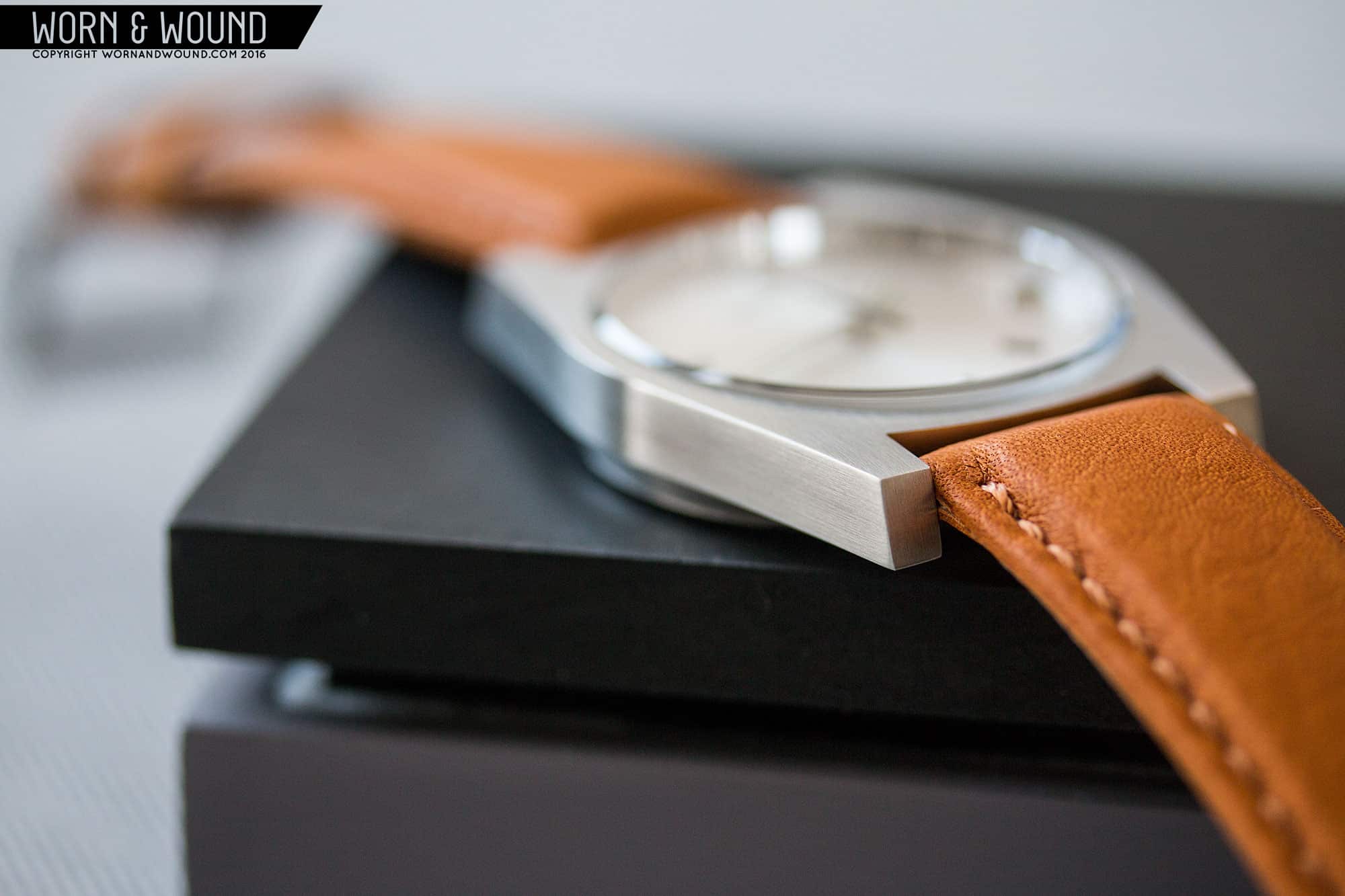
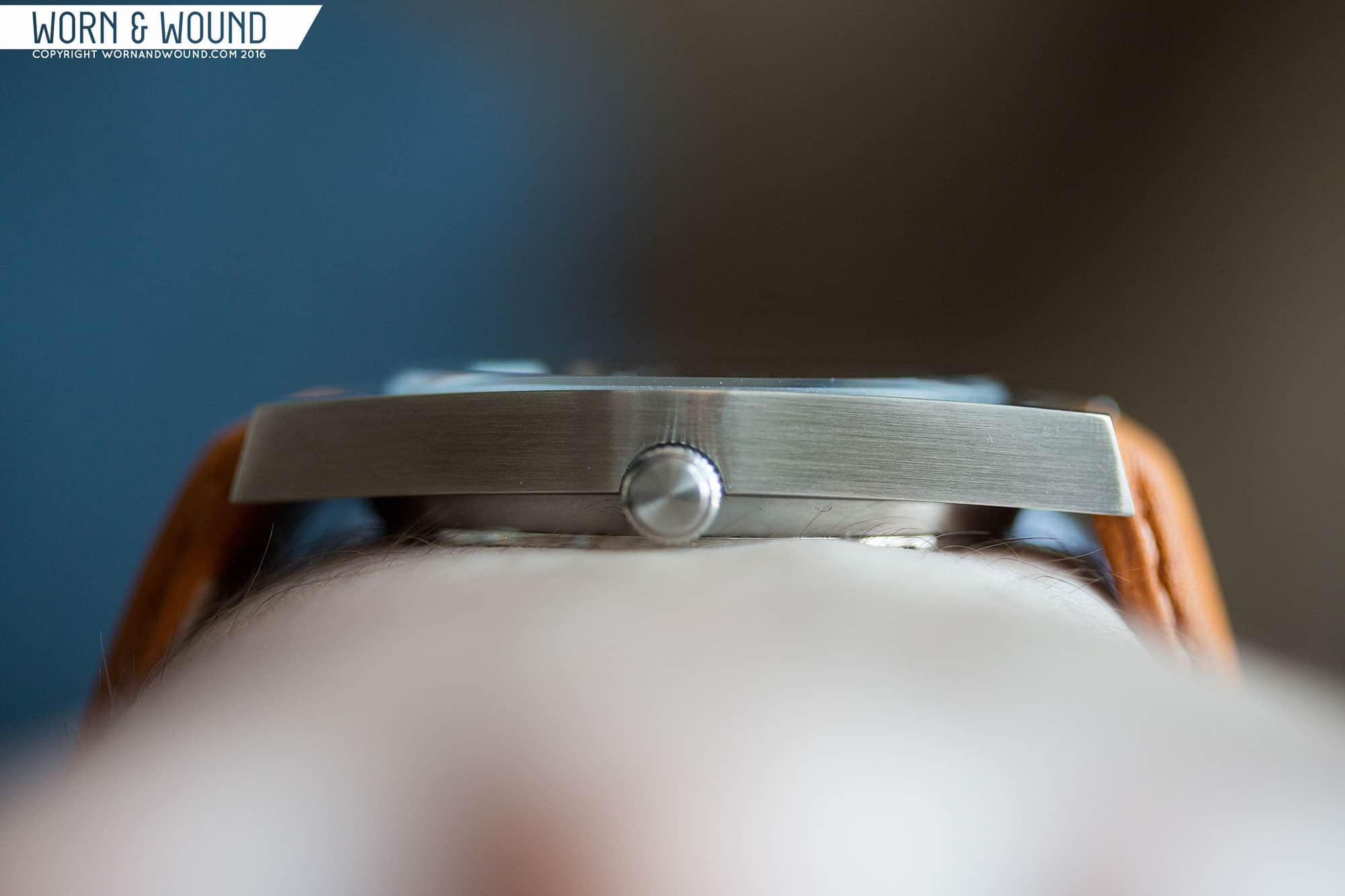
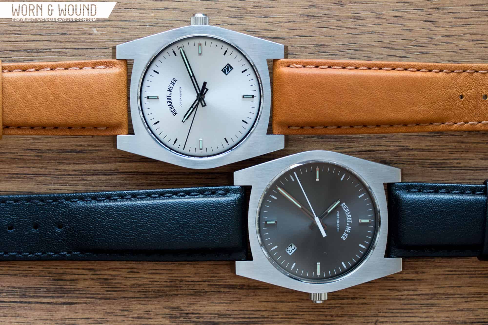
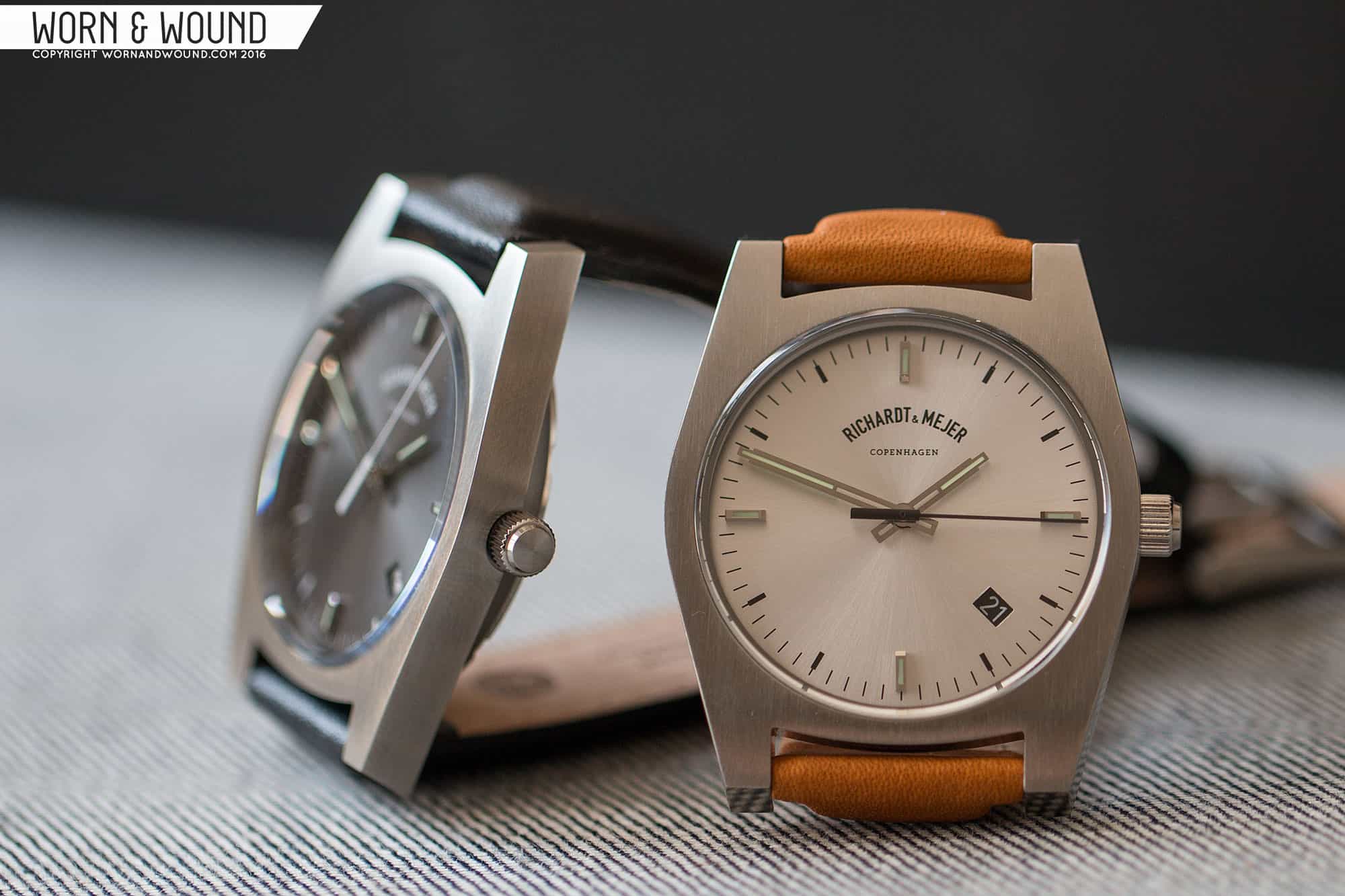
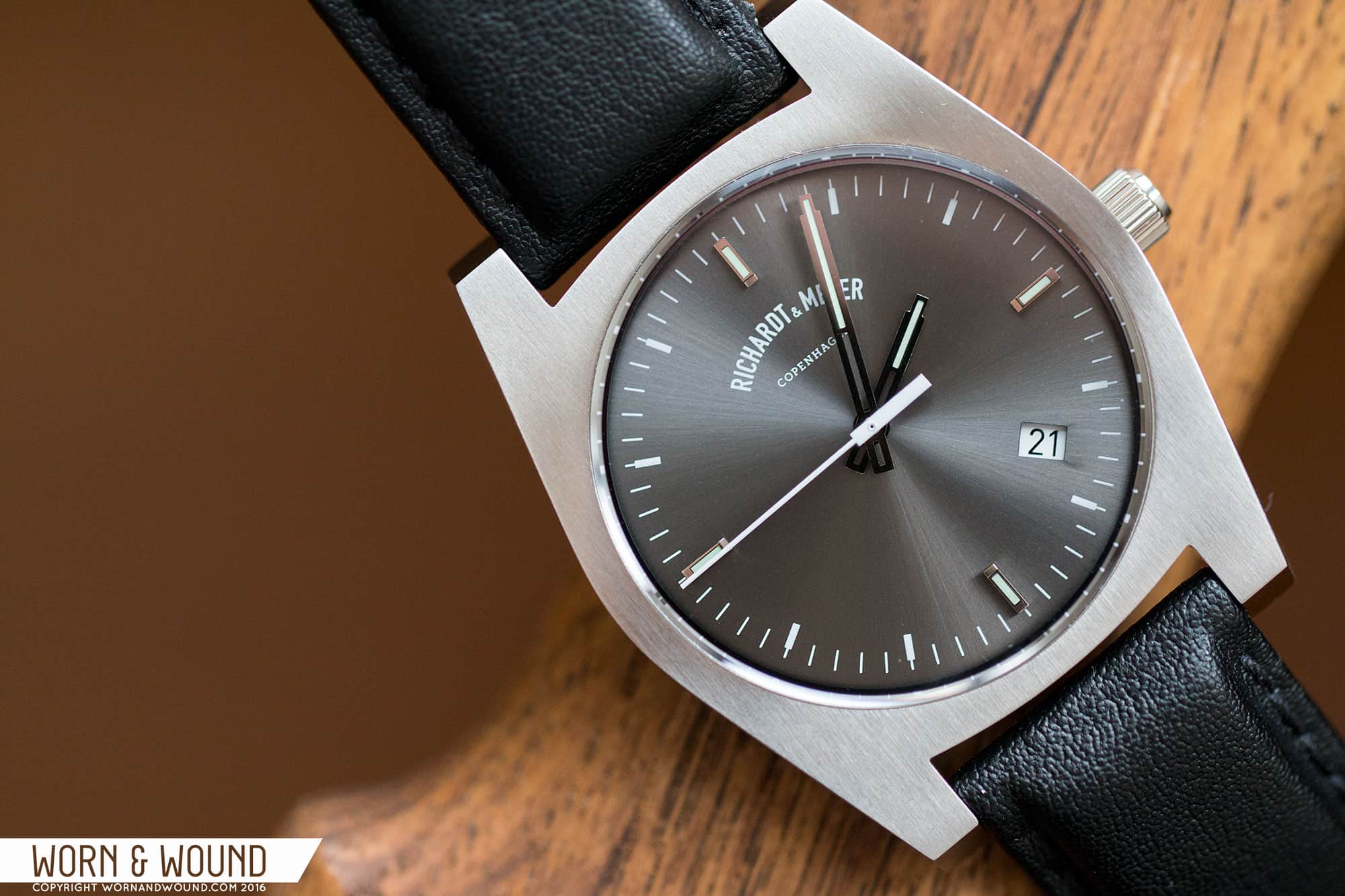
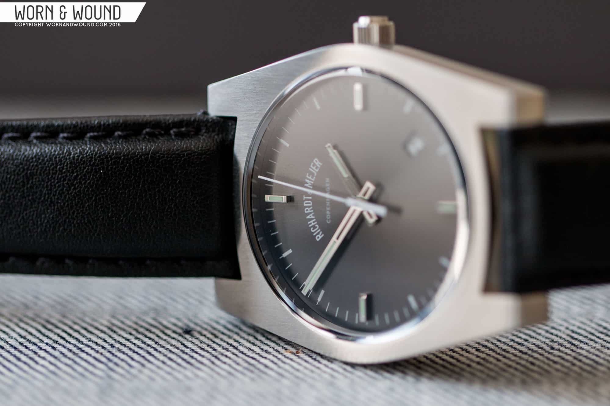
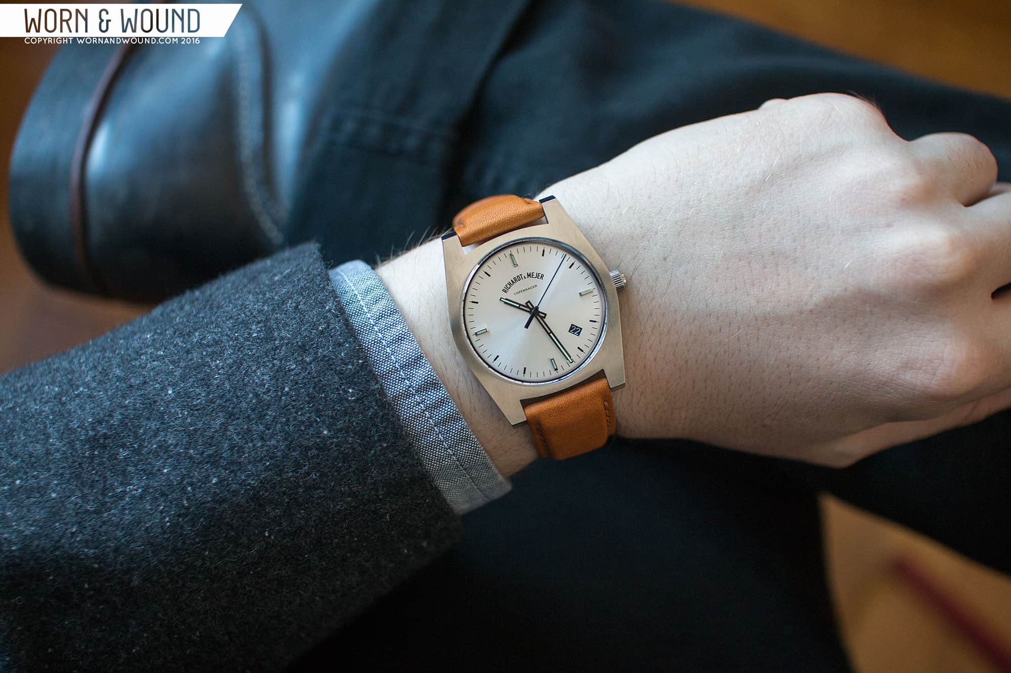
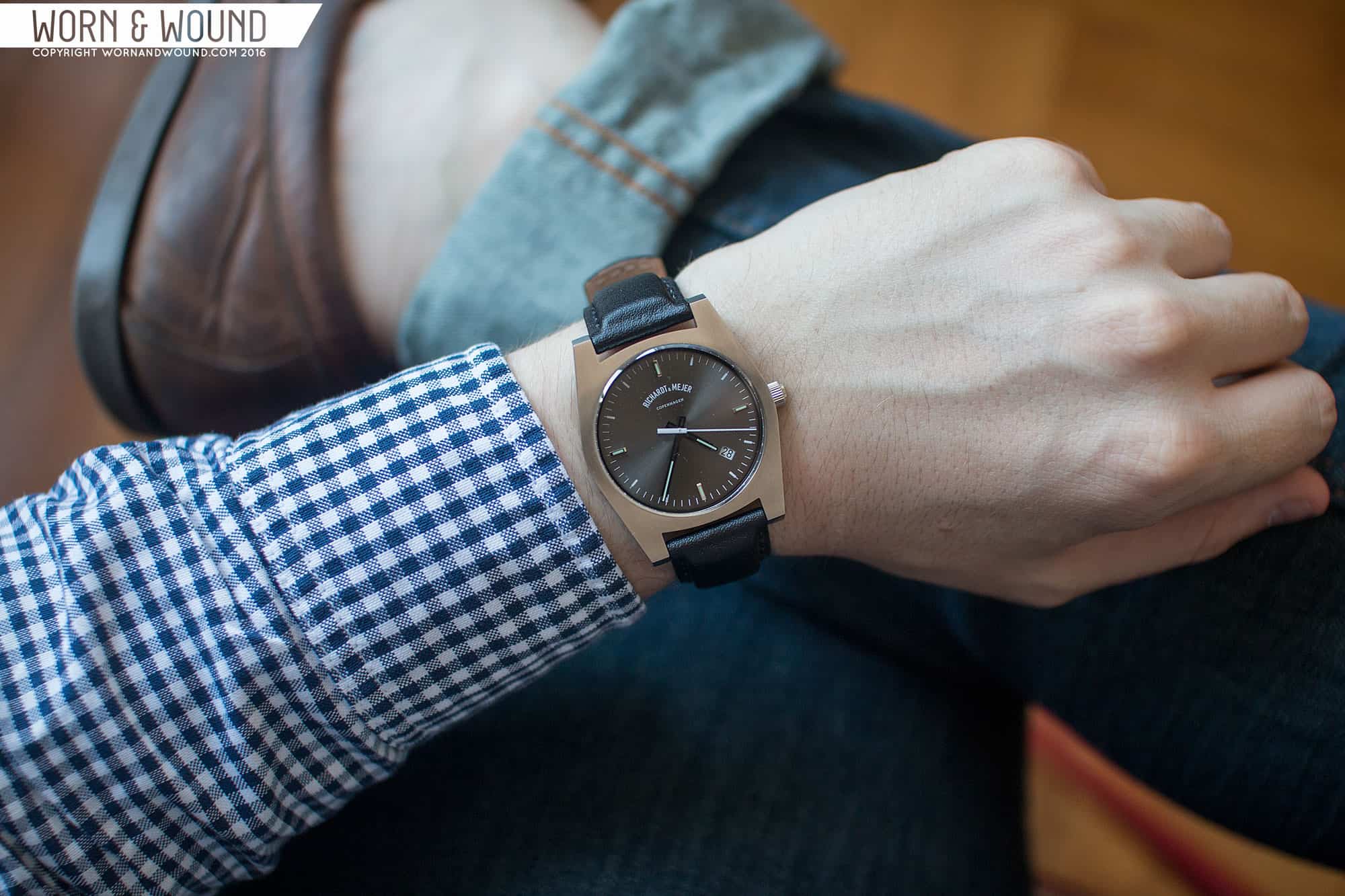
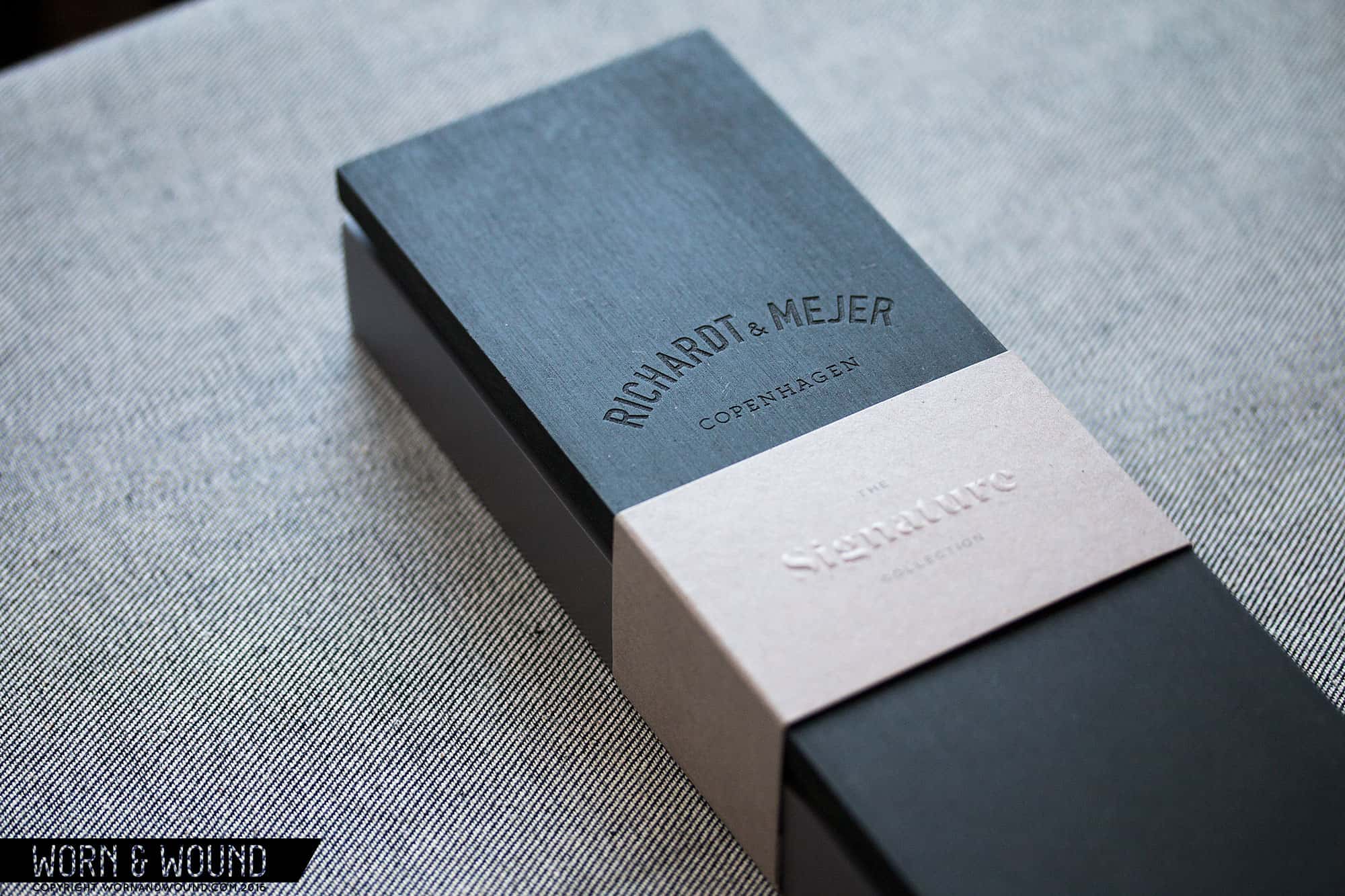
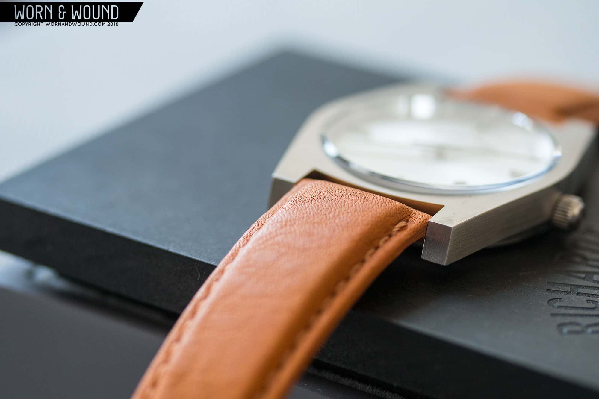
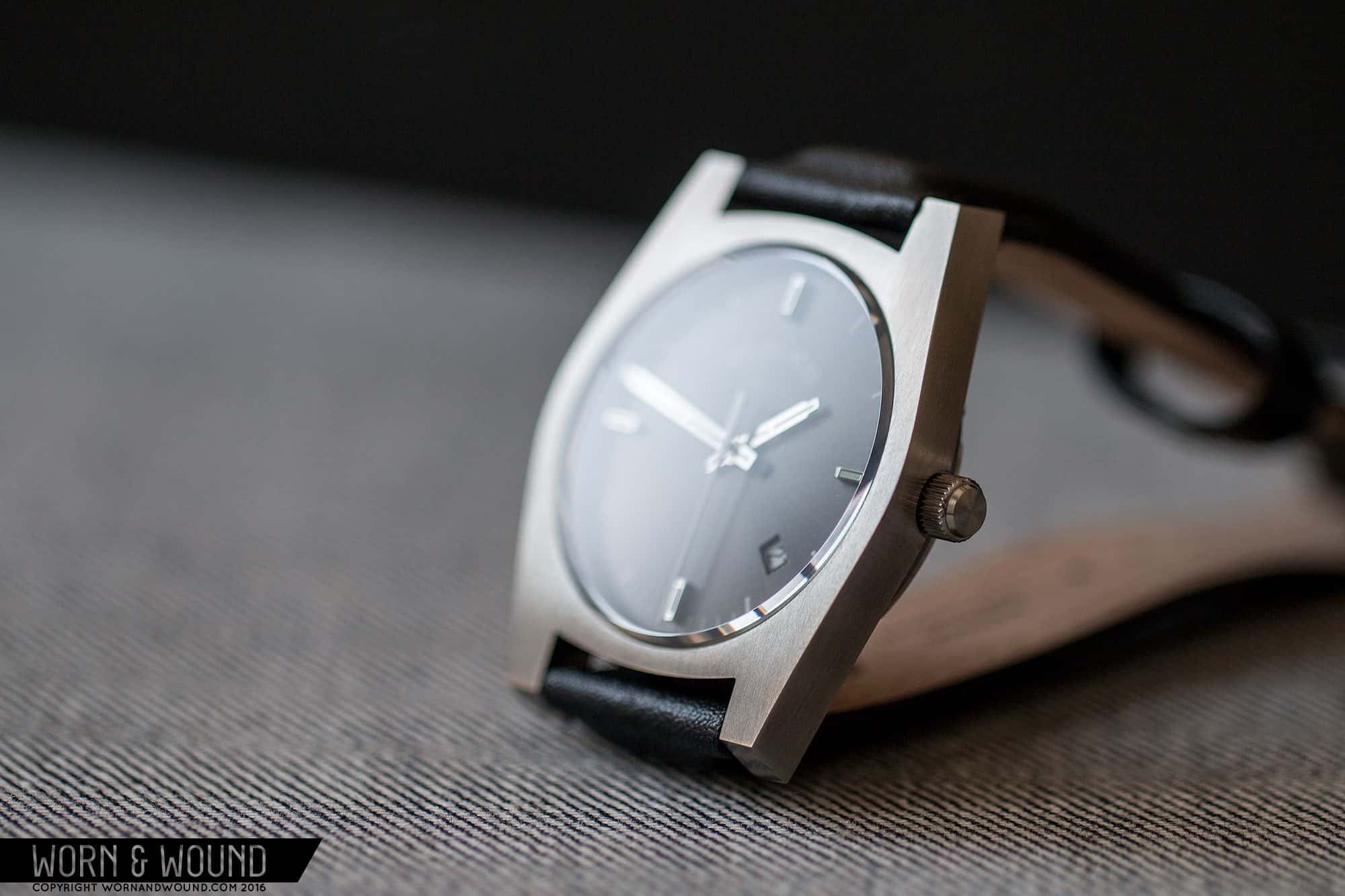
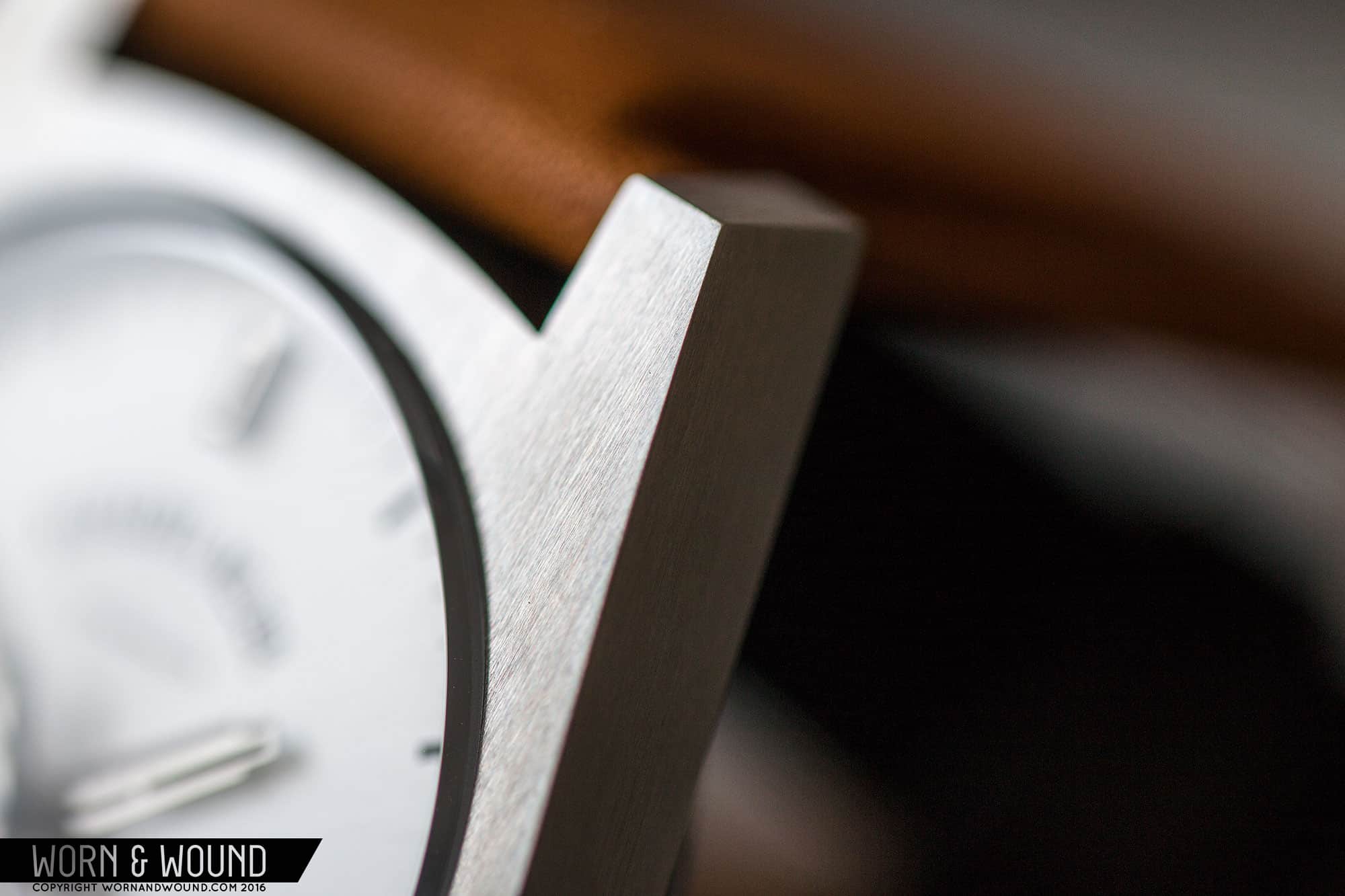
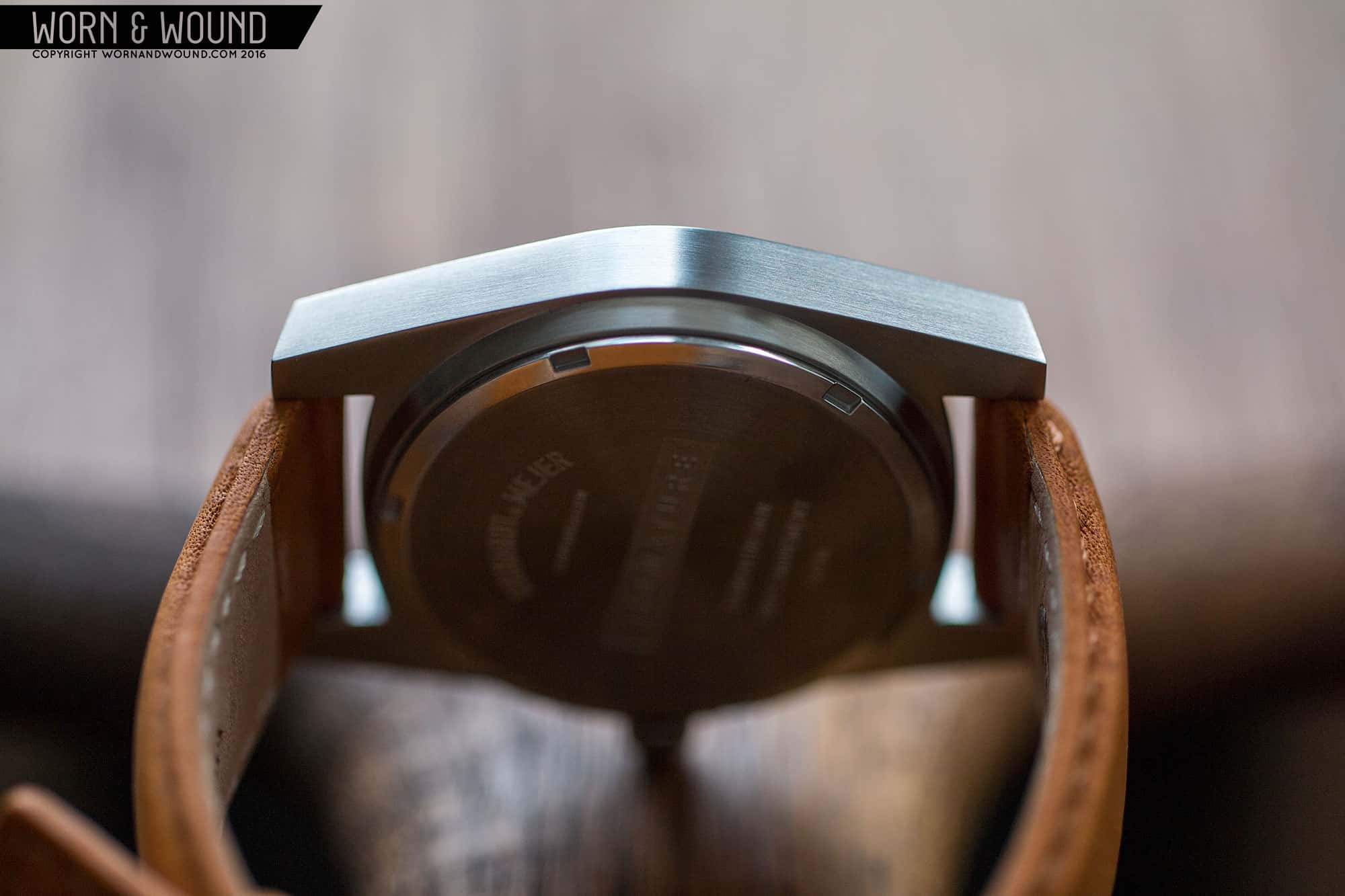
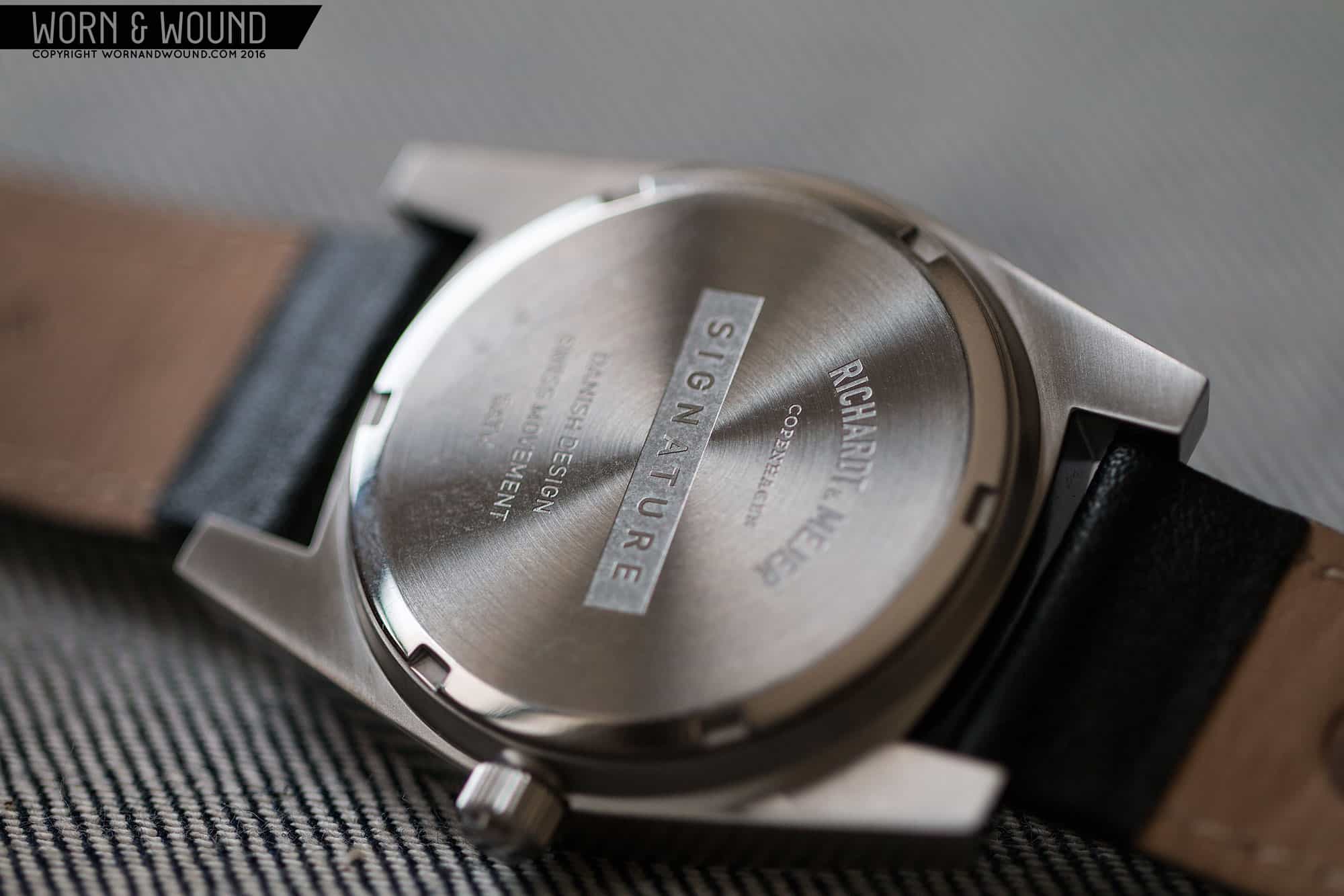
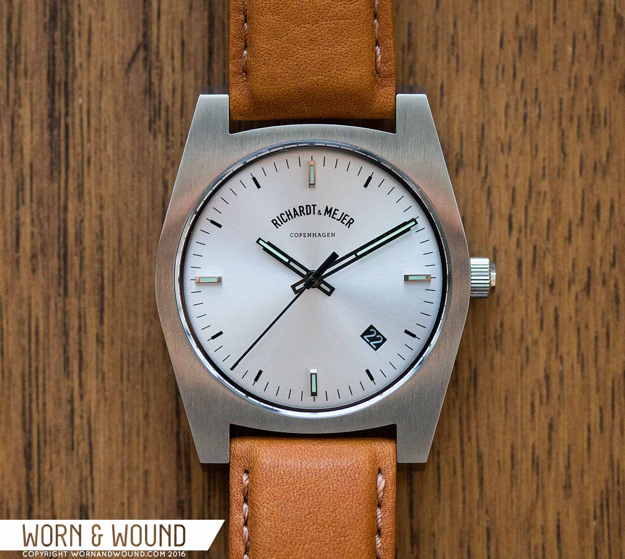
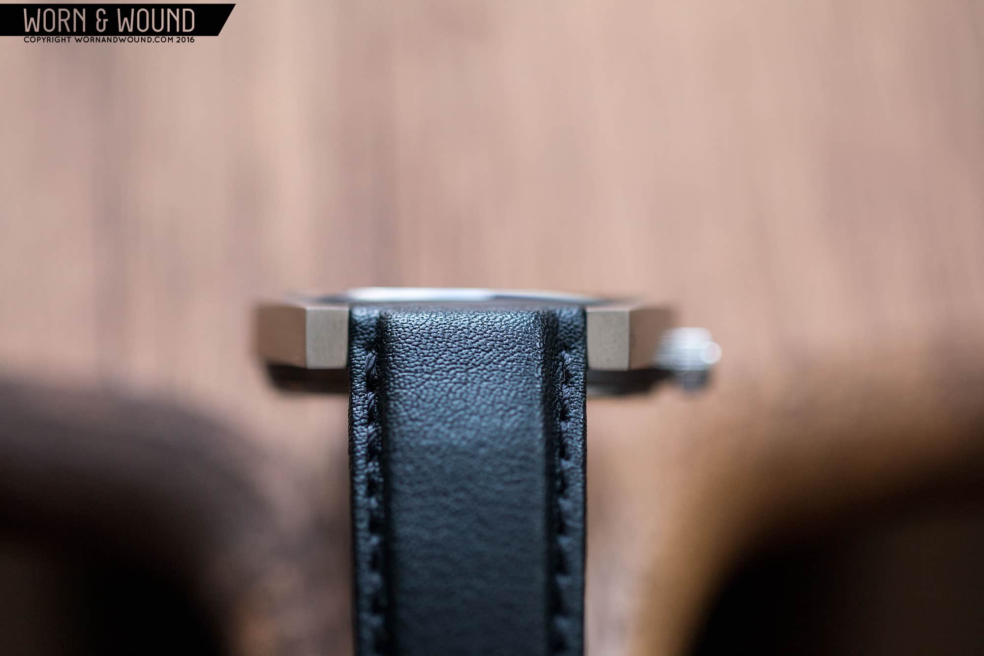
Today, we’re taking a look at a newcomer to the industry, Richardt & Mejer, whose first design is a striking and stylish timepiece that speaks strongly to the aesthetics of their Danish roots. The simply titled Signature series comes in four varieties, each powered by the Ronda Powertech 515, and featuring chamfered sapphire crystals and calf leather straps for about $340 (without VAT).

Advertisement
$340

Richardt & Mejer Signature Review

Case
Stainless Steel
Movement
Ronda 515
Dial
Sunray
Lume
yes
Lens
Sapphire
Strap
Calf Leather
Water Resistance
5 ATM
Dimensions
38 x 46mm
Thickness
9.3mm
Lug Width
20mm
Crown
5 x 3
Warranty
Yes
Price
$340

Case

The case of the Signature is one of the most curious and even perplexing I’ve come across. That’s not to say I don’t like it. Far from it. It’s utterly gorgeous, but doesn’t play by the normal rules. First off, it’s sized wonderfully at 38 x 46 x 9.3mm, giving it a classic proportion that makes it a great day-to-day timepiece. In fact, overall there is a mid-century aesthetic to the watch, even if it’s not trying to be a vintage throw-back. Actually, the geometry is anything but, having the sensibilities of something very modern.

From above, it looks like a flat slab of metal. Almost like they drew a profile in 2D, milled it out and put a movement in it. It’s so simple, it’s almost a graphic made of metal. But, this is where that playfulness comes in. It’s a challenging design, but one that brings your eye back to it, focusing on the subtle lines of the geometry. You’ll notice that the curves above and below the dial are much shallower, while the lines of the case sides are almost straight, rounding out just before they meet. The lugs are then short and blocky with a chamfered edge that you can see from above, hinting that there is more going on from the sides. It has an almost childlike quality to it, though I don’t mean that in a derogatory way.

Looking at it from the side, the case goes from playful to structural. You’ll see that, in fact, the case is not flat, but rather the whole thing has a delicate curve. So, the top surface is actually bowing ever so slightly, which is clear from how the sapphire crystal rides higher out of the metal towards 12 and 6. The shape from the side is simply a slab with a slight curve, ending with an angle. It’s an even thickness throughout, and while simple and understated, it is also captivating. The subtle curve, the way the crystal rises up, the flat planes of brushed metal… it all brings to mind the sculptures of Frank Serra and architecture.

Further emphasizing this, there is some mass underneath the slab, and then the case back. This makes the whole thing stand up and off of the wrist. This is an intentional move, making the whole thing sort of float over your wrist. The straps, which we’ll get to later, are then positioned to cut straight down, following the angle of the lug. It all comes together to make something unique that wears very nicely. Richardt & Mejer have done something very interesting here that plays into that concept of Scandinavian design. It’s so simple, it’s actually anything but. Through just a couple pieces of metal and a handful of lines, they created a very dynamic concept–one that is simultaneously understated and complex.

RICHARDT+MEJER_WRIST_3It’s worth mentioning that the case machining and finishing are very good. It matters because the design only succeeds due to sharp edges and crisp facets. The brushing all around is also well executed, with a slightly coarse grain giving it nice texture. The watch is also available in PVD, which while I haven’t seen in person, I could imagine is striking.

Dial

The dial of the Signature takes a more classic approach, grounding the design. Available in blue, gun or silver, the dial utilizes simple graphics and applied markers to make something crisp and clean with a vintage undertone. The surfaces have light sunray textures, giving them a metallic sheen. The primary index consists of tall applied markers at 12, 3, 6 and 9, with printed markers in between. The markers are in either black or white, depending on the surface beneath.

At intervals of five are heavier marks, with thin marks for the individual minute/second. I quite like how the applied markers and heavy marks are moved in ever so slightly, creating a full circle of thin lines around the perimeter of the dial. The applied markers are polished blocks with lume filling. They are dramatically tall, adding to the depth of the dial. At 12 you’ll find a “Richardt & Mejer Copenhagen” logo, which arcs, giving it a vintage flair. It looks quite nice on the dial.

At 4.5 is an angled, rectangular date window. They went for contrast, using dark disks on the light dial and light on the dark, bringing extra attention to the window. This is the first design decision I have disagreed with so far on the watch. Date windows are so often divisive little beasts, and here I can’t help but feel like it is disruptive. It breaks the symmetry of the dial, and ends up distracting. Considering this watch is a bit more daring in some ways, I don’t think a date is needed at all, but if desired might have been better if it had matched the surface and was located at 6.

For the hands, they went with a geometric design. The hour and minutes both consist of partially skeletonized rectangles with long strips of lume on their forward half that stick past the hand’s edge, creating a pointer. It’s an attractive design that complements the applied markers, giving everything a cohesive feel. The seconds had is then a straight stick with a thick base and counterweight. The seconds is eiher in black or white depending on the surface below (save the blue dial which has a red hand).

Advertisement

Straps and Wearability

The signature features 20mm lugs and comes with a strap that is as much a part of the design as the case and dial. Available in black or a bright tan, the calfskin leather straps are beautifully executed, with folded edges, a 2mm taper, matching edge stitch and a blunt tip. What makes them particular to the watch is the aggressive padding by the lugs. They are about 6mm thick at their thickest, tapering down quickly to 2.5mm. Because the spring bars are set high in the lugs, when sitting flat on a table, the padding actually comes up and over the case. When on the wrist, the straps perfectly fit within the lug such that just the padding comes past the edge. It has a very intentional look to it.

On the wrist, the Signature wears well, but different. As already mentioned, it’s nicely sized at 38 x 46mm, so there is no concern about it looking or feeling large. In fact, it’s pretty ideal, even coming across with more presence than one would expect. The different part is how high it sits because of the case back design. That beautiful curved central slab hovers over your wrist with a noticeable gap. At first, it’s quite odd, but you get used to, and then, at least if your are me, begin to appreciate the unique aesthetic.

And the watch really looks great. It’s a bit odd and not for everyone, but I’ve been loving wearing it. It’s a bit mid-century feeling, a bit contemporary. Casual, but not too much so. It’s definitely a watch one could wear to office or with a blazer, etc… I found myself particularly drawn to the lighter, silver dialed version, which we had on the tan strap. The light dial matches the steel of the case, adding to the sense that the whole thing was carved out of a single block of metal.

Conclusion

If you’re looking for a wrist mounted dose of Scandinavian design, the Richardt & Mejer Signature is very worth your consideration. It’s a unique watch with a lot of character. The case is a work of art, simply put. It’s not for everyone, especially people with a strict idea of what a watch case should look like, but for those who want something a bit more playful, it fits the bill. I love that it rides the line between the quirky watches found in museum shops and the mid-century watches I pine over.

RICHARDT+MEJER_PACKAGING_1

At $340, the Signature is fairly priced. It’s not a bargain, and not a rip off either. It’s well built and finished and has a sapphire crystal, but it is, of course, a quartz watch. And herein is the biggest con. If this watch had an ETA 2801 and cost $1,000, I’d be downright in love. It’s the same thing I say about most quartz watches. But, I understand this watch being a quartz. It’s more for a certain fashion and design focused watch consumer than for the die-hards. But to entertain the idea a bit, design like this doesn’t come along often, and barring the date window, would put it aesthetically up there with some well known design-focused German brands in my book. Certainly a watch that would make it into my daily rotation.

Images from this post:
Related Reviews
Zach is the Co-Founder and Executive Editor of Worn & Wound. Before diving headfirst into the world of watches, he spent his days as a product and graphic designer. Zach views watches as the perfect synergy of 2D and 3D design: the place where form, function, fashion and mechanical wonderment come together.
wornandwound zsw