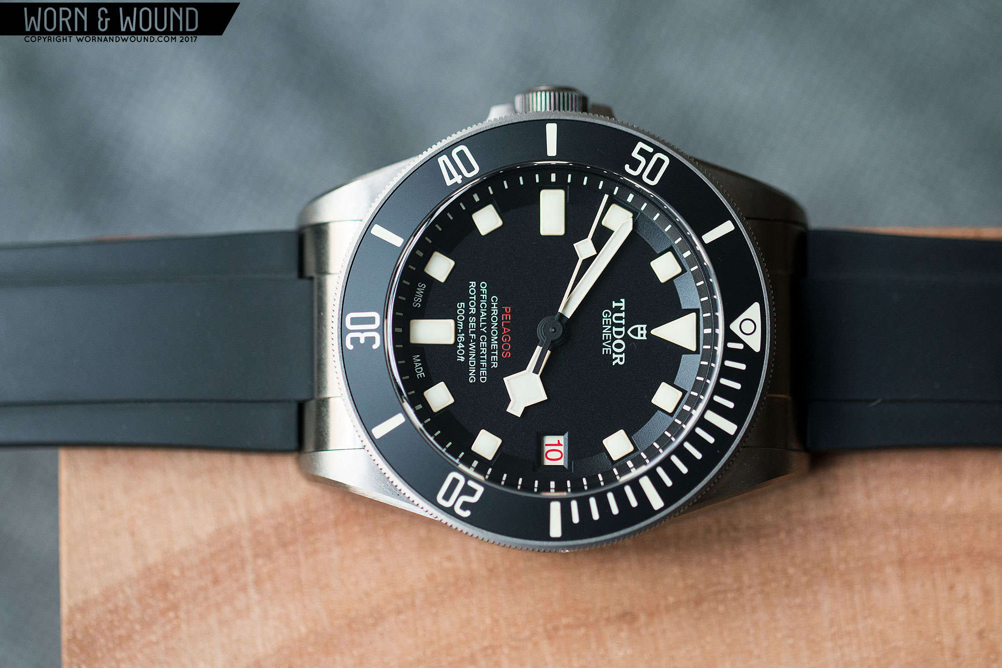
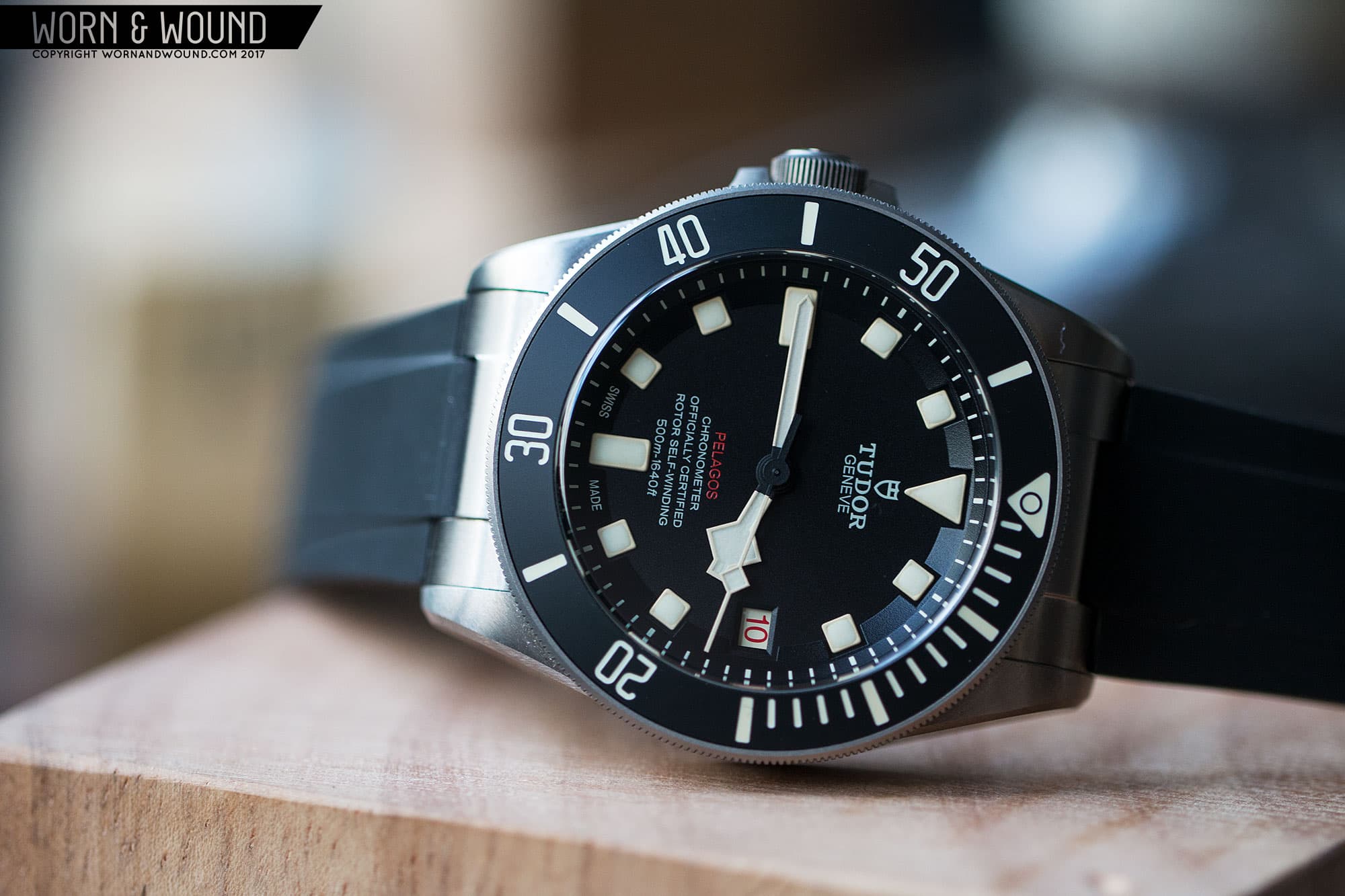
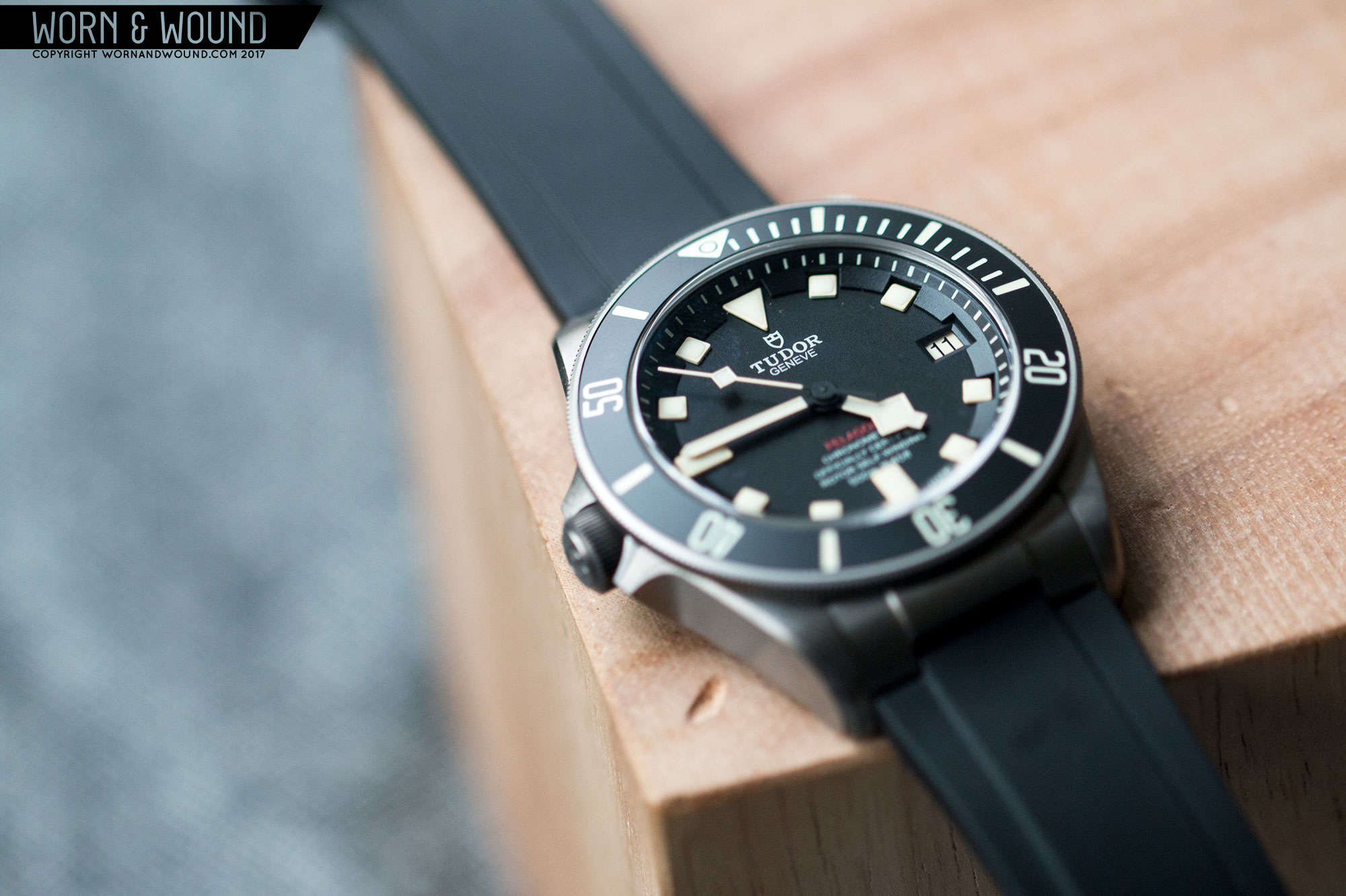
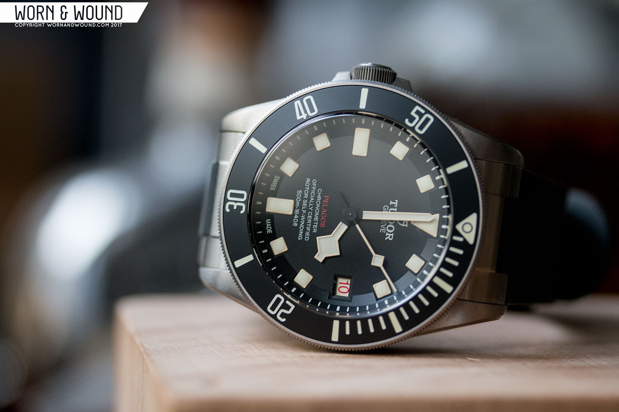
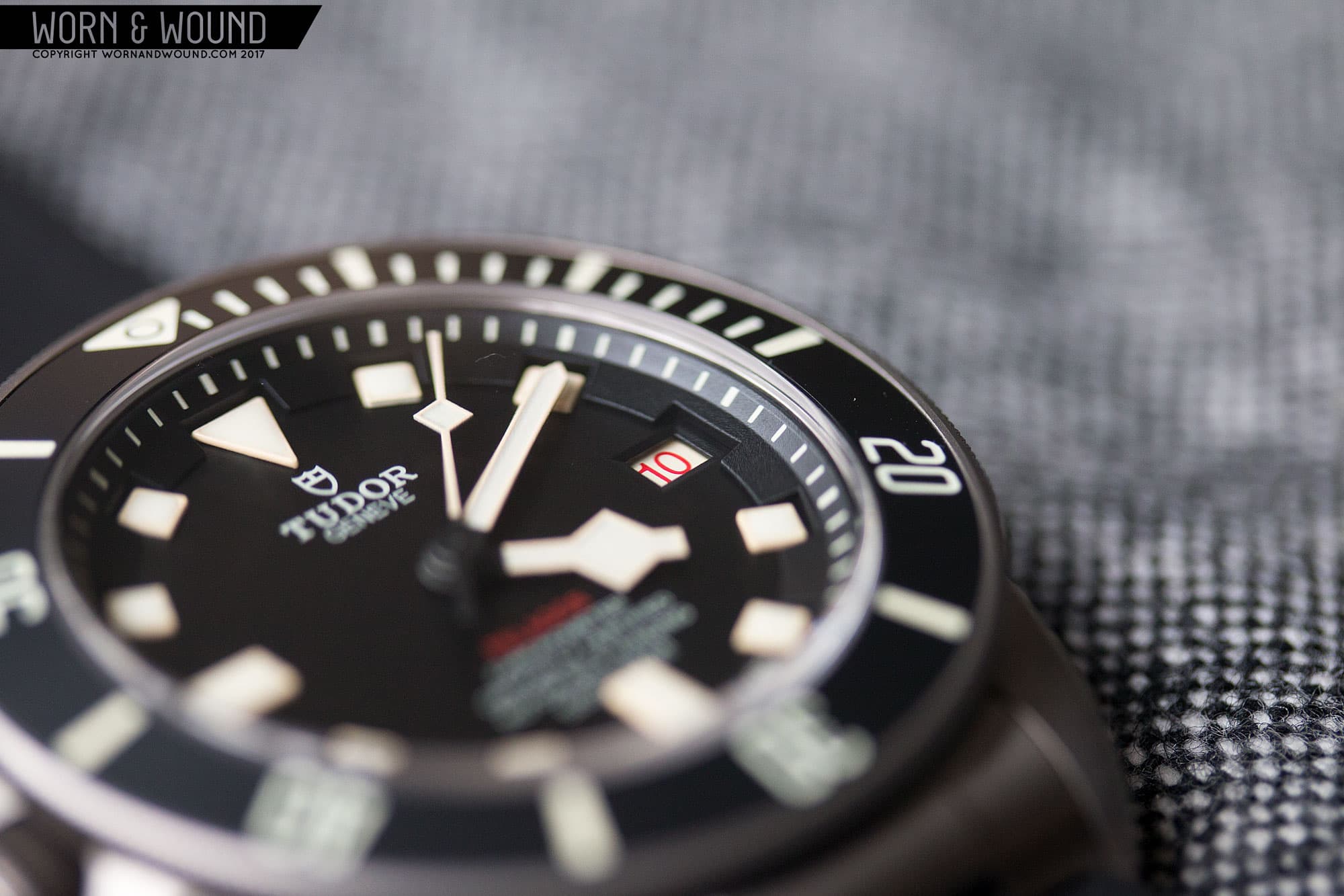
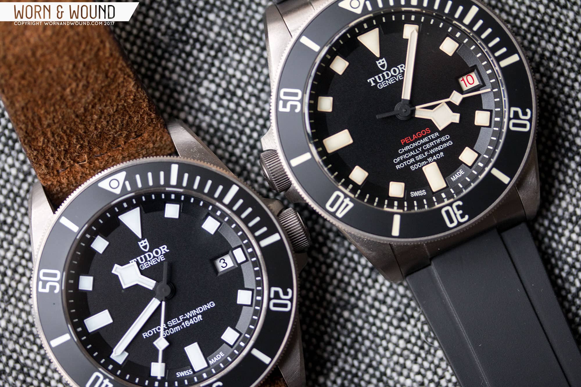
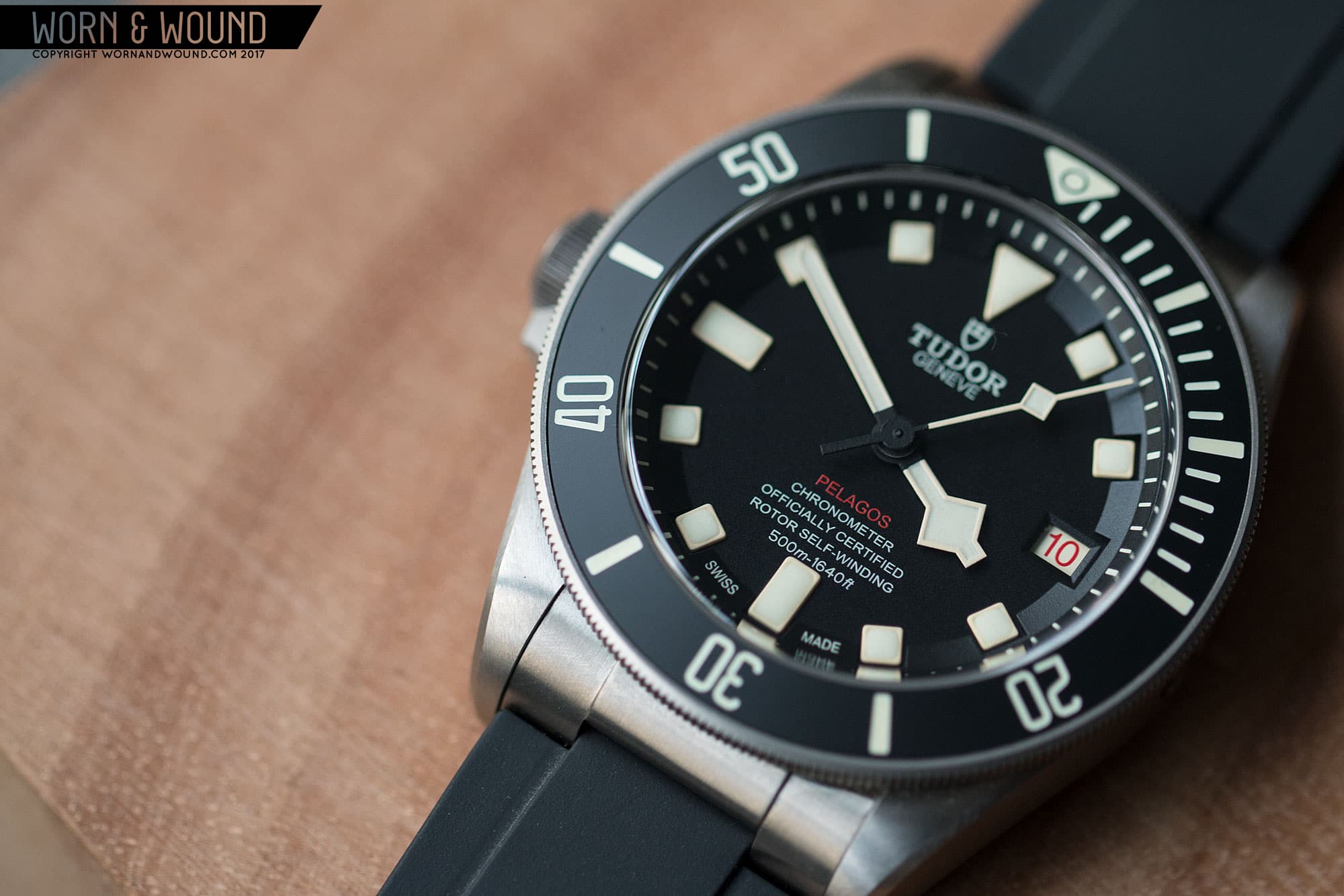
At three you’ll find a date window. For the LHD, they did something really cool, and used a “roulette” date disk, meaning that the numbers alternate between black and red. This is something that you’ll find occasionally on vintage watches. Once again, it’s a detail that doesn’t really improve upon anything, but it certainly adds character to the design. On the LHD and the other in-house Pelagos models, the date window is alone at three, where as on the original ETA 2824 version (oft referred to as the two-line Pelagos), the date window is a little closer toward the center of the dial, which gives Tudor just enough room to add a smaller rectangular marker.
While the in-house movement is exceptionally cool and a huge value booster, I do really prefer the original date window placement and added marker. The date window coupled with the marker mirrored the longer rectangle at nine, creating a nice visual balance on the dial. Furthermore, the marker was also painted with luminous material, which highlighted the three in the dark. Now it’s just a void.
![]()
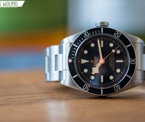
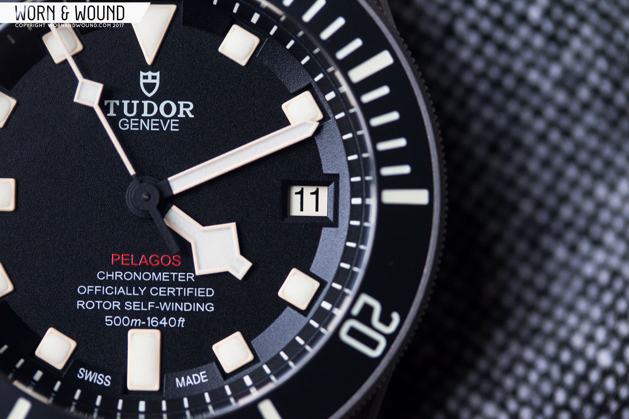
At six, you’ll find the Pelagos’ controversial five lines of flavor text. Back on the 2824 models, you just had two lines: “Rotor self-winding” and “500m:1640ft.” Once Tudor put their in-house caliber inside, above those lines you’d also find “Pelagos,” “Chronometer,” and “Officially Certified.” It’s simply too much text, with unneeded details like the name of the watch. The text crowds the lower half of the dial and comes really close to the marker at six, which just seems odd as there is plenty of space above the text block.
For the LHD they helped this a little bit, by making the Pelagos red. This obviously plays off of “Red-line” Submariners, but more important it makes the five lines appear a bit less obtrusive, almost as though there are only four lines. Honestly, while it helps and the red looks cool, Tudor should take a cue from the Black Bay and cut down to three lines for future Pelagos models.
![]()
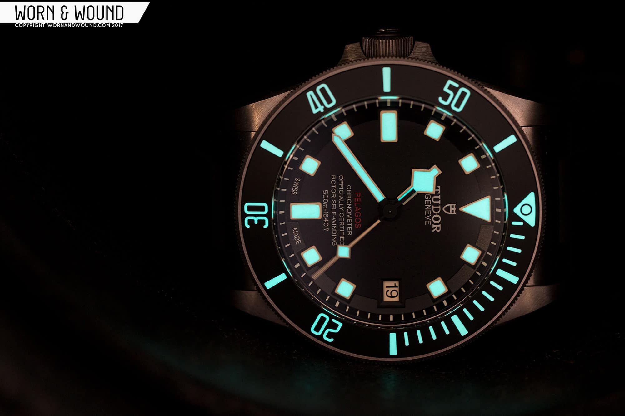
For hands, Tudor obviously went with the classic, blocky Snowflake combination, completing the look the square markers begin. The hour hand has a very distinct wide diamond shape, while the minute is a thin straight sword. Like the markers below, the surrounding edges of the hands are matte and match the beige color of the luminous paint. The seconds hand is then a thin stick with a lume-filled diamond about halfway between the center of the watch and the edge of the hand, also in the beige color. The luminous material is very good all around, and though it’s beige in daylight it glows blue/green in the dark.
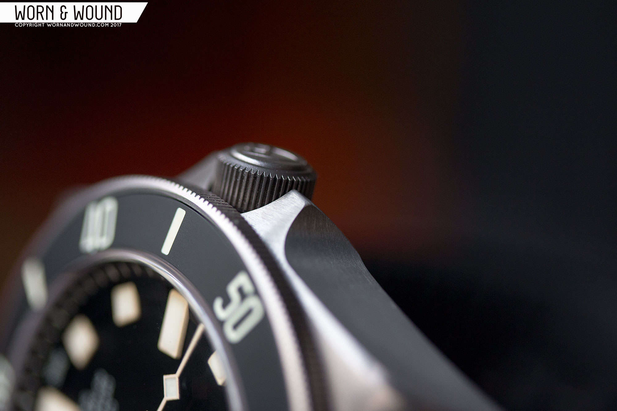
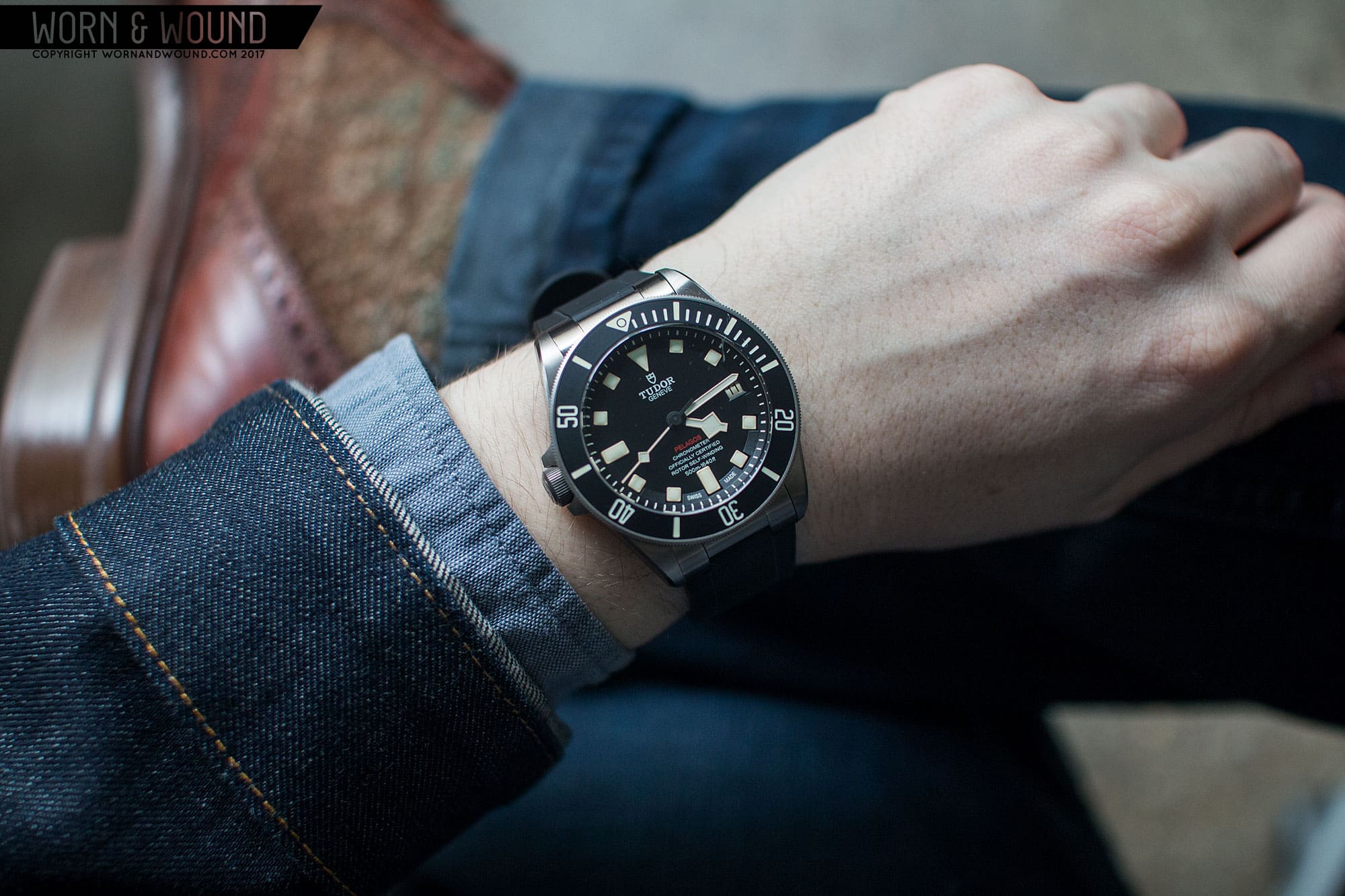
Overall, the dial of the LHD–with its different lume color, roulette date and red “Pelagos”–has a bigger impact on the look and feel of the watch than the left-side crown. The Pelagos is a very modern watch, but this colorway clearly has a faux-vintage feel. It’s not over the top, nor is it too obvious. After all, it is a 42mm titanium watch with a ceramic bezel. But it is different from the other models. It’s less clinical looking, and perhaps it’s a bit more aggressive. That’s not to say that it’s better, as the clinical feel of the crisp white and deep black of the original speaks to the watch as an instrument first, object of style second. In the end, it really comes down to personal preference, as both perform equally well.
Save
Save
Save


 Featured Videos


