Tudor Heritage Black Bay Black ref 79230N Review

Tudor really needs no introduction. The sister brand of Rolex, it carries with it a certain bravado that few other brands can match. One backed by fairly universal praise from both the press and the public alike. In the last few years, since Tudor’s big return to the states, they’ve become a new staple brand in the $3,000 – $5,000 bracket. A bracket that we don’t often cover, not because of the price itself, but because value tends to fall away, making room for hype and marketing. Needless to say, there was a a big opportunity for a brand to come in and take over. Tudor, the Shield backed by the Crown, was primed for this bringing with it trusted Rolex quality to a lower price point.

tudor_black-bay_black_2016_dial_4
Tudor Heritage Black Bay Black ref 79230N

When Tudor returned in 2013, they did so with a bang bringing with them the Pelagos and the Black Bay lines (as well as others). Both watches were conceptually based on Submariner models of days past, and while clearly designed to not directly compete with the Sub, stayed true enough to that revered design to pull in many a fan new and old. In fact, they did more than that, they riffed on a design that one could argue had grown a bit stale. The modern Rolex Sub doesn’t have the character of the vintage models, and Rolex being conservative with their design decisions is unlikely to make any big changes in the near future. However, Tudor appears to be more of a design playground for the Hans Wilsdorf group (parent company of both), allowing them to experiment.

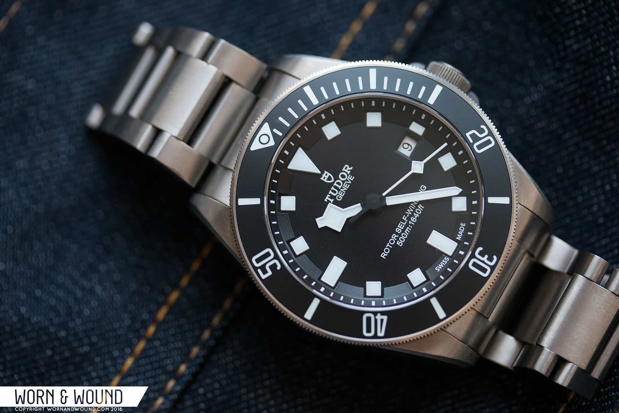
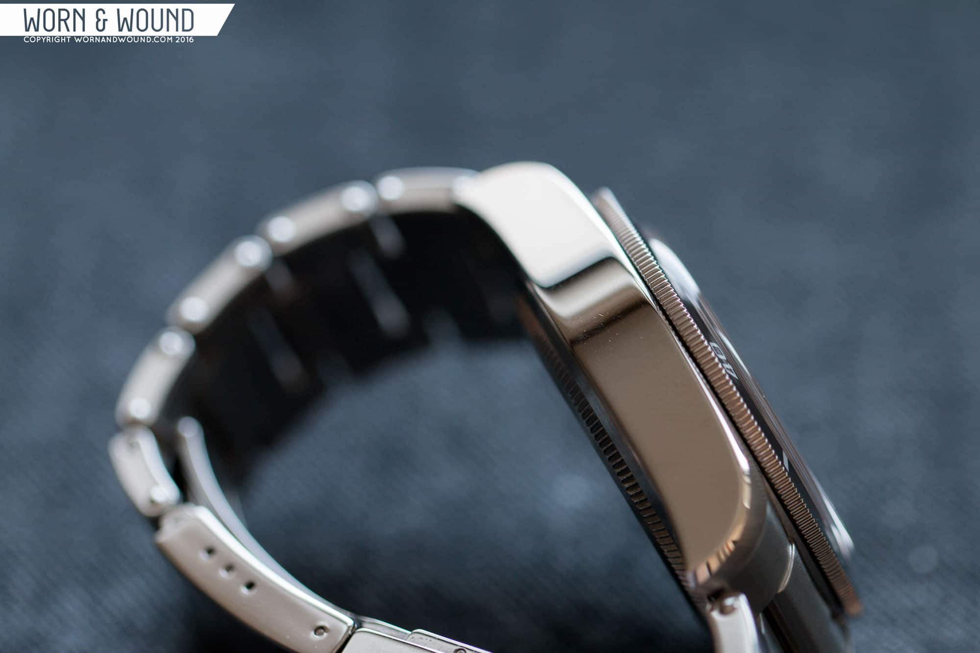
With the Pelagos, they created an evolution on the Snowflake Sub that, with its titanium case, matte ceramic bezel, razor sharp lines, 500m WR and clever-expandable bracelet, felt like a proper modern incarnation of the tool watch the Sub once was. Though different in many ways, it spoke to the heritage of a watch that was meant to be worn. The Black Bay was then a different and curious creation.

tudor_pelagos_1
Tudor Pelagos “Two-line”

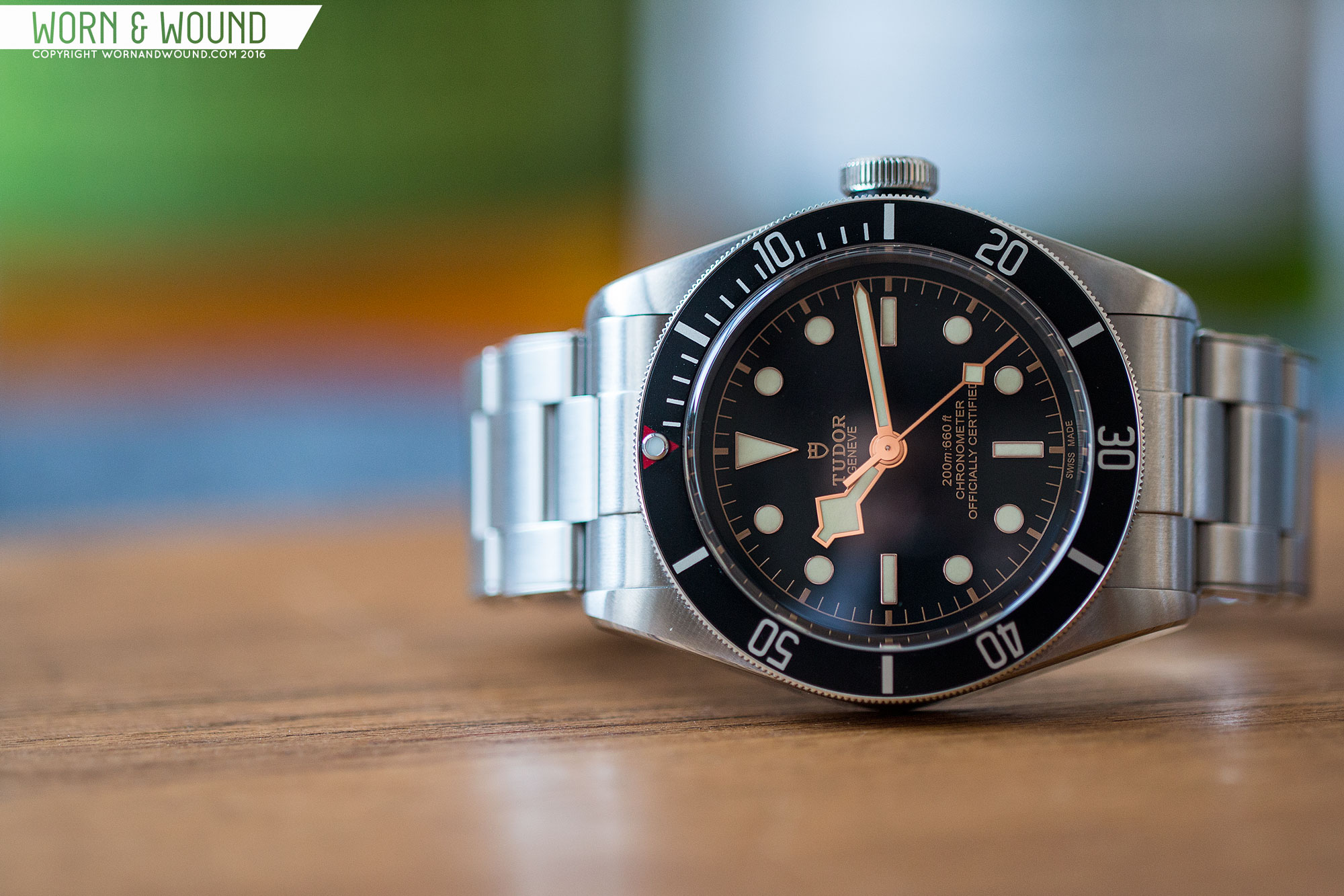
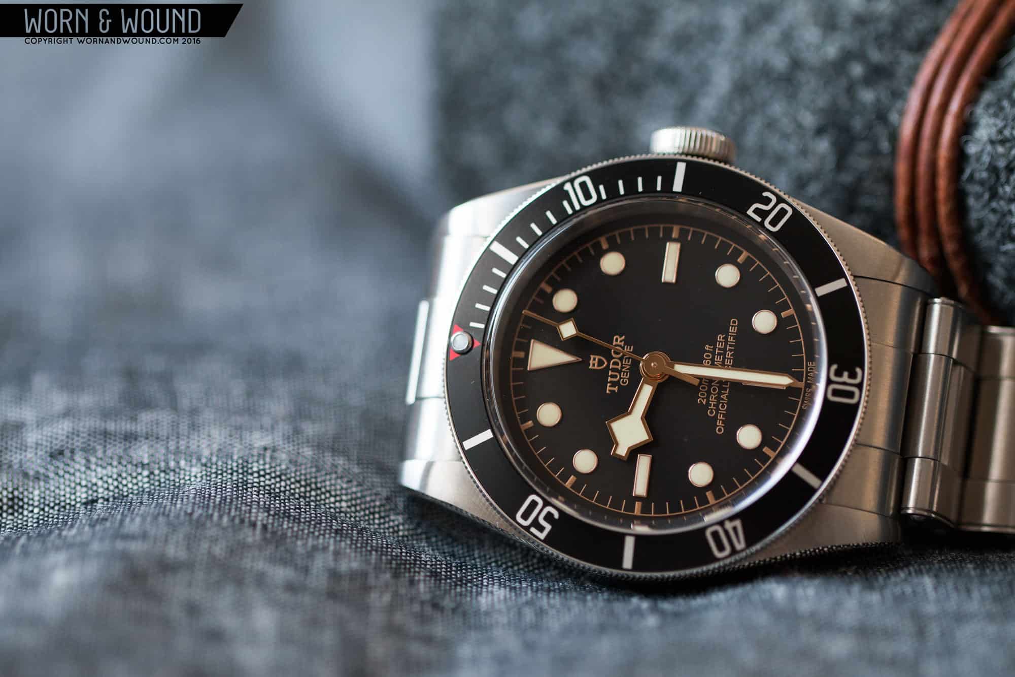
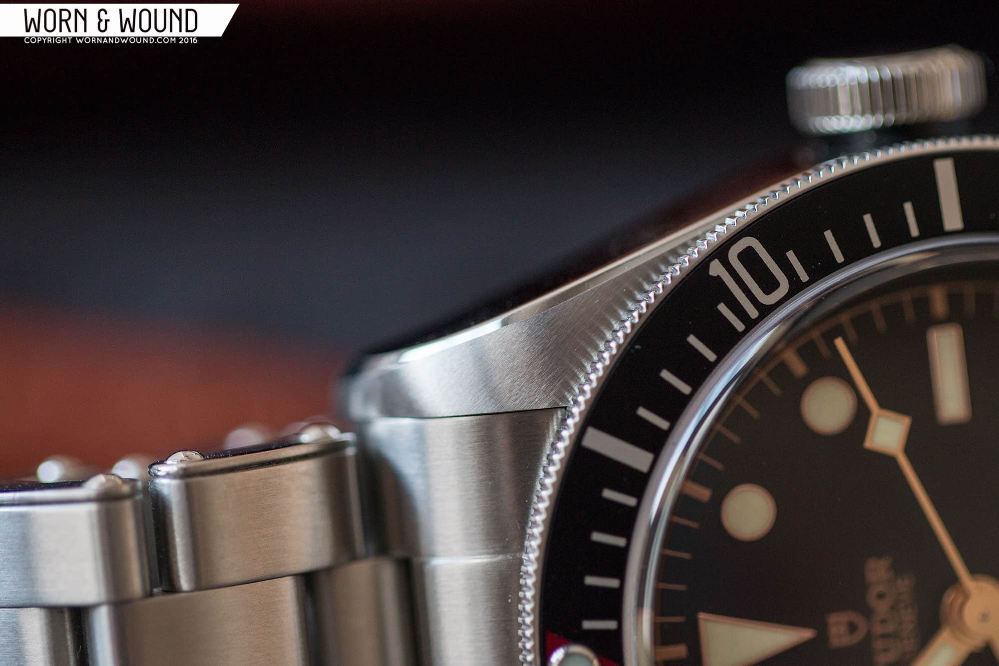
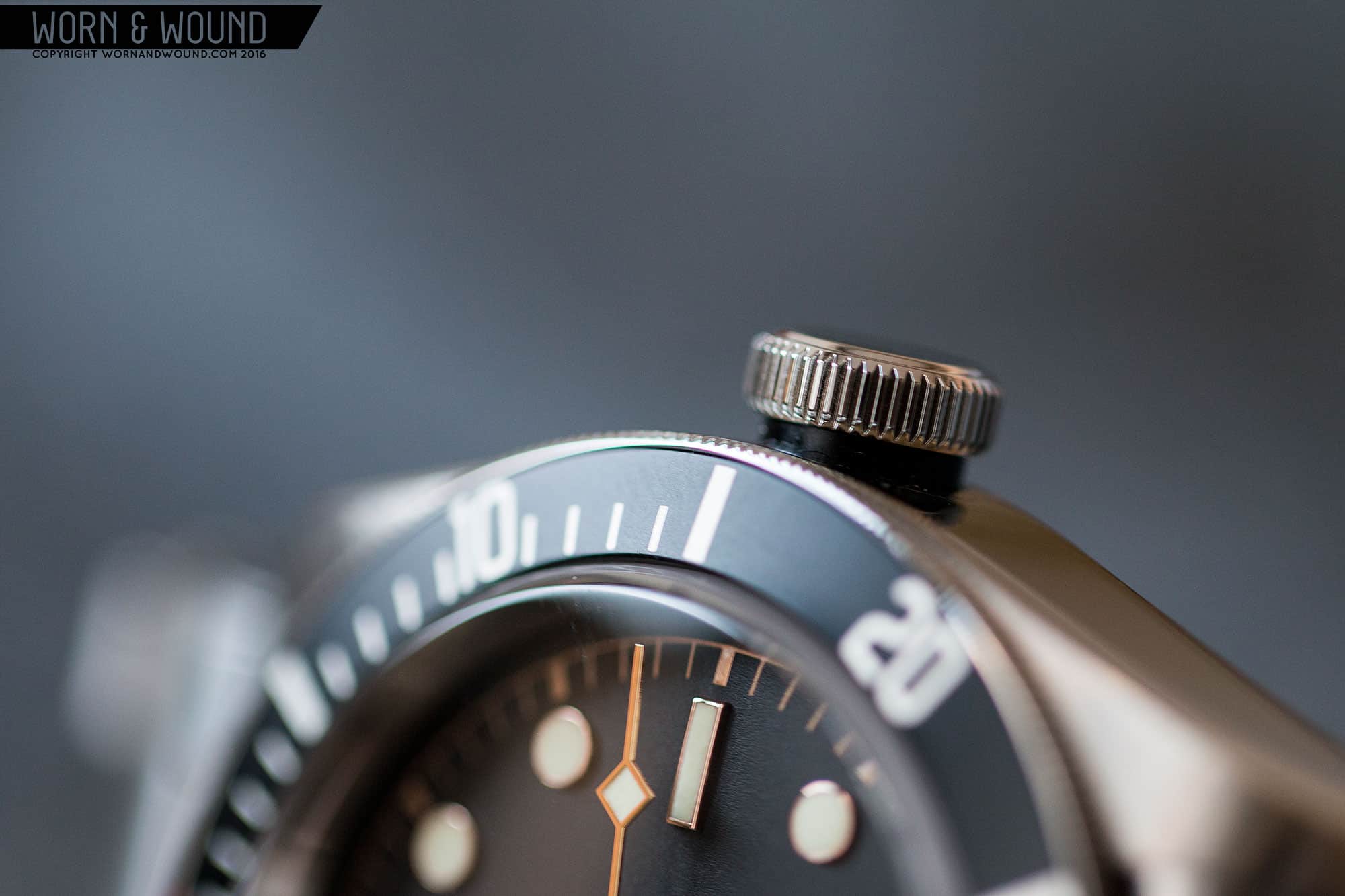
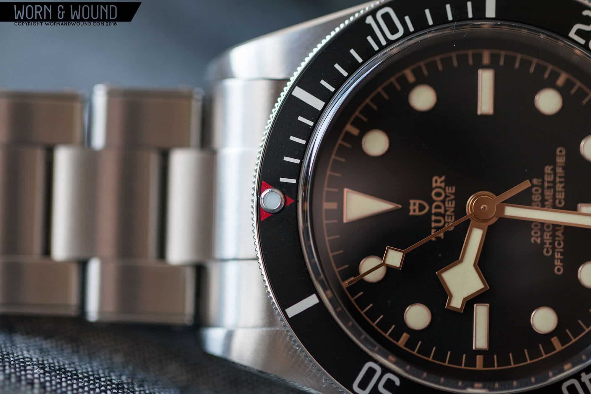
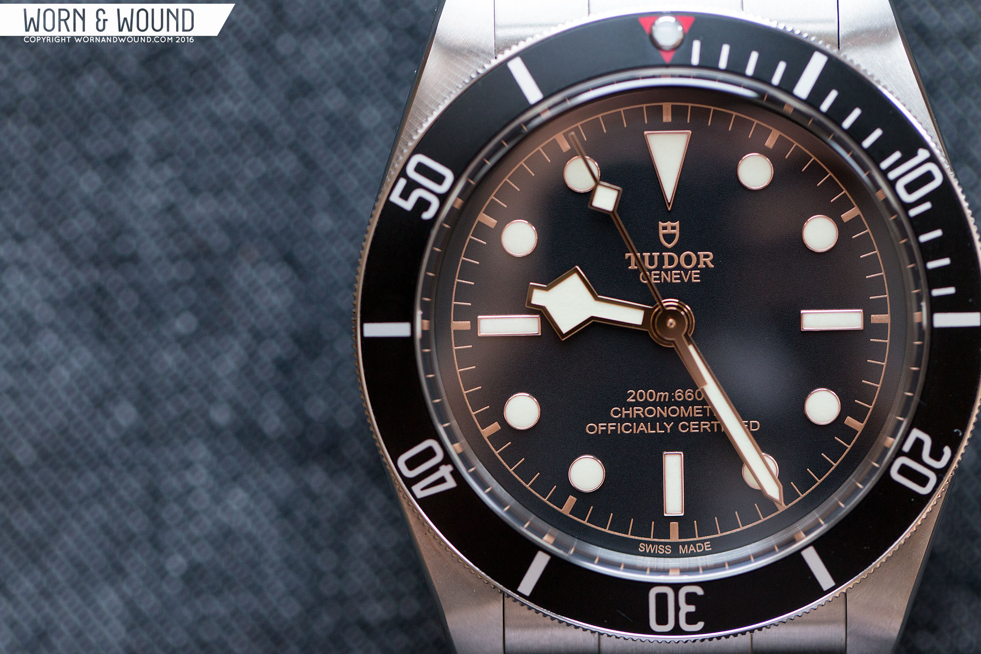
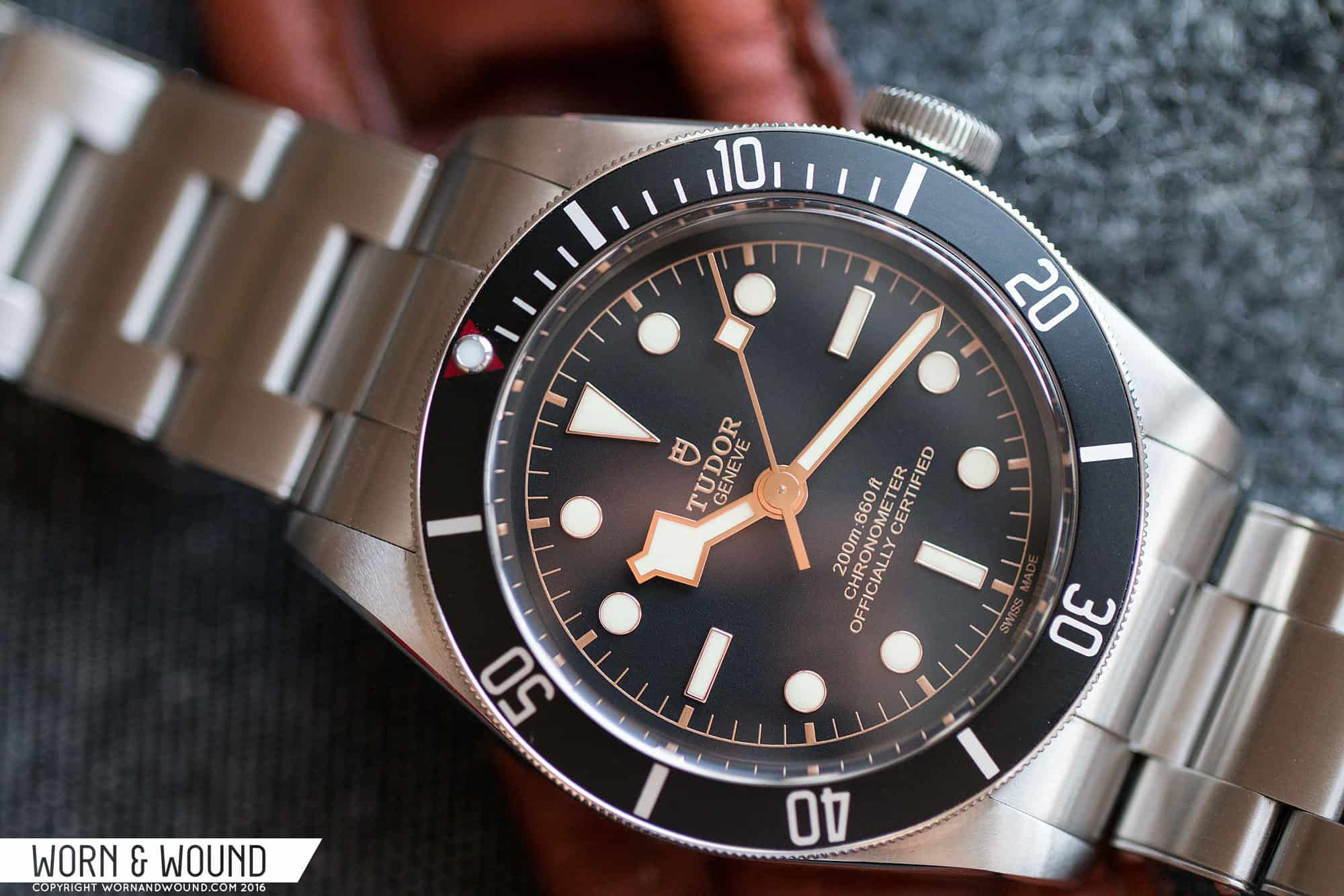
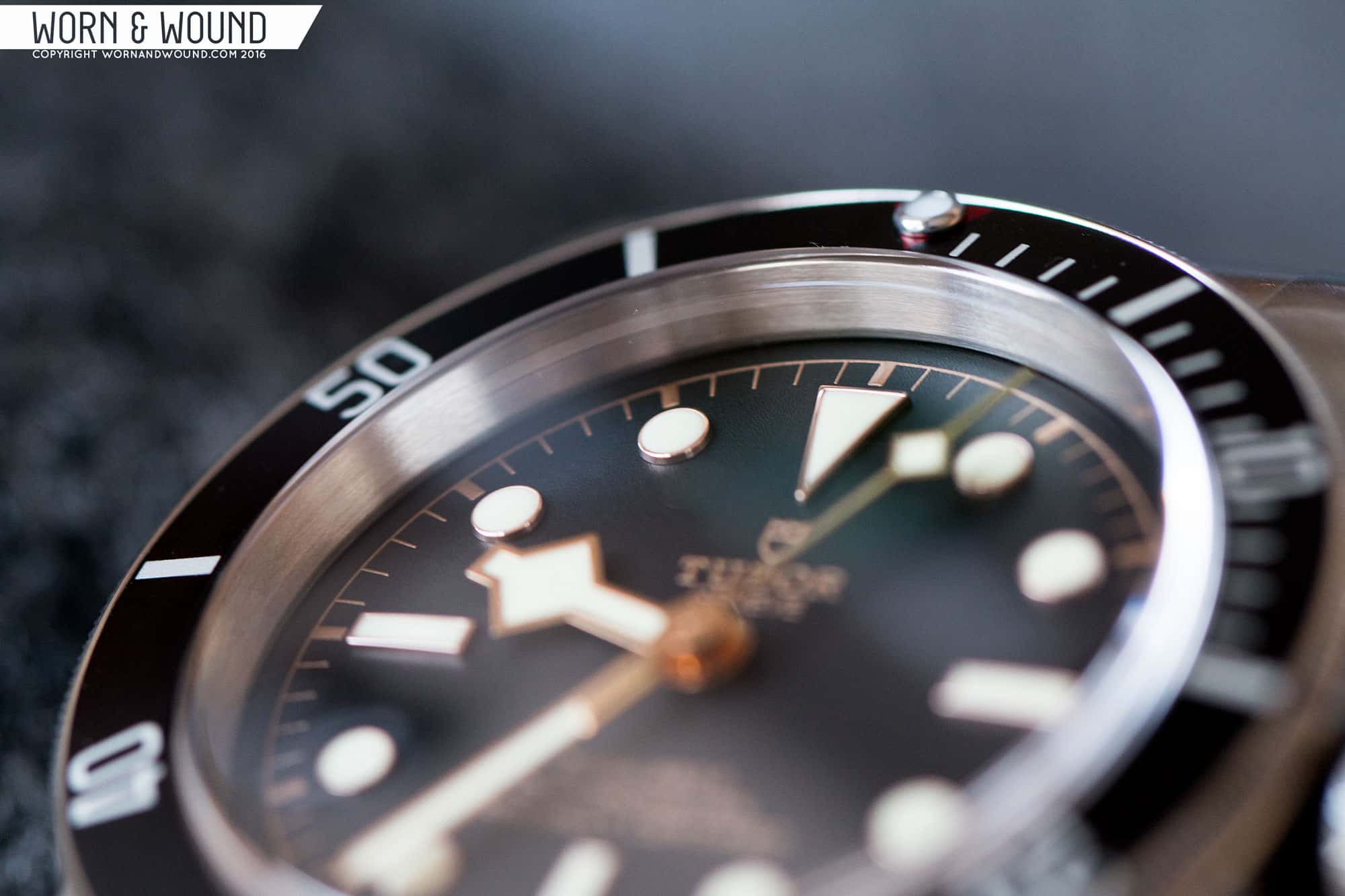
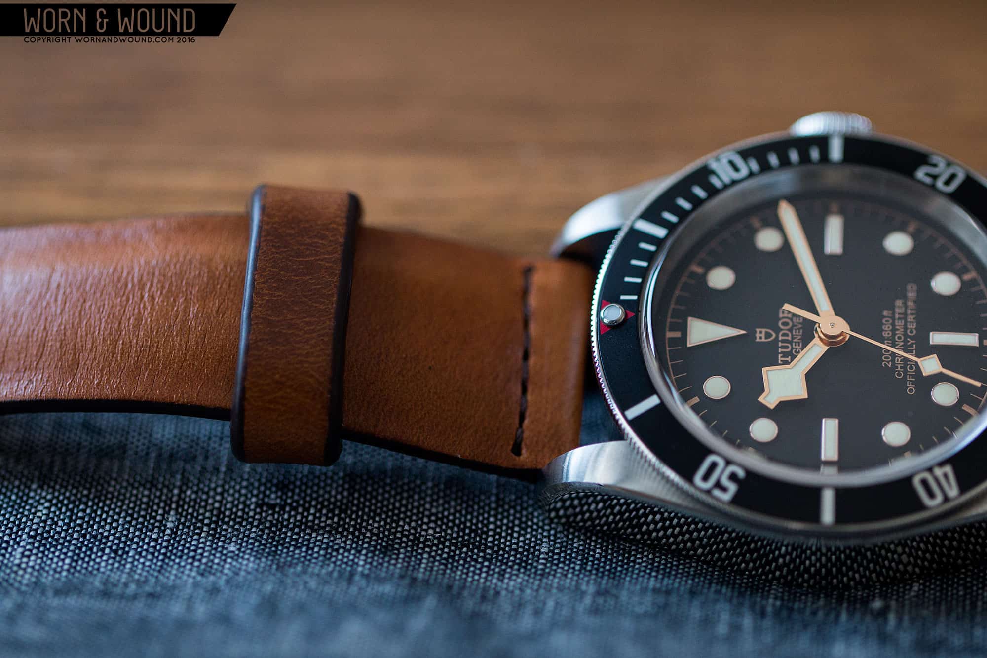
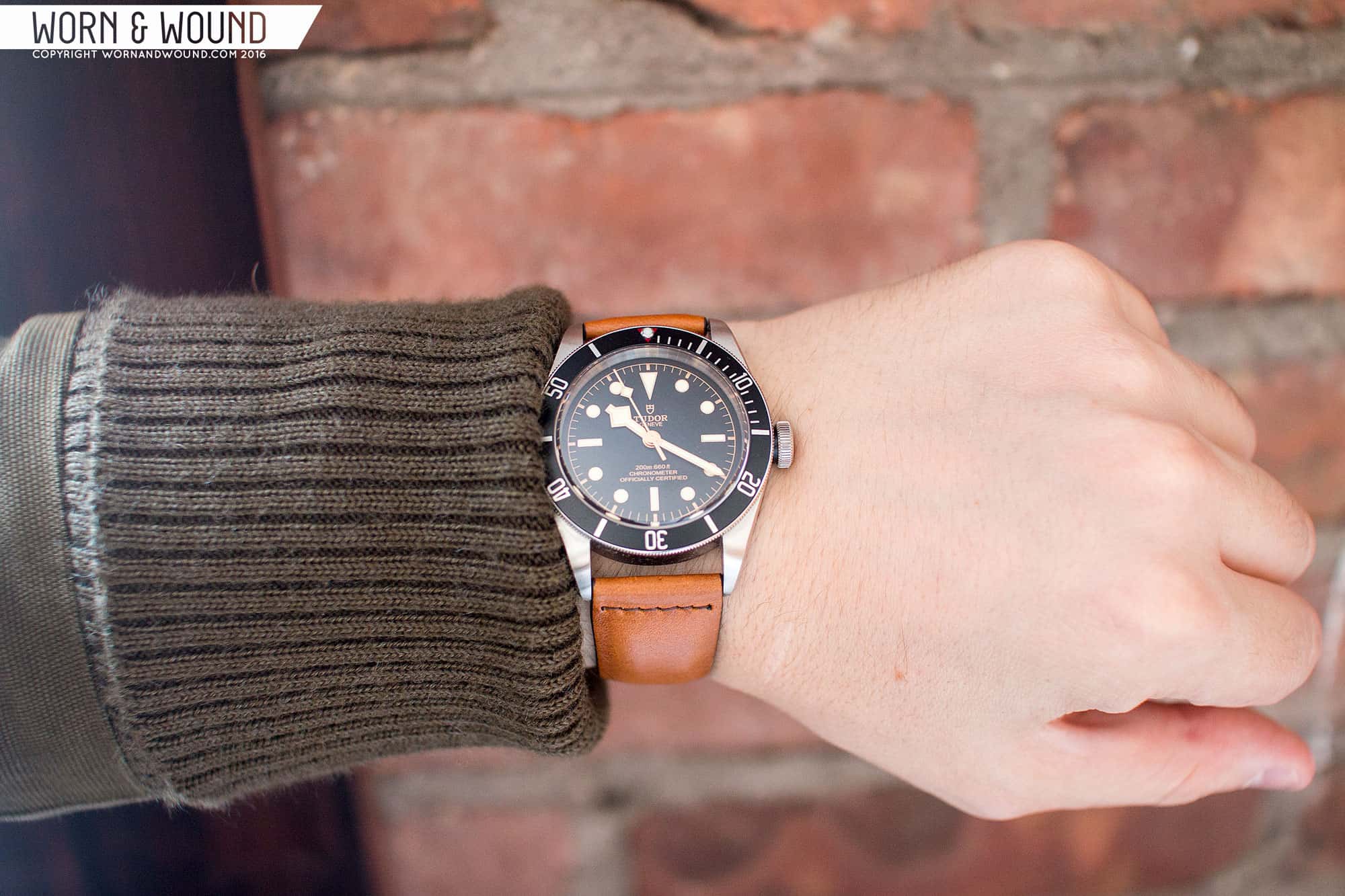
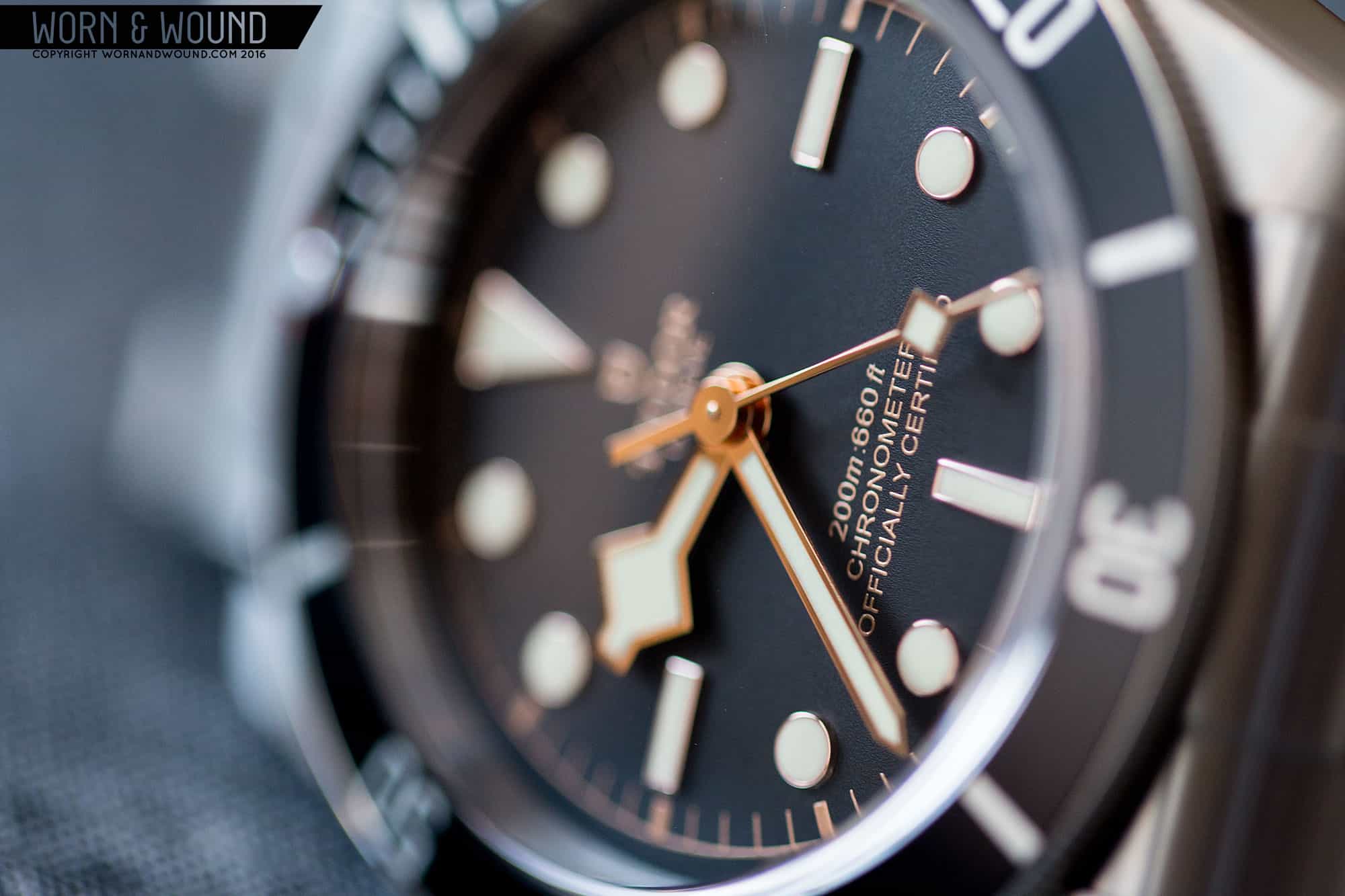
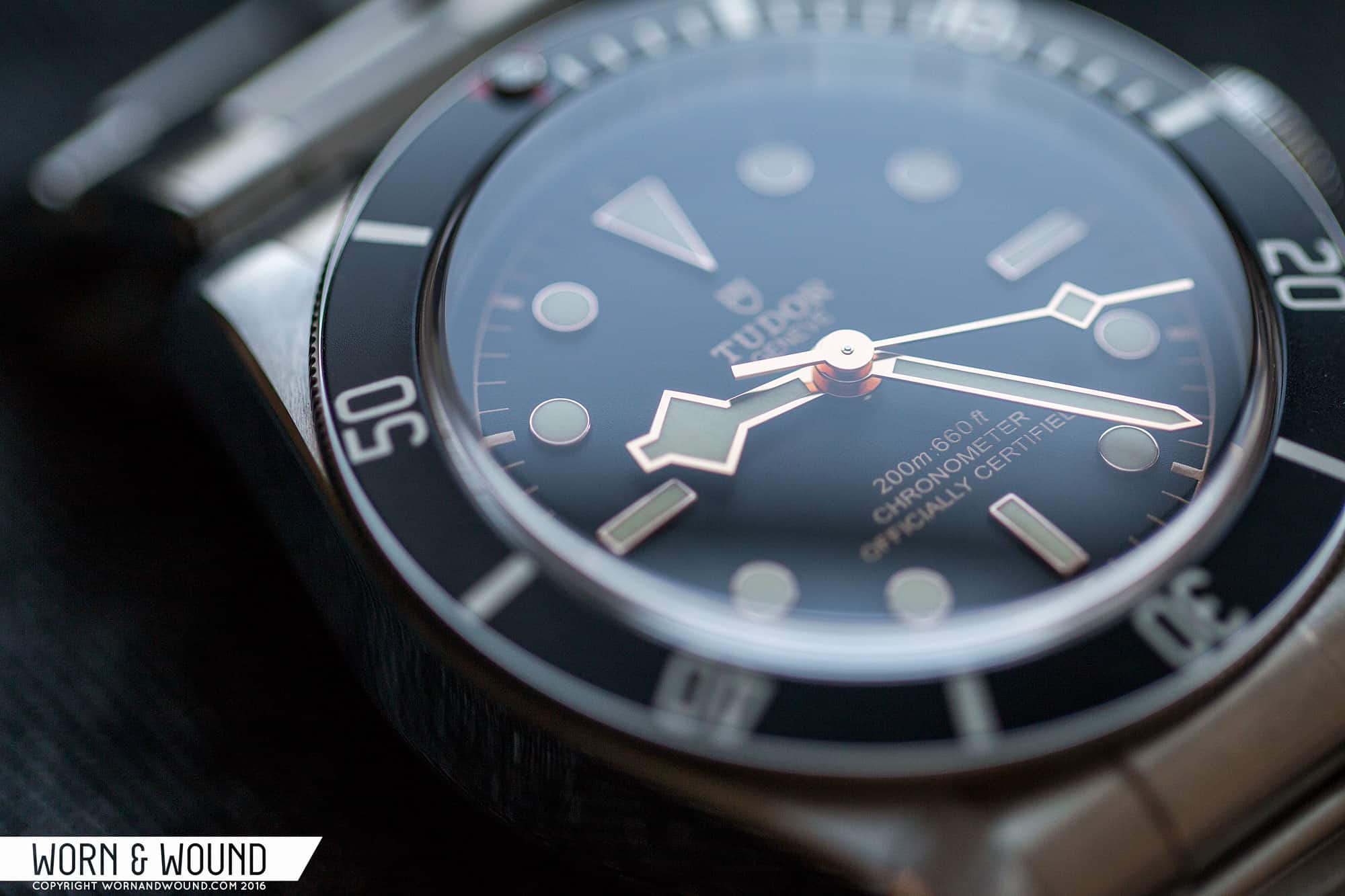
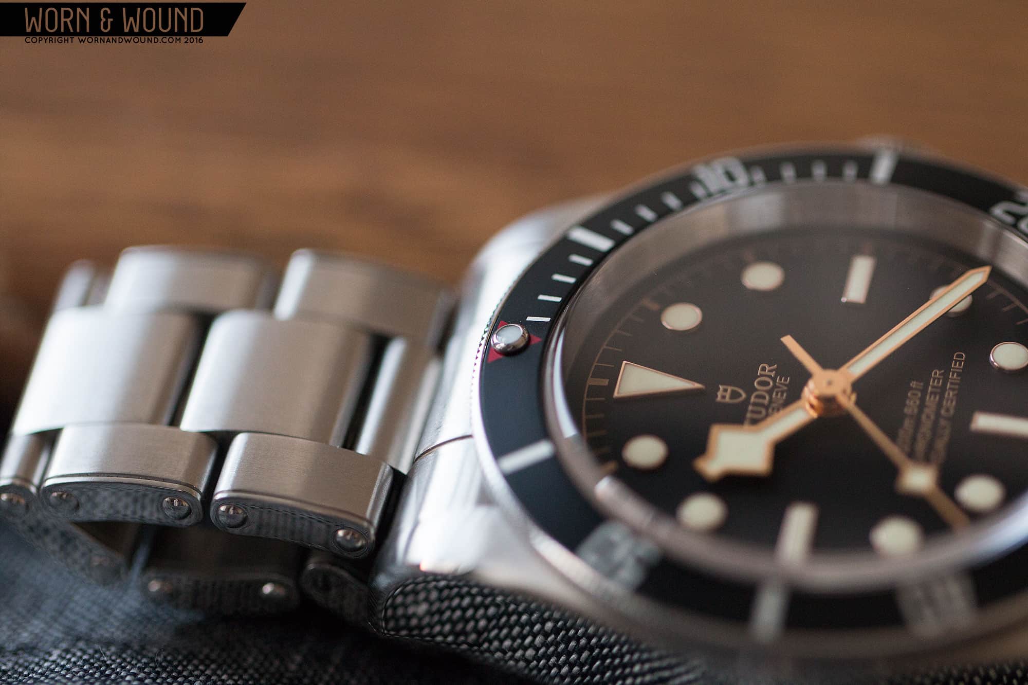
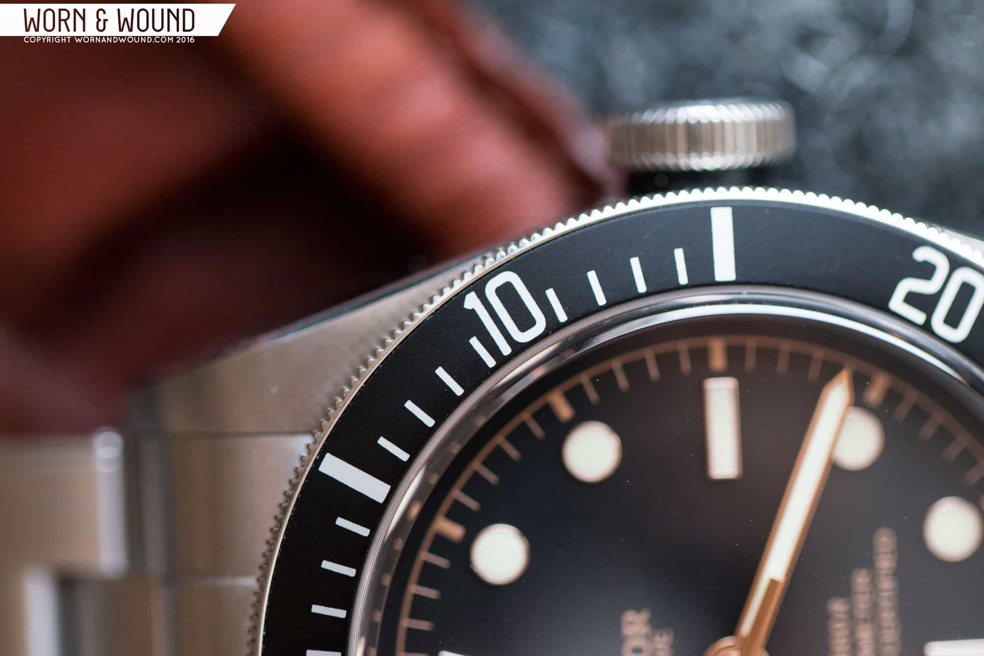
The Black Bay is less a tool watch than its titanium brother and more a tribute to the history of the brand’s Submariner variations. It took design cues from a few references, such as the earliest Tudor Subs, the 7922/7924, which featured a short gap between the case and an over-sized crown, no crown guards, and a Tudor “Rose” logo and smiling “self-winding” text on the dial. It also drew from the now hyper popular 7021 “Snowflake” Submariner, taking the blocky hour hand instead of the Rolex signature “Mercedes” style, which I wonder if we’ll ever see on a modern Tudor again (I doubt it).

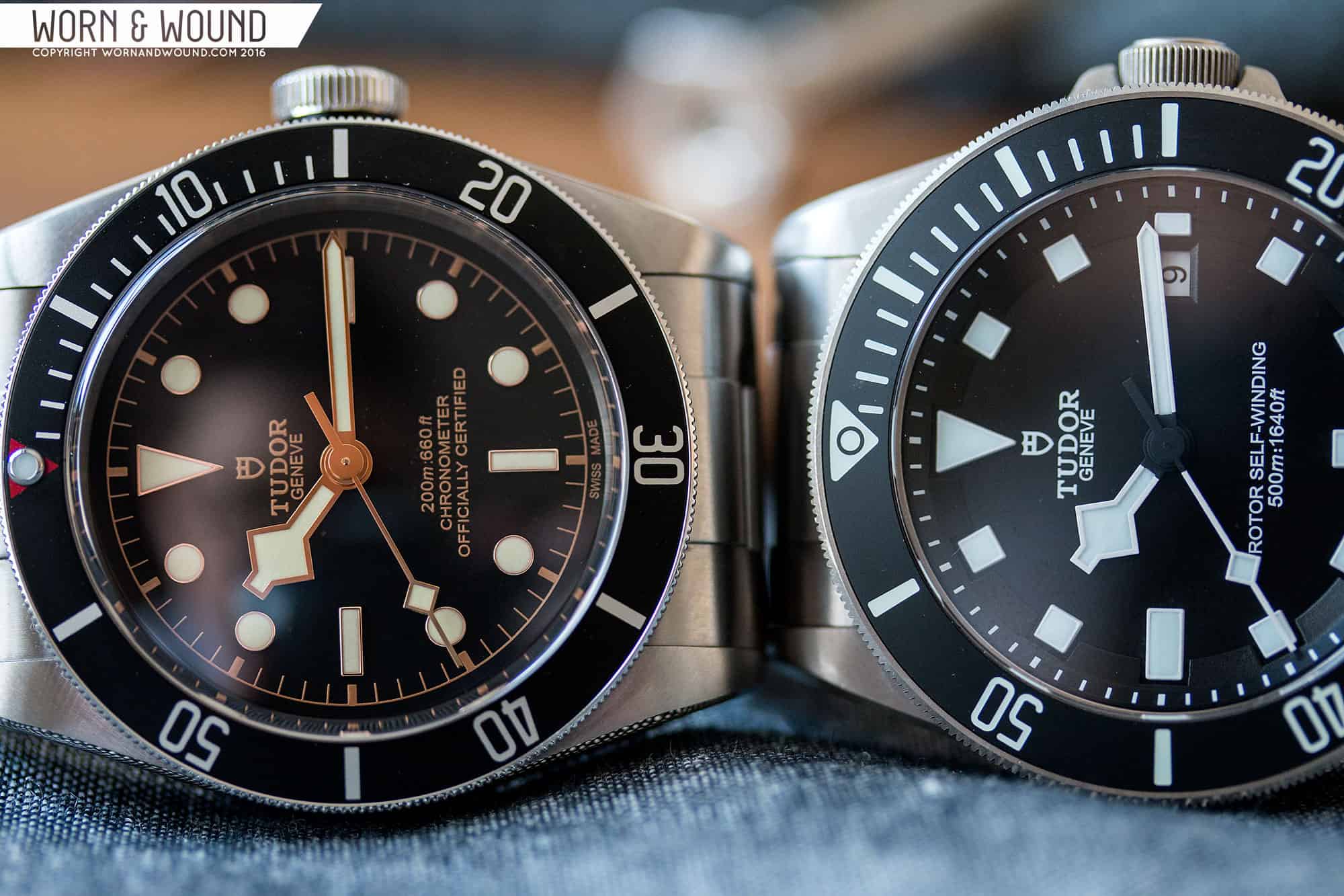
To say the Black Bay was a success is an understatement. They’ve become a go-to modern luxury watch. A weekender for those with money to spare and an accessible modern Sub to those who want to get into the crown. It seemingly has beaten even the Pelagos in popularity, likely due to it being a more style focused timepiece. The Black Bay has clearly become the brand’s breadwinner, with Tudor now expanding the line into three core colors, a PVD version, a bronze model (that feels like it could have had a different name) and a bezel-less 36mm version.

ww_highcraft_vintage_saffron_snowflake_blackbay_1
Left: Black Bay Blue, Right: Vintage “Snowflake”

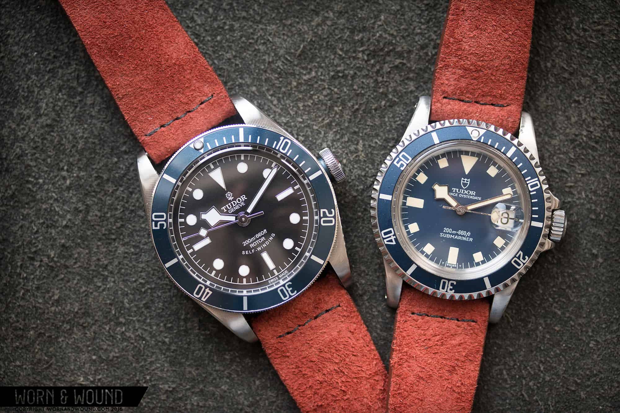
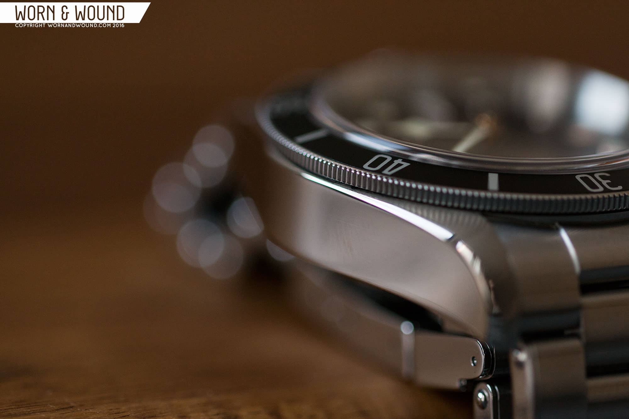
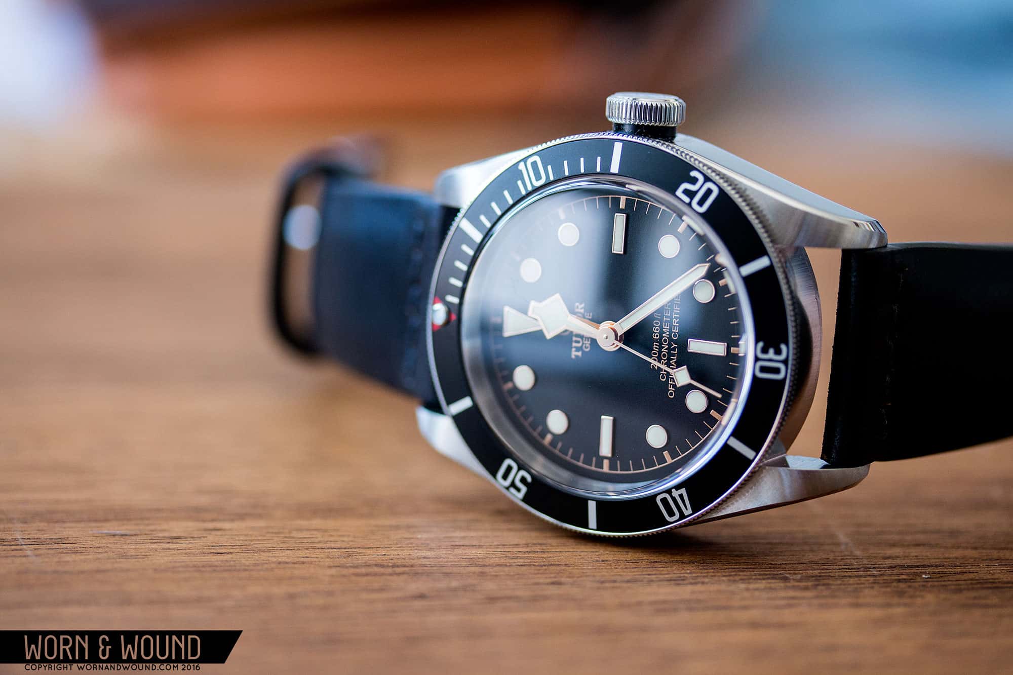
Now, I have to come clean and say that despite the watch’s immense popularity, I had some issues with the design that I discussed in one of our Round-Tables. In short, I found the use of a Snowflake hand with circular markers odd, and the use of a very modern case appeared to play against the heritage concept. With the Pelagos being so successful and modern, it would seem that a heritage model would want to be smaller, thinner and truer to those subs from the 60’s – 90’s. I’ll get into these later, but another underlying concern, was one of value. Powered by the ubiquitous ETA 2824, the Black Bay seemed steep at over $3,000.

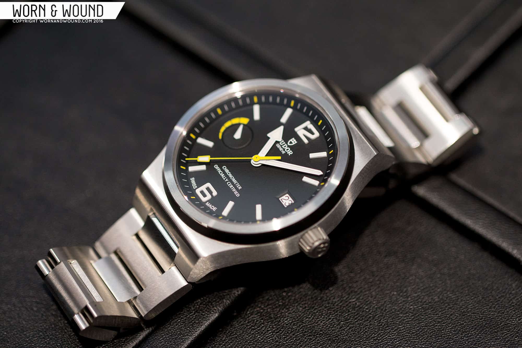
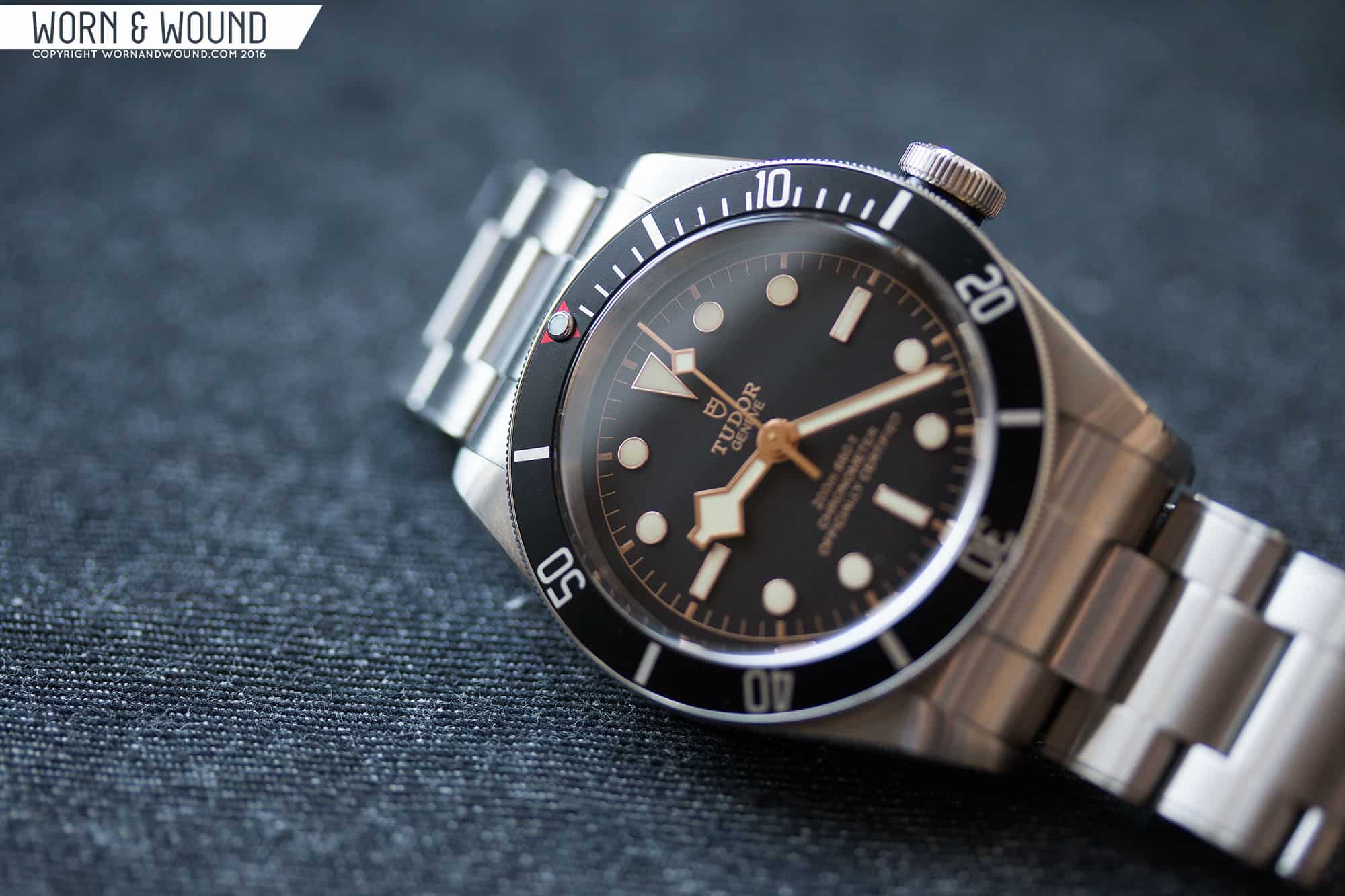
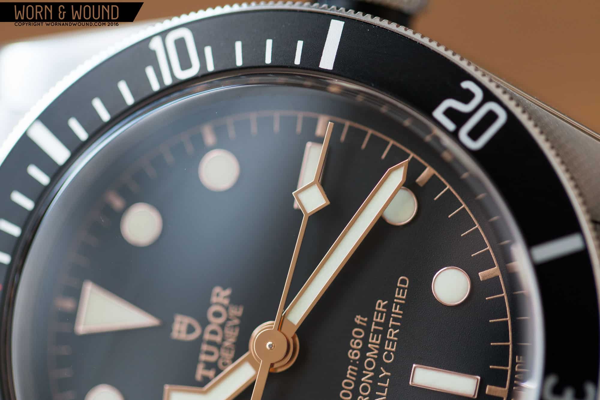
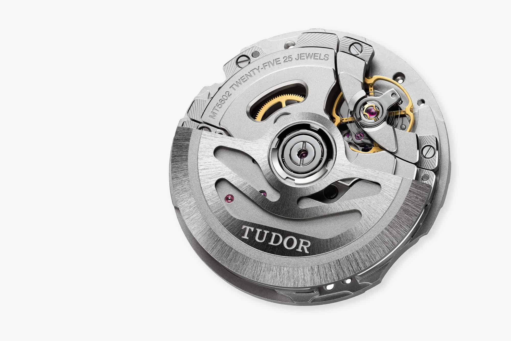
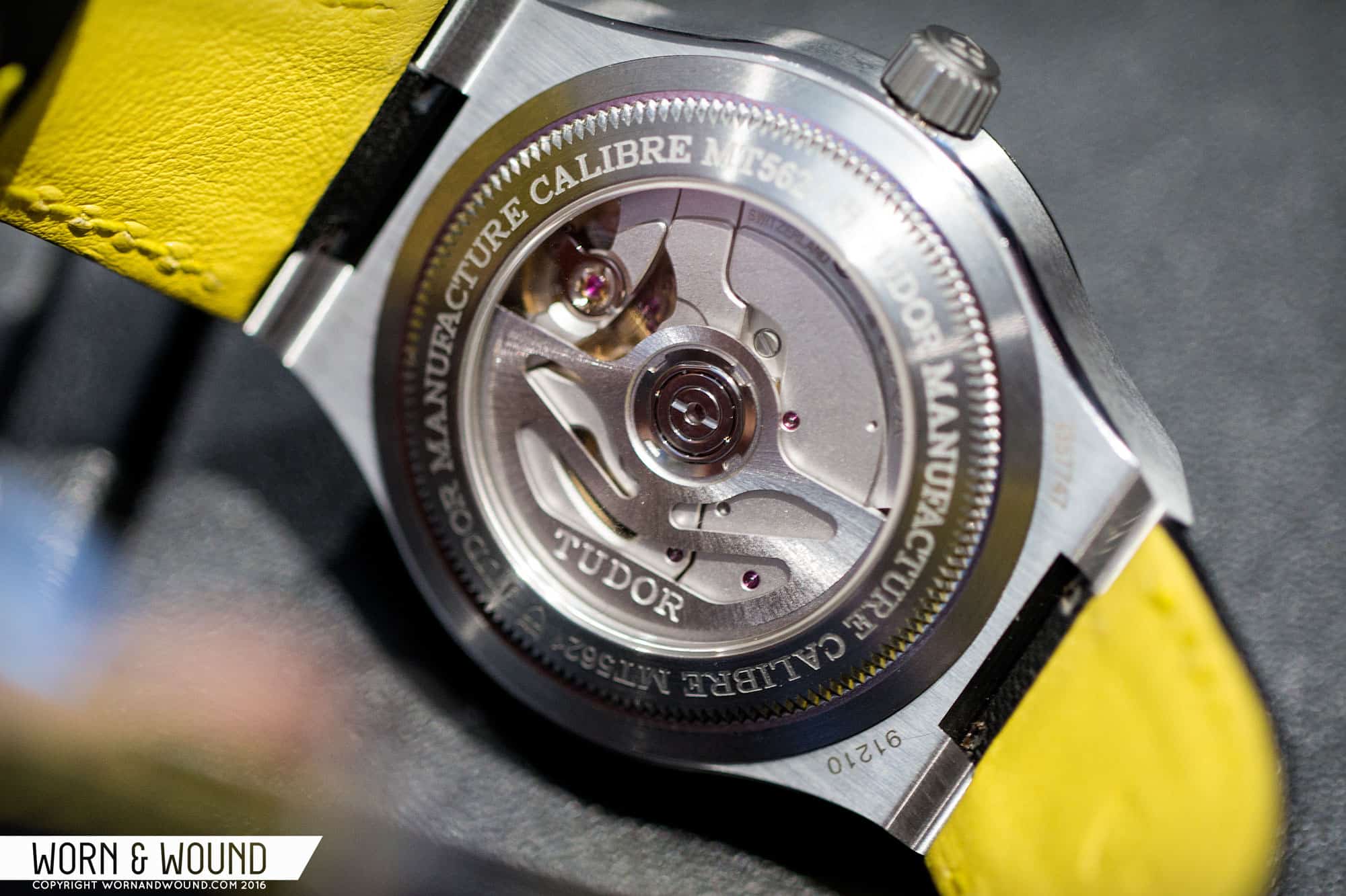
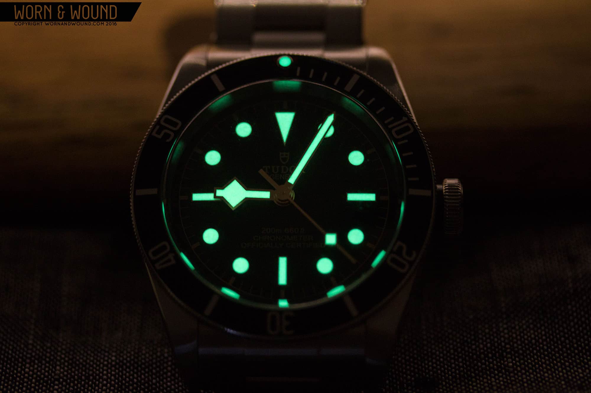
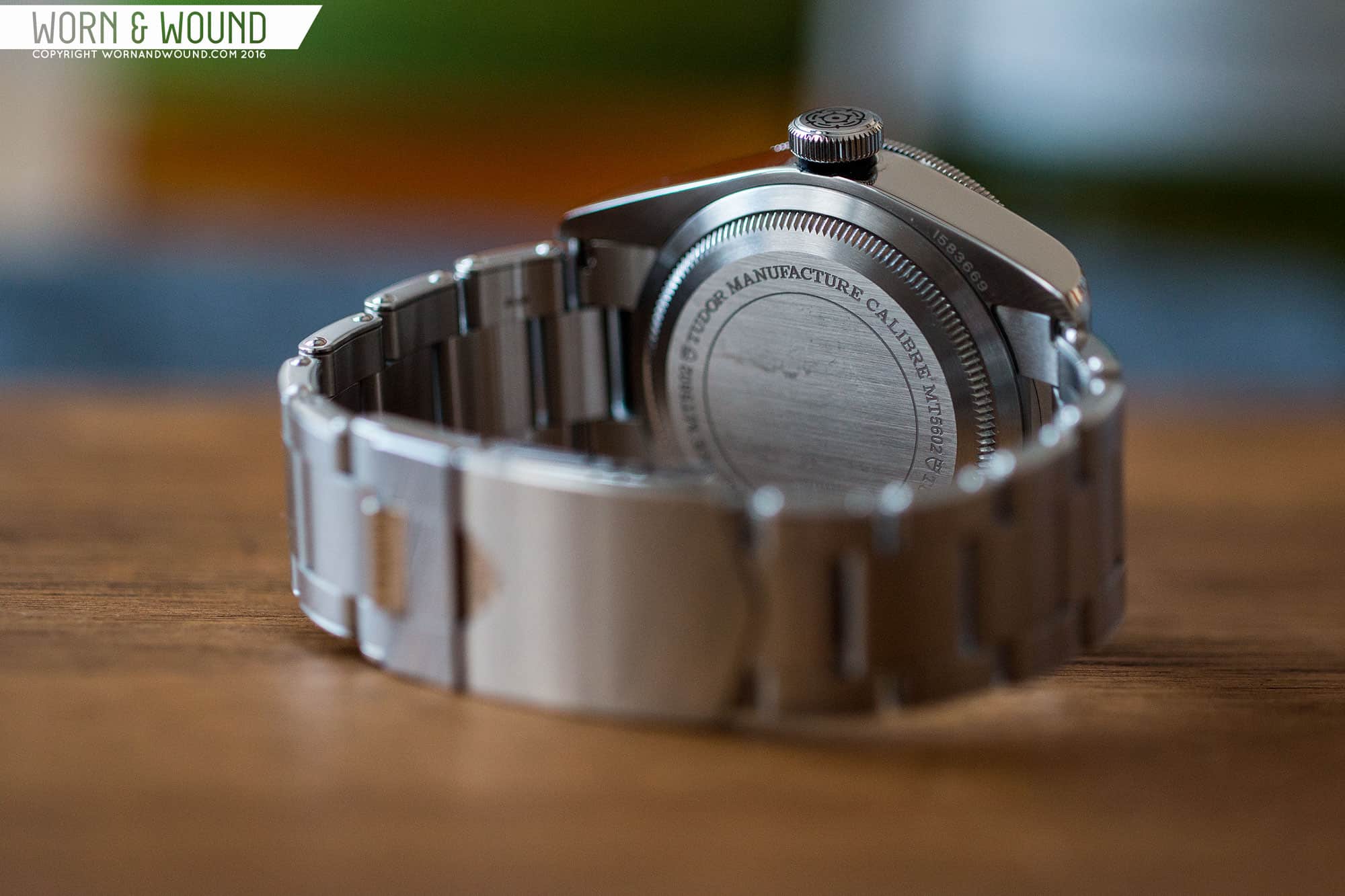
A few things have happened since that assessment. First, they brought out the Black model, which is more conservative and also “truer” overall to some of the original designs. The other, more important development was the introduction of Tudor’s in-house movement. First unveiled at Basel 2015 in their North Flag model, the MT56XX (the last two digits change per variation) was a game changer, certainly in my eyes. In-house movements are few and far between under $5,000, so any that come out are a big deal, and one that is designed and manufactured by *Tudor is truly something to note. The MT56XX wasn’t just another 2824 clone, but rather a unique movement that is seemingly closer in design to Rolex’s own calibers. With specs that include a silicon hair spring, COSC-rated accuracy and 70-hour power reserve, it was designed to impress. Though it didn’t happen immediately, everyone knew Tudor would put these new calibers in the Black Bay. (*at the request of Tudor, it should be made clear that the MT56XX movements are designed and manufactured by Tudor independent of Rolex)

tudor_northflag_1
The North Flag

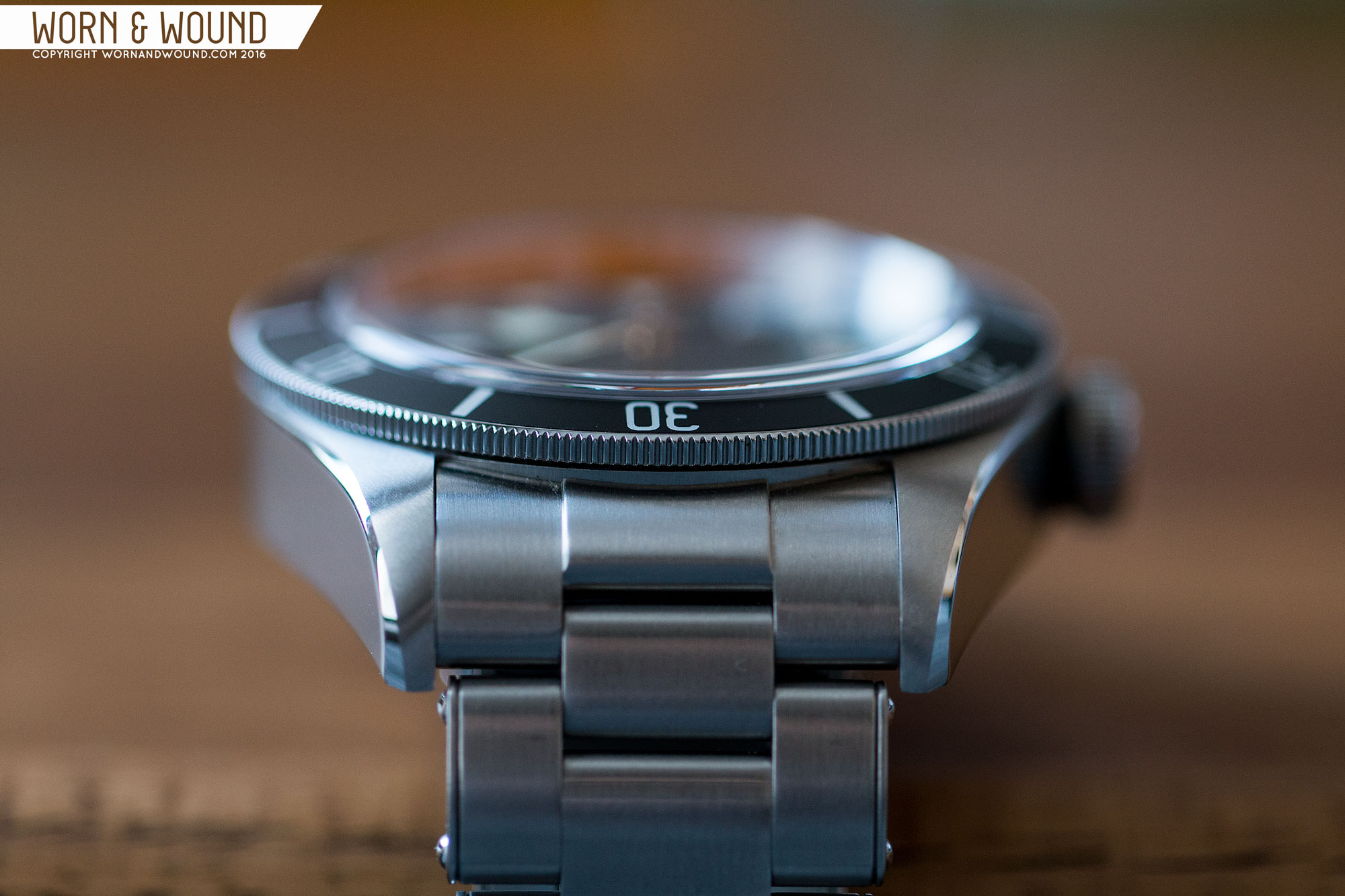
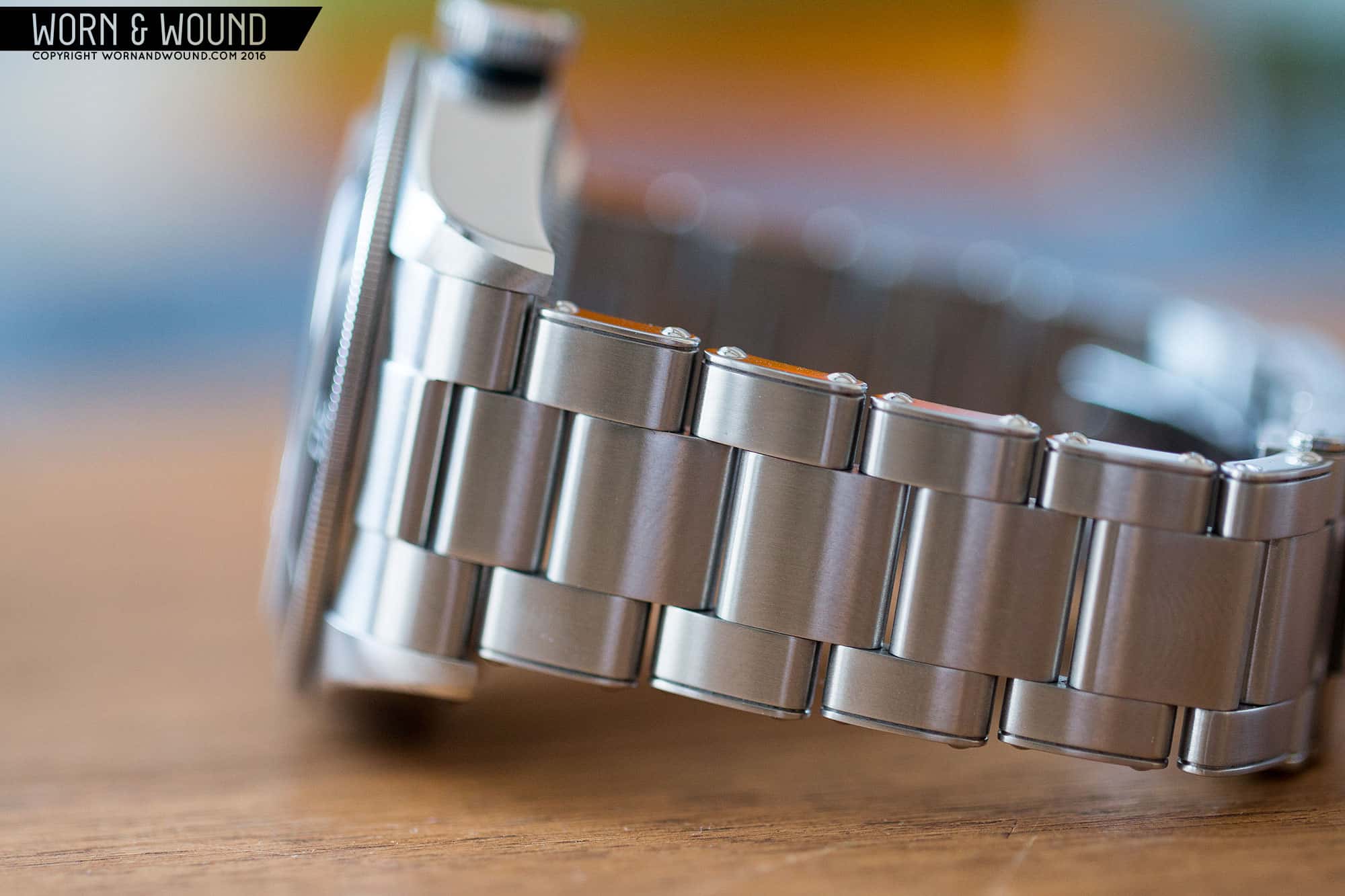
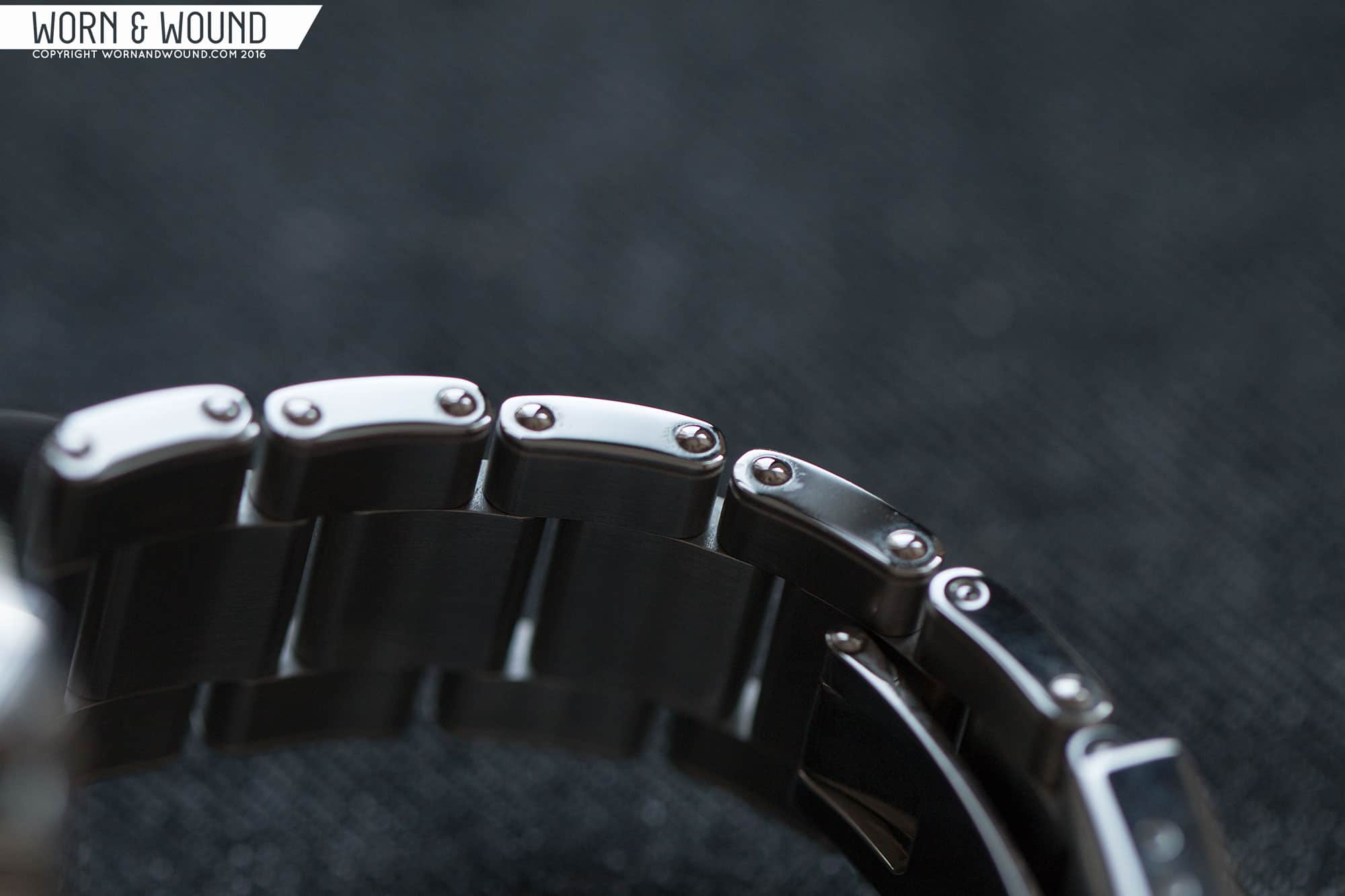
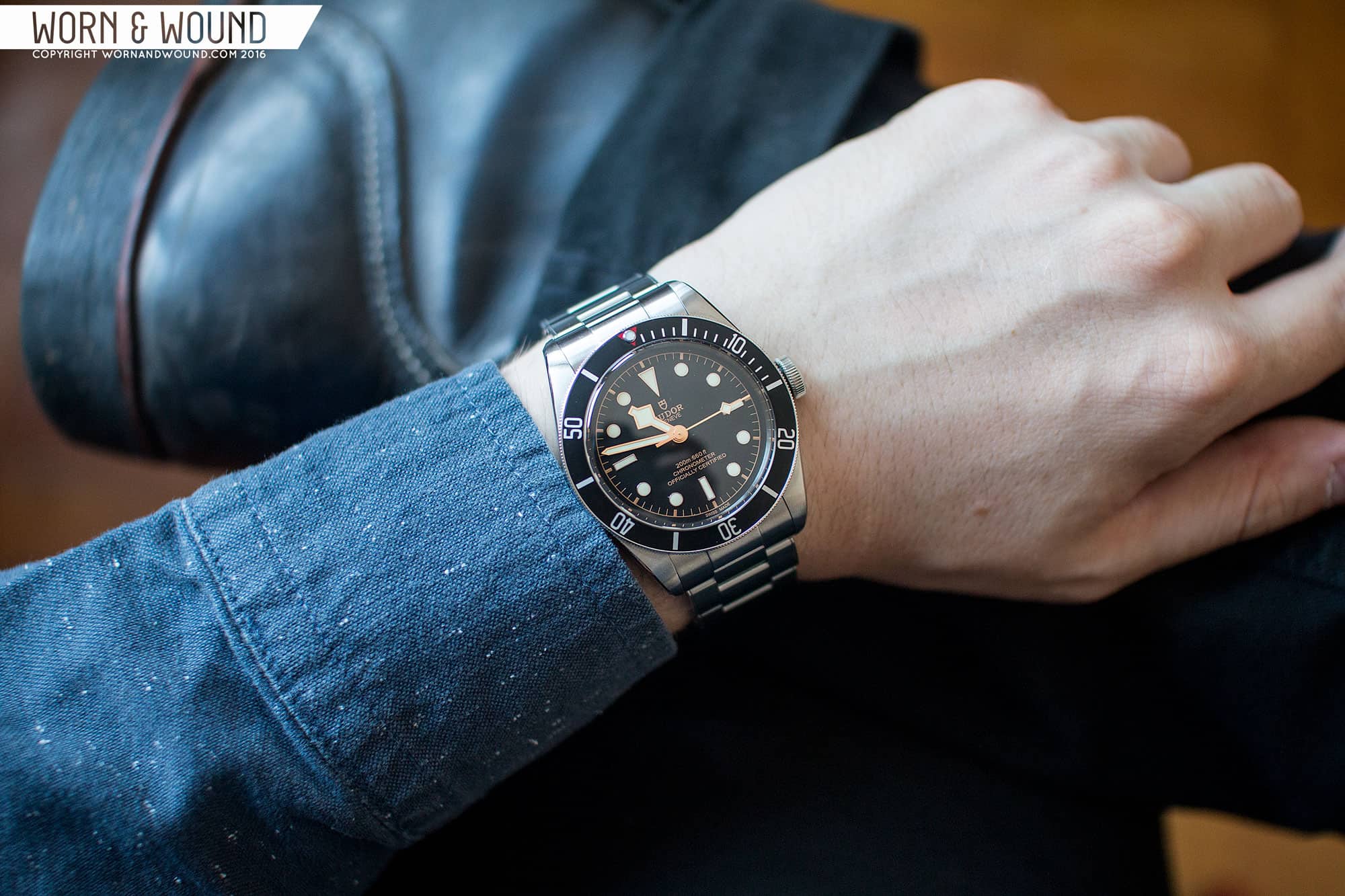
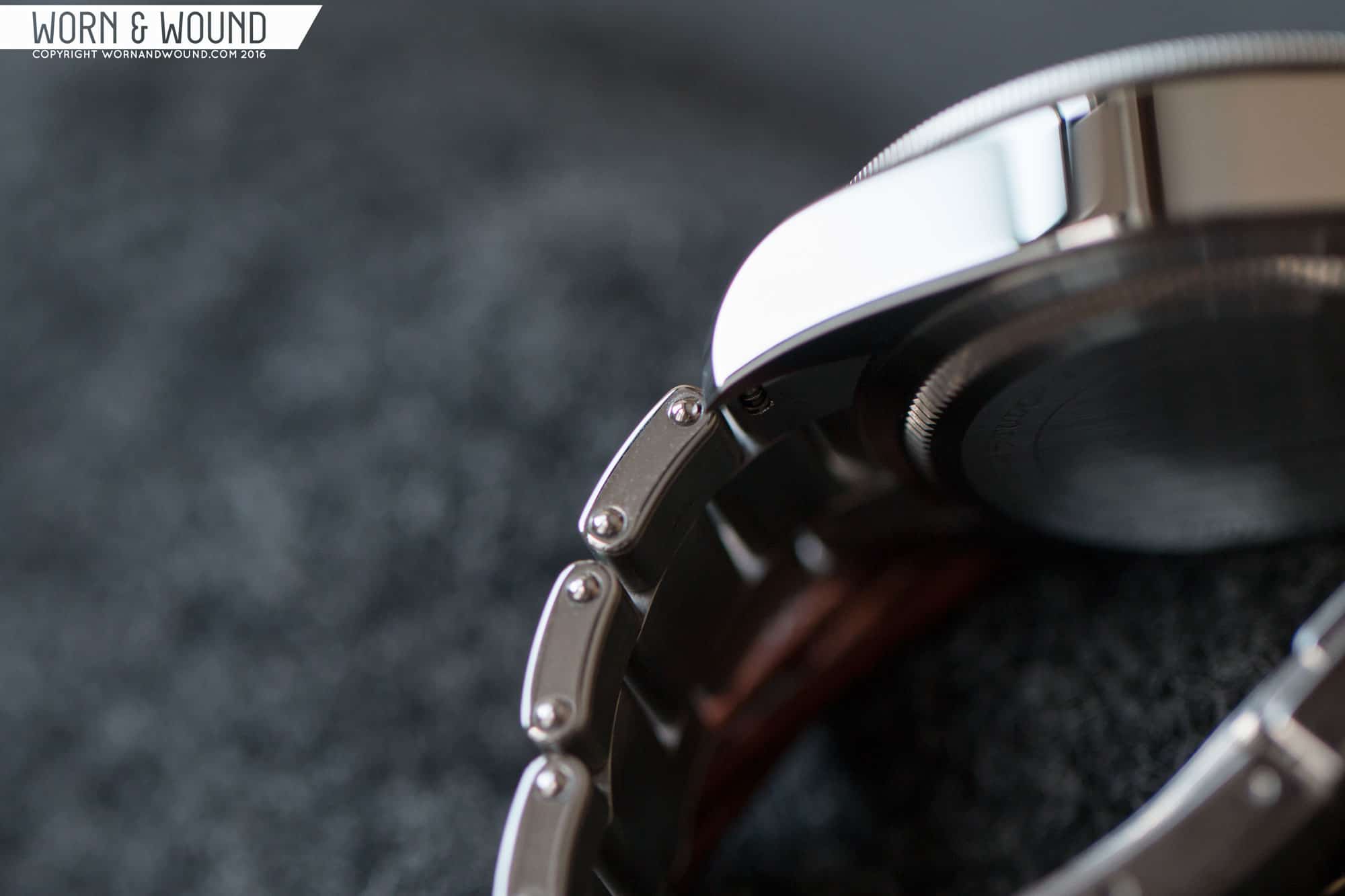
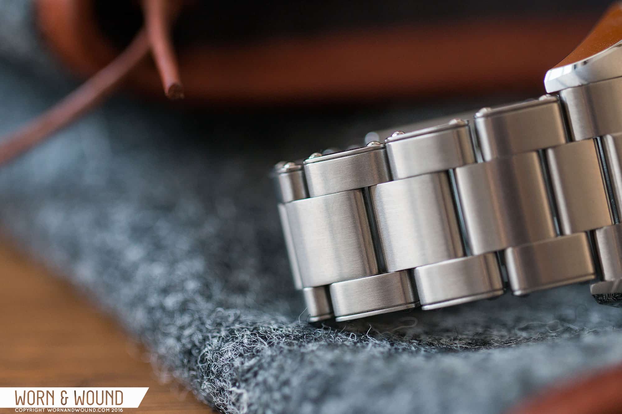
For Basel 2016, all Black Bays but the new 36mm model were now equipped with Tudor’s in-house calibers (the Black Bay Bronze actually has a slightly larger version called the MT5601). Along with the new movement came a few other changes – a new “rivet” style bracelet and the rest mostly cosmetic. The price tag? About $250 more than the previous version. I am personally a huge fan of rivet bracelets, so that immediately added to the appeal of the watch, but more over, the in-house movement really changed the value consideration. The Black Bay was no longer an expensive 2824-powered watch, but rather a potentially affordable Rolex alternative.

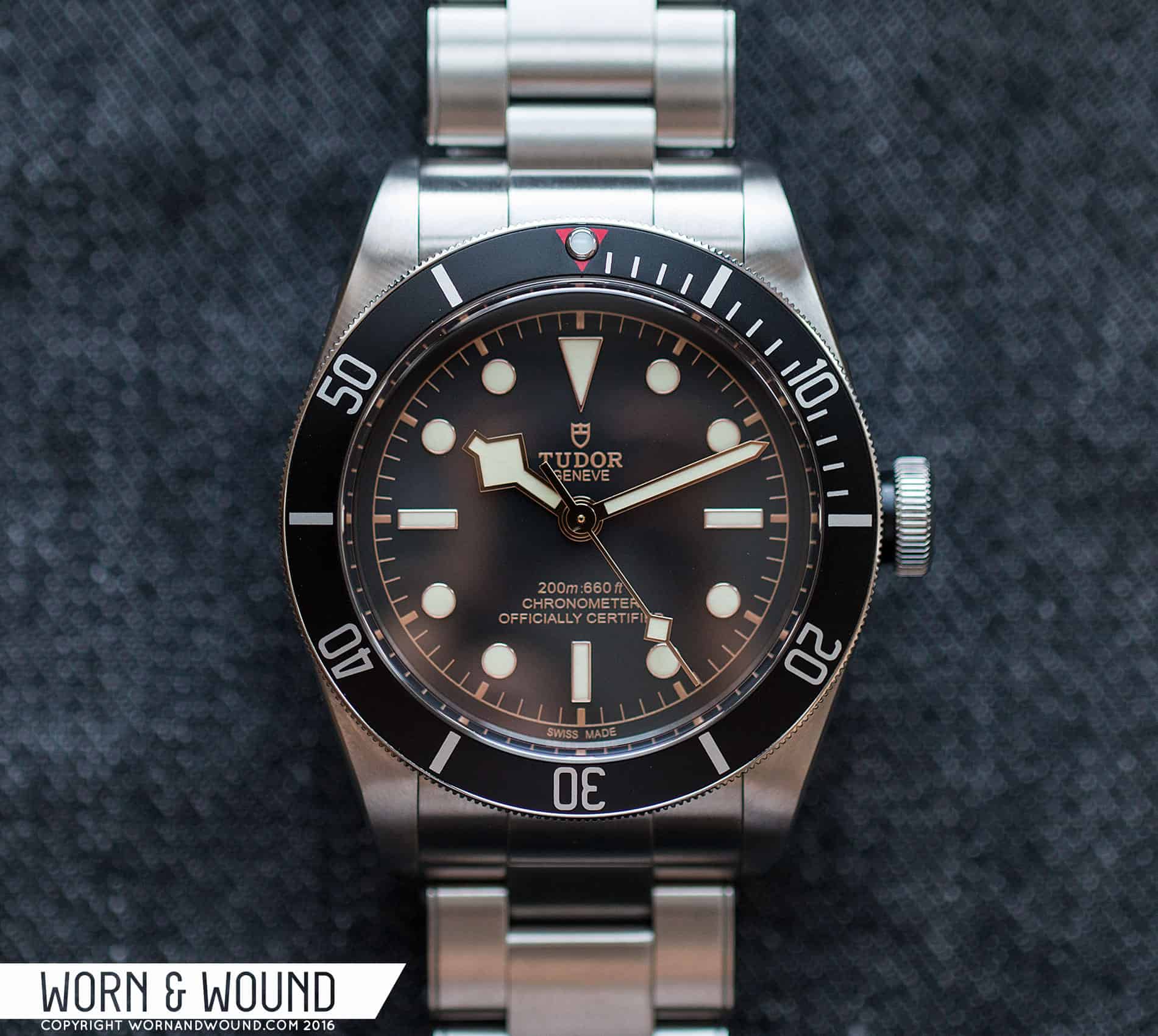
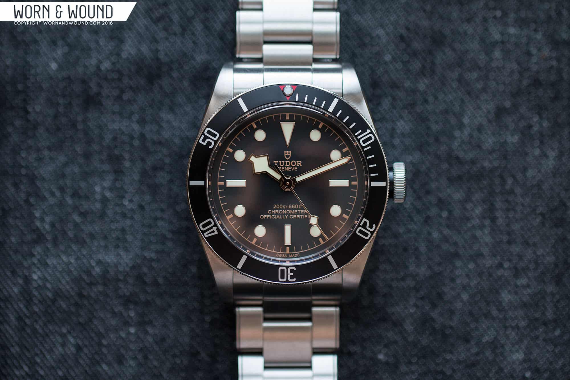
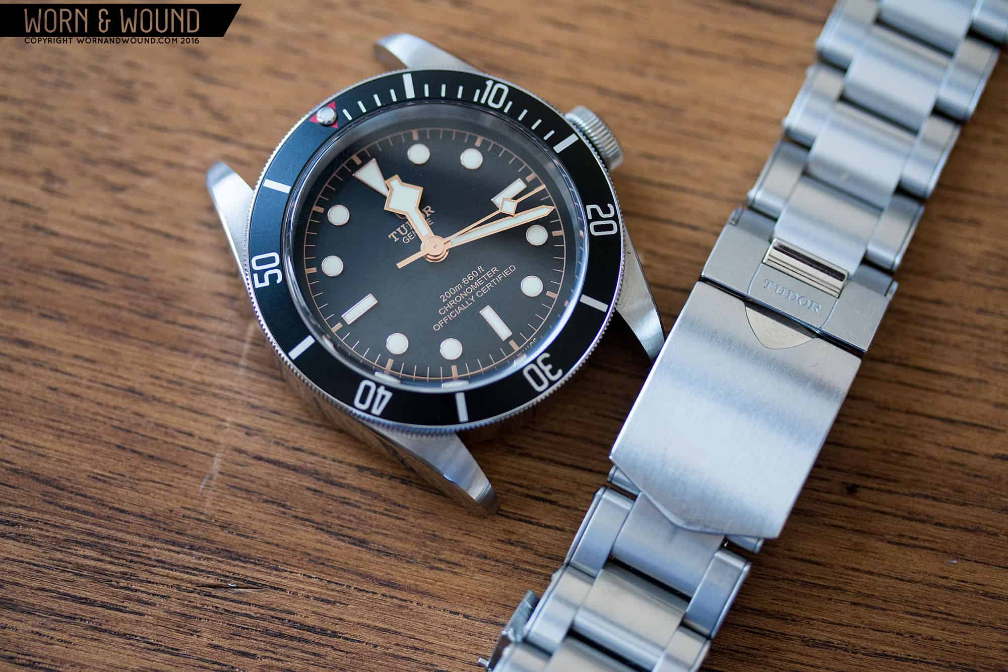
So, when offered the opportunity to review the Black Bay Black ref 79230N, I jumped at the chance. Might I have to eat my own words? Yes, but it would be worth it to give what is ultimately a very popular and potentially high-value watch the worn&wound go over. Well, the table is set, so let’s get to it.

Advertisement
$3675

Tudor Heritage Black Bay Black ref 79230N Review

Case
Stainless Steel
Movement
Tudor MT5602
Dial
Domed Black
Lume
Yes
Lens
Domed Sapphire
Strap
Steel Bracelet + Fabric (not pictured)
Water Resistance
200m
Dimensions
41 x 50mm
Thickness
14.8mm
Lug Width
22mm
Crown
4 x 2.7mm
Warranty
Yes
Price
$3675

Case

The case of the Black Bay ref 79230N has the kind of crisp lines, sharp edges and high quality finishing one should demand of a watch at this price point. Featuring a 41 x 50 x 14.8mm (to the top of the domed sapphire crystal) stainless steel case the Black Bay is a medium sized sport watch in terms of diameter and length. However, it is a tall watch. In fact, the 2016 version increased in height over the previous models by 2mm, presumably to make room for the in-house movement. Not to start with a negative, but this is a drawback of the watch. It sits high over the wrist and would make it hard to wear under a dress-shirt sleeve. This detail wouldn’t matter with a lot of tool watches, but I feel like this is a watch that one would want to wear semi-formally as well. After all, a vintage Sub can basically accompany any outfit.

tudor_black-bay_black_2016_case_5
The bevels flare out beautifully

Moving on, the design is simple, yet satisfying. From above, it’s all lugs, bezel and that huge crown and distinct crown-tube. The 22mm lug width gives the watch broad shoulders, which is definitely a beefier look from the Subs of yore. The lugs themselves angle in from a tangent of the bezel with no contour and start off quite wide. This gives the watch, especially on the bracelet, a bit of a barrel feel. Around the edge of the lugs you can see the high polished bevel that runs around the case.

The finishing here is exceptional. The tops of the lugs have angled brushing with a visible grain and texture. The quality of the brushing is different from what you typically see. It’s a bit hard to explain, but the grain itself is more dynamic, occasionally having a slightly pearlescent quality. The bevel then cuts around with a razor sharp line, starting thin along the side and flaring out as it reaches the bottom of the lug. It’s simply a beautiful detail that adds to the overall luxurious look and feel of the watch.

From the side, the height of the case becomes more pronounced. The profile is very simple, with a straight slab of steel measuring a little over 8mm in height, which then follows the shape of a wrist and curls down to a point. The whole side is flat and polished. The uninterrupted span of polished steel doesn’t help with the height issues of the watch. Something with more texture and lines always appears thinner. That wouldn’t have been in keeping with the Sub-style, but as is, the Black Bay profile looks like a lot of metal. I wish Tudor had horizontally brushed the sides. Tudor’s brushing is particularly nice, and it would have accentuated the bevel more. Plus, polished surfaces are magnets for fingerprints. Every time I look down at the watch, I see a new thumb print.

Exceptional brushing quality
The black crown tube accentuates the thin, wide crown
The black filled Rose logo speaks to the brand’s heritage
Simple coin edge does the trick

On the right side, you have the over-sized crown and black crown tube. The tube has been a point of contention at times, with people either loving or hating the use of anodized aluminum. On the Red and Blue models, it stands out a lot more. On the black, it’s fairly subtle, and a detail I enjoy. Rather than being the thing you look at, it brings more attention to the unique crown. Measuring 8 x 2.7mm, it’s wide and flat, making it very easy to use. It features fine toothing along its outer edge for grip and a black-filled Tudor Rose logo on its outer face. The quality of the crown action is worth noting. When you unscrew it, the crown pops out and it requires a satisfying tug to get into the first position. Screwing it back in, it threads easily and smoothly.

The bezel of the Black Bay features an aluminum insert and a thin coined edge. On the Black model, the insert is Black with a red triangle at 0/60 and classic Sub markings. While the Red and Blue models are a bit more adventurous, I prefer the classic black, especially since it has the red triangle, that refers to some of to the oldest, rarest references. The bezel features a 60-click uni-directional mechanism with nice action. It has a reassuring, high-pitch snap to it, lines up just right and has no play. One very interesting and underplayed detail—and I’ve noticed this on the Pelagos, too—that the bezel “locks” when in home position. When the triangle is at 12, the bezel is actually a touch harder to turn.

tudor_black-bay_black_2016_bezel_1
Got to love that red triangle

My one critique with the bezel is that it’s a bit hard to get a grasp on. Since it perfectly matches the diameter of the mid case, turning it relies purely on friction along the case side. In comparison, the Pelagos bezel hangs over the edge, which adds to the size of the watch, but makes the bezel much easier to turn.

Turning the watch over, you have a solid steel case back that in true Tudor/Rolex tradition is very plain. In fact, other than their signature tool mark, there is little more than a few words, a line and some brushed steel. While this might be what you would expect to find on a Tudor, given that this watch is a 200m sport watch (less a tool diver) and that it features their in-house movement, I’m surprised the Black Bay didn’t have a display akin to that of the North Flag. It’s not like it’s a close remake of a vintage watch, and I’d think for general consumers at large, seeing the movement would be an enticement. I know I’d like it there.

Dial

The dial of the Black Bay Black 2016 has some minor cosmetic changes from the previous versions, but overall features the same design. The dial surface, which is slightly domed, is matte black. Like the brushing on the lugs, the quality of the surface stands out with a light, egg-shell texture. The color is a slightly faded black, coming across just a bit softer than deep black. This works well with the gold tones of the “gilt” print, markers and hands, creating a warmer feel.

tudor_black-bay_black_2016_dial_3
The classic Submariner layout

The primary index should come as no surprise. It’s the iconic Submariner layout, with a long triangle at 12, rectangles at three, six and nine, and large circles in between. It’s the classic design and has just the right proportions. To modernize the design, Tudor opted for applied markers rather than printing them directly to the dial. They feature rose gold surrounds and a creamy, off-white lume. While I greatly prefer the printed dial Rolex Submariners to the later applied versions from the mid 80’s forward, the decision here was the right choice. It doesn’t look tacky, rather the added texture gives the dial some needed depth, and the rose gold surrounds are particularly attractive.

Around the edge of the dial is a minute/seconds index of lines that are thicker at the hour/intervals of five and thinner in between. They are all connected with a circle that frames the whole dial. This index is presented in a metallic rose gold color that, with the gold surrounds of the markers, refers to the gilt dials of the early Submariner references. The mix of the warm gold with the matte black surface and creamy lume works very well. It speaks to vintage pieces while not seeming like faux-patina. The lume color in particular was well chosen.

This text on the dial is where the cosmetic changes have occurred in the 2016 model. At 12 the dial still reads “Tudor Geneve,” but instead of the Rose logo, Tudor went with the Shield, matching the brand’s other lines. I liked the Rose logo, but I totally understand this change from a branding perspective. The Shield is Tudor’s primary logo mark, and the Rose is secondary to that. Being that the Black Bay is seemingly their flagship watch, having it be consistent with Tudor’s identity is the right move. Plus, the Rose is still on the crown. Above six the text has changed more dramatically. It still reads 200m:660ft, but instead of the “rotor” and the smiling “self-winding” there are two lines of straight text reading “Chronometer Officially Certified.”

The rose gold has a glow of its own
The applied markers are a nice modern addition
The cream colored lume is just right

This one I go back and forth on. On the one hand, having the chronometer rating is a feature worth mentioning. On the other, the previous text was pulled from historical models and it had a friendlier (hence smiling) and more unique look. The three lines of chronometer text is also something associated with Rolex’s Subs, not Tudor’s. I think they could have gotten away with just putting that on the case back and keeping the old text to save the character. That said, it certainly doesn’t look bad the way it is now.

The hands are where I previously took some umbrage with the design. The Black Bay features the signature, blocky Snowflake hands from the ref 7021, which the Black Bay has in common with the Pelagos. As such, the hour hand has a distinct wide diamond shape, the minute hand is a straight sword (this hand would likely remain that same on any permutation) and the second hand has a small lume filled diamond. It’s a very attractive handset, especially when presented in polished rose gold as it is here. My issue is not with the hands themselves, but rather how they correspond with the circular markers below. On a true Snowflake and the Pelagos there are square markers. When the hour hand come near a marker, the flat sides become parallel, clearly responding to each other. On the Black Bay, no such relationship exists. Is it hard to read? No. Is it ugly? No. It’s just not as it was “meant” to be.

tudor_black_bay_vs_pelagos_1
Snowflake and circle vs Snowflake and square

I’m fairly certain we’ll never see a Mercedes hand on a Tudor again, so I imagine this choice was to make the Snowflake Tudor’s signature. That I get, but Tudor also has the option of using the lollipop hand (Mercedes sans cross) of the ref 76100, which would have been a great choice visually. It also would have paid tribute to the brand’s history and further distinguished the Black Bay from the Pelagos. In the end, will this at all effect the enjoyment of the watch for 99% of people? No, so take my issue with it as you will.

The lume mentioned before is not just a pretty cream color. It also works incredibly well. In fact, it’s some of the best lume I’ve seen, requiring very little charge, glowing brightly and for a long time and having very even application. It’s the kind of lume that charges up just being in a semi-well lit room. Also, the hands and markers glow the same brightness, which is something that I honestly don’t look for as it’s very uncommon.

Advertisement

Movement

The biggest change to the Black Bay for 2016 is the use of the MT5602 in-house caliber. As mentioned, in-house or manufacture calibers are uncommon under $5,000 with only a few brands coming to mind, so when any come out they are a big deal. When a brand on the scale of Tudor does it, it’s a really big deal as the movement is backed by decades of manufacturing expertise. Here, it also means that the brand was cutting free of Swatch Group and coming closer to a vertically integrated manufacture. If there is one very legitimate concern about new in-house movements, it’s their reliability over the long and short term. Other concerns are serviceability, especially further in the future as the brand itself might not still be around. With a “standard” movement like the 2824, you know it’s backed by the test of time and is easily serviceable. So, if I were to bet on a new movement between a brand that’s been around 10 years and one that is over 100, I’d pick the latter.

With the MT5602, Tudor presents an excellent upgrade to the ETA 2824 previously used across the Black Bay range. The MT5602 is a 25-jewel automatic movement with a frequency of 28,800 bph and features hacking and hand-winding. In that regard it’s similar to the 2824, but here’s where it differs: the MT5602 also features a 70-hour power reserve (up from 40), a silicon hair spring, a free-sprung balance, a full balance bridge and COSC chronometer rating (yes, 2824’s can be COSC rated, but the units in previous Black Bays were not).

tudor_black_bay_mt5602
The Tudor MT5602

70 hours means the movement will run off the wrist for a few days. A silicon hair spring, while in addition to just being more tech forward, is non-magnetic, lubricant free and in theory leads to longer service intervals and greater reliability. It’s also clear that Tudor manufactures their own escapement, rather than relying on parts from ETA. A free sprung balance means that the movement is regulated by adjusting micro-screws on the balance itself (variable inertia) rather than through the use of a regulator system (the little caliper-looking device and screw with a +/- sign over the balance that adjusts the length of the hairspring on 2824s and other movements). Whether there is an advantage here I’d have to default to a watchmaker’s opinion, but I do believe regulators are prone to issue with shock. This is also a feature found more often on higher end manufacture movements. A full balance bridge, which you’ll see on Rolex’s calibers, in theory provides more stability. I happen to also like how they look, though without a display case back you’ll have to imagine it.

The chronometer rating speaks for itself. It’s a proven declaration of accuracy as governed by the COSC, which you can read about in greater detail here. This isn’t the most “unique” aspect of the MT5602, with many movements having COSC certification at price points both above and below the Black Bay, but it’s certainly worthwhile to have. In my time with the Black Bay, it’s been exceptionally accurate. I measured it using the Twixt app and it came in between -3.2 and -4 seconds daily—well within the -4/+6 variation allowed by COSC. (Disclaimer: I can’t speak to Twixt’s accuracy, so take this report as you will.)

tudor_northflag_m75621
A display case back would be a welcome addition to the Black Bay

In terms of design and decoration, the MT5602 has a clear physical resemblance to Rolex’s calibers, however actual technical similarities are hard to determine. It would make sense for there to be a trickle down of tech from Rolex to Tudor, but Rolex is also clearly making very different movements at very different price points. Just take a quick look at what their new 3255 caliber features and you’ll see that it’s a whole different beast. In terms of decoration, Tudor movements are wildly different as well. The MT5602 has a very industrial look with sandblasted bridges that gives the metal a dark tone, beveled edges and a skeletonized rotor. It’s not the typical Swiss decor of bright rhodium plated metal with Côtes de Genève and blue screws. It speaks to Tudor’s goal of being more of a tool watch brand, but also it may simply speak to manufacturing and cost.

Overall, it’s an impressive movement that I do think is an upgrade over the 2824. It makes the watch more unique and a greater value as the price change was only a couple hundred dollars. That said, there is one drawback to the movement, and that’s the height. The MT5602’s is 6.5mm tall. This is very tall for a three-hand movement. In comparison, the 2824 is 4.6mm, the 2892 is 3.6mm, and the Miyota 9015 is 3.9mm. This obviously adds to the space requirement of the movement within the watch, and thus the watch’s overall height, which I think is the biggest drawback of the Black Bay.

Bracelet and Straps

Also new for 2016 is the rivet bracelet. This is a great addition no matter how you look at it. For those unfamiliar with the concept, it speaks to a much older style of bracelet where the links are held together with side plates that were riveted on. Instead of tapering, the links step down in width. For the Black Bay, they created a beautiful modern Oyster style bracelet that has the aesthetic features of the riveted style. The rivets and plates add a cool texture to the side of the bracelet, which subtly adds to the overall look and feel of the watch. The stepped links still get that 4mm vintage taper across and they make the bracelet more comfortable on the wrist, but visually it looks more abrupt. It’s a fun detail that I really enjoy, but I could see how someone might view it as a step in the wrong direction. For me, removing some of the modern slickness works well.

The bracelet starts at 22mm with a solid and expertly fitted endlink, and then it steps down about a millimeter at a time to 18mm at the clasp. The smallest links are the ones that you can swap out for sizing, and Tudor’s solution here was clever. They kept the side plates, but replaced one rivet with a one-sided screwbar. This detail keeps the look and allows for easy sizing. The clasp on the bracelet is beautifully designed and machined, featuring a mix of polished and brushed surfaces. There are also nice details, such as the Tudor Shield being created through some clever use of lines and gaps.

Advertisement
Steps
Rivets
Subtle branding
Great attention to detail

Overall, the bracelet is gorgeous and works really well with the watch. In addition to the bracelet, the Black Bay comes with one of Tudor’s Jacquard loomed mil-straps in black. I didn’t have one to try out, but I’ve heard good things about them. However, I did try the Black Bay out on some of our High-Craft Vintage straps, as they were sort of designed for watches just like this. The Black Bay works great on leather because the location of the springbar holes is low and far out. This creates a nice amount of space between the strap and the case, allowing for the case to be more defined. I actually prefer straps over bracelets for this very reason. I find leather accentuates the geometry of a case, particularly the lugs and bezel. For colors, I tried black Chromexcel, an obvious option that looked great with the bezel, dial, etc., and one of our Ryes. The Rye made the gold in the dial jump out, and gave the watch a much warmer look, speaking to the vintage elements of the design. I’d definitely recommend pairing the Black Bay Black with a honey/tan-colored leather like this.

tudor_black-bay_black_2016_rye_3
Rye and gold, great combo

Wearability

The wrist test is the most important of all, and unsurprisingly, the Black Bay passes. The diameter and lug-to-lug work on my 7-inch wrist. It’s masculine and modern in stature, but not grotesque or over done. I still think a smaller 39mm version would be great, but as is the Black Bay is not “too” big. The height is, as previously noted, more of a concern. The watch sits very high on the wrist with the case sides having a bit too much presence of their own. You get used to it, as you do with all tall watches, but that doesn’t make it any more svelte. Furthermore, putting it on a mil-strap would only add to this issue.

In terms of aesthetics and style, the Black Bay Black really shines. I actually received multiple comments from people while wearing it, which really doesn’t happen all that often. It just exudes class and elegance, mixed with something more rugged and masculine that defines the “vintage Submariner” (sounds like a cologne commercial, I know, but trust me—it makes sense). The mix of rose gold and black is timeless, the proportions of the iconic dial are just right and the applied markers and case bevel bling just enough. It’s a damn sexy watch. It looks great with work clothes, casual clothes and even more formal attire thanks to that touch of gold. Playing around with strap material and color opens it up to a world of possibility and make it a very versatile watch.

Advertisement
41mm isn’t small, but it fits well
A leather strap accentuates the case’s geometry

Conclusion

So, how do I wrap this one up? Do I have to eat my words and take back everything I said in our Round-Table? Well, I think partially. I do think a better solution could have been found than the Snowflake hand, and I do think the case is bigger than one wants it to be, especially in height. With that said, the Black Bay is an incredibly enjoyable watch to wear. I loved every second of having this one on my wrist and would happily have it be a part of my collection. The overwhelming quality of the construction and finishing speaks for itself, and it oozes style. That’s just the aesthetics.

The MT5602 really does change the overall picture, making the watch a more unique and desirable offering. The specs are great, especially the 70-hour power reserve, silicon hairspring and chronometer rating. The new movement just makes the watch a better value. Obviously $3,675 is not cheap, but I don’t mean value in the sense of inexpensive. In the $3 – $5,000 range, the in-house Black Bay is offering more (at retail) than many of its competitors. We all know some high value brands under $5,000, but too few actually have something akin to the MT5602. Unfortunately, the height might be an effect of the movement, but if I were to have to pick one over the other, the movement would win. It just makes the Black Bay a more special watch.

tudor_black-bay_black_2016_edit_1
Black leather works too

In the end, the Tudor Heritage Black Bay Black ref 79230N is really one hell of a timepiece. For people who are interested in vintage or modern Submariners, the appeal will be immediate. For people who are aching for a modern Rolex, perhaps they don’t have to save or wait so long and can instead buy the Black Bay with the MT5602. Heck, they might even be getting something that suits them better. The Rolex Submariner is a whole different beast with many technical advantages, but the Black Bay is just the cooler watch.

Images from this post:
Related Reviews
Zach is the Co-Founder and Executive Editor of Worn & Wound. Before diving headfirst into the world of watches, he spent his days as a product and graphic designer. Zach views watches as the perfect synergy of 2D and 3D design: the place where form, function, fashion and mechanical wonderment come together.
wornandwound zsw
Categories: