Video Review: Farer Cobb Mechanical Chronograph

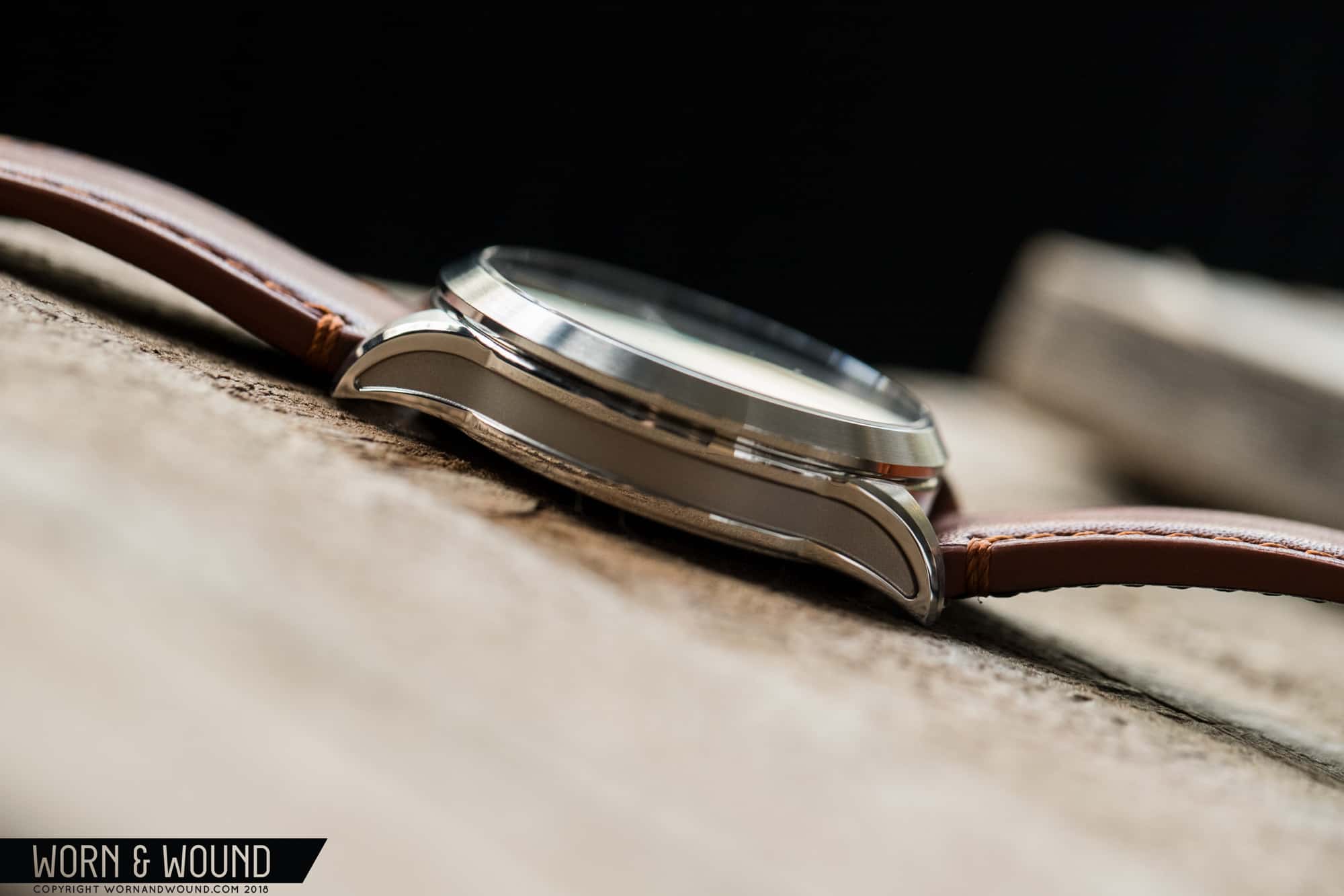
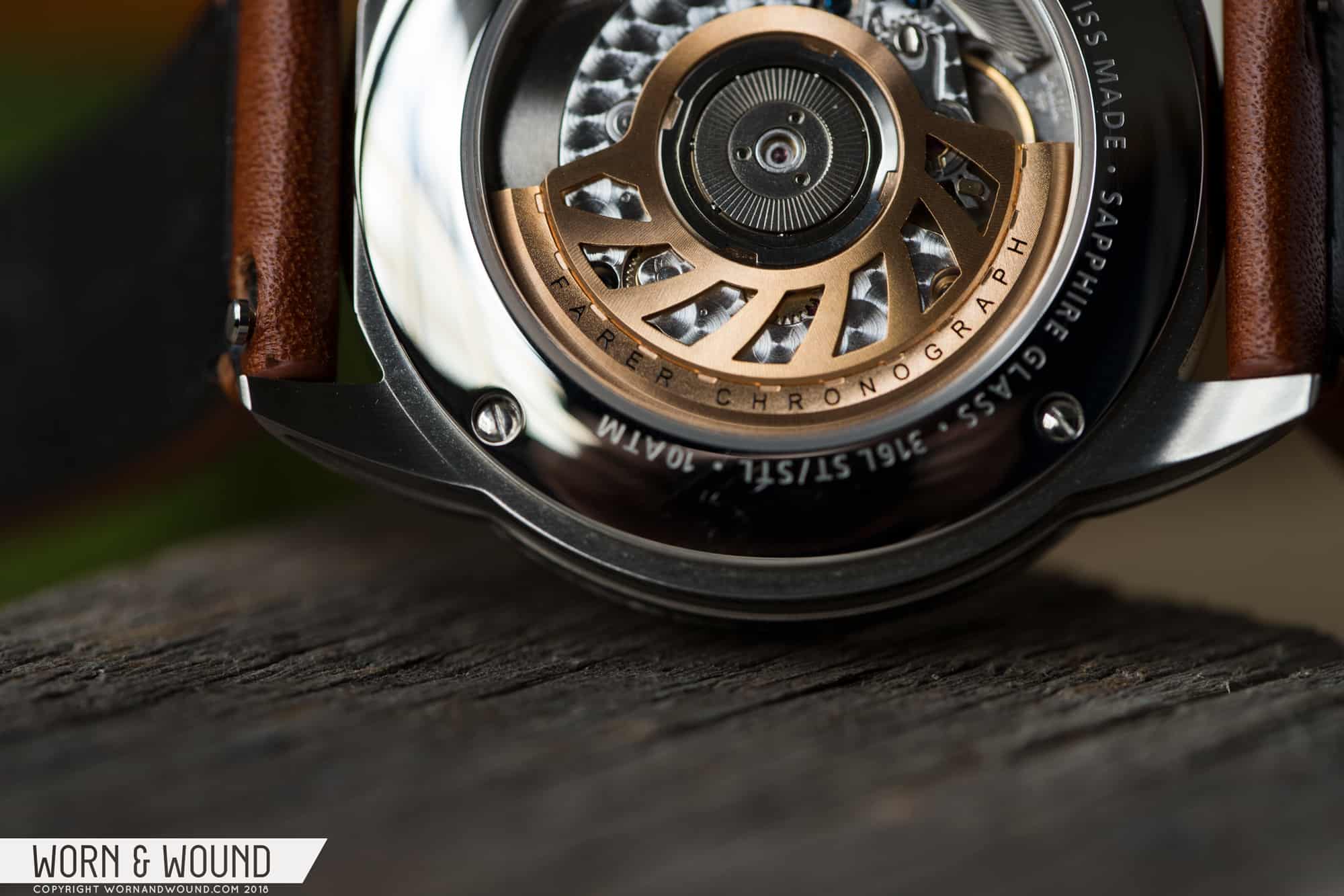
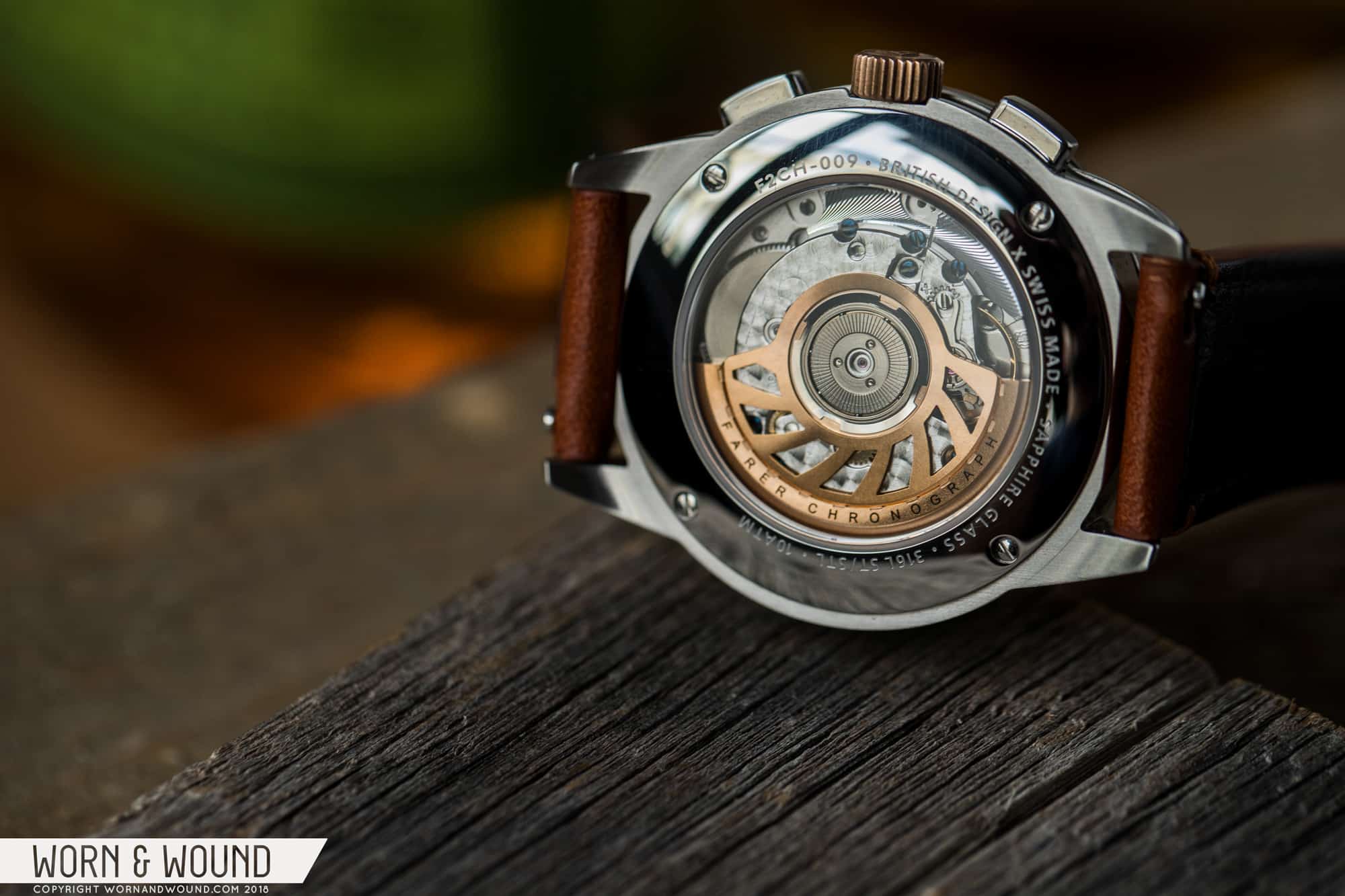
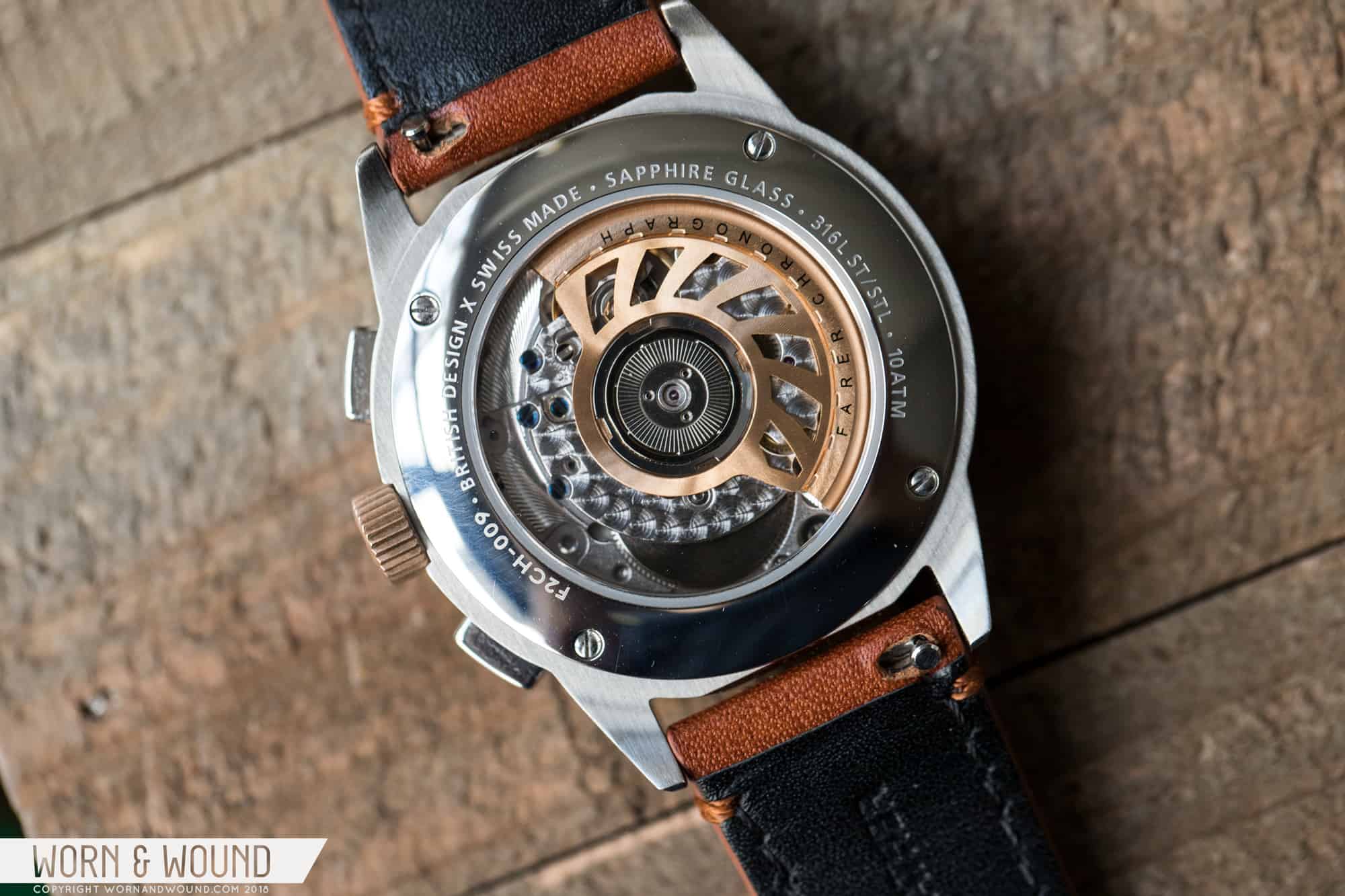
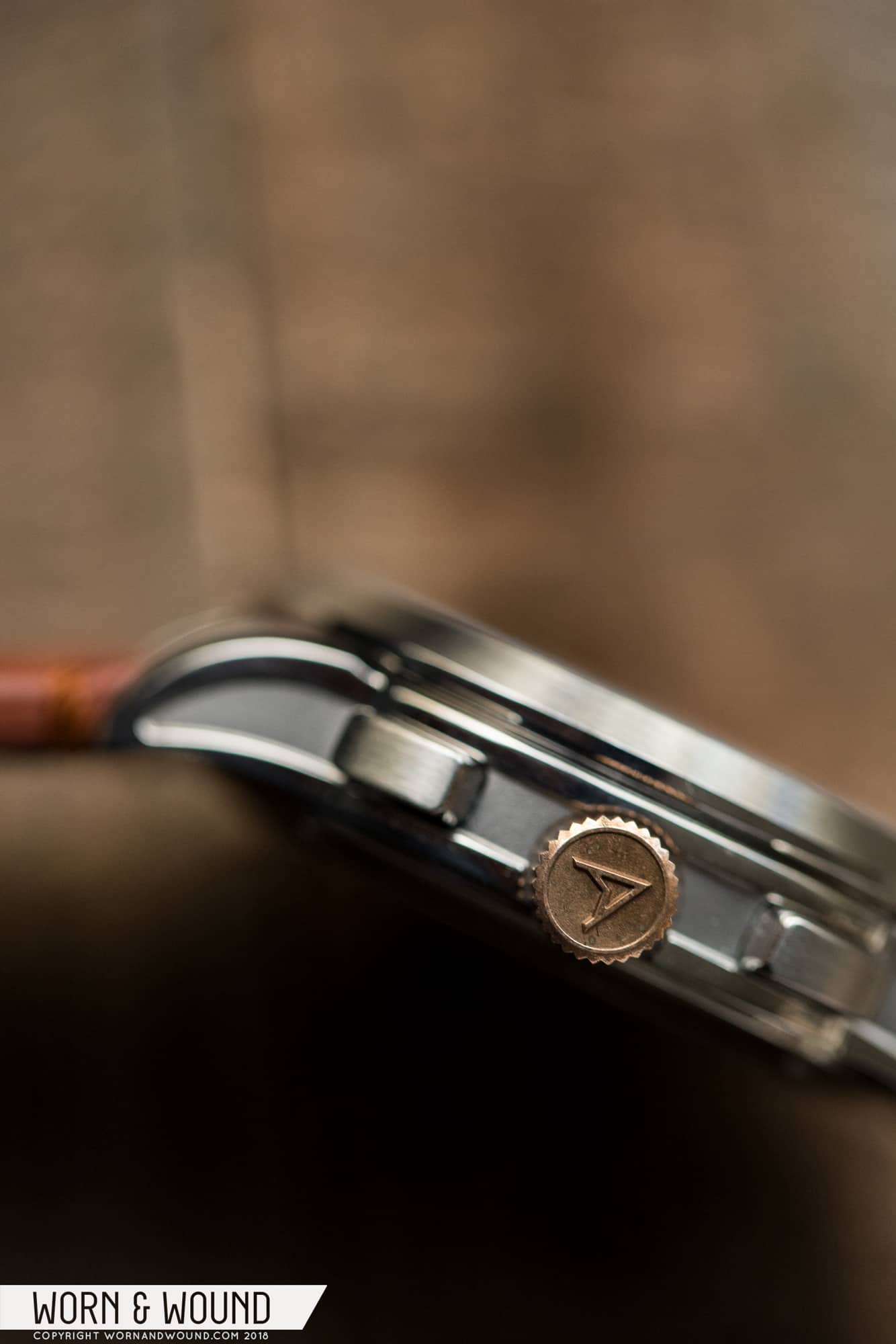
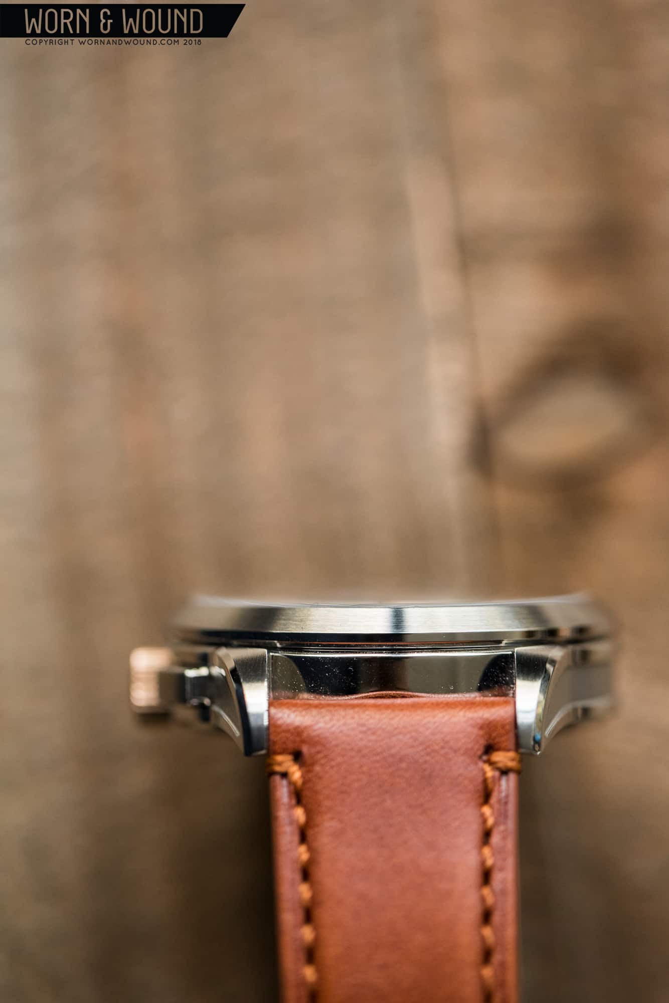
In September, Farer launched their first series of Mechanical Chronographs. Continuing the brand’s now well-established formula for releases, Farer put out three distinct models—all sharing the same case but featuring wildly different dial designs and configurations. And, as one should now expect from Farer, the watches themselves showed once again that the British marque’s design team is not at all afraid of color.

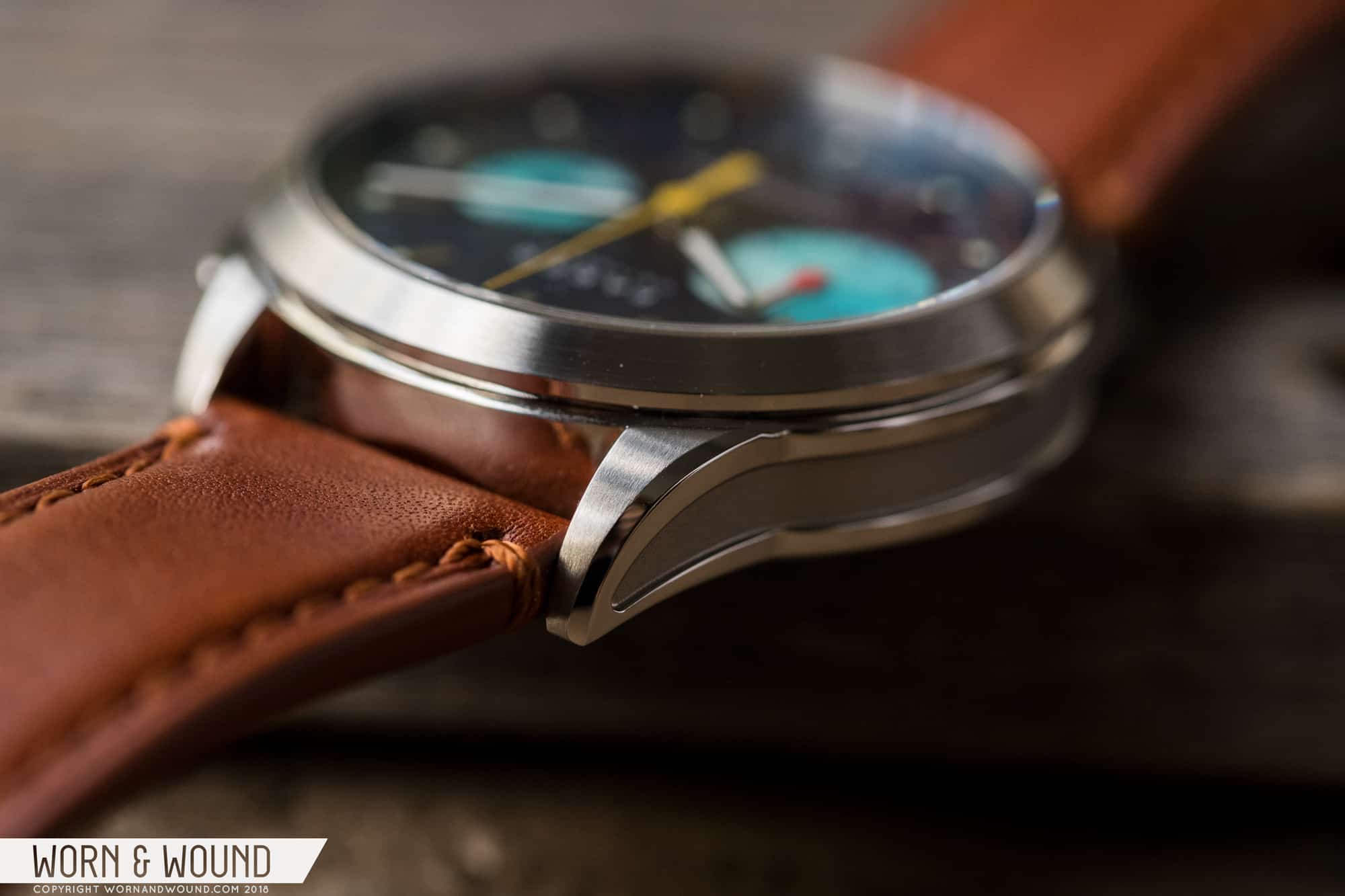
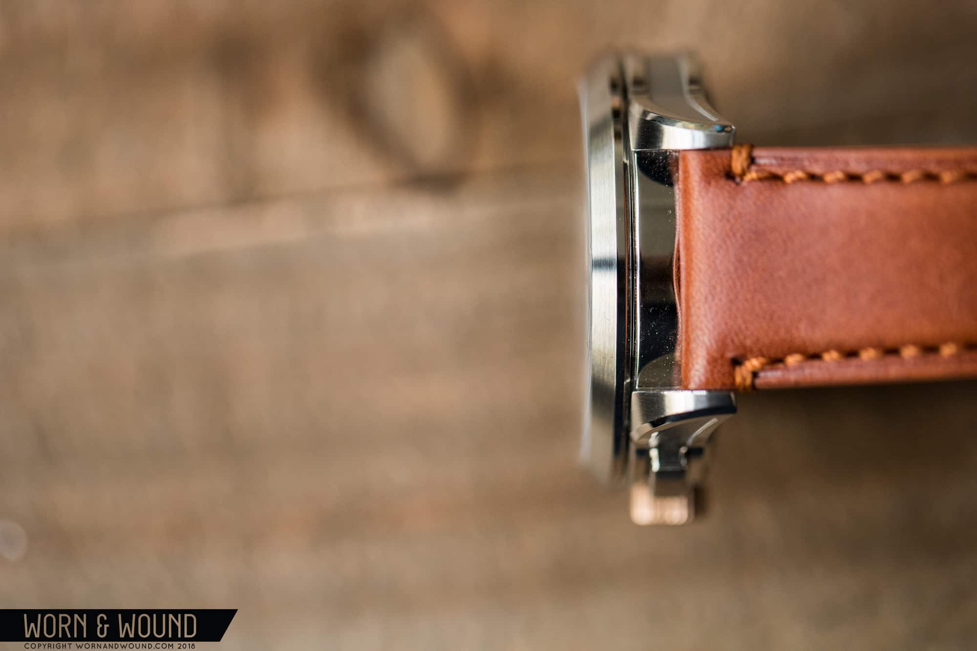
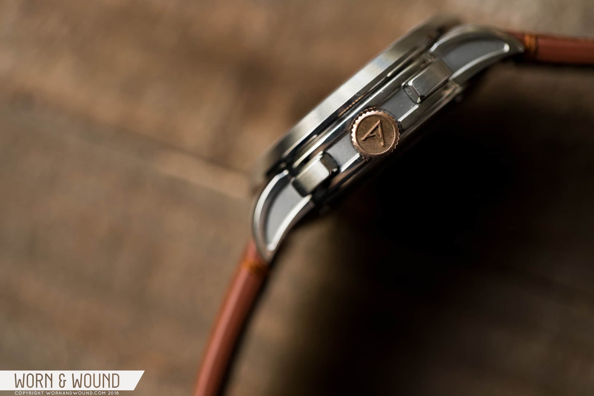
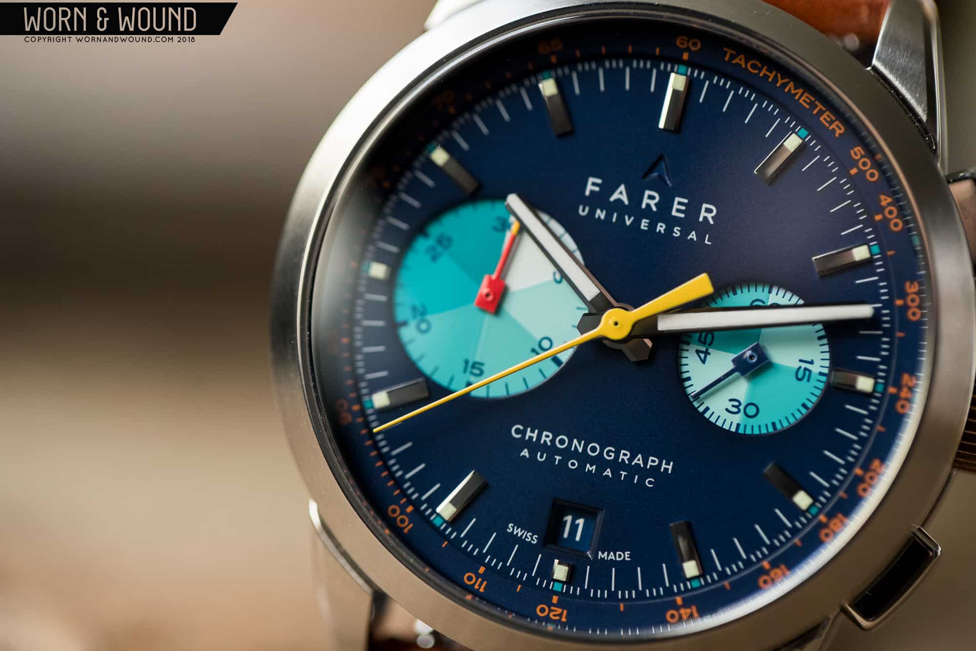
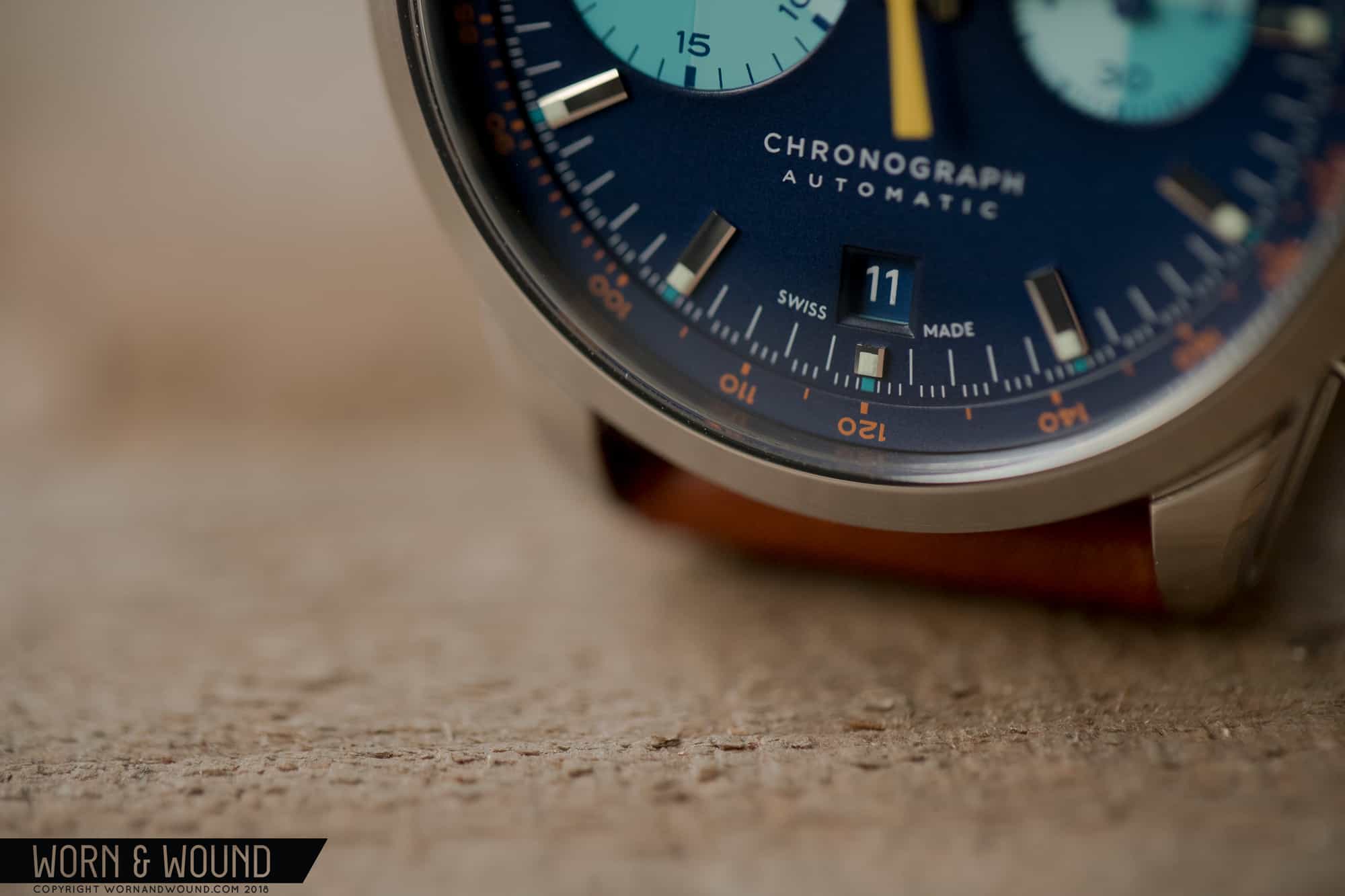
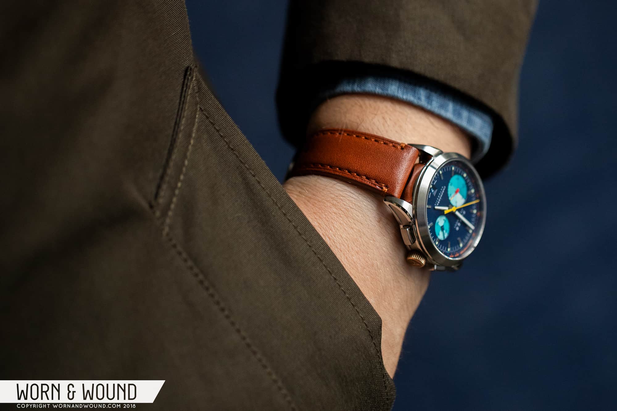
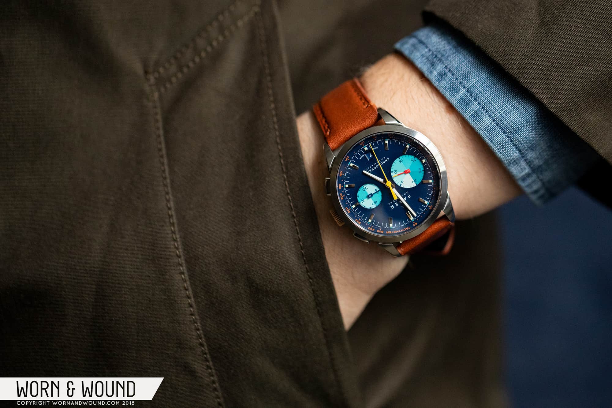
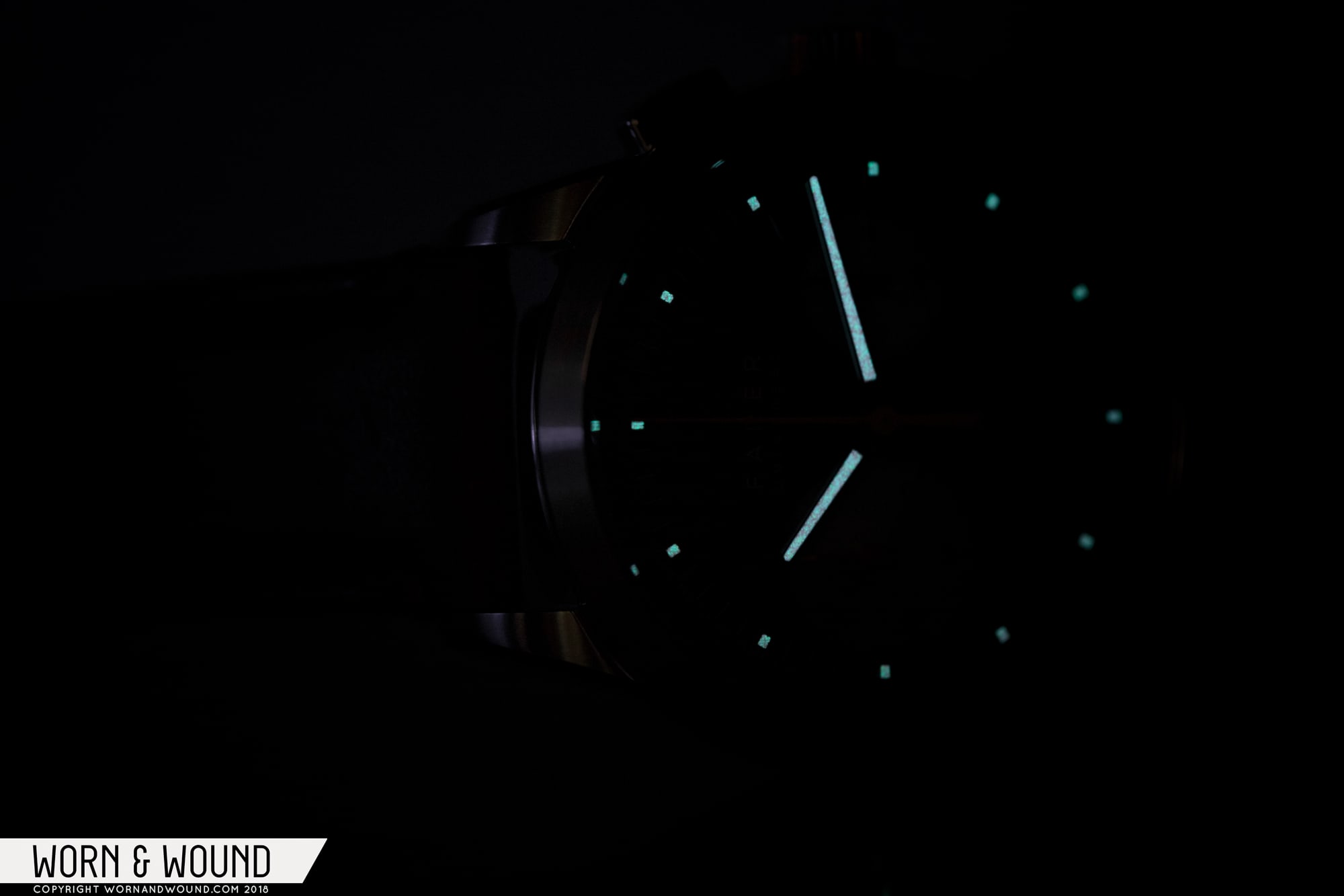
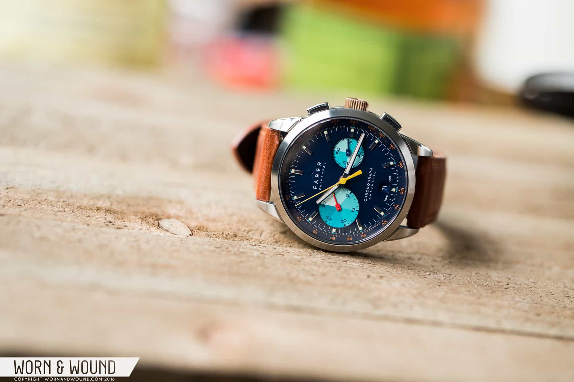
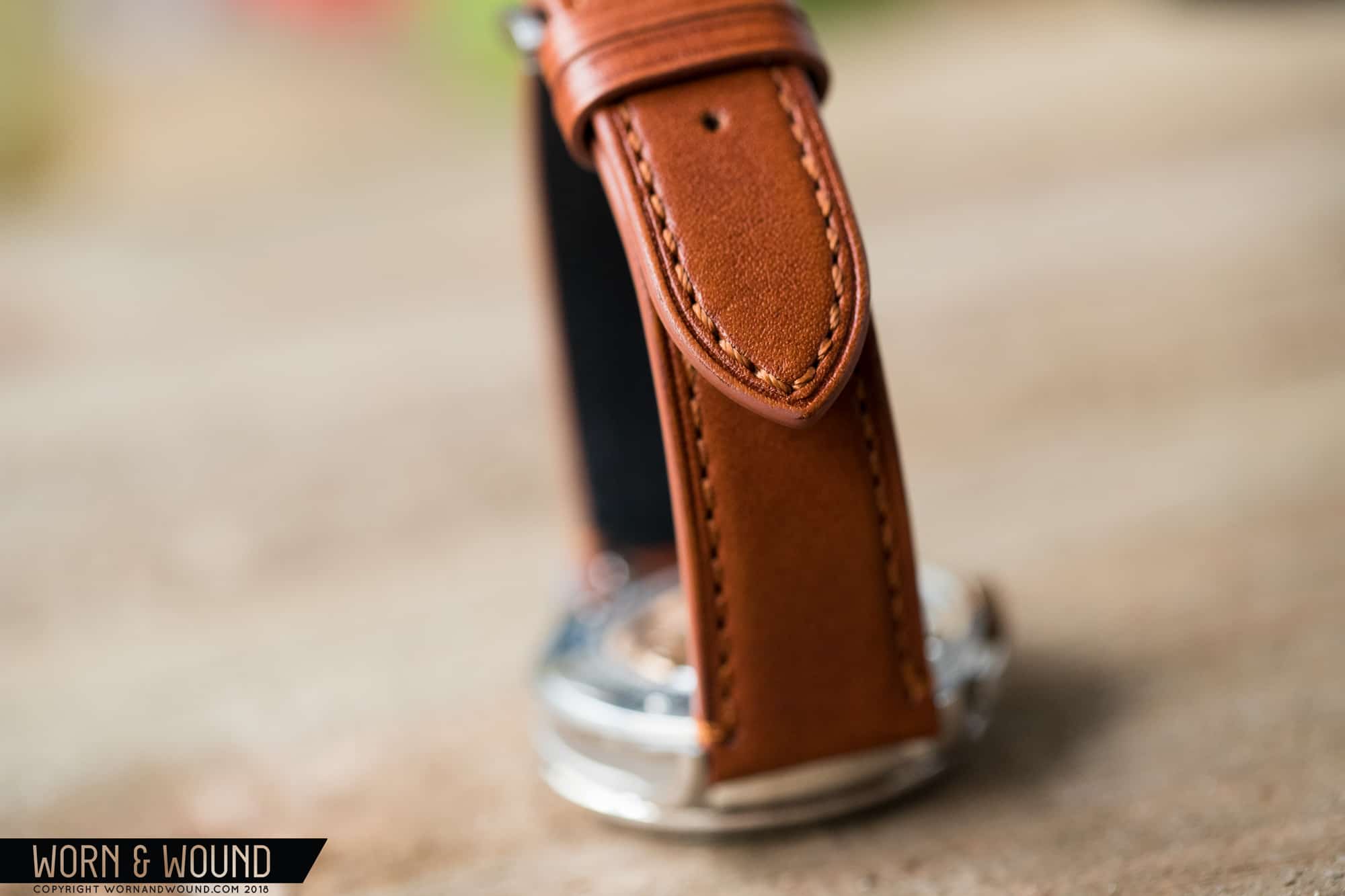
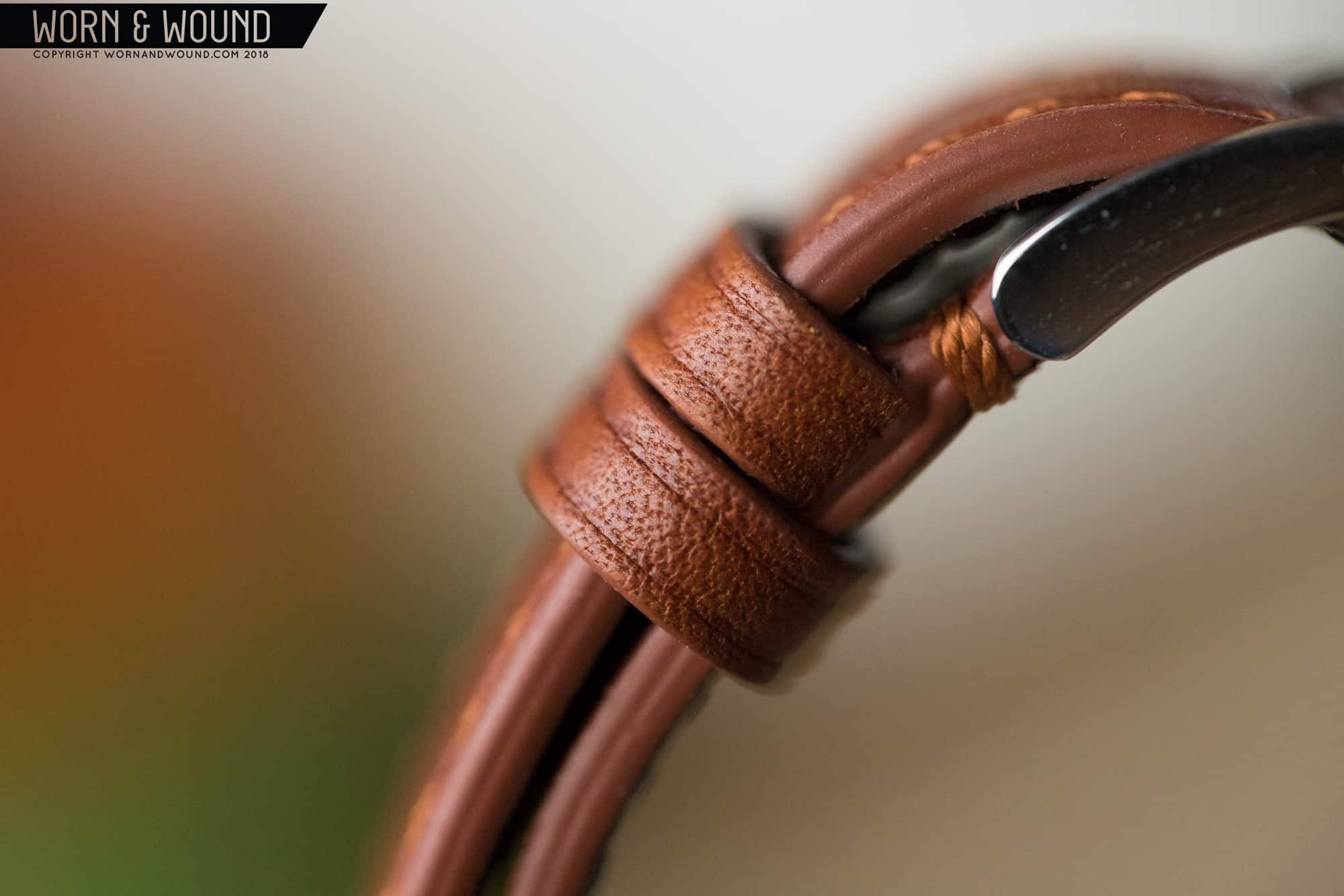
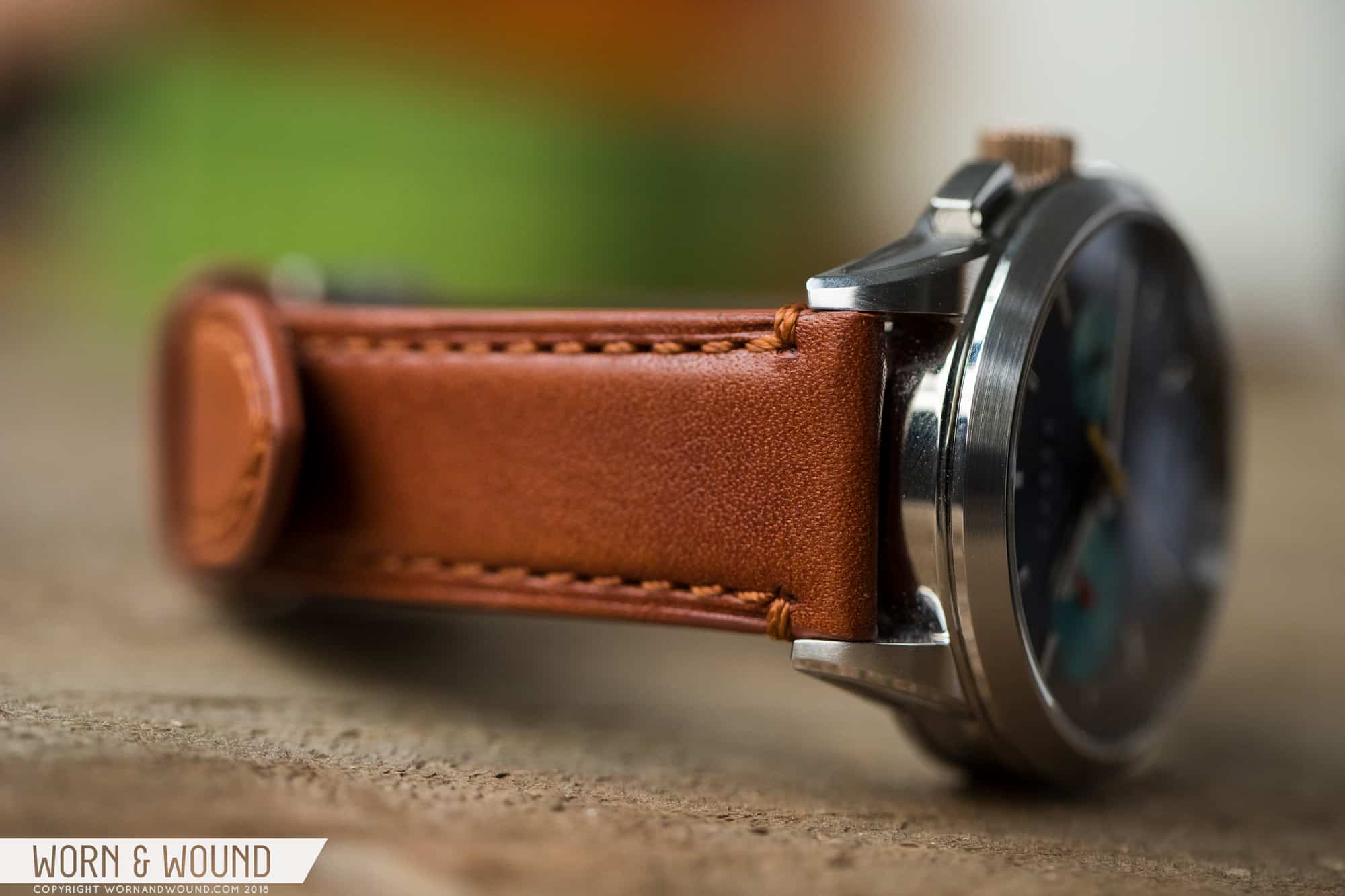
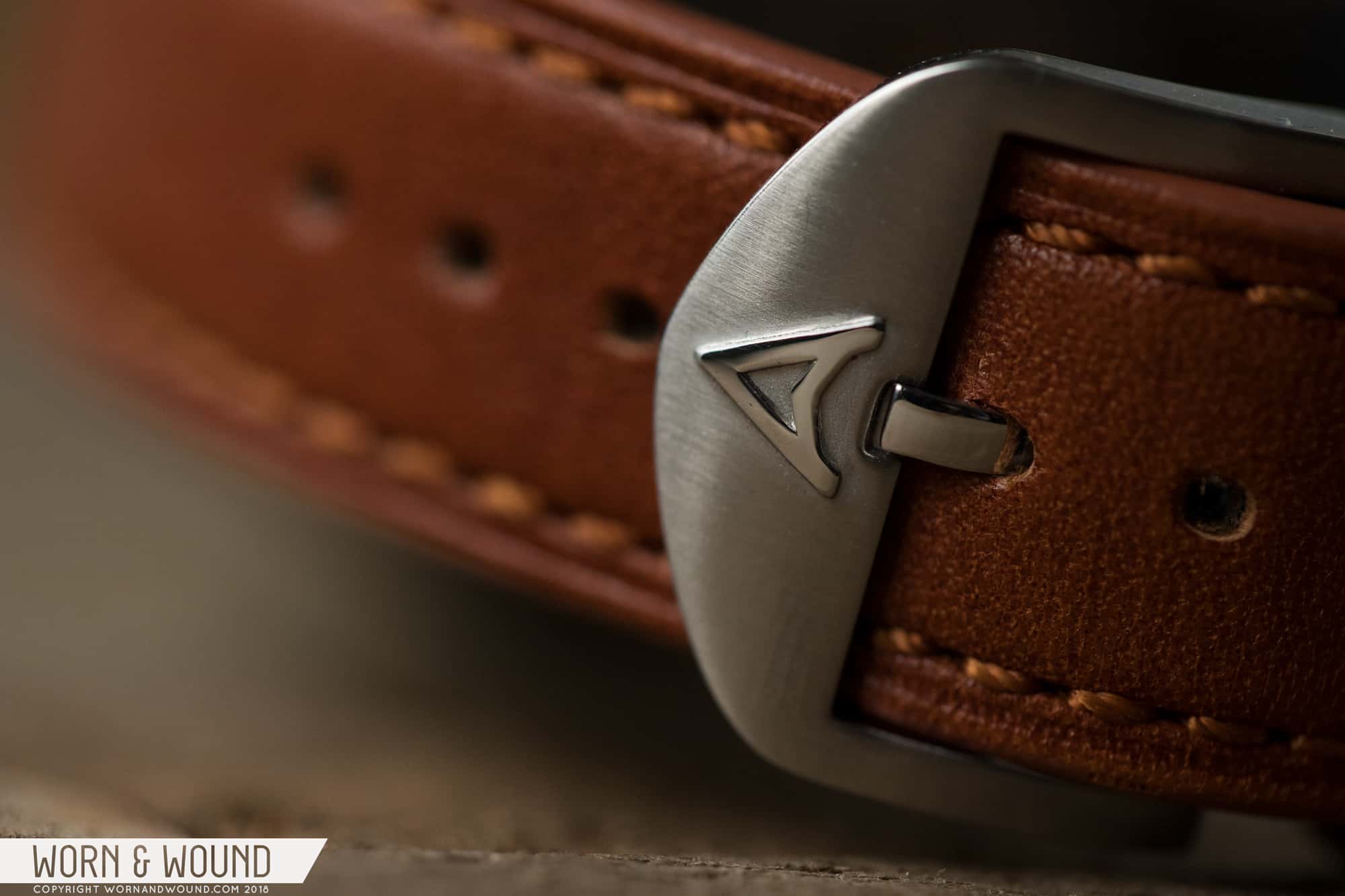
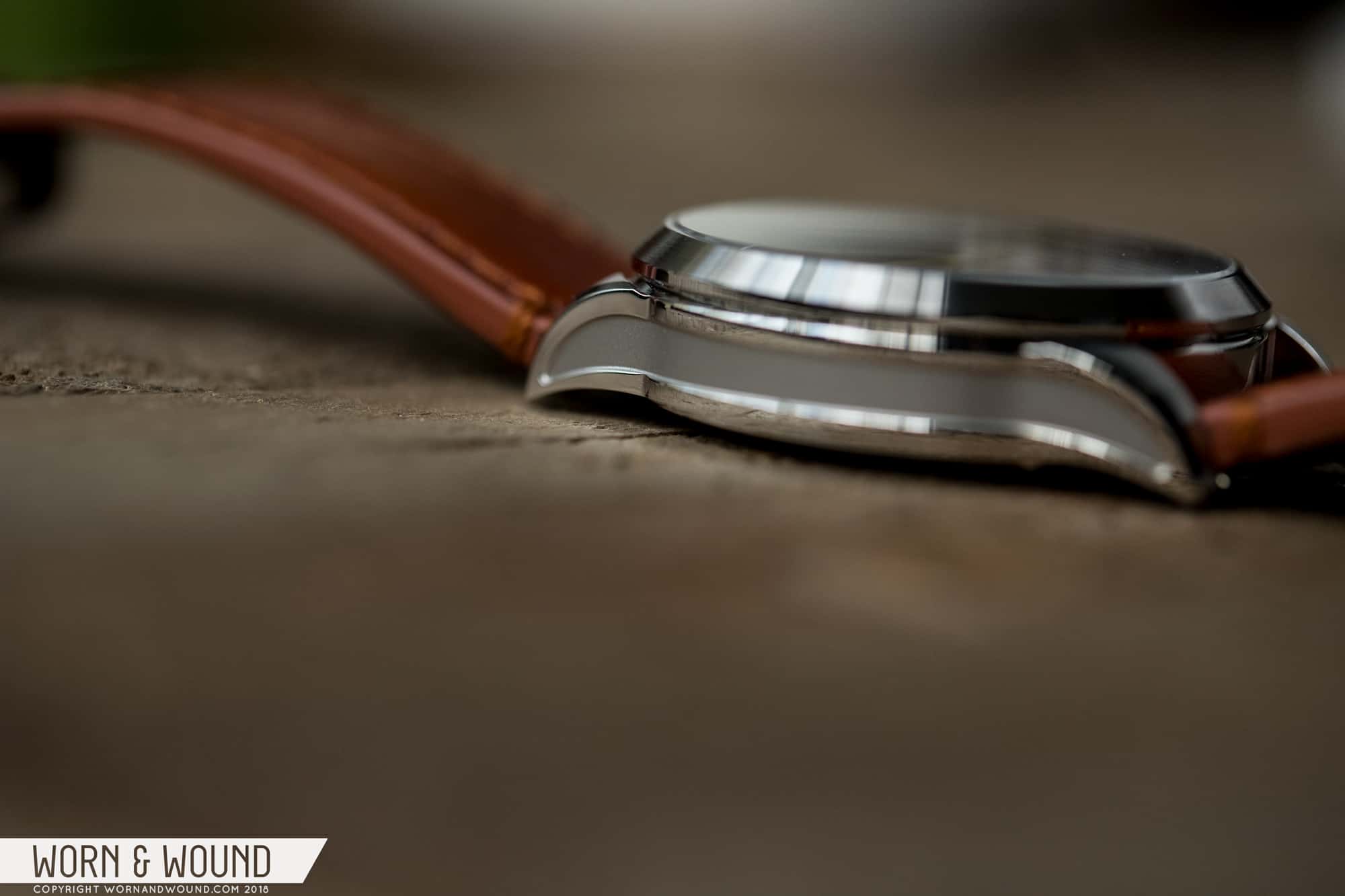
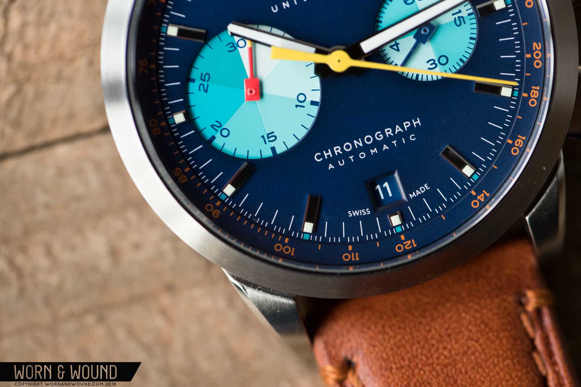
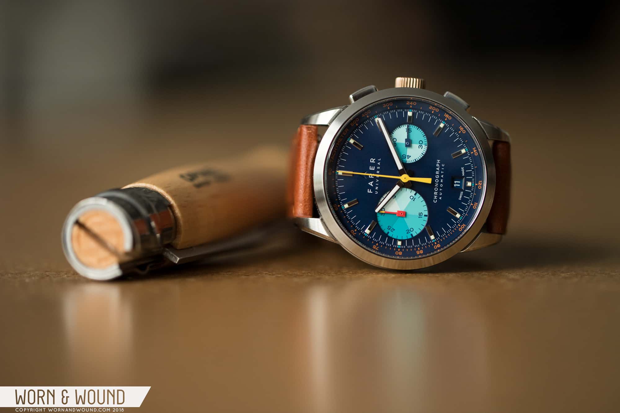
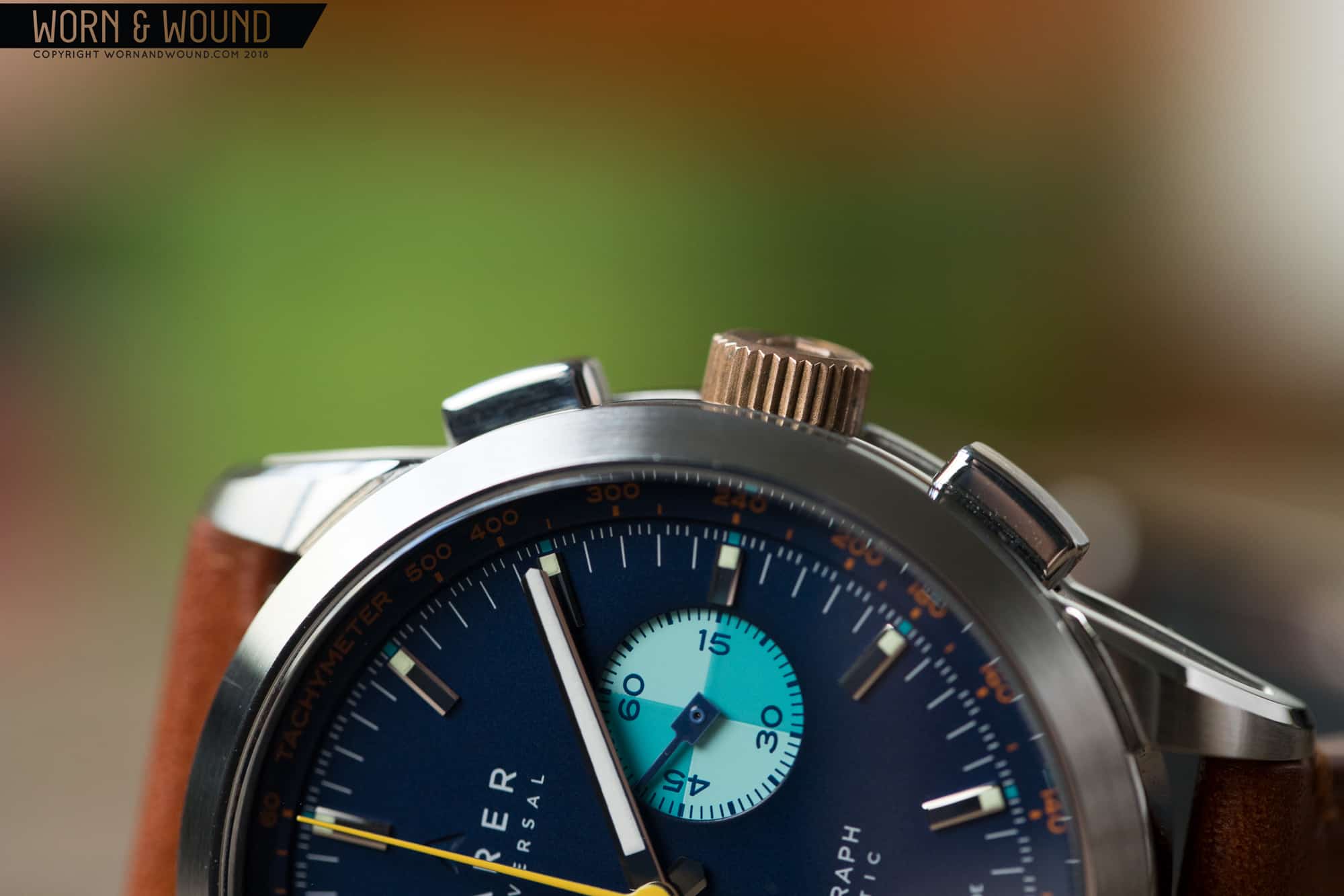
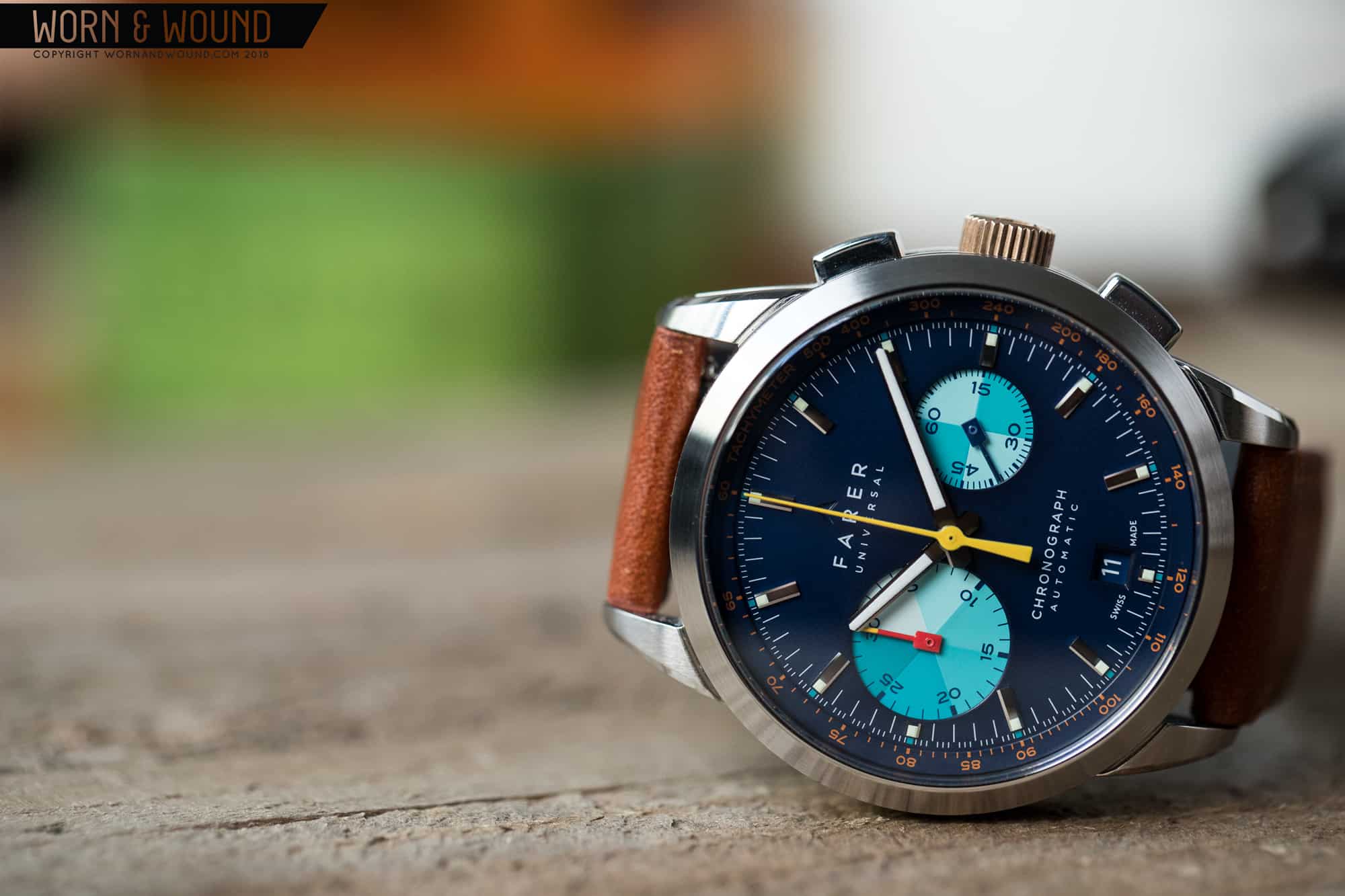
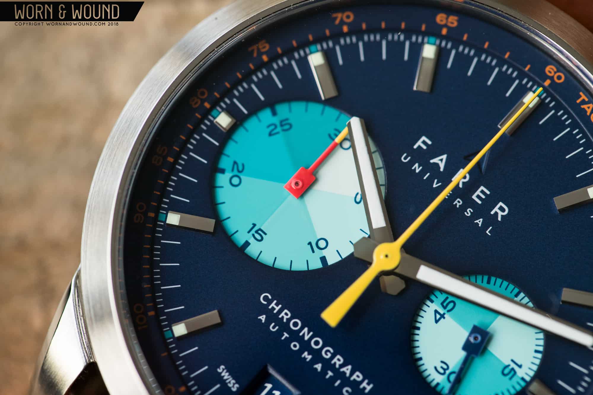
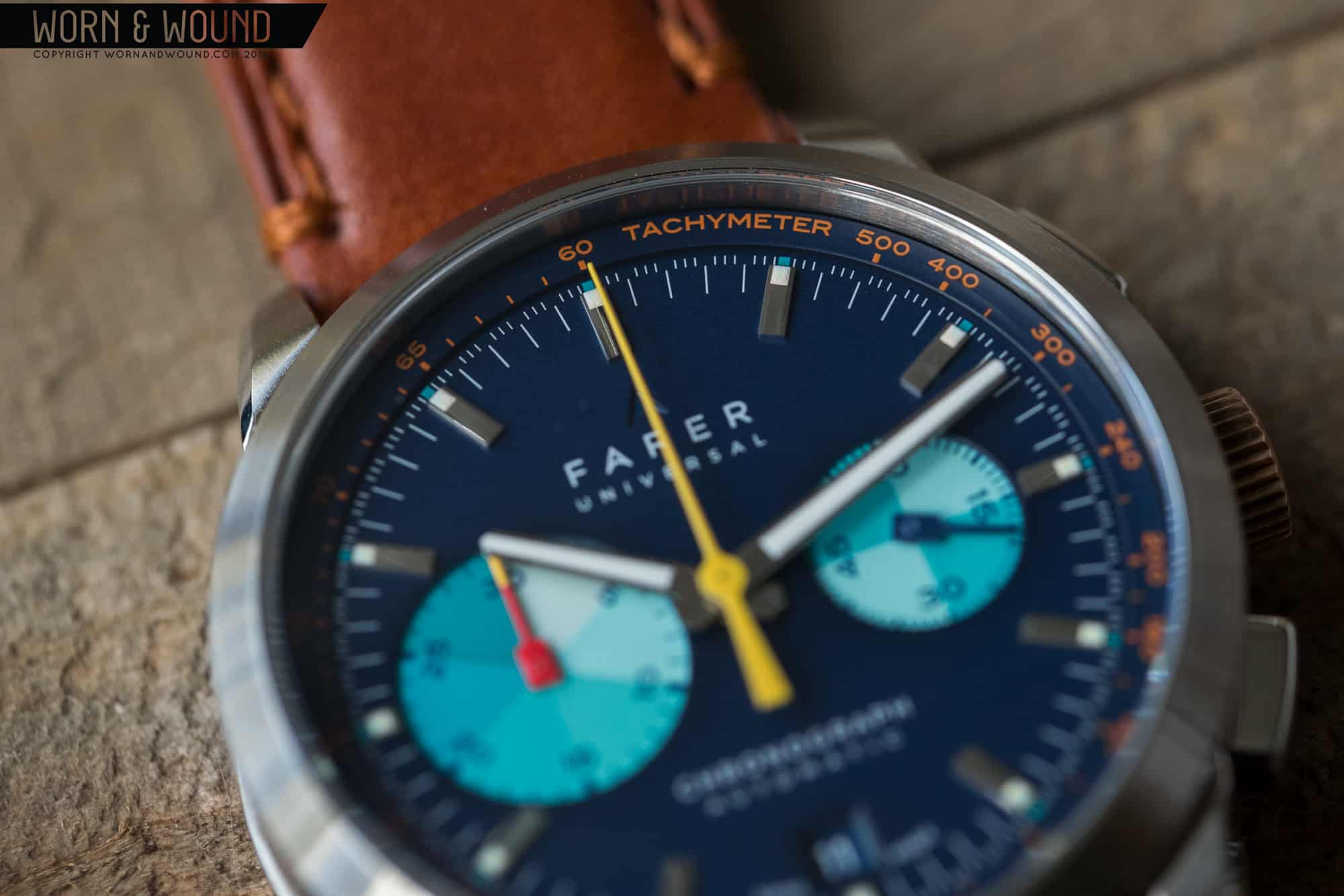
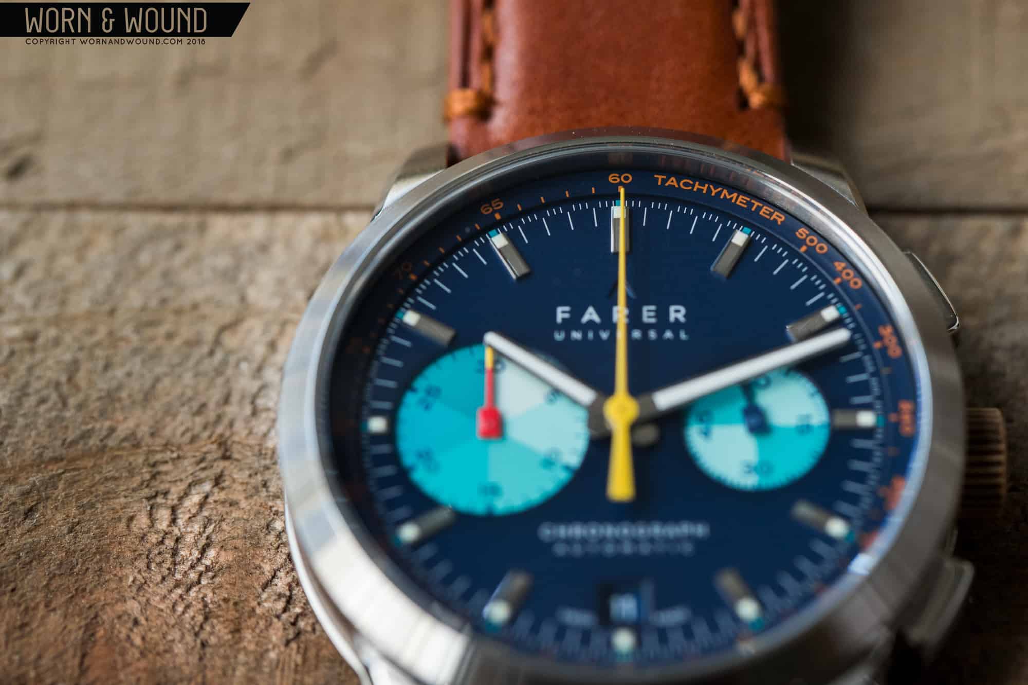
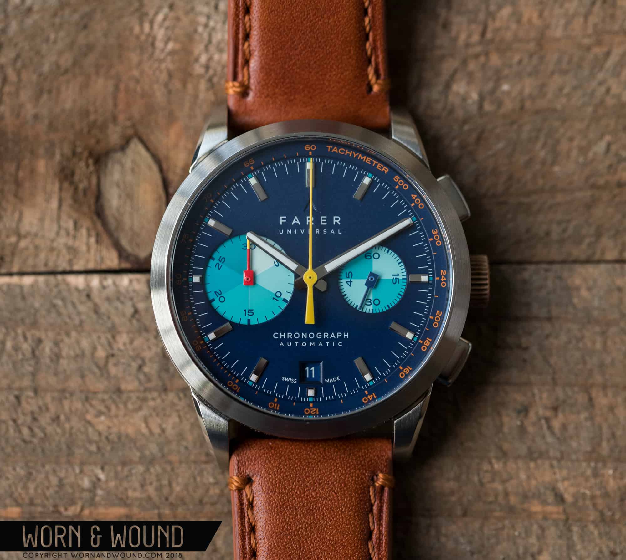
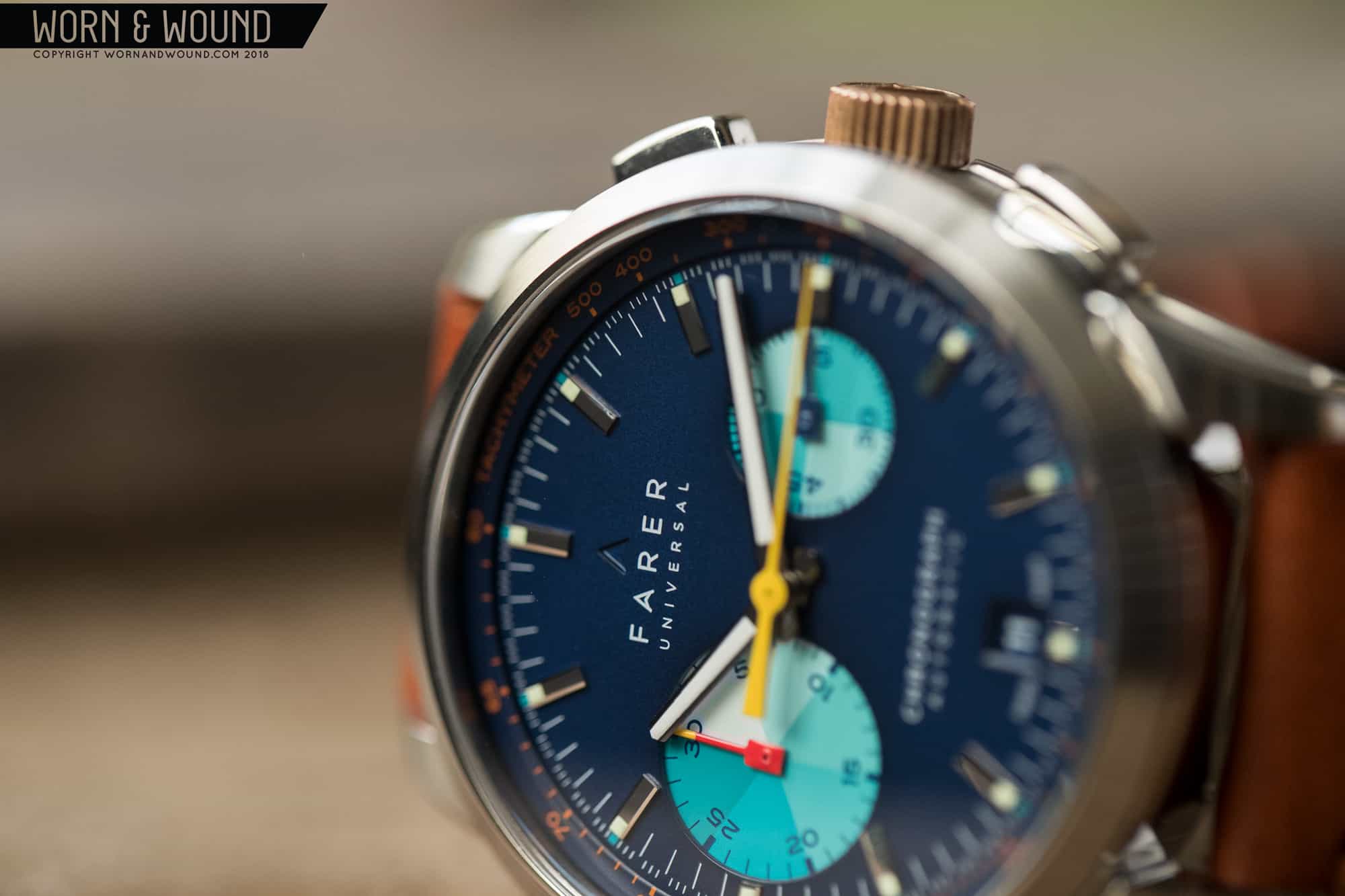
We wrote about that initial release here, and to sum up I’ll just say that we were incredibly impressed with the watches. The team behind Farer, it seems to me, has never taken any shortcuts to get their watches out into the world. Each release has built on the one that’s come before it, exhibiting maturity in design, commitment to quality, and a unique aesthetic that shouts “Farer” from a mile away. The Mechanical Chronograph collection continues in that vein.
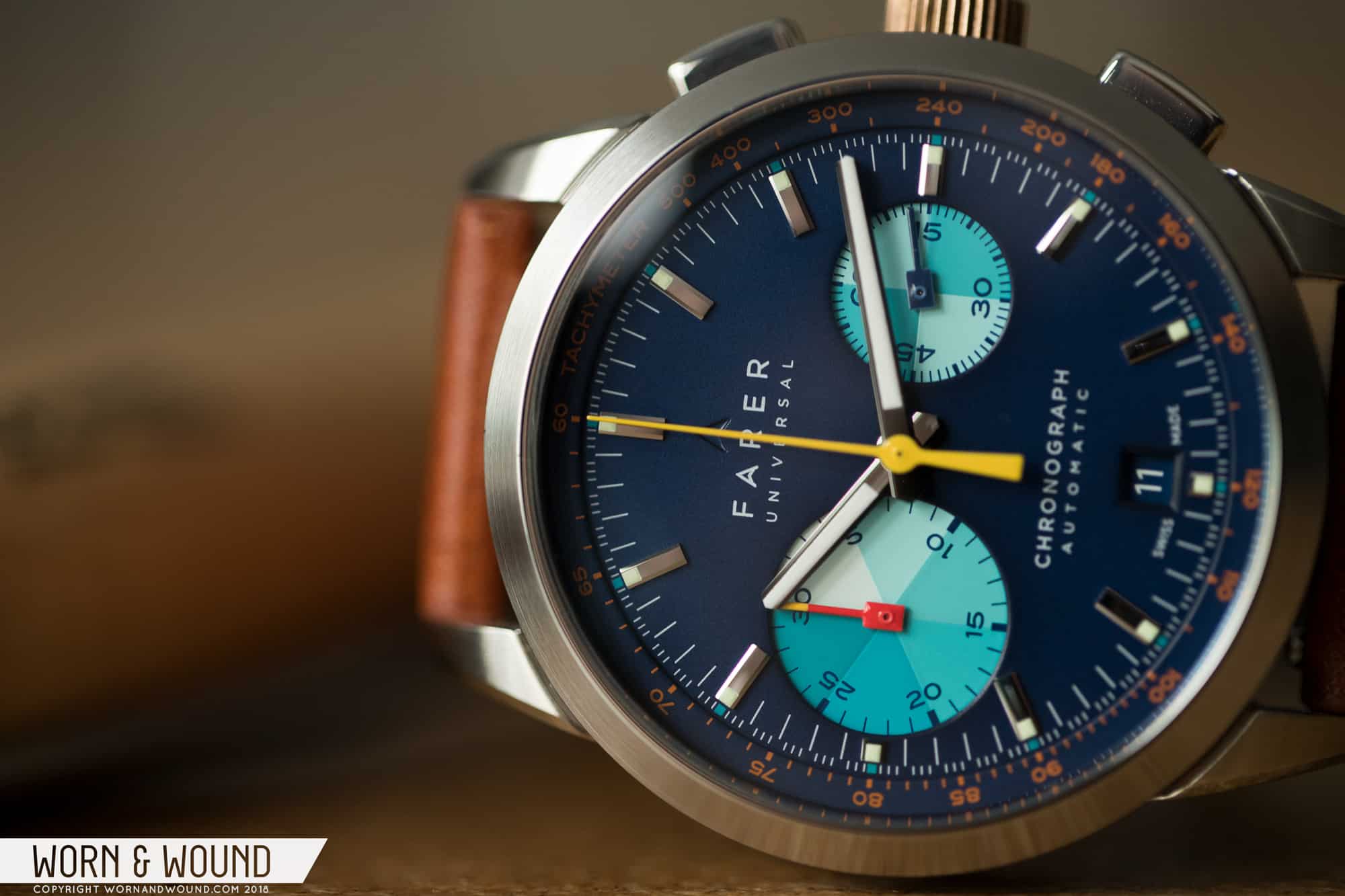
In today’s review, I’ll be taking a closer look at the Cobb, named after British racing motorist John Cobb. Featuring an asymmetrical “big-eye” dial with a distinctive color combination, the Cobb is an immediate eye-catcher. Now that I’ve worn the watch for a couple of weeks, I can confirm that my initial impressions have held up over time; this is a great timepiece—one that’s truly a joy to wear—and it’s so chock full of details that I spent countless moments over the past couple of weeks just admiring the darn thing on my wrist.

Advertisement
$1950

Video Review: Farer Cobb Mechanical Chronograph

Case
Stainless steel
Movement
ETA 2894-2 Modular Chronograph
Dial
Matte Blue
Lume
Super-LumiNova
Lens
Domed Sapphire
Strap
Horween Leather
Water Resistance
100 meters
Dimensions
39mm x 45mm
Thickness
12.5mm
Lug Width
20mm
Crown
Bronze (Push/Pull)
Warranty
Yes
Price
$1950

Let’s start with the case. Farer nailed the proportions. The case measures 39 millimeters across (in my opinion, a sweet spot for a number of wrists), 12.5 millimeters thick (that’s pretty thin for an automatic chronograph), and 45 millimeters lug-to-lug.

Let’s look at the case in profile. Those aforementioned 12.5 millimeters are brilliantly broken up so that the case, which is already quite svelte for a chronograph, feels and looks even thinner. There’s a balanced distribution of the bezel, mid-case, and case back so that no single case element dominates. Furthermore, the cut-outs along the mid-case offer additional visual segmentation so the watch runs no risk of ever looking slab-sided.

All of this ultimately means that the watch wears wonderfully, with the low, down-turned lugs securing the case against the wrist. Furthermore, there’s no bulging case back here, which isn’t always true for chronographs, so there’s no uncomfortable wobble when you’re wearing the watch. Chronograph makers don’t always get these proportions right.

The case features a mix of finishes, with brushing along the bezel; polished surfaces along the bezel edge, mid-case, and inner lugs; and sand-blasting inside the cut-outs. Everything here is neat and tidy with no sloppy lines between finishes.

Light patina developing on the bronze crown.

On the right side you’ll find oblong pushers and Farer’s signature bronze crown signed with Farer’s “A” logo. The pushers feel solid and springy when you engage the chronograph. The crown is tactile, and in my short time with the watch it has already developed a light patina.

Around back, you’ll find a sapphire crystal covering an open aperture offering a view of the caliber within. Now’s probably a good time to discuss the movement—an ETA 2894-2 Elaboré grade modular chronograph.

Oh, no! Not a modular movement!

Hold on. As we noted in this article—in which our contributing watchmaker breaks down the differences between modular and integrated chronographs—modular chronographs have unfairly gotten a bit of bad rap, but they’re actually solid movements. Execution goes a long way here, and Farer doesn’t hold anything back with a full catalog of finishing and bespoke details—like the gorgeous “turbine” rotor rendered in bronze.

The biggest benefit of using a 2894-2 is that it allows the watch to be significantly thinner. The movement itself is nearly 2 millimeters thinner than a Valjoux 7750 (6.1 millimeters versus 7.9 millimeters), and that coupled with some really tight engineering (which in turn allows for impressively razor-thin tolerances) results in a watch that’s not too far off, size-wise, from many three-handers currently on the market. It’s also worth noting that engineering tolerances like that don’t come cheap. Kudos.

A movement you’ll love to show off.

On to the dial. There weren’t any stinkers in the group, but the Cobb immediately spoke to me. I love this dial design, and I especially love Farer’s distinct use of color. The dial is a matte blue, and the inset sub-dials are split into different tones of aqua. Bordering the dial is a raised ring featuring a tachymeter scale printed in a lovely burnt orange, and as someone who is normally not too fond of orange, I’m a bit surprised by how much I love its inclusions here. Sitting near the applied hour markers are aqua-colored squares, obviously playing off of the sub-dials.

The hands are not devoid of color, either. While the main hour and minute hands are painted with Super-LumiNova, the chronograph second and minute hands are rendered in bright yellow and red with a yellow tip, respectively.

The overall design of the dial is exceptional. Even with the show-stopping “big-eye” register, the dial somehow manages to come across as evenly balanced without losing a drop of its playfulness. The segmenting of the sub-dials is a brilliant vintage throwback, and it’s a detail I hope other makers embrace.

Advertisement

The date window, often a point of contention among watch-heads, is so well integrated into the dial you almost welcome it. The wheel color matches the dial, and Farer’s custom approach here really helps the aperture blend into the design. It’s truly well done, and it may be one of the better date windows I have encountered in some time.

A perfect execution of a date window—not something you often read on Worn & Wound.

From a manufacturing standpoint, Farer’s dials hold up to scrutiny. Everything is crisp, neatly printed, and the different levels (sub-dials, tachy ring) are sharp and distinct. There’s no slop here.

The watch comes on a stitched Horween leather strap (available in brown, tan, navy, and black) with light padding, a small taper, and quick-release bars. Overall, it’s a nice strap, and in my time with the watch the leather has broken in nicely. Of course, this watch is undoubtedly a strap monster, and should look great on all manner of bands, from leather to nylon and canvas. I’d be tempted to throw this one on a bund (and I would have had I had one handy). The accompanying signed buckle is of nice quality as well.Altogether, Farer hit it out of the park—again. I’ve thoroughly enjoyed my time with the watch, and this is one loaner that I had a hard time parting with. The Cobb is a superb timepiece, and one absolutely worth its asking price ($1,950). From the unique design to the execution of that design, Farer gets all As, and I’d wager that should you get a chance to check it out in the metal or you decide to buy one, you’ll absolutely agree. Farer

Images from this post:
Related Reviews
Ilya is Worn & Wound's Managing Editor and Video Producer. He believes that when it comes to watches, quality, simplicity and functionality are king. This may very well explain his love for German and military-inspired watches. In addition to watches, Ilya brings an encyclopedic knowledge of leather, denim and all things related to menswear.
ryvini
Categories: