


 Featured Videos


I have a watch that I absolutely love, but hate to wear. This saga began roughly six or seven years ago when I was discussing grails with an equally addicted watchaholic friend of mine. After a short lull in our conversation, he asked me what I thought of MeisterSinger. “Mister Singer?” I queried with a bit of confusion. “No, MeisterSinger,” he retorted with a quizzical look on his face. “They’re the one-handed watch people,” he continued.
I shrugged my shoulders and confessed complete ignorance. It was almost embarrassing. I mean, me?, never heard of a watch brand? Then, without a moment to spare, he blurted out a site address where I could “gaze in awe” at the whole collection. Turned out, unfortunately, that I could buy one there too.
Later that day, I visited the site, and, once again, I couldn’t believe that, in all my many years of watch obsessing, I had never come across MeisterSinger. This was like discovering a whole new species. It was immediately clear that these watches had a distinctive, totally unique design sense that was unlike anything I had ever seen.
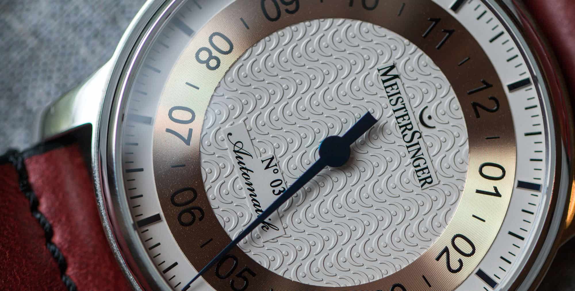
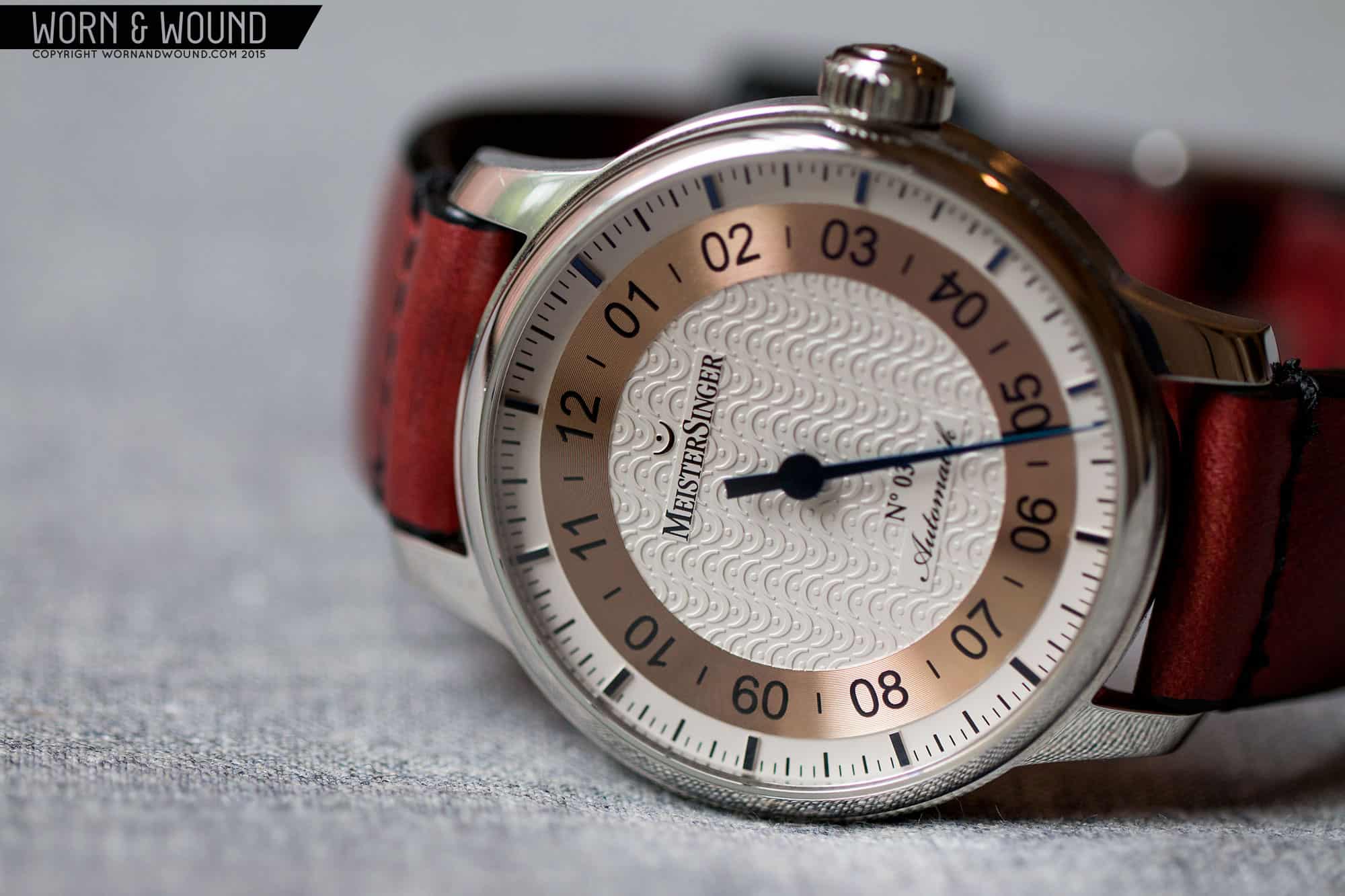
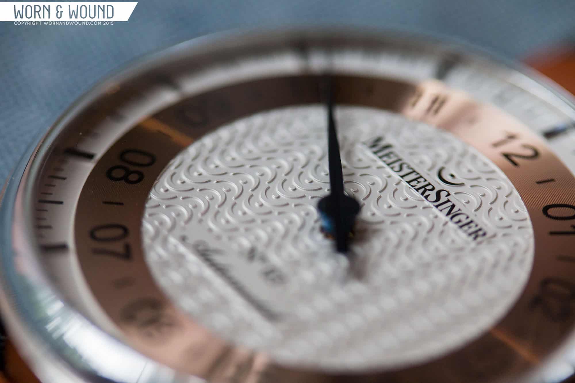
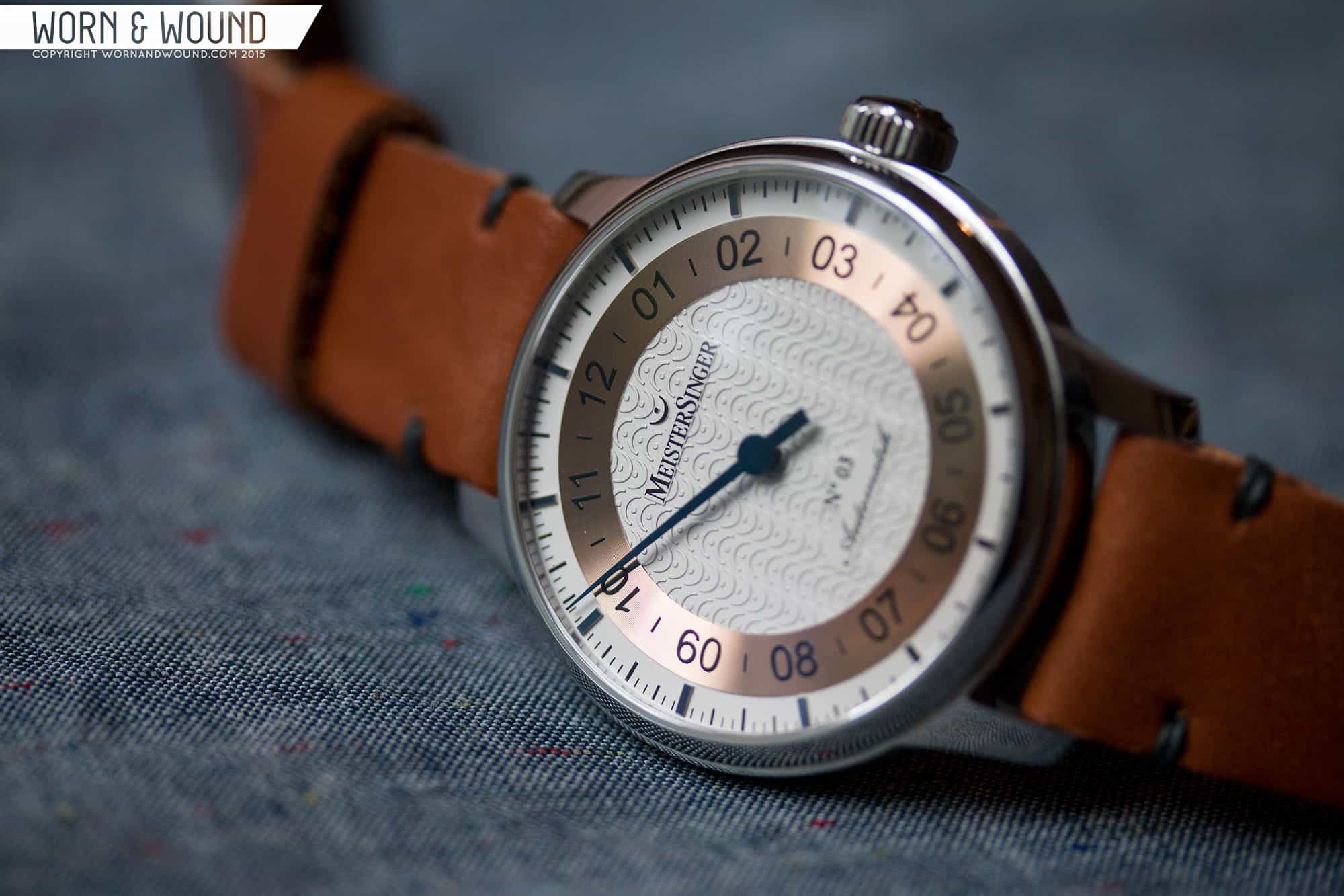
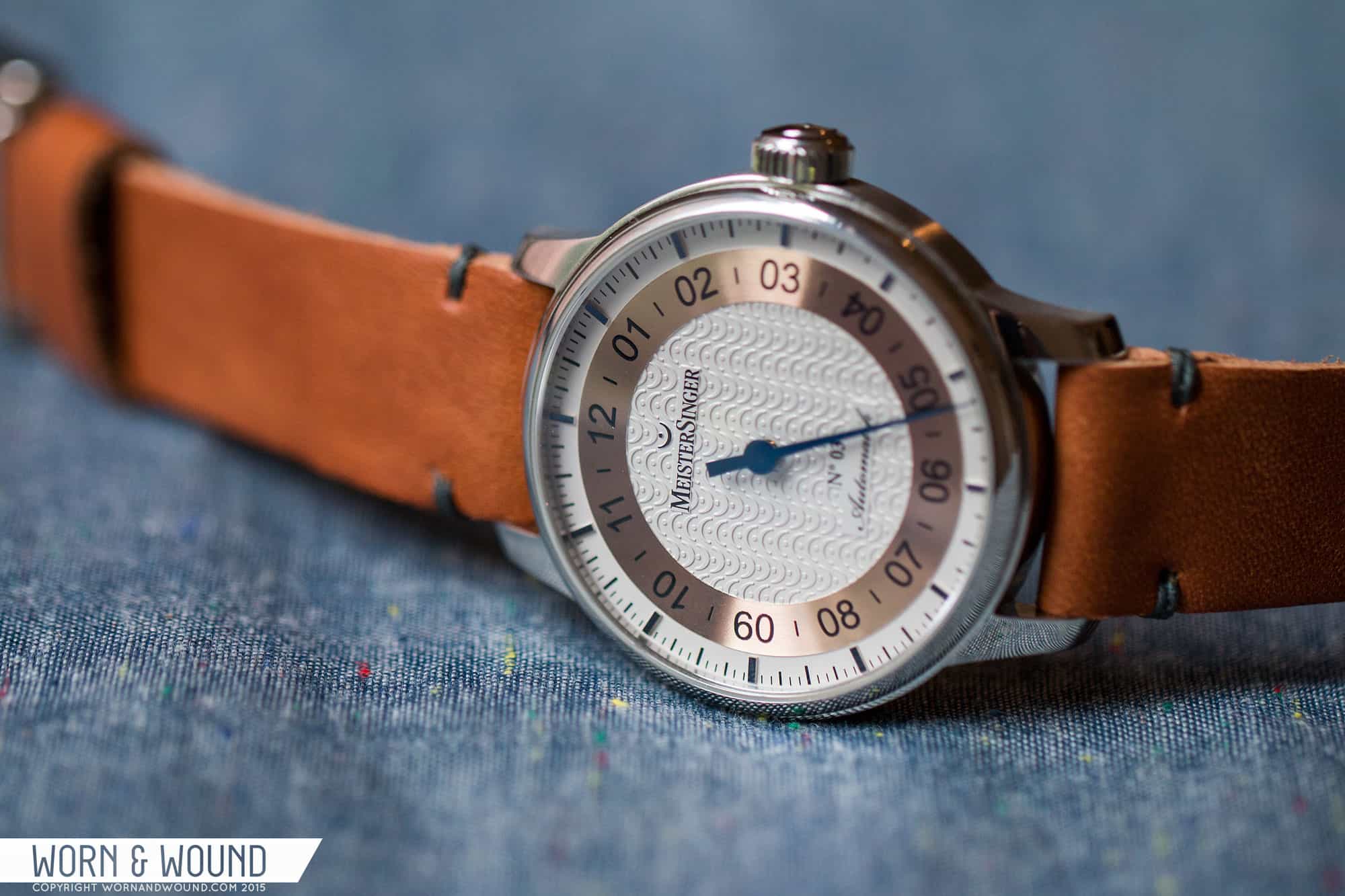
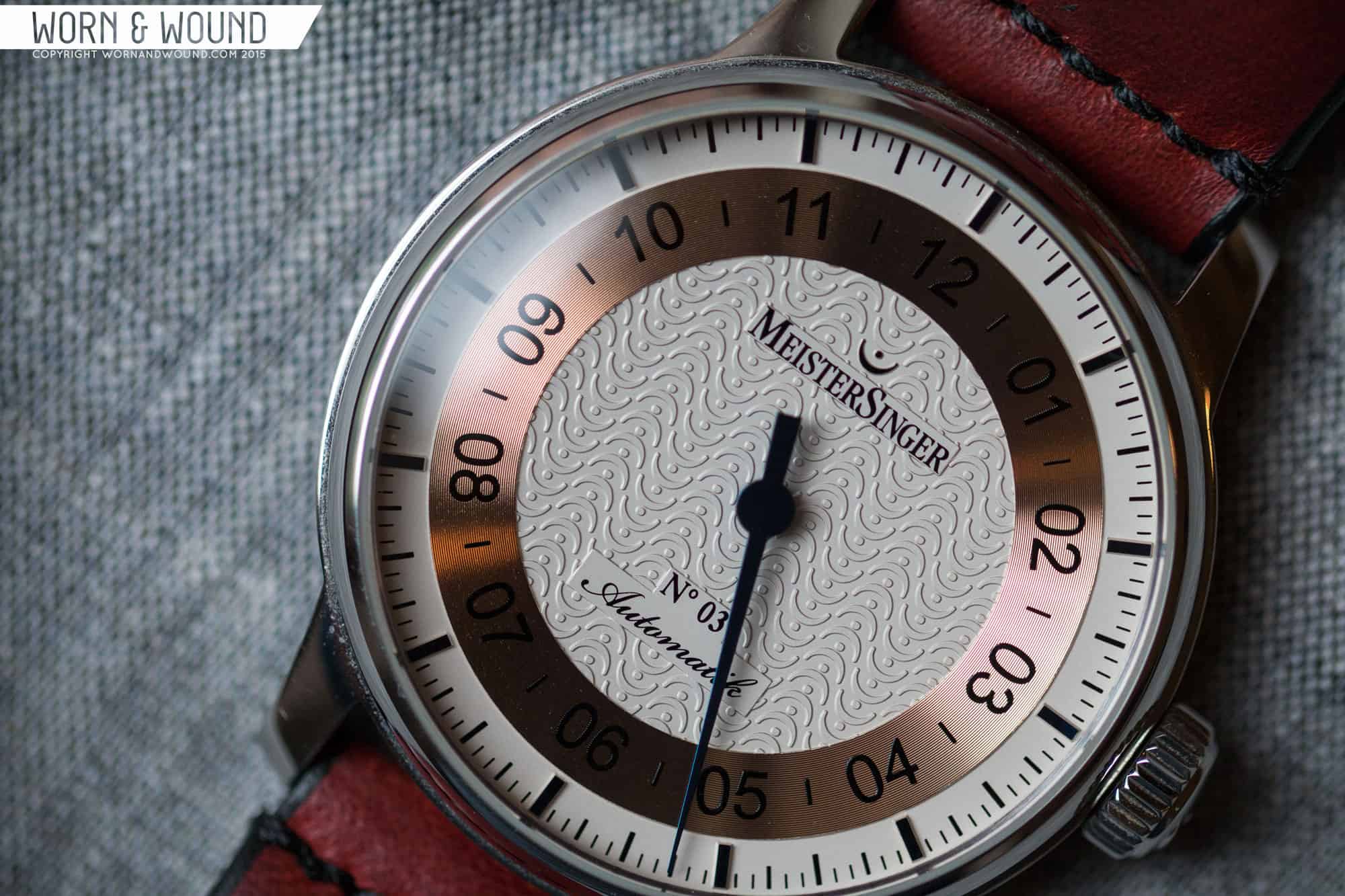
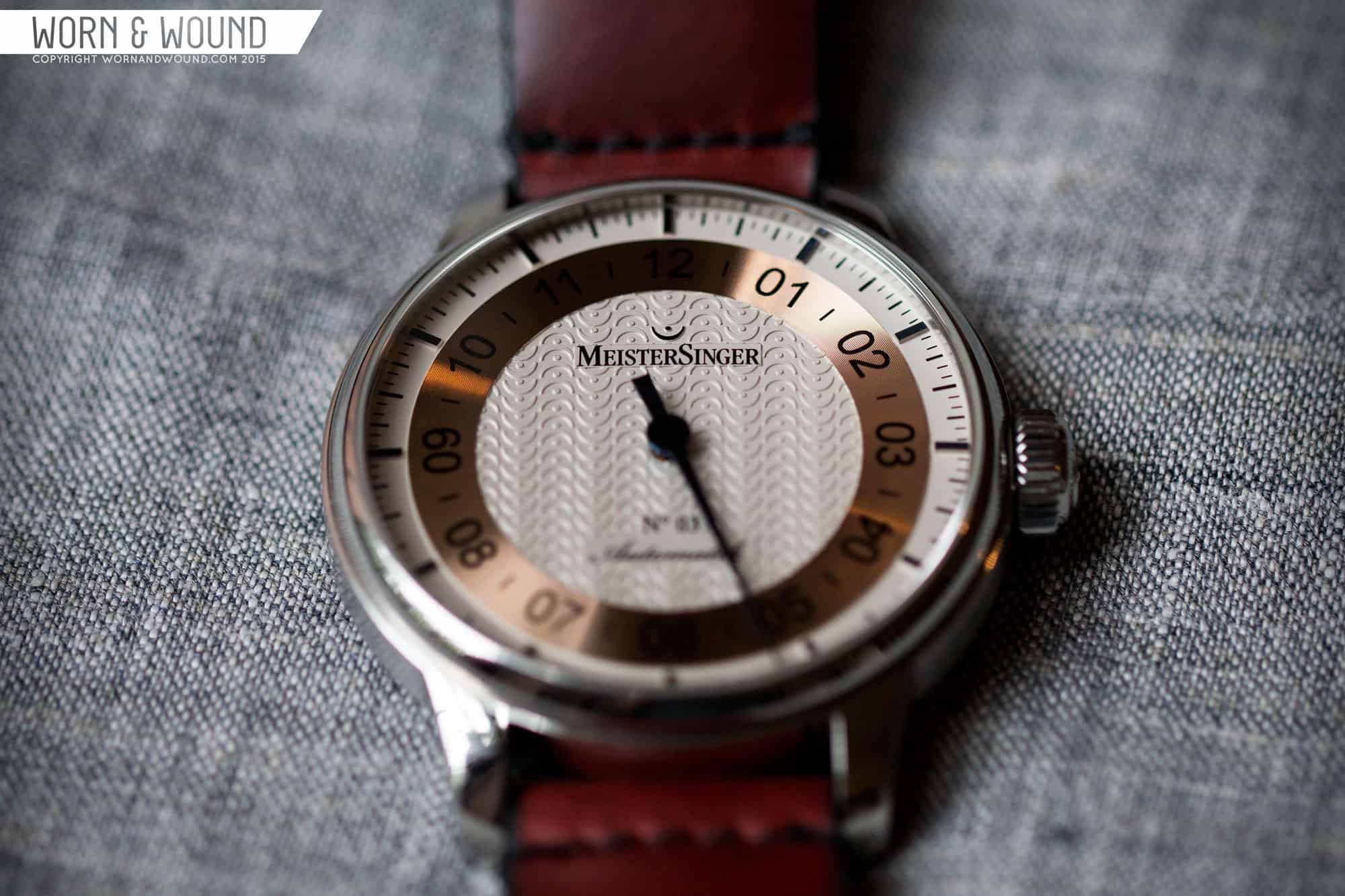
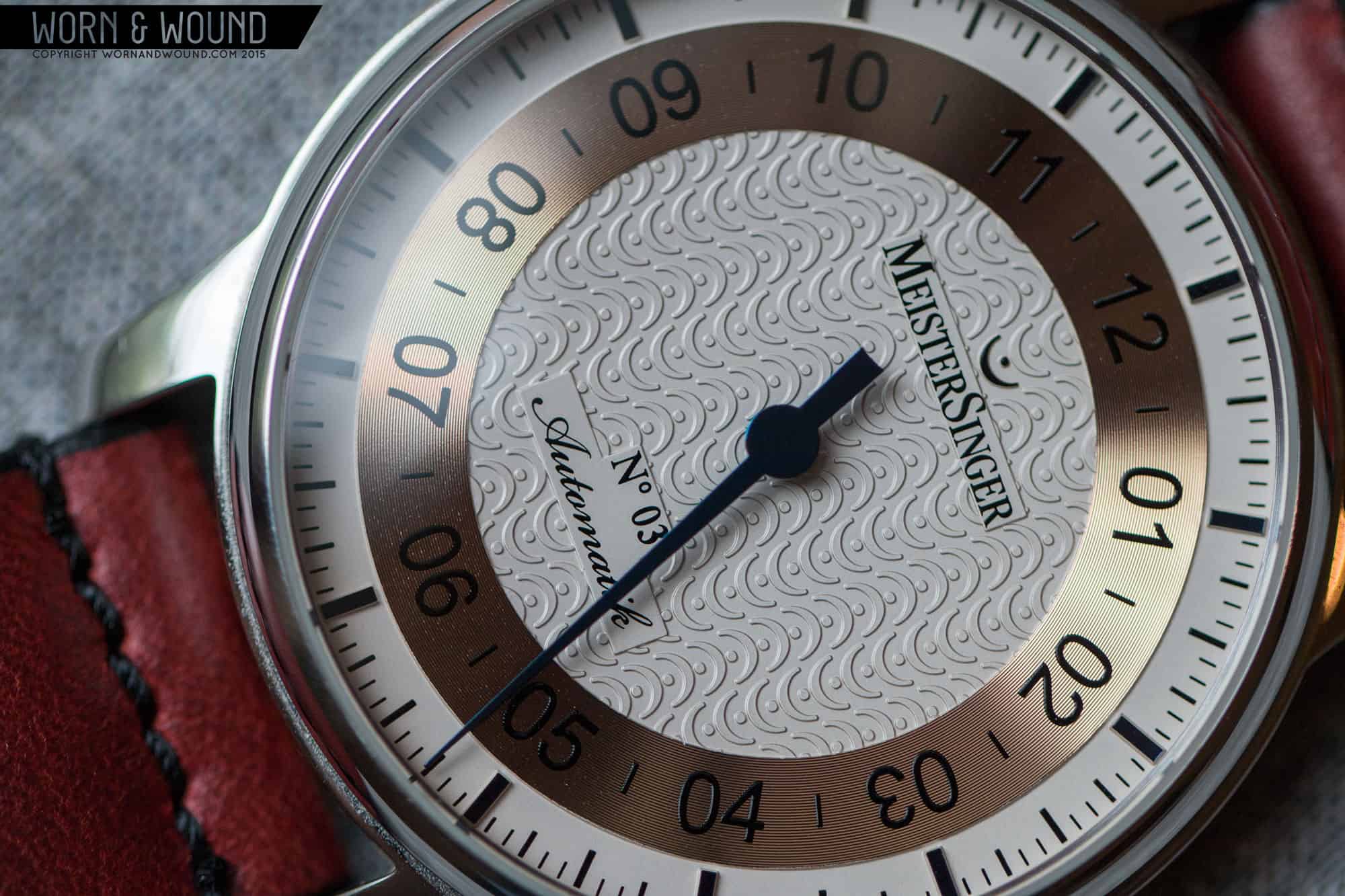
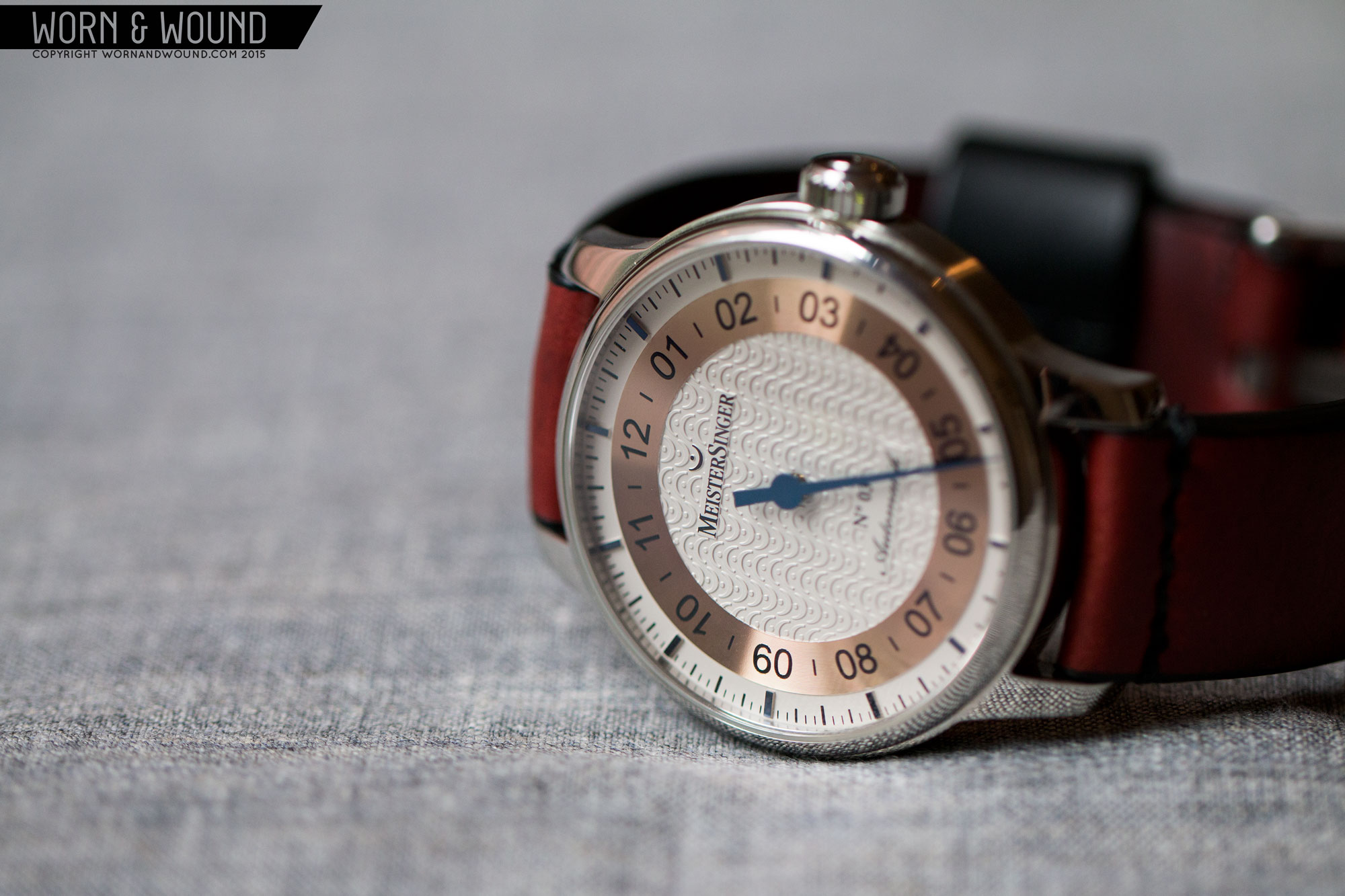
At first, your eye goes right by the case, which is a relatively standard affair. Fortunately, the classic styling and minimal bezel do nothing to detract from the dial, which grabs all your attention. Now, the collection features many dials with a wide range of graphic treatments, but they all share a pleasingly simplistic, sparse aesthetic with lots of empty space. What pulls each dial together is that bold, deeply blued single hand that says that this is a serious instrument for calculating time. In a way, the watches reminded me of a singularly purposeful utility meter, which I found just too compelling.

So, between a graphic approach that completely seduced my senses and an interesting new way to tell time, I was thoroughly hooked. Since this was so absurdly different from all the other watches in my collection, I could easily rationalize buying one. There are many reasons to persuade yourself to buy a watch, but this one was perfect. Not a moment of guilt. Yet.
After agonizing over the wonderful selection, I chose a limited edition style with a bit of flair. Look at Zach’s photo, and you’ll see the copper ring insert that houses the hour numerals. Within the ring, you’ll also see a continuous pattern of logo symbols in relief. Normally, I absolutely detest self-aggrandizing logo treatments, but this was different in a very tasteful way. I also happen to like their symbol, the Fermata, which is the pause symbol in musical notation. As you’ll soon learn, “pause” is the key word here.

When the watch arrived, and I hastily ripped open the package, one look at it assured me I had made a spectacular choice. It was magnificent in every way, far more so than the one-dimensional site photo. This was a finely-crafted, superbly detailed piece of machinery – from the contrasting polished and satin case to that wonderful, deep blued hand. It had a reassuring weight to it, and turning the hefty crown was an interesting experience: With a normal watch, the dominant minute hand turns quickly, but, being the Meister’s hour hand, it turns slowly.
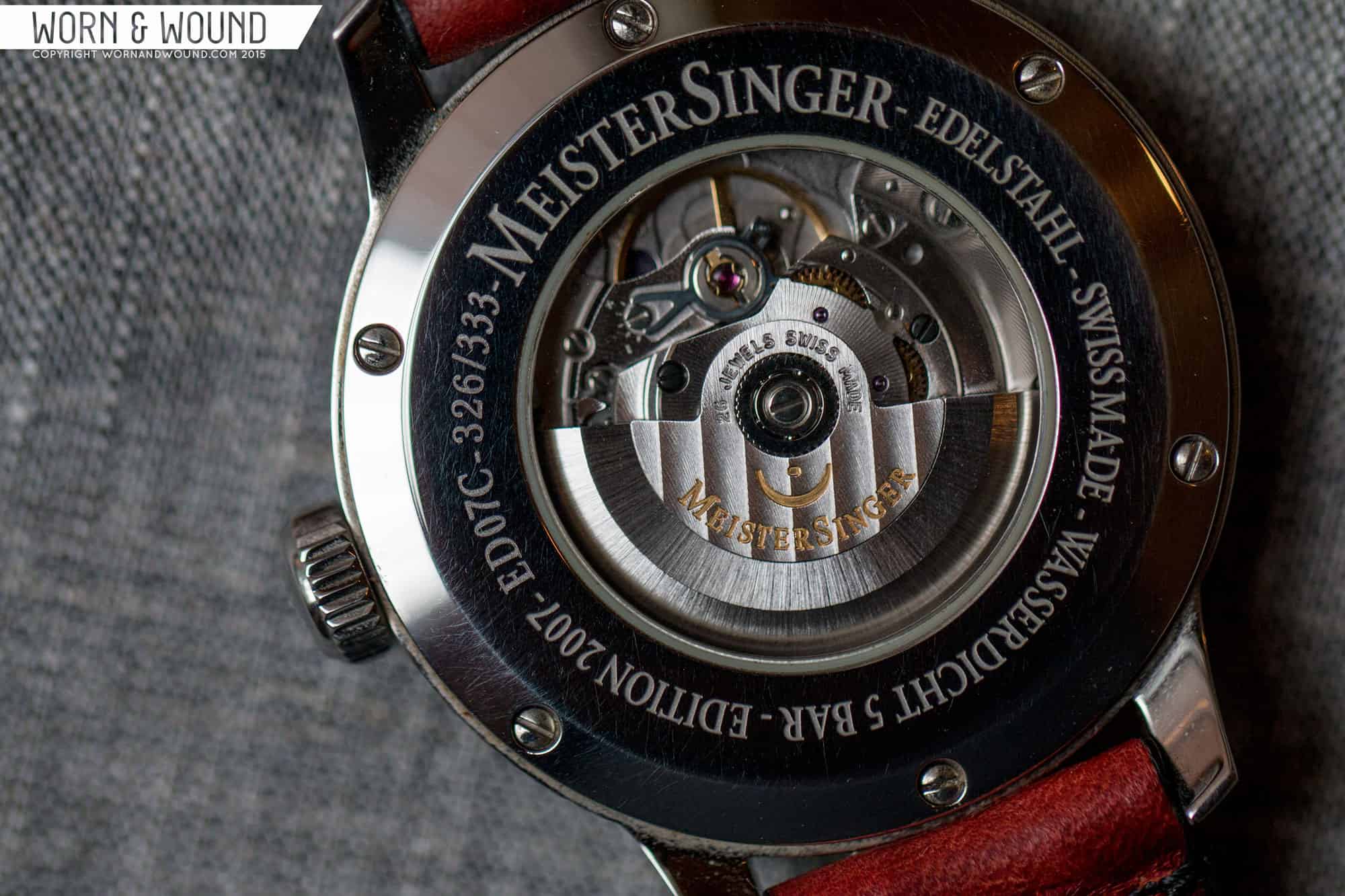
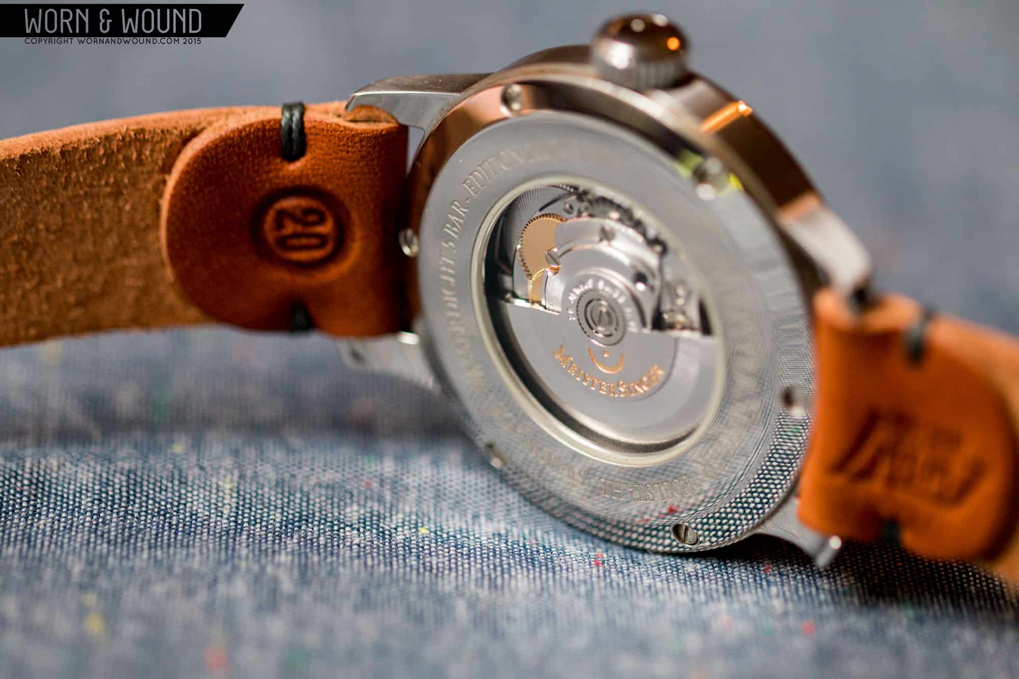
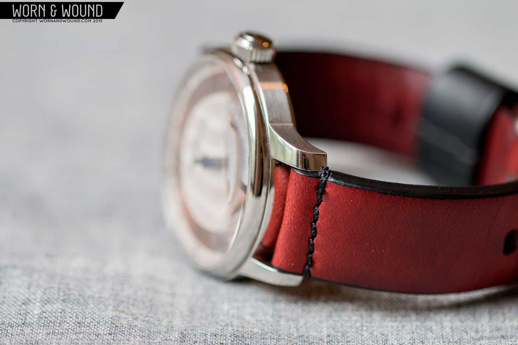
(Obligatory specs: 43mm X 10mm, yet very comfortable for someone who prefers 38-40mm. Lug width is 20mm. The engine is an automatic ETA 2824. The crystal is domed sapphire that, from an angle, pleasantly distorts the dial. Screwed-in exhibition back with sapphire window. Original strap was a smooth black calf which lost out to a Crimson worn&wound. Blah blah blah.)
When I strapped it on, I went through the usual ritual that we all practice when wearing a new watch for the first time. I spent a large part of the day admiring it on my wrist from every possible angle in all lighting conditions. It even looked great in the mirror and partially hidden under my shirt cuff. Every now and then I’d check the time, and found the one-hand method peculiarly interesting. But, as more time passed, “peculiarly interesting,” devolved into peculiarly annoying.
It became sadly apparent to me that I couldn’t tell time with any reasonable accuracy by quickly glancing at the dial. And that’s my life-long, normal method. Sure, I can lovingly stare at a watch for long periods of time, but a quick glance at the angle of the hands is how I’m conditioned to calculate time. I don’t want to pause, as in Fermata, every time I want to read my watch. It’s just too damn frustrating. Even setting it with any means of accuracy is very difficult because time is divided into five minute increments. The whole thing became a chore, albeit a beautiful one.

What’s more, the dial is virtually impossible to read in dim lighting, such as during a movie, and it’s dangerous while driving. Thousands of people wear one-handers, and probably have no problems. But not me. I’ll admit that it’s pretty cool that MeisterSingers were inspired by the early days of horology in the 17th century when most clocks were one-handers. Of course, most of them were probably off by a few hours, and at least 90% of the population couldn’t tell time anyway.
According to Manfred Brassler, MS’s founder and designer, “The idea of a single-hand watch embodies an attitude of relaxed, self-determined time perception.” Well, Manny, I don’t have a relaxed attitude, and I’m not that self-determined. However, that’s my own personal problem, and it is not meant to demean your philosophy or your superb collection of watches.
So there you have it: MeisterSinger, one of my life’s most frustrating conundrums. This is the first time in my collecting career that I’ve purchased an extraordinary watch that I hate to wear. Of course, I definitely wear it every now and then, and find staring at that gorgeous dial simply irresistible. But do I love this watch? Absolutely! Not.
