Welcome to the New worn&wound

Ladies and gentlemen, we’re beyond excited to announce the newest version of worn&wound! As you probably immediately noticed when pulling up the site today, things look a bit different. Well, they are actually very different. For our fourth version of w&w, we worked with a very talented duo, Jesse Rosenfield and Kyle Mac, to rebuild the whole site from the ground up. This isn’t a re-skin, it’s a whole new build, one that has been designed and coded to work better and be faster. We also put an emphasis on making sure the mobile experience is top notch for you readers-on-the-go.

mobile_review_1

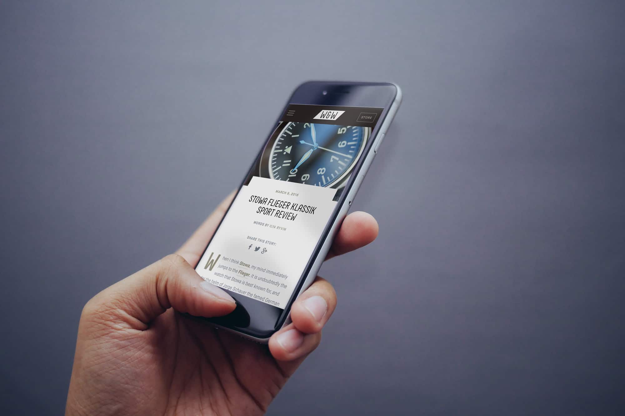
For the aesthetic, we stayed true to what we think is most important. It’s minimal, with a focus on  clean lines and imagery. As with our previous sites, we’ve wanted to make sure the w&w is a unique experience. So, expect the new site to have some cool features and design elements you wont find elsewhere. But more over, the design is meant to celebrate and elevate the content and the watches we talk about.

Homepage + Content

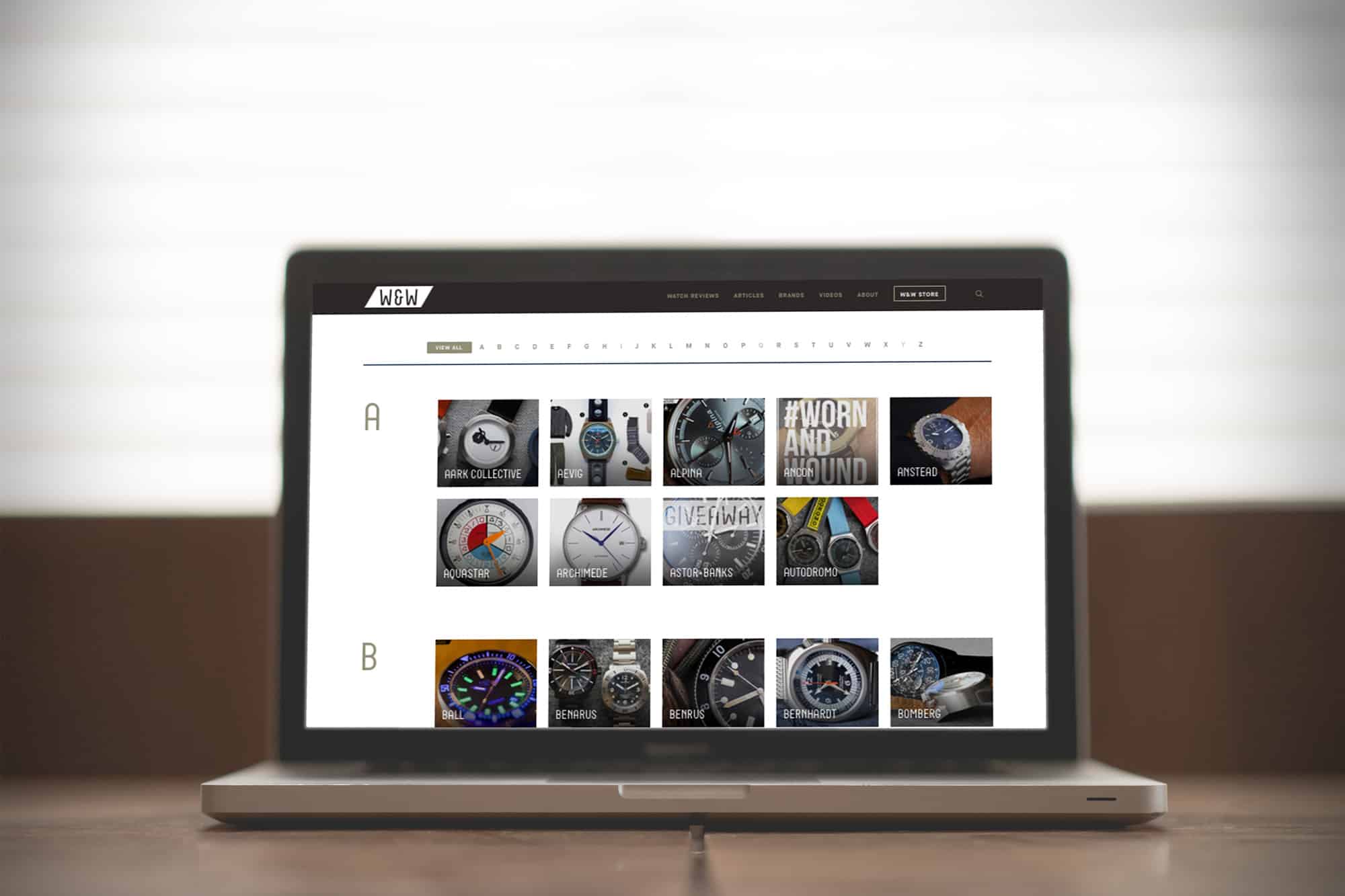
Diving right in, the homepage opens with our cover story section, presenting the day’s lead story and following 3 stories with bold images. That might be all you need, but if you wish to dig deeper, below you’ll find our dynamic news feed, presenting recent articles in an attractive layout.

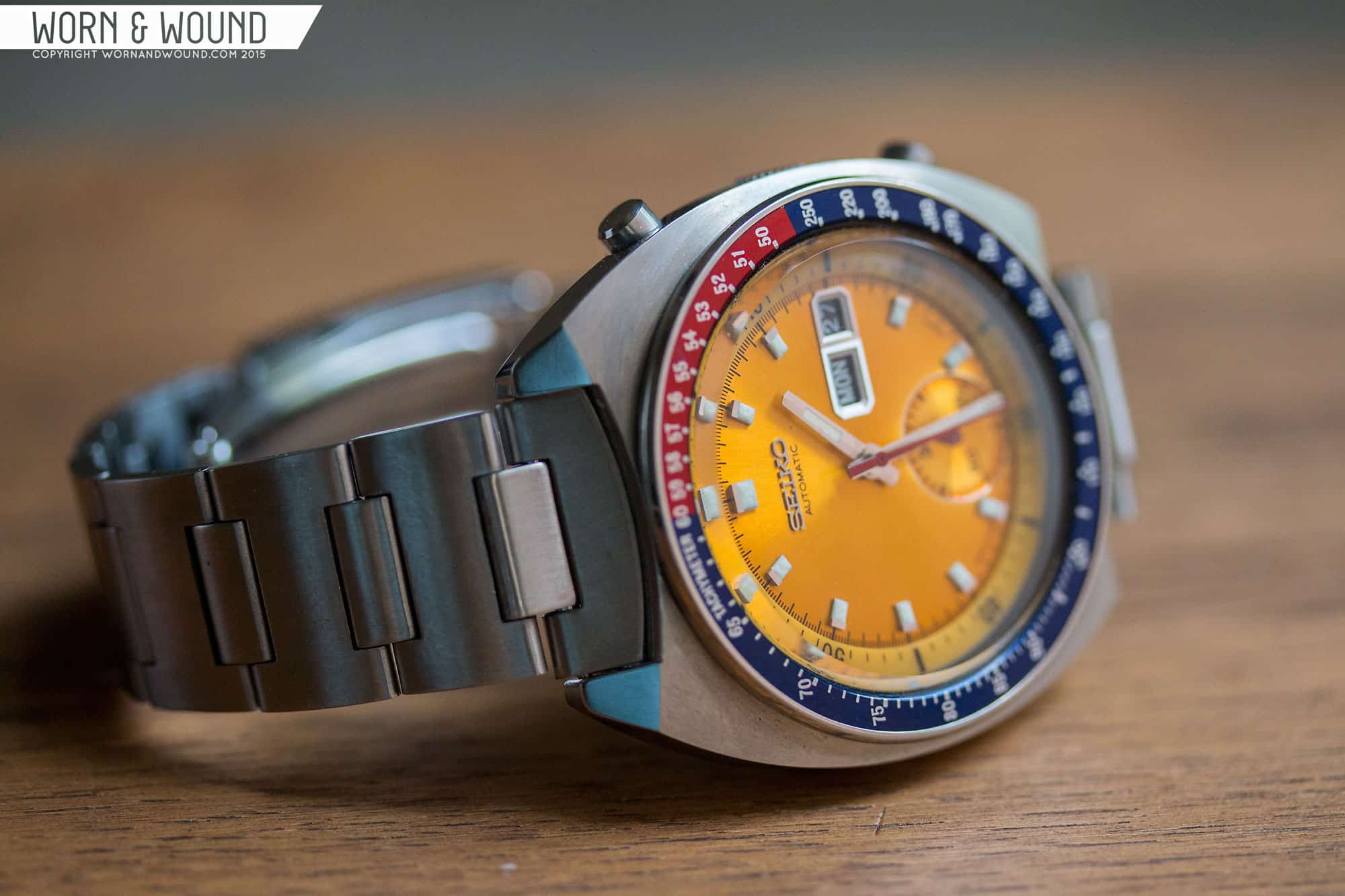
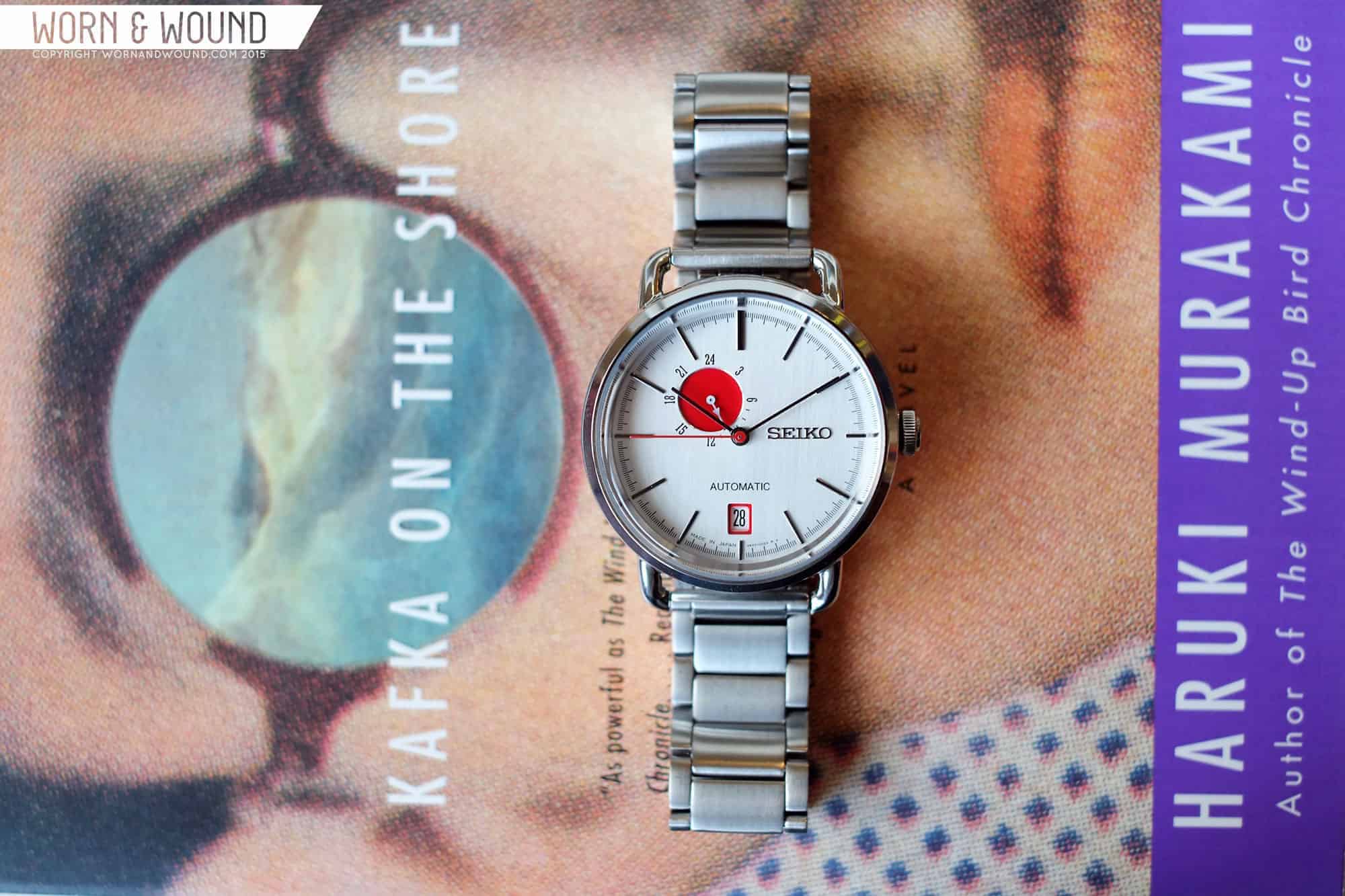
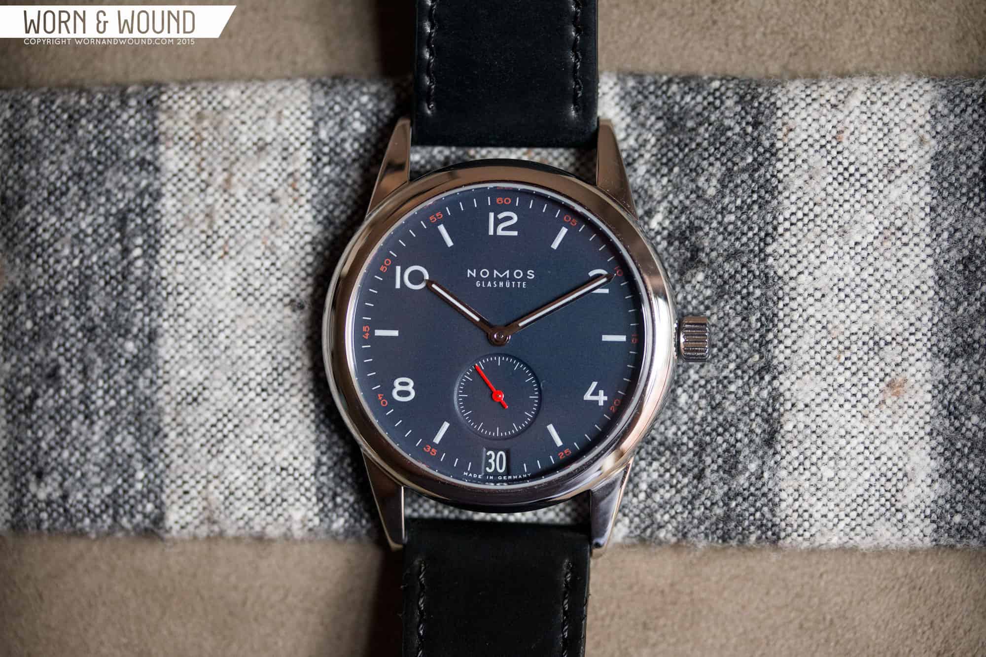
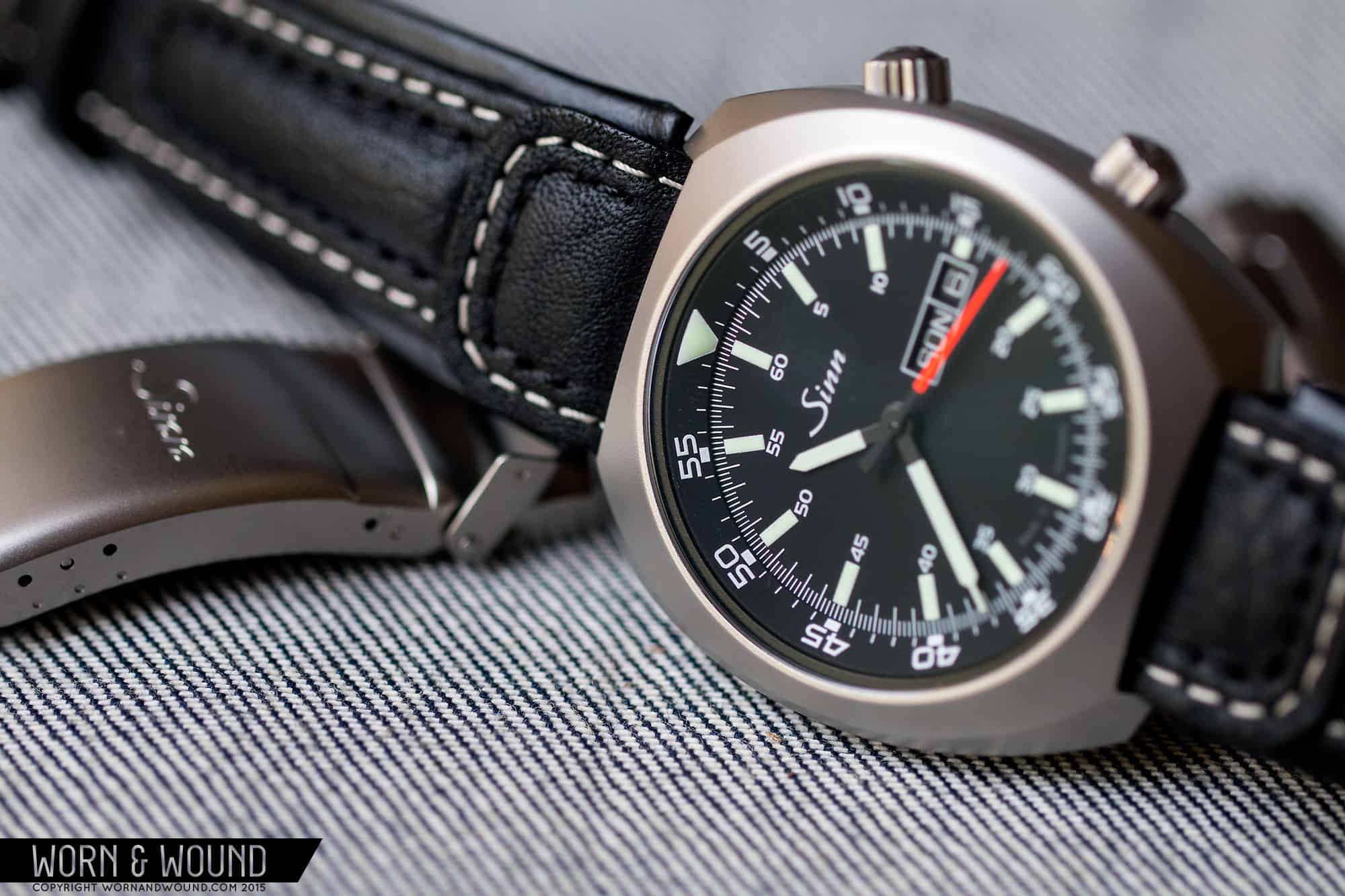
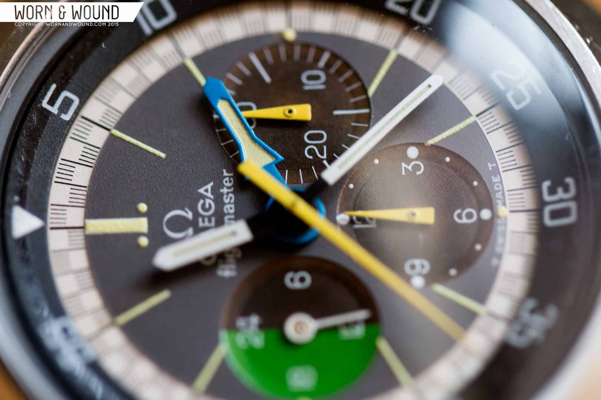
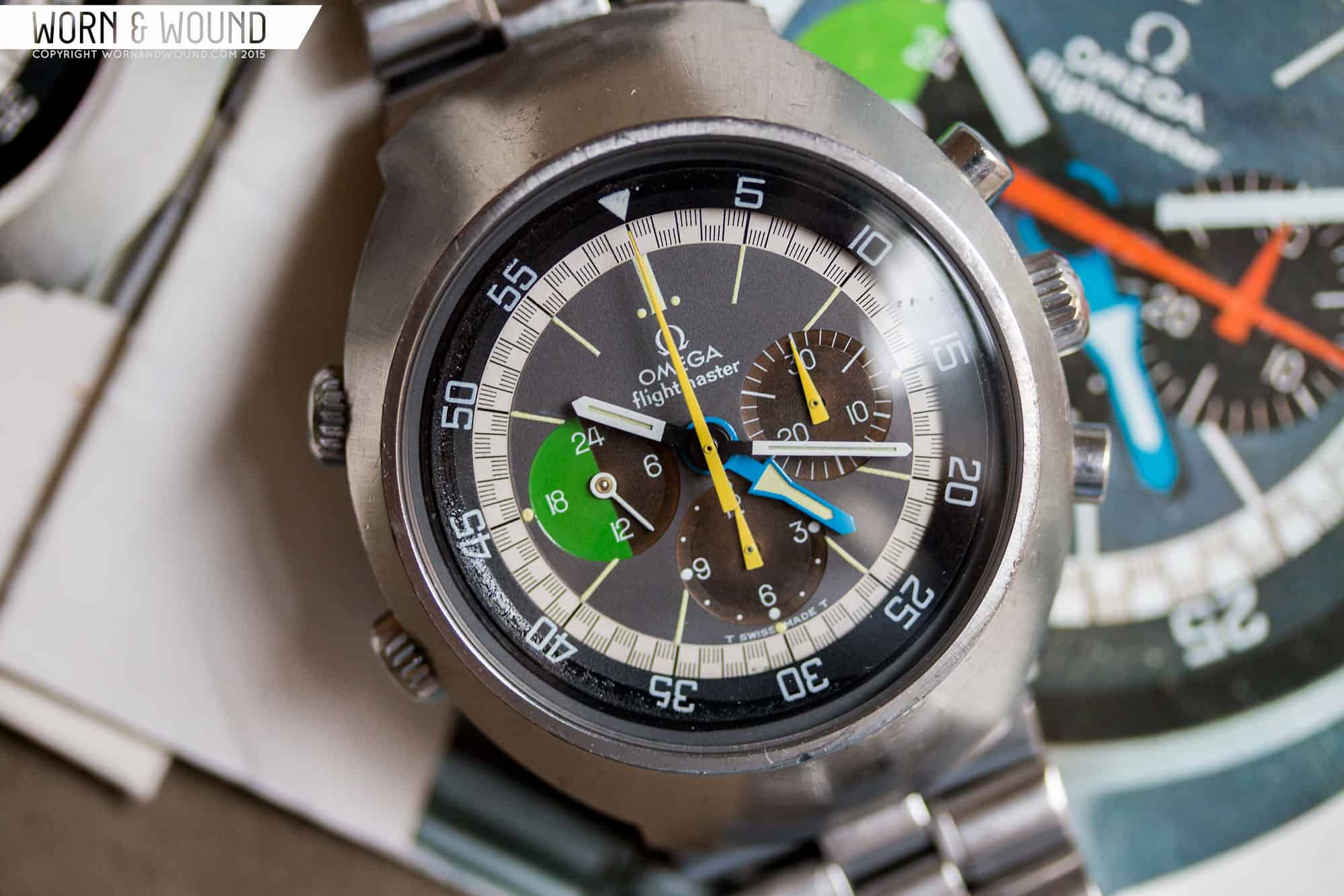
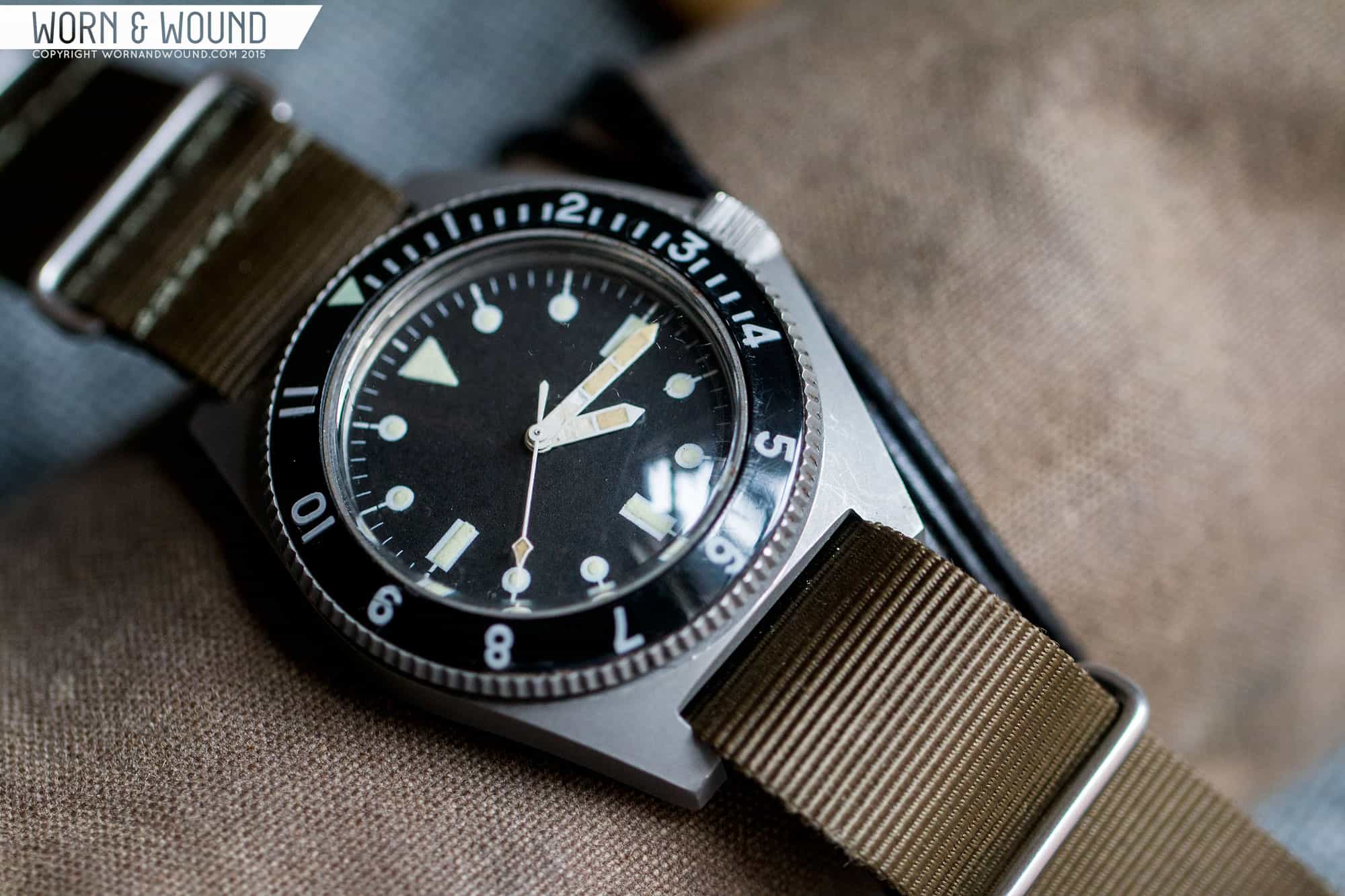
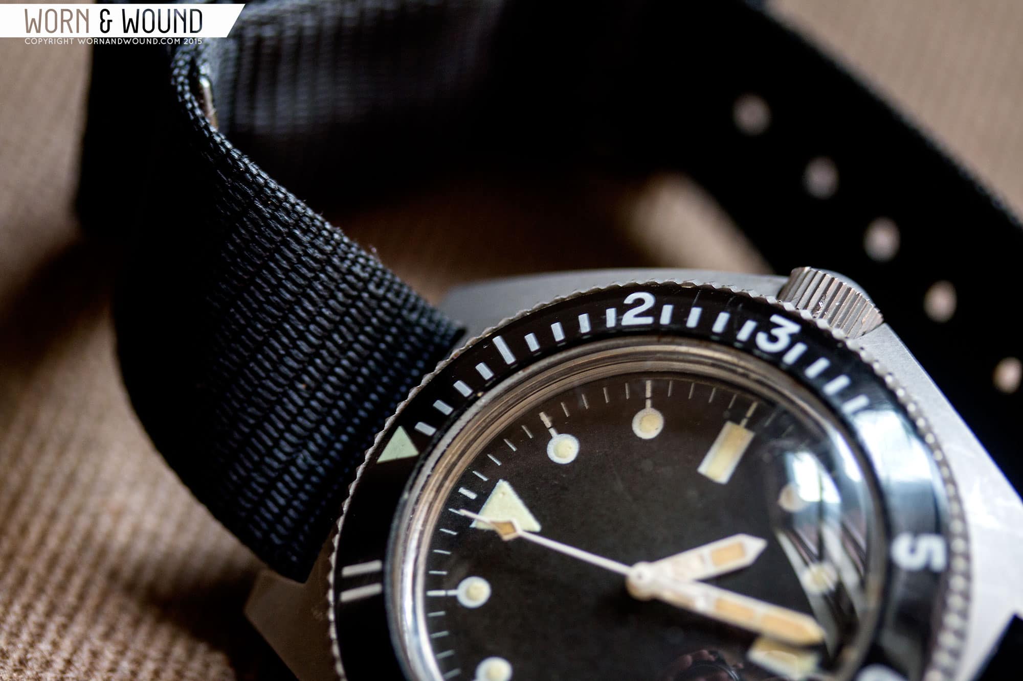
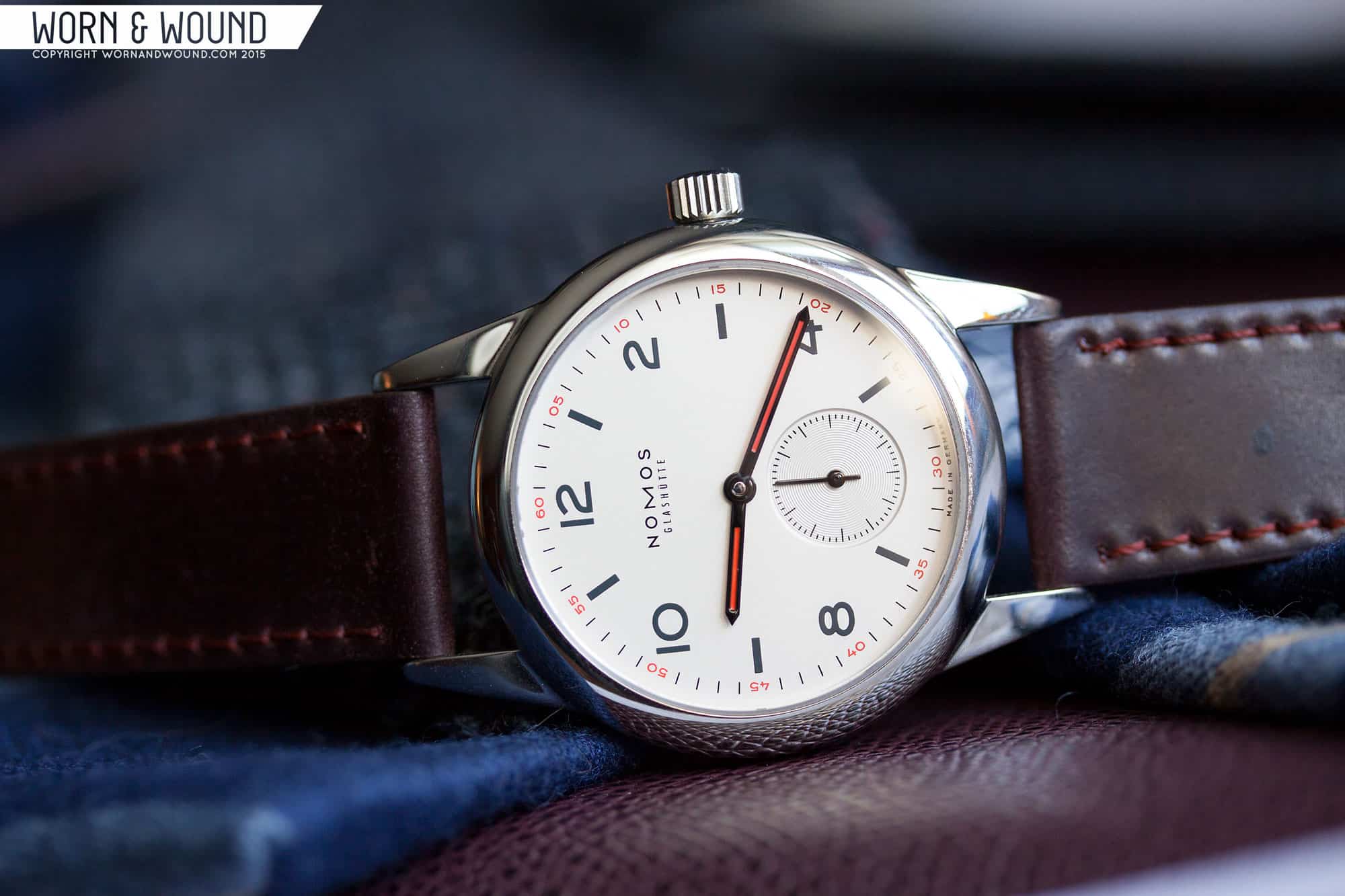
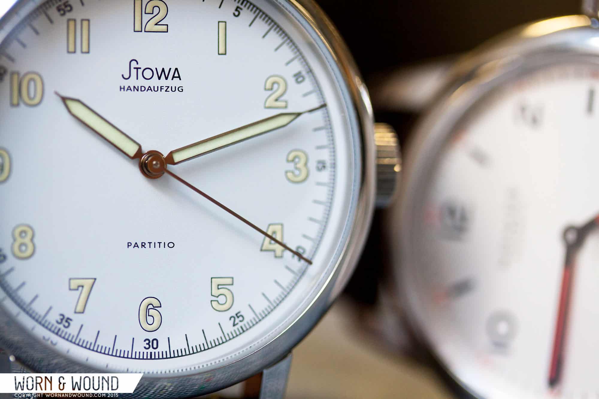
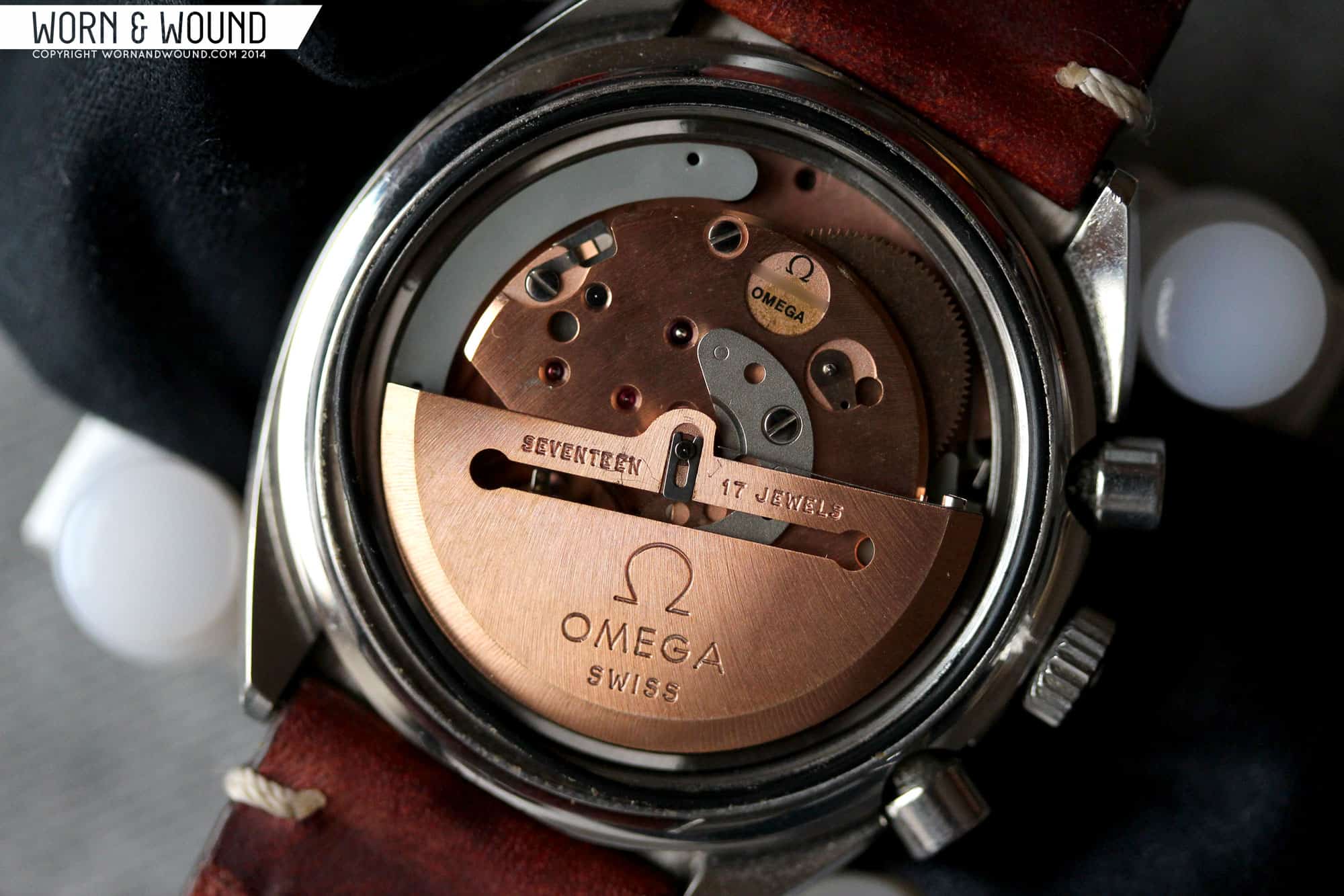
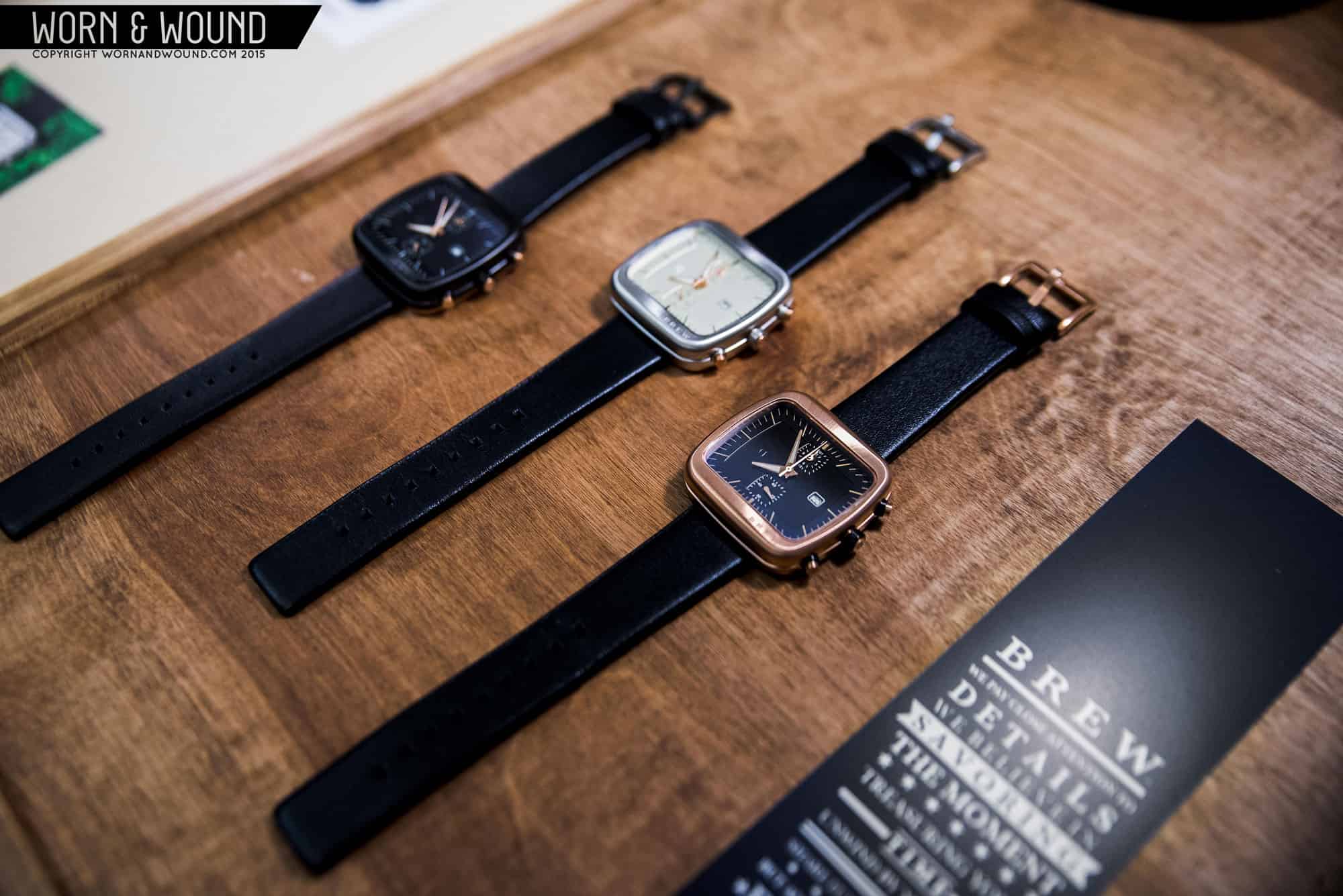
Moving further down, you’ll now find multiple curated content sections. Over the last 5+ years, we’ve created a lot of content. But unlike in many other industries, much of that old content is still totally relevant. Of course, you can access it all through the archives, but here we plan on presenting you with interesting packages of posts, perhaps highlighting a topic, brand or series. Check it out now, and you’ll find some w&w classics in one section and the first three parts of Chronography series in the other.

Advertisement
This is a slider! Click on the right arrow for another image

With this rebuild, we put an emphasis on reapproaching how our content is displayed. Our articles will now feature many more options for displaying both text and images. As you likely already noticed, we now can put content into a multi-column format (on desktop). This will allow us to tailor the article layout to the type of content being presented, creating a better and more engaging experience. What you see here is a two-column layout that will be great for shorter releases, editorials and other quicker pieces. We also have a new layout just for guides, which you can check out in our post on Summer Beaters from last year.

For images, we’ve really upped our game. You’ll find almost every post has a full-bleed image in the title, boldly presenting the article’s subject. Within posts, you’ll continue to find the classic in-line images we’ve always used, as well as new larger in-article sliders. These allow us to emphasize certain images or tell a visual story within an article. For example, check out our review of the Autodromo Group Bs. You’ll find in the case and dial sections sliders that show the watches in greater detail. Lastly, we will be able to drop big, sexy full-bleed images within the posts themselves, like the one below. These make for a great break in some of our longer articles and reviews.

Full bleed image goodness

Watch Review Finder

Watch reviews have always been at the center of the content here at w&w. In fact, we’ve made a few hundred of them, with over 100 videos and thousands of accompanying images. So, a few years ago we created our Watch Review Finder, a unique and intuitive way to browse our reviews and find the watches you are looking for. Well, we’ve given it a major overhaul making it easier and faster to use on both desktop and mobile.

On our Watch Review Finder, you’ll find a footer menu on desktop or a pop-up menu on mobile, that allows you to easily sort through over 250 in-depth reviews, filtering by brand, price, watch type and case size. You can also sort your results by price (lowest to highest or highest to lowest) and date of review. All queries are sharable, so the next time your friend asks you for a recommendation on a dive watch under $500, your answer is one click away.

Article Archive

All of our old content will still be easily accessible through our Article Archive, but we’ve greatly improved the experience of navigating it. First off, it looks great, dynamically feeding the articles into a new design that will bring articles you might not have realized we wrote to attention. Second, we liked the footer menu from the Watch Review Finder so much, that we ported it over to here as well, allowing you to sort by month (for the last year), author and category. Should you just want to browse, you can flip through the archive pages in normal fashion.

Brand Index

Want to see everything we’ve written about a specific brand? Well, our new Brand Index makes that an easy experience. Sorted alphabetically, you can either browse the list by scrolling through, or jump to the brand you are looking for by clicking the letter that corresponds with the first letter of their name. Want to go back to the full list? Simply click “view all” or the “x” over the letter you are on.

Additionally, at the top of the page you’ll find a few brands we’ve highlighted. We’ll keep these rotating, so be sure to check back.

This and that

Those are most of the big changes, but you’ll find various functional and visual changes through out. Our main menu has been simplified, especially on mobile, and now clings to the page, popping down when you scroll up, which is becoming the industry standard. On our homepage, you’ll find a slider of products from the worn&wound shop. Here, we’ll feature our American-made straps and cases that we manufacture (not just buy off the shelf and put our name on). Get ready for a lot of cool stuff to be coming through this section in the coming months.

Last, but far from least, you’ll now find author bios on the bottom of each post. We’ve always had them in our masthead, but we want to make sure you know a bit more about the people behind the articles here at w&w, so be sure to check them out as you read. You can also quickly jump to all of the articles by that writer by clicking on their name, or check out their social media accounts, if provided.

So, take some time and check out the site. We’re still working on updating old posts with some of the snazzy new layout options, but our newer and most popular content will likely already be redesigned. That said, everything seems to look and feel better than before. Should you find some bugs along the way (we’ve done a lot of testing, but a some are inevitable) do us a favor and email them to us at [email protected]. Most of all, enjoy!

Oh, and we’ve totally restyled our galleries, so check out the random assortment of watch pics below!

-w&w

Images from this post:
Related Posts
This is the house account for Worn & Wound. We use it on general articles about us, the site and our products.
Categories:
Tags: