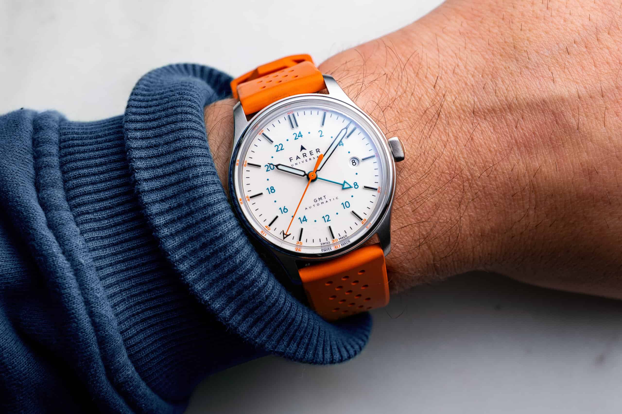
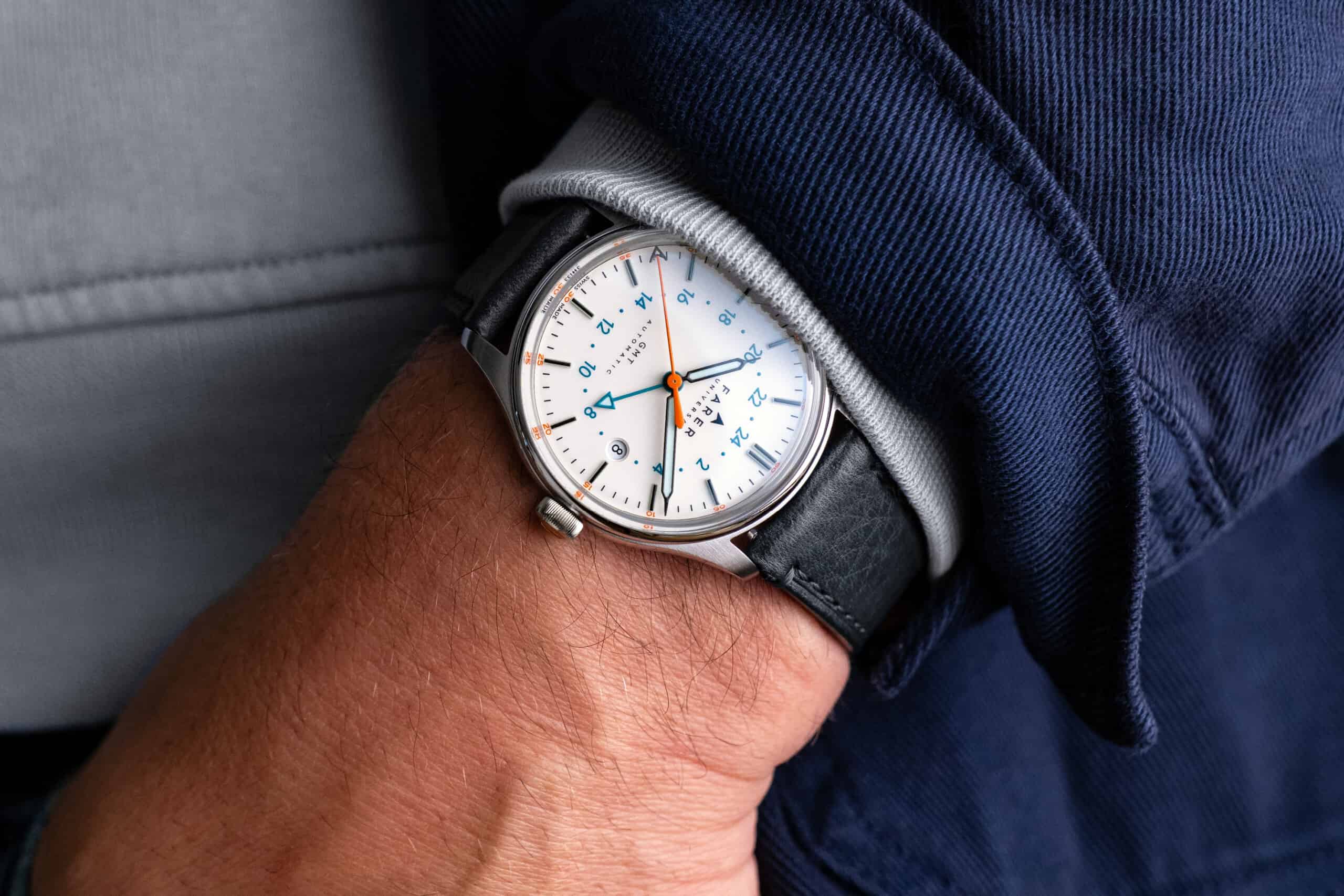
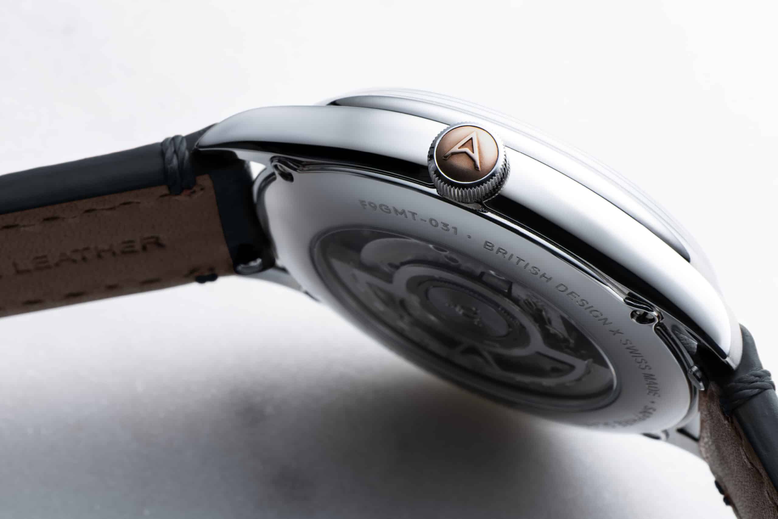
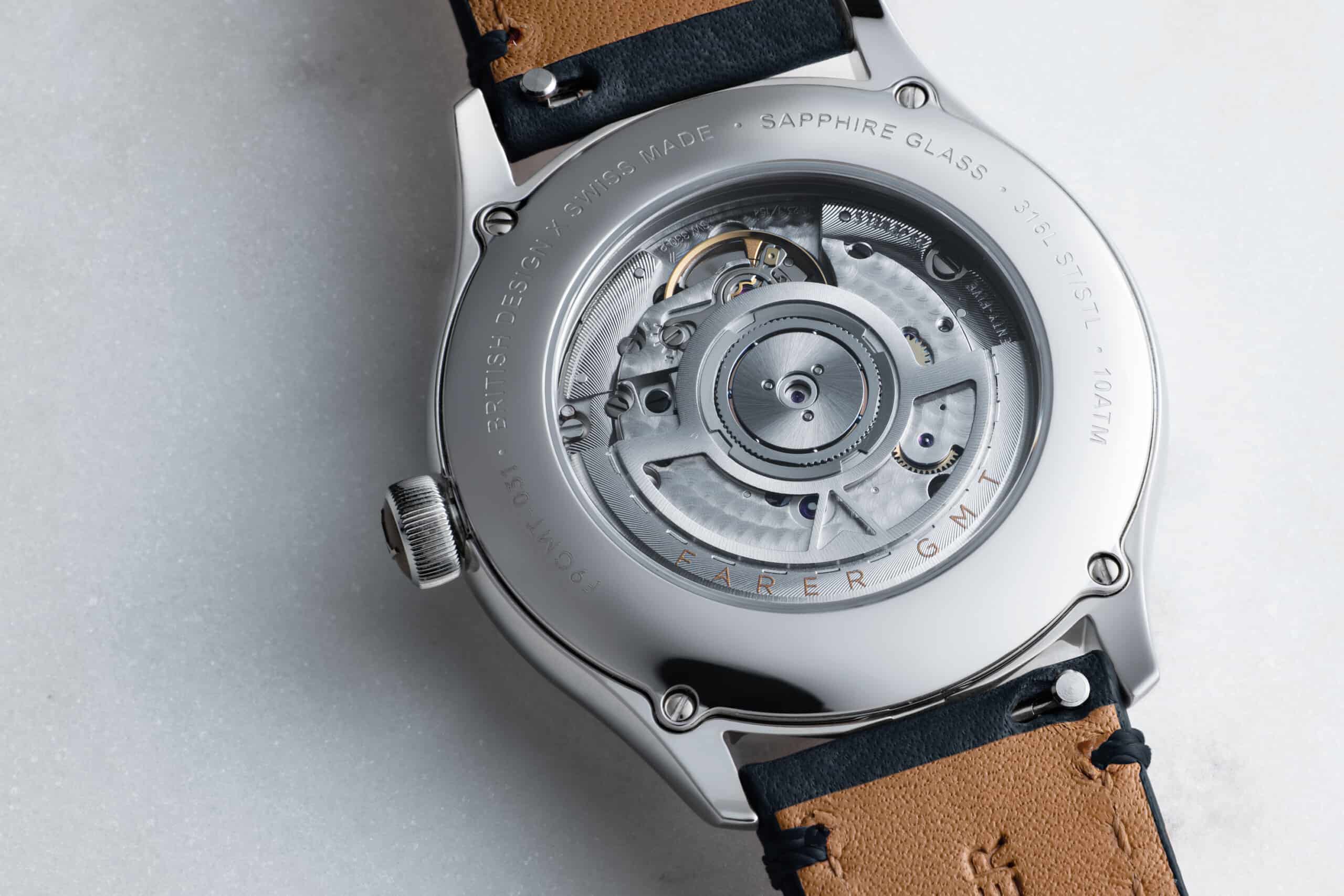
The latest addition to Farer’s lineup of GMT watches is a balancing act between simplicity and the brand’s signature use of vibrant colors and bold accents. Farer is no stranger to dynamic dial colors, peculiar color combinations and large numeral displays that have separated Farer amongst the pack with their own distinguishable design language. It’s not just for looks either as their dial aesthetics account for prime legibility, both in daylight and low light situations thanks to the heavy dose of lume usage they’re notorious for, as well. It’s always an intriguing release when Farer releases a white dial because it allows the brand to explore minimal ways to apply color without sacrificing the Farer panache. With this new limited edition release, the Farer Palmer GMT hits the sweet spot in both simplicity and case size making it their most appealing GMT yet.
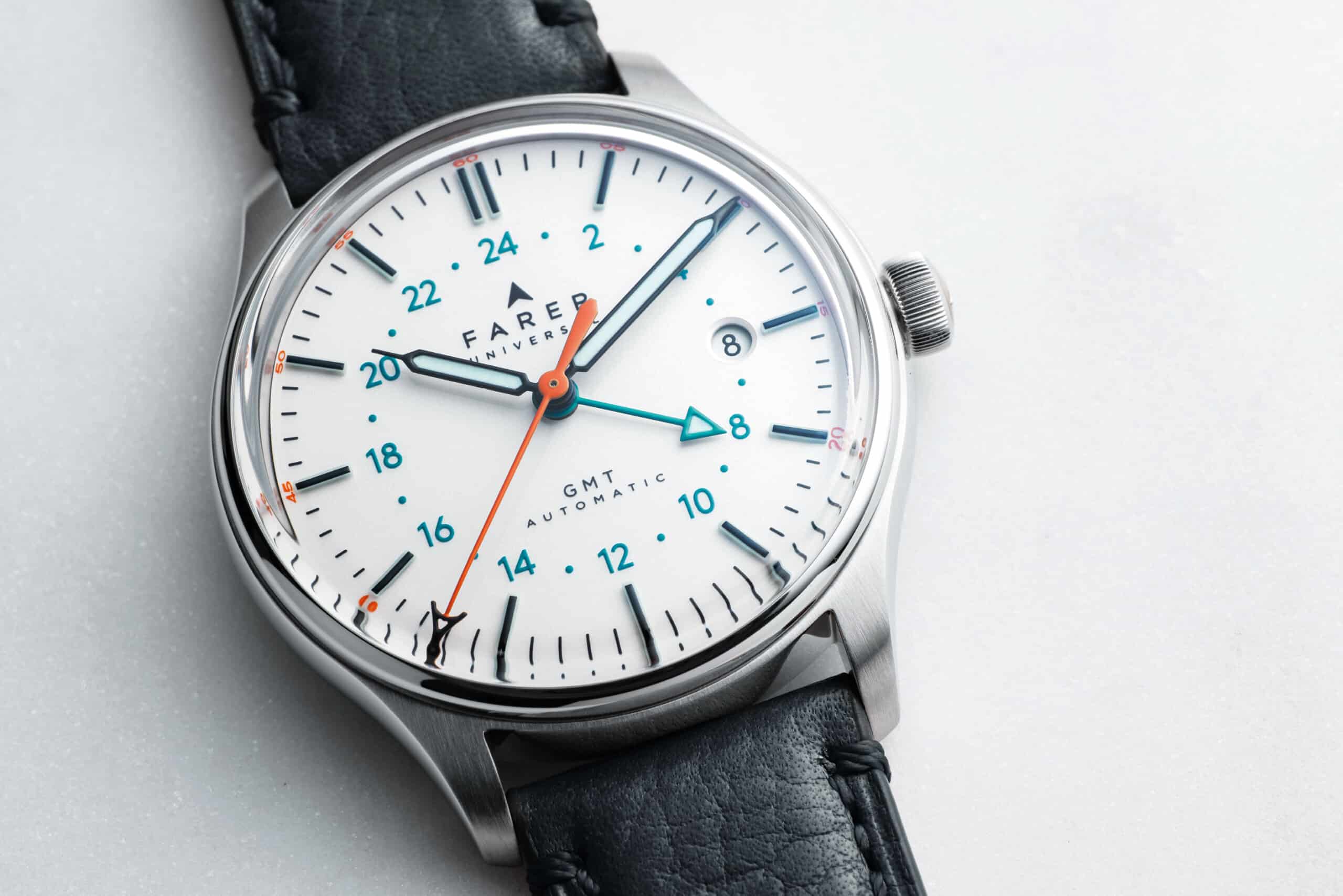
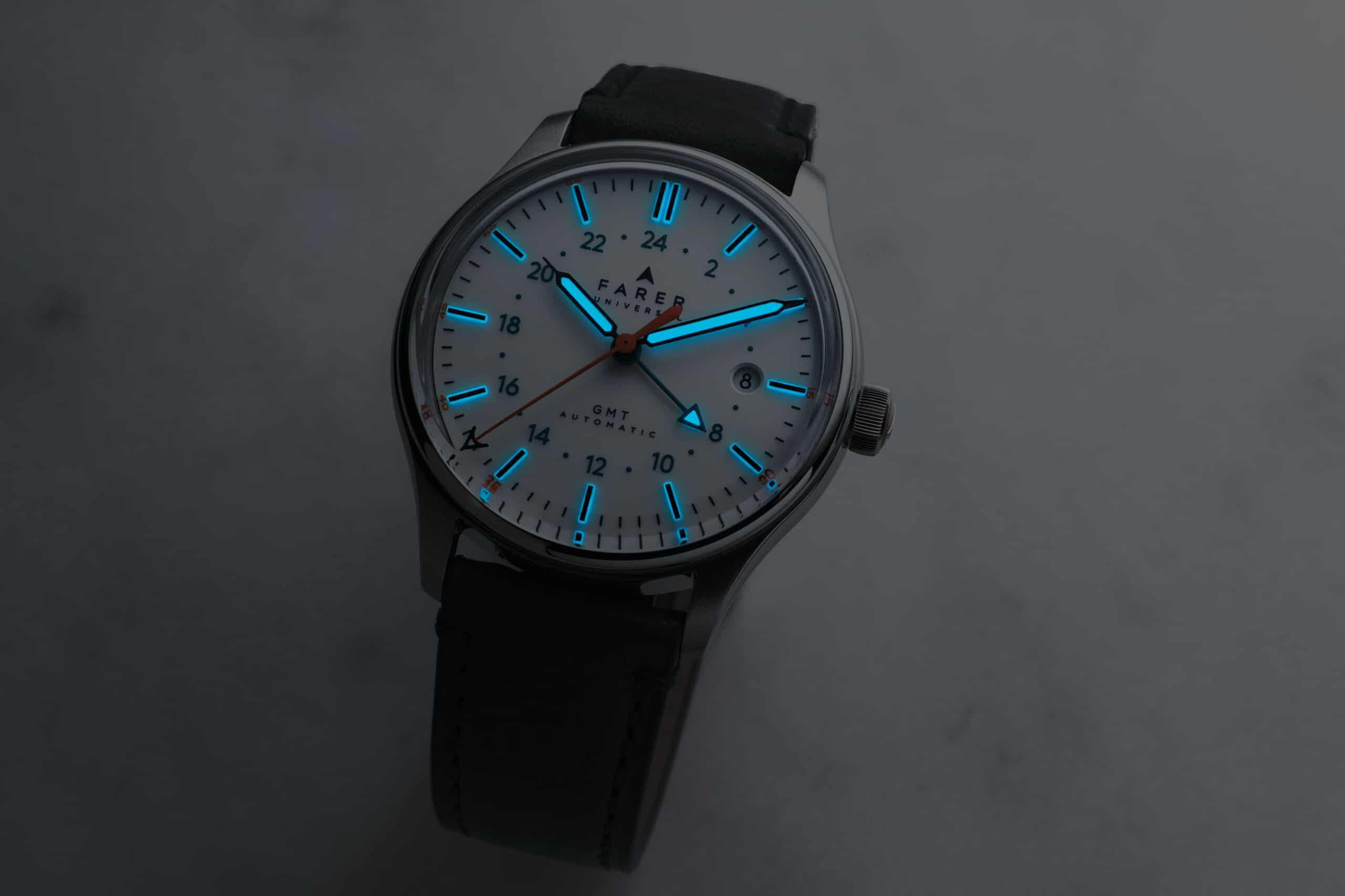
The Palmer GMT doesn’t just use a standard tone of white for the dial; we are talking about Farer after all. Farer is calling the Palmer dial color “pearlescent opaline” which gives the dial’s surface a slightly creamier tinge. Each hour marker is raised from the dial thanks to the block of SuperLuminova that makes up its construction and is hit with a thick application of black paint on its top surface. This in combination with the black outlining of the handset maximizes legibility against the white, excuse me, pearlescent opaline dial. The use of numerals are much more subdued than were used to which underlines the minimal approach to the Palmer. The inner 24-hour ring is color-matched by its short teal GMT hand and balanced out by the use of orange on the seconds hand and with the smaller numerals around the dial’s edge.




 Featured Videos


