Givenchy is not a brand name that comes to mind when thinking about innovative watch design. Started in 1952, this Paris based luxury goods brand makes everything from clothing to perfume. As an haute-couture brand, their products are often wild, conceptual and come at a high price. Currently the brand is seeing somewhat of a renaissance as their creative director, Riccardo Tisci, has hit a stride within fashion and pop-culture worlds. Recently, Tisci has collaborated with Kanye West on new lines (think t-shirts with large dog prints).
So, again, Givenchy is not a brand one associates with watches, let alone fairly affordable one…until now. Their new Seventeen line is dark, edgy and masculine, but unlike watches by so many other fashion brands, really works. And it does so not by shocking, but by drawing upon the known vocabulary of watch design and evolving on. In fact, I’d go so far as to say this is the kind of innovative watch design I wish we saw from more watch brands.
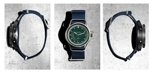
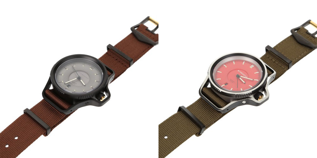
The case of the watch is immediately striking. It appears to be two parts; a central chassis that houses the movement and dial, and a sort of bumper that encircles the watch, guards the crown and doubles as lugs. Measuring 46 (unclear if that is to the crown guard or internal case diameter) x 52.5mm this is a large watch with a clearly aggressive style. From the spiked bezel to the screw details on the side, Givenchy went for durable, tool look, which is surprising for a fashion brand.
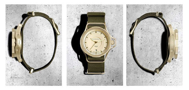
The most standout feature of the case design is the bumper that is simultaneously functional and decorative. Looking at side shots of the watch, you can see how this piece is actually a very complicated form, curving and tapering in interesting ways. It’s also quite thick, giving the watch a very protected and rugged look. Since the bumper essentially connects the lugs, the watch is designed for use with NATO straps, which weave in and out of it. Clearly, there is a military vibe to the whole watch that is reinforced by the use of pass-through straps. The case will be available in matte steel, black PVD and gold for a range of options.
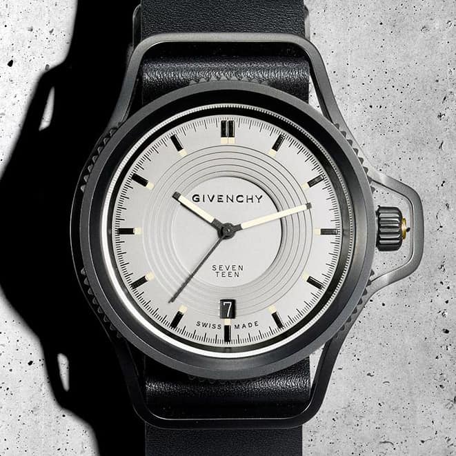 The dial too has a very interesting, albeit more elegant design that has a touch of vintage influence. On the outer edge, there is a simple index of black lines for the minutes and seconds and applied markers with lumed squares towards the inside of the dial for the hours. The clean index works well to balance out the boldness of the case. Had there been much going on here, the watch would have become overwhelming. The use of applied markers also adds a bit of refinement.
Moving in, things get a bit more unique. The dial steps down in a concentric circle pattern to a lower area that contains the Givenchy logo and the word “seventeen”. These steps have an interesting visual effect, making the dial seem very deep. Though I don’t think this detail would have been missed if it had been left off, it is unique, adds some texture and in the end doesn’t detract from the aesthetic. Finishing the dial off is a simple handset with lumed rectangles for the hour and minute, and a stick for the seconds. The dial will be available in a few colors, including grey, beige, green and red.
The Givenchy Seventeen will cost $770 – $890, which is surprisingly low for the brand; especially considering that the watch is Swiss made and features a sapphire crystal. Of course, nothing is without a downside and in this case it is the Ronda quartz movement inside. Nothing wrong with a Ronda, but at that price it’s definitely a hard sell. If they had thrown a Selitta SW200 or a Miyota 9015 in there this watch would have been a surefire winner. That being said, whether or not Givenchy customers are looking for mechanical watches is hard to say. Regardless, the design is really exciting and attractive. It’s unique and novel, yet calls upon familiar elements. It goes to show that you don’t need to reinvent the wheel to standout.
The Seventeen will be available at Givenchy boutiques and select retailers. The are available online at colette


 Featured Videos


