


 Featured Videos


A successful minimal design is like a breath of fresh-air. They have a certain inexplicable beauty that is achieved through restraint and balance, rather than opulence or complexity. It’s a simple pleasure. The watches we’ve seen that most succeed at minimalist designs are typically crowd favorites too, despite being very different from the sporting watches we most often discuss. Watches like the Max Bill’s by Junghans, the Nomos Orion and the Stowa Antea are crowd favorites, though they don’t dive, pilots don’t wear them in the skies (well, maybe) and they are quite small. People like them because their designs are just approaching some sort of perfection we can’t quite grasp.
These watches don’t come along often and are always worthy of attention. Most recently, MMT, a young brand who until the last few months only made pocket watches, created a two lines of watches that expertly achieve clean, stripped aesthetics, but with slight twists. If there was one complaint to be had about minimal designs, it’s that they can be a bit cold, lacking a human touch. Through material and texture, MMT created designs that manage to be spare, but warm, and utterly enjoyable to wear.
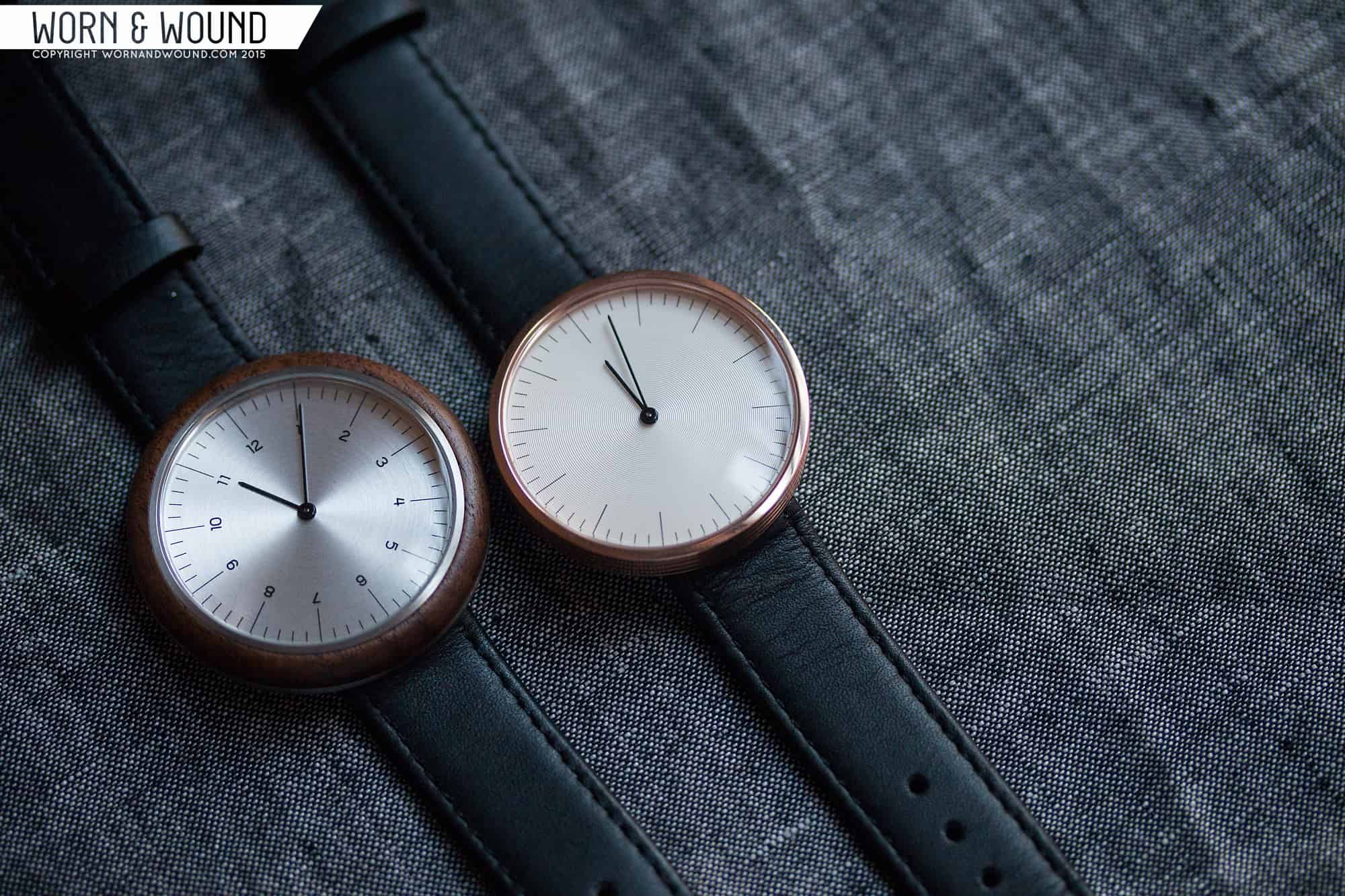
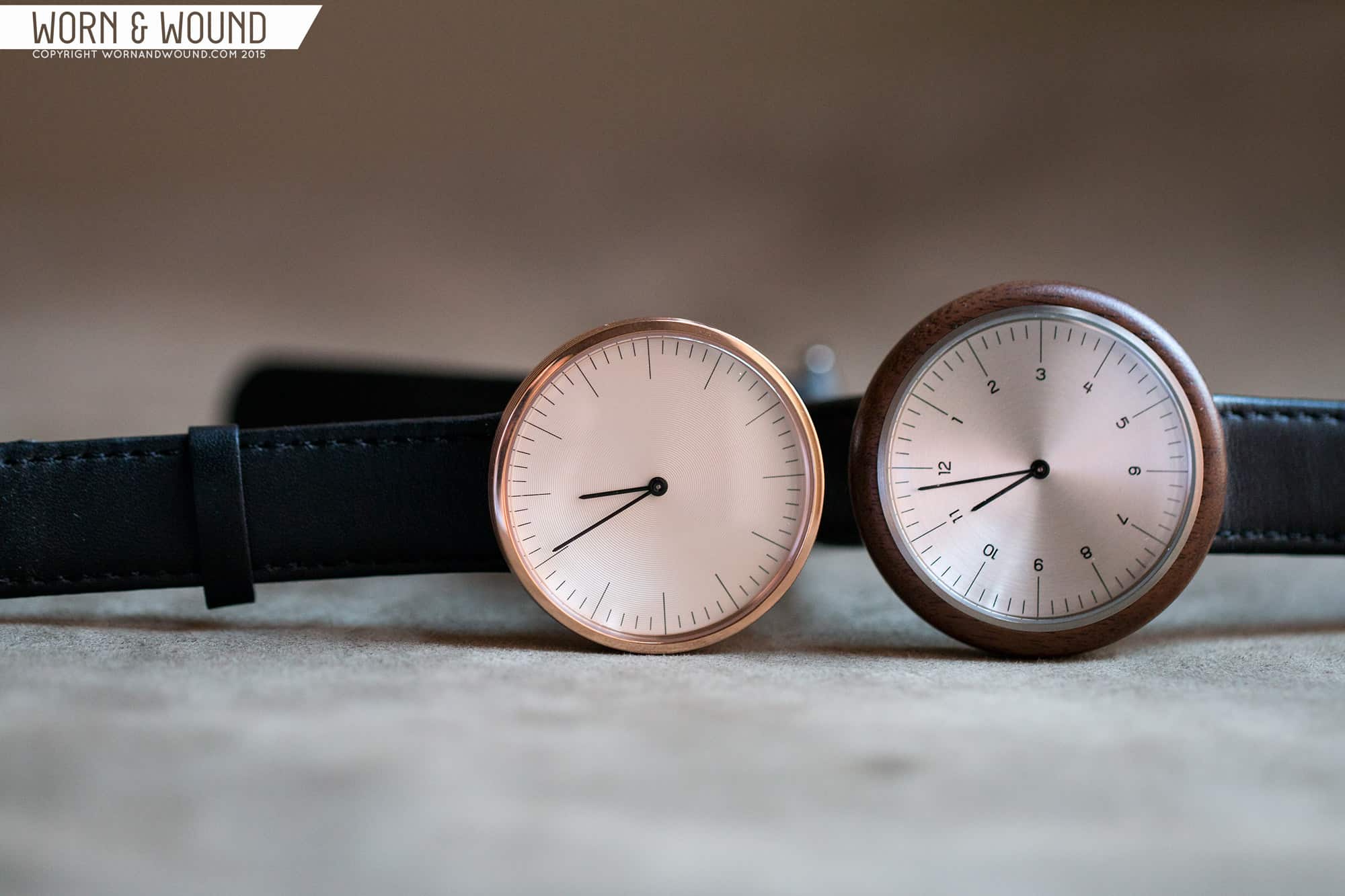
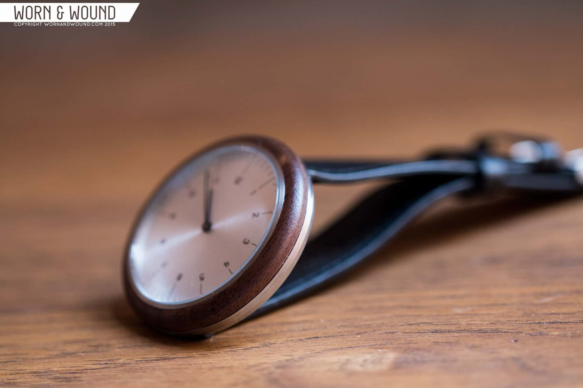
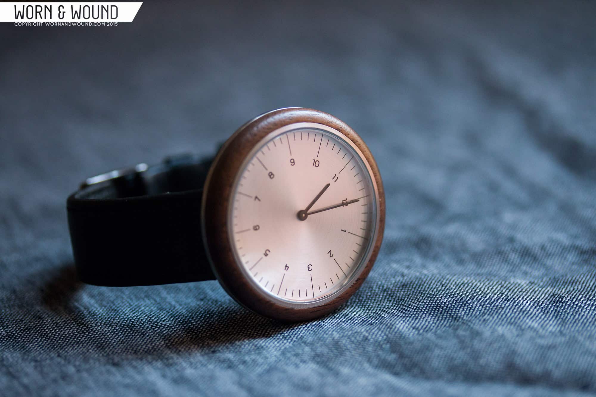
The two lines, which for simplicity can be called R and C, each consist of 4 quartz watches, with two dial designs and either steel or rose gold finishes. The obvious difference is that the R-line feature walnut bezels and are 43mm, while the C-line features a 38mm all-metal case with fluted sides. The R’s are $399 in steel or $419 in rose gold, and the C’s are $299 in steel and $329 in rose gold. I had the pleasure of trying one of each, and here are my thoughts.
Cases
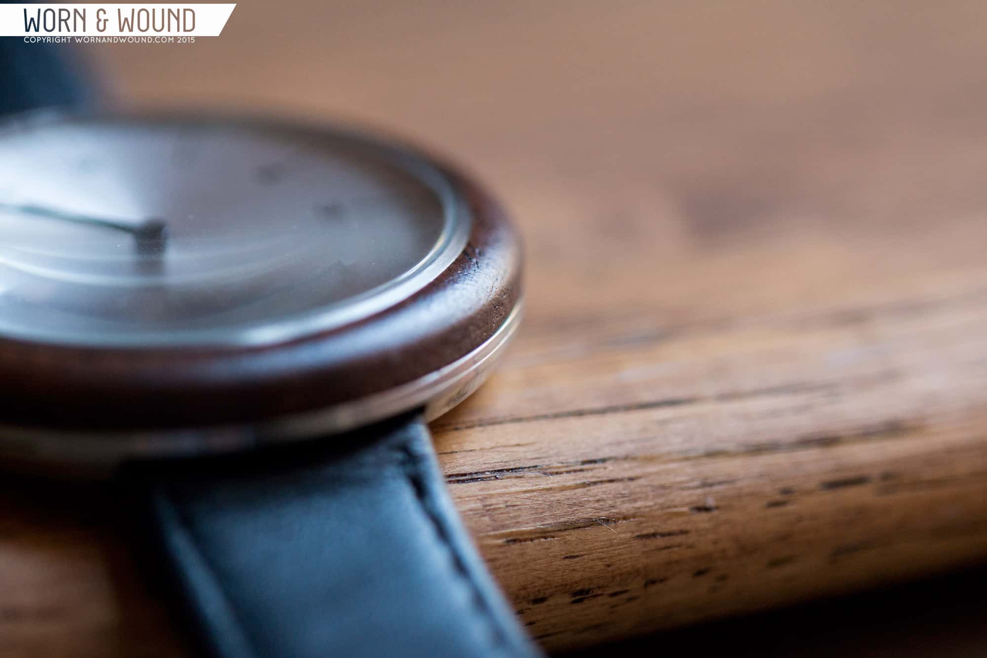
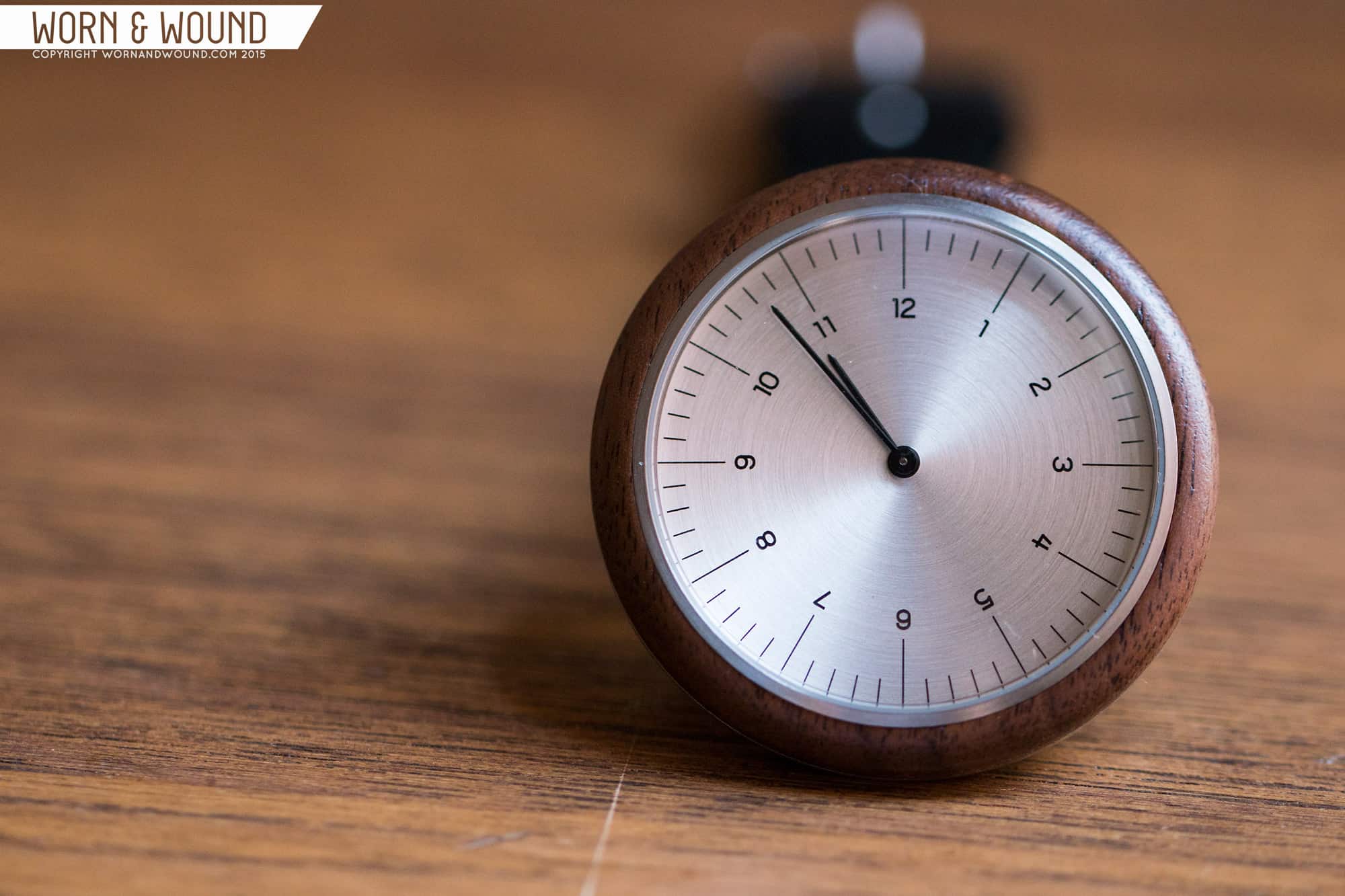
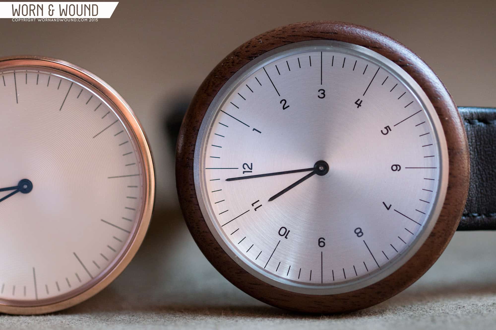
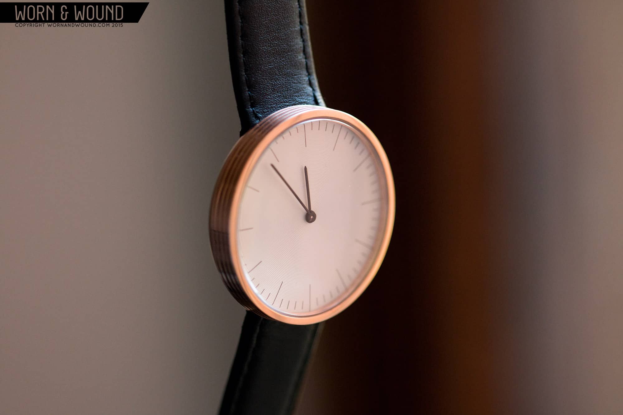
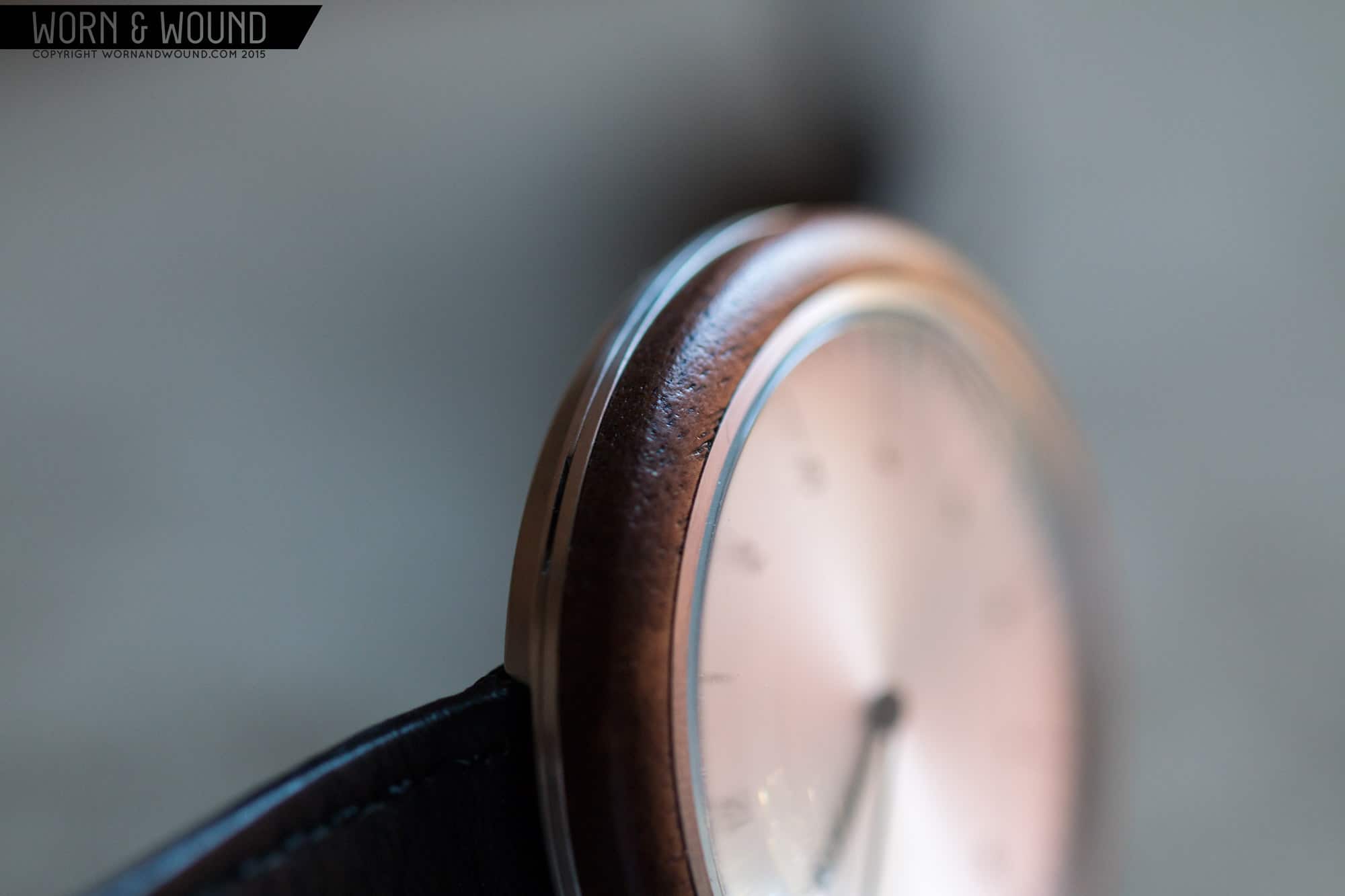
While very different from each other, the two case concepts each achieve a unique feel that works with the similar dials. The R series is the more striking of the two, with its broad, wooden bezel. I’ve always found the concept of wooden watches interesting, but the actual products almost appalling. The MMT changed that. While it’s not a wooden watch so much as a watch with a wooden bezel, it comes right to the edge of the case, and compromises about half of the side as well. When you look at the watch, you see wood. And in this context, it’s a perfect material.

As I had mentioned, minimal watches, even ones we adore like the Antea, can be a bit cold and robotic. They are clean and precise to a point of verging on harsh. The natural grain of the wood, the slightly inconsistent coloration, the imperfect surface, make the watch more alive, more organic. Yet, their is still something singular and clean about it. It’s a material presented in a very honest way. It’s not decorated, carved, colored or overly lacquered (there is likely some protective coating, but it isn’t glossy) it’s just present, adding a warm earthiness to the watch. The fact that each watch is also slightly unique adds to the appeal as well.
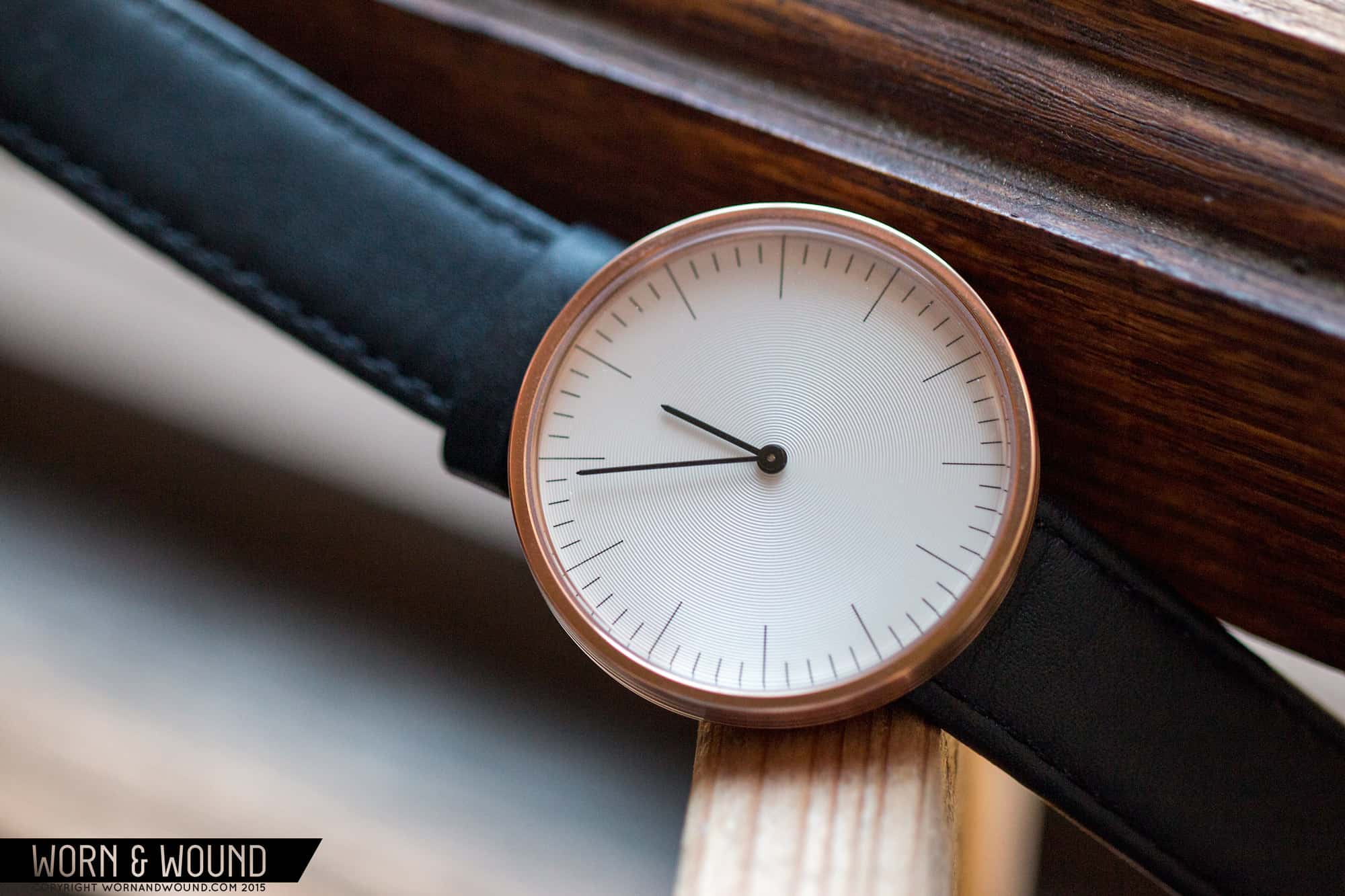
In contrast, the C series forgo the wood, instead focusing on texture to break up the case side. While not organic, the fluted design provides something tactile. It also veers the design toward the streamline, giving it a slightly playful mid-twentieth century feel. It’s also simply very attractive, making the watch more of an object in the round than something to be enjoyed solely from above.
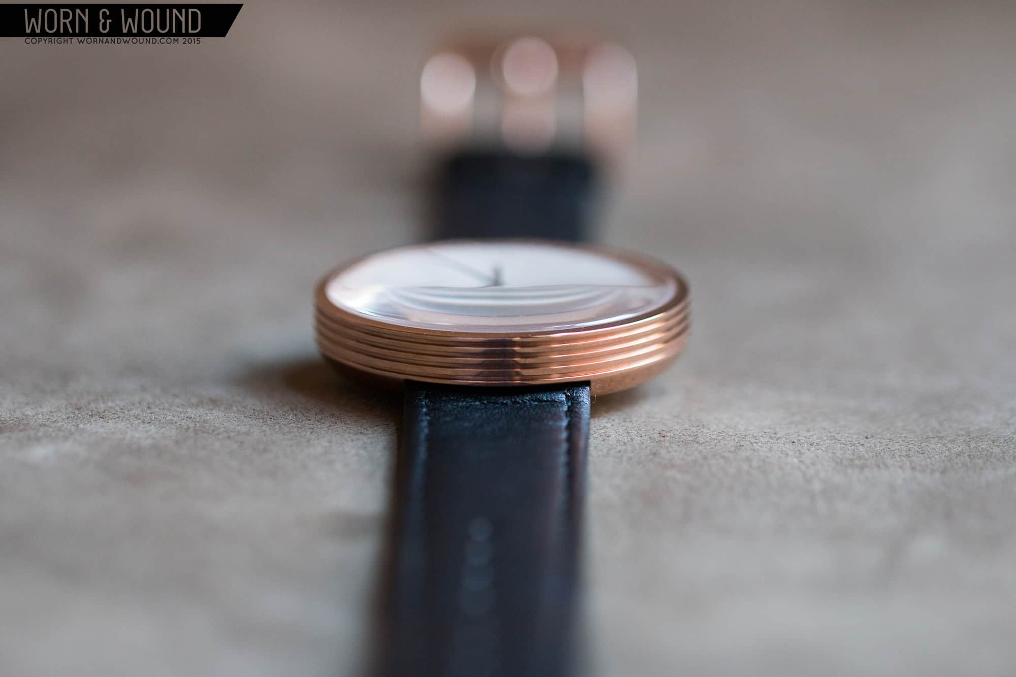
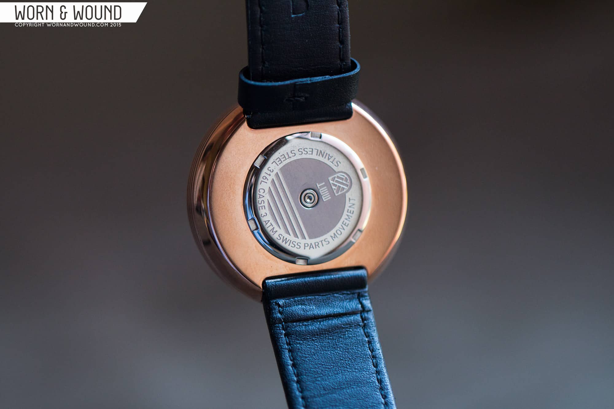
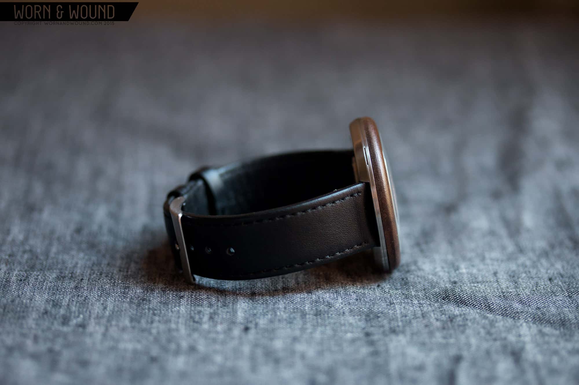
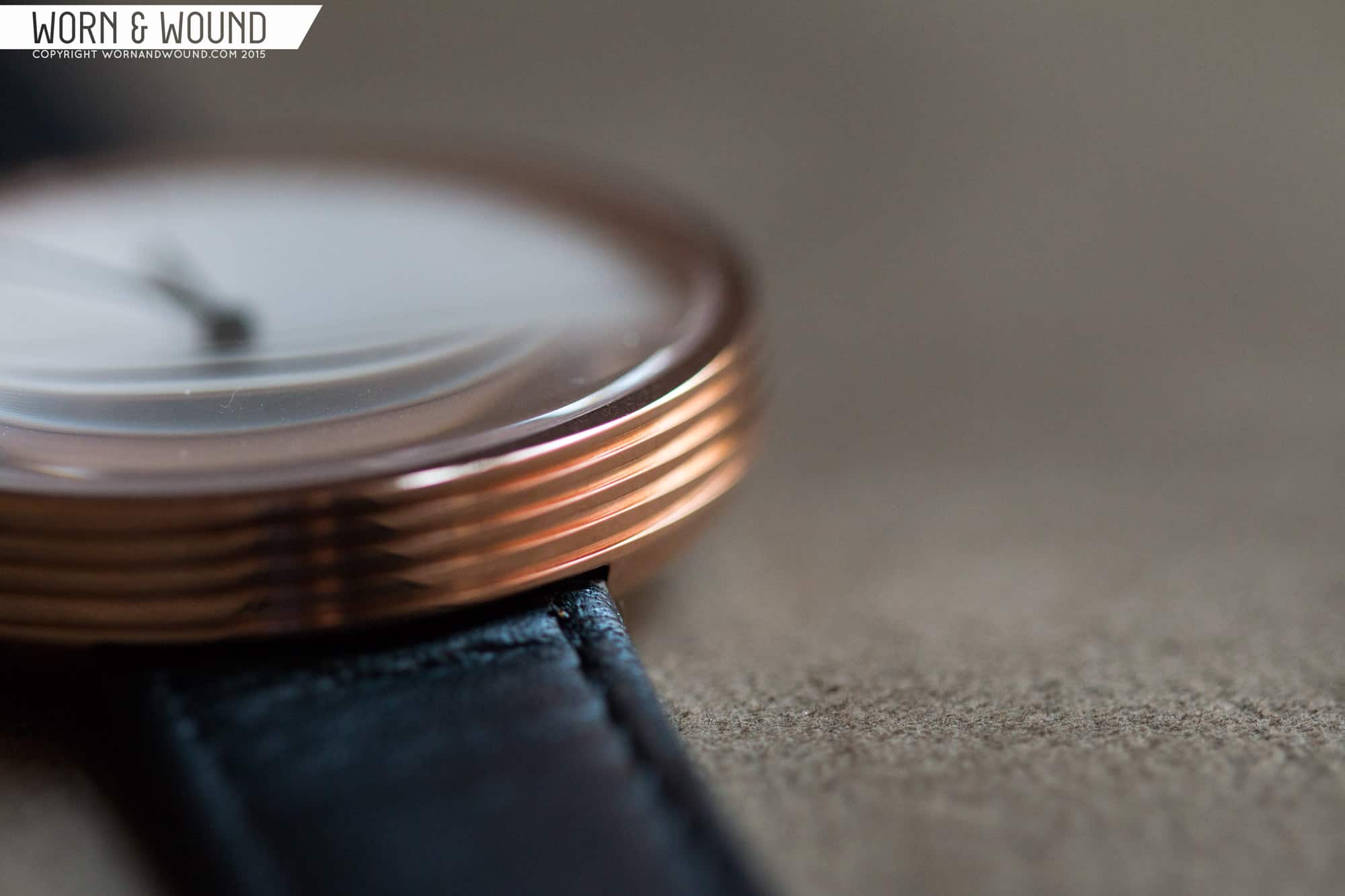
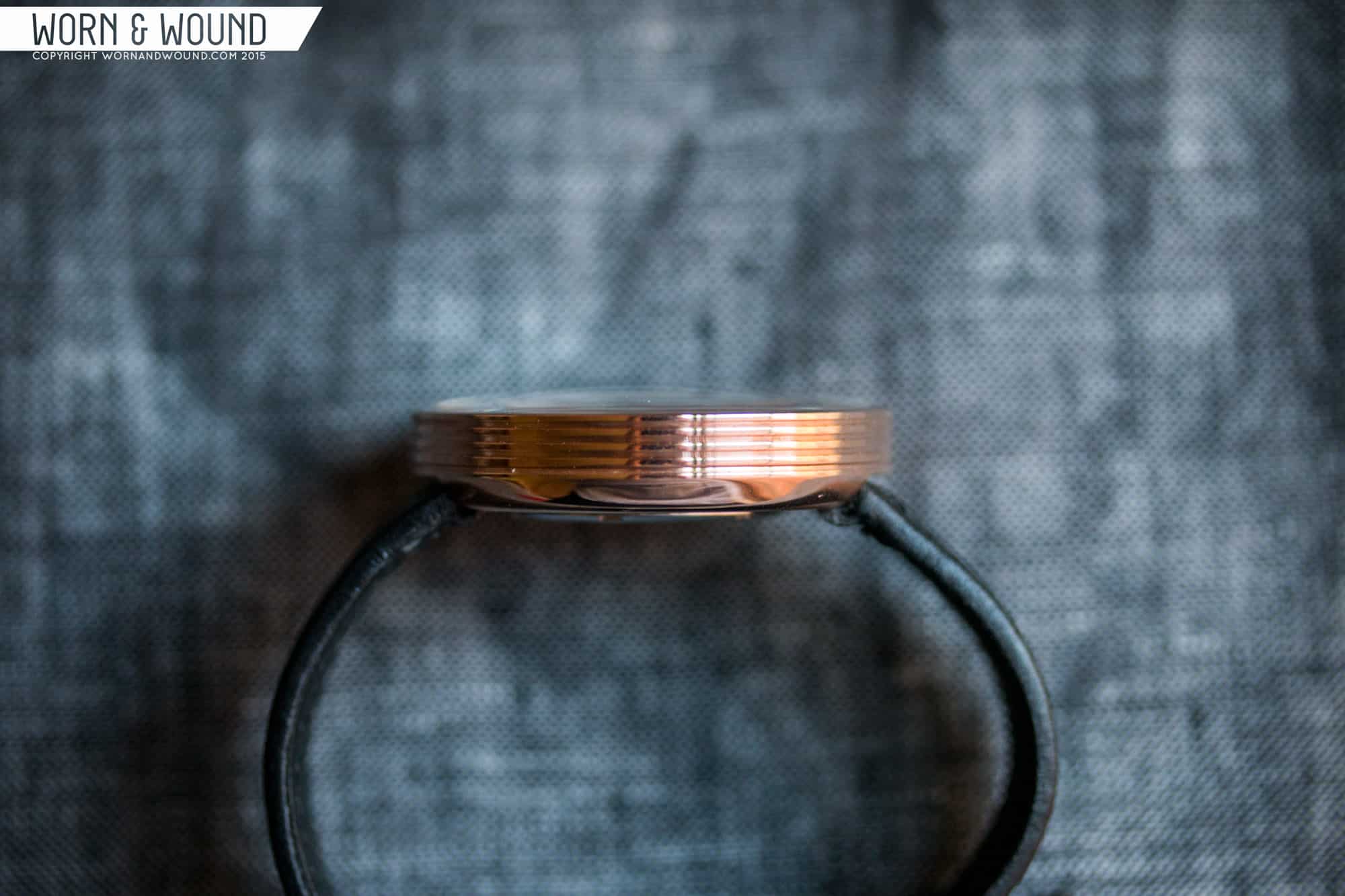
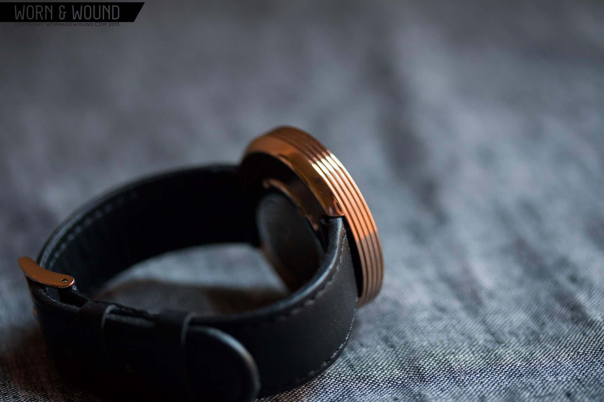
Both are lug-less designs, giving them a certain contemporary air… but one very cool detail is that they are also crown-less. Instead of the traditional push pull crown, on the case-back, in the very center, is a little button. The ISASwiss movements inside are set via depressing this button, which jogs the minute hand around the dial clockwise. It’s simple to do, though you have to find a comfortable way to push the button while looking at the dial. Since it’s quartz, you will only have to do this once in a while, though I must say, going back an hour for daylights savings, which required going forward 11 hours, was a bit of a pain… But, one that was worth it for the aesthetic effect. Having completely uninterrupted cases, no crowns or lugs, makes for far cleaner, purer shapes, which pays into the overall minimal design.
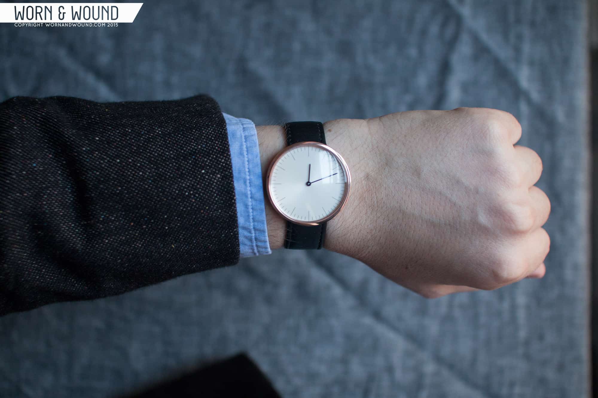
Despite having the same dial real estate, the cases are very different sizes. The R is 43mm while the C is 38mm. Since they are lug-less, the 43mm case wears much smaller than a 43mm sport watch would, occupying a nice area of the wrist. The extra diameter goes to the wood, which is welcome. In 38mm, the C-series feel small, perhaps at my lower limit. That said, they put a much greater focus on the dial. Both are uni-sex, but the C-series in particular would fit thin wrists well.
Dials
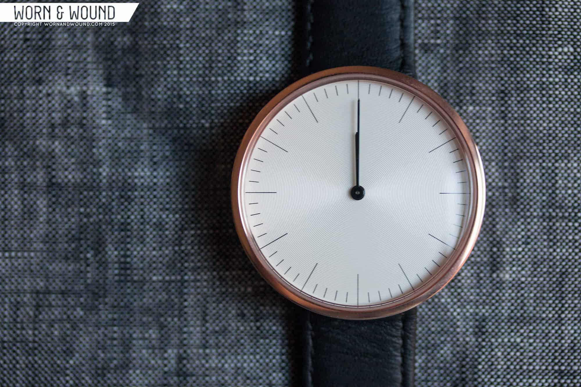
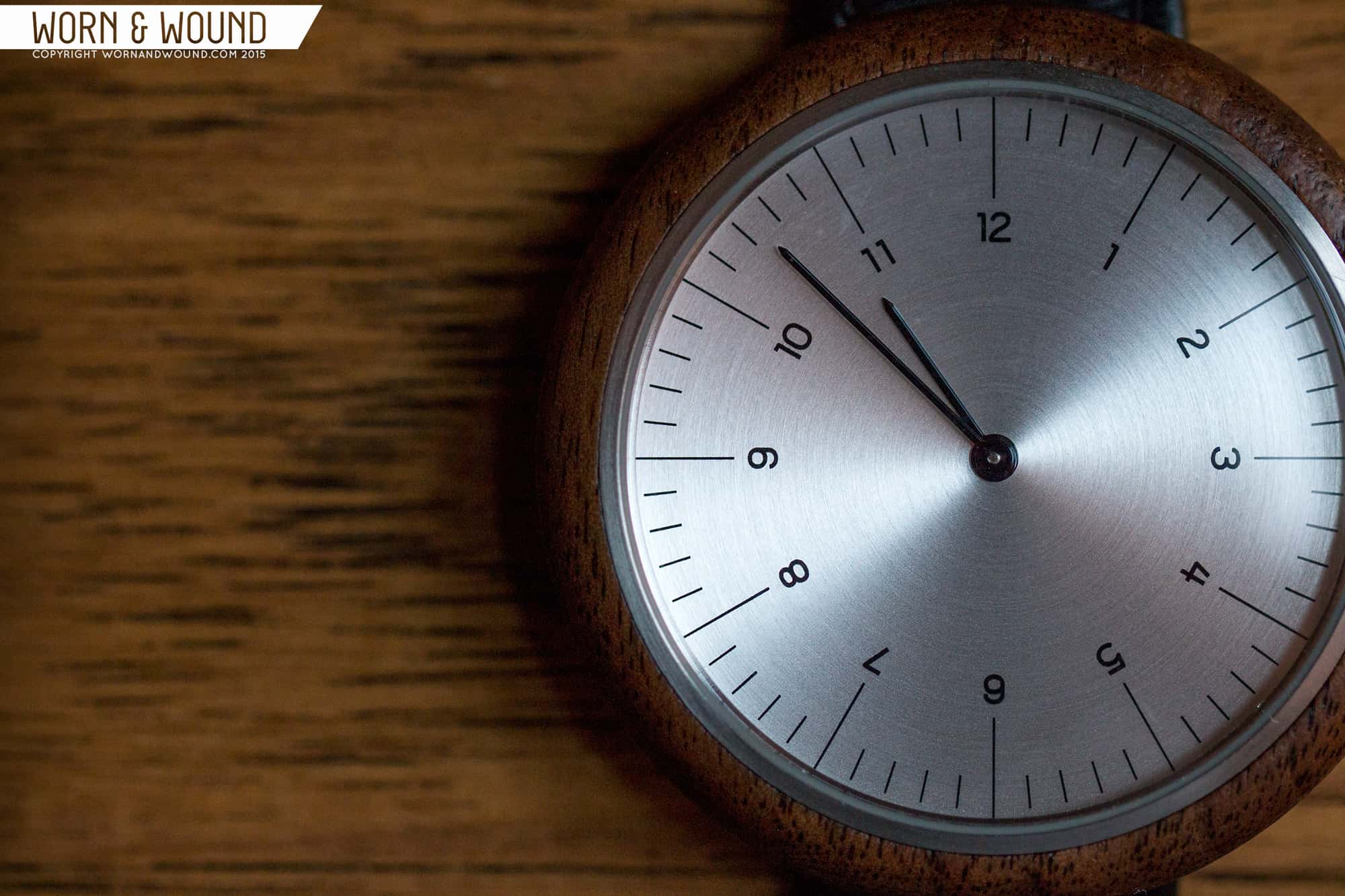
Less is more is typically the motto for minimal dials, and MMT took that to heart. Across the various watches in the R and C lines, there are really only 2 dial designs, but they varied them a bit more by, once again, using materiality and texture. Both designs consist of an index of printed pencil-thin lines. Those that mark the hour are substantially longer, and run to the edge of the dial. The individual minutes step in from the edge a bit, and are perhaps a third the length of the hour lines. The two main variants consists of solely those lines, or those line and an index of hour numerals towards the center of the dial. Neither has any text or logos.
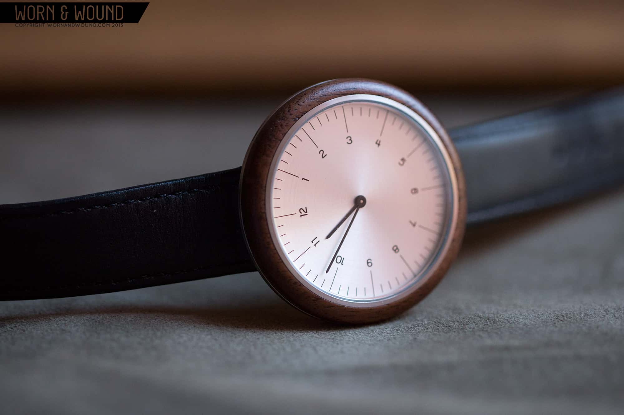
For the numeral index, the type is very small and spaced just a hint from the end of the lines. Proportionally, they feel just right for the paired down dial, leaving a lot of breathing room in the center of the dial. The typeface chosen is very attractive. I’m not sure of what it is, perhaps it’s of their own creation, but it definitely has a German quality to it. Though the numerals are one small difference, the effect is great. It’s a touch busier and a bit more legible, but their is something very striking about the non-numeral dial. It’s so stripped down, it almost aches for something else to be added…but it’s that tension and restraint that works. Conveniently, you can choose which one you want with either case.
Additionally, there are different surface finishes, subtly creating very different effects. On the R-series I tried, the dial was a brushed steel color. The brushing was circular, rather than vertical or horizontal, adding a slight, inconsistent grain. It made the dial seem more like a piece of raw steel, adding that sense of materiality. It was a nice contrast to the softer wood bezel, and gave the whole watch a more raw feel.
On the C-series watch, to complement the rose gold PVD, the dial was a pale off-white with an embossed concentric circular graining. It was much like the texture we often see on sub-dials, but a bit larger in grain, and covering the entire dial. This gives it a subtle sun ray effect that is very pleasant. The ridges also pick up a bit of a warm glow from the inner edge of the rosegold case. It’s also very attractive, perhaps the more refined and dressy of the two, though I prefer the brushed steel as I find the materiality appealing.
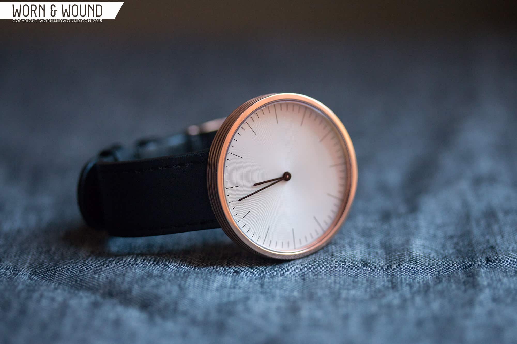
All of the dials are paired with thin stick hands with slight points at the end. The hands look right on the dial, standing out against the surfaces, not over shadowing the very finely printed indexes. I was very glad they left off the seconds hand. The ticking would have drawn too much attention to the hand, and would have been jarring in the otherwise calm and serene dials. On both of the models featured, the hands were gloss black, however other models feature polished silver and rose gold as well.
Straps and Wearability
The watches are paired with either black or brown 18mm straps. They are straight cut, with stitching around their edge. They are fairly plain and understated, which is to be expected for the designs. The construction seems fair, nothing special.
As mentioned before, the two watches wear fairly differently, but both well. Both wear smaller than expected since there are no lugs, making the 43mm fit my 7″ wrist very well, and the 38mm feel a bit small. They are both fairly thin at 10.5mm, and feature very gently domed mineral crystals, making them feel nice and flat, especially the 43mm model.
Aesthetically, these watches are stunning, comparing to the far more well known and expensive watches listed in the intro. They achieve that look and feel of a minimal design that grabs your attention, and somehow holds it with a lack of extraneous detail. But, the material story of these watches makes them so much more intriguing than expected, and frankly typically found at the price point.
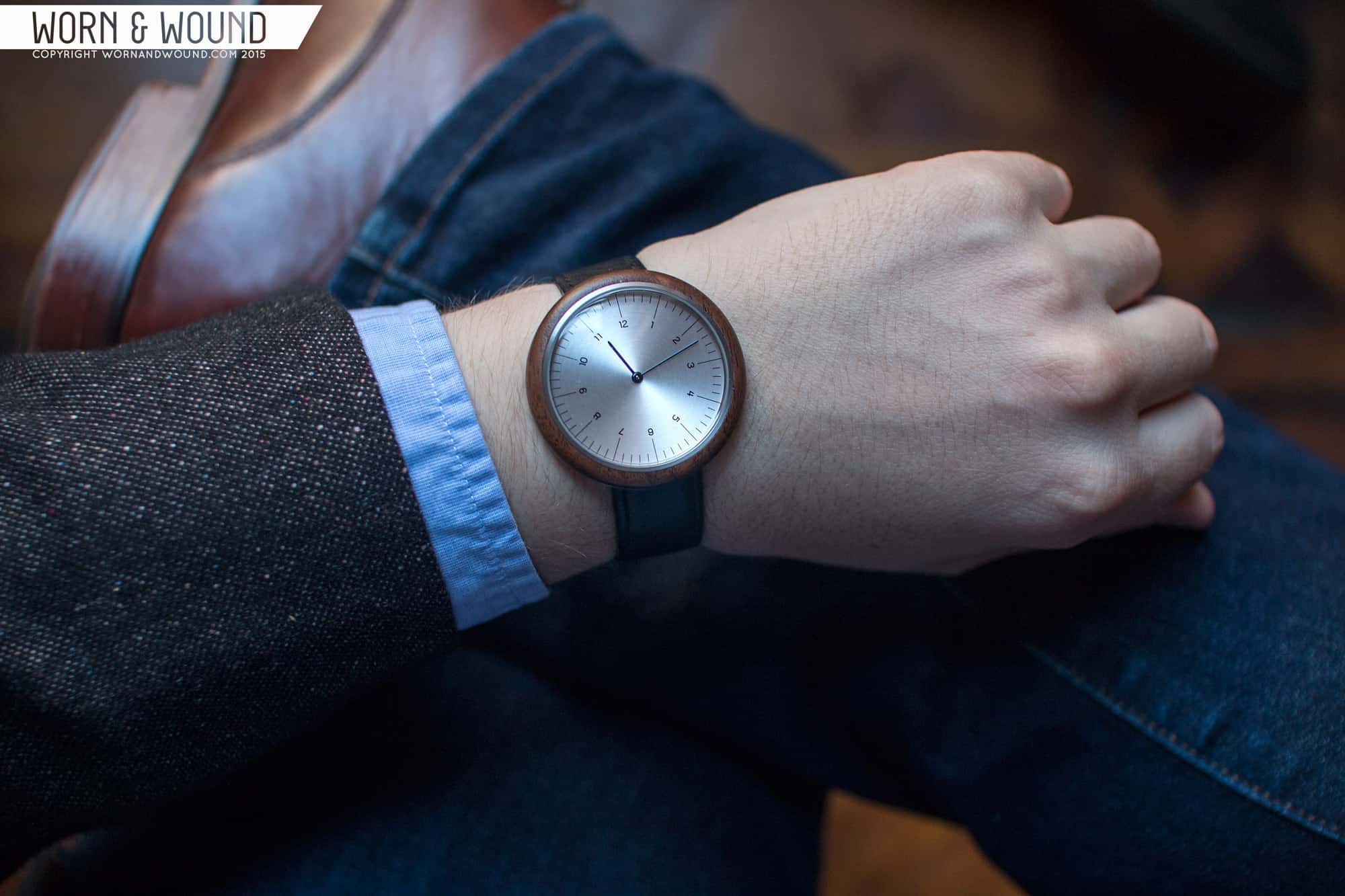
As far as attire, these are very neutral and versatile watches. They can be worn casually or fairly formally. The C series could even stand in as a dress watch for someone with a more modern, fashionable style. The R series, with it’s warm walnut bezel, would look great with leather, denim and other materials with an organic or natural feel.
Conclusion
If you’re like me, when you first saw an image of these watches, you were sold. They just appealed to you on all the right aesthetic levels. MMT has truly created some beautiful timepieces with the R and C series that I think any minimal watch fan will find appealing. Of course, they aren’t mechanical, so that might be an issue for some, but I like that they used an interesting quartz movement that suited their design, rather than what’s typically found. The lack of a crown is important for the design and makes for very impactful cases. Needless to say, I look forward to what MMT has planned for the future, and hope to see some other woods and interesting materials enter the picture.
