[Hands-On] With the Retro-Cool Heinrich Taucher 2

I have to confess, I’m still not sure what makes a retro-inspired diver. A large part of it is styling, of course, but even then there is no single blueprint for what a 1970s dive watch looked like. Give me a blank sheet of paper and I wouldn’t know where to start. I do know one when I see one though, and the Taucher 2 from Heinrich watches certainly fits the bill. We may think of German divers as being utilitarian by nature, but the one I’m looking at today has a little more flair. In fact, I’d even say it’s a little funky.

Two watches made their way from Stuttgart in the south of Germany to Brad HQ in the south of England, and despite only a few differences between them they give off very different vibes. With a total of eight colorways in the Taucher 2 lineup there’s plenty of variety, but the case and bracelet remain the same throughout. At 41mm in diameter, the Taucher 2 is right around the “go-to” size for a retro diver, but the 42mm lug to lug could bring this watch into play for small wrists too (more on that later though!). Heinrich refer to this measurement as horn-to-horn, which is more appropriate given the lack of pronounced lugs and the scalloped shape where the case meets the bracelet.

Advertisement

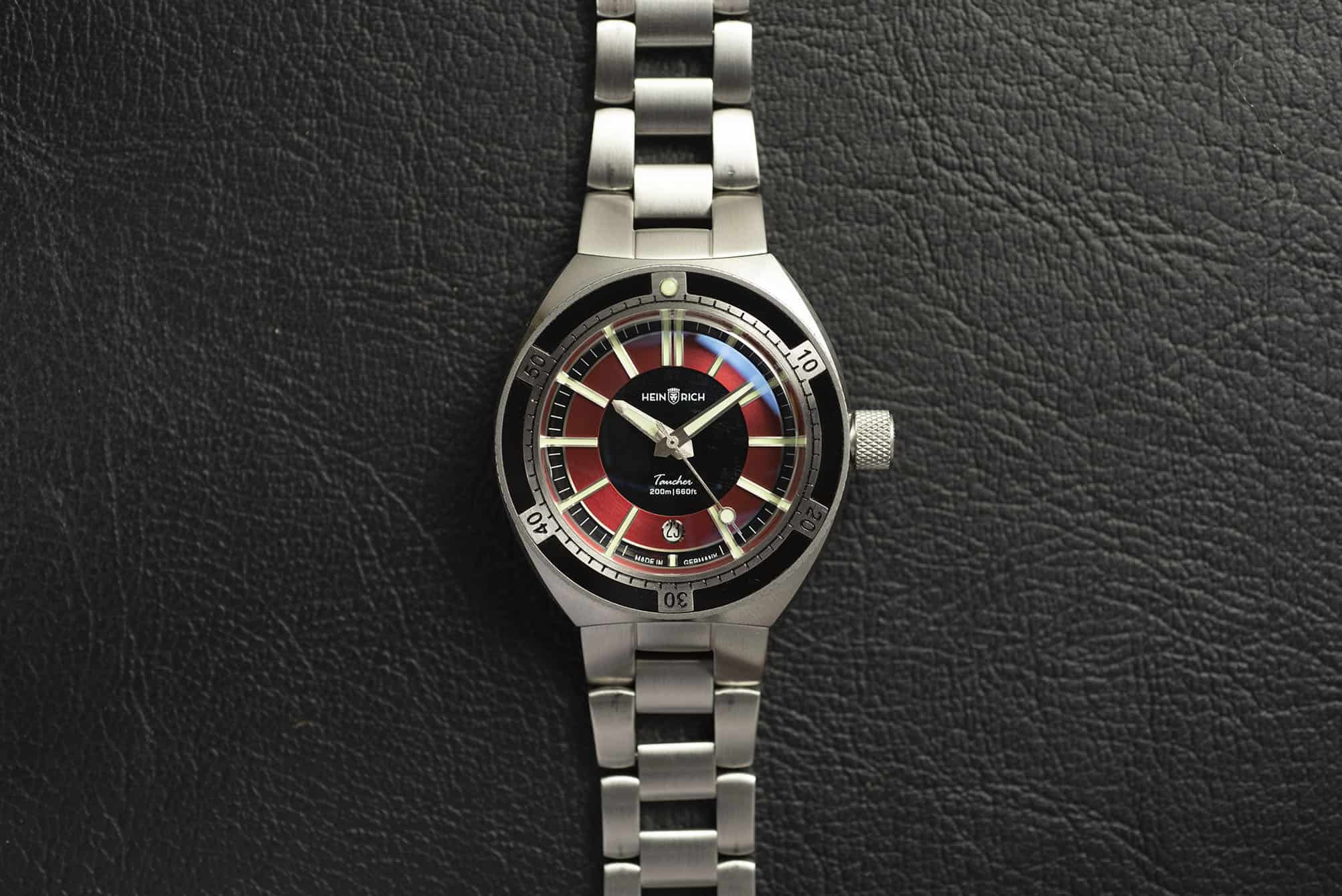
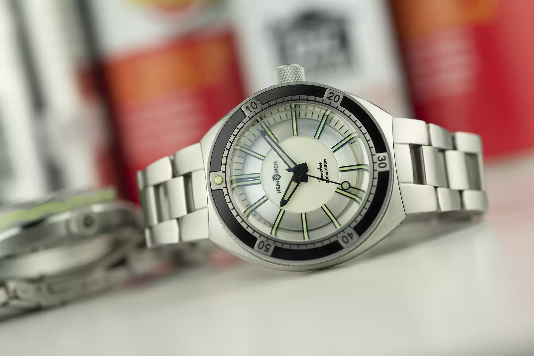
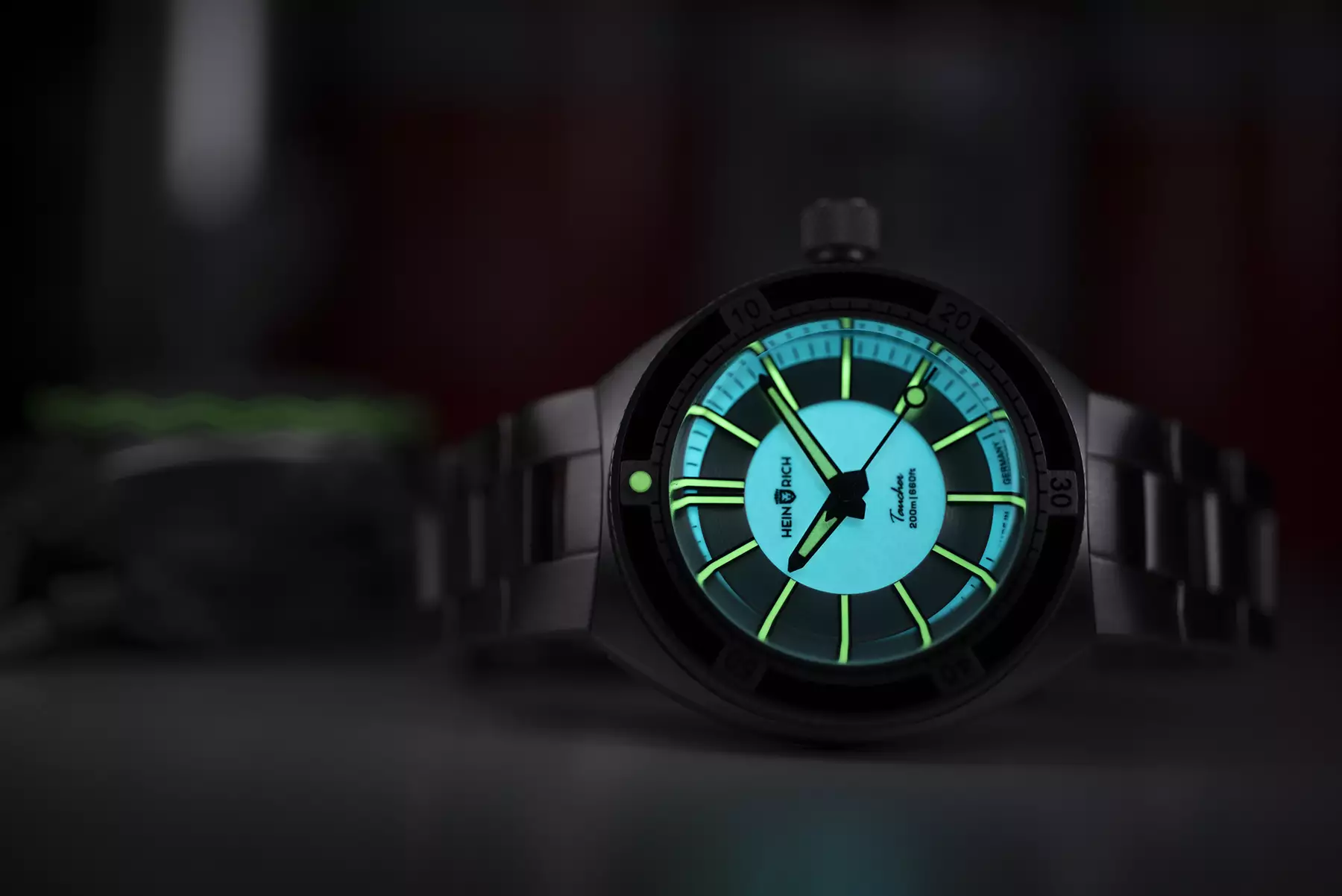
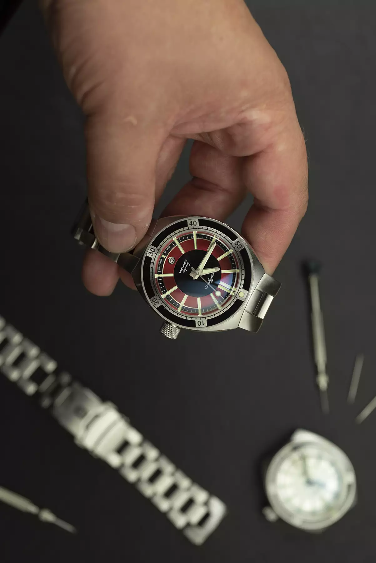
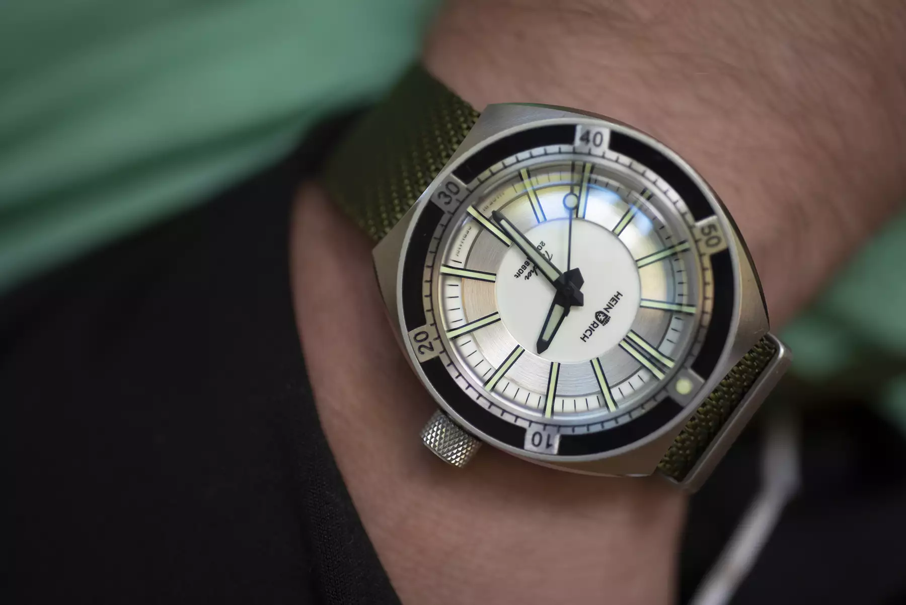
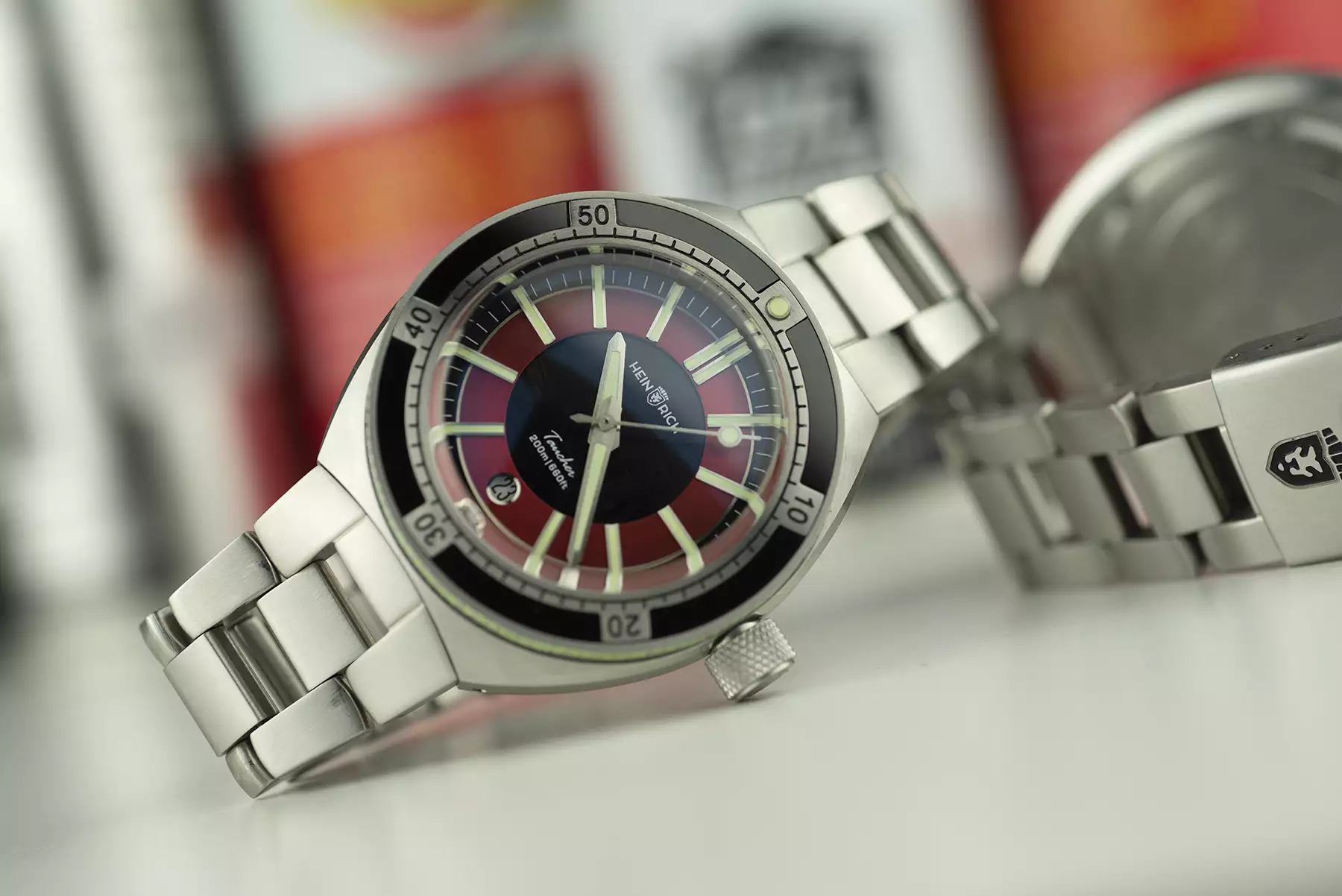
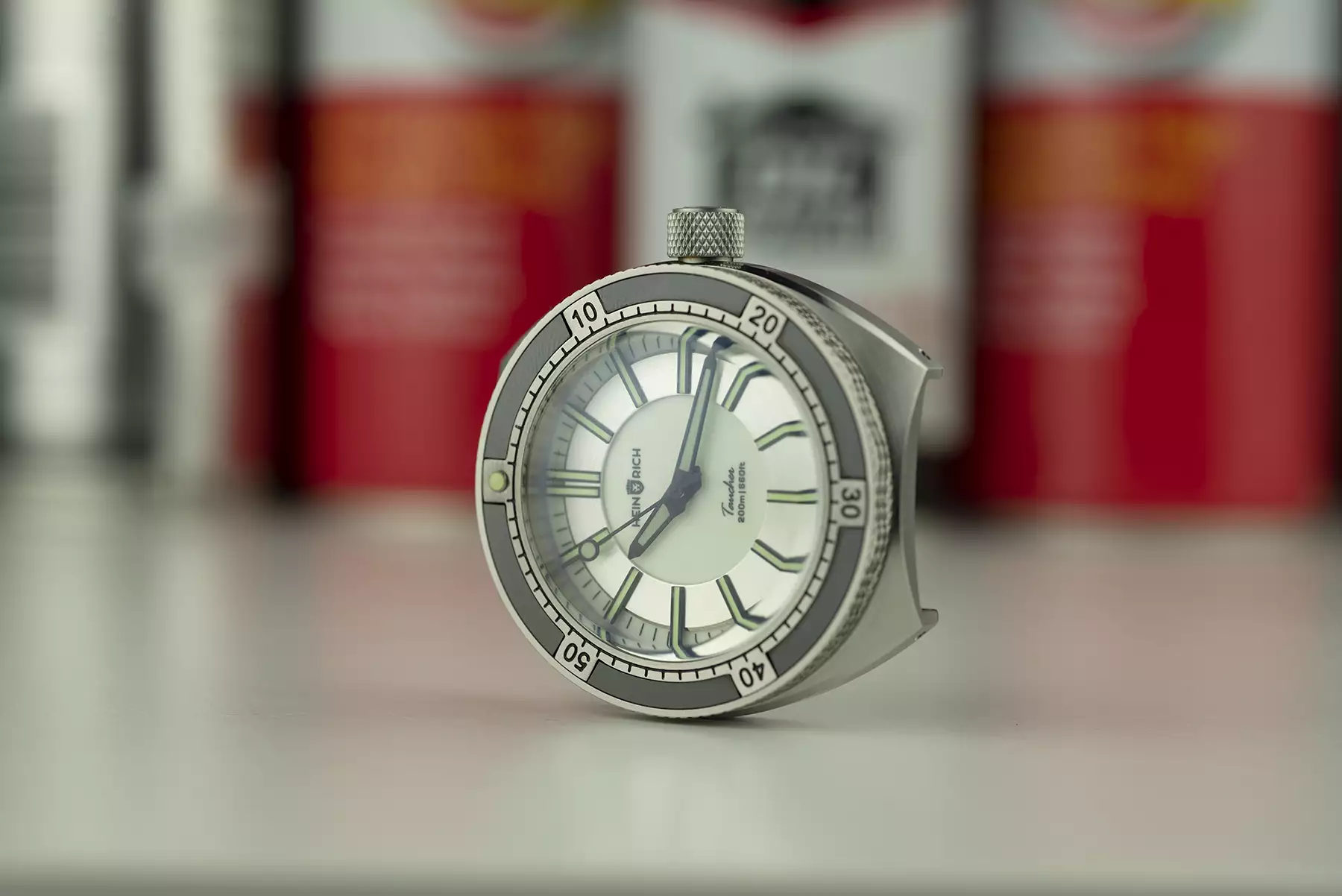
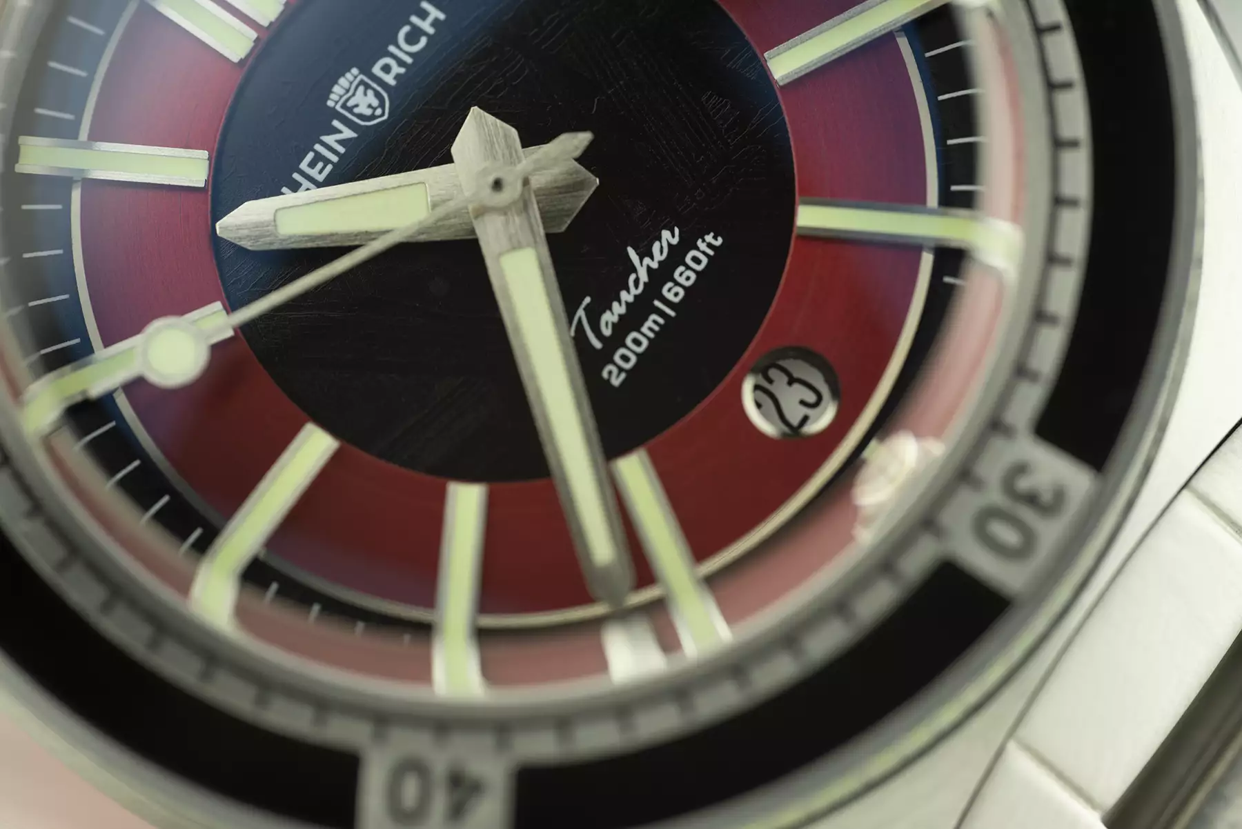
Perhaps one of the few attributes that I could confidently identify for a retro-inspired diver is a nice, slim midcase, and Heinrich have included that here. The case height is cloaked well with combination of brushed surfaces along the case sides and top, a generous polished crease between them, a pretty tall bezel and box crystal on top. In profile, the watch appears substantial rather than outright chunky. Both crown and bezel actions have a quality feel about them, but visually neither quite hits the mark for my taste. While the crown is functionally faultless and the knurling is well done, I can’t get away from the feeling that it’s just too big. My qualm with the bezel is restricted only to the red and black dial, and is the presence of the lumed wave around the perimeter. As cool as it looks in the dark (and we all know lume is cool, right?) the bright green doesn’t really work against the dial and bezel colors.

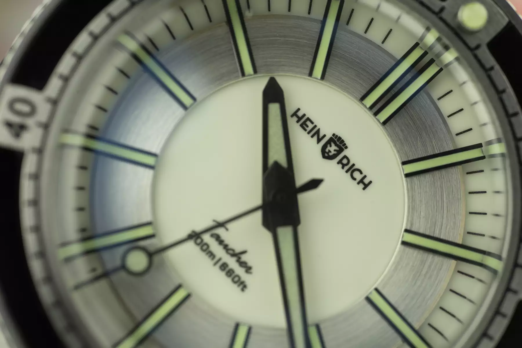
What I definitely do like is the bullseye pattern which starts with the center of the dial and continues with alternating surfaces and/or colors right through to the outer edge of the bezel. With many dial colors on offer, including blck, yellow, cyan, green, blue, and red the effect and funkiness will be different in each one, and the two I have are probably at opposite ends of the spectrum. The black and red dial is actually a combination of meteorite and brushed red surfaces. The pattern of the meteorite is almost too subtle to notice straight away. If you like watches that keep revealing things the more you look at them then this is undoubtedly a good thing, but if you would rather have a watch that just screams you’ve got a piece of meteorite on your wrist then you might be disappointed by its perceptibility. The other watch I have is the full-lume version which features the same C3 X1 Superluminova on the hands and bezel pip as the other variants, with contrasting blue lume around much of the rest of the dial. Despite becoming a beacon in the dark when fully charged, in normal daylight the white dial is much more sober and serious than the alternating black and red.

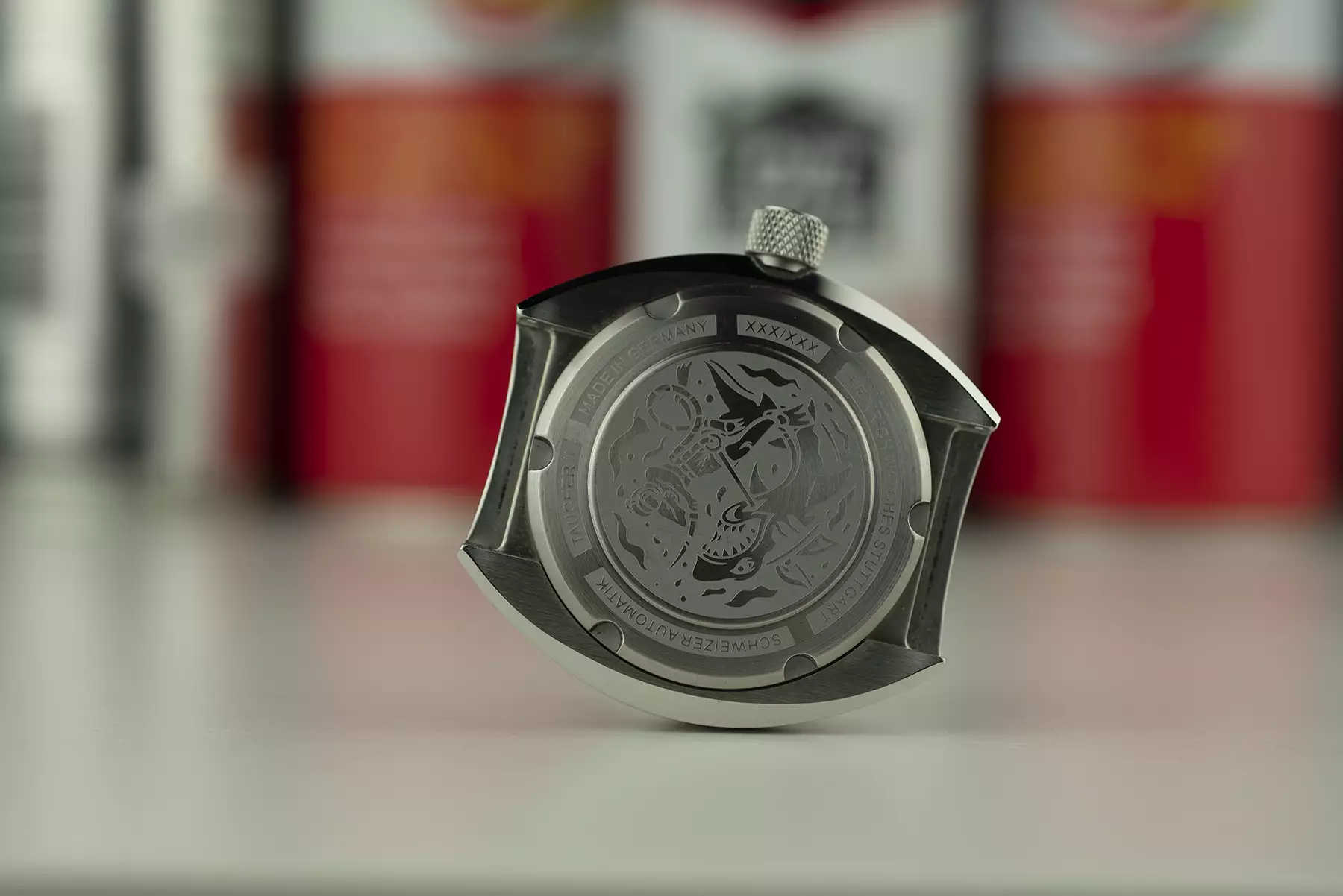
As you might also have picked up from the photos of these two, the whole series is available either with or without date. Where the date is present, symmetry of the dial is preserved by locating it in place of the six o’clock marker, and where no date is present the date setting position is removed from the crown. The movement selected by Heinrich is the Selitta SW 200-1 in Elaboré grade – a well-known Swiss automatic caliber with 38 hours of power reserve and beating at 28,800 bph.

One huge retro touch which I struggle to get fully on board with is the ladder bracelet. We’ve seen the style successfully executed on the Zenith Chronomaster Revival, and I personally don’t like it there either. Seeing stray arm hairs poking through doesn’t appeal to me, but I can try to put my own feelings to one side to take an objective look at it. The transition from case to bracelet isn’t a completely smooth one, but it’s not supposed to be. The arc between the two is a part of the design which I really like. I mentioned above that this watch could be good for smaller wrists, but I don’t think that’s going to be the case when worn on the bracelet. The first link, fixed in place against the case, extends the overall length to something in the region of 54mm – the downward angle of those end links does mean the ‘wrap’ around the wrist has already begun, so the length is not absurd by any means, but definitely worth bearing in mind. It’s an entirely different story on a single pass strap however, which really plays well on the short case length, but it pains me to admit that part of the charm is lost without the bracelet attached.

The Taucher 2 is certainly not a homage of anything I can think of, which is something to be commended about a dive watch that looks back to a specific period for inspiration. Heinrich have done a great job of bringing so many interesting touches into a single watch and getting them all to gel, even if some of those aren’t to my taste. The fact that I miss that bracelet as soon as I take it off shows how well the whole package works. With so many colors on offer, each appearing to sit somewhere between the sober and funky extremes I have looked at today there is probably a combination in there that plays up or dampens the retro vibes to each individual’s preference. The Taucher 2 is currently available for preorder with prices starting from 869 EUR. Heinrich.

Images from this post:
Related Posts
Brad stumbled into the watch world in 2011 and has been falling down the rabbit hole ever since. Based in London, Brad's interests lie in anything that ticks, sweeps or hums and is slightly off the beaten track.
bradwatch
Categories:
Tags: