Junghans Continues to Expand their Meister Line with new Pilots and Drivers

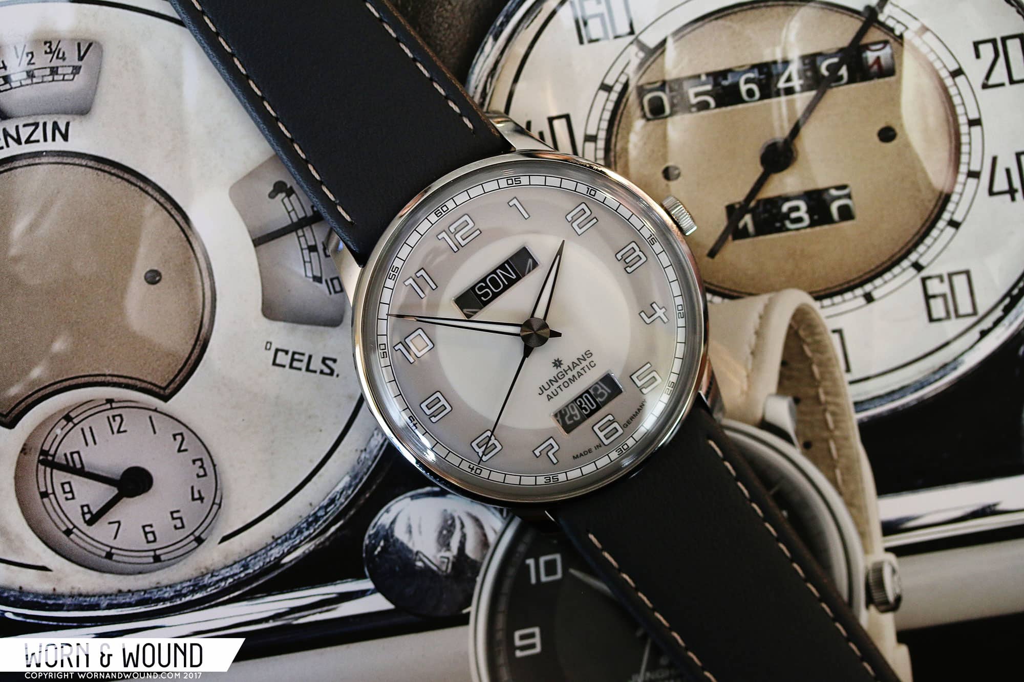
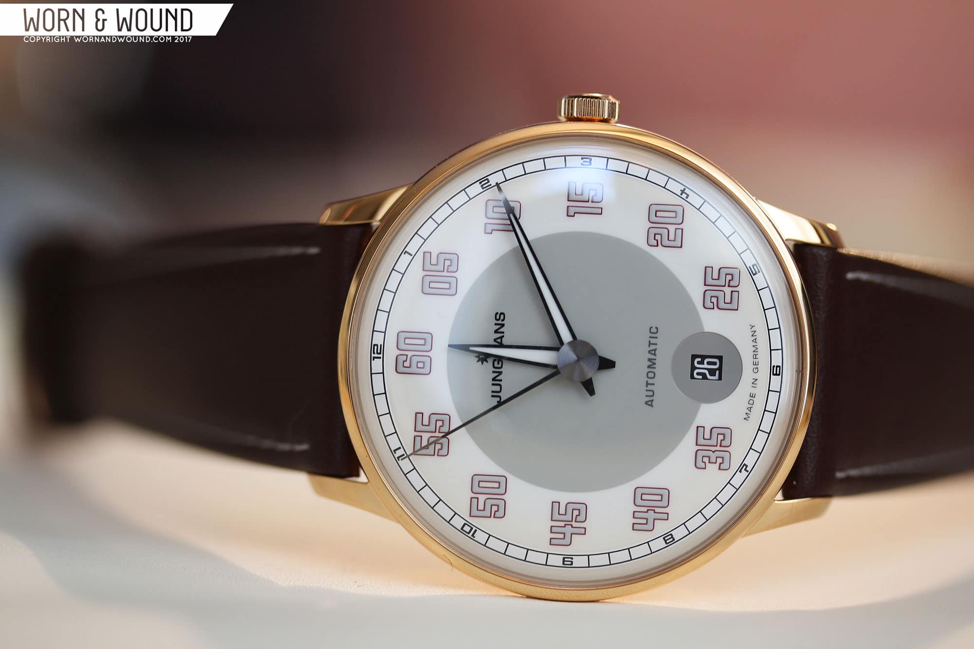
Junghans always puts on a good show at Basel, even if they are technically outside of the main event. This year, they continued to push some of their most successful lines from last year, as well as dropped a whole new line for us to enjoy. Here we’ll take a look at their new additions to their Meister Line, with a separate article on their new Form line to follow. Let’s get into it.

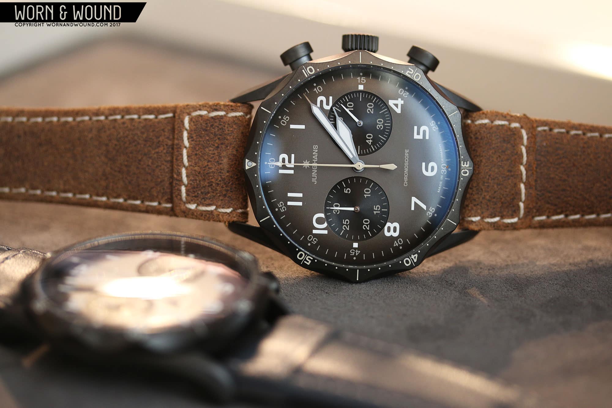
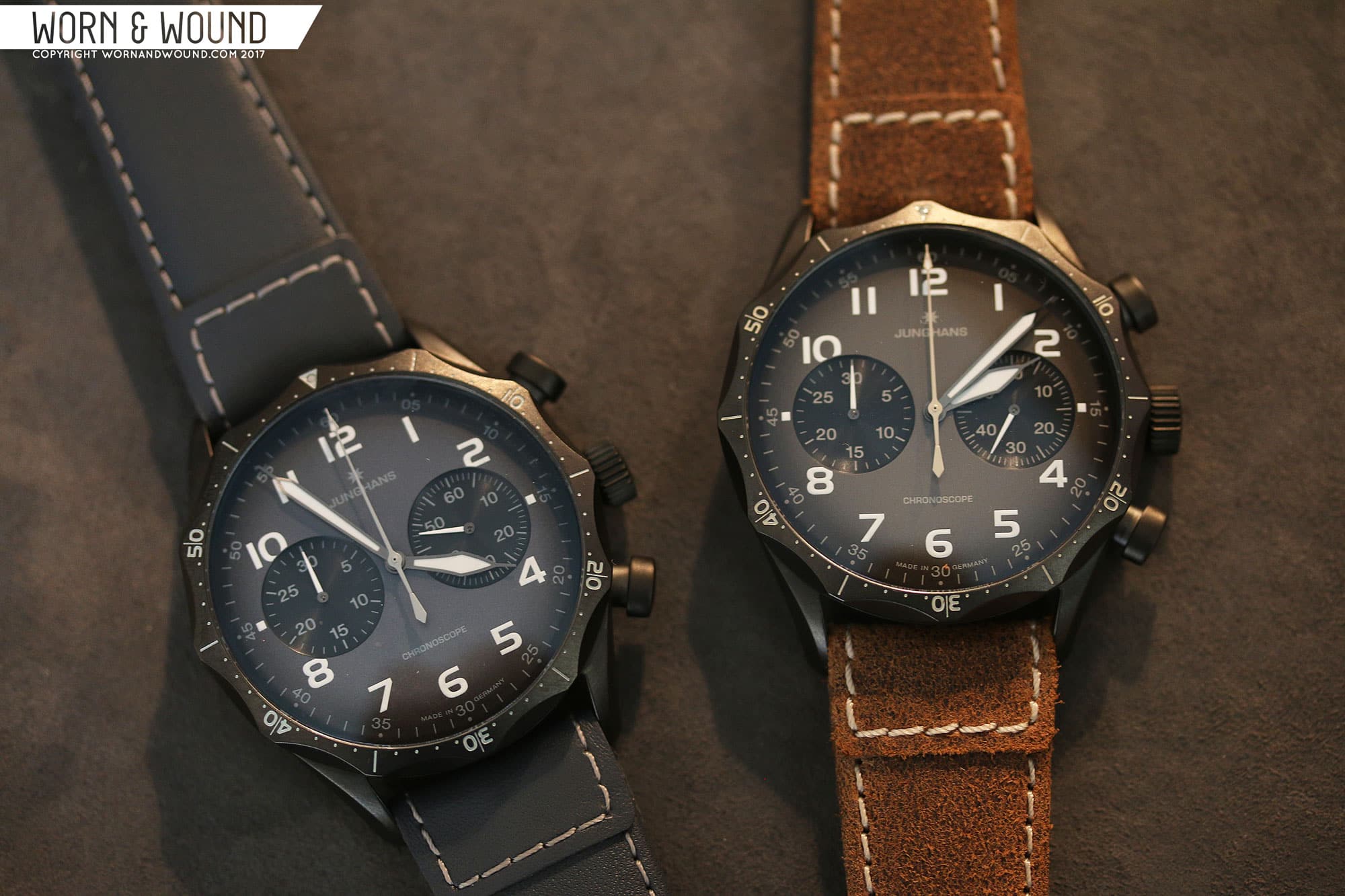
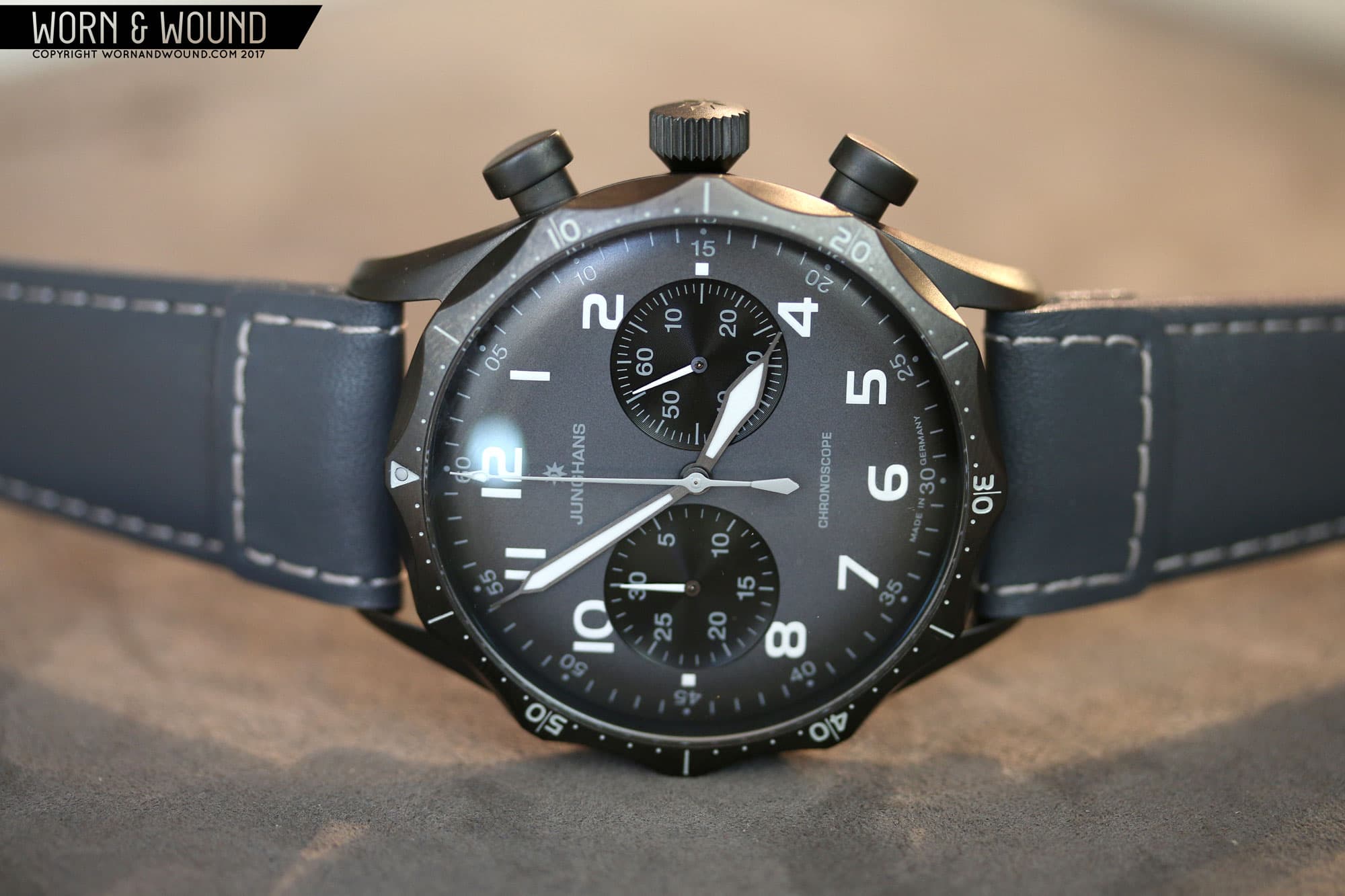
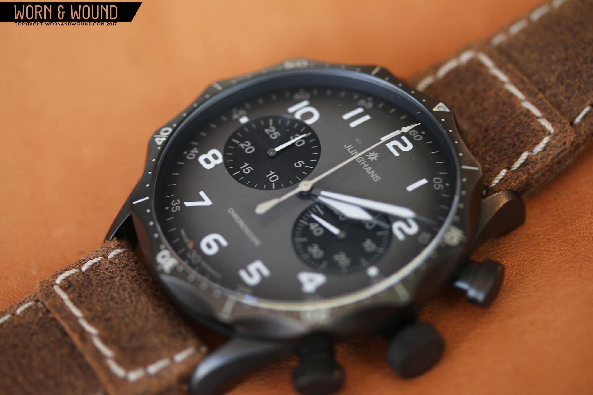
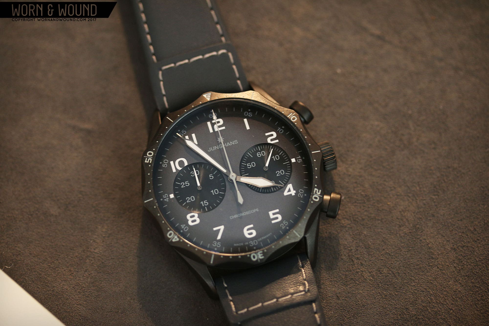
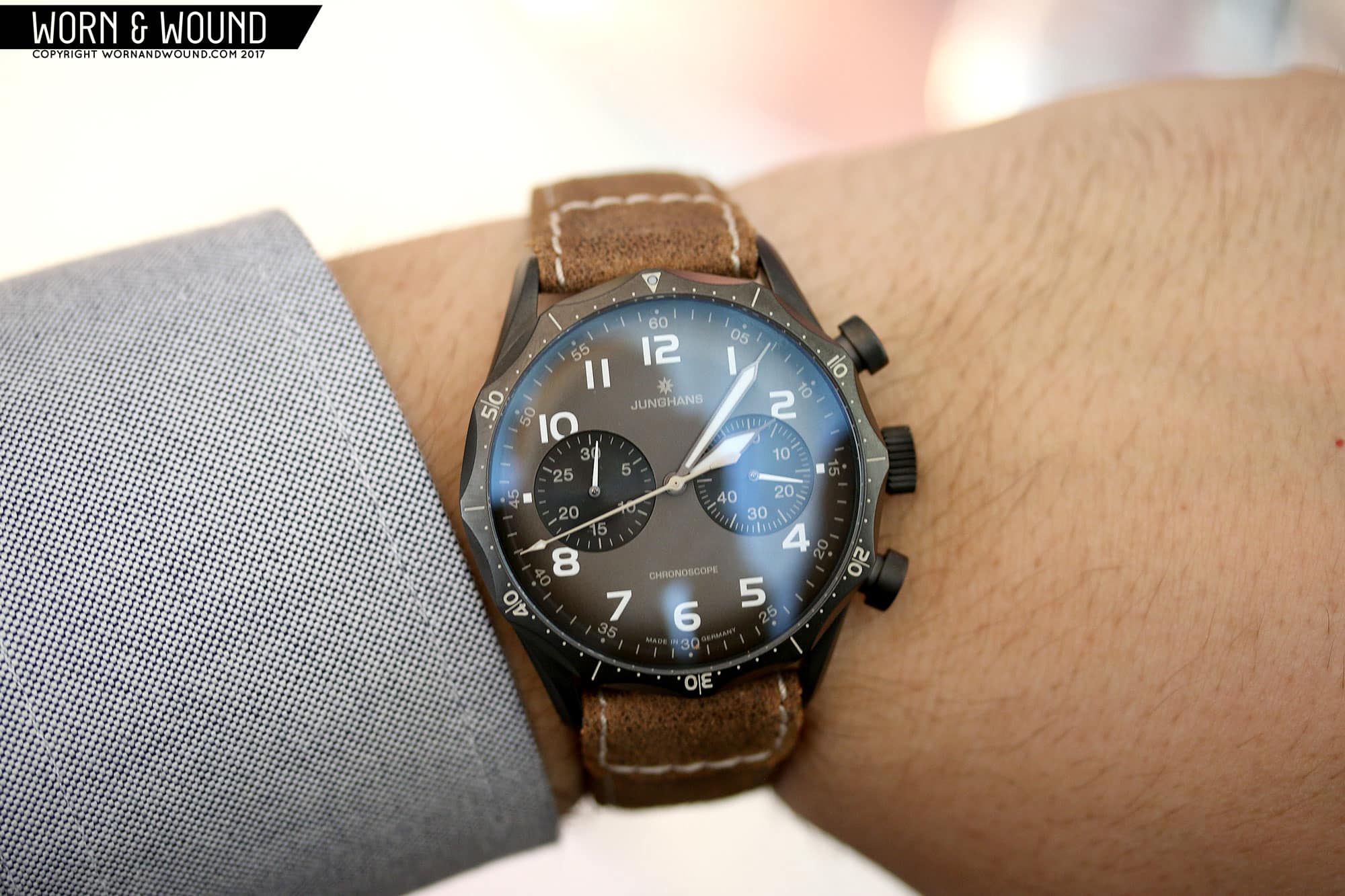
The Pilot Gets a Dark Makeover

One of our favorite watches from last year was the Meister Pilot Chronoscope. We reviewed it a few months ago as well, and it’s truly a stunning watch. Despite being a military pilots chronograph with historical roots, it looks unlike any other brand’s watches. The case is nothing short of a work of art, with the distinct scalloped bezel riding the top of the case like a crown. It was easily one my favorite watches from 2016.

For this year, they added two variations on the Meister Pilot, both with blacked-out, DLC cases. I was truly surprised to see this as Junghans doesn’t seem to do DLC very often, and the result is striking. The case goes from its normal awesome, to intense, aggressive and dark, both literally and figuratively. The scalloped bezel becomes mean looking, while the rest of the case just takes on a toughness the original didn’t have.

For dials, they continued with the surprises by doing blue/gray and brown bursts that fade to black. They look aged, or burnt, like they were black dials that had sat in the sun for a few decades. It’s a fantastic effect that both tones-down the colors and continues with the new aggressive edge the watch has been given. We’re not done either, instead of matching sub-dials, they are now black, contrasting the subtle faded colors around then. Honestly, the watches look almost demonic, and I mean that in the best of ways. Pricing TBD, but the originals were $2,465, so I imagine these will be a bit above that.

The Meister Drivers Continue to Roll Out

Next up we have the continuation of last years Meister Driver line, with two new models; the Automatic and the Day Date. The Automatic start with an obvious feature, an automatic movement versus last year’s hand wound and chronograph movements, packed in a modest 38.4 x 9.9mm case. The overall aesthetic speak to the originals, but have been imbued with a dose of color, meant to emote vehicles of the 50’s, as well as a date and central seconds.

So, you have a deep, rusty red, a soft sky blue and a fresh mint green accenting the three new designs. That color is then found mostly in the strap and a bit on the dial, in the form of an outline to the numerals. The result is, honestly, a bit more feminine than the previous versions, but given the unisex sizing and concept, that’s probably a smart move on their part. The date window has been smartly placed in a little gray circle that balances things out. All three will be available with either steel or gold PVD cases. Pricing TBD.

Date windows are always a contentious topic on w&w, so I’m curious to see people’s reactions to this one. The Meister Driver Day Date takes its inspiration from automobile dashes from the 30’s, specifically ones with total and daily kilometer readouts. They translated this fairly literally by adding wide, rectangular cutouts with black-backing below 12 for the day and above 6 for the date.

Because the slots are wide, the next and previous date and day are partially visible through a ghosted material. The result is dramatic and harsh, though undeniably intriguing. Typically when a date causes issue on a dial, it’s because it’s disruptive of the theme. Here, the disruption is the theme, so it’s hard to argue against the execution, it’s jut a matter of whether you like or dislike it. I’m on the fence at the moment, as I like the originality of it, though I do prefer the elegance of the originals. The Day Date is also a bit larger than the other models coming in at 40.4 x 11mm. Pricing TBD.


For more information on the Pilot and Driver lines, head to Junghans.de

Images from this post:
Related Posts
Zach is the Co-Founder and Executive Editor of Worn & Wound. Before diving headfirst into the world of watches, he spent his days as a product and graphic designer. Zach views watches as the perfect synergy of 2D and 3D design: the place where form, function, fashion and mechanical wonderment come together.
wornandwound zsw
Categories: