Opinion: Selling Points that Don’t Sell Me Part II – Deal Breakers, Pet Peeves, and Collecting Authentically

What makes watches so expensive? It’s a question enthusiasts ask themselves at the beginning of their horological journeys, and later on, a question we find ourselves answering from curious friends and family. The answer comes down to options. Not all watches are powered by in-house movements, but some are. And if that’s what you’re into, companies will ask you to chip in for the research and development required to develop a new caliber. Likewise, not all watches go through extra testing to confirm accuracy to a few seconds per day. But if that level of reliability is a priority for you, plenty of brands are willing to provide that service for a fee.

With enough rationalizing, it’s easy to see how even six digit price tags offer fair value. On the other end of the spectrum, if those options that increase MSRP don’t excite you, then maybe a one watch collection of a single $15 Casio F91W makes the most sense…but where’s the fun in that?

Advertisement

For most of us, myself included, the sweet spot lies somewhere between the Casios and the Urwerks of the world. In the previous installment of Selling Point that Don’t Sell Me I explored what options excite me on my personal quest for quality on a budget. But enjoying watches at modest price points doesn’t mean I can’t still be picky.

And so, for this installment of Selling Points that Don’t Sell Me, I’ve compiled my personal list of deal breakers and pet peeves. This list is less focused on keeping costs low, and more focused on keeping standards high while collecting authentically.

Applied Logos

At some point, the watch community must have decided that applied logos were better, though I don’t remember getting the invitation for this vote. It’s always one of the first selling points touted in Youtube reviews. I can hear it in my sleep: “Sapphire crystal, 200 meters of water resistance, applied logo…” It’s shared as if a printed logo is inferior, and a watch with one wouldn’t check the correct enthusiast boxes.

I recently reviewed the Bulova Oceanographer and ragged on its applied logo, which appears to have been adhered to the dial with unsightly murky white blobs. I love the modern Oceanographer, but can’t wrap my head around Bulova’s decision to skip the classic, clean look of a printed logo found on the original, and instead opt for something that cheapens the appearance of an otherwise great watch. I can only assume they fell for the idea that enthusiasts demand it.

And it’s not just Bulova. Brands from around the world are hastility jumping through hoops to check that applied logo box, but botching the execution. We see it in the Tissot Heritage Visodate, which reinvents the laws of cursive to awkwardly connect letters into a consolidated mess, and find it again in certain models of the Seamaster that opt for applying the word “OMEGA”- taking questionable calligraphy liberties that distort the iconic name in the process. Just this week I saw a new independent Swiss brand use similar tactics on watches still only available for preorder. I love when a good trend takes off and brands take cues from the success of their peers. Morphing letters just to raise them off the dial is not one of them.

Applied logos are a great way to add depth, but they are also hard to get right, especially when opting to slap an entire name on the dial. When done in a  lackadaisical way, they do more harm than good. Two of my favorite dials at the moment are the anOrdian Model 1 and the Serica 4512. Both pad printed, and both showcasing deliberate design choices to add depth without an applied logo.

If brands feel obligated to apply logos simply to appease enthusiasts and check boxes on our collective wishlists, allow me to be the first to speak up and say: I don’t want this. I didn’t ask for this. And, if you’re going to half ass it, just don’t do it.

Overbranding

Sorry, Tissot, but I need to pick on you again. I’ll stop after this, I promise.

I can’t count how many times I’ve tried to convince myself I want a Tissot Seastar. Overall, it’s a great watch and a top contender for the best attainable automatic Swiss diver. But that “T” seconds hand stops me every time. Watching it perpetually float around the dial reminds me of those planes pulling banners advertising casinos when I’m just trying to enjoy a day at the beach. It’s distracting and draws my attention away from positive aspects of the watch. If I’m spending $800 on a Seastar, I know it’s a Tissot because I paid for it. I don’t need product placement to remind me of the brand on my own wrist.

It’s not just Tissot that takes the opportunity to clutter a dial to self-promote. Ball Watch, a brand I deeply admire, is easily recognized by their refined cases and use of tritium. Despite this, they still unnecessarily add a logo’d second hand and excessive text on the dial touting the technology housed inside. Again, if I’ve just dropped a couple grand on a watch, I’ve already been sold on the brand and its accomplishments. The watch itself should be reserved to deliver on that value, not advertise it further.

When I’m being picky, and I always am, I seek out the best designs that are recognizable without over-branding- or even any branding at all. It’s another aspect that draws me to Serica and anOrdain, both confident enough in their design language to hide their names on the periphery of a dial. An enamel printed dial with skeletonized hands is going to be an anOrdain, and a funky California dial with an extra-broad arrow hand is going to be a Serica. 

Bracelets

My personal feelings toward bracelets are simple: I don’t like them. They are uncomfortable and add unnecessary weight and expense to a watch. We spend so much effort finding the perfect fit, wishing brands would stop using pins, applying Loctite to screws prone to backing-out, applauding micro-adjust as if we will ever carry around a tool on a hot summer day, and fawning over sparsely offered toolless on-the-fly adjustment. The constant search for the perfect fit and solution is only necessary because bracelets are an impractical method of securing a watch to a wrist.

I’ve been fortunate to experience some of the best bracelets out there, from the Royal Oak to a modern Jubilee. And, while I can respect these engineering marvels for their finishing and what they contribute to the aesthetic of a watch, no bracelet will ever be as comfortable as a $20 NATO. Sure, bracelets look better. But personally, I will always prioritize ergonomics over aesthetics. If I can do that while saving money, even better.

Advertisement

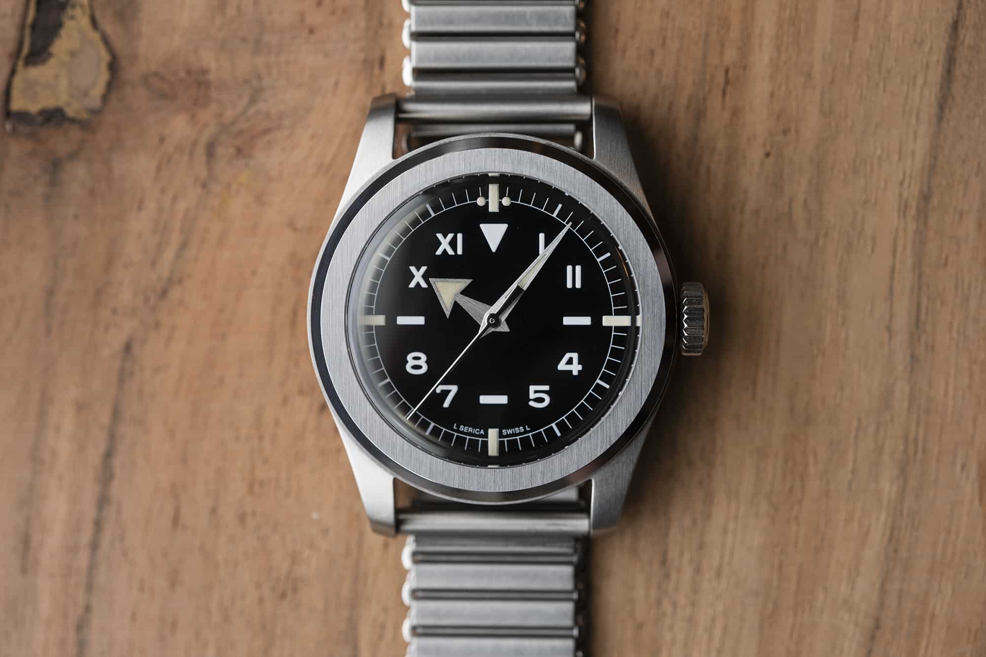
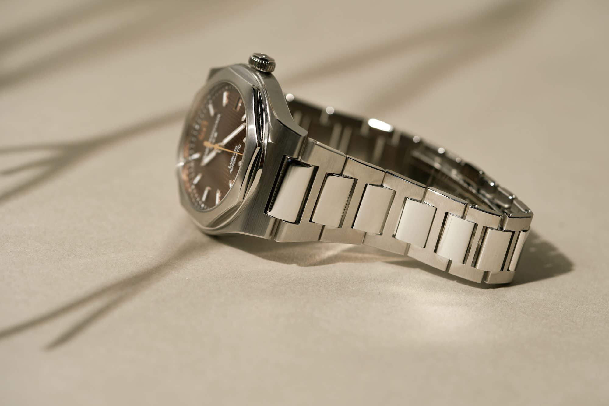
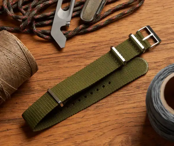
I think the bracelet dilemma extends beyond bracelets vs. straps, and is founded on a larger problem in the industry: brands don’t care enough about them. Consumers have grown unfortunately desensitized to sub-par quality. When I was reading reviews of the olive green Seiko Land Tortoise, a common theme was suggesting to throw away the strap. And, hyperbole aside from actually disposing of the strap, they were right. I tried to wear that stiff slab of material for the first few days, and I’m not convinced the watch even touched my wrist- instead hovering above it on a cloud of cut corners. When a $10 no name silicone strap from Amazon can enhance wearability on a $500 watch, it’s clear where Seiko’s priorities lie.

When I sell a watch the post usually includes the phrase “unworn bracelet.” I appreciate when brands give me the option to opt out and instead use the cash I saved for a quality 3rd party strap that will make me actually want to wear the watch.

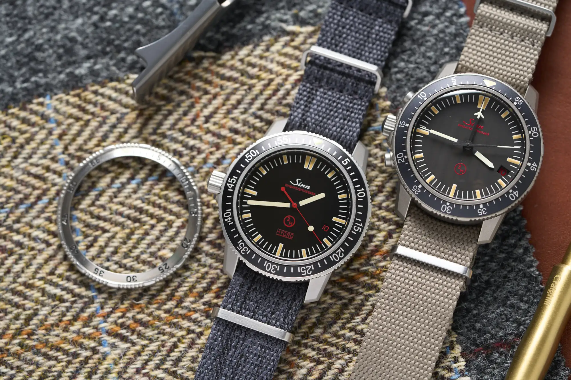
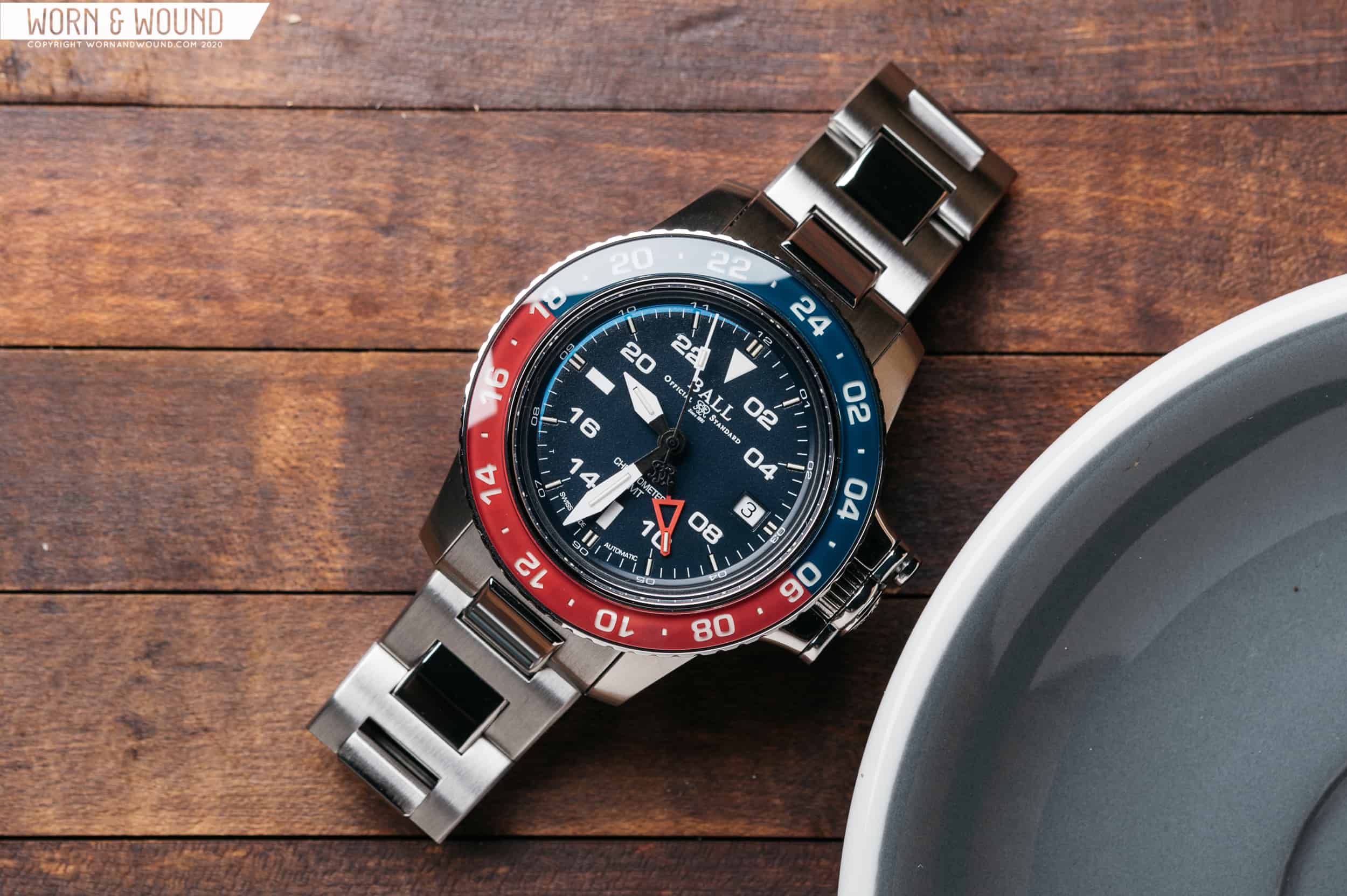
Scratch Resistant Cases

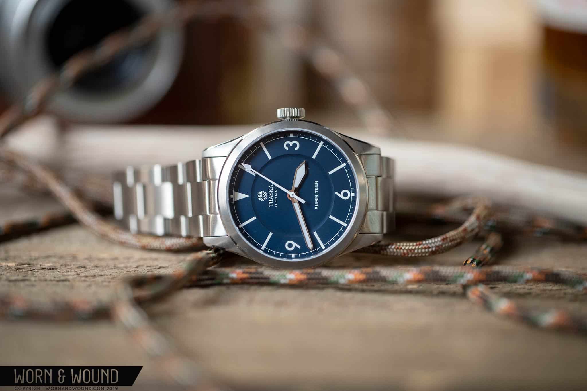
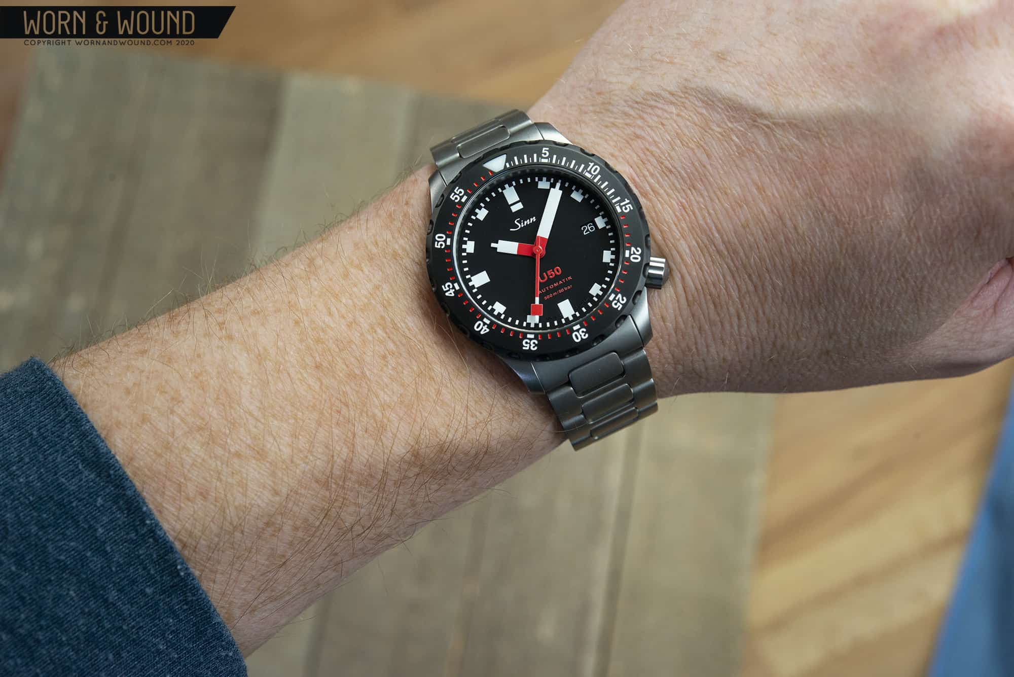
For Sinn its Tegimented, a technology used to harden their steel cases. Other brands opt for coating, such as Traska’s proprietary scratch resistant application. No matter the method, the end result is the same: resistance to wear and tear.

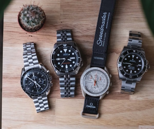
For a group that is often excited by patina on vintage watches, our aversion to letting modern watches age seems contradictory. When buying anything expensive, there is an innate desire to protect it. I get that. But watches aren’t shiny new kitchen appliances that look noticeably worse with a couple scratches. 

Most of the time, the scratches are only noticeable to the wearer. And, as I’ve discovered on my own collection of tool watches, the inevitable abrasions add an aesthetic charm. But most importantly, scratches tell a story. It’s why we cringe at the idea of a polished Rolex. All that history, all those scuffs associated with lives lived, washed away. To create a watch designed specifically to resist collecting those stories seems counterintuitive. 

We’re all here for different reasons, and a new Traska wouldn’t be so hard to obtain if there wasn’t a market for scratch resistant sport watches. But decades from now, when my kids are hopefully still enjoying the watches I created stories with, I doubt they will be wishing for pristine, blemish free surfaces.

Opinions change and preferences evolve, but something I can always depend on is the simple joy of discovering a new watch that feels authentic to me. At the moment, inspired by finicky preferences, that happens to be a recognizable yet not over-branded pad printed dial in a scratch-prone case on a NATO- not a niche I predicted, but one I enjoyed the journey to discovering. 

This concludes the two-part series, but please don’t let it conclude the conversation. Do you agree with my pet peeves and deal breakers? Disagree? Let me know what selling points don’t (or do) sell you and what unexpected preferences your opinions have led you to.

Related Posts
Nathan Schultz is a New Hampshire based writer, equally obsessed with watches and outdoor gear. He specializes in dad jokes, breaking NH35s while modifying watches, and testing the limits of recreational equipment. Micro brands hold a special place in his heart, and he aspires to stop buying and selling so many darn watches.
Categories: