Bernhardt is one of those cult brands that people simply love. As you can read in our brand highlight on them from a little while ago, it’s a small family run brand that puts an emphasis on customer service and the relationships they make with customers. In that way, they really are unique, even amongst the boutique brands, having the feeling more of a local corner store than an internet based company. The watches themselves are very modestly priced for modern day mechanicals, most coming in between $259 and $459. As such, they have a big following of devote fans who collect their affordable dive watches.
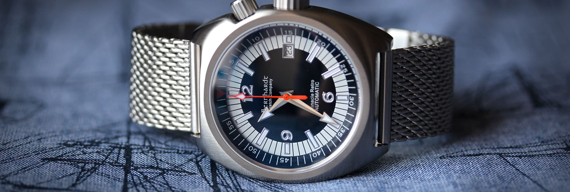
Their newest watch, the Bernhardt Binnacle Retro, is also their most expensive at $679, which is still lower than where most brands start. As the name suggests, this watch is based on vintage divers, mainly of the 60’s and 70’s, by featuring a barrel case and dual crown design. It also features a Swiss made ETA 2824-2 automatic movement inside, where as their other autos have Miyotas, which likely counts for most of the cost. It’s also a limited edition of 1000 units, adding some exclusivity into the picture.
Bernhardt Binnacle Retro Review
 Case: Steel
Movement: ETA 2824-2
Dial: Black
Lume: Yes
Lens: Sapphire
Strap: Steel Mesh
Water Res.: 200M
Dimensions: 41.5 x 46.5 mm
Thickness: 13.3 mm
Lug Width: 22 mm
Crowns: 6 x 4 mm & 8 x 4mm
Warranty: 2 years
Price: $679
Case
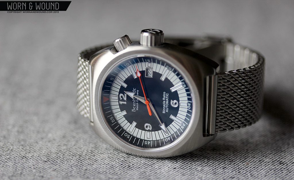
The barrel shaped dual-crown case of the Binnacle retro gives it it’s distinctly 70’s look. Measuring 41.5 x 46.5 x 13.3mm (to the top of the domed sapphire crystal) is small-medium for a contemporary dive, but logically sized for a vintage throwback. The case shape is very simple and straightforward. From above it has the smooth bowing characteristics typical of barrel case design. The top flows directly into slab sides for a design with no hard edges, save around the lugs. The whole case has an even satin brushed finish.
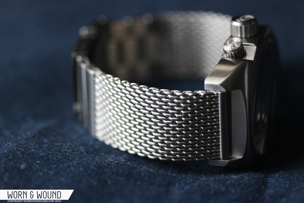
Since the watch features an internal bezel, there are two crowns. At 2 is a crown for controlling the bezel and at 3 is the primary crown. For those familiar with the super-compressor watches of the 60’s and 70’s you might find the orientation of the crowns a bit disconcerting as those were typically positioned at 2 and 4. Nevertheless, this positioning is functional. Both crowns screw-down for water resistance and feature a chunky and easily graspable design. They also are both marked with large B logos on the end. Since they are so close together it looks a bit odd. A different symbol for the bezel would have been a nice touch.
The internal bezel crown measures 6 x 4mm, which looks small compared to the 8.4 x 4 mm used for the time. That said, they feel in proportion to the case, even though they are different sizes. Since the barrel case does not have a cylindrical center, the 2 crown has to be placed in a cutaway, which is a bit strange and abrupt looking, though easy to get used to. The bezel itself is bi-directional and non-ratcheting with a good, smooth action.
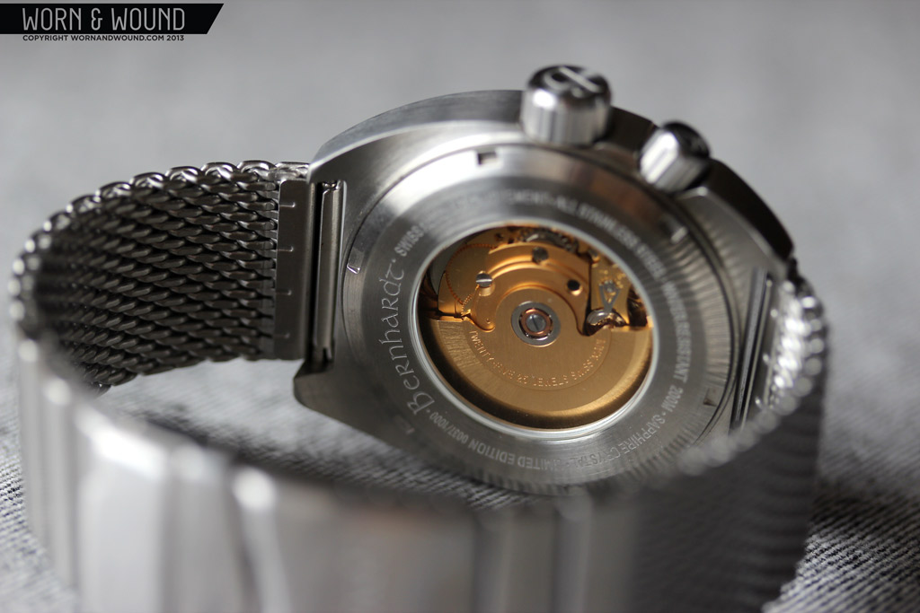
The Binnacle retro features a display back which shows off the gold tone ETA 2824-2. I was quite surprised to find that the movement was plated as that is pretty atypical. Otherwise, it is undecorated, but the gold alone makes it attractive. It’s also a bit odd to have a display back on a diver, though the watch does have a respectable 200m resistance. Clearly this isn’t a pro-diver so much as a stylized tool watch, so the water resistance makes it more versatile.
Dial
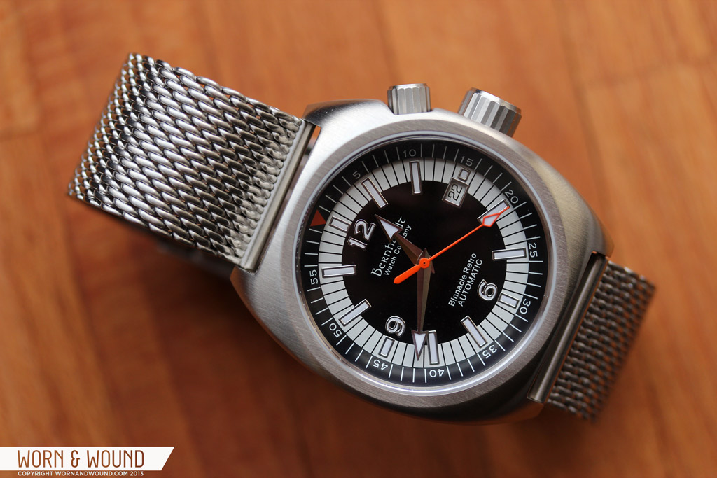
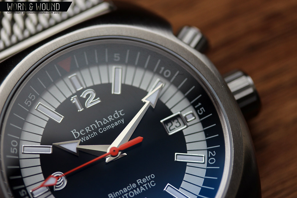
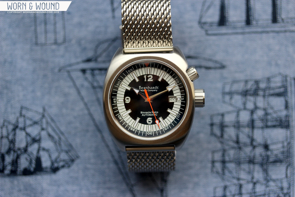
The Binnacle retro has a bold and somewhat funky design. Available in three color-ways, the general motif could be described as a bulls-eye, with concentric black and white areas. The primary index consists of large lumen rectangles with a raised steel border, giving them the appearance of an applied marker. The rectangles cross from the inner black area to the white edge, which makes them very noticeable.
At 12, 6 and 9 there are large numerals executed in the same fashion as the markers. The font used seems to be the same serif and somewhat old-world font used for the Bernhardt logo. It’s definitely an atypical font to be used for a dial, especially on a diver, but I think it gives it a bit of a unique Bernhardt twist. It’s not for everyone, but it’s not unattractive. The issue I have with the numerals is actually the silver edge, which is a drop too thick. It makes the numbers less defined and almost blurry.
At 3 is a date window which balances with the numerals. The date is presented as black text on a white surface. Since a sizable portion of the dial is white, the date plays off of the that, so the black on white works in this instance. The perimeter of the dial is an inverted black on white index for the individual minutes/seconds, which consists of just thin black lines. The area itself is quite wide, giving it a very bold look. The black lines extend all the way to the edge of the dial, lining up with the internal bezel.
The design of the bezel insert is quite simple and plain. It has a black surface with white lines and white numerals every 5 min/sec. At the origin is an orange triangle. The white lines continue the black lines from the dial for a continuous flow from dial to bezel. The insert works with the dial design, but lacks a bit in personality. I also was a bit bothered by the placement of the numerals, which is below the center.
The Binnacle features a pretty interesting handset that closely resembles that of the Omega Seamaster Planet Ocean. Both the hour and minute hands are alpha/diamond shaped with large triangular tips in polished steel with lume filling. It’s a fun look that adds a lot of character to the watch. The second hand is a bright orange stick with a lume filled pointer. Tying into the the orange triangle on the bezel, the color here is needed to liven things up.
The dial overall is pretty fun and fairly well executed. The lume is pretty weak on the dial surface, though a bit stronger on the hands. Ultimately, it’s not a design that will appeal to everyone and I think could have used a bit more refining. There is just something a bit heavy handed about the layout that keeps it from having the elegance one often finds in vintage divers, especially dual crown models.
Straps and Wearability
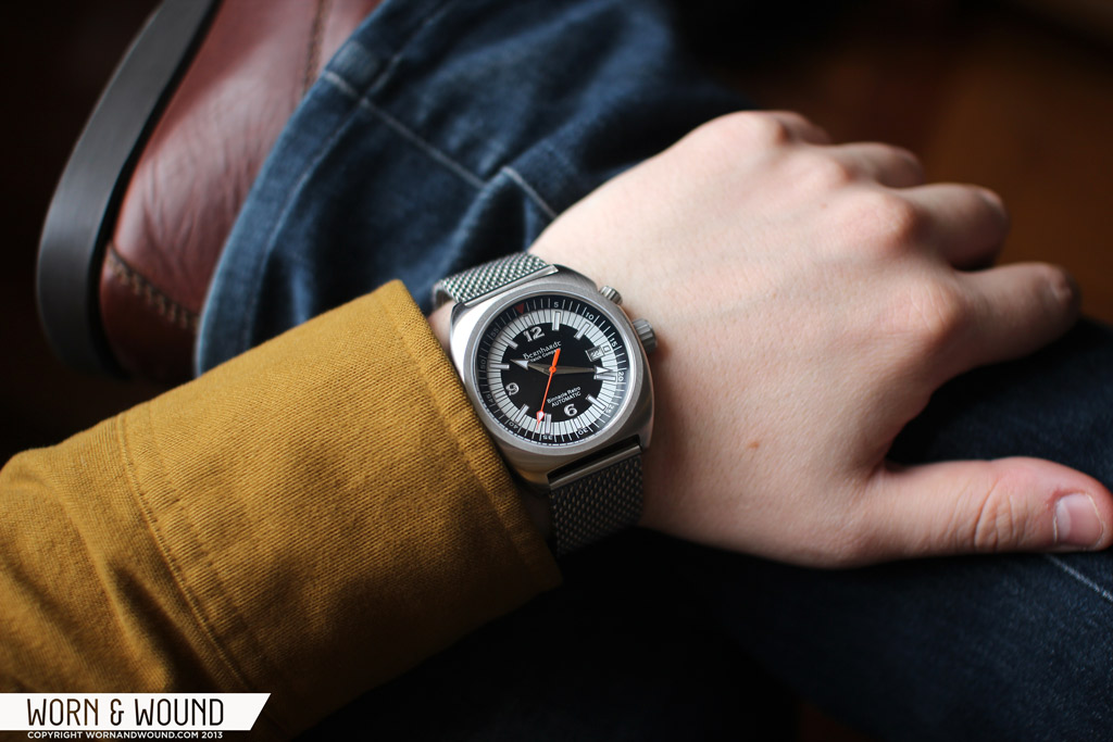
The Binnacle Retro comes on a 22mm steel mesh bracelet with adjustable links. It’s a thick and well made bracelet that is easy to size to your wrist. I removed 4 links to fit my 7″ wrist, and then it fit very well. The mesh adds a lot of mass to the watch, visually and physically. The steel on steel look adds a seriousness to the design that makes the watch feel more formal. The texture of the mesh also plays nicely off of the brushed case. Wearing the watch like this was fairly comfortable, though I did find the mesh pulled on the hairs of my arm, though that is typical with meshes.
Alternatively, the watch would work great with rubber or leather strap. I put it on a 22mm Hirsch Liberty that I had kicking around and it changed the look quite a bit. The rugged leather softens the look, bringing out more of the casual vintage styling. Since the strap tapers, it also emphasizes the smooth contours of the case. The honey brown color also plays off of the orange present in the dial for a bit of harmony. This was definitely my preferred way of wearing it.
On the wrist, the Binnacle Retro wears well. The size is very comfortable, large enough to have a sporty feel, small enough to be sensible. The 13.3mm height also feels a bit thinner as the watch hugs the wrist. Aesthetically, it’s a curious watch. At once vintage/retro and just its own thing. The bulls-eye dial is bold and stands out, though the watch isn’t ostentatious. So it has enough presence without being showy.
Since it’s a diver, it is inherently sporty, but the smooth barrel case and use of fonts make it less aggressive looking than a typical tool diver. Overall, it’s definitely a casual watch that I think is best with relaxed clothing. Sure, on the bracelet you could probably wear it with a sport coat, though I think it’s best suited to jeans, shorts, etc…
Conclusion
The Bernhardt Binnacle Retro is above all else just a fun watch. It’s a bit different and quirky, but in a way that has charm. I appreciate the Bernhardt has their own approach to things as I don’t think this watch could have come from any other brand. As far as the retro aesthetic goes, it doesn’t quite come across other than in the case shape, though that doesn’t really take away from the watch as a whole. That said, I do wish that the case had had the 2 and 4 arrangement for the crowns, as I love vintage super-compressors.
In the end, it’s a decently made diver with a distinct look that will appeal to certain people. If your looking for a barrel cased or an internal bezel dive-style watch, this is worth taking a look at. At $679 its also not a bad price for an ETA 2824-2 based watch these days as prices are going up.
review watch supplied by Bernhardt Watches
By Zach Weiss





 Featured Videos





It’s cool to see them go to ETA movements. However, I’m curious if moving up a beg on the ladder will mean more competition between other boutique brands that also have ETA movements.
Sticking with Miyota means same quality cases as competitors but half the price overall.
Nice watch and great review. I wonder how’s the lume?
I’d like to see them using a Miyota 9015 and keep the price lower. I get tired of seeing the ETA 2824 in watches just so a watch company can say it has a Swiss movement.
But I thought ETA movements were Swiss?
They are Swiss. That’s my point. I would rather see them use a Miyota 9015 to keep the costs down. The benefit to using the ETA 2824 is that they can say it’s a Swiss movement and charge more.
I personally think the benefit of the Swiss movement in the Binnacle Retro is negligible and I’d rather see a lower price.
No lume shot?
I’m not really big on things that are obviously retro, but I do dig that mesh strap.
I like the case, but the hands do not stand out against the background. Also, the white ring is distracting. A fundamental purpose of a tool-sport watch should be instant legibility.