In the world of independent watches, brands like Damasko stand out. Small, family owned and operated, they produce a limited amount of watches per year with a focus on quality and technology that surpasses most brands many times their size. Though in a year, they might produce a fraction of what other sport watch brands do, and their name is not on buses or on shelves in watch shops across the US, Damasko still manages to produce truly exceptional pieces of engineering and for a good value too. And I mean value in the true sense. You get something of quality that exceeds its price tag, not something for as little as possible.
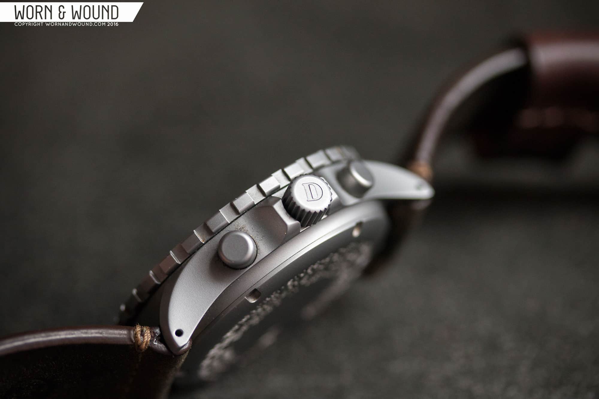
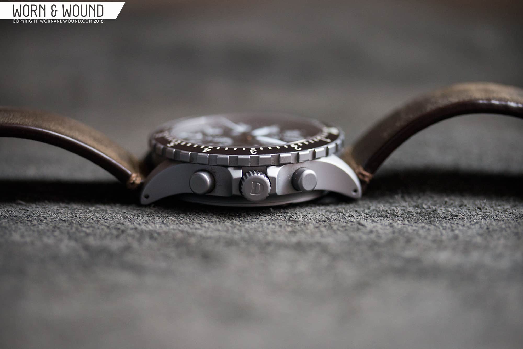
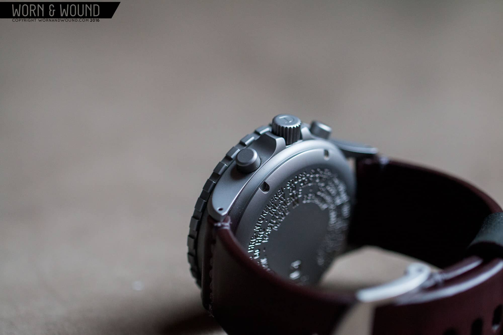
As such, Damasko is a favorite around w&w, with this being our third review of their watches. If you’re familiar with the brand, you’ll know they focus on modern pilot’s watches and chronographs. While they have a bunch of models, the differences between them are often slight. With and without bezel, with and without PVD, a different color hand, etc… The dials are often the same or similar within a couple of styles. More importantly, they all share the same astounding case tech, which is the driving force behind their watches.
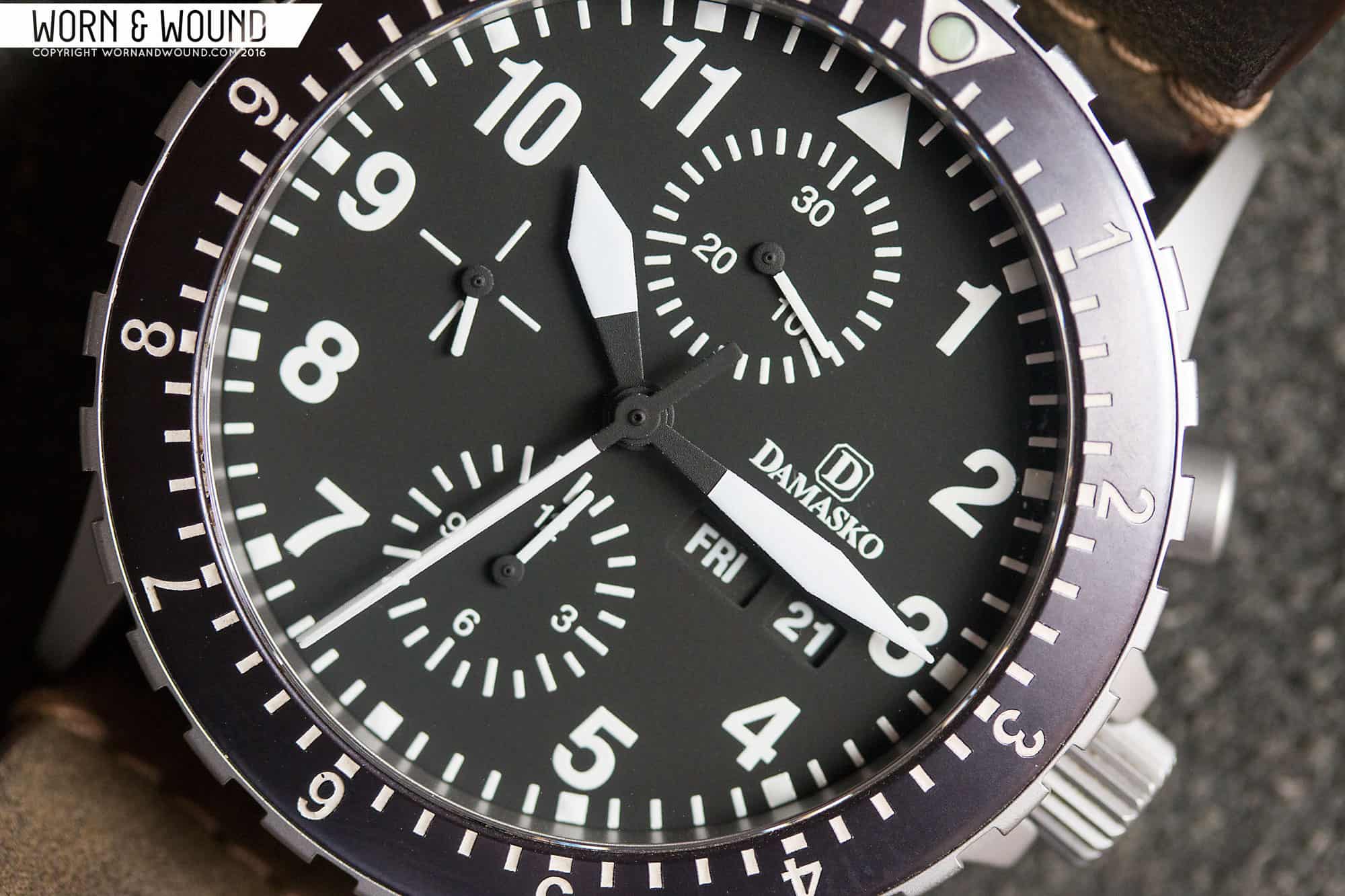
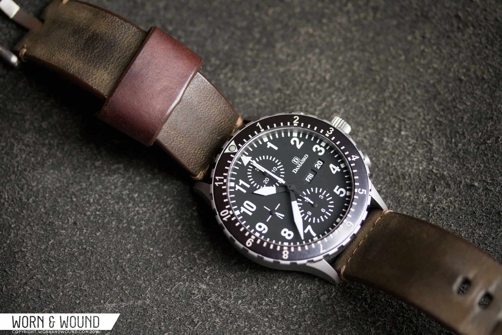
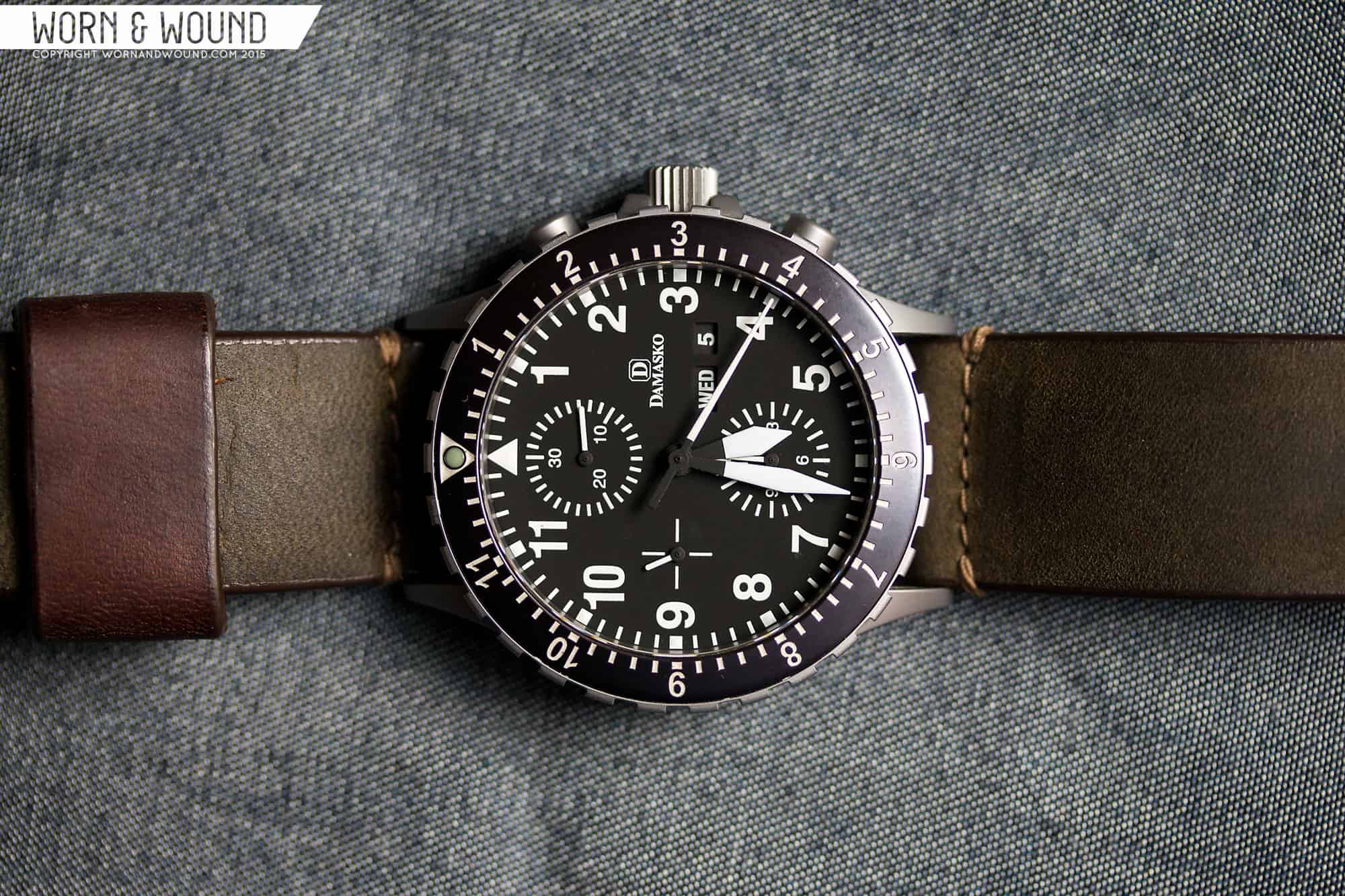
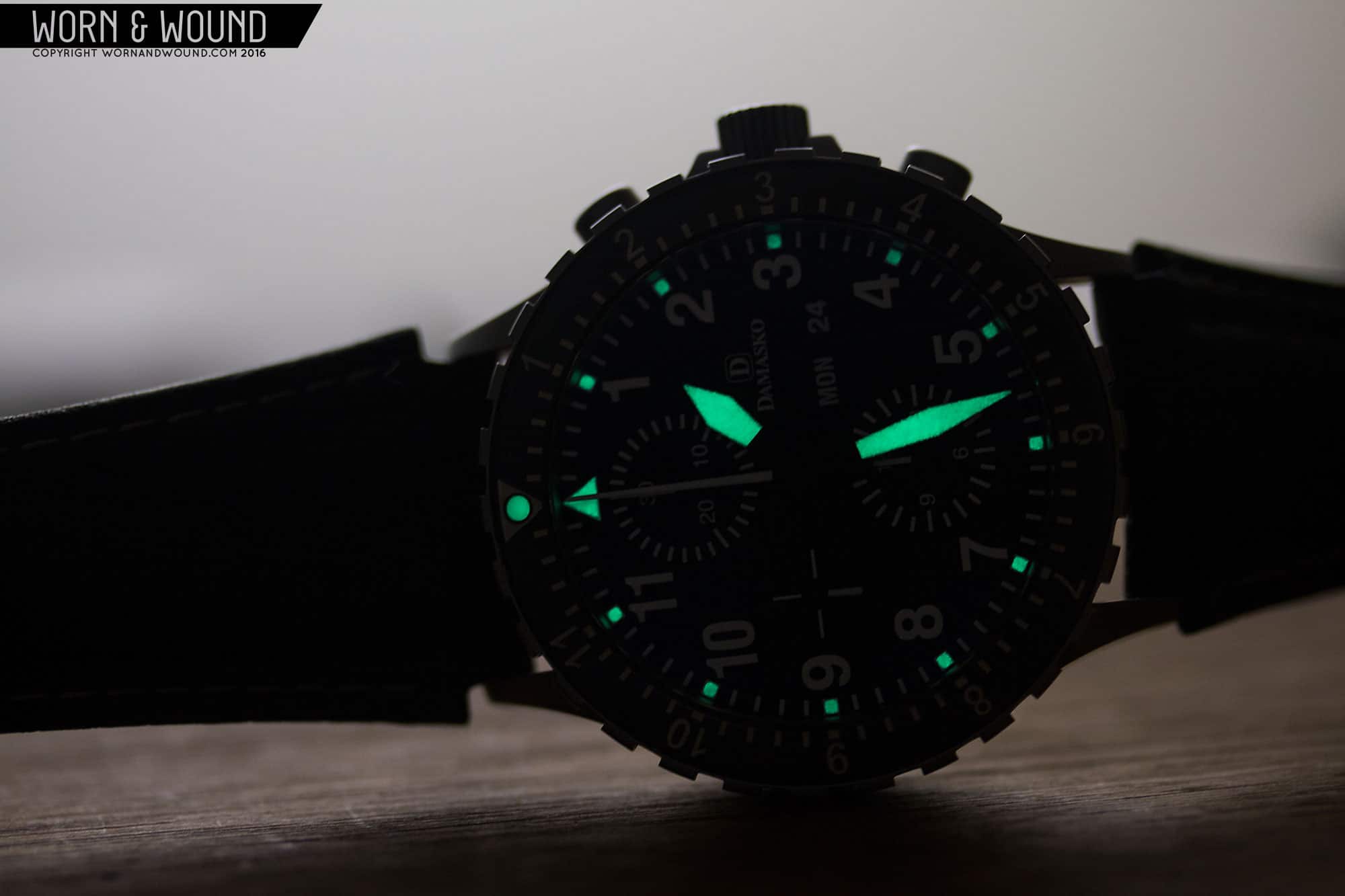
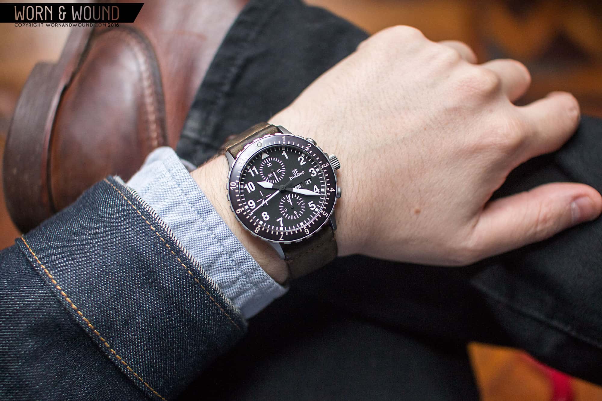
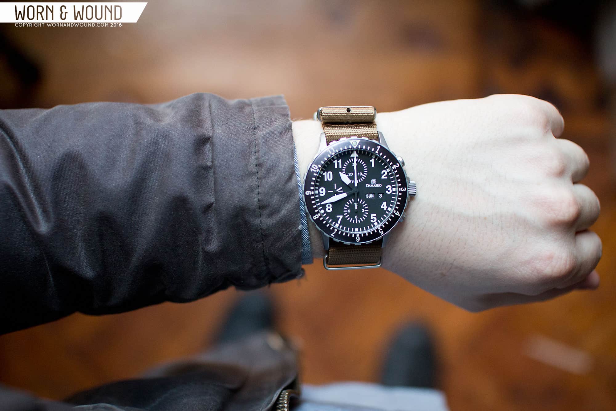
The watch we’re looking at today, the DC66, is a Valjoux 7750 powered chronograph with a bezel. The same watch is essentially also available without a bezel and in PVD. The dial also has a lot in common with the DA36, which we reviewed in PVD some months ago. It’s about as no-nonsense as a pilot’s chronograph can be with a focus on legibility and sheer toughness. The DC66 is for those who are looking for a chronograph that can take a beating, and emphasize at-a-glance legibility over decorative flourishes. At $2,305 the DC66 is not inexpensive, but it’s worth every cent.
Unlike with many watches we review, this watch happens to actually belong to me (and was purchased by me), and has for quite sometime. As such, these opinions were formed over a longer than normal period, as the DC66 is one of my most worn watches.





 Featured Videos












Great review. That 12 hour bezel is the one to get on a chronograph. A 1 hour timer on a chronograph seems pointless unless you’re somehow finding yourself timing two things at once. I agree that the Damasko logo should have been lowered a little. And that #8 colour strap really works with the metal.
As a fan of Damasko and a DA36 owner myself, I’m always a little baffled why blogs like Hodinkee and A Blog to Watch seem to completely shun Damasko. You would think that they’d clue in to the in-house movement in the DK10 or DK14, which is the most technologically advanced movement in German watches, and do a feature on it, at least. With the amazing bracelet, it’s the German Rolex (and tougher). But they’d rather cover anything else! Hodinkee, for example, has never done even a single story on any Damasko. There must be some reason why.
“As a fan of Damasko and a DA36 owner myself, I’m always a little baffled
why blogs like Hodinkee and A Blog to Watch seem to completely shun
Damasko.” They do? Hodinkee seem to appeal to a demographic that couldn’t be bothered with Damasko, so I wouldn’t be surprised. But don’t underestimate the work the other companies do to make the bloggers life easier – by providing images, press release, flying them in for a tour of the factory etc. It is no accident that all blogs have IWC, Panarai, Rolex etc. news on the same day they launch a watch even if it virtually identical to the previous one … We just have to thank WAW for bringing our attention to the smaller guys.
Love everything about the watch and seriously consider buying one for a forthcoming adventure of mine. It would be perfect.
Very well said. At the end of the day, even what we still naively consider amateur ‘blog’ sites are advertising driven concerns and the big brands make providing content easy…
More power to WAW and brands like Damasko, I’m seriously considering this model based on what I know is an unbiased and unsponsored ( haha, not a word!) review!
Great review. I really like the 12 hour bezel, but I think I like the cleaner look of DC56 more. The smaller size would also work better on my smaller wrist.
This is absolutely everything you’d want in a super-sophisticated tool watch…….and more! Owning one of these is like joining a very exclusive club of watch enthusiasts who flaunt their knowledge rather than their ability to dumb-down their wrist with the likes of Panerai, Rolex and Breitling, to name a few. Damasco is not a status symbol and hopefully never will be. On the other hand, it is a powerful status symbol when observed by someone who actually knows what it is. The industry sorely needs more brands with the level of integrity exhibited by Damasco, Sinn and only a handful of others.
Beautiful timepiece, Damasko’s attention to detail is apparent. Reminds me of the Sinn 103
Thanks W&W for the review. First time I’ve seen this brand and at the price is really good.
Interestingly enough, the DC56 Si fixes the “floating logo” problem on the dial by pulling it closer to the date window as suggested by Zach. It’s the only chrono model that does this along with its counterpart the DC57 Si. The DC66/67 Si does not have the change. Even stranger is that Damasko’s own site does not show this alteration. Do a Google image search for the DC56 Si though and you’ll see it.
That’s a tough one to find. It appears that the DC56 si without a 3 at 3 O’clock did indeed have the logo pulled in tighter, but those with the # 3 do not. I wonder if those without the 3 are an earlier model. It looks better with that logo pulled in for sure, though not a show stopper, still a great looking watch, both the 56 and 66
I agree that they should put the logo a bit lower. This watch is too cluttered for me. Anyway, great review.
I don’t find the “floating” logo distracting at all. In fact, I think the logo and day/date placement nicely bracket the numeral three.
The dimensions of the watch are not 42 x 48 mm. Here is the info from Damasko:
It seems like they know 43.8 mm is too large …
The logo…HORRIBLE typography. Small caps (ugh); the capital “D” is waaaay too tight up against the “a”; the capital “D” is inexplicably repeated in the mark; and it’s serif text (this watch screams for sans serif text).
I love my DA 44—in spite of the logo.