Junghans Form A Review

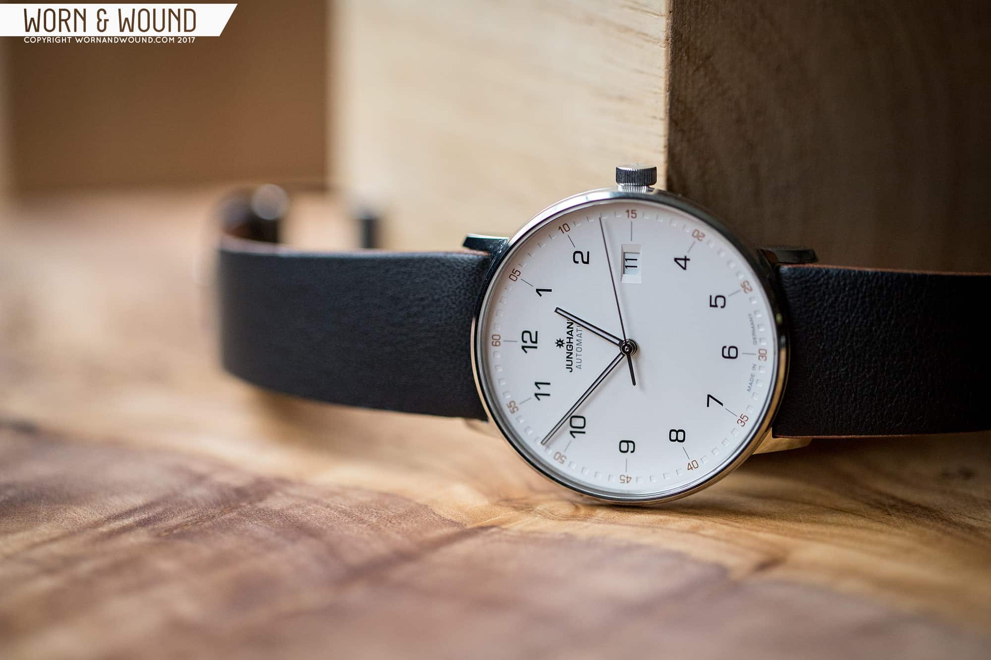
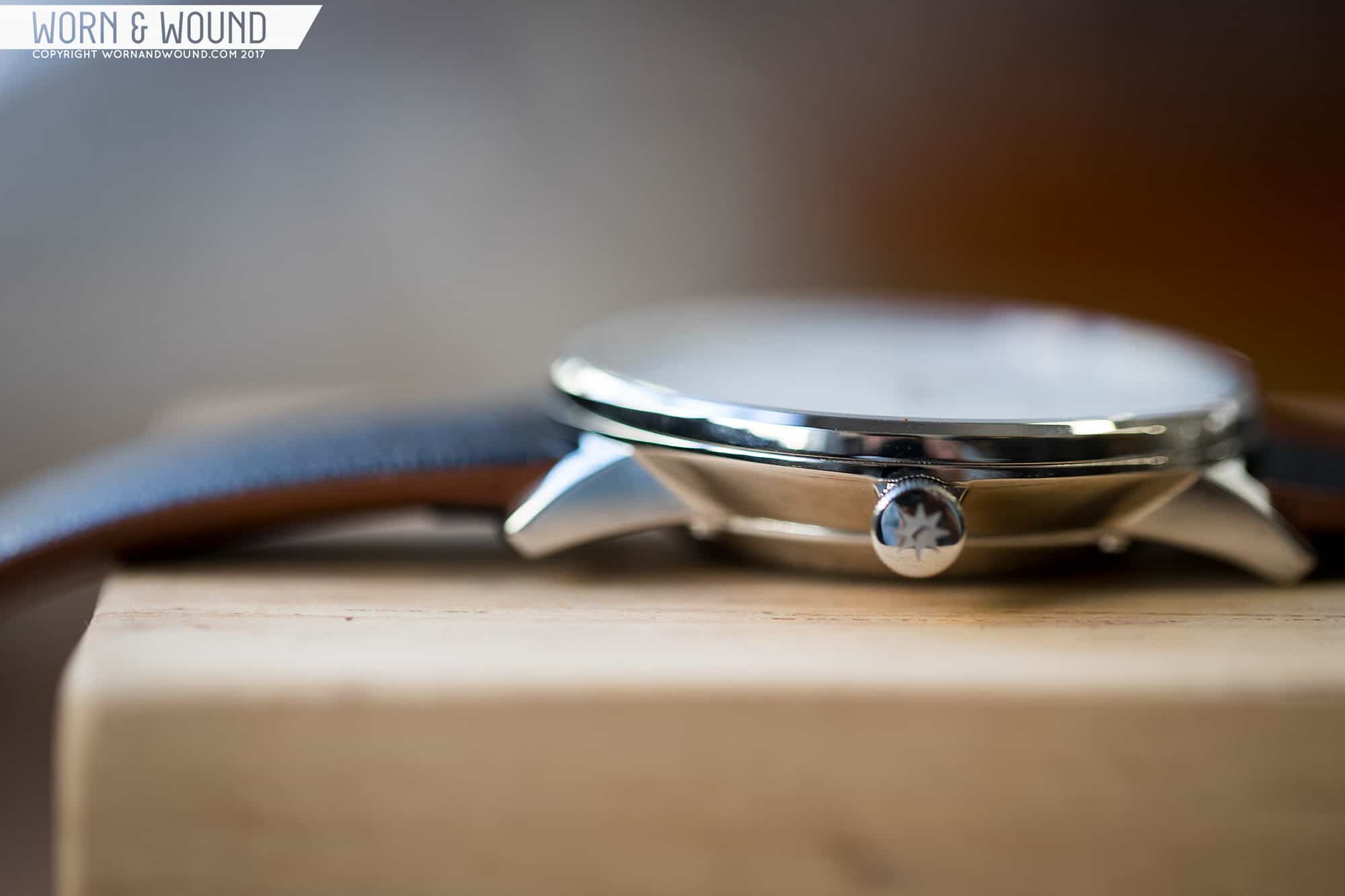
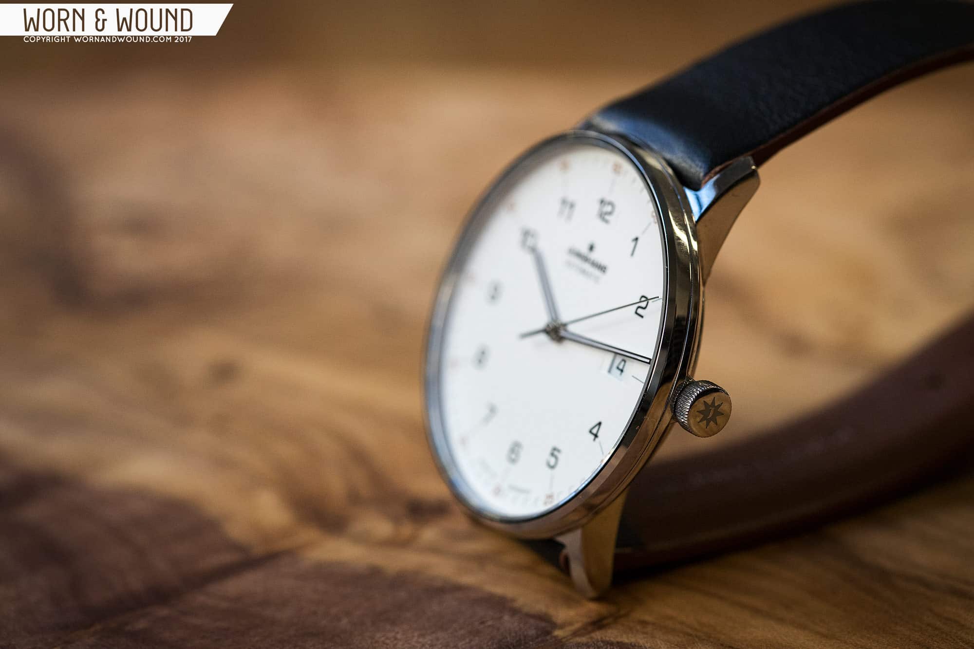
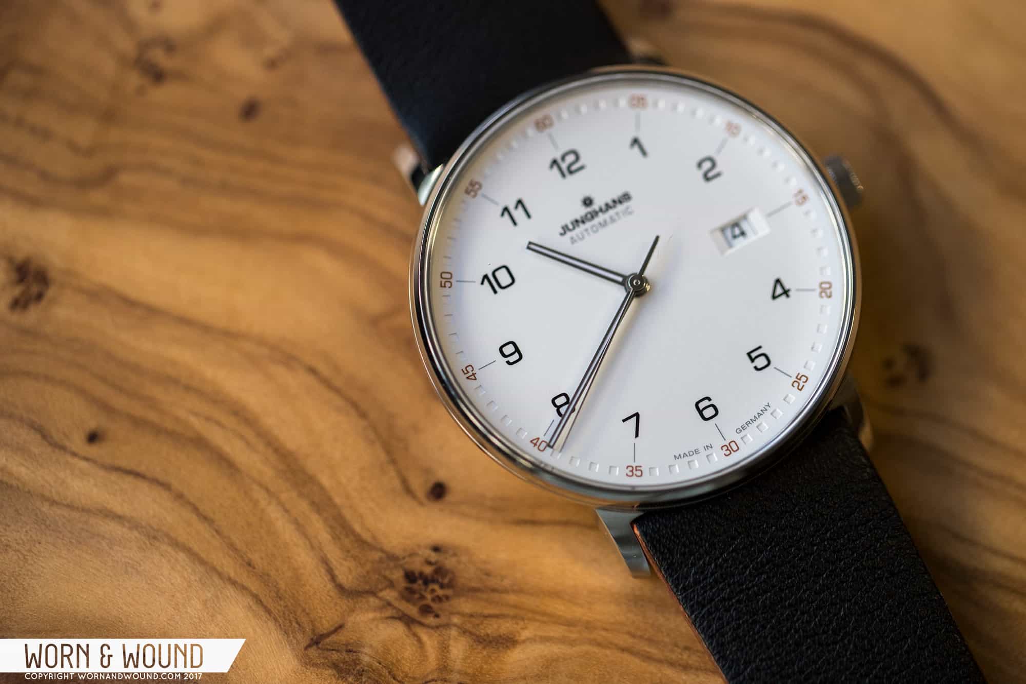
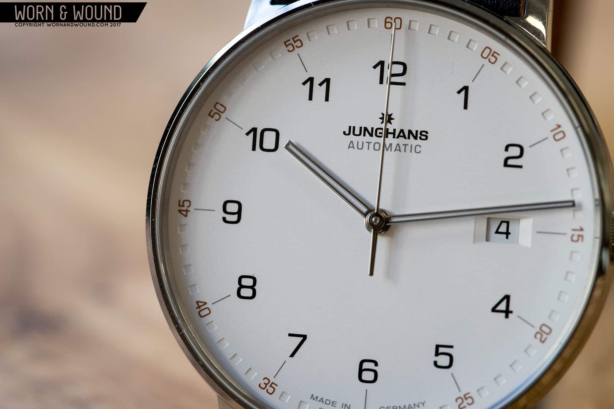
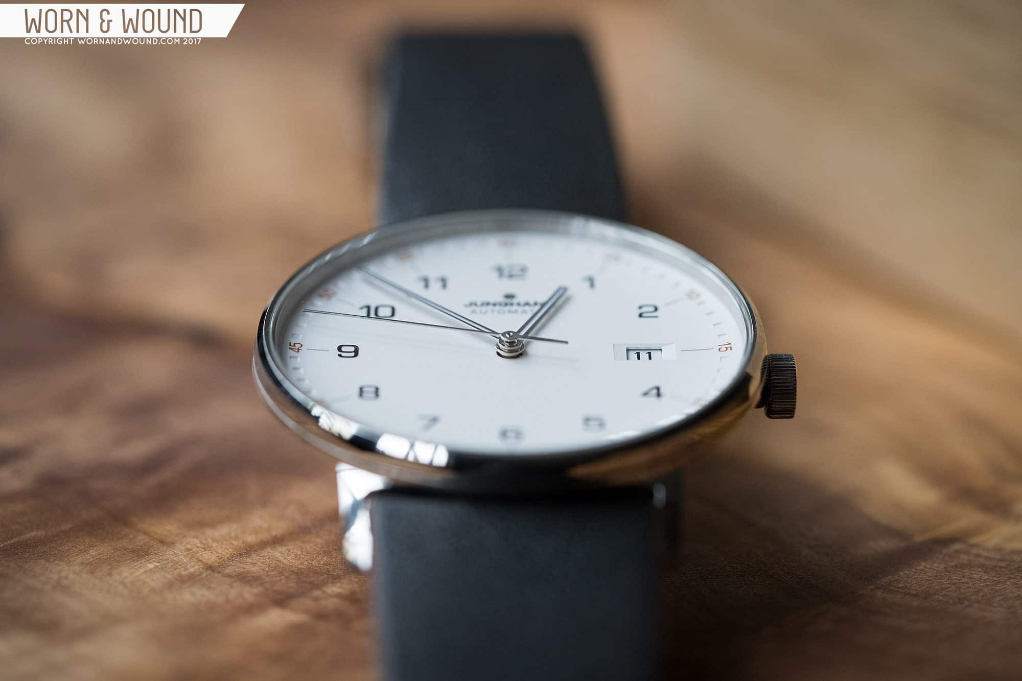
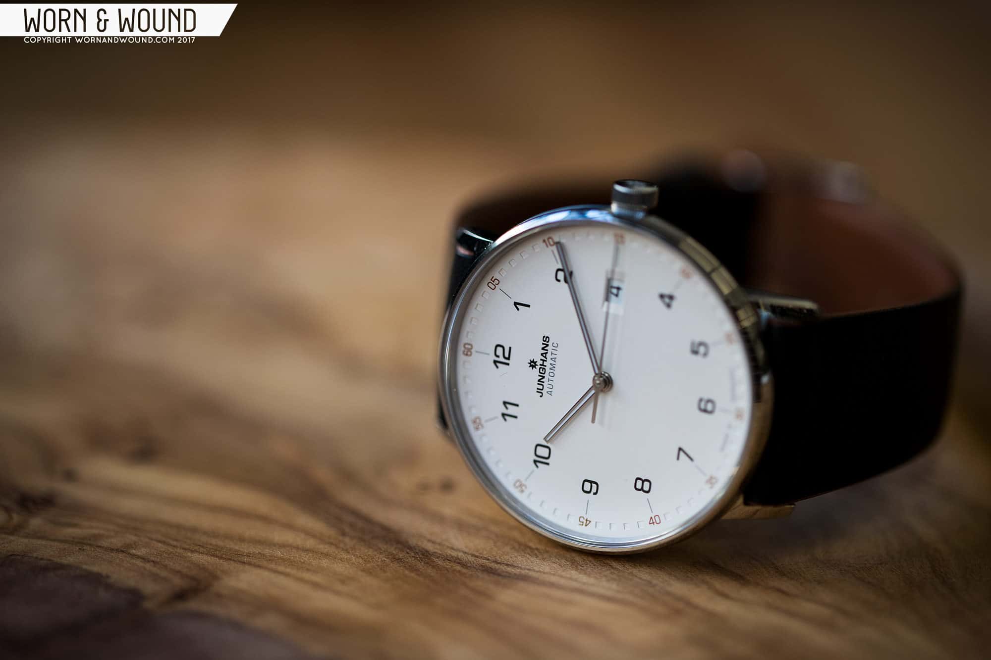
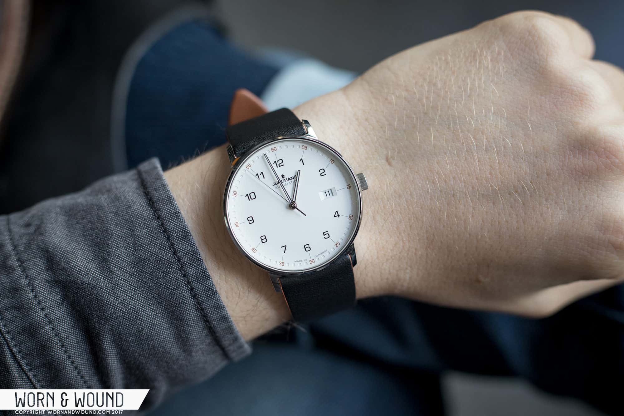
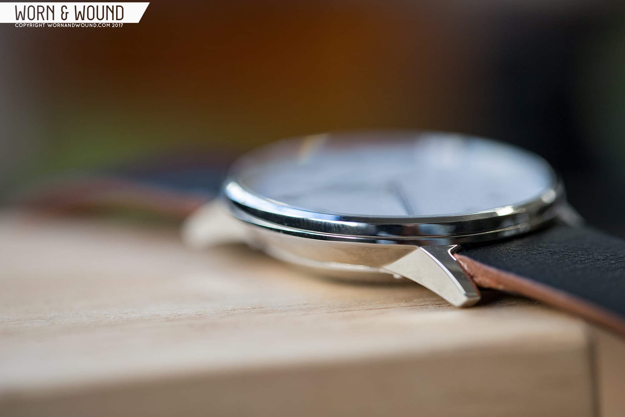
I have to be honest, when I first saw the Junghans Form watches in a press release a few weeks before Basel World 2017, I wasn’t blown away. They were generally appealing, sure, and being Junghans I knew they would deliver in build and finish, but… they just lacked charisma. They were a bit too stoic, too serious. Well, having now spent some time with one, I am happy to say that I was totally wrong about my assumptions. Yes, it’s a serious watch – dry even – but it also is exactly as it should be, and a contender for one of the nicest business-casual watches I’ve ever worn.

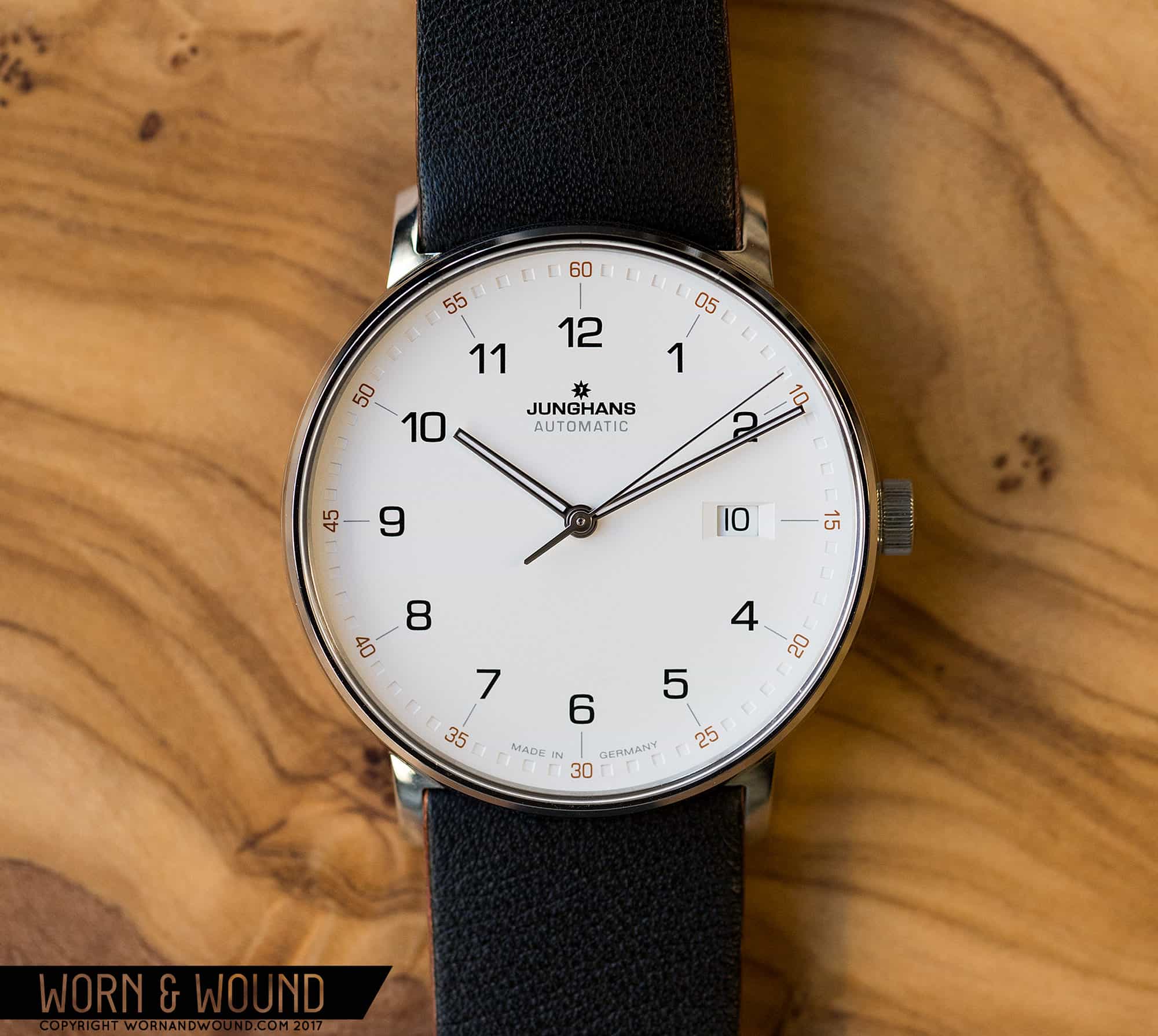
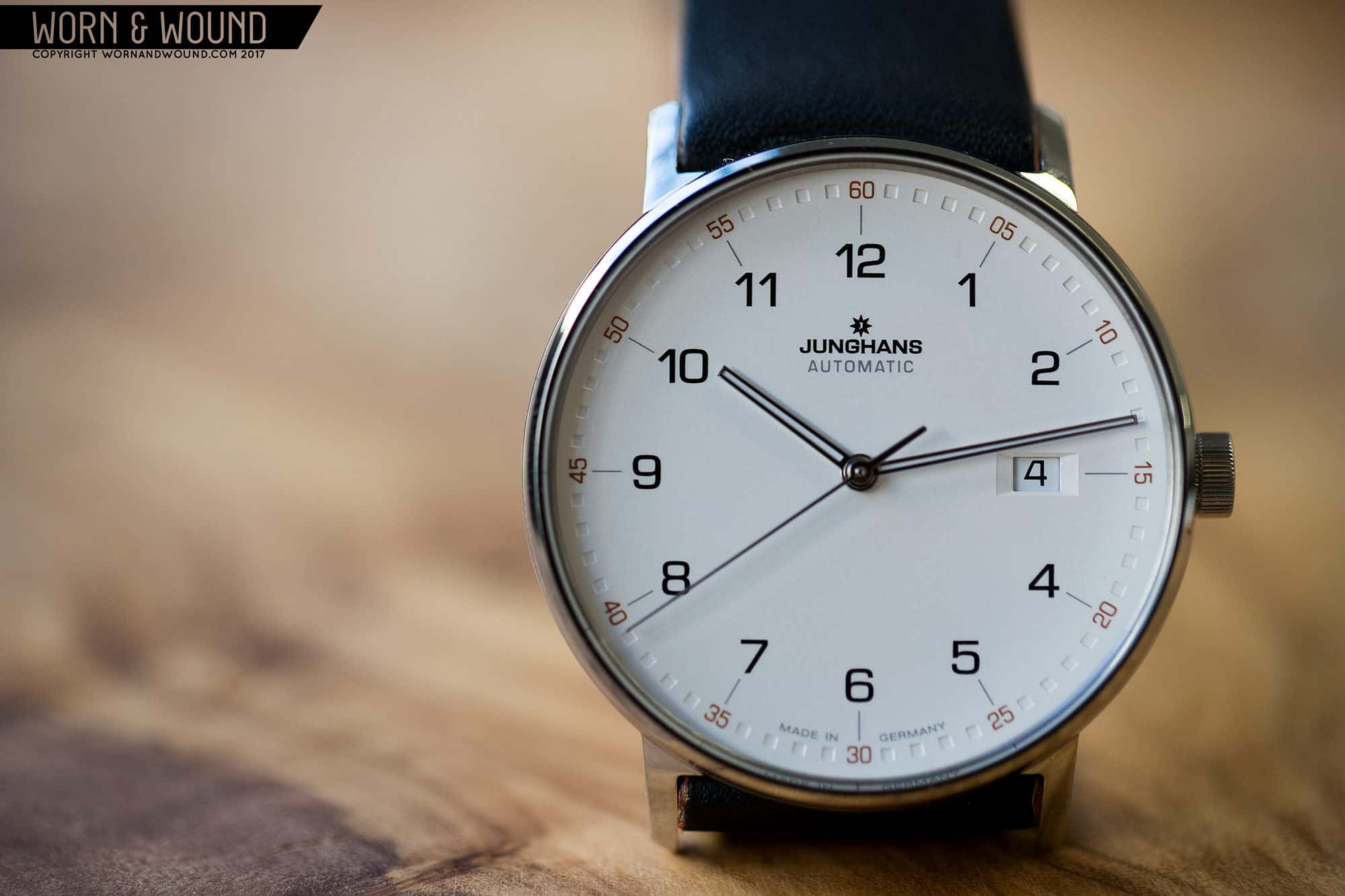
The Form watches aren’t a part of any existing Junghans line, rather they are a whole new one. This wouldn’t be significant with other brands, but with Junghans, most of their watches in the last few years have been couched in their Meister or Max Bill lines. Interestingly, all three lines share some common relatives, some DNA, yet differ in the details, making them different species (or perhaps family? my taxonomy is rusty). The point being, that a new line is kind of a big deal, as they’re likely only going to expand upon it from here.

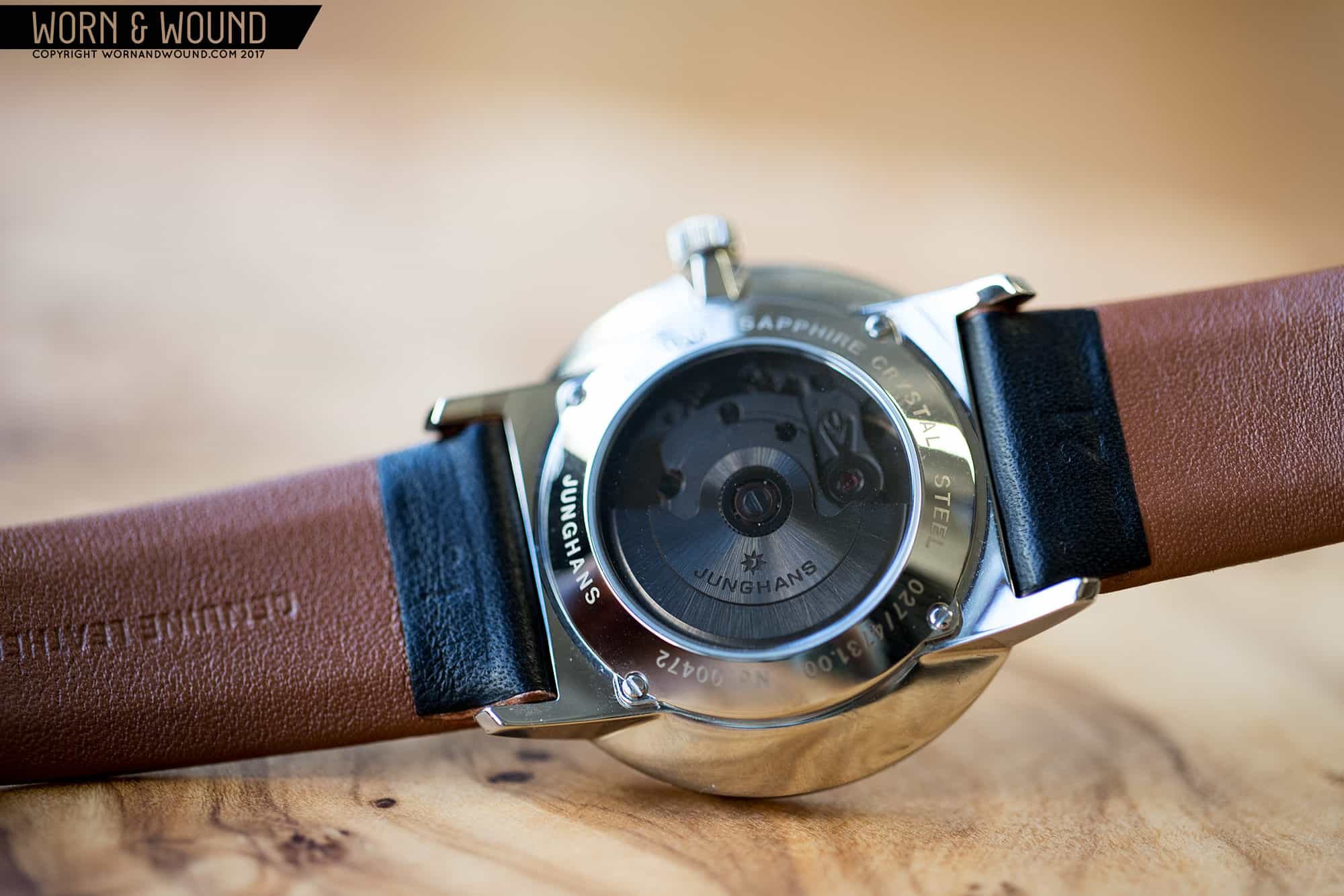
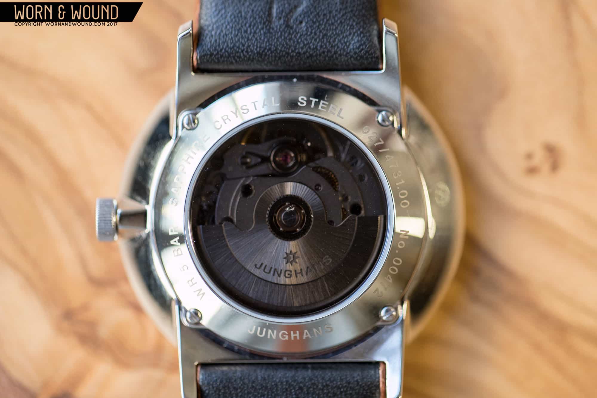
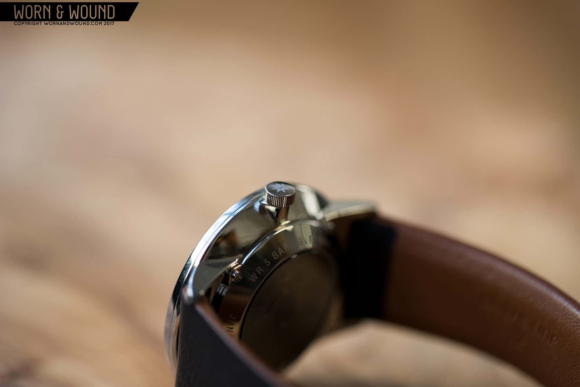
So, to kick things off, Junghans released four watches in two groups (genuses perhaps?) the Form As and the Form Cs. While that might seem like a play on the alphabet it’s actually A for Automatic and C for Chronograph. Within each is a version with hour numerals, and one without. The two automatics sport ETA 2824s and go for $920, while the chronos are actually quartz and come in at $490, indicating that, at least for now, the Forms are on the entry-level side of Junghans’ offerings.

Advertisement
$920

Junghans Form A Review

Case
Polished Stainless
Movement
ETA 2824
Dial
Matte Silver
Lume
On Hands
Lens
Sapphire
Strap
Leather
Water Resistance
3 ATM
Dimensions
39 x 44mm
Thickness
9.9mm
Lug Width
21mm
Crown
Push Pull
Warranty
Yes
Price
$920

To test the Form out, we got in the Form A with hour numerals. In the metal, the geometry of the case is immediately striking. It’s a 39.1 x 44.1 x 9.9mm fully polished conical case with a thin chamfered bezel. It’s pleasantly thin to begin with, but the sharply angled sides create the illusion of it being even thinner. From the sides, the lugs have an elegant, flowing shape that helps the watch contour to the wrist, while from above, they are much harsher and more geometric, with a squared off connection. The overall shape is similar to that of the Meisters, but where the lines curve on those watches, here they are sharp resulting in a more modern overall aesthetic.

Flipping the watch over, you are presented with something different. There’s a display window showing the rather undecorated 2824 inside, but to mix things up, it’s smokey grey. It’s a surprising detail that is hard to guess the exact reasoning for (if they didn’t want to show the 2824, there are simpler solutions), but I like it. It’s not a detail that would convince me to get the watch, but it helps distinguish it a bit.

The dial of the Form A is deceptively simple, with layers of subtly that reveal themselves with wear. At a glance, it might appear as just a white dial with various expected markings and a nicely executed date window. In reality… well, it’s those things, but done so with a lot of finesse! The dial isn’t white, it’s actually matte silver, so it has a slightly grey tinge to it and the occasionally cool feel of metal. It’s also not flat, but rather than the dome you’ll find on Meister and Max Bill watches, it’s slightly concave. This is hard to see as it’s delicate… It’s more that you can sense that it’s not quite flat, like standing in a room that angles slightly in one direction.

On the curved surface is a primary index of large arabic numerals in black, in a typeface that feels somewhat mid-century.  Each is studded by a line that connects them to the outer minute/seconds index which features numerals at intervals of 5 and blind-debossed squares. This latter detail I really like as the markers are purely textural, catching the light in cool, dynamic ways. The numerals are then a tobacco brown tone, also an unexpected detail. It all comes together so nicely, showing off the expertise of their designers. The proportions, color choices, typefaces… it’s a graphic nerd’s watch, and what one should expect from the brand behind the Max Bill collection.

The date window is worthy of some special attention as well. Sure, it’s there, at three, right where you’d expect it. But rather than a blunt punch through the dial, they sort of carved it out, beveling the sides, creating a slope into the window. This goes a long way towards integrating the window into the dial, and simply making it interesting to look at. Lastly you’ll find thin tapering hour and minute hands and a stick seconds. My one point of criticism is that the hands feature lume, which just feels out of place. The dial has none, and so little is on the hands it’s basically useless. These hands as skeletons would have been spot on.

What really won me over about the Form A was how it looked and felt on the wrist. Ever get that feeling that a watch was made for you? Like, you put it on and a bell goes off in your head saying “yeah, that’s how a watch should fit me”? That’s what the Form A was like for me. It fits well, literally, but then it just looked amazing with my normal work attire. It’s a part of the uniform and a watch I could see wearing constantly. The size is pretty ideal for an everyday watch, small enough to be comfortable, but bold enough for high legibility and some style. The color combo of the dial is also very neutral, making it pair with pretty much anything, and the seriousness of the design would allow it to pass with a suit.

The strap the watch comes on is also pretty cool. It’s 21mm, which is a bit annoying admittedly, tapering down a bit and all leather. From the top, it looks like a clean surface of black, nicely grained leather. No stitches, no padding, just sleek, minimal black leather. However from the side, you’ll see that the edges are tan brown and the the underside actually bevels, flowing into a matching brown surface. I’ve never seen this before, it’s sort of like the strap is upside down, but it makes it wear very well, and adds an unexpected flash of color from the side.

To make a long story short, in the metal, the Form A really won me over. It’s a design whose subtleties are lost in 2D (hopefully the video will help), but in 3D will impress. It’s still at it’s core a serious, stoic watch, but it’s also just so damn well-designed that the charisma I thought it lacked it had in spades. It’s possible it’s a bit shy at first, and takes a little time to open up, but once you have that eureka moment with the watch, as I did once on my wrist, you’ll be sold. Lastly, it’s a good value too. $920 for a German watch with a Swiss movement and a high level of finish is hard to argue with. The biggest issue is now which to get, the Form A, a Max Bill or a Meister? They don’t make it easy.


For more info: Junghans Form A

Images from this post:
Related Reviews
Zach is the Co-Founder and Executive Editor of Worn & Wound. Before diving headfirst into the world of watches, he spent his days as a product and graphic designer. Zach views watches as the perfect synergy of 2D and 3D design: the place where form, function, fashion and mechanical wonderment come together.
wornandwound zsw