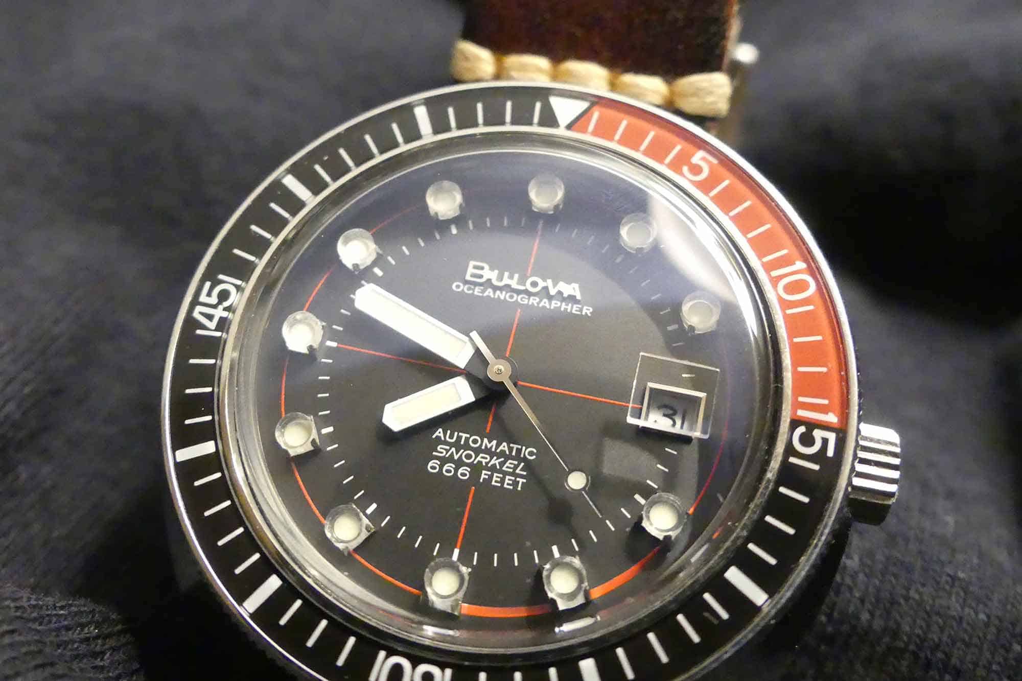
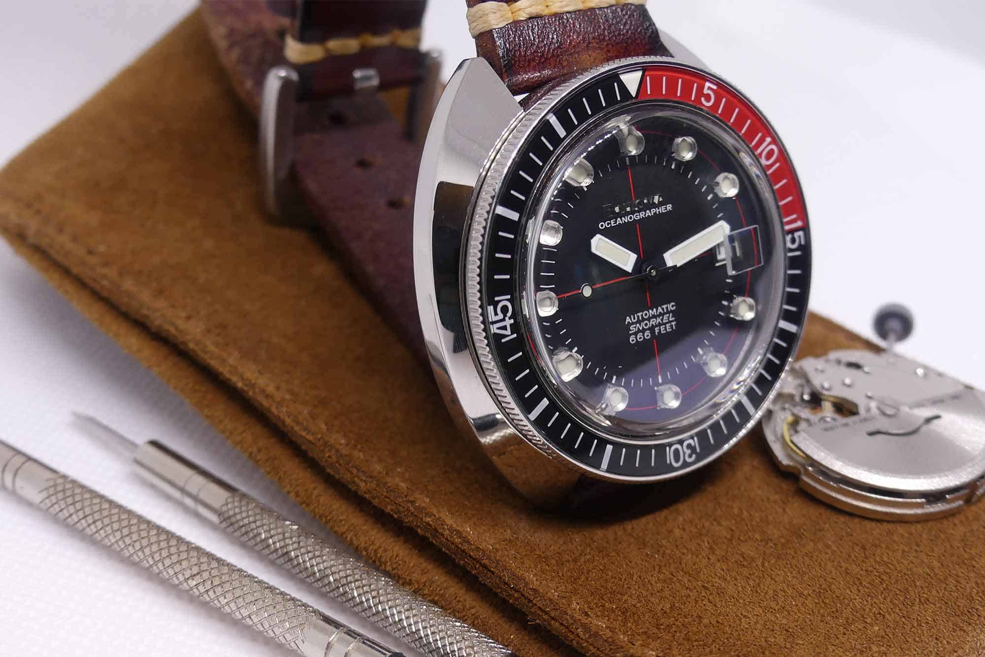
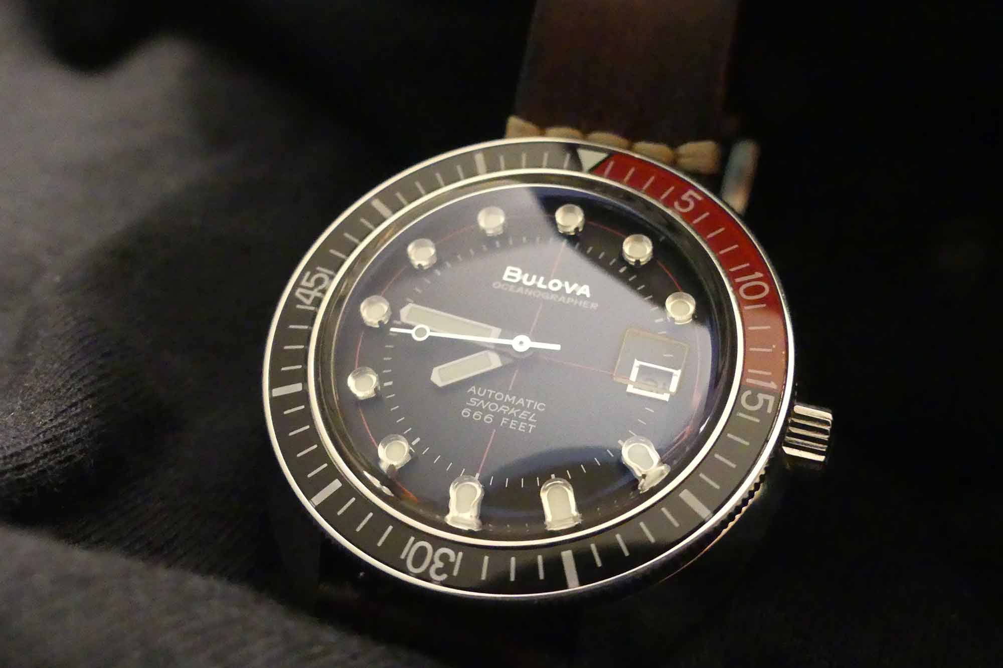
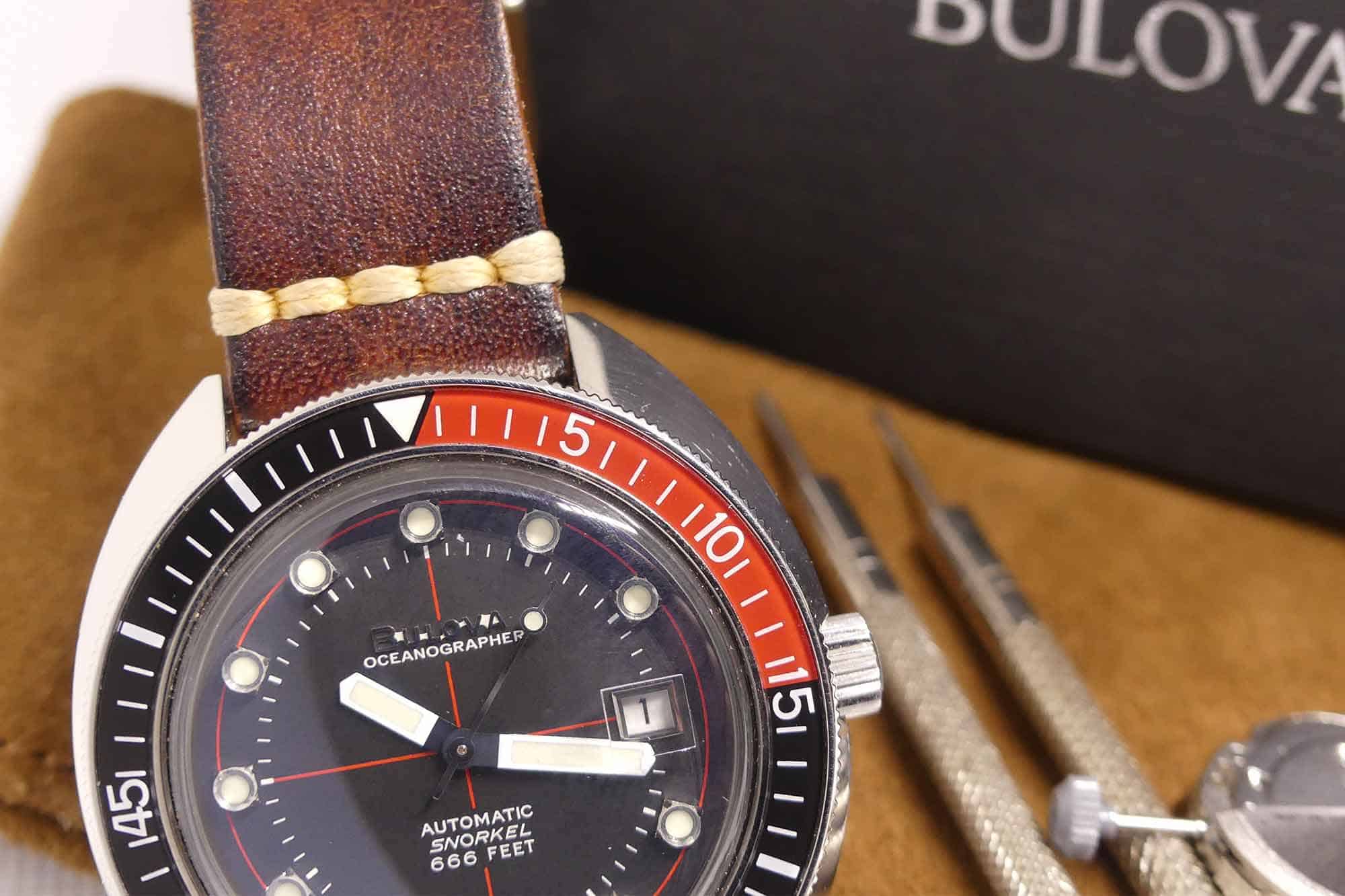
Bulova could have simply made the case a few millimeters bigger on the reissue and enjoyed their home run. Instead, they made two truly perplexing updates:
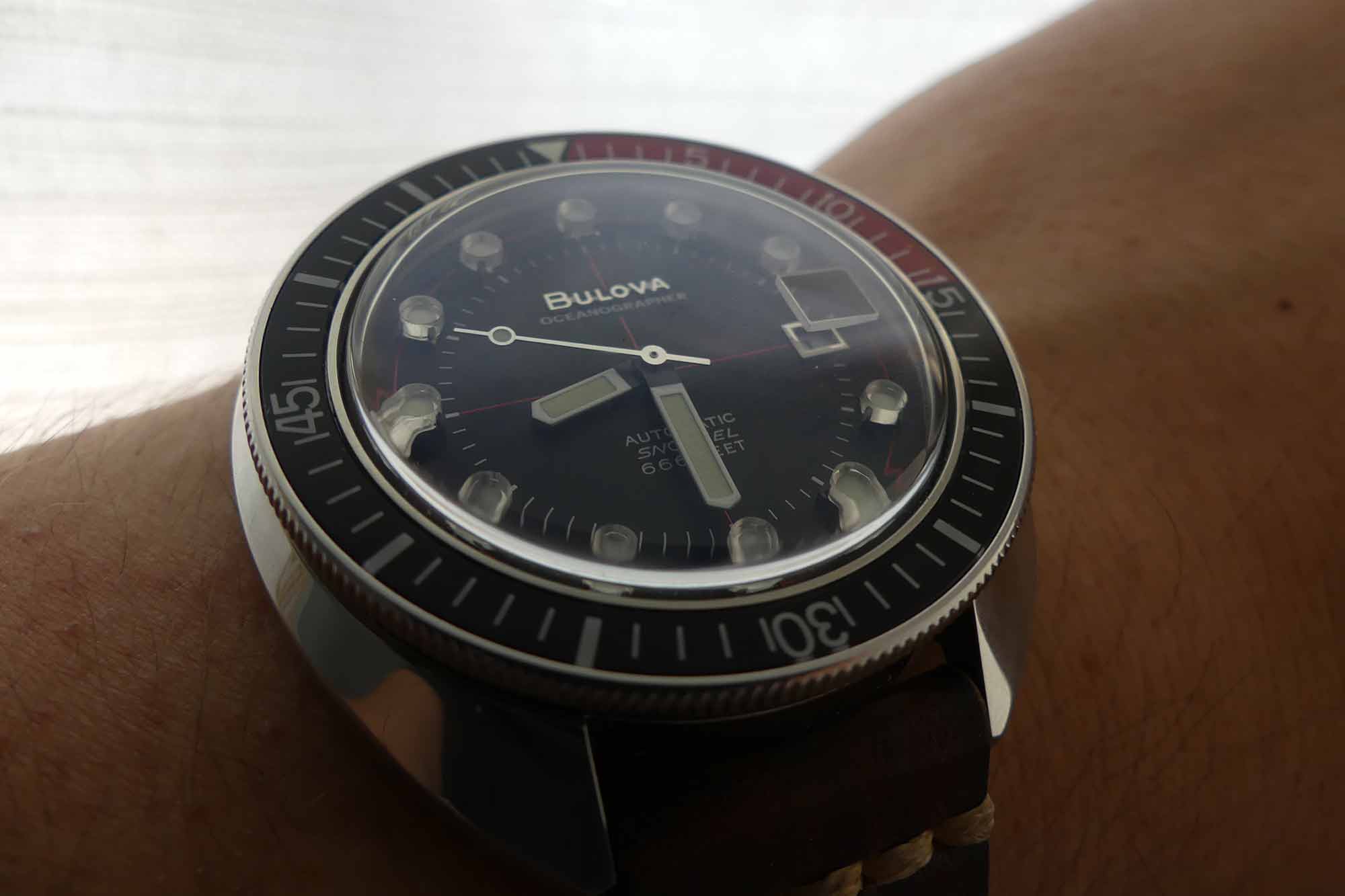
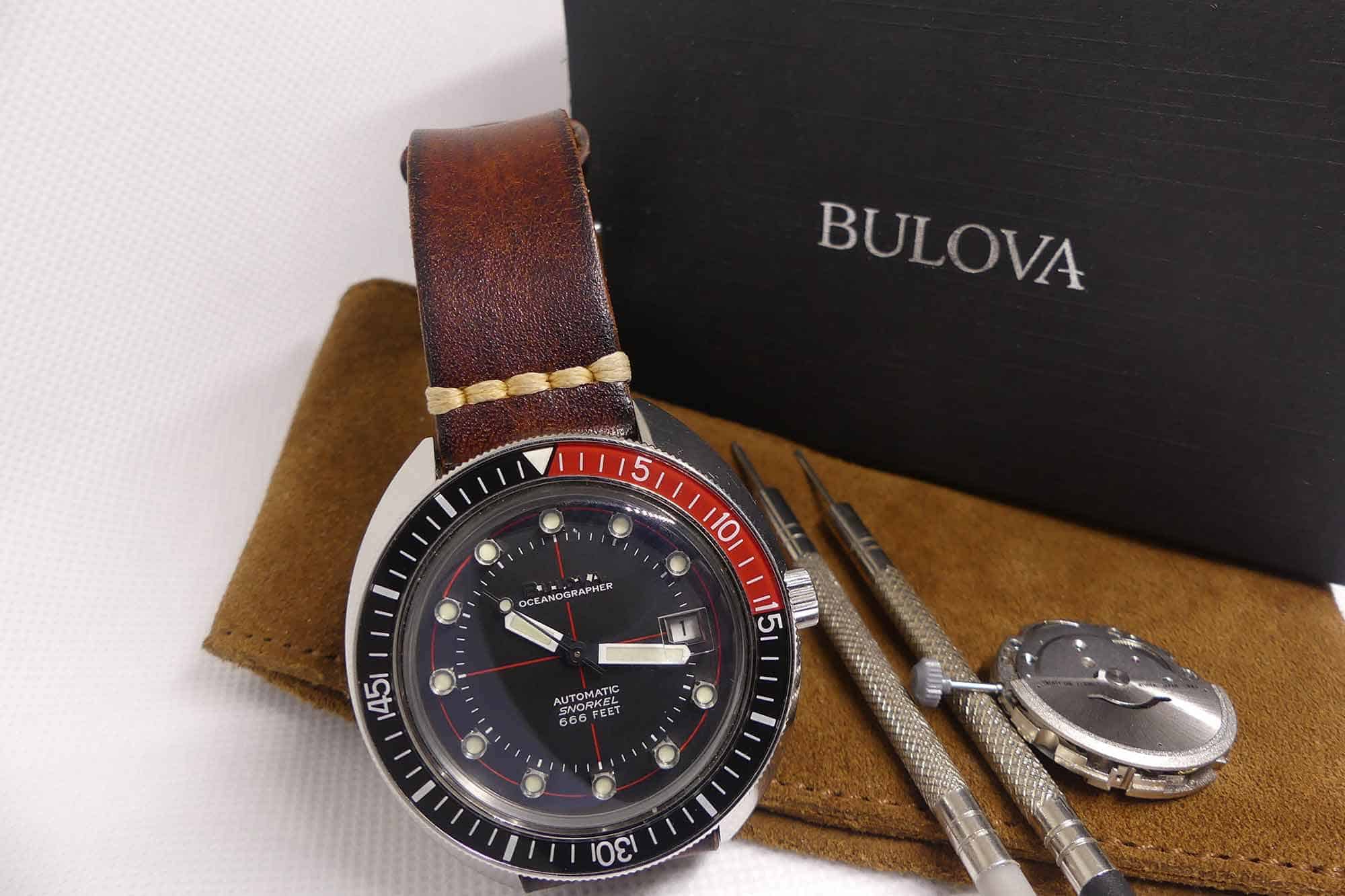
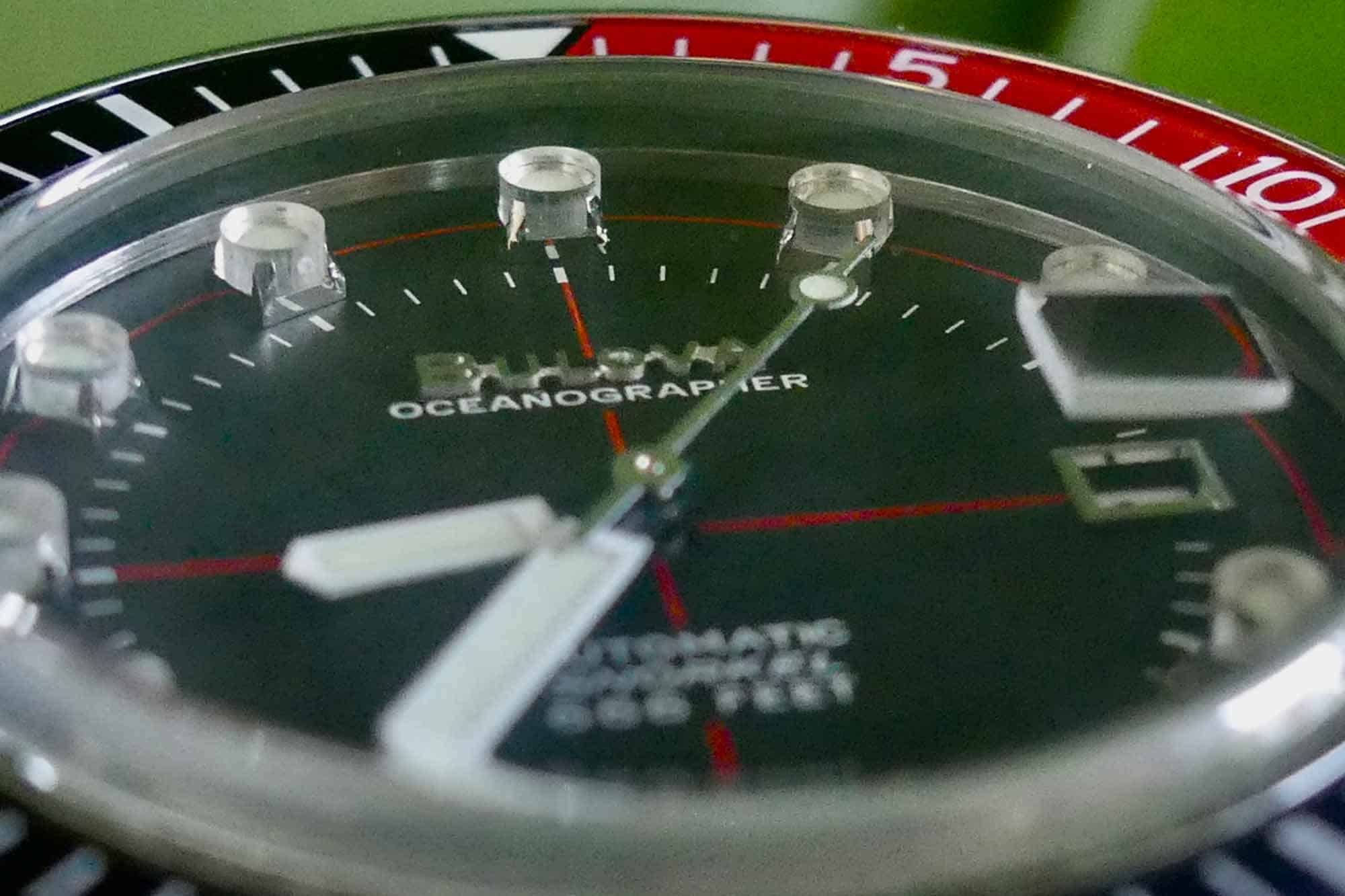
The logo: The 1971 Model G has a beautifully printed logo on the dial. It’s simple, efficient, and I like it a lot. The 2018 reissue has… glue? At least that’s what it looks like to me. All I know is that my watch has six prominently displayed murky white blobs on it, one between each letter in B-U-L-O-V-A, and one filling the opening in the “A”. In the right light, these blobs are hidden. But when I check the time, they are prominently displayed. At certain angles, the logo completely disappears against the black dial and it’s all I can see. For a watch at this price point from a big brand, it’s a surprising oversight.
![]()
The second hand: I love the red second hand on the original Model G, which provides a subtle pop of color that ties in well with the red cross hair and the bezel. However, Bulova ditched that easy win on the reissue, and went with a silver second hand. Again, I have no idea why because I’ve never seen a silver accent hand before. It clashes with the white hour and minute hands, and draws the eye to the least appealing aspects of the dial: the poorly applied logo and the chromed-out date window.
Final thoughts: Go Green (or Orange)
Should you add an Oceanographer to your collection? Absolutely, but only if you’re prepared to let it set a ridiculously high bar for affordable divers. But go green (or orange). Lots of watches do black dials well. A well-done black dial is, by design, unremarkable. A well-done green dial is remarkably rare. As an added bonus, the logo adhesive clashes less against the more brightly colored dials.
![]()
This watch would be immeasurably better had it stayed more faithful to the original. But it didn’t, and I’ve made peace with that. The Oceanographer taught me to stop looking for the perfect watch. Instead, it taught me to buy what I like, keep what I like, and compromise when I want to. Bulova



 Featured Videos


