[VIDEO] Owner’s Review: The Just-Right Seiko SPB317

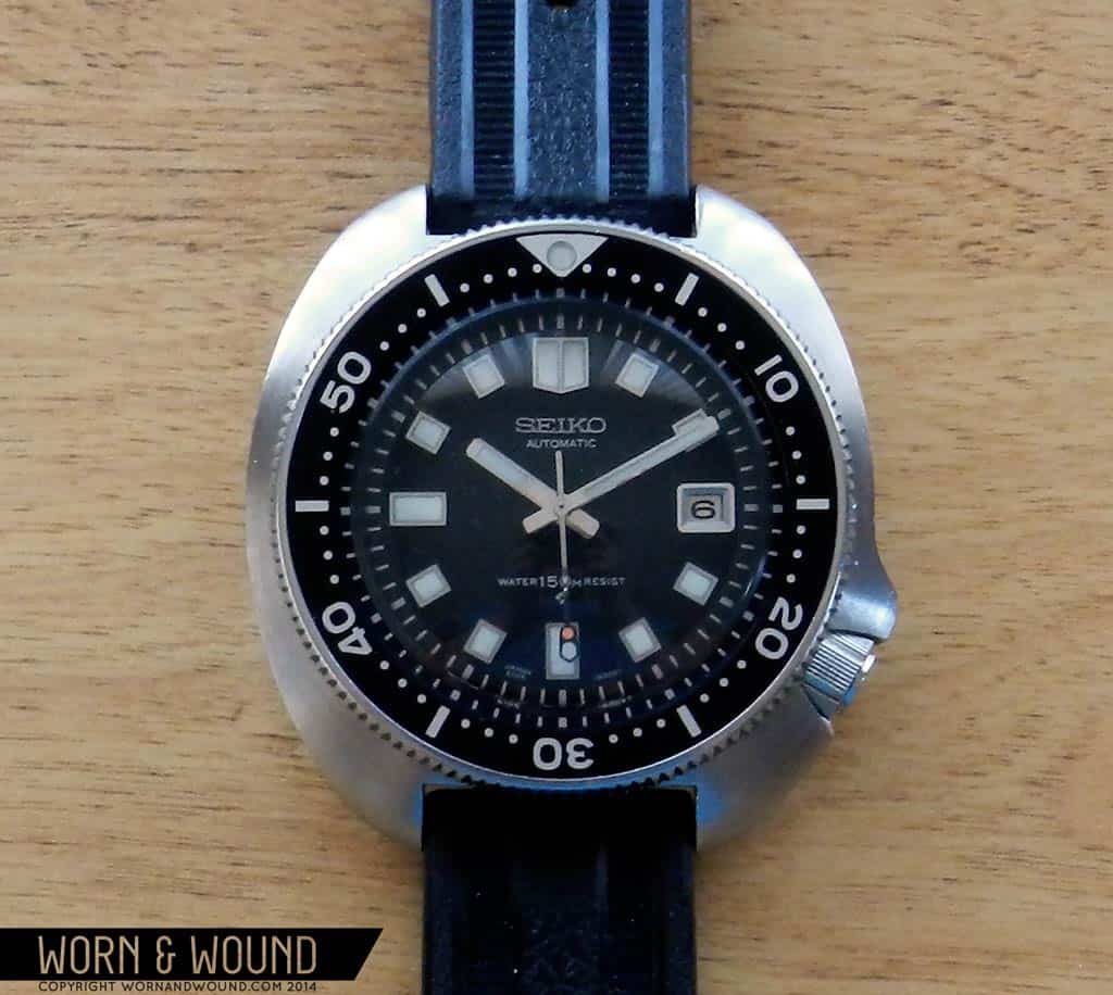
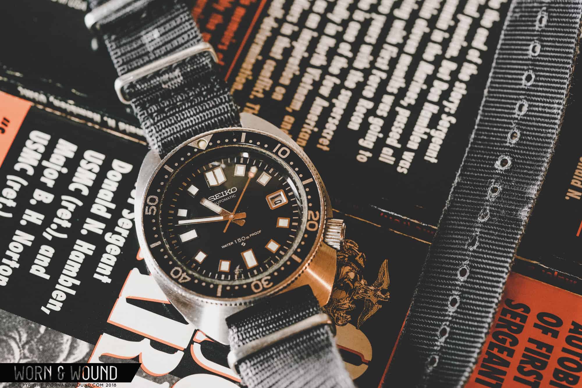
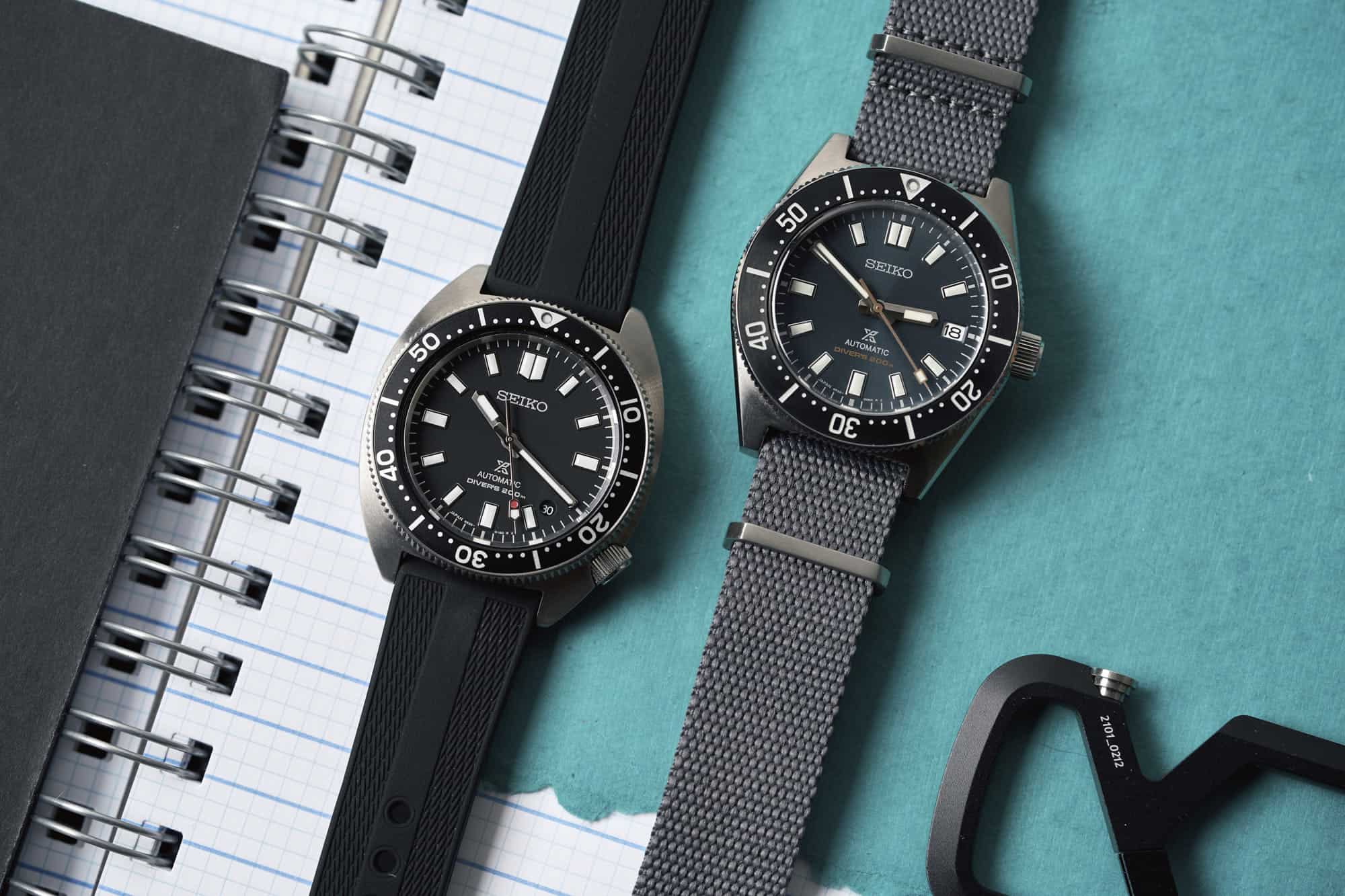
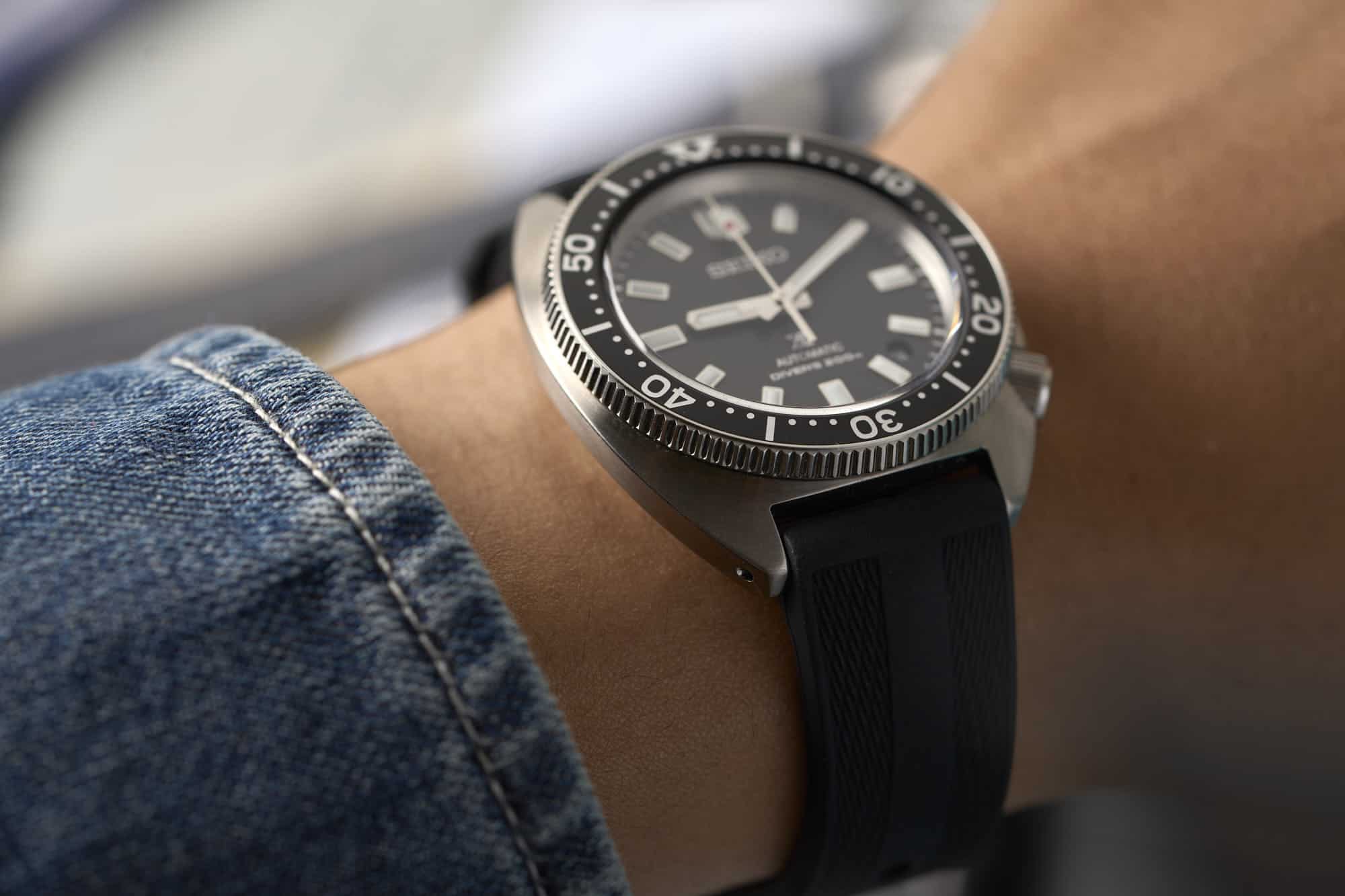
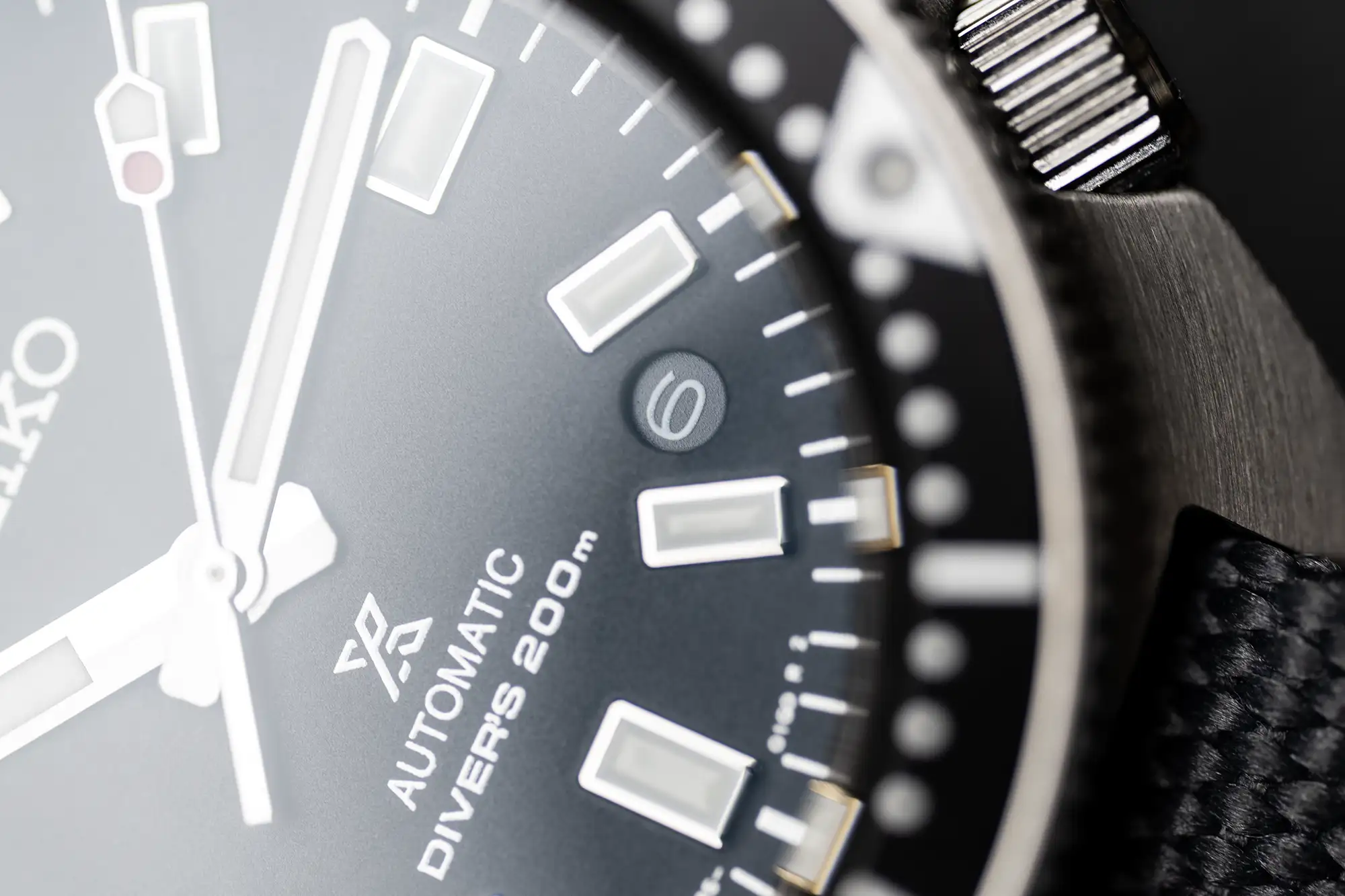
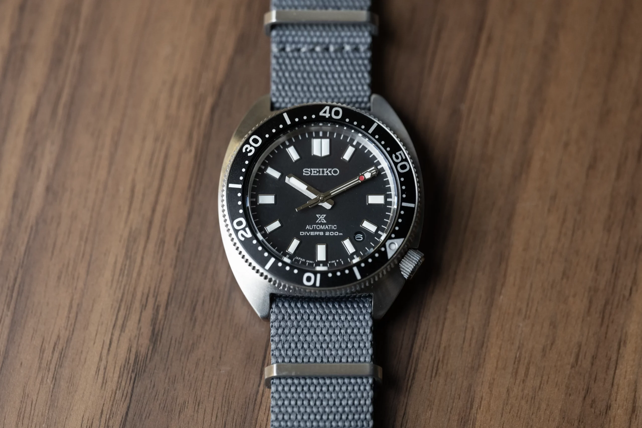
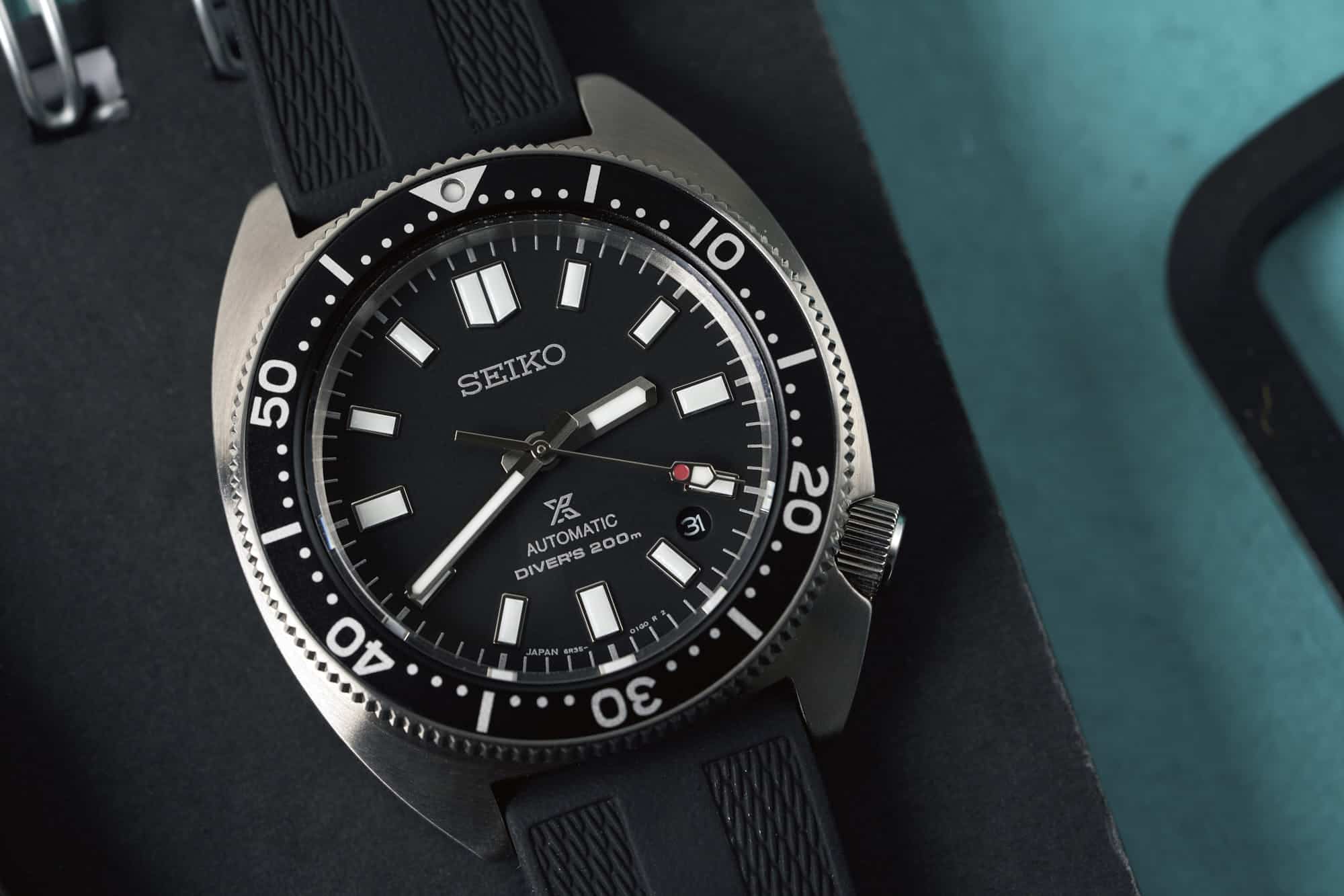
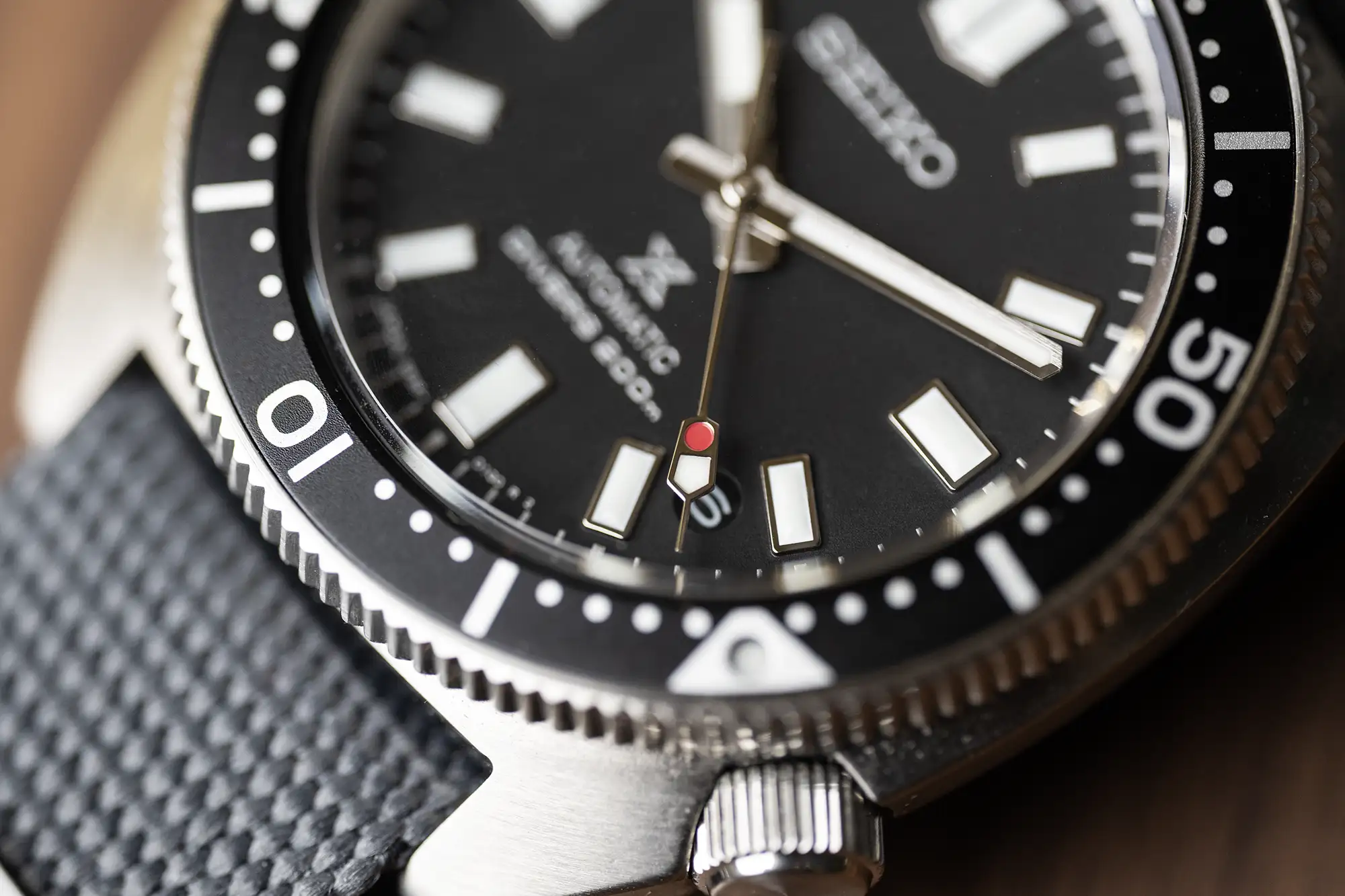
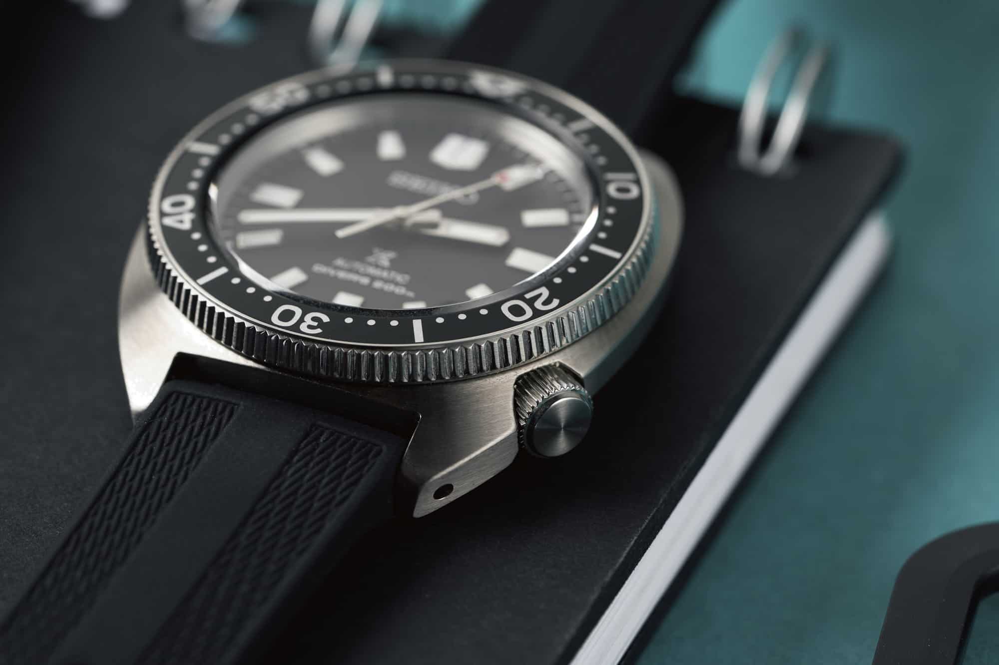
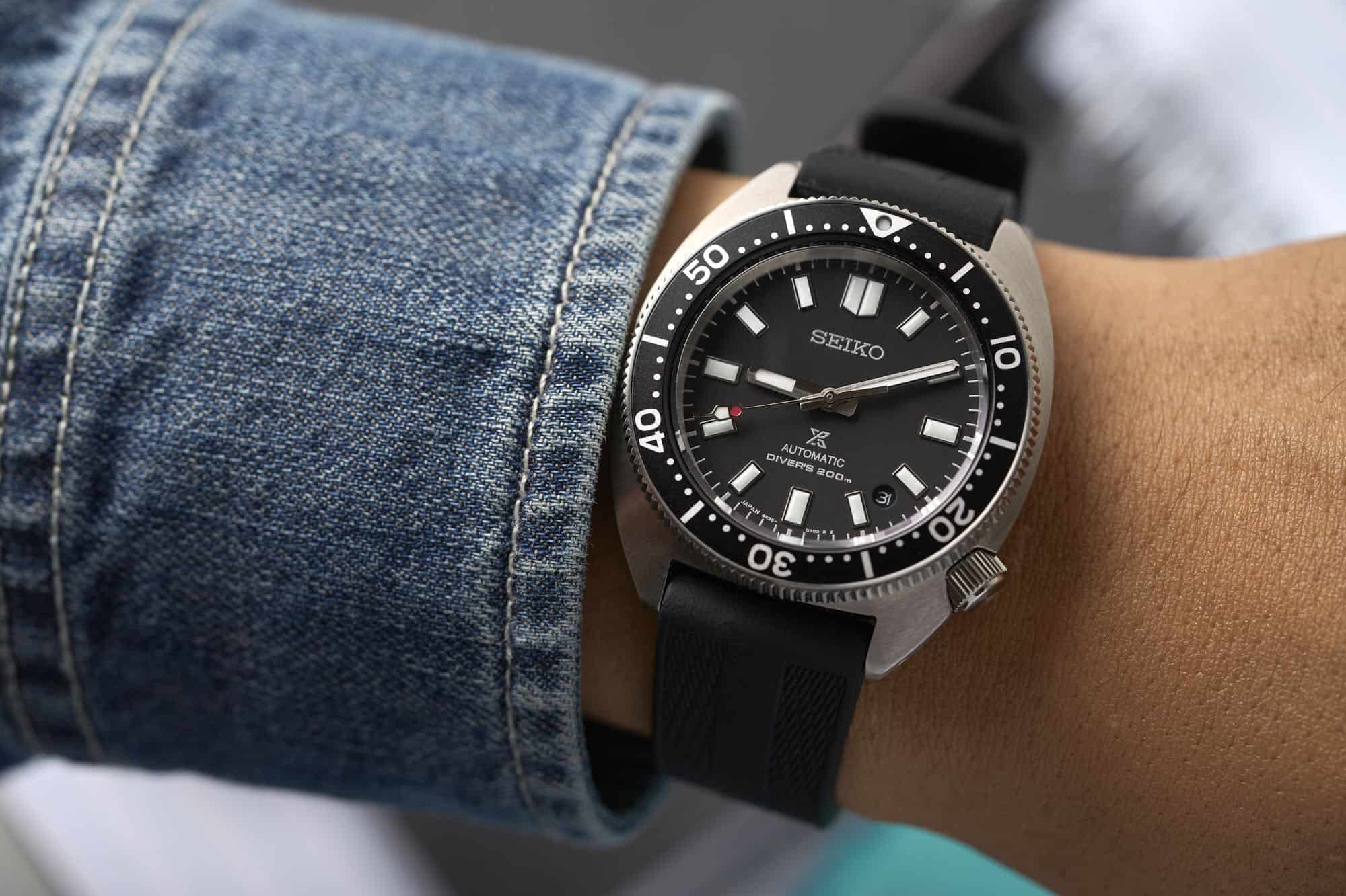
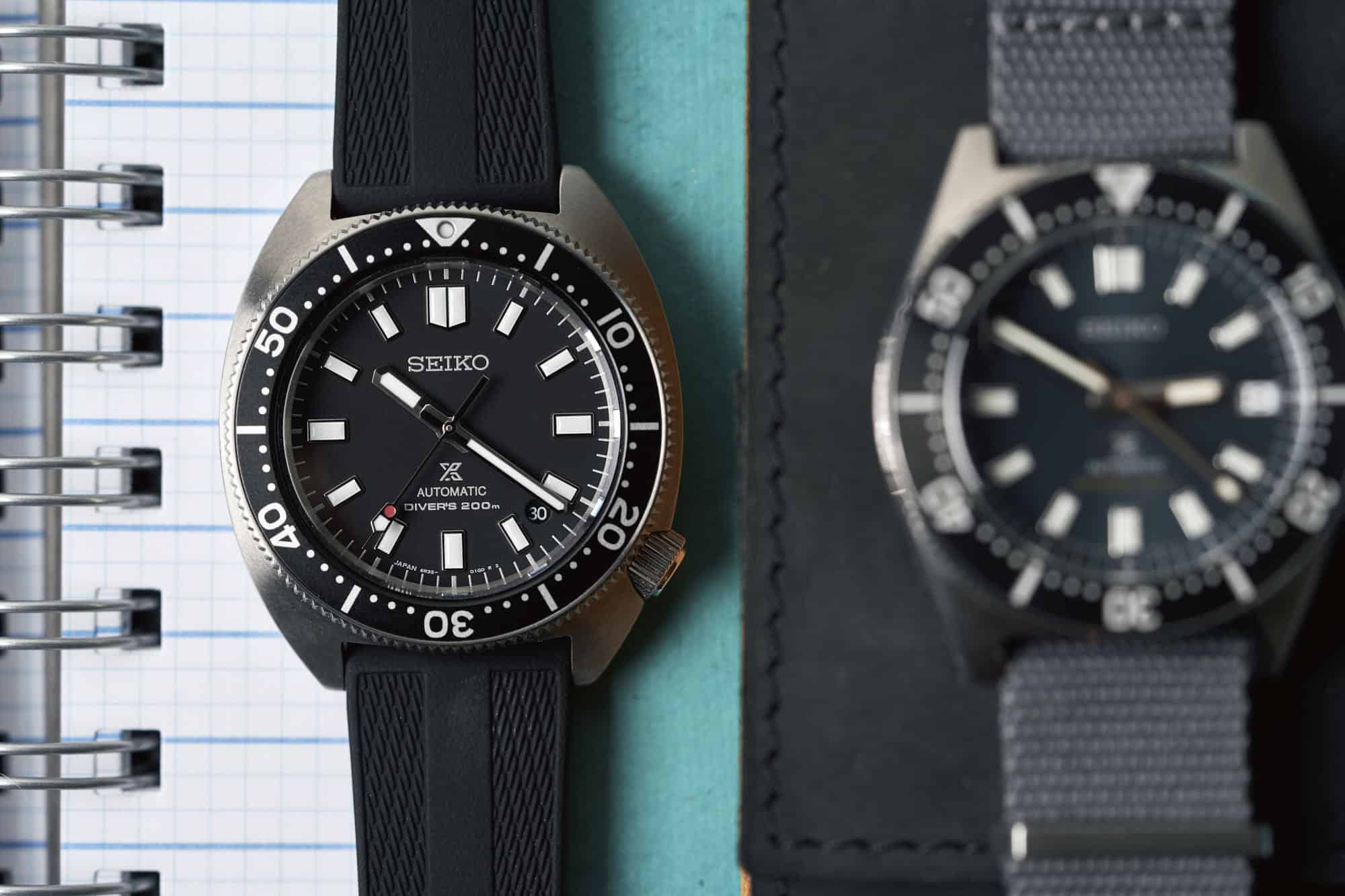
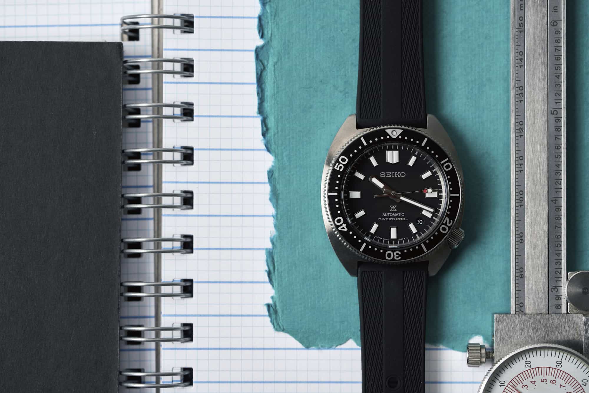
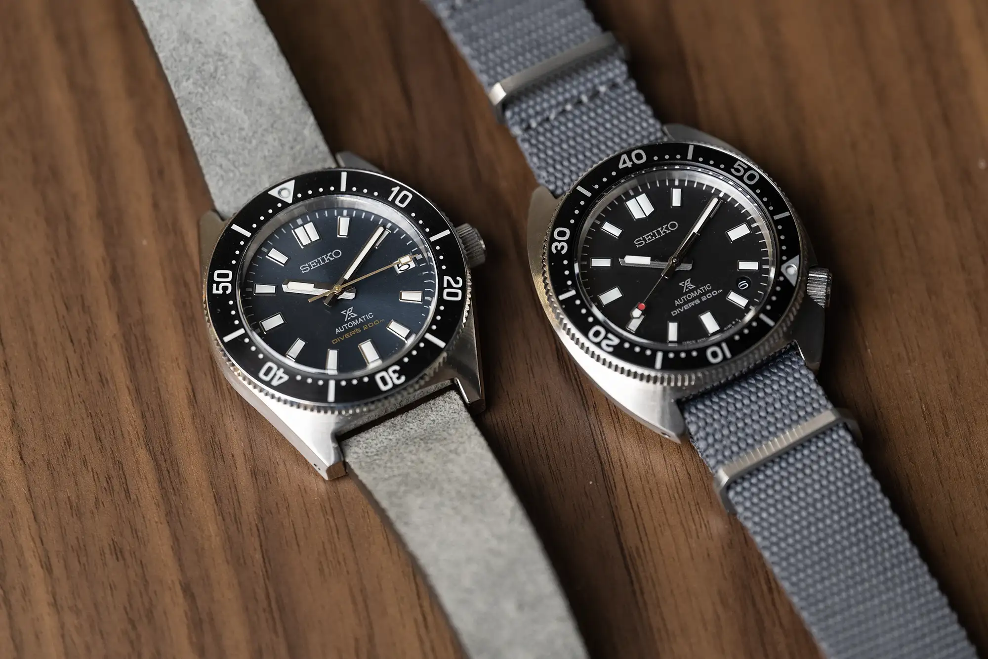
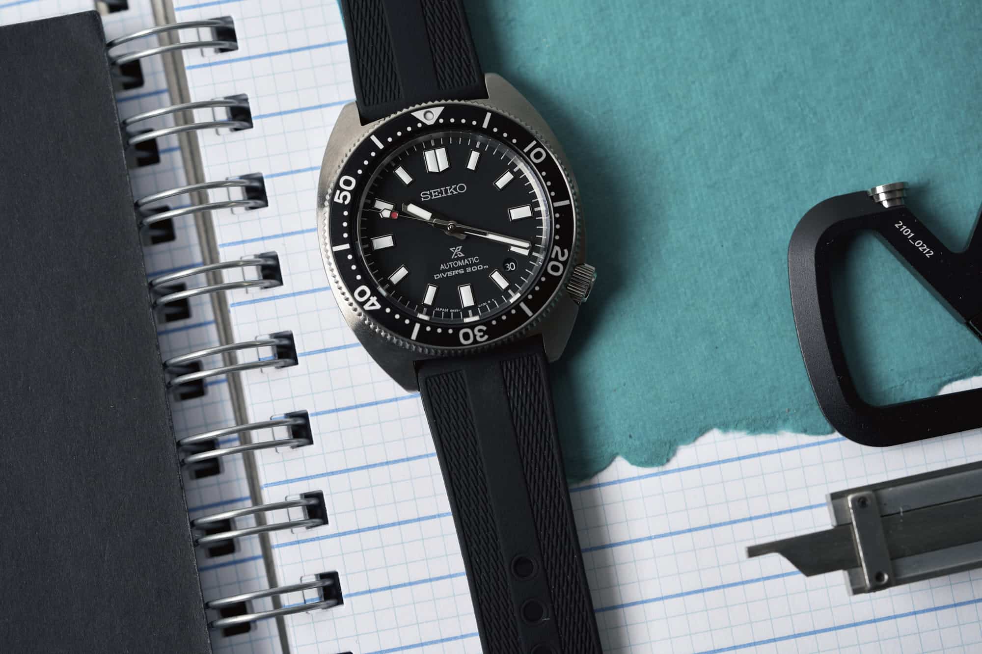
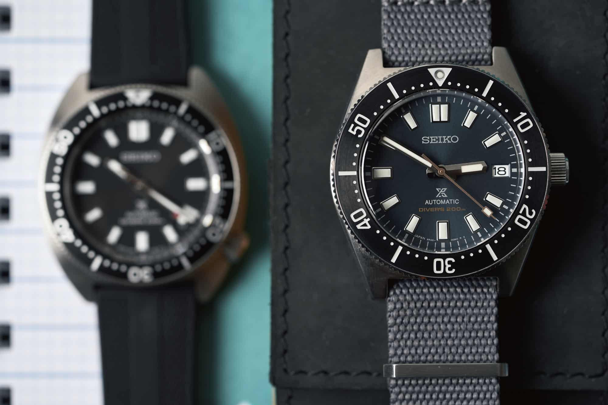
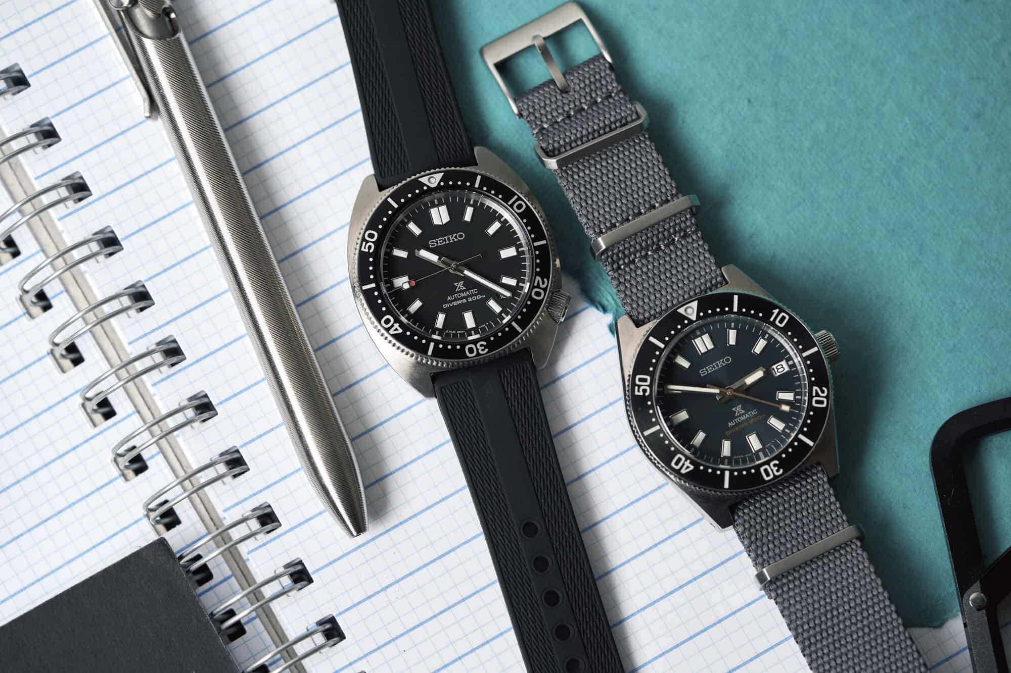
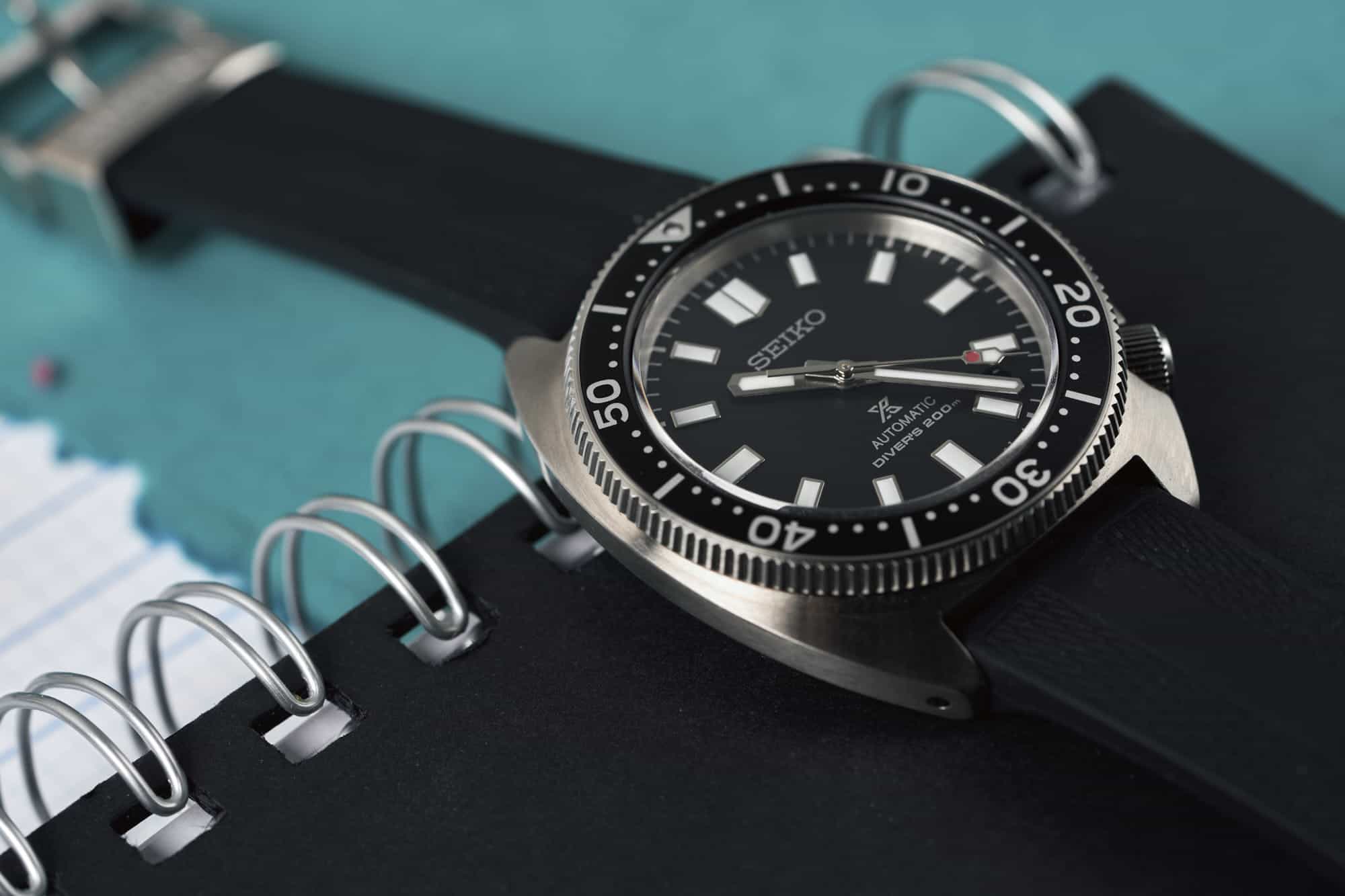
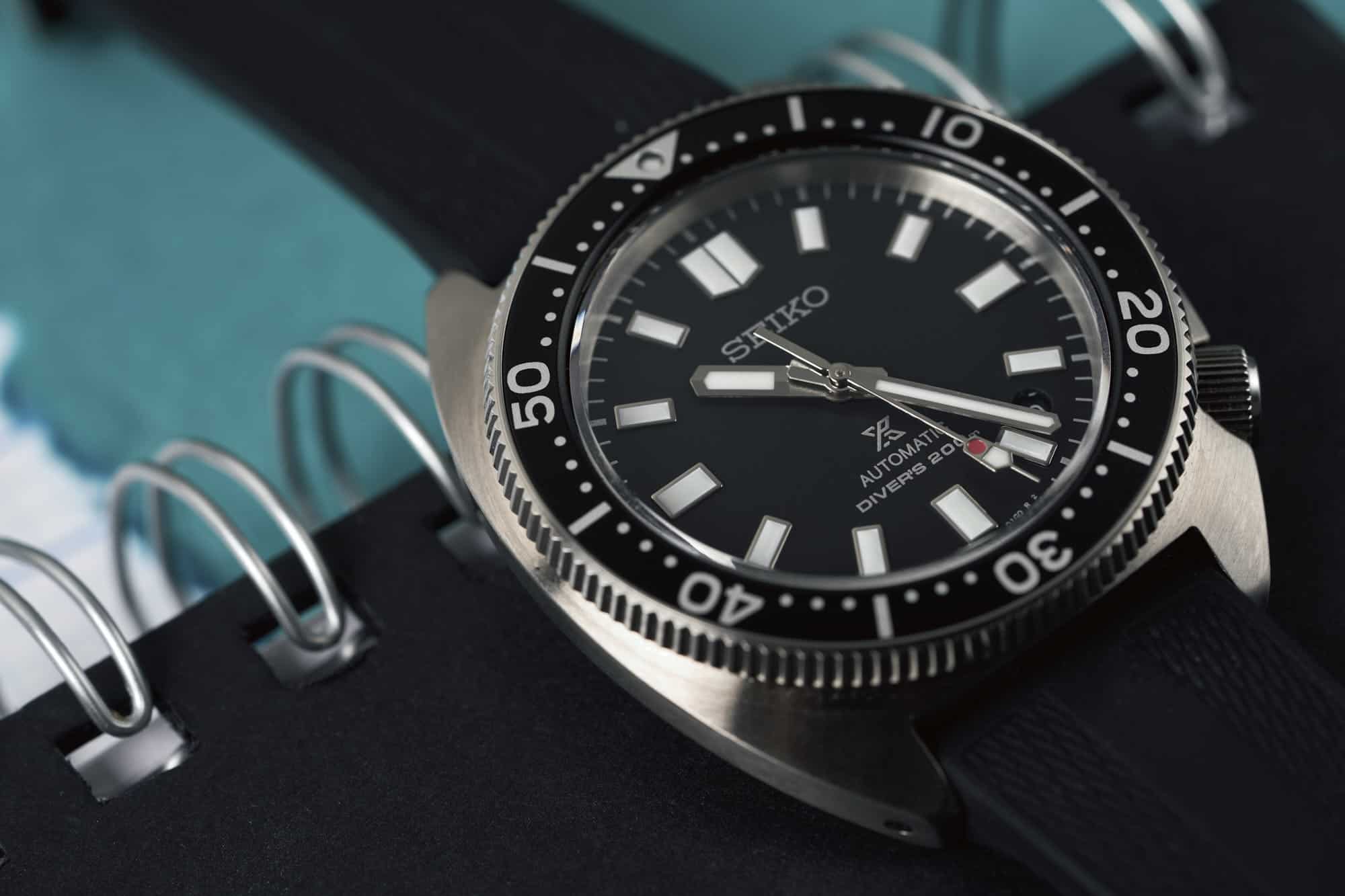
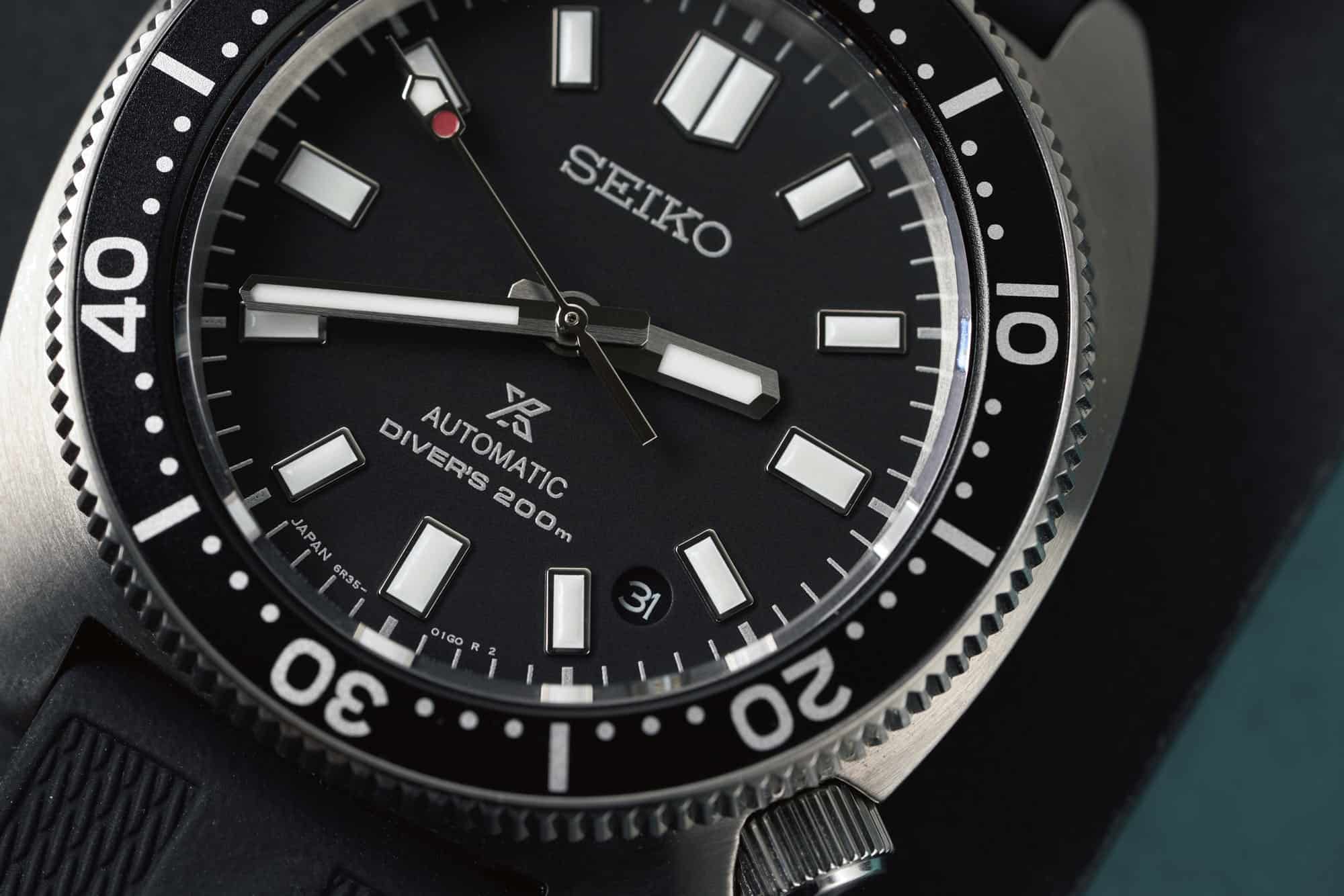
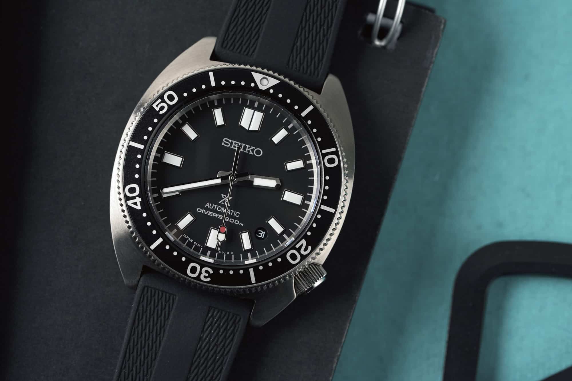
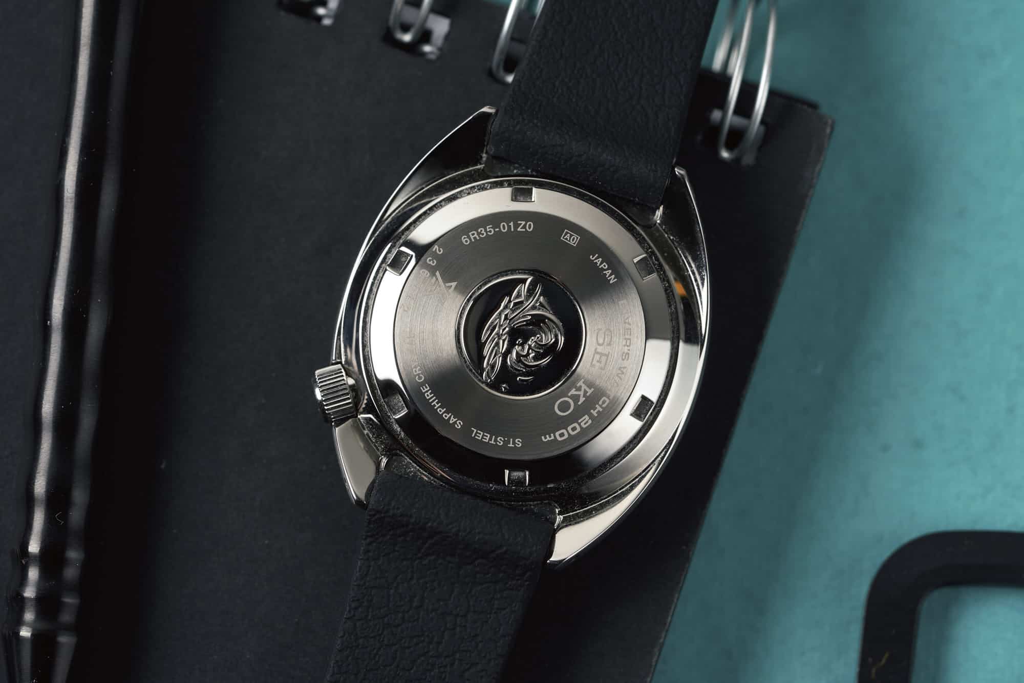
Seiko divers have a way of sneaking up on you. You’ve noticed it, no doubt. Watches from the 6159 to the SPB149 enjoy a certain lore within collector circles, and for good reason, but it takes more than a passing glance to suss out the references that make the most sense to you. Small details make a big difference here, as they do with any watch, but Seiko offers a broad and at times diverse range of dive watches, so it can be tough to make heads or tails from a few pictures on Instagram. One reference that I, along with many of you, connected with right off the bat was this Prospex SPB149, it had all the trappings of an instant classic from the storied Japanese brand. That watch still sits in my collection, and I don’t anticipate it going anywhere. But one of their latest releases from last year snuck up on me, and by golly, it’s found a spot right alongside my 7002-700A and that very SPB149. That watch is the Prospex SPB317. 

This wasn’t a watch I was looking for. Owning one has certainly upset the Seiko equilibrium that my collection enjoyed before. But none of that matters. It’s a great watch and presents something of a conundrum for current happy Seiko dive watch owners.

Advertisement
$900

[VIDEO] Owner’s Review: The Just-Right Seiko SPB317

Case
Stainless Steel
Movement
6R35 Automatic
Dial
Matte Black
Lume
LumiBrite
Lens
Sapphire
Strap
Rubber
Water Resistance
200M
Dimensions
41x46mm
Thickness
12.5mm
Lug Width
20mm
Crown
Screw Down
Warranty
3 Yrs
Price
$900

In June of last year, Seiko surprised us with a handful of new releases, including the SSK GMT collection, new Arnies, and a trio of slim divers that we first looked at in this video. While the SSK sucked up most of the oxygen of these releases, it was those divers that were stuck in the back of my head. Up until that point, I had looked at the Willard references like the SPB153 with a hint of curiosity. In love with the funky shape, but unsure of just how well that case would get along with my wrist. With the release of the SPB313, 315, and 317, I was looking at a watch right in the sweet spot in terms of dimensions, and enough of the funk from the Willard to be compelling in a similar fashion. It was the modern 6105 I never knew I needed in my life. 

The asymmetric Willard references 6105-8110/8119 may get the lion’s share of attention thanks to its appearance in Apocalypse Now (which earned it its nickname), but the history of the symmetric, cushion case 6105-8000/8009 has just as much character and depth as the best of ’em. These were the watches that followed the 6217 or “62MAS” and in the process, set the template for some of the all-time great Seiko divers, from the 6309 to the SKX range, and indeed many of the modern Prospex offerings in some form or another. The evolution is clear and I dare say the design ethos holds up just as well today as it did in the ‘60s. None of these modern Prospex watches look much like vintage designs. Plus, setting aside the appearance in Francis Ford Coppola’s fictionalization of the Vietnam War, these watches made appearances in the real thing, on the wrists of actual servicemen.

Asymmetric 6105 “Willard”

People often cite the Rolex Submariner as the Porsche 911 of the watch world, but I’d submit the Seiko diver as a better (or equally good) candidate. Like the early Seiko divers, which have spawned a litany of different ranges and styles, the 911 boasts a surprising amount of variety, from the base model on up to the GT cars, there’s seemingly one for every kind of (well-heeled) person. By contrast, the Submariner has changed comparatively little since its introduction in the ‘50s. Sure there’s two-toned and all-gold references, and it’s gained a mm here and there, as well as a ceramic bezel along the way, but it’s largely the same watch, and other than the Sea-Dweller (kinda), it hasn’t spawned a wide range of designs and options. Which is probably a good thing for the Submariner, and for Rolex. If the Seiko diver is like the 911, then the early 6105 references are the early 911S with Type 901/02 engines, and the SPB317 is the 992 Sport Classic. 

Seiko 6105-8000

Another thing these Seikos have in common with the 911: the core design is old, but it never seems to age. Great design has a way of transcending its era, and this lineage of Seiko divers is a perfect example. The design is as recognizable and functional as it ever has been, and nothing about it feels dated or “throwback” in style. Other than the shape of the case itself, there’s no real design flourishes here that would be susceptible to passing trends. It’s purely functional, a simple and straightforward take on the dive watch. That simplicity is what makes it so charming, and the manner that Seiko has held on to this precise blueprint is also what makes it instantly recognizable. 

The SPB317 features a steel cushion case that measures 41mm in diameter, and 46mm from lug to lug. It gets a uniform brush finishing that doesn’t really call attention to any particular area or shape, it’s just… cushioned shape. The inset crown at 4 o’clock is a signature design feature and makes for a watch that feels a bit smaller than the 41mm would suggest in practice. The case may be a bit larger than the SPB149, but their viewing areas into the dial are the exact same area. The biggest departure with the SPB313 is the case thickness.

SPB317 (left) and SPB149 (right)

This watch measures 12.5mm in thickness, addressing one of the biggest (only?) gripes owners of the SPB143, 145, and 149 have had, as that watch clocks in at a hair under 14mm in thickness. Now, I’m not one to get too caught up in these numbers, and I don’t think you should be too concerned with them either, but the 317 is noticeably trimmer than the 149, and I’d call it all the more wearable as a result. Where the 149 feels almost blocky and tanky on the wrist, the 317 is damn near svelte, helped in part by the more organic feeling case design. 

The difference isn’t vast, but if this is the kind of watch you like to wear day in and day out, you might find yourself reaching for the 317 more often than the 149 precisely for this reason. This has been my biggest conundrum with the watch. The 149 is a watch I enjoy wearing quite often, and with the addition of the 317, I have just enough of a pause to think about it. They both scratch the same itch, but is there enough space between them? The answer to that really comes down to the type of collector or enthusiast you are. 

Taking a step back, these are very similar watches, and if you stopped 100 random people on the street, few would notice any differences at all. Same goes for most watches, truth be told. But not us. There are plenty of unique features on the SPB317 worth celebrating, and for myself (and perhaps some of you), this watch represents something more than the sum of its parts. It’s a nostalgia for some of the themes responsible for pulling me deeper into this hobby. The 317 has this in spades, and just how strong that effect would be didn’t really sink in until a month or so of ownership.

Again, it’s no single detail, it’s how they all come together in practice. But the details are still worth consideration, as I’m sure not all of them are universally loved. Sometimes there are features or design decisions that leave a bad taste in your mouth in one execution, but work surprisingly well on another. Chief among these is the 4:30 date position. 

I generally don’t have qualms with any specific date application, other than the chrome frame that is sometimes placed around the apertures, of course. While many recoil at the very thought of a 4:30 date window, I take a more agnostic position that really comes down to the execution. In principle, they sound perfect. You get the practicality of the date, with the general feel of a dateless layout. In practice, however, it rarely works out so well. The SPB317 executes the 4:30 date placement about as perfectly as I’ve seen. This watch truly does read as a dateless design. 

This is achieved thanks to the size of the aperture, which is relatively small, and the base of the date disc being color matched to the dial. It also appears as if that disc rests tightly tucked up under the dial plate, so there isn’t much in the way of shadows to be seen. It’s out of the way when you don’t need it, but easy enough to spot when you do. This effect may not work as well on the white dialed variant, the SPB313, as there’s nowhere for the shadow of the recession to hide. The migration south is the biggest deviation from the original 6105-8000 watches, which had the date placed at 3 o’clock. 

The SPB149 (and its ilk) have a similar effect by using a non color matched date disc in place of the 3 o’clock hour marker, but it’s not quite the same for some reason, as the number of the date itself reads much larger. Now that’s a watch I’d love to see in a dateless format.

Advertisement

Another feature of the SPB317 that many of us enjoy is the stoplight seconds hand, which places a small dollop of red into one of two openings at the top of the seconds hand. The other is filled with lume. It’s a weird design that dates back to the original, and is also found on the asymmetric Willard references, naturally. It’s such a small detail that has an outsized impact on the overall impression the watch makes in use. 

We talked about the slim dimensions of this reference compared to other recent Prospex releases, and that’s partially thanks to the flat crystal that sits flush with the bezel. This a welcome move in my book as I find this to be optimal for legibility. You can see some of my gripes regarding domed crystals in my Missed Review of the Sinn EZM1

The dial itself is another area that snuck up on me with this watch. It’s easy to call this a black dial and bezel watch, and that’s also technically correct, but its matte texture seems to absorb slightly more light than you’d expect, making for a nearly dark gray appearance. I’m not sure it’s intentional on Seiko’s part, but it’s the only component of the watch that feels old. It looks like the dial of a 30 or 40 year old watch, that’s a bit drenched of its density and contrast. It pairs beautifully with a neutral tone fabric strap, as you might have guessed. 

The bezel is also matte black, but reads a bit sharper than the dial. The typeface used for the numerals marking each ten minute segment are exactly the same as they appeared on the original symmetrical 6105 references. The width of the bezel falls into more comfortable territory than the SPB149, which gets tall markings and a radial brush. The size of its bezel was a turn off for some when that watch released, so this 317 once again strikes a nice balance.

If there’s one word I’d use to describe the SPB317 it’s just that: balance. This is a watch that manages to highlight some of the best features of Seiko dive watches in a historically accurate way, while pushing aside some of the less flattering features of more recent Prospex releases. It may not be as flashy as the 62MAS or asymmetrical Willard, if you could ever call them such a thing, but it’s nearly every bit as good both in personality and in practicality. In fact, if you have both of those watches in your watch box, I’d wager you’d end up grabbing the 317 a majority of the time for daily duties. 

I say “nearly” there because, while it is every bit as good, it does lack some of the panache of those other two watches. It’s a similar issue I took with the Tudor Pelagos 39, arguably the best all around Pelagos ever made (or the worst, depending on your point of view), but one that doesn’t quite capture the big personalities of its stablemates. I called that watch a perfect candidate to lead off a small, two or three watch collection, but one that you might not reach for in the context of a larger selection. I’d say the same about this SPB317. It is more wearable, more practical, and more daily-driveable than other Seiko divers, but if you find yourself wearing these watches only from time to time, and for a specific experience, you might find that experience heightened with the likes of the 62MAS and Willard references. 

If you’re looking to fill the diver/tool watch slot in your collection, and have only one slot to play with, the Seiko SPB317 is perhaps the best candidate you’re likely to find in this price range. If, on the other hand, you find yourself with a selection of divers and relish the big personality, the funk of asymmetry, the harshness of a skindiver case, or just want more presence, then you’d be better served with the other references in the 62MAS and Willard ranges. That’s not a knock on the SPB317, but rather an exaltation of the others.

Advertisement

The appeal of the SPB317 did sneak up on me, and I’m glad it did as it now fills that Willard-esque hole in my collection, but it did take some time to reveal its full personality. If I already had an asymmetric Willard, I may be struggling to find a reason to keep this one, even though I do find it more comfortable. Same reason I opted to keep the FXD over the Pelagos 39. 

The Seiko SPB317 is the least expensive of the trio that was released, as it’s the only one offered exclusively on a rubber strap. It’s a perfectly supple and comfortable strap, but who keeps the oem strap or bracelet on a Seiko diver? This watch works beautifully with any strap you feel compelled to throw at it, and I’d say the same for the other two colorways. This is a $900 watch, and it feels about right for that money. I’ve never had issues with the 6R35, but it’s never been the most accurate movement in the world, which isn’t a deal breaker for me, but be aware that this has some wide margins for acceptable drift each day. 

The takeaway here is simple. This is a brilliant watch, and if you glossed over it on release because it doesn’t quite have the personality of the 62MAS or Willard references, you’re doing yourself a disservice. This is perhaps the best all-rounder in the Seiko Prospex line at the moment, and if you appreciate these Seikos and their lineage, you’ll find all the charm in the world with the SPB317. 

Seiko.

Images from this post:
Related Reviews
Blake is a Wisconsin native who’s spent his professional life covering the people, products, and brands that make the watch world a little more interesting. Blake enjoys the practical elements that watches bring to everyday life, from modern Seiko to vintage Rolex. He is an avid writer and photographer with a penchant for cars, non-fiction literature, and home-built mechanical keyboards.
blake_buettner
Categories: