Review: Farer Crooms

If I have one gripe with modern watch designs, it’s that there’s a sense of sameness from one release to the next. In our current climate of watches that owe their very existence to a resurgence in interest in vintage watches of all kinds (but especially sports watches) it’s no wonder that we see so many simple black dialed divers, Pepsi bezels, and so on. 

Now, I genuinely enjoy many of these watches. Heck, I own some of them. But as a person who works in the industry and cares about the future of watch enthusiasm, I spend perhaps more time than the average watch wearer wondering about how our current fixation on subdued vintage reissues will impact the hobby. What does the next generation of watch designers draw influence from when the current crop seems to be copy/pasting looks from the golden age of the Swiss sports watch? 

Maybe it’s ok, though, that so many of these watches start looking alike to me. Good design is good design. If the Submariner is the “perfect” dive watch, what really is wrong with every watch looking like a Submariner? Unless you’re a hobbyist, perhaps it just doesn’t matter that much. 

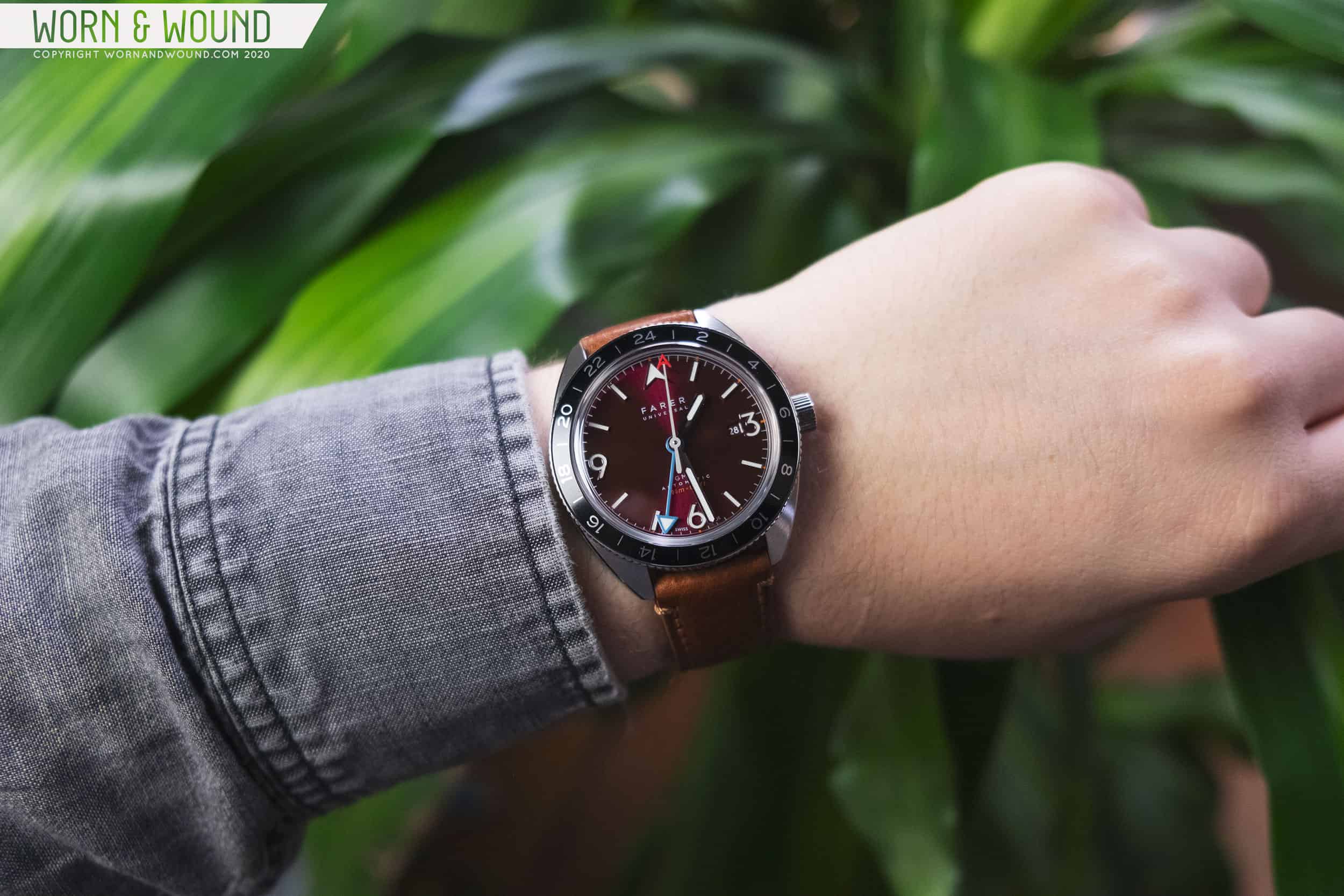
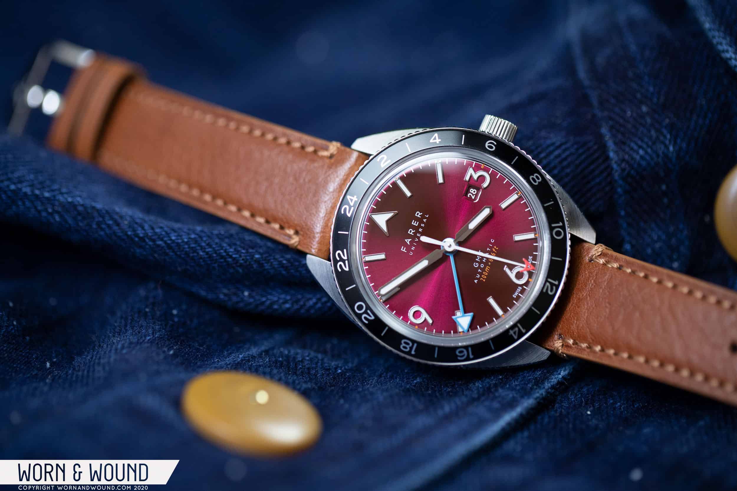
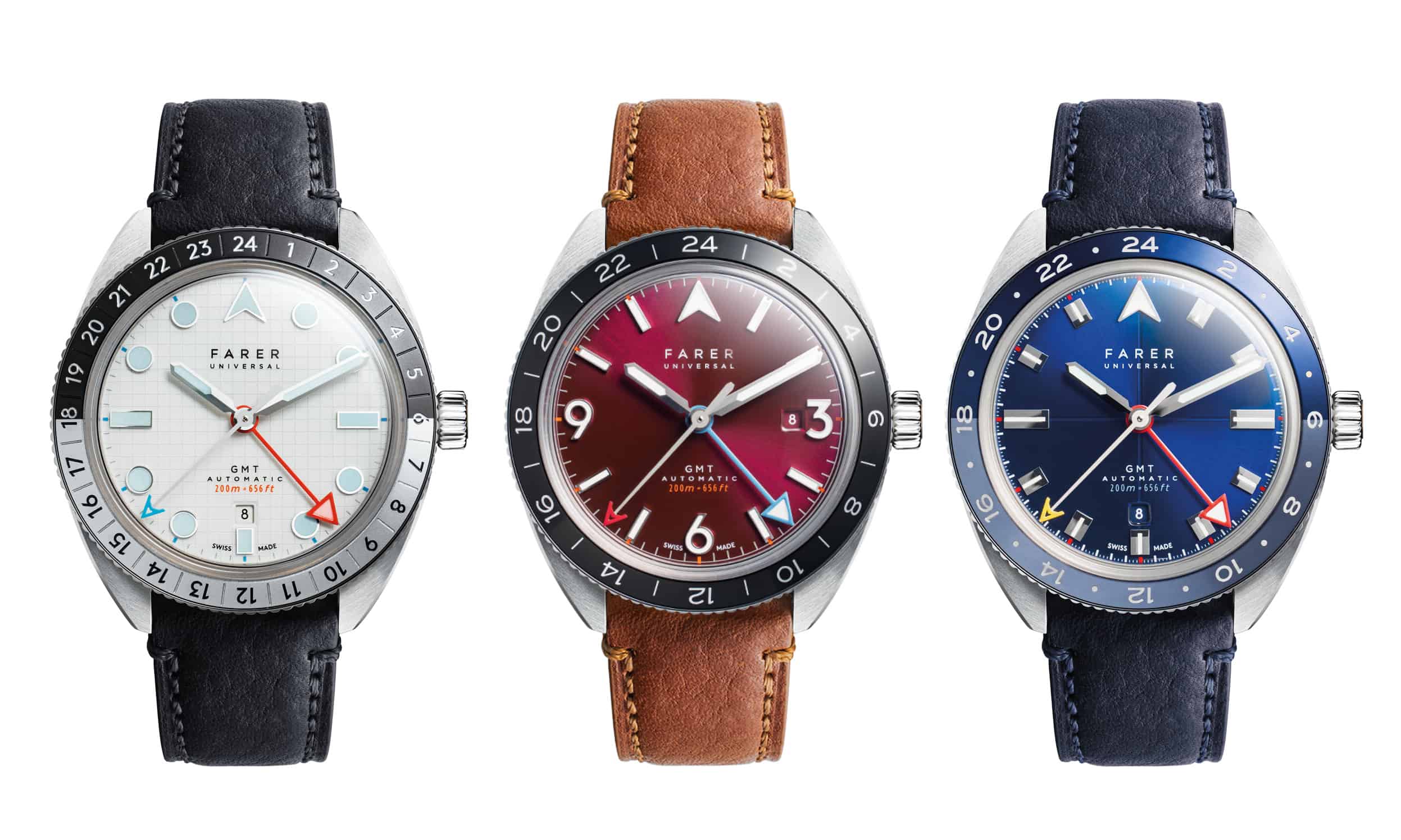
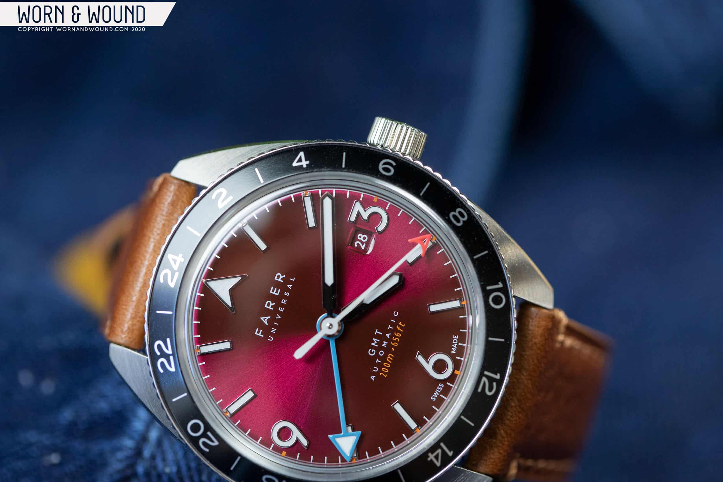
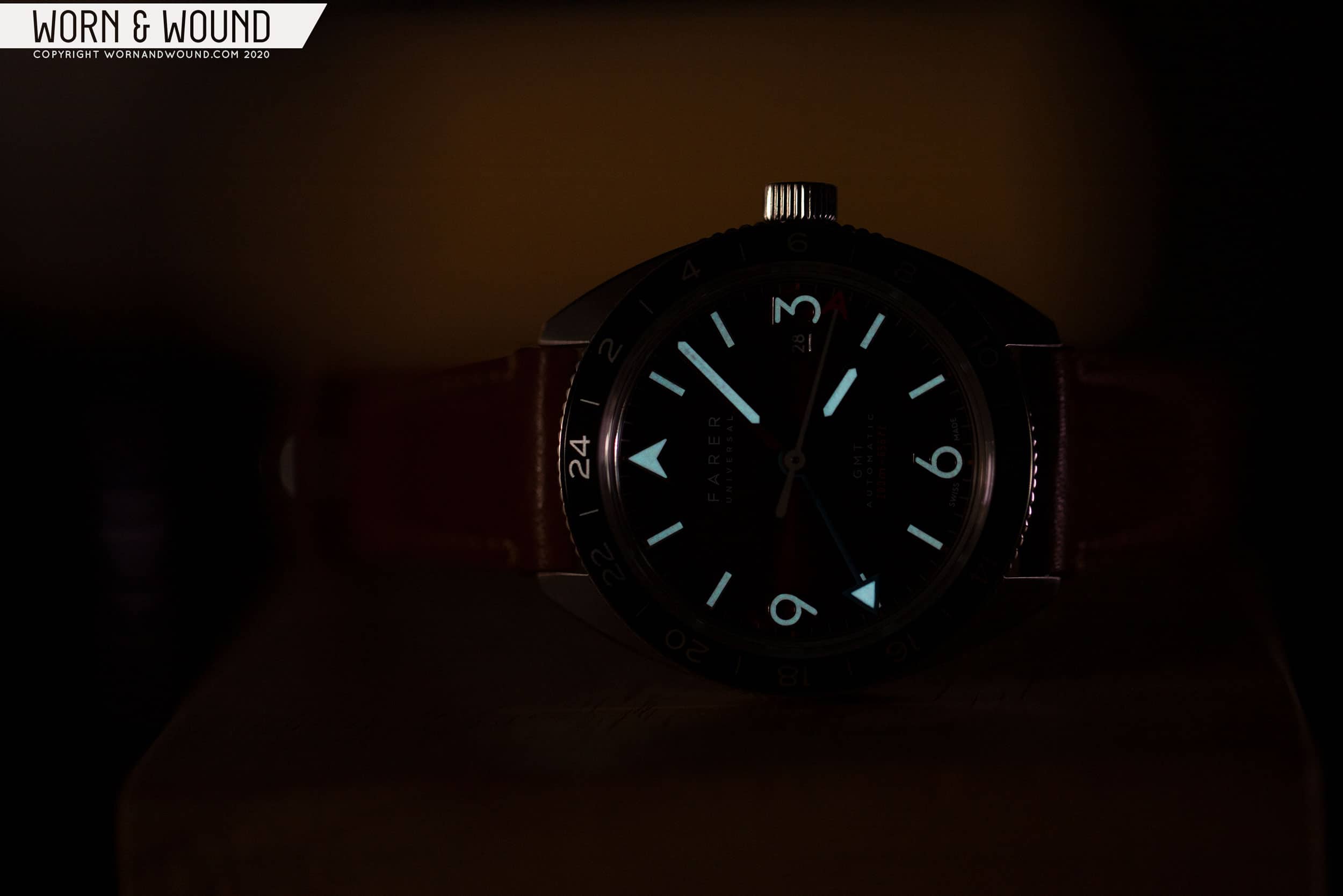
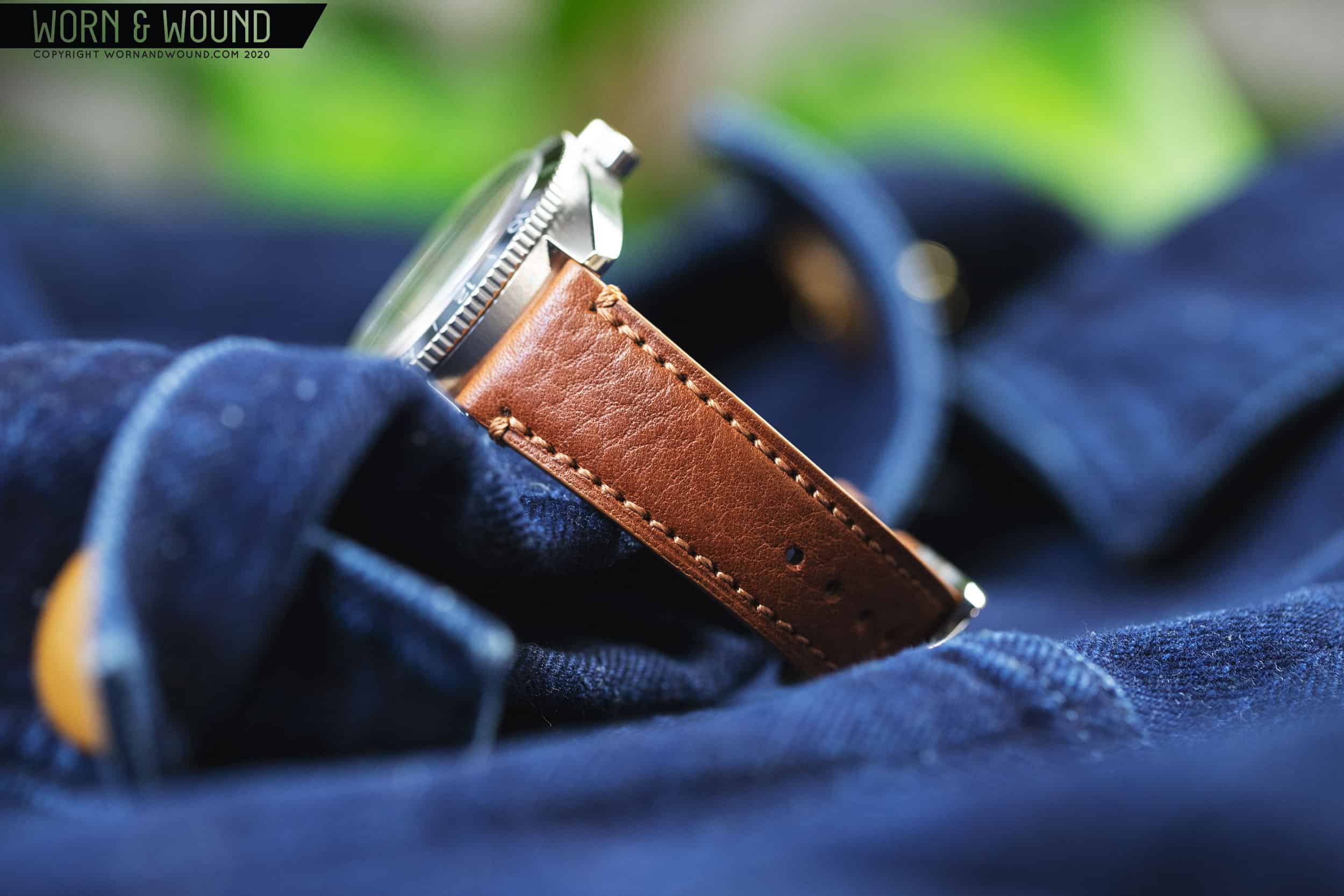
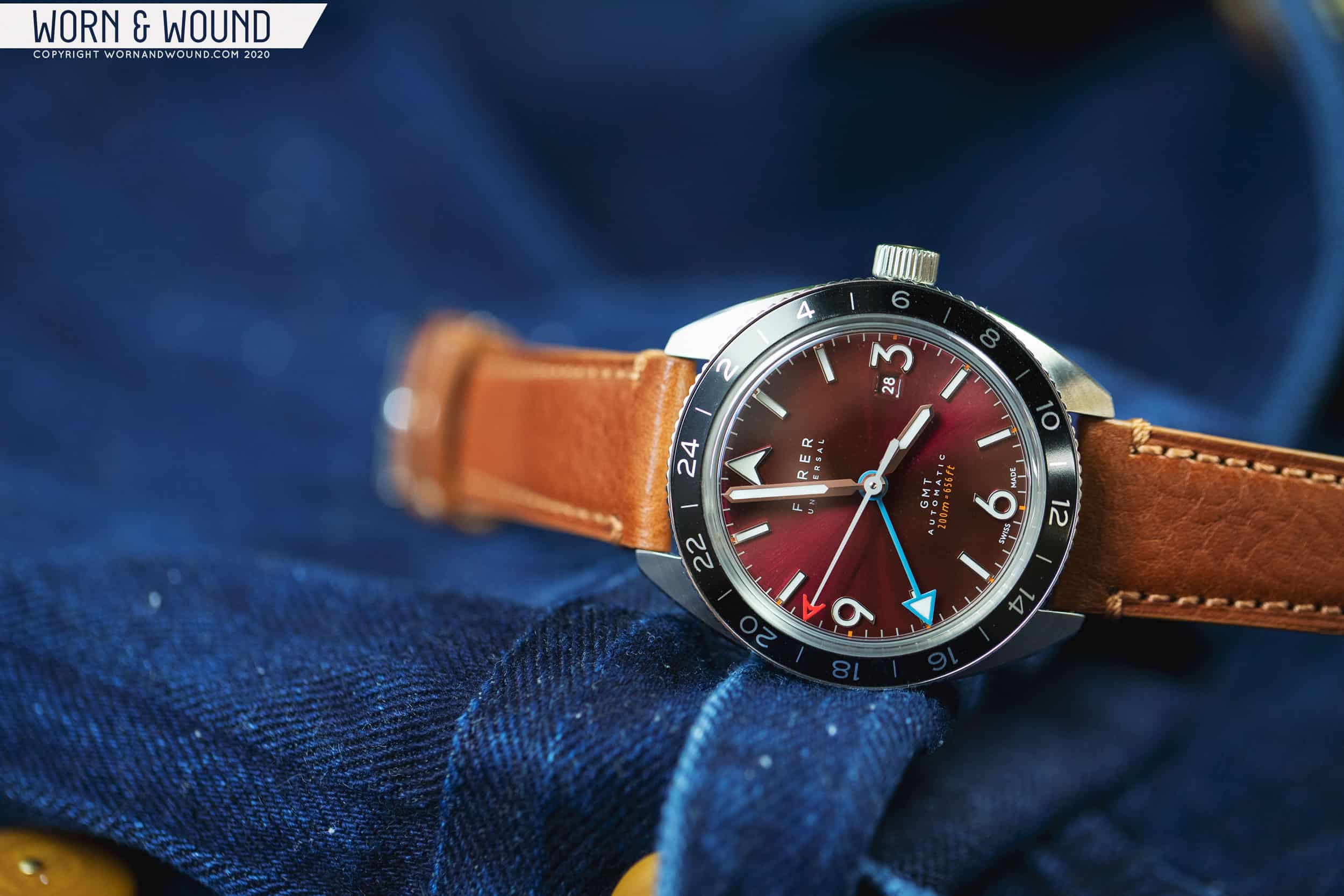
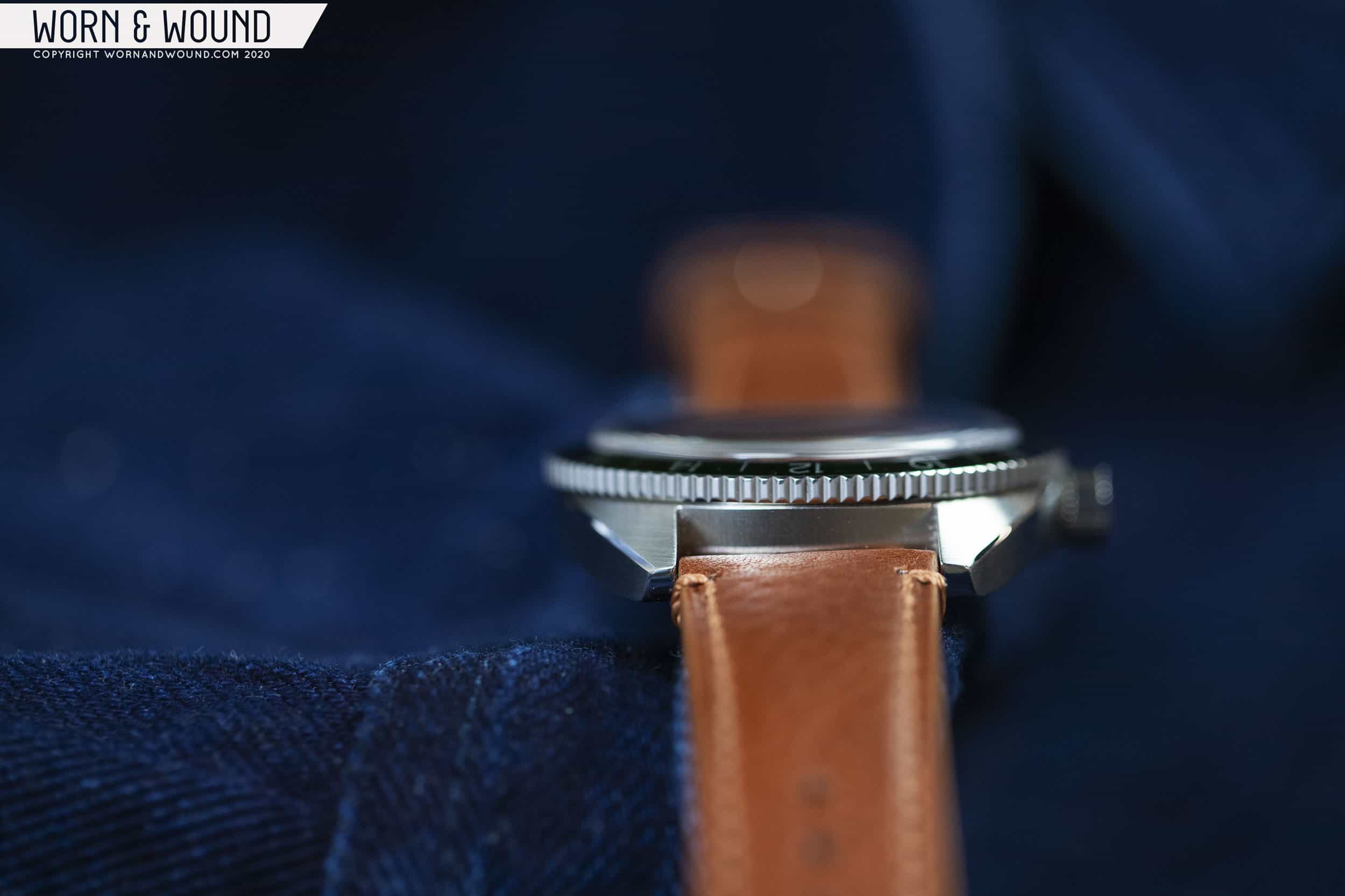
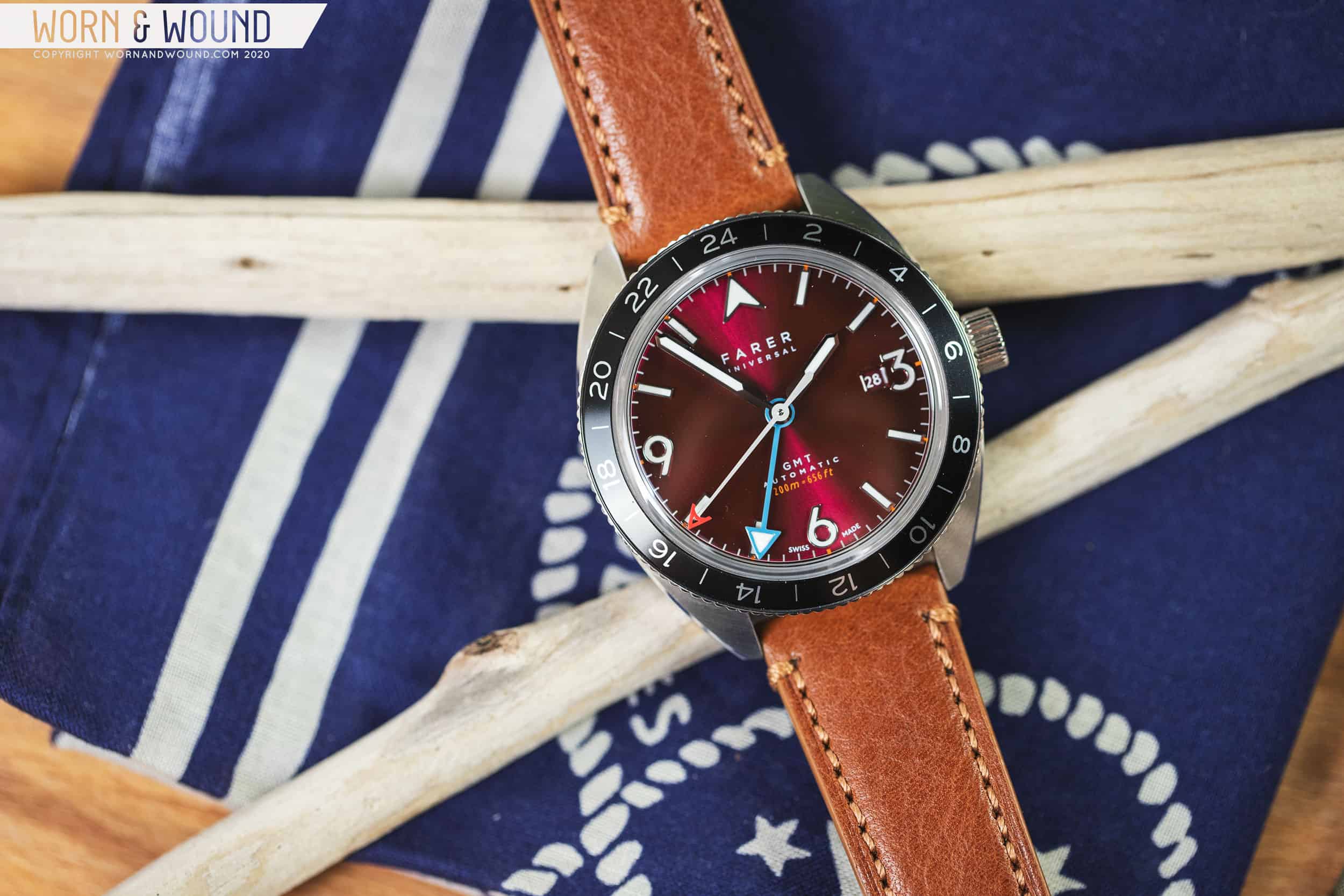
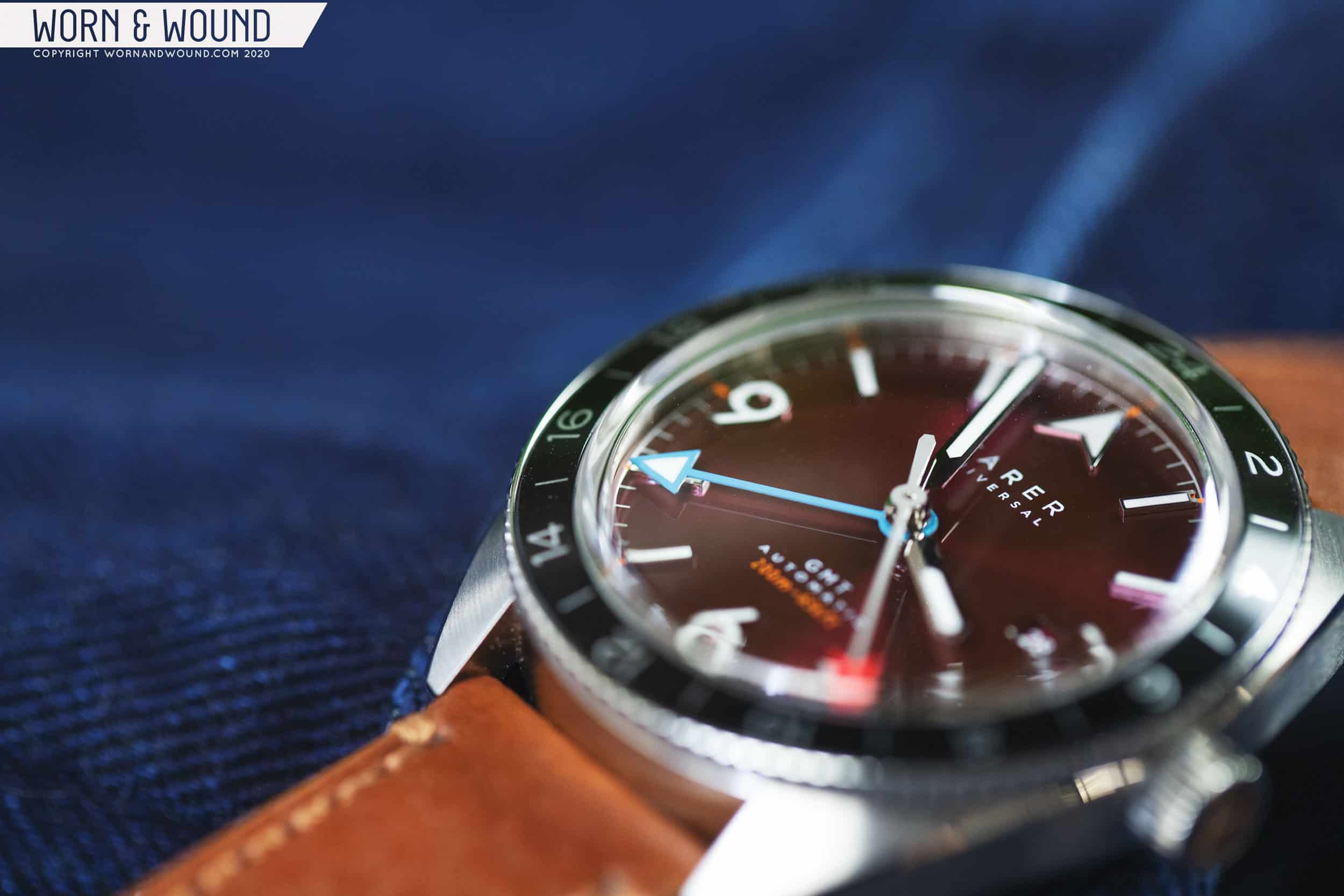
Well, we are hobbyists. And there’s a lane that’s opened in recent years for design that’s genuinely different. Farer has been on the bleeding edge of that movement since their inception, and have released a series of watches that have contemporary styling and an old time charm, setting themselves apart from other brands in this period of prominence for the vintage reissue. Having never owned a Farer, but getting the chance to handle a number of them at meetups over the last few years as they’ve gained traction, I was excited by the prospect of spending some extended time with the Crooms, from their recently launched GMT Bezel line. 

Advertisement
$1475

Review: Farer Crooms

Case
Stainless steel
Movement
SELLITA SW330-1
Dial
Red
Lume
Super-LumiNova
Lens
Sapphire
Strap
Maine St. Venere leather
Water Resistance
200 meters
Dimensions
40.5 x 44mm
Thickness
11.75mm
Lug Width
20mm
Crown
Screw Down
Warranty
Yes
Price
$1475

Blake Buettner introduced us to the new GMT Bezel collection in late August when news of the new watches dropped. The three watches in the collection use the case from Farer’s popular Chronograph Sport line and make some key adjustments to enhance its functionality as a travel watch. In addition to the Crooms, the GMT Bezel line consists of the white dialed Maze and the blue Charlton. Like other Farer collections, it’s important to note that these watches are not simply distinct colorways, but are actually wholly unique designs. Dial textures, hour markers, date placement, and other details are unique from watch to watch, so when you’re deciding on which GMT Bezel to go with, it’s not only a matter of choosing the dial color that works best for you – you’re asked to consider the whole package. 

Farer’s GMT Bezel collection

This is a fascinating approach that’s honestly quite a bit different from what other brands are doing at this price point, and underscores the care and attention the Farer team place on the small details. It also makes me hopeful for the future of the brand – this is a design team that’s bursting with ideas, and wants to experiment. They’re not content to simply give us a choice between blue, red, and white – they want to show us different takes on dial graphics and a variety of approaches to a common idea. 

These Farer collections tend to come in threes, with two somewhat “normal” variants and a third that could be considered more experimental or exotic. I was thrilled when I heard I’d be getting a chance to look at the Crooms, as it’s clearly the most avant-garde of the three new GMT Bezels, and that’s a corner of watch design I’m inextricably drawn to.

Case

Let’s start with the elements of the GMT Bezel that are common to all three versions of the watch. The cushion case measures 40.5mm in diameter and 44mm from lug to lug. Including the crystal, the watch is 11.75mm thick, but that’s a bit deceiving because the sapphire glass is domed, and set atop a rotating 24 hour bezel. The actual wearing experience, in my opinion, is of a watch that’s considerably thinner. The case plants to the wrist nicely and sits low – it’s very sleek for a watch that measures above 40mm.

Because the lugs are so short compared to the case, I’d say the watch wears a bit smaller than you’d expect based on the numbers, but it doesn’t lose wrist presence as a result. This definitely feels like a sports watch and has a pleasing heft, but it’s not likely to get in the way as you move about your life with it strapped to your wrist. 

Finishing is subtle but very well executed. Most of the surface area of the case is brushed. On the tops of the lugs, that brushing is angled toward the strap, and along the case band it flows laterally. A thin, polished bevel separates these two sections of the case on either side of the dial. It’s a small detail but it nudges this watch up a level in terms of its overall quality and feel – it becomes a more premium product with this little touch. 

We should also talk about the bezel – it is, after all, the namesake of the watch, and in a design like this has the tough job of linking the case to the dial, in a manner of speaking. The 24 bezel allows for the tracking of a third timezone, in addition to the two on the dial, with the aid of a 24 hour GMT hand. The rotating action on the bezel is stiff and satisfying, advancing or retreating in both clockwise and counterclockwise directions with a prominent click and very little play. On the other GMT Bezel models, the bezel has a notable design flourish with dual color execution, and hashmark dividers between the hours on the Maze, but the Crooms is fairly pedestrian by comparison, a simple black aluminum insert with even numbered hours counted off all the way around. This, like every other design choice on the Crooms, feels deliberate, and goes toward highlighting the unique nature of the dial, which is the clear star of the show. 

Dial

Red is perhaps the most divisive dial color. It’s notoriously difficult to do well, and it tends to be a tough color to match to most wardrobes. While a red dial can be, and often is, visually striking, nobody ever accused one of being particularly versatile for everyday wear. That said, I own a red dialed sports watch, and have absolutely no problem wearing it with any number of odd colored shirts and ensembles, not caring a wit whether I’m matching or clashing. But many people do care, and rightly spend a lot of time considering how their watch will look with the clothing they wear, and I think that’s as simple a reason as any as to why red dials are tough for many to love. 

And this dial, let me tell you, is very red. I mean, it’s not subtle. While not immediately apparent from the press photos, the surface of the dial is highly reflective and glossy, which makes a singular impression when you bring the Crooms into the light. You have to really like red for this to work. 

Hope you like red

Assuming you’re into red, or at least open minded, I think that if you give the Crooms a chance you’re likely to come away a fan of the way the dial is executed in terms of its color palette. Something that becomes very clear very quickly with this dial is the prominent sunburst pattern, which is explosive in the right lighting conditions and gives the whole experience a sense of texture and intentionality. Hour markers are applied and surprisingly thick, and I like the 3, 6, 9 layout. The oversized Arabic numerals are not only easy to read but well proportioned, and the typeface choice here is playful and gives the watch a modern feel, where the case is more retro.

Farer is known not just for their use of color, but the variety of colors that are used in a single watch. Inspiration is drawn from color charts of classic car makers and other touch points of shared culture, leaning heavily on British influences. Farer easily could have gotten wild and included bright shades or orange or green to complement the red dial, but they’ve held back quite a bit here. The most obvious contrasting element is the baby blue 24 hour GMT hand, and red tipped second hand, a couple shades brighter than the maroon-like dial. A bit of subtle orange text at the very bottom tells us the depth rating (200 meters), but other than that this is a fairly monotone effort from Farer. That tone, of course, is a vivid one, but this watch, in a way, is more reserved than some of Farer’s other offerings which live or die by how multiple colors complement one another. 

From the moment we posted our initial story covering this and the other GMT Bezel watches, there’s been an ongoing conversation about the date window on the Crooms. I don’t have to tell you that date windows are controversial. This isn’t the forum for a Jeremiad on date window implementation writ large. But we’ve got to talk about the date on the Crooms. 

Normally, I’m fairly forgiving of date windows in a general sense. I like a date on a watch – I find it helpful. As someone who is a bit old fashioned and managed to resist automatic bill pay and other similar conveniences, I still write a lot of checks for someone who can technically be described as a millennial, so in this strange time of social  distancing, when the days bleeds together anyway, I like to be able to look at my wrist and be sure of the date when I need to pay the electric bill. In that spirit, it’s with some considerable regret that I tell you the date window on the Crooms is really not very well done at all, and I quite frankly wish it wasn’t there. 

There are a few issues with the date window on the Crooms. First, its location immediately to the left of the “3” on the dial. It’s hard not to see the unintentional representation of whatever number is created by the date and that 3. This is why it’s almost always better to not use an Arabic numeral in that spot at all, and just let the date exist there on its own. 

The other big problem with the date window is the size. It’s tiny, and very difficult to read clearly at a glance, which makes the point of a date window nearly moot. In comparison to the large 3 that it sits next to, it’s almost comically small. Perhaps Farer’s intent here was to be playful or ironic, but the end result is a date window implementation that looks like it’s trying to be hidden from view, but isn’t, because of its proximity to a very large, applied, numeral. 

The date window placement, and sizing, might not be to everyone’s taste
Advertisement

Is this a dealbreaker? That’s a highly personal question that gets to the heart of how we all feel about date windows. I’ll come right out and say it: a date window has never been a deciding factor for me in whether to purchase a watch. But I also can’t recall purchasing a watch that included a date window that I had an aversion to. I’m a strong neutral on the matter, most of the time. Even date windows that many think aren’t very well done tend not to get my goat. But like the first gen Rolex Explorer 214270, that initial 39mm reference with the handset lifted from the previous generation’s 36mm case, this feels like a mistake.

Perhaps, like Rolex did with that Explorer, Farer will return to the Crooms at some point and cover up that date window. They’ve returned to watches before, making small adjustments here and there, so it wouldn’t be unprecedented. In the meantime, Farer is likely to find their customers for the Crooms as is. This is a brand that has proven over several release cycles that they’re comfortable taking risks and letting the chips fall where they may, and for that they deserve a whole lot of credit. 

Movement 

The Crooms is powered by the Sellita SW330-1, a GMT movement with an independently adjustable 24 hour hand. We’ve covered the different types of GMT functionality at length here on Worn & Wound (head here for a breakdown of what’s currently available) so we won’t retread that ground here. It’s enough to say that the Sellita caliber chosen is a proven reliable movement, eminently capable of tracking a second time zone (plus one more with the 24 hour bezel) and Farer has done a tasteful job of customizing its appearance. The skeletonized winding rotor is a nice touch, and allows you to see more of the movement at any given time.

A small critique, which is not Farer’s fault at all, is that the movement is dwarfed by the case, and appears to be rather small, surrounded as it is by stainless steel. Personally, I tend to prefer closed case backs when the movement doesn’t match the size of the case so closely, but this is a minor and quite particular quibble. The movement size, of course, also has a direct impact on date window placement which we covered above, and makes us realize how much more compact this watch might have been if the case size had been designed to be in closer proportion to the movement being used. 

Straps and Wearability

The Crooms ships on a brown leather strap that’s surprisingly soft and comfortable from the get go. Let’s face it: we all have our favorite straps and switch them around often, so it’s rare for a strap to be included with a watch that we’d actually want to use, but I’d happily wear the Crooms on the included strap. It’s thick, well made, and nicely complements the tones on the dial – no easy feat. 

Advertisement

The Crooms wore comfortably in my testing. As we noted above, the short lugs are a favor to the sporty case, which is substantial without being unwieldy. My wrist is 7.5 inches, and the Crooms always felt in proportion to me. I think it could easily wear too big for those with smaller wrists, say under 7 inches in circumference, for the same reasons it feels just right to me, but it is a sports watch after all, and wrist presence is not a bad thing.

Conclusion

At the end of the day, in spite of my reservations about the date window on the Crooms, I really enjoyed my time with it, and came away from the wearing experience with a deeper appreciation for Farer as a brand. I’ve said it many times, in many ways, including at the top of this review: one of the biggest challenges for those involved in this hobby is finding stuff that’s genuinely new and interesting in a sea of product obsessed with the past. Farer walks the line in a really interesting way, with nods to history in their branding and color choices, but end results that are unlike anything else on the market and read as new and different. I think that’s important as they continue to find their niche.

It should also be said that the quality of the watch is just really outstanding. The machining, finishing, design work, movement, and overall presentation represent a ton of value. If you’re new to watches, and you buy a Crooms, I doubt very much that you’ll come away thinking to yourself that you got shafted. You’re likely to think that you did pretty well for the money you spent, and that’s the type of experience that keeps people involved in this hobby, while the inverse pushes them away. 

This is a strange year to consider travel watches, because so much of the world is stuck in place as we continue to fight a global pandemic. But there’s an undeniable romance to wearing a travel watch even if you’re staying put, and the Crooms captures that nicely with its mix of influences and unique style. At the end of the day, it’s a comfortable and distinctive watch with a lot of personality that’s completely deserving of your consideration if you’re after something unique from a brand that isn’t afraid to take a chance. Farer

Images from this post:
Related Reviews
Zach is a native of New Hampshire, and he has been interested in watches since the age of 13, when he walked into Macy’s and bought a gaudy, quartz, two-tone Citizen chronograph with his hard earned Bar Mitzvah money. It was lost in a move years ago, but he continues to hunt for a similar piece on eBay. Zach loves a wide variety of watches, but leans toward classic designs and proportions that have stood the test of time. He is currently obsessed with Grand Seiko.
Categories: