


 Featured Videos


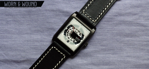
After having spent a few weeks wearing the Orient Masquerade I can confidently say that this is a great watch. It is built well, looks great, feels good to wear, is very unique and is quite affordable. I covered many of my opinions in my initial impressions a couple of weeks ago, but wanted to present some more substantial views here.
 Case: Stainless Steel w/ IP Coating
Movement: Orient Caliber 46S50 21 Jewel Automatic w/ date
Dial: Multi-layered
Lens: Mineral Crystal
Case Back: Polished Stainless Steel
Strap: Beige Genuine Leather
Water Res.: 5atm (50m/150f)
Dimensions (rectangular): 46m x 35m (38 w/crown)
Thickness: 12mm
Lug Width: 25mm
Warranty: 1 year international guarantee
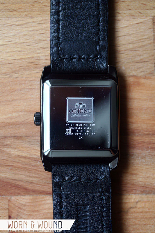
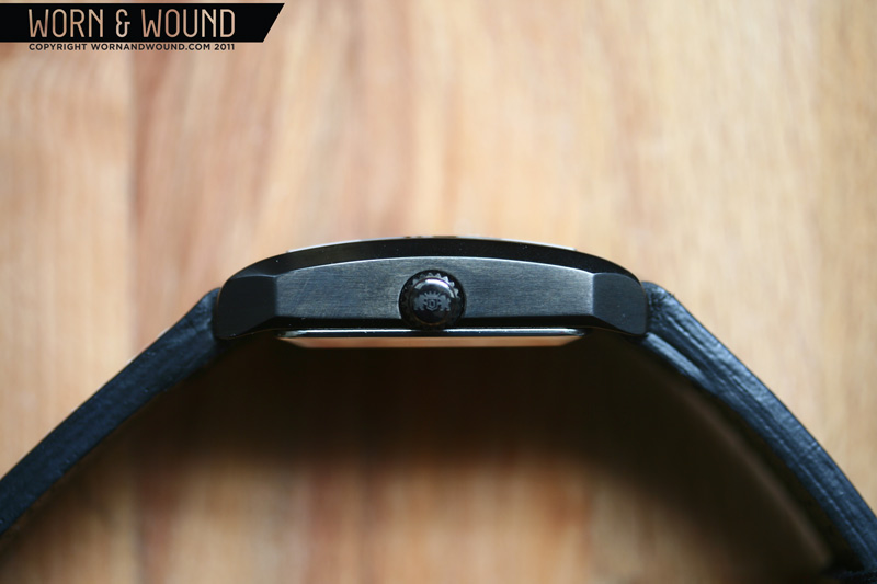
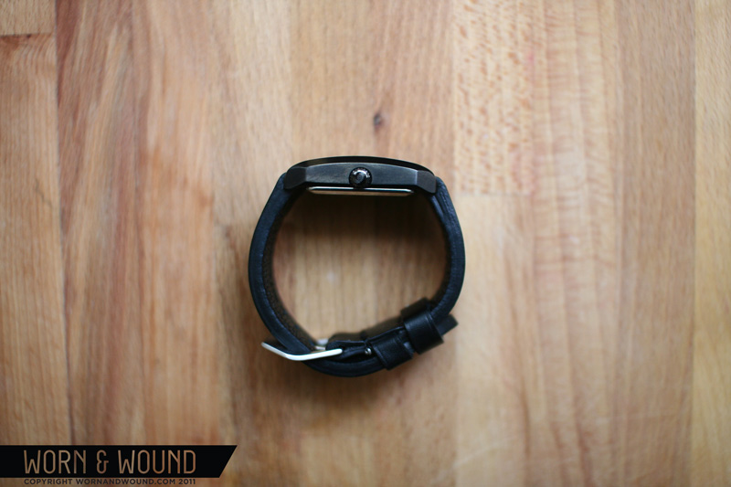
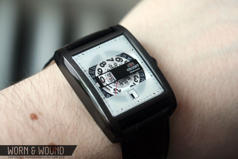
The Masquerade is a well-built watch with a confidence inspiring weight to it. The body is primarily a single solid chunk of IP coated steel that maintains a thickness of at least 1/8 inch all around giving no part of the case any fragility. The body is basically a rectangle with various bevels on, short fat lugs and a curved profile. The proportions of the case are just right, especially for my wrist (medium > small). Lug to lug, it sits comfortable across my wrist at 46mm without any issue of overhang and the width is a nice slender 35mm. Though the underside is flat, the curved crystal makes the watch feel more ergonomic than it really is, and minimizes any chunkiness from the 12mm thickness. The push/pull crown is on the smaller side, which helps maintain the rectilinear form of the case, and has average resistance. That is to say, I doubt one would accidentally dislodge the crown, but it is not as sturdy as a screw-down. The case-back is a pressure fit polished stainless plate with a large etched logo that seems very secure.

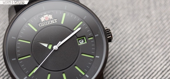
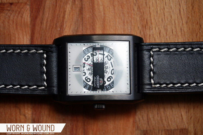
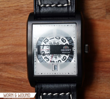
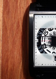
I love the face of this watch. As I described in my initial impressions, there is a great sense of depth to the face that is created by the layering of disks and screened graphics on the crystal. The screened crystal is particularly unique, and Orient used the surface intelligently, building on the functionality and readability of the face rather than adding garish embellishments. Being that the Masquerade is not a classic three handed watch, what you are really looking at are the raw disks used to tell the time and date. As such the design of the face is more defined by the font used than by colors, finishes or the other additional elements many watch faces have. The end result is much more graphic than anything else in Orient’s line, and feels like an ode to watch typography; the type of watch you would find at a museum shop rather than a watch or jewelry store. After all, looking straight down at the watch, one basically just sees a spiral of numbers and few white or black boxes. At the same time, the watch does not call unnecessary attention to itself, and it is only upon second or third glances that someone might notice that you have a very different type of watch on your wrist.
 Reading the Masquerade takes a little getting used to, but is ultimately quite simple. The time is read at a red line at the nine position. The current hour is the hour that is in line with or just passed (moving clockwise) the red line and the minute is being intersected by the line. The part that is strange is that at 11:55 it will look like it is 12:55, since the 12 is just about lining up and the 11 is well past. This isn’t an issue with the Masquerade, but rather this type of watch to begin with. Since it is not a true jump-hour, that is to say the hour doesn’t remain stationary and then “jump” forward every 60 minutes, but rather just a dial watch, there is no way around this. Frankly, it is a minor issue and you get used to it very quickly. The date is very clearly displayed at the 6 position.
The Masquerade has an Orient in-house movement, caliber 46S50, which is a 21 jewel automatic rated at +25~-15 sec / day with an approximately 40hr power reserve. I have had no issues with the movement in terms of accuracy or power reserve. The case back of the watch is polished stainless and has no window, so no comments on the look of the movement. The one thing I could say is that like the Seiko 5, the rotor is rather noisy, making a sort of grinding sound when rotating. Not really an issue, but something to make note of.
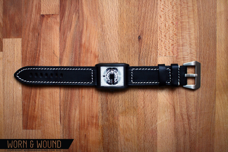
 In my initial impressions I brought up the strap, and that to my eyes it was not a perfect match for the watch. It is a very nicely made strap, and is very comfortable, but something about it just did not feel right against the layered face, sturdy body and gunmetal finish. Basically, it was a strap for a dress watch, but the masquerade is aesthetically more casual and modern. However, finding a new strap is quite difficult as the lug width is 25mm…Someday, someone will need to explain this phenomena to me… I get making your customers come to you for straps, but as far as I can tell, Orient does not sell replacement straps, at least not stateside, so you are left in a very annoying position. My father (another watch nut) suggested I try a 26mm band with the 25mm spring bars, and just squeeze it in there. So, I eventually landed on getting a 26mm black calf-leather band with white stitching from Panatime. The strap is gorgeous, and for me really works with the watch (except for the humorously oversized buckle, but that will change too). Since it does not taper, it emphasizes the angles of the body, the white stitching plays off of the white in the dial and the matte black of the leather emphasizes the gloss plating on the body.

SO! I unequivocally love this watch and recommend it to anyone looking for a dial watch/jump-hour, a watch that is off-the-beaten path, or a watch that is typography heavy. I really praise the designers at Orient for creating such a tasteful watch that focuses on graphic sensibilities and presentation quality over typical watch design features and styles. I find myself drawn to this aesthetic, and it is one that is quite rare in mainstream watches. Furthermore, the build quality is great, it is rocking an automatic movement and, though I didn’t love the looks of it, a good quality strap, all for $135 with a promo code. This watch basically defines good value in my book.
Enjoy the gallery below!

I’ve got a CERAK Vintage in the mail, which is like the funky stepbrother to this line (same basic look, bronze case, blue surround, orange center highlight). When I ordered, I’d somehow missed this model. Now I’m thinking I might just return the CERAK and get a FERAP. I had my eye on the same color scheme you picked, and it looks fantastic in your photos. Good to know about the oddball strap width.
I love the idea behind this watch. I just wish the execution was a little better. Those half-opacity screens just turn me off. Shame because it’s a super cool idea with a good movement at a killer price. Same as the Orbit – I’d grab one in a sec if they didn’t look like a Swatch.
another rectangular watch to add to the list of watches to buy. it’s getting rather long at this point.