Review: Seiko SPB149

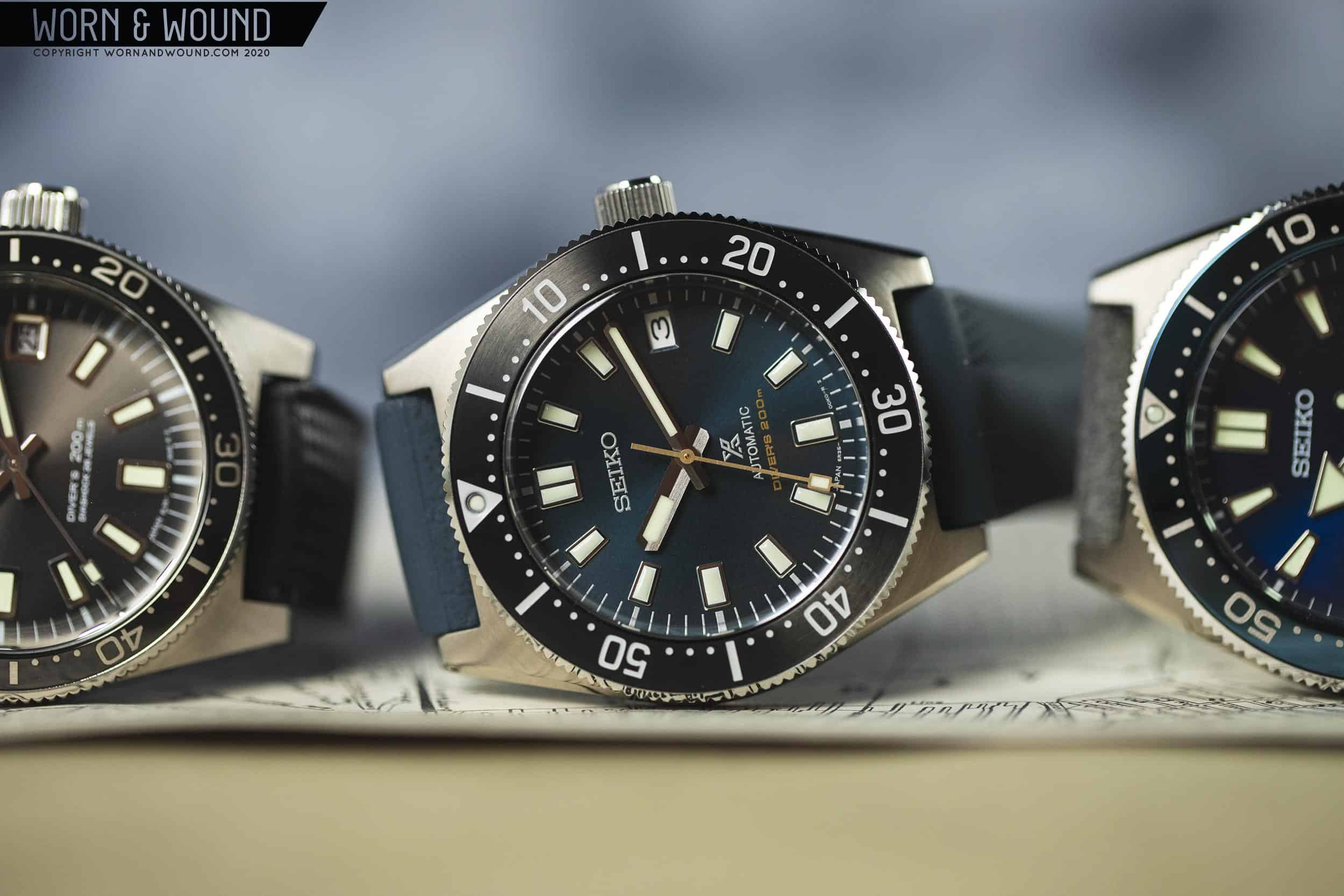
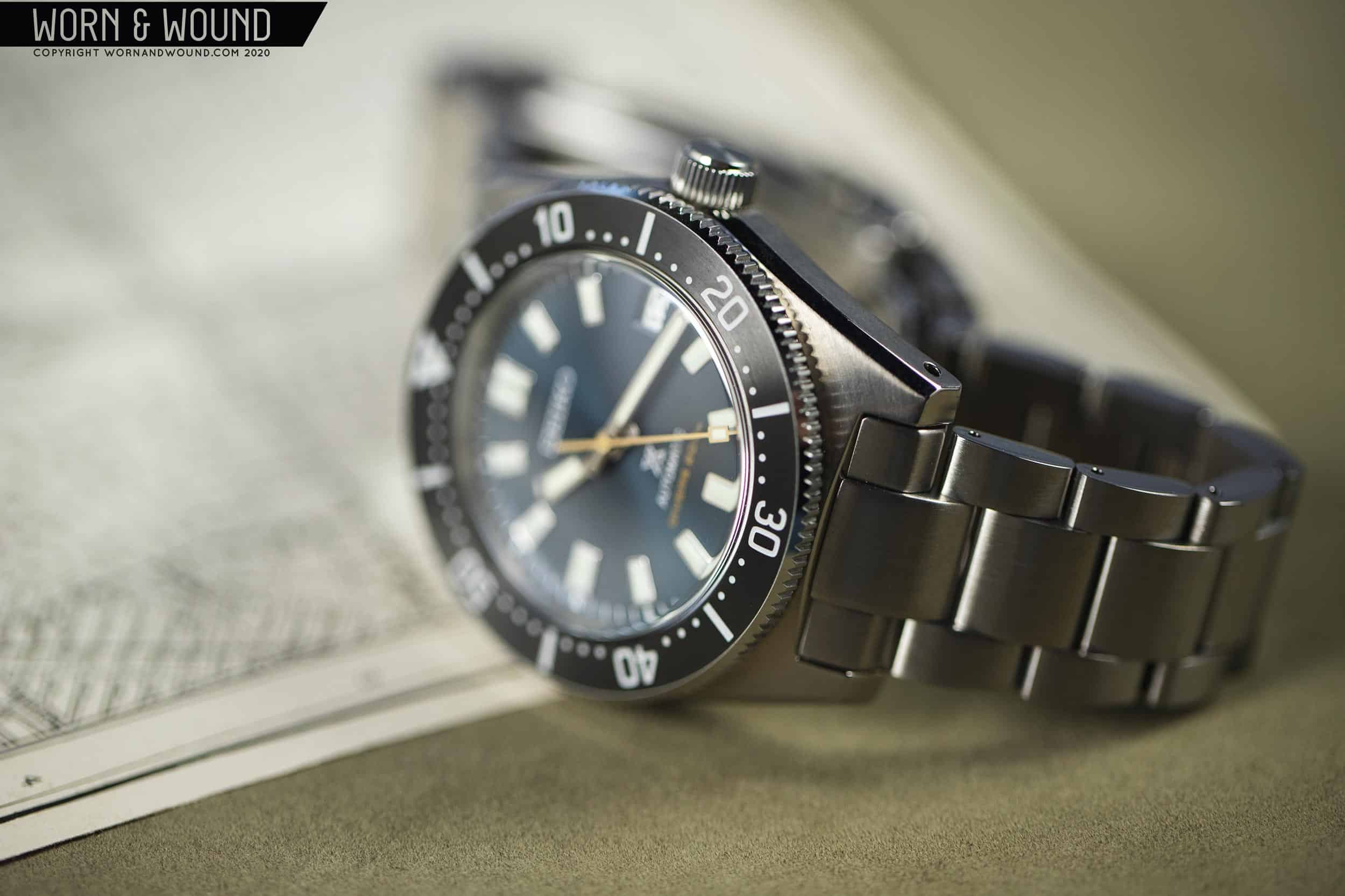
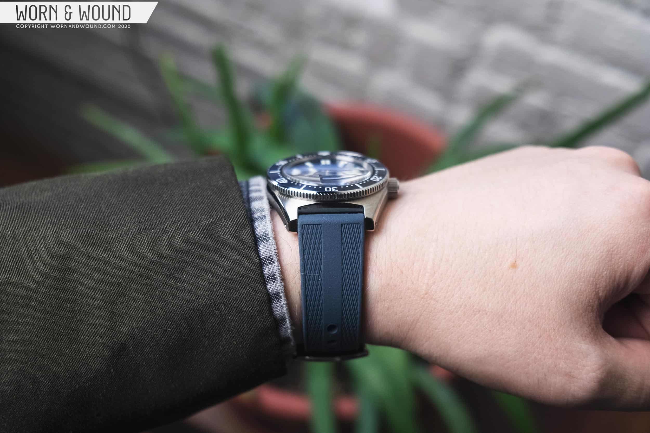
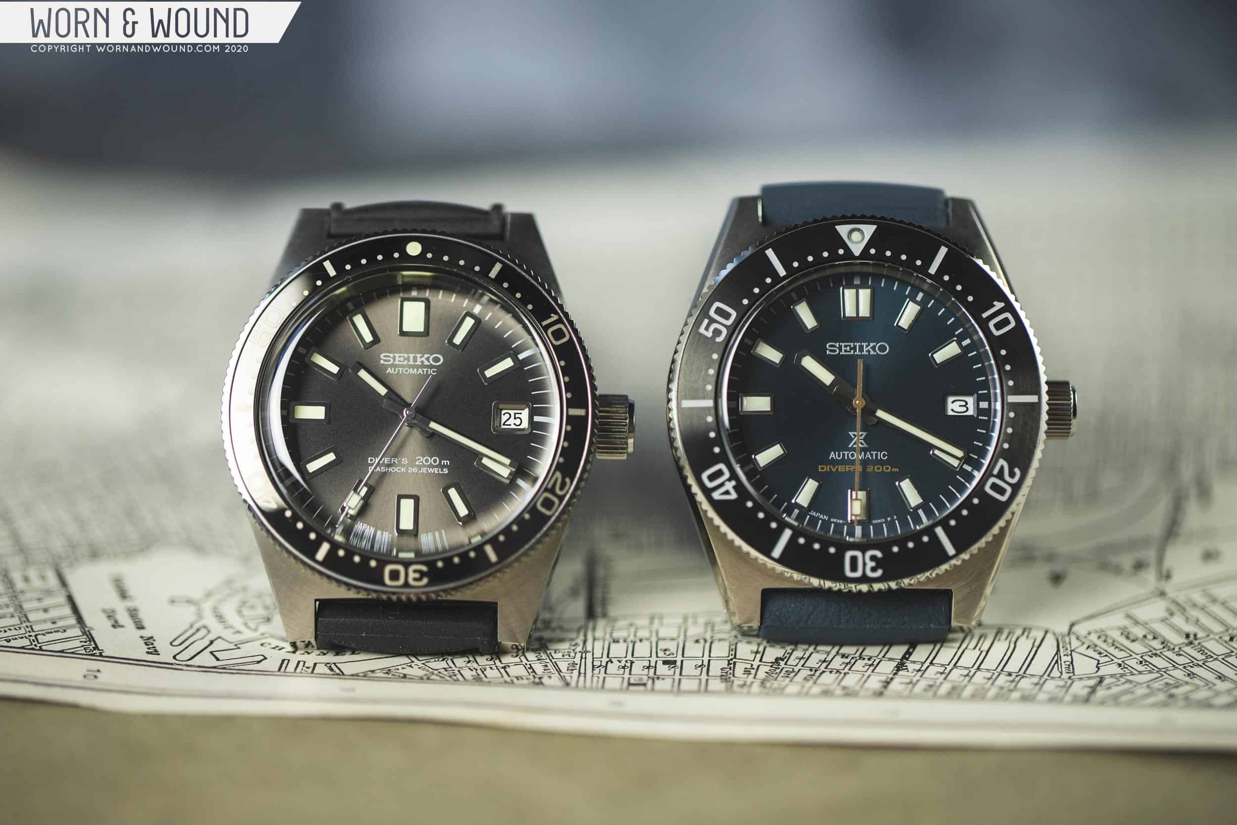
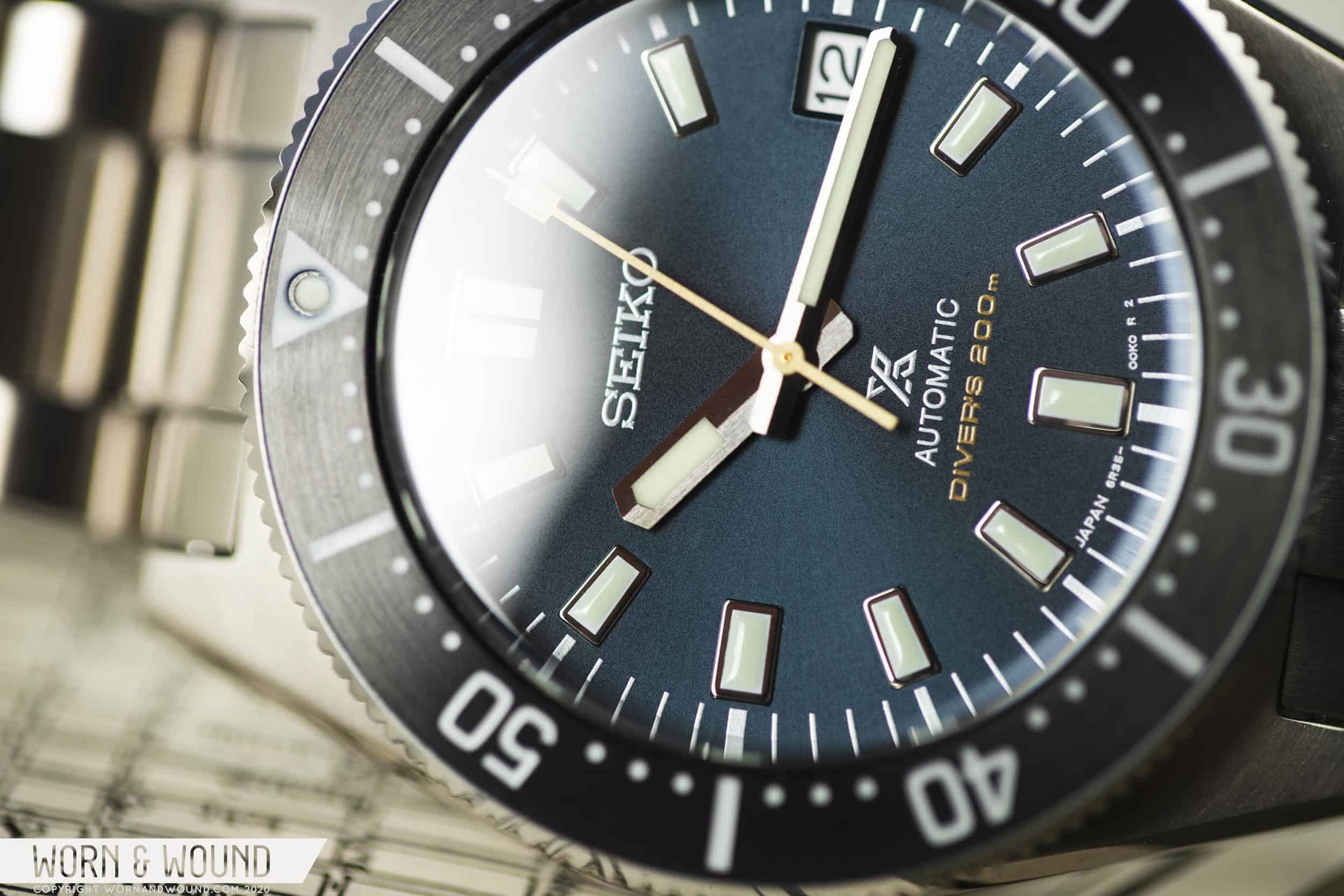
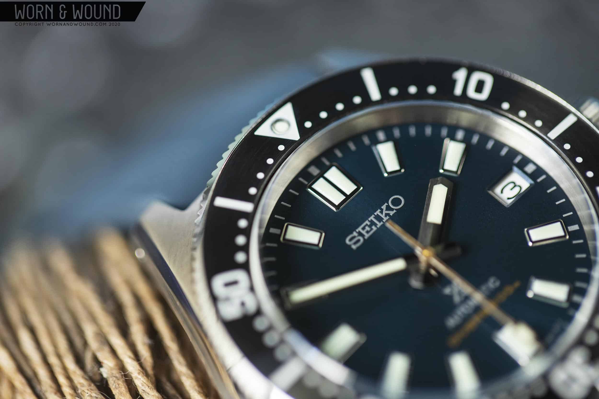
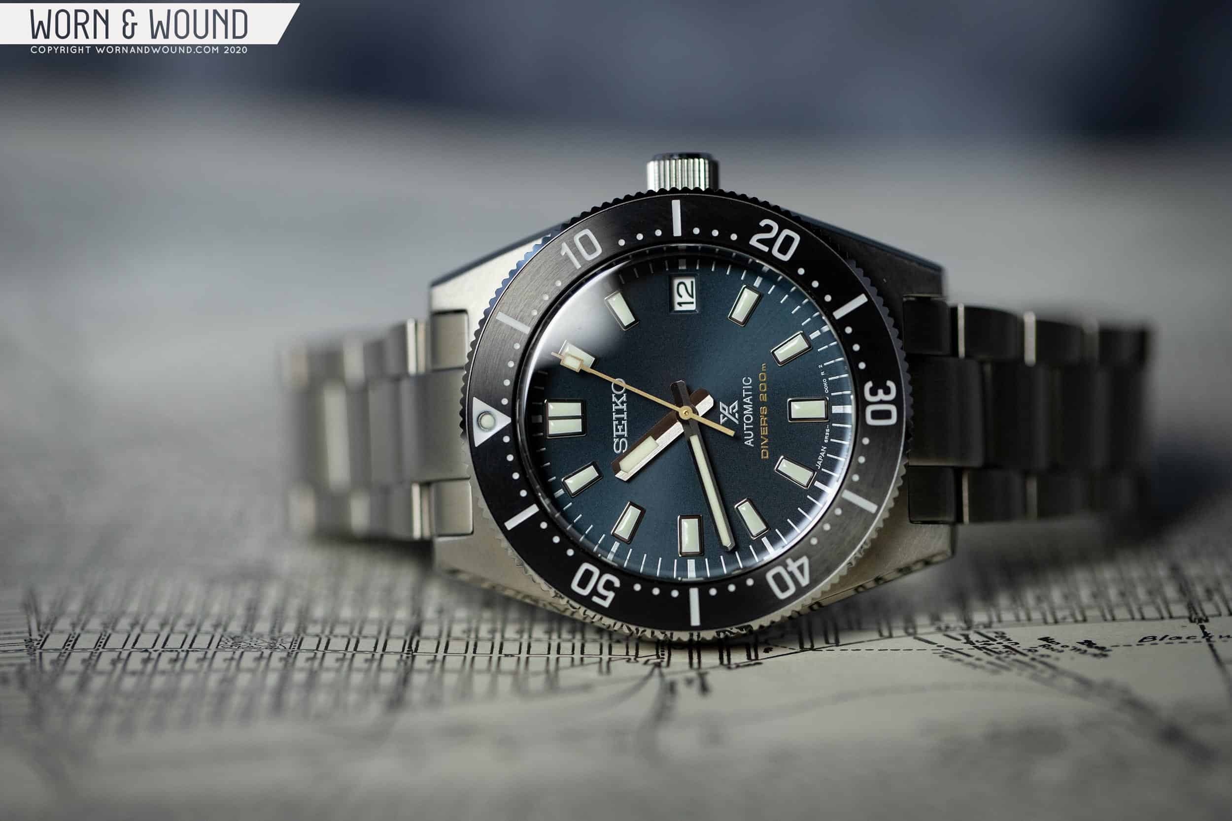
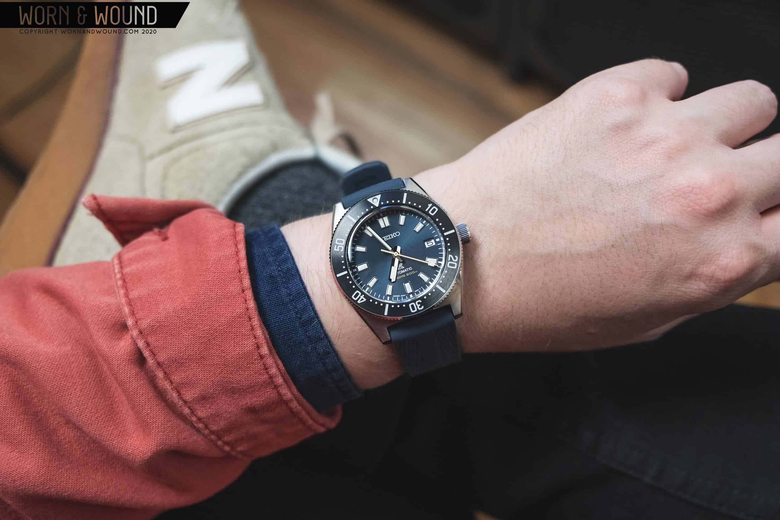
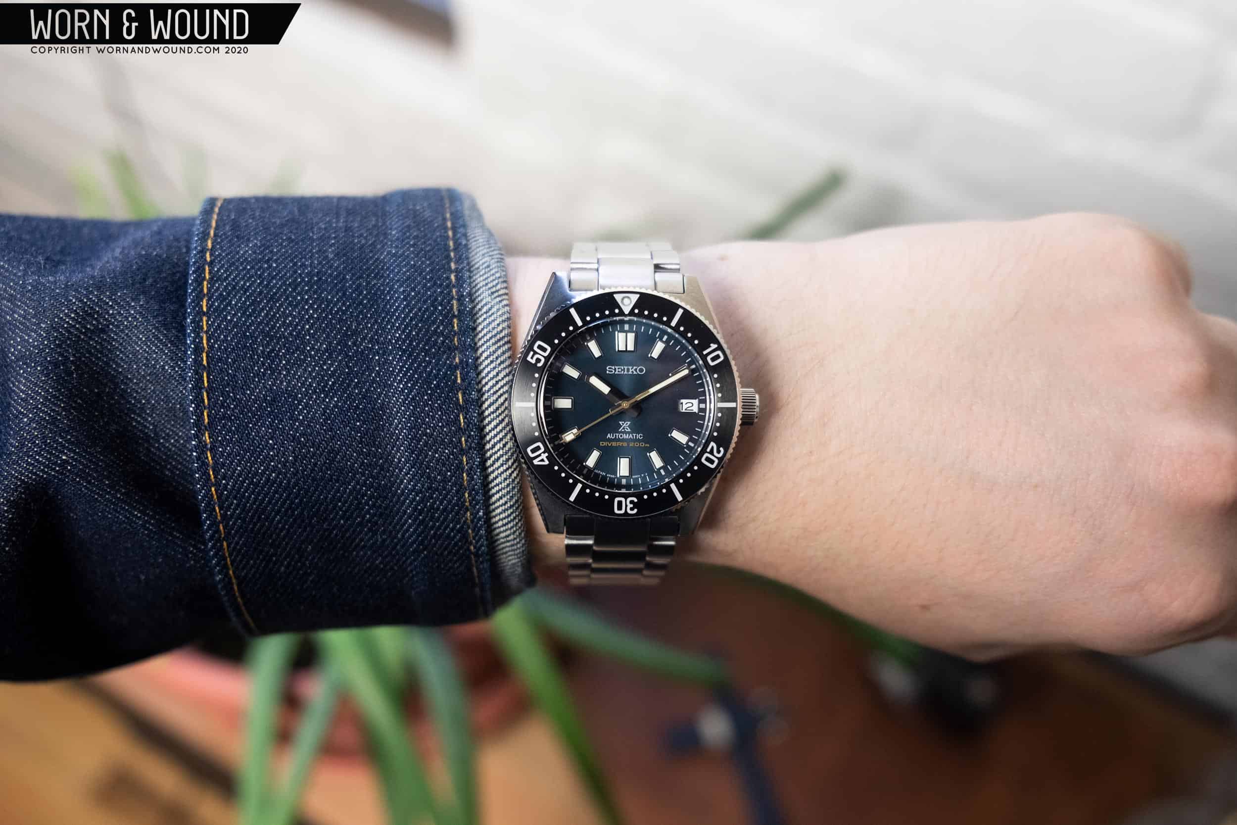
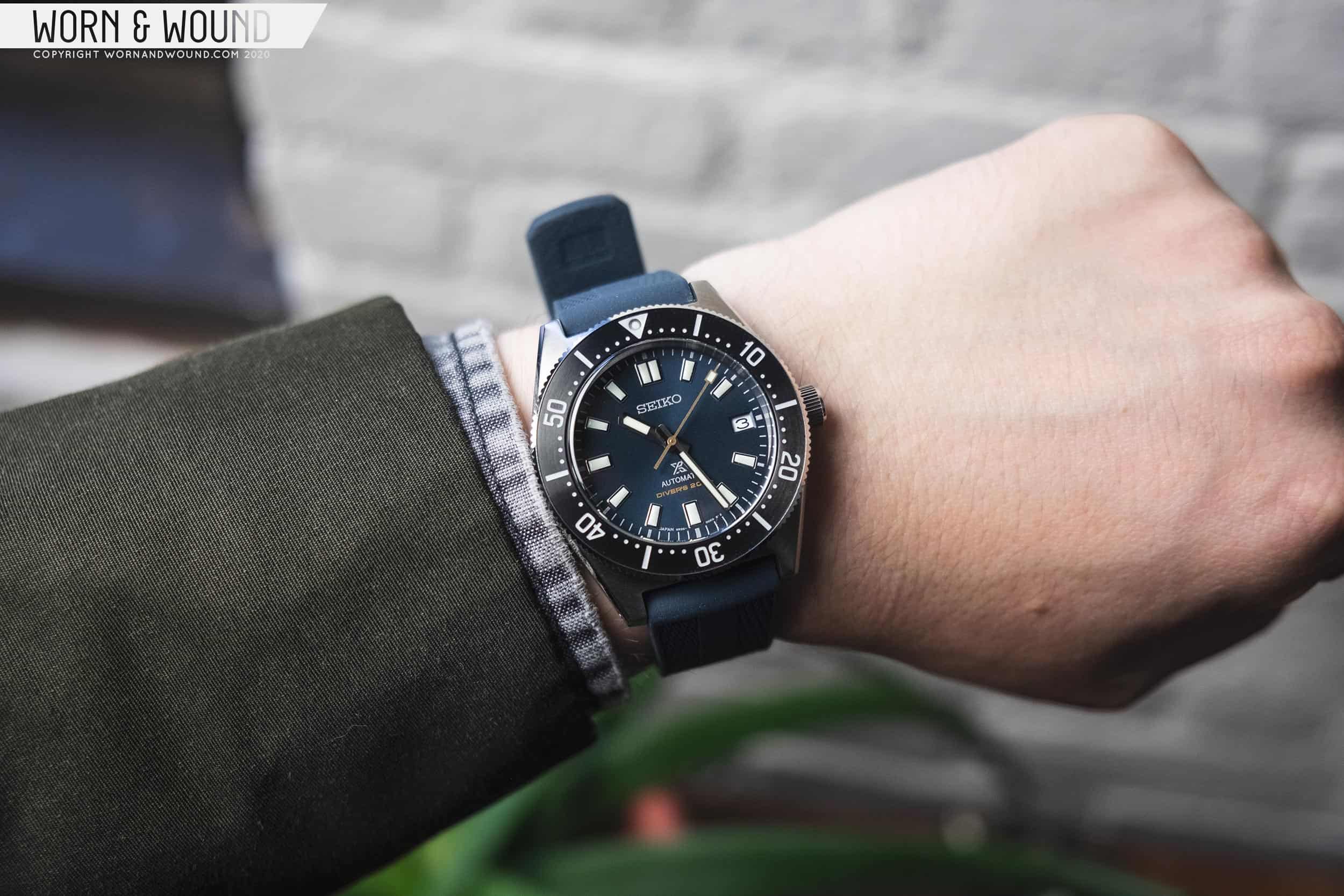
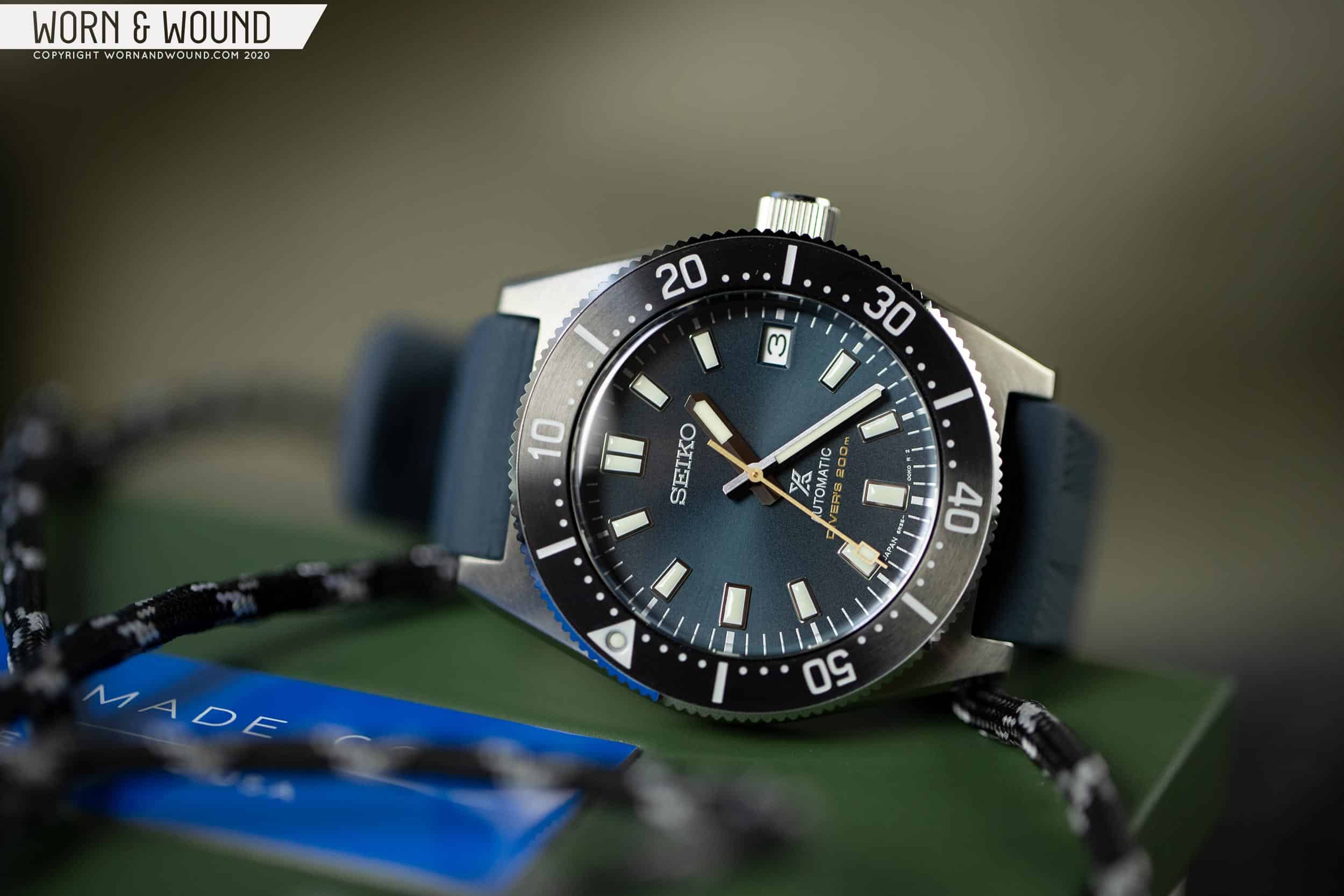
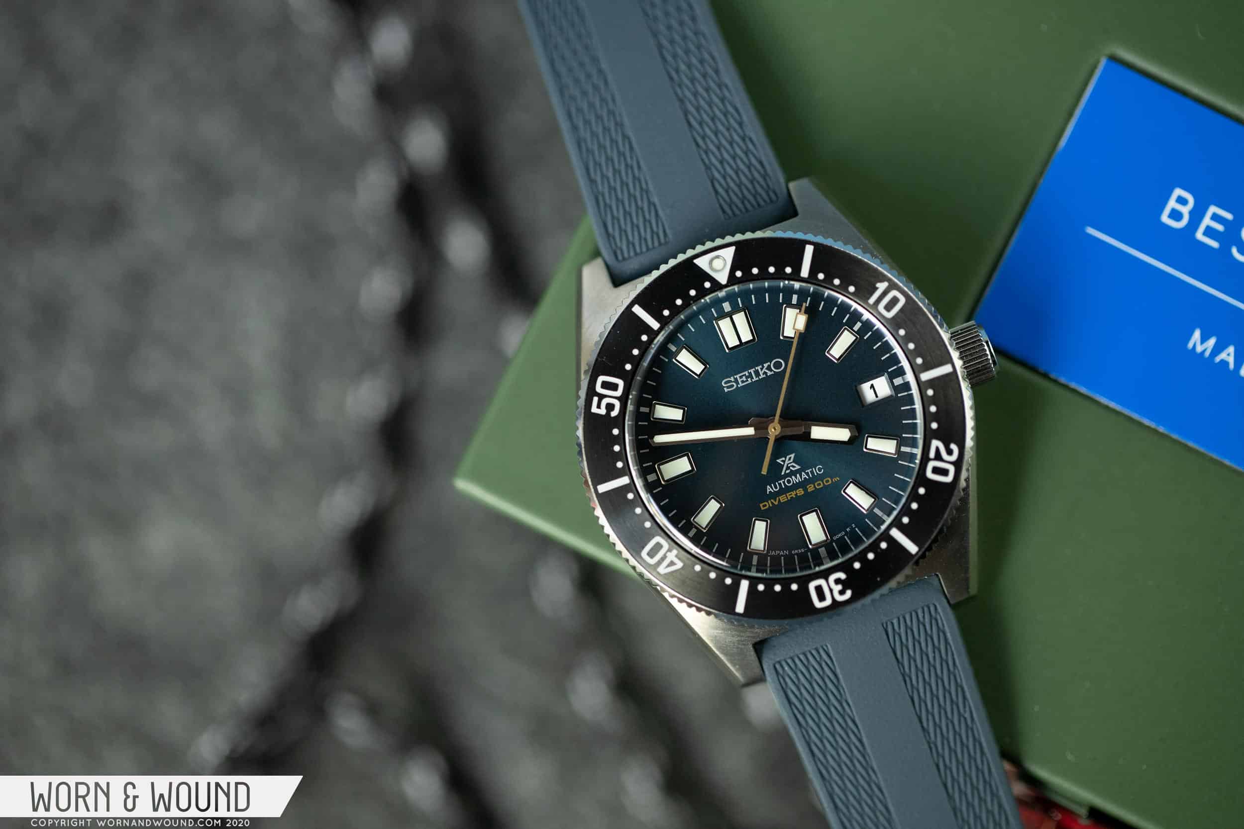
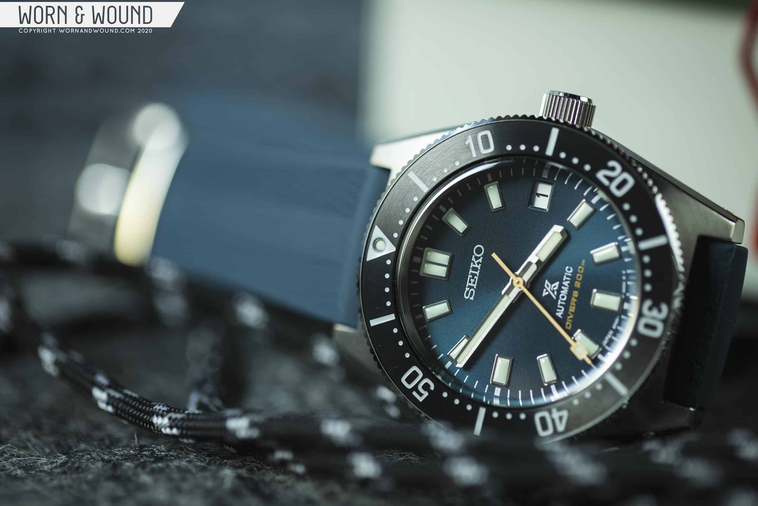
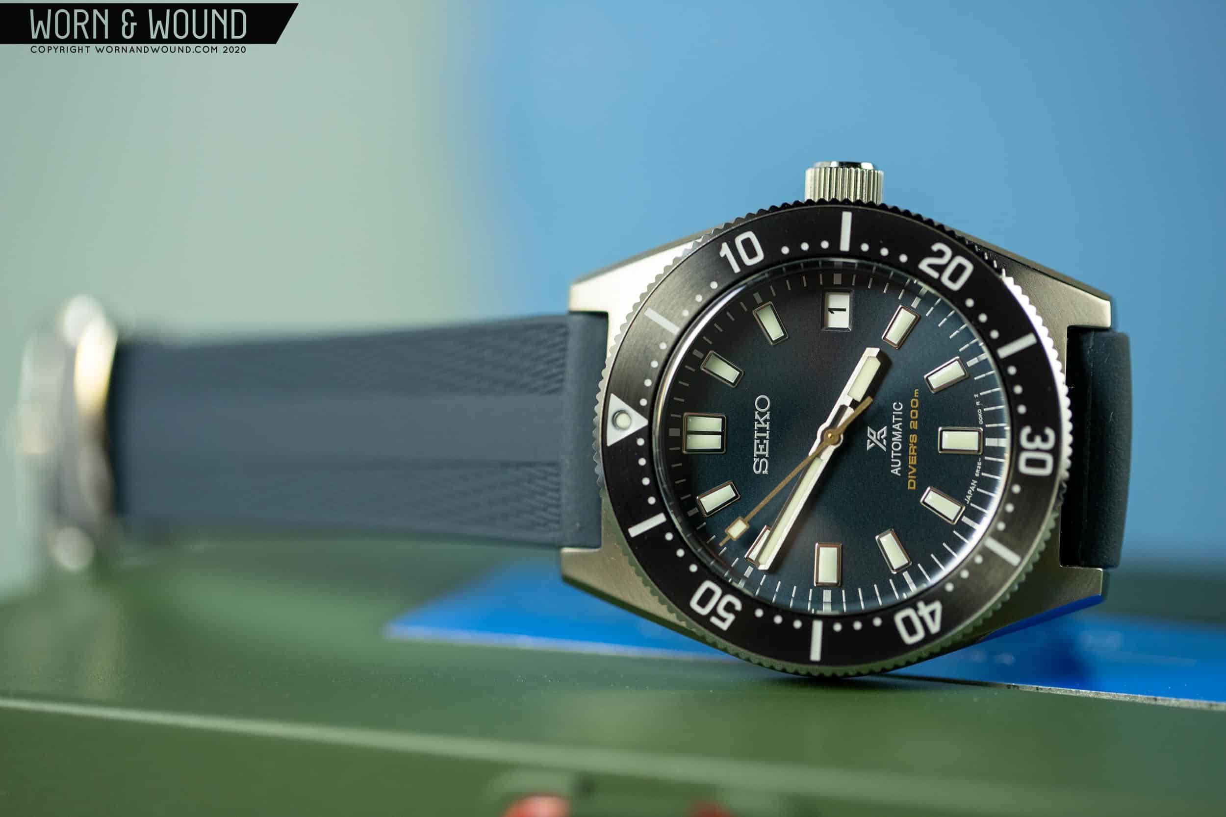
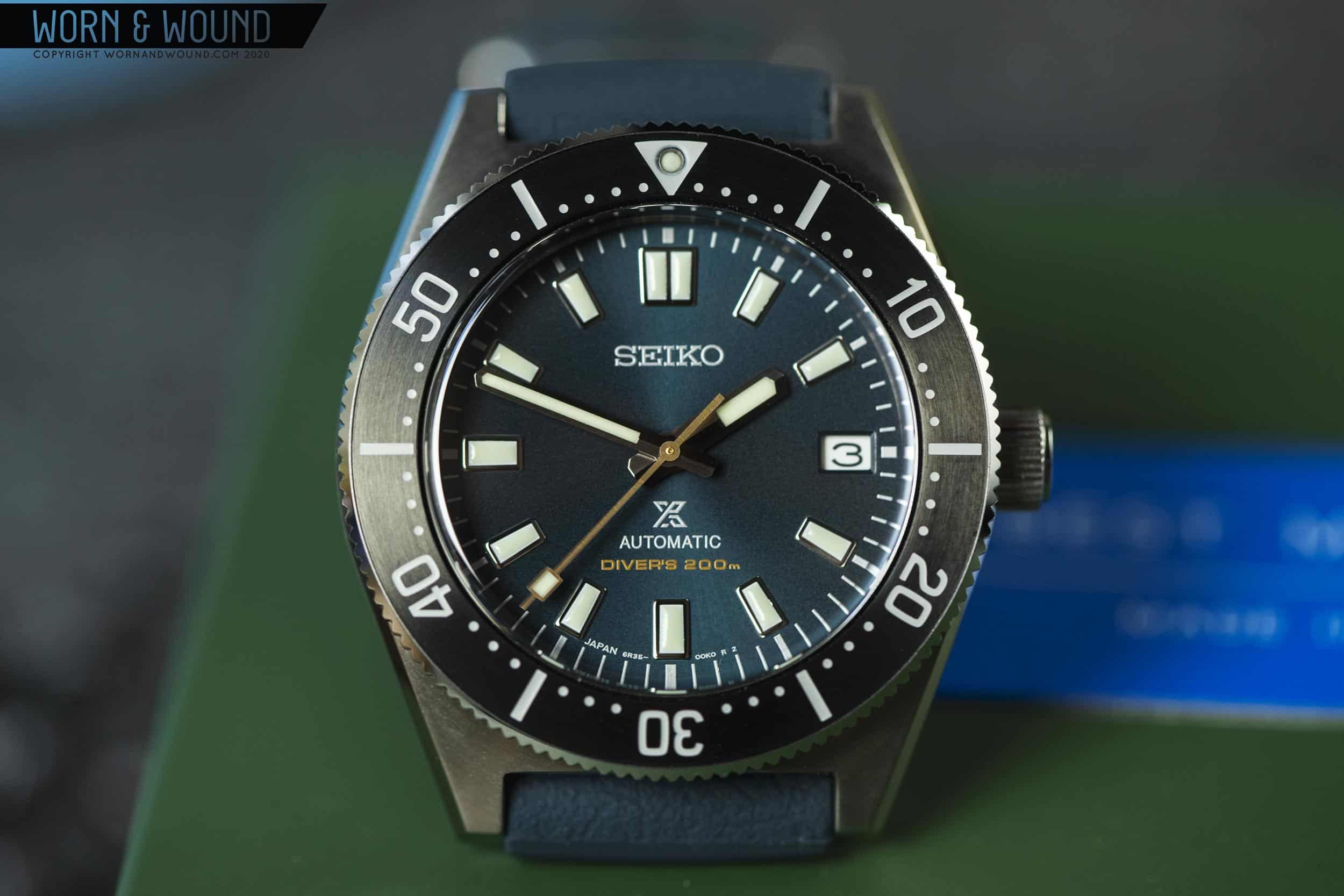
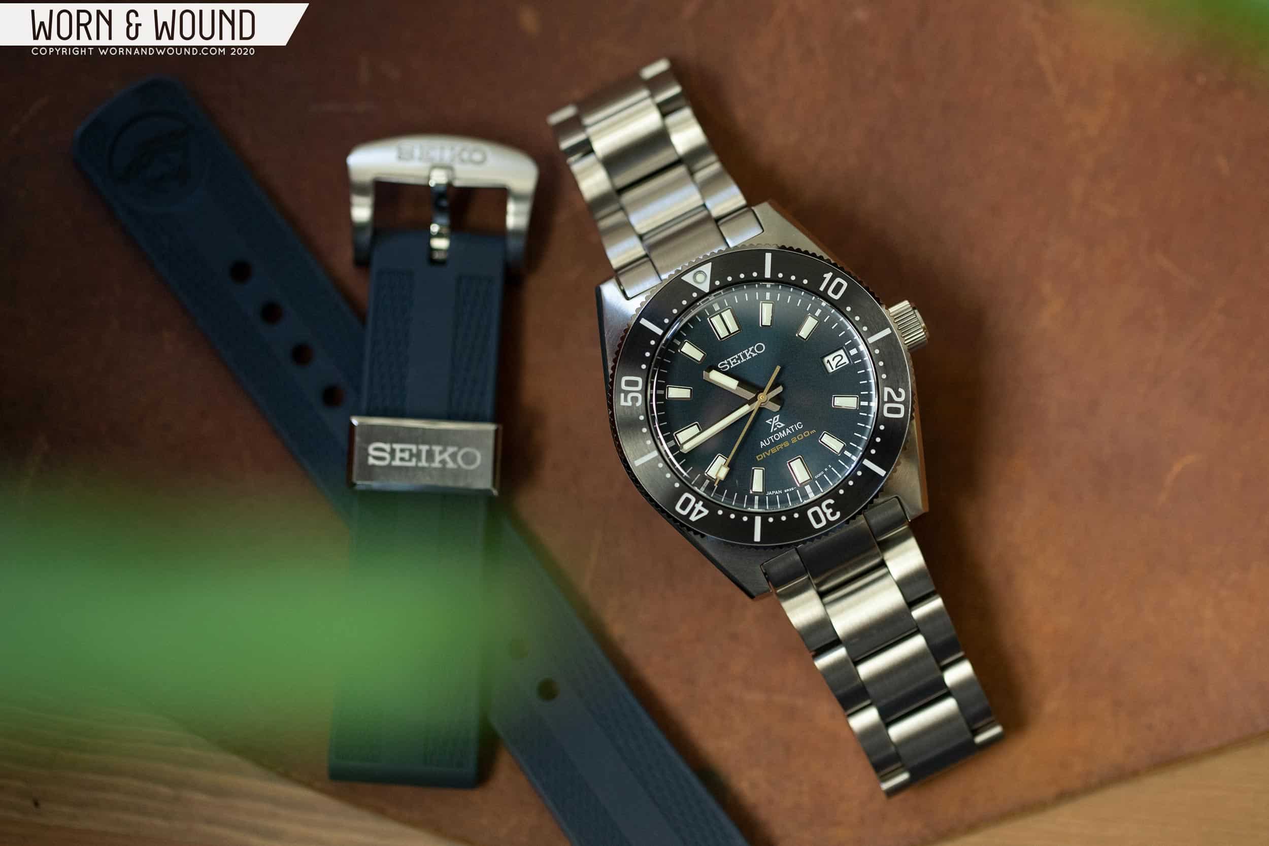
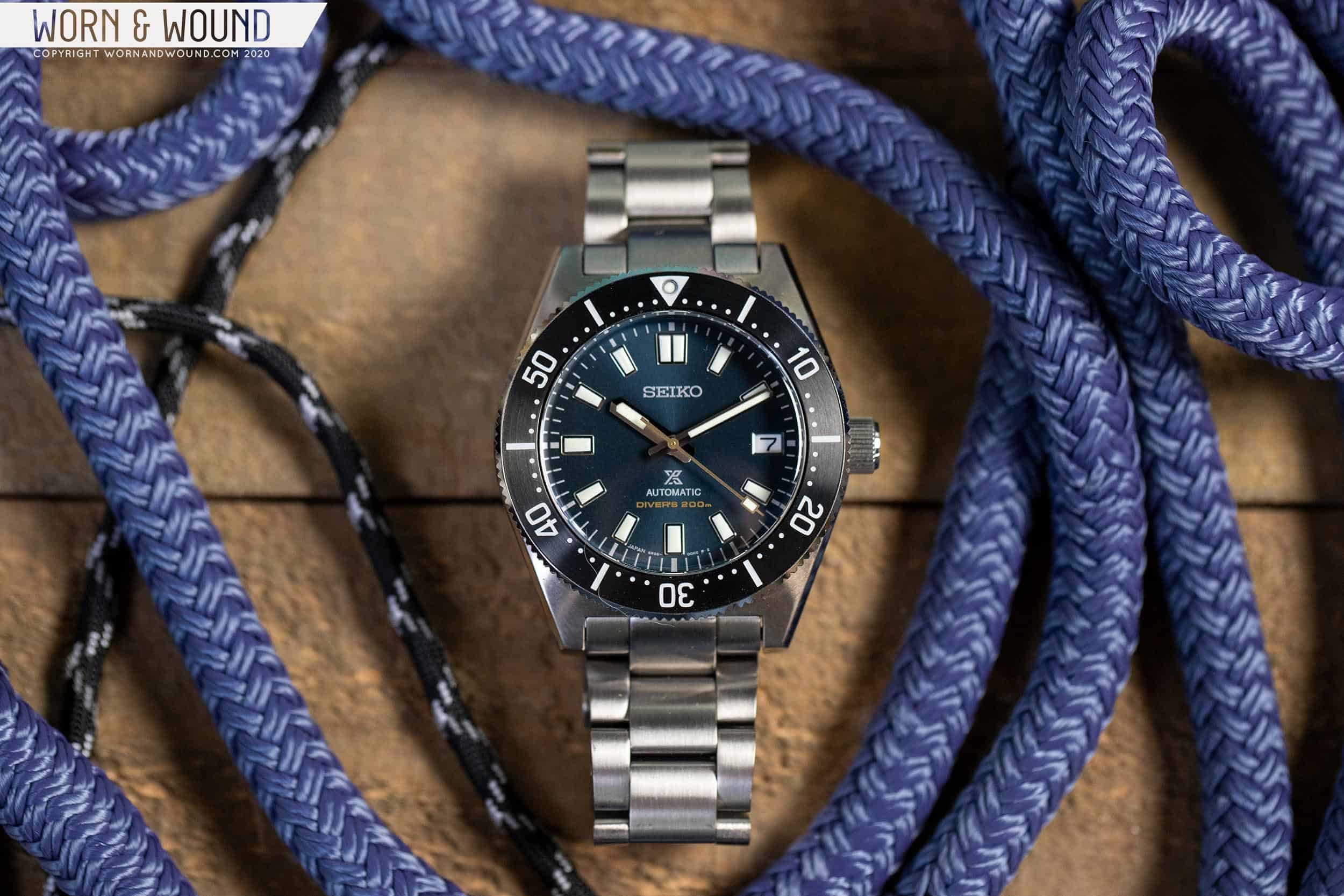
I can honestly say that I haven’t looked forward to trying out a new watch as much as the Seiko Prospex SPB149 in a long time. When first revealed in early March 2020, it took me off guard. In a single day, Seiko released a trilogy of high-end Prospex divers for the 55th anniversary of the release of their first diver (the 6217-8001, aka the 62MAS), as well as the SPB149. Almost lost in the din of those other watches, the SPB149 was, at least for Worn & Wound, the real story. A new “affordable” version of the 62MAS, it stayed truer to the source than the SPB051/053s, which were a similar release from just a few years prior. Smaller in size and more deftly detailed, regardless of the vintage-inspiration, the SPB149 (149 from here out for brevity) simply seemed like it would be an incredible watch to wear, and a bit different from the current lineup of Seiko divers.

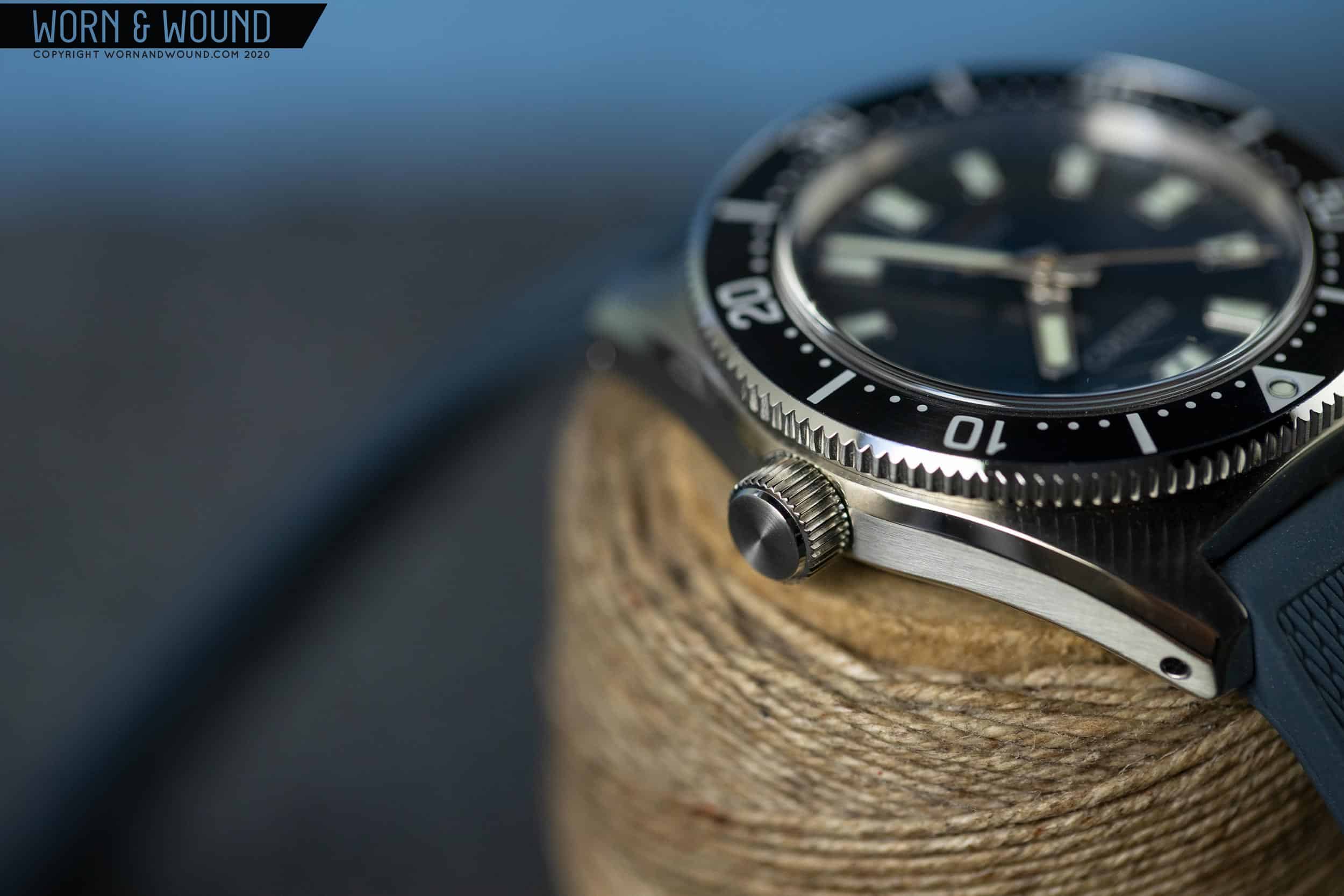
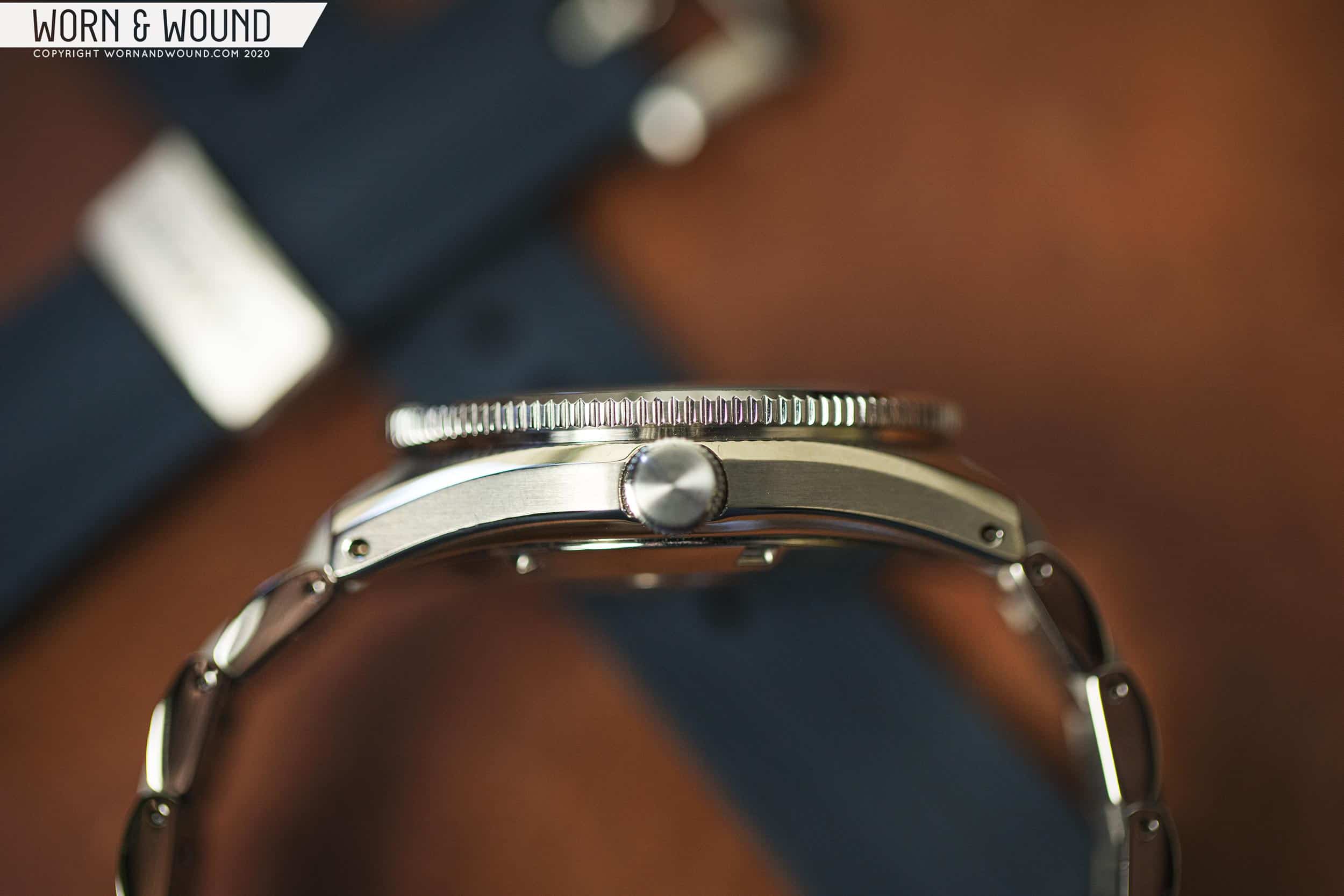
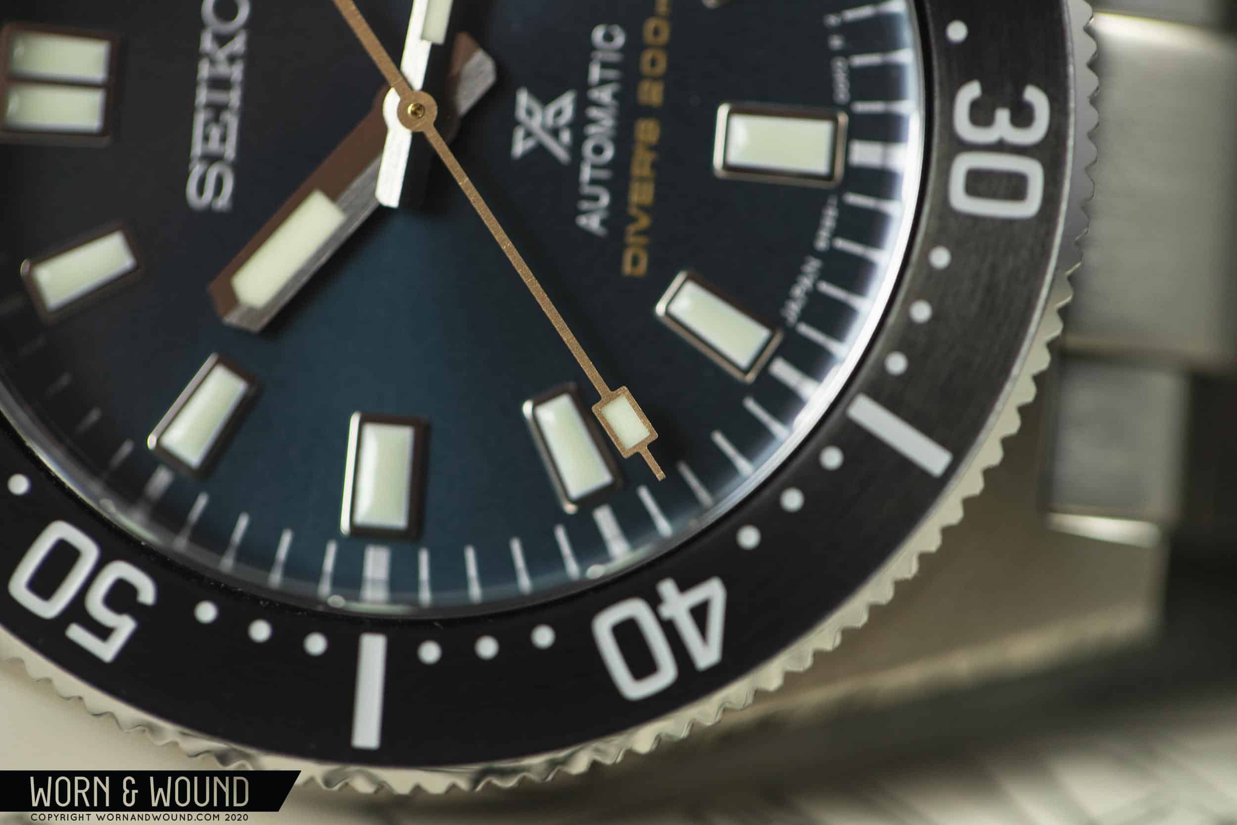
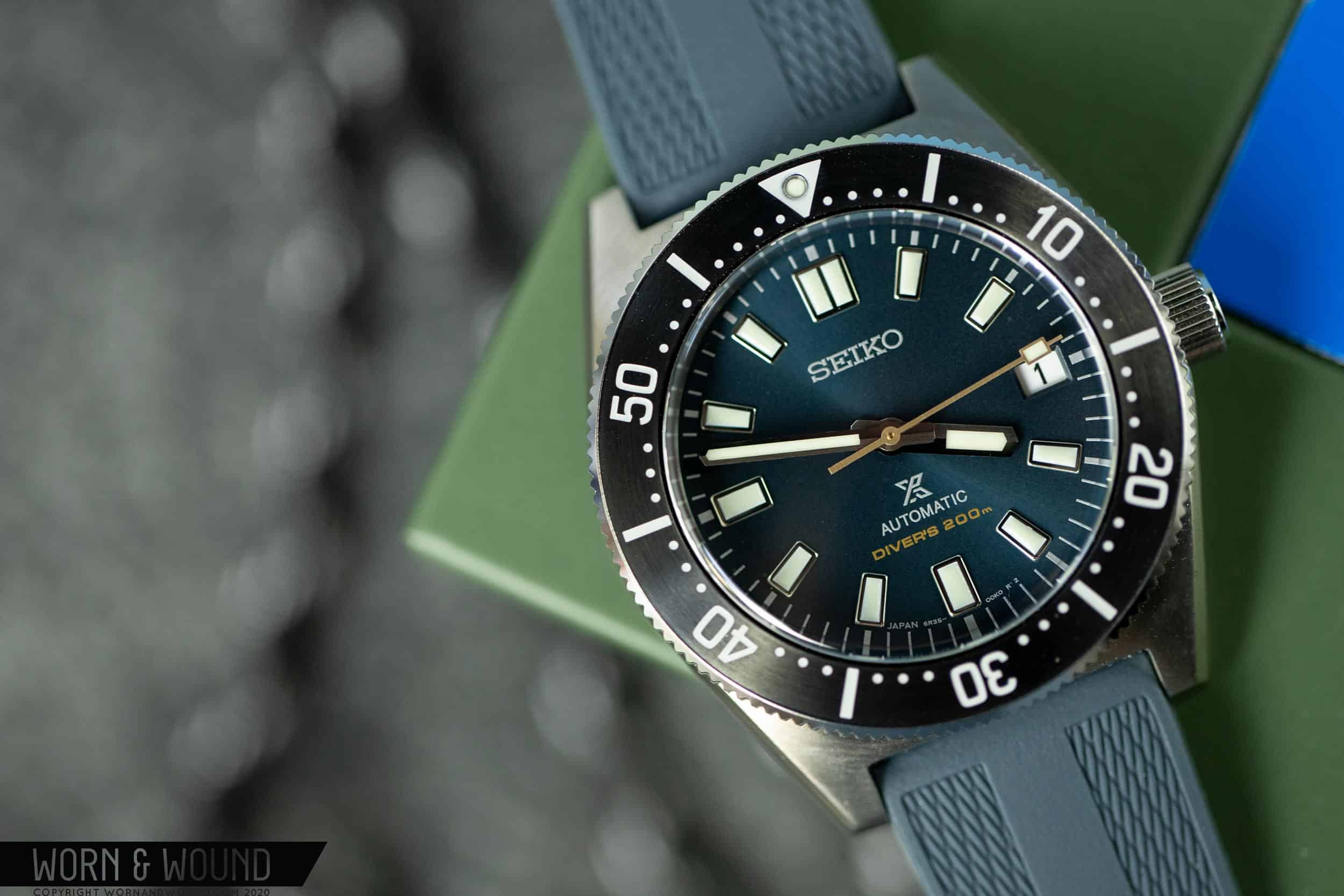
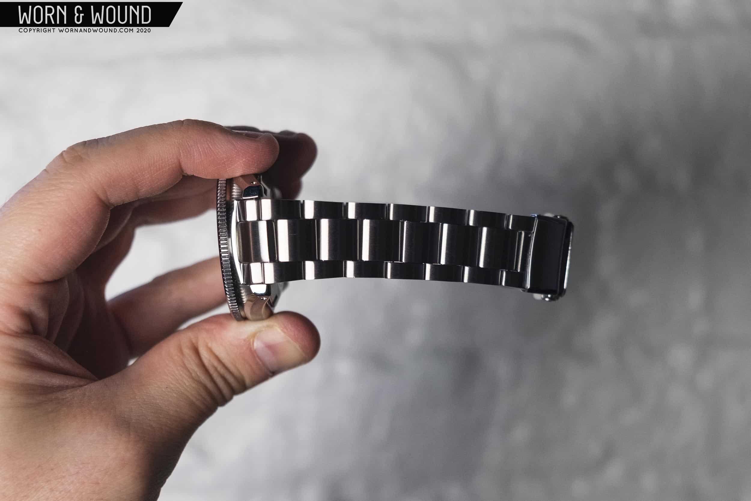
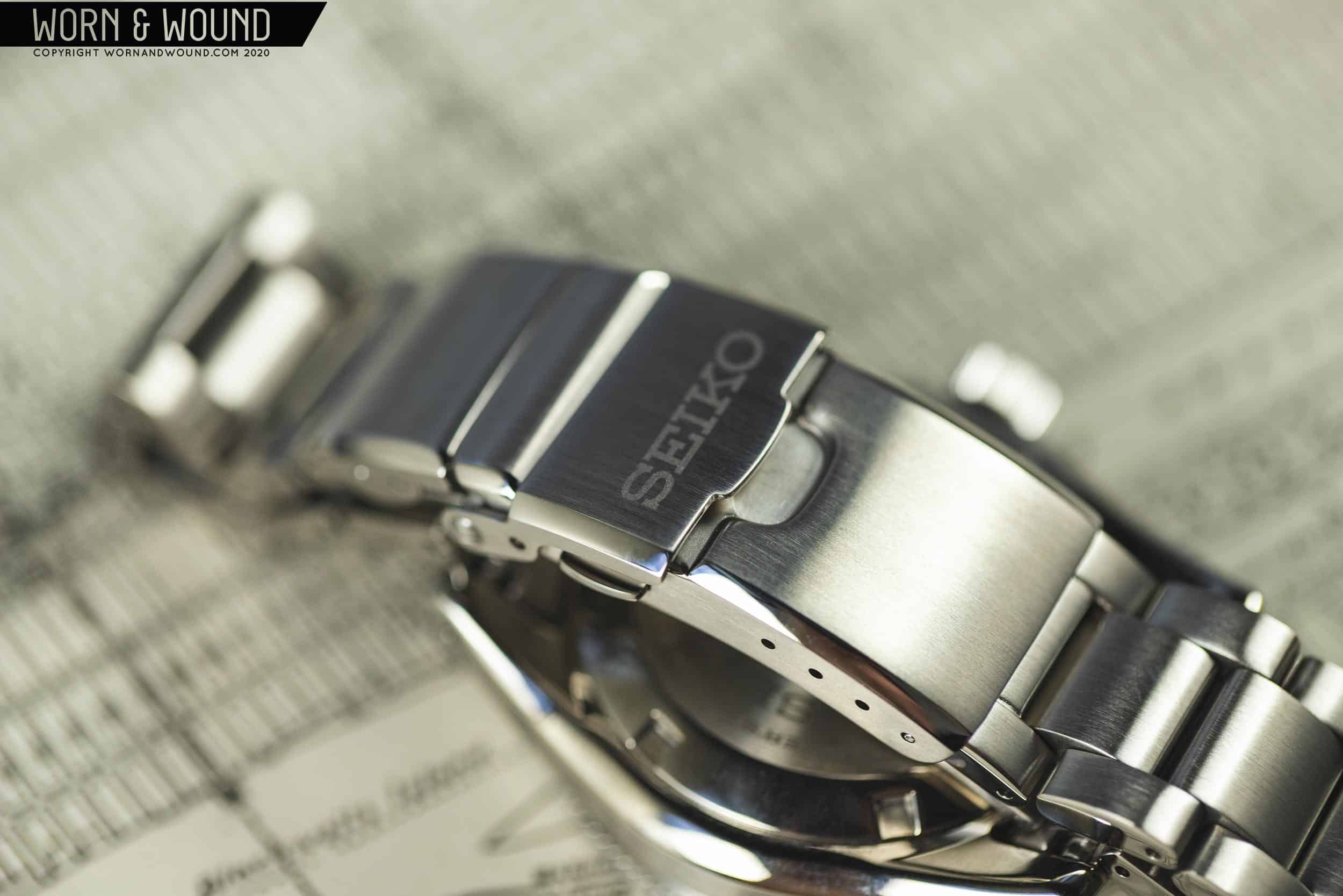
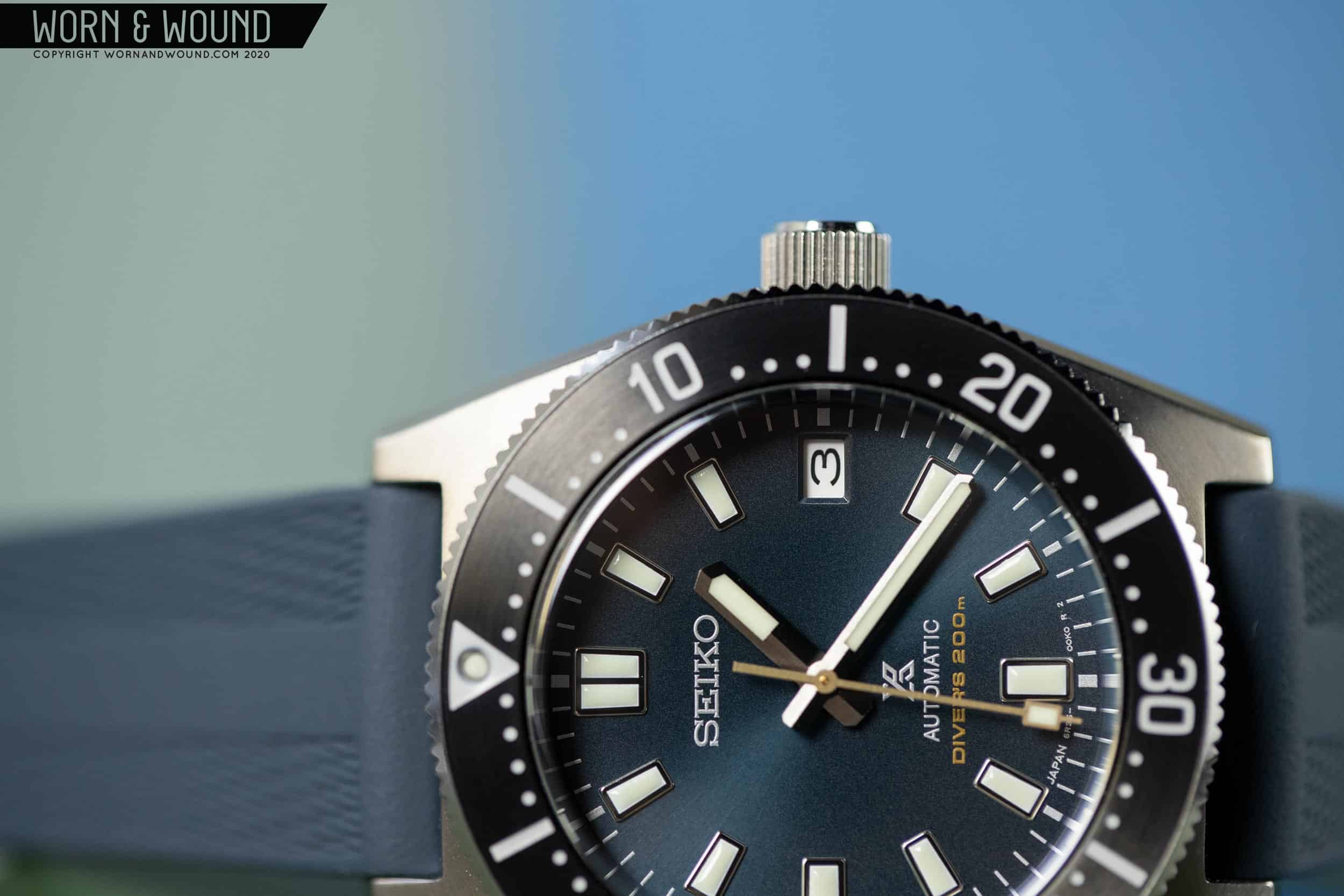
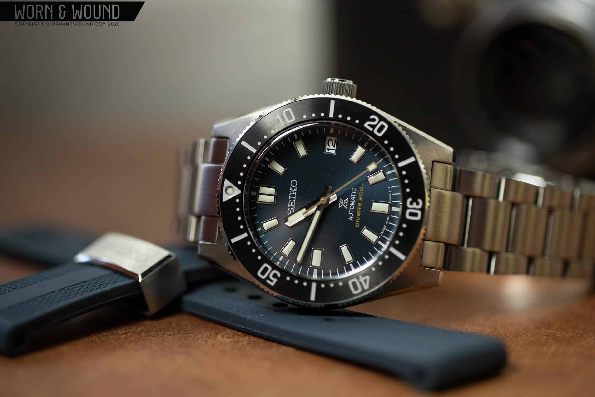
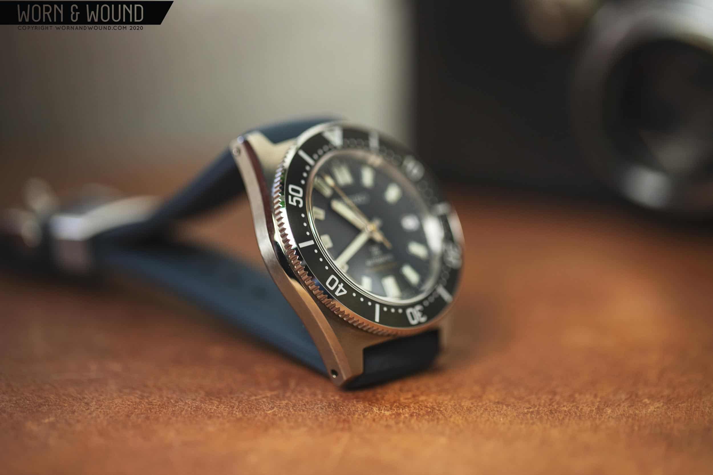
What we couldn’t tell from the renders was that the 149, and by extension the rest of the 14X series, would represent a new level of fit and finish for mid-tier Prospex watches (which I would typically associate with 6R movements and price tags around $1,000). Before moving on, it’s worth stopping on the topic of price, as that seems to be a main point of contention on these watches. The 143 and 145 are $1,200 on bracelets, while the 147 is $1,000 on rubber. The 149 tops out the series, coming in at $1,350, but is a limited edition and includes both a rubber strap and bracelet. There’s no way around the fact that Seikos are creeping up in price.

The SPB149 looks great but wears even better

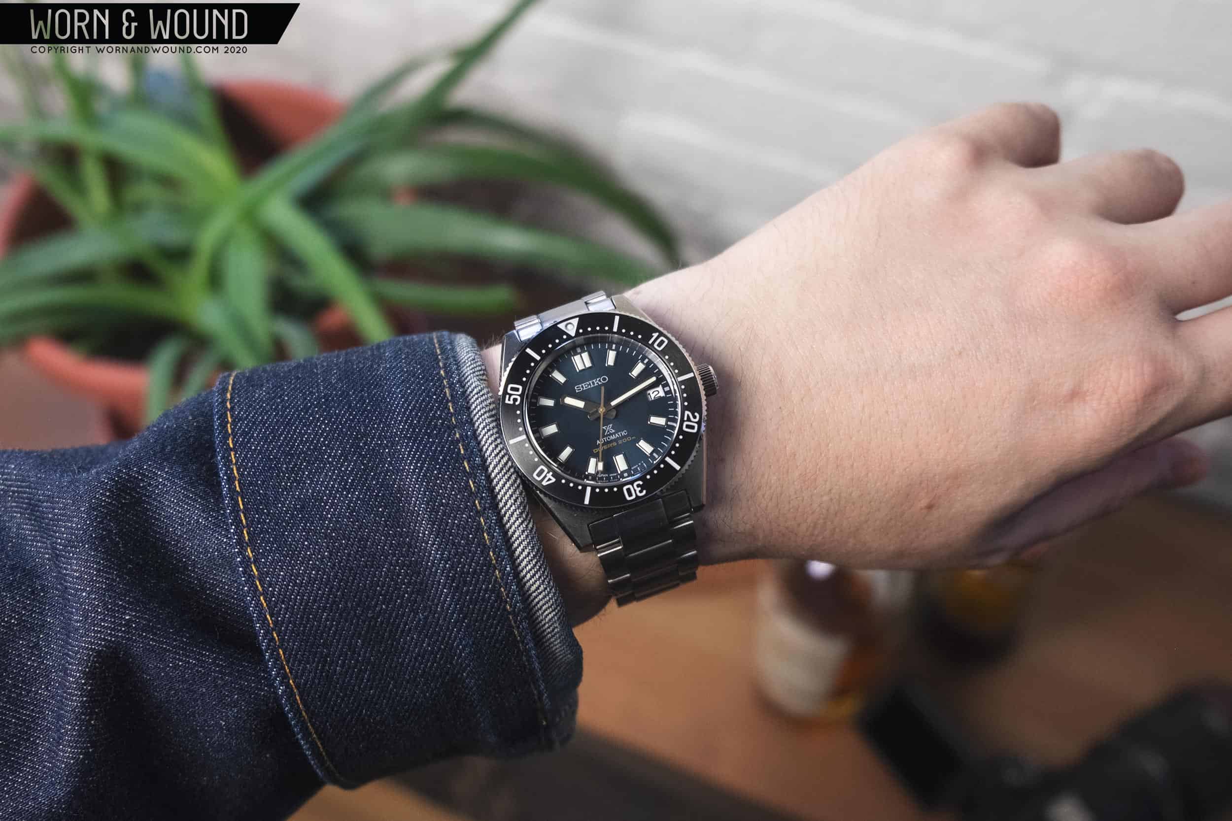
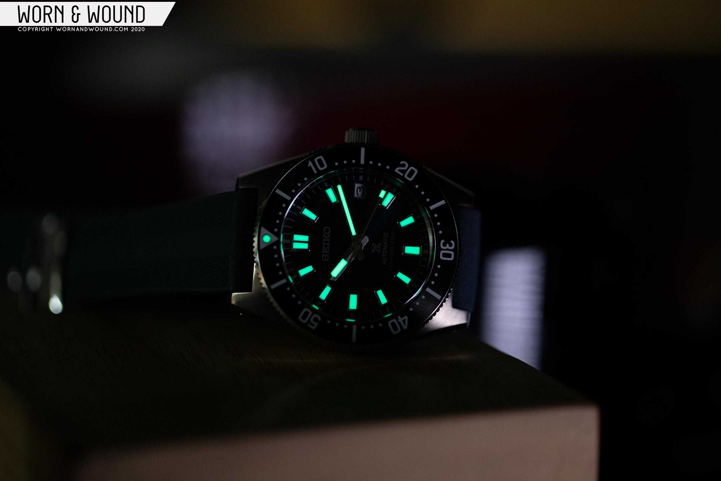
I’m not going to try to defend this, as no one likes to pay more, but I think the most important thing to keep in mind is whether or not the watch seems worth the price. And, as I think you’ll find in this review, I believe it is. Issues I’ve found on Prospex watches in the past were not present here, and the overall package feels more refined and better executed. But, beyond all that, with the 14Xs, Seiko has created a watch platform that will likely satisfy an itch fans have had for something smaller, and a bit truer to Seiko DNA from the past, that isn’t a high-priced replica. Like Oris’ Divers Sixty-Five or Tudor’s Black Bay Fifty-Eight, the 14Xs are, in my opinion, likely to be a breakout hit for the brand.

Enough preamble, let’s get to the good stuff.

Advertisement
$1350

Review: Seiko SPB149

Case
Stainless Steel with Dia-Shield
Movement
Seiko 6R35
Dial
Blue-Gray Metallic
Lume
Yes
Lens
Domed Sapphire
Strap
Silicone Strap and Steel Bracelet
Water Resistance
200m
Dimensions
40.5 x 47.8mm
Thickness
13.9mm
Lug Width
20mm
Crown
Screw-down
Warranty
Yes
Price
$1350

Case

As is often true with Seiko dive watches, the case steals the show with the 149. While not as exotic looking as many of their other iconic dive cases, it’s not run-of-the-mill either, with an appealing, blocky barrel shape and massive bezel. It also stays generally true to the shape of the 62MAS, at least from the top-down, though it’s by no means a copy. Measuring 40.5 x 47.8 x 13.9mm (to the top of the domed sapphire crystal), it’s one of the smaller Seiko Prospex dive watches currently available, though I’d call it a healthy medium in terms of dive watches in general. While trim in diameter and lug-to-lug, it is relatively thick by the numbers but manages to hide its height very well.

in a word: sharp

From the top, the bezel of the 149 totally dominates the show. In an appealing detour from the 62MAS, Seiko made the bezel quite wide, proportionally, to the overall size of the watch. At about 5.5mm, much of that is the insert, it has a bold and aggressive stance that contributes to the sense that the 149 is a modern update, rather than a vintage-homage. Additionally, the larger bezel allows them to show off the finishing on the insert which, visually at least, is the first hint at the 149 having a higher-end execution. Rather than the high-gloss inserts found on other Prospex models, this features a delicate concentric brushing on a dark gray surface. The result is captivating, once again adding to a higher level of fit and finish.

Since I began writing this review, I’ve noticed that the bezel seems to be a small point of controversy for some fans. They seem to think it’s too wide for the watch, or at least, a watch based on the 62MAS. It is a marked difference from the 62MAS, which had a distinctly narrow bezel, but I personally think it’s for the best. The 149 is not an homage to that watch, it’s a continuation of its legacy. It is similar enough to have a clear tie to the 62MAS, but different enough to be its own thing. For the record, I think it works really well with the overall design and proportions of the watch. It’s an aggressive, sporty element that just slightly crosses the line into oversize. Like a “maxi” dial, it adds to the watch’s underlying toolish spirit.

Excellent finishing
Lovely 62MAS-inspired design
The profile design hides the height well
Classic Prospex case-back

As far as the mechanism goes, it features 120-clicks and is unidirectional. Compared to other Seikos I’ve tried out, it has a stiffer feel and a quieter click. It’s sturdy and secure, though I wouldn’t call it the most satisfying bezel I’ve felt, but that’s less important, frankly. It’s hard to describe the sensation of turning it, but it kind of reminds me of pushing something that has fluid resistance.

From the side, the 149’s clever design is more apparent. Seiko utilizes several bevels and undercuts to break up the metal, contributing to a case that reads and wears thinner than its measurements would suggest. A gorgeous polished, broad bevel runs from one end of the lugs to the other, with a consistent width. This leads to a flat portion that is about 3.5mm in height, which quickly recedes into a deep undercut that flows into a fairly thick case-back. Like the Turtle or MM200, this undercut allows for the case-back to sit in your wrist, hiding a few millimeters of height, as well as creating room for your wrist to flex, which greatly increases comfort.

For the love of brushing

What’s missing from the description above is the fact that these various surfaces feature the best finishing I’ve seen on a Seiko that doesn’t also include “Grand” in the title. The top surface of the case is fully brushed, as are the flat portions of the case sides. The quality of the brushing has been bumped up from other Seikos I’ve seen. The grain is more pronounced and has that slightly pearlescent quality you’ll find on the likes of Tudors. The polished bevels are super clean and crisp with sharp lines where they meet the brushed surfaces. It’s all truly gorgeous. This case also features Seiko’s Dia-Shield super hard coating, meaning those polished surfaces should stay clean for a good long time.

That mostly covers it. There’s a crown at three, sticking with the 62MAS DNA. It’s screw-down, nicely sized for the case, and features a brushed outer surface. Though I love Seiko’s four o’clock crowns, this makes obvious sense here, and luckily I didn’t experience it digging into my wrist. The solid case-back is the Prospex diver standard with an embossed tsunami motif in the center, and various details etched around it. The crystal is worthy of some extra attention, however. It’s a gently domed sapphire with internal A/R. It stands just a hair above the bezel before doming, giving it a subtle vintage look. Having generally experienced Prospex divers with flat crystals or simple domes, this one stands out.

never a boring angle

There’s a very appealing solidity to the 149. It’s compact and stout, and nothing moves without intention. The height, though largely obfuscated, adds to a reassuring build quality, as does a nice heft. It’s like a fat little metal rock you strap to your wrist, in the best sense possible.

Dial

The dial of the 149 has no surprises, in a good way. Well, perhaps in color choices, but I’ll get to that in a bit. What I mean is that the 149 is meant to be a modern diver with a direct line back to 1965’s 62MAS. In all ways, it looks the part. Everything is similar, but nothing is quite the same. There are no details that make you think, “why did they do that?” Nor is it boring or too much of the same. I also wouldn’t call it a refinement, since the original is a pretty spot-on dive watch. It’s more of an adjustment of attitude. It’s the next generation, so it feels younger, spunkier, and perhaps the slightest bit brash.

Old meets new (yes, that’s an SLA017, not a 62MAS, but you get the point)

On to the actual dial. The primary index of the 149 is a series of fairly large, but still balanced, applied markers with lume fill. The markers at six and nine appear to be purely rectangular, while the other hours have a very slight taper. At 12 is a double marker, giving it just a little more visual weight. I want to point out that the lume is all perfectly formed here, unlike on the SPB077 I reviewed, which was a big issue for me. This is what I want to see on a Seiko at this price point. Around the edge of the dial is a printed minutes/seconds index in white/silver, as one would expect.

However, there is something unexpected as well. Or rather, the lack thereof. There is no chapter ring. Any fan of Seiko divers knows there is always a chapter ring. At times, these are also a point of contention as people claim they don’t line up (I think this is often a photography issue, though at times a true alignment issue). Personally, I don’t mind them as they add depth, and create a visual transition from the dial to the bezel. Either way, in removing it from the 149, which keeps it truer in style to the 62MAS, they gave the 149 a more classic, vintage appearance. It also gave their designers some more room on the dial to play with, which considering the overall size of the watch and width of the bezel, was a good choice. The dial could have easily become cramped.

Split-finished hands
The perfect matte gold
Beautifully molded lume
Cool, calming blue-gray

At three you’ll find an unframed date window. No surprises here. The size of the window is actually quite well-balanced against the marker at nine, so it works nicely with the design. Below twelve is the Seiko logo, while above six is the Prospex X, automatic and “Diver’s 200m”. All standard fare for a modern Prospex diver.

Before we get to color, let’s take a look at the wonderful handset Seiko chose for the 149. A sort of “greatest hits” of Seiko dive watch hands, it draws on several past models, yet also feels like something new. Both are straight fence posts that come to a shallow point. The minute hand is long and slender, while the hour is short and broad, making it impossible to mix them up at a glance. The minute hand features a long and narrow strip of lume, while the hour hand has a slightly wider, but shorter strip that is pushed towards the tip of the hand. This is in keeping with the 62MAS design, and helps you distinguish between them in the dark.

Seiko lume doesn’t fail

A detail of these hands that I didn’t pick up on until I saw them in person is that they are split-finished, with one side being blasted matte, the other polished. This gives them the illusion that they are slightly 3-dimensional and is a nice aesthetic detail that adds to the watch’s overall sense of quality. The seconds hand then stays pretty true to the 62MAS with a slender stick that features a large square of lume by its tip.

What distinguishes the various 14X models are the colors of the dials, markers and bezels. The 149 stands out because it is also a limited edition. As mentioned before, it was released alongside a trio of high-end limited Prospex divers, all featuring soft blue-gray dials, which the 149 received as well. It’s quite hard to come up with something new, but Seiko did it here. Subtle is almost too blunt to describe this amazing color. It’s never quite gray or quite blue. It’s soft and soothing, yet has a depth you can fall into. Depending on the light, it can range from faded black, to almost a dark teal, but it never is too bright or bold. In short, it’s utterly gorgeous. Seiko goes a step further and makes the seconds hand and “diver’s 200m” pale gold, which adds the most cautious and tasteful amount of contrast possible. Seiko’s designer’s were truly showing their restraint with the palette on the 149, and the result is excellent.

Balanced proportions and colors
Advertisement

I already described the beautifully brushed, dark gray metallic surface, but the bezel insert also sports a full index of numerals, lines, and dots. If you’re familiar with Prospex diver bezels, the general layout will come as no surprise. In fact, it riffs on the index first established in 1965 on the 62MAS. There’s a minute index with bold lines alternating with numerals at intervals of five for the odds and evens, respectively, and dots for the rest set just along the inner edge of the bezel. At the origin is a triangle with a lume circle at its center.

It’s always an appealing and functional design, but I have to say, I like the execution on the 149 more than on most. The typography is a bit different than usual, with more compact and boxy numerals. The zeros in particular look great, with a rectangular shape that just slightly puffs out, for a more gentle appearance. I think they work a purely aesthetic level, but they also build off of the aggressive stance the wide bezel gives for an overall sporty, athletic feel.

The typeface on the bezel is a favorite detail

Last, but certainly not least, is the lume. As you’d expect from a Seiko Prospex, the lume is fantastic. Step out into the light for a moment, and the watch is glowing bright. While I have no complaints, I would love to see Seiko have full lume numerals on the bezel, rather than just the pip. Since the 149 is a modern diver, at the end of the day, it just would have been a nice upgrade.

Movement

The 6R35 powering the 149 is quickly replacing the 6R15 in all of Seikos “luxe” Prospex models, and is a welcome upgrade. A 24-jewel automatic with hand-winding, hacking, date, and a frequency of 21,600bph, what sets the 6R35 apart from the 6R15 is a 70-hr power reserve. Though not quite ETA/Swatch group’s 80-hr reserve, 70 is enough to have a noticeable difference in practice, especially if you rotate several watches.

Straps

In addition to being limited, the 149 is unique amongst the pack in that it includes both a rubber strap and a steel bracelet. Given that it’s always annoying to get the OEM strap you are lacking, having both in the box is nice, even if it comes with a higher price. That said, for reasons described below, if I could only go for one, it would be the rubber strap, not the bracelet. While I like the look of some rubber straps, and certainly can appreciate their role on a dive watch, I rarely find them particularly nice to wear. Well, that is until I tried the one that comes with the 149.

A rubber strap that feels as good as it looks

Molded in a shade of blue-gray that is likely as close an approximation of the dial as one can get from a matte material, it’s soft and supple in a way I’ve not experienced from other rubber straps. The design suits the watch well, featuring a chain-like texture on its top surface, with accentuated sizing holes, and a large Seiko tsunami motif molded at the end of the long side. It has a 2mm taper, quickly getting down to 18mm, which I feel adds to the overall comfort as there isn’t too much surface area on your skin. Additionally, the strap features a wide metal keeper with a surprisingly high level of finish, as well as a very nicely machined and finished buckle. There are even metal tubes for the spring-bars. In all ways, it feels like a high-end rubber strap.

The bracelet has a bit less of a “wow” factor, but it’s still nice looking. Unlike the SPB077, which had a very robust bracelet with a semi-unique take on a three-link bracelet, the 149 has a pretty straightforward three-link design. No bevels, raised polished center links, or facets, though the links are brushed and a bit rounded, allowing them to catch the light in nice ways. There is a simplicity to the case design that allows this design to work. It doesn’t compete with the case, which arguably the more ornate SPB077 bracelet did.

An odd end-link design

The solid end-links are short and stubby, continuing the three-link design directly into the case. Unlike most end-links, they don’t really match the space they are in, in more ways than one. First, they literally are a bit narrow. Even with the “fat” Seiko spring-bars that come with the watch, there is a slight, but noticeable gap. Enough so that the end-link can actually move a bit, and a sliver of the spring bar is visible.

Second, they don’t seamlessly match the case edges. Where typically end-links fill out the space by matching the shape of the void between the lugs, these don’t at all. I can’t quite decide how I feel about this. On one hand, by not completely flowing into the case, they let the case’s shape retain more definition, which I really appreciate. In fact, this is one of the things I typically don’t like about bracelets (though I seem to be an outlier on this). On the other hand, the bracelet almost looks like it’s an aftermarket accessory. With that said, the end-links are in keeping with the SLA017 design, so there is a precedent.

Advertisement
Flexy
Decently finished clasp

Whether intended or not, I can’t say, but there is a fair amount of play in the bracelet and fairly sizable gaps between links. When held out, the bracelet dips significantly. This gives the bracelet a bit of a “stretched-out” look and feel, which I personally like. It’s often the rigidity of bracelets and their lack of give that fatigues me. This adds to the long-term comfort when wearing it, but might not impress people out of the box with a sense of build quality.

With that all said (it’s my job to get picky) I don’t think you’d have a bad experience with this bracelet if you owned it and plan on using it. At the end of the day, it looks good and is comfortable. I just think there are a handful of little flaws and some strange design decisions that keep me from being as impressed by the bracelet as I was by the rubber strap. But, then again, I’m not a bracelet guy.

Wearability

Did Seiko 3D scan my wrist when I wasn’t looking, because I feel like this watch was made for me. Only perhaps with the Black Bay Fifty-Eight have I felt a dive watch fit so well. At 40.5mm it’s big enough to have a modern, sport watch presence, though small enough to fit well and look appropriate on my 7” wrist. Similarly, the 47.8mm lug-to-lug keeps it positioned well and secure to the top of my wrist. It never crosses over the edge, and just looks in proportion with its surroundings. As said before, the height of the 149 on paper is not how it reads on the wrist. The case back sinks in, and the undercuts create an illusion of a much thinner mid-case. It looks and feels flush and, while not quite “thin,” a healthy “trim.”

A genuine pleasure to look at
a perfect fit
The color of the silicone strap is exceptional
Low rider

Looking down at the 149 never ceases to amaze. It’s alive from every angle. Whether from the side, where the polished bevel might cause a glint of light. Or from a three-quarter angle, where the edge of the bezel and the curve of the crystal become more apparent. Then straight down, when the dial and bezel insert take over, and you’re met with a classic-but-updated dive watch design and that stellar blue-gray. I know I’m fawning, but it just all works so well.

On the silicone strap, the shape of the case and blue tones in the dial are dominant. It’s fun and sporty, but pleasantly subdued as well. Though the watch has plenty of wrist presence, it’s not flashy, which I greatly appreciate. On the bracelet, I find the bezel to have an even stronger presence. The extra metal increases the athletic attitude of the design, and furthers the sense of the solidity of the watch, in a reassuring manner.

Conclusion

There are lots of ways to know that you really like a watch, but for me, the most important is that I’m excited to put it on. I look forward to it, in fact. With the SPB149, I was more excited to wear it than some of the watches from my own collection (sorry guys). It’s everything I want in a Seiko diver. Heck, a dive watch in general. It’s sized appropriately for the aesthetic and concept, not to satisfy a trend or for the sake of just being “smaller.” It has unique aesthetic elements but is still reassuringly familiar in the ways I want from a diver, or a Seiko for that matter. It fits exceptionally well and is impressively finished in the places that count. And most importantly, it’s just undeniably cool looking.

A face you’ll be happy to see every day

Though a vintage-inspired watch, the 149 does not try to come across as a NOS watch from the ‘60s. It’s too aggressive in posture and too sharply finished for that. I’ve said it before, but it’s worth repeating, this isn’t meant to be a 62MAS. It’s a new watch in that lineage, and easily one of the most well-tuned modern divers out right now.

I genuinely feel like the handful of issues I had with the SPB077 were rectified in this watch. Brands as big and old as Seiko rarely feel like they are actively trying to improve, but with the 149, improvements seem apparent. It’s a better-executed watch in many ways, which brings me back to the price. While $1,350 is not cheap, and it might be more than long-time fans of the brand want to see, you won’t feel like you overpaid. Plus, you can save a bit if you go for the other models. At $1,000 for the 147 model, which features a dark brown dial with gold accents and the same exceptional rubber strap, but in black, it’s a solid value. In fact, compared to similar Swiss watches, you might feel like you got a great deal. Seiko

Images from this post:
Related Reviews
Zach is the Co-Founder and Executive Editor of Worn & Wound. Before diving headfirst into the world of watches, he spent his days as a product and graphic designer. Zach views watches as the perfect synergy of 2D and 3D design: the place where form, function, fashion and mechanical wonderment come together.
wornandwound zsw
Categories: