Review: the Bamford B347 Monopusher Chronograph

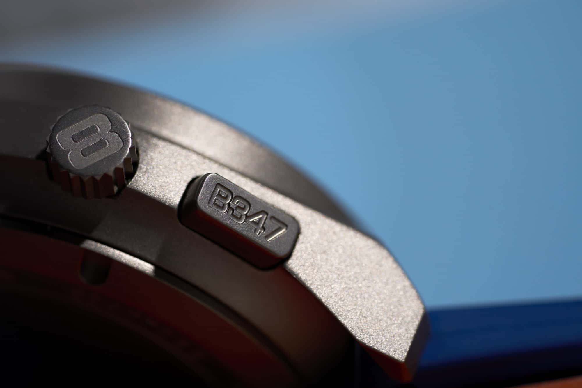
While Bamford might be known for modding luxury watches and high-profile collaborations, today we’re looking at a line of watches created by the brand that has somehow gone largely under the radar. Perhaps overshadowed by their flashy creations with Bulgari, Frank Muller, TAG Heuer, and recently Bremont, their house lines are curious creations as well. For several years, they’ve made the Mayfairs, a line of Benrus-esque sports watches in metal, plastic, and every color under the sun. Then they created the simply titled “GMT,” an internal bezel traveling watch in a cushion case design that is likely very familiar. Finally, in 2021 they released the Bamford B347 Monopusher Chronographs, which really upped the ante for their house-branded creations.

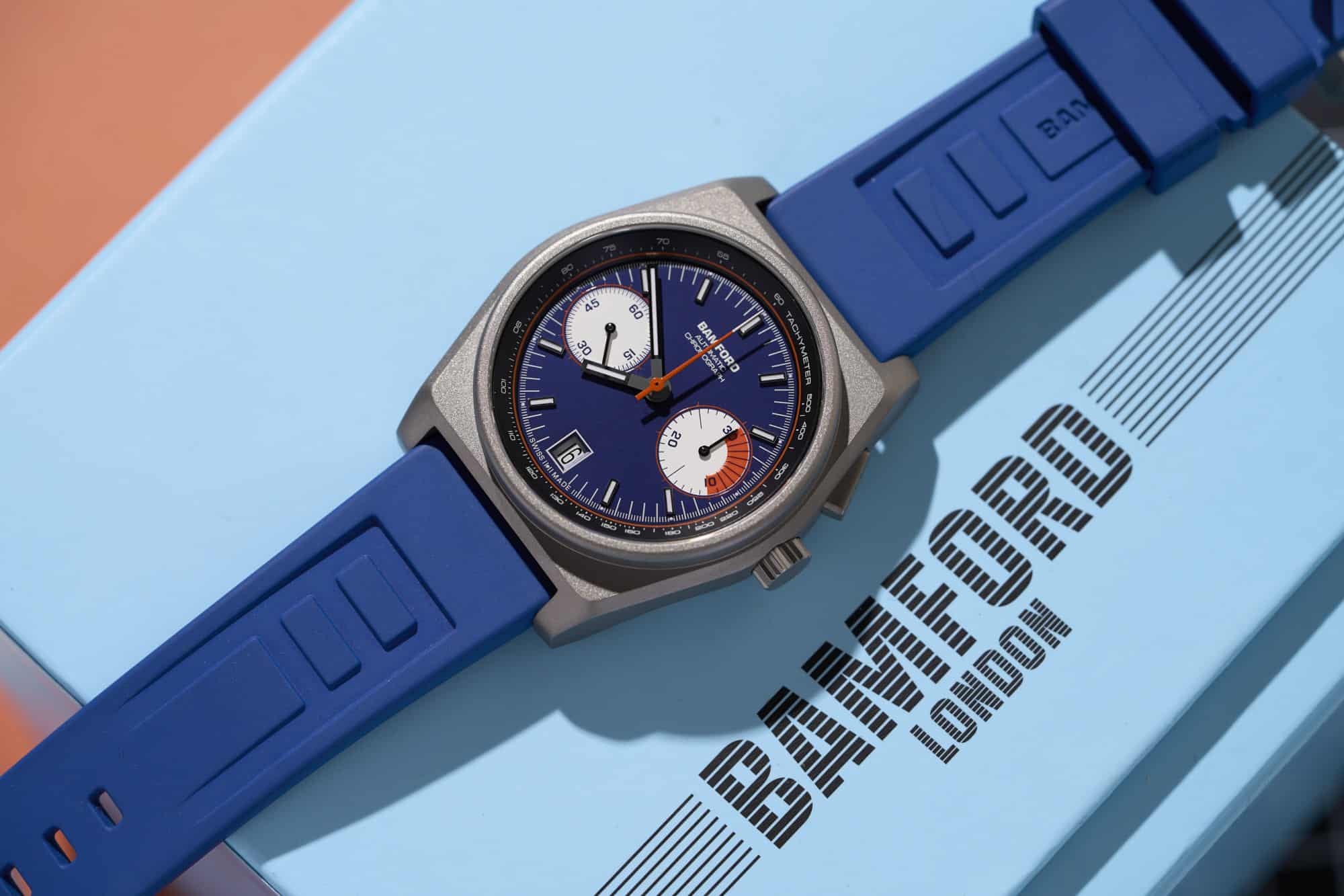
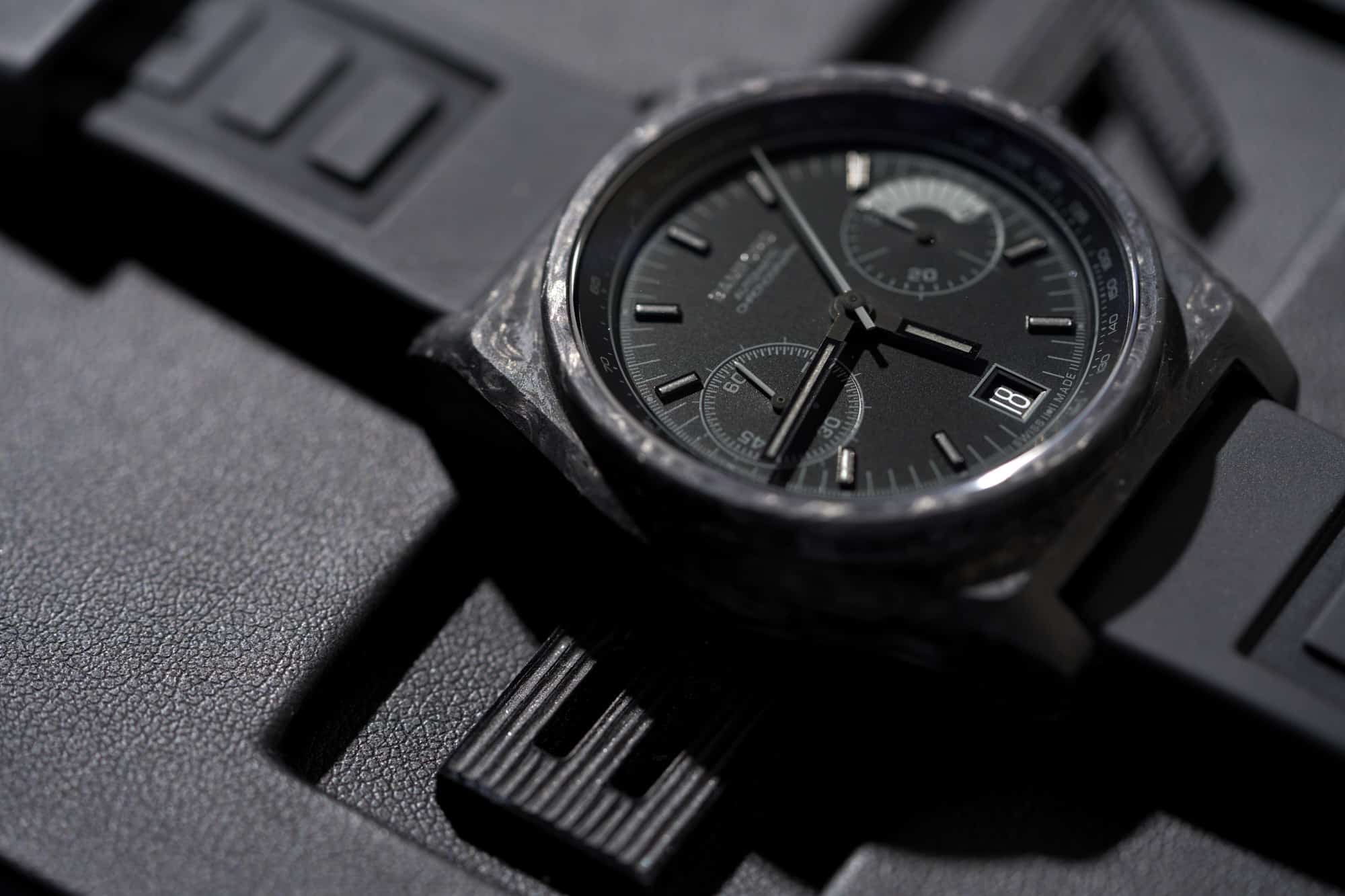
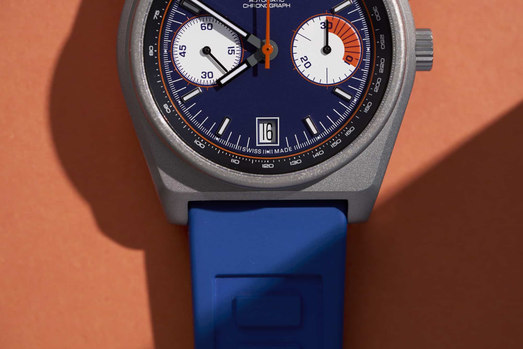
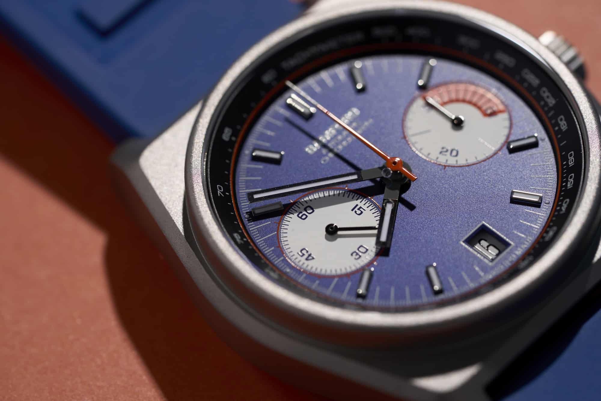
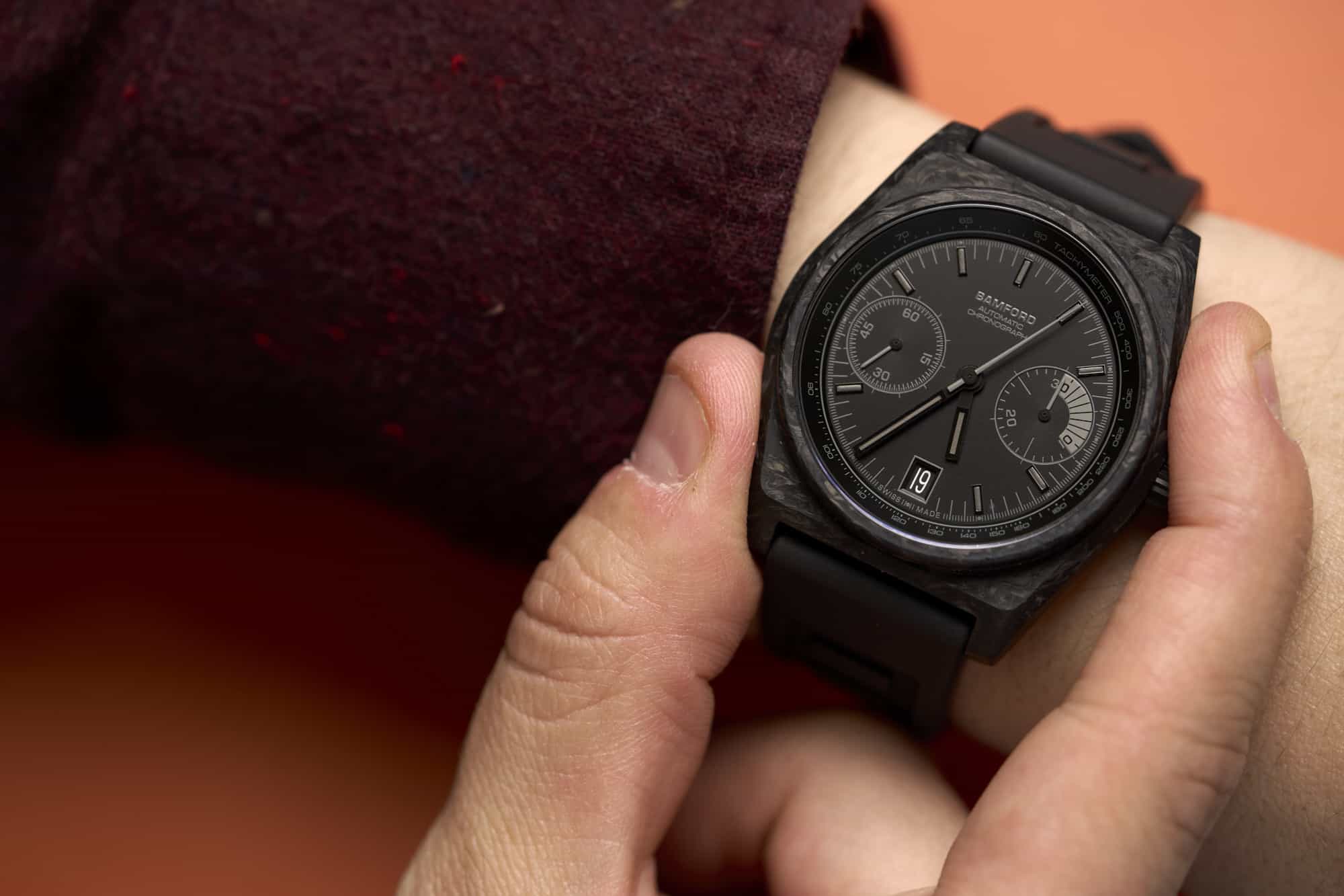
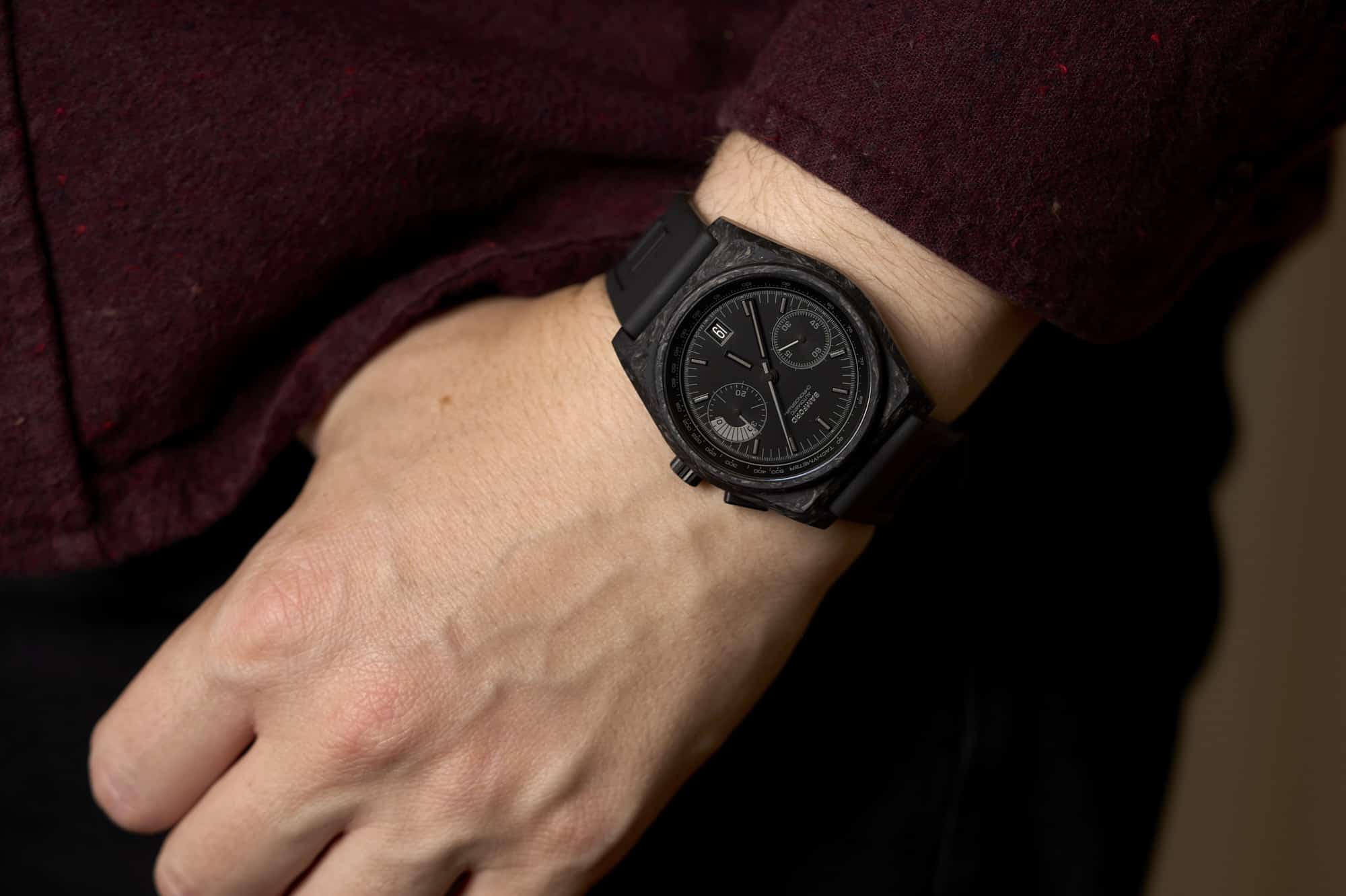
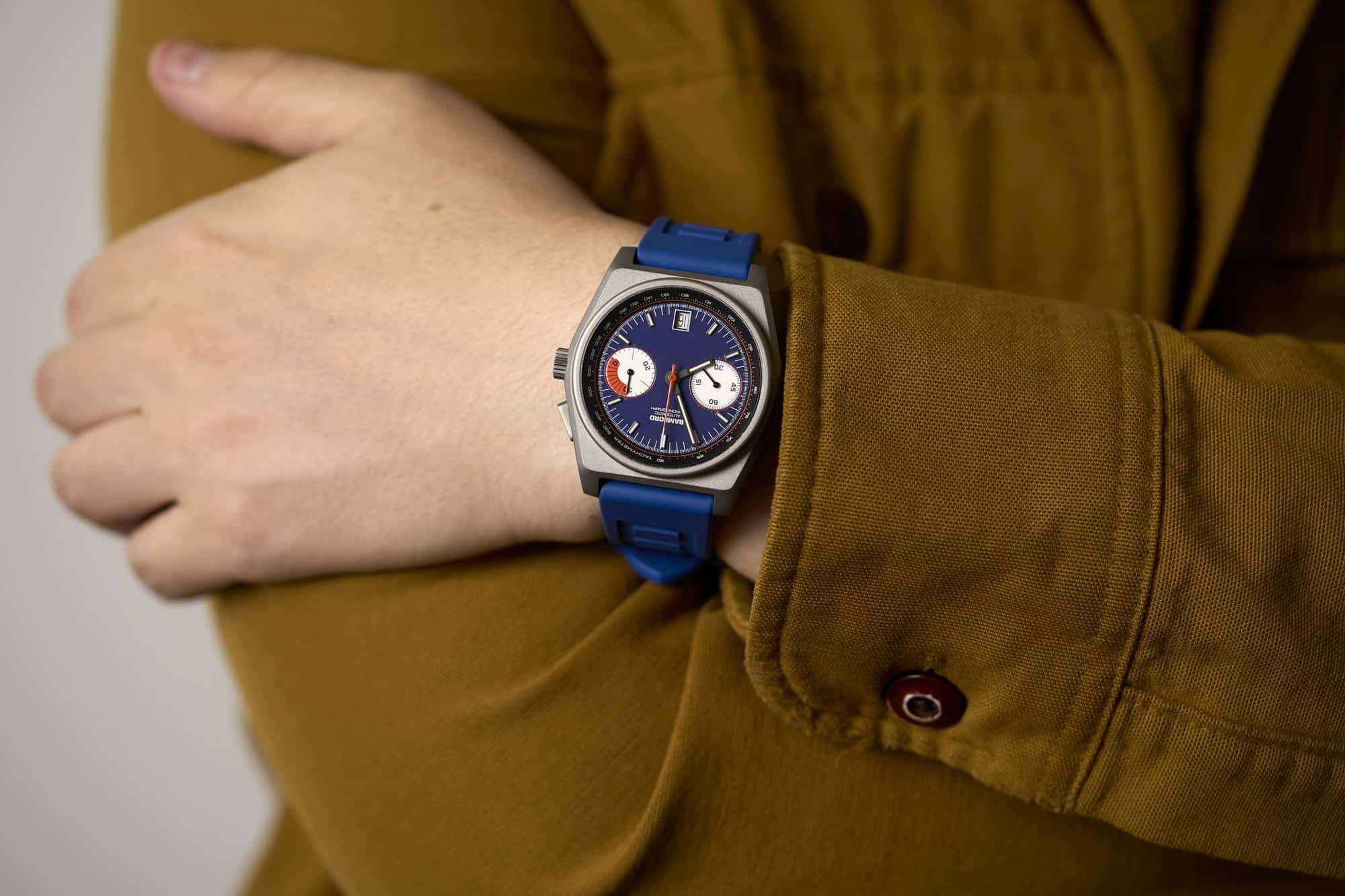
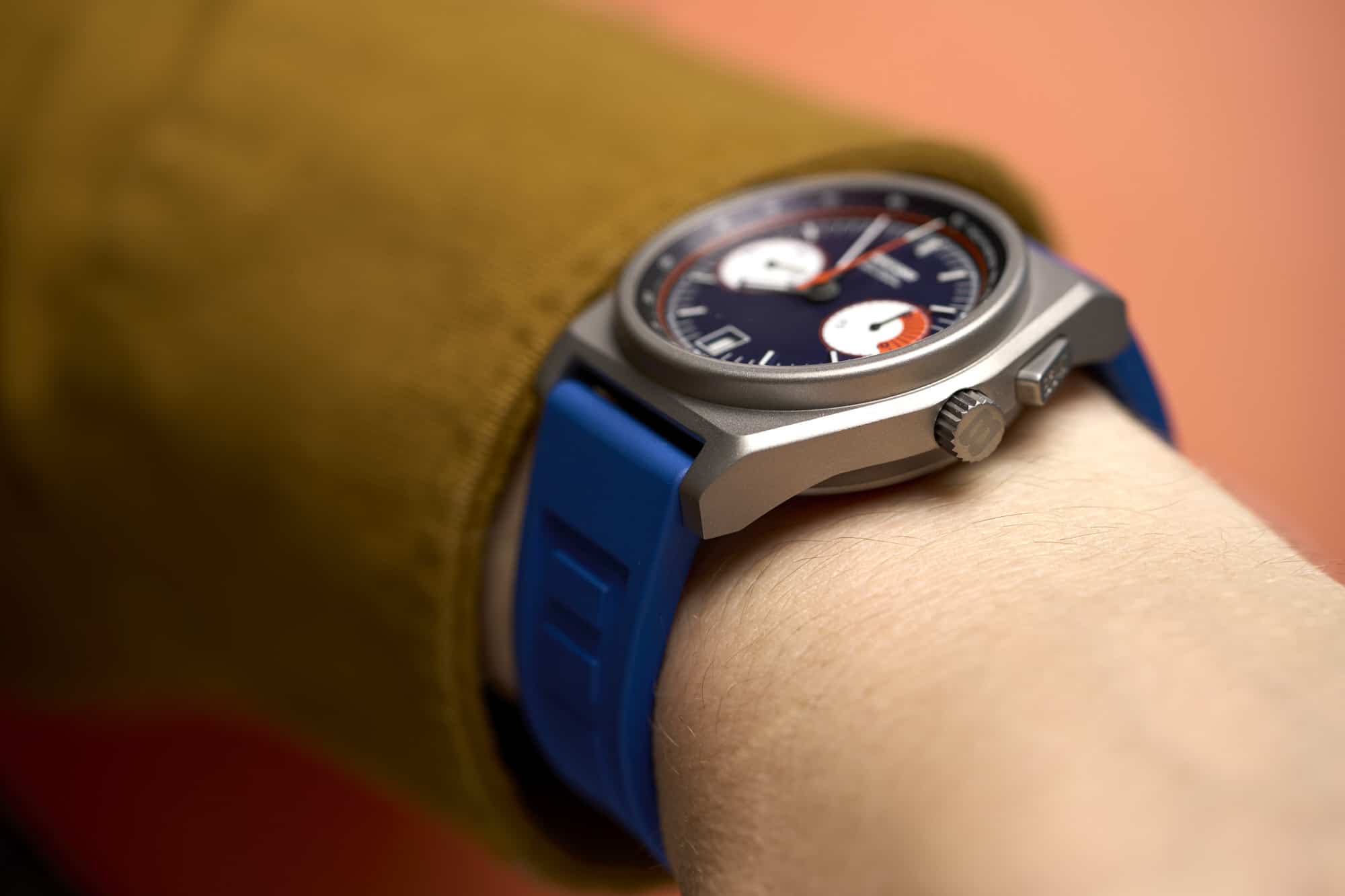
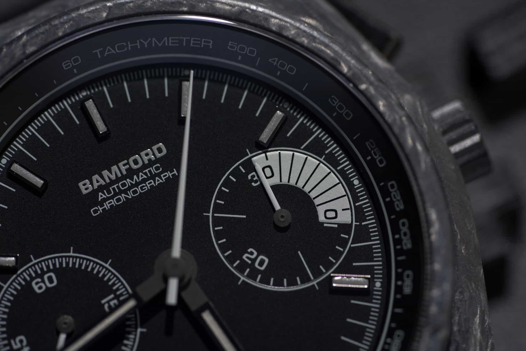
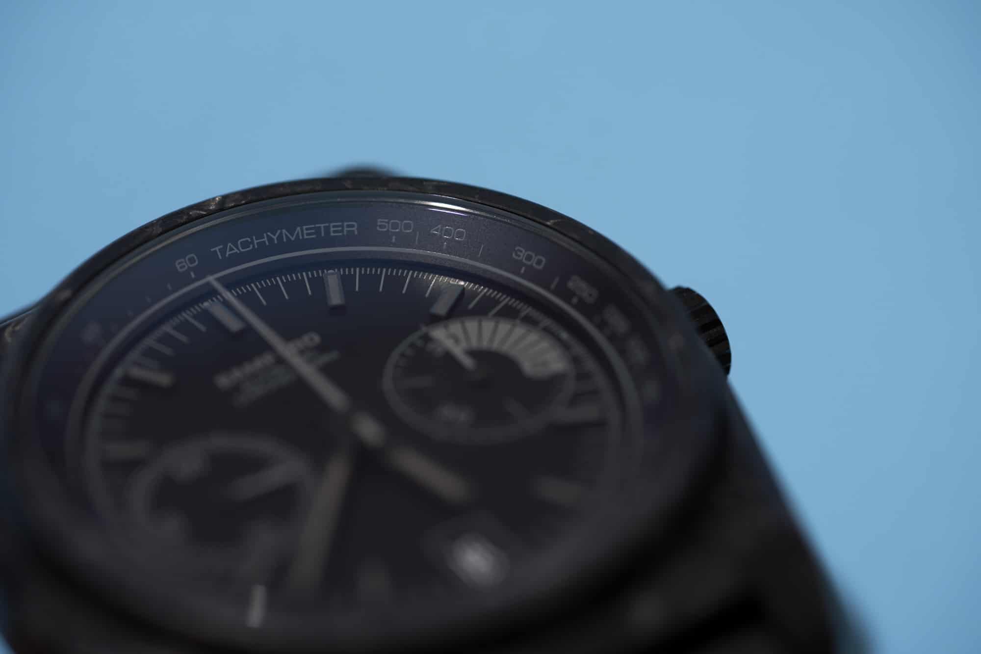
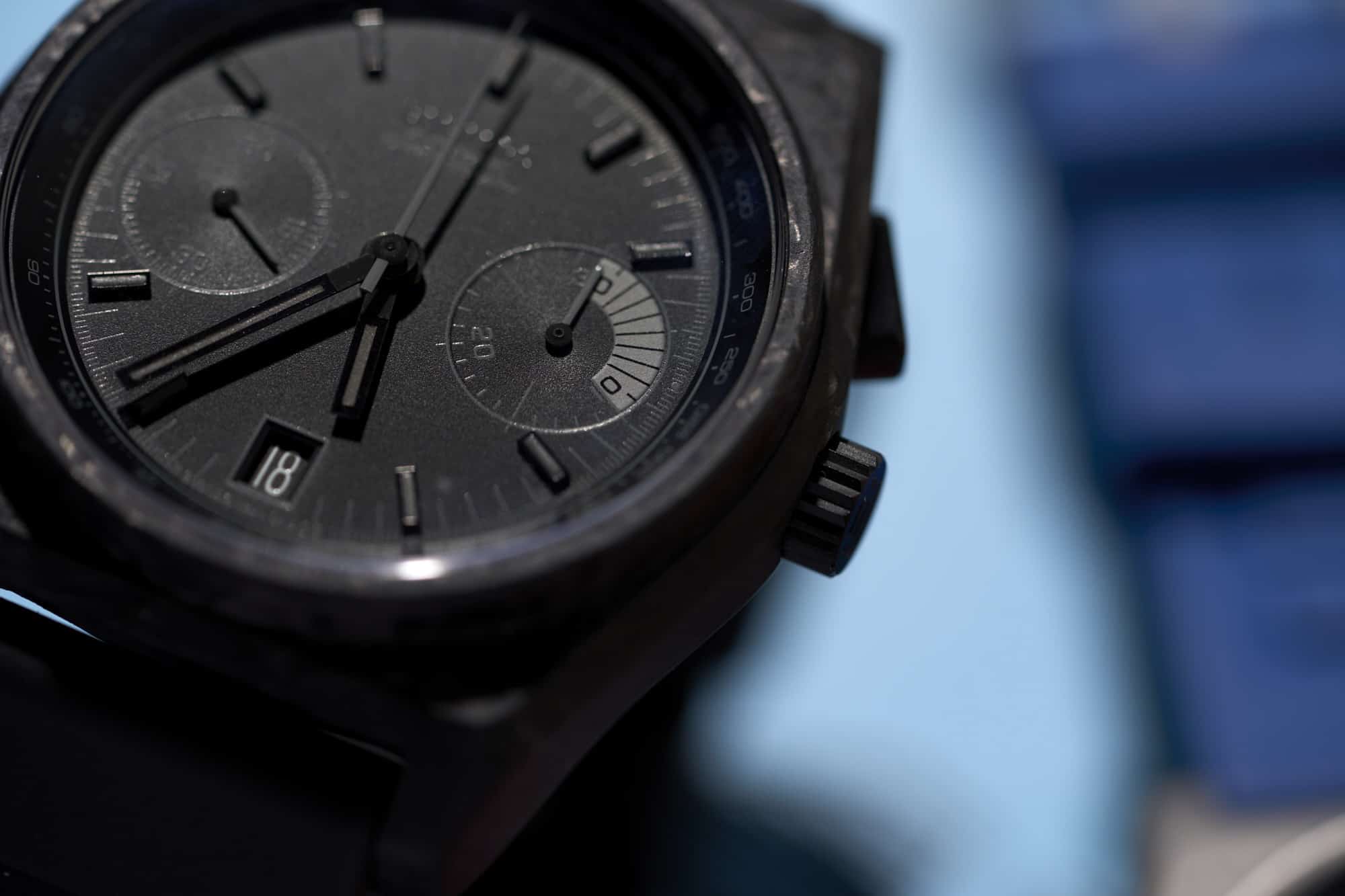
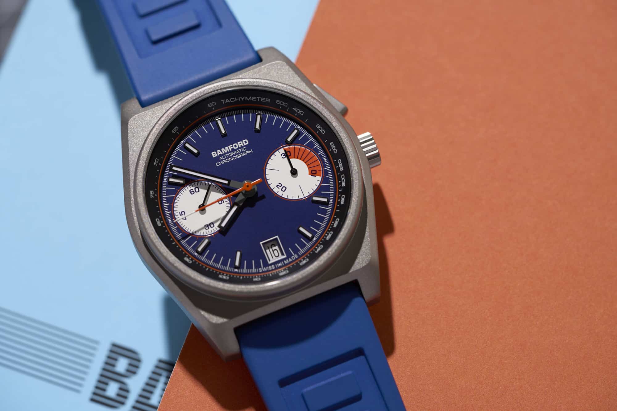
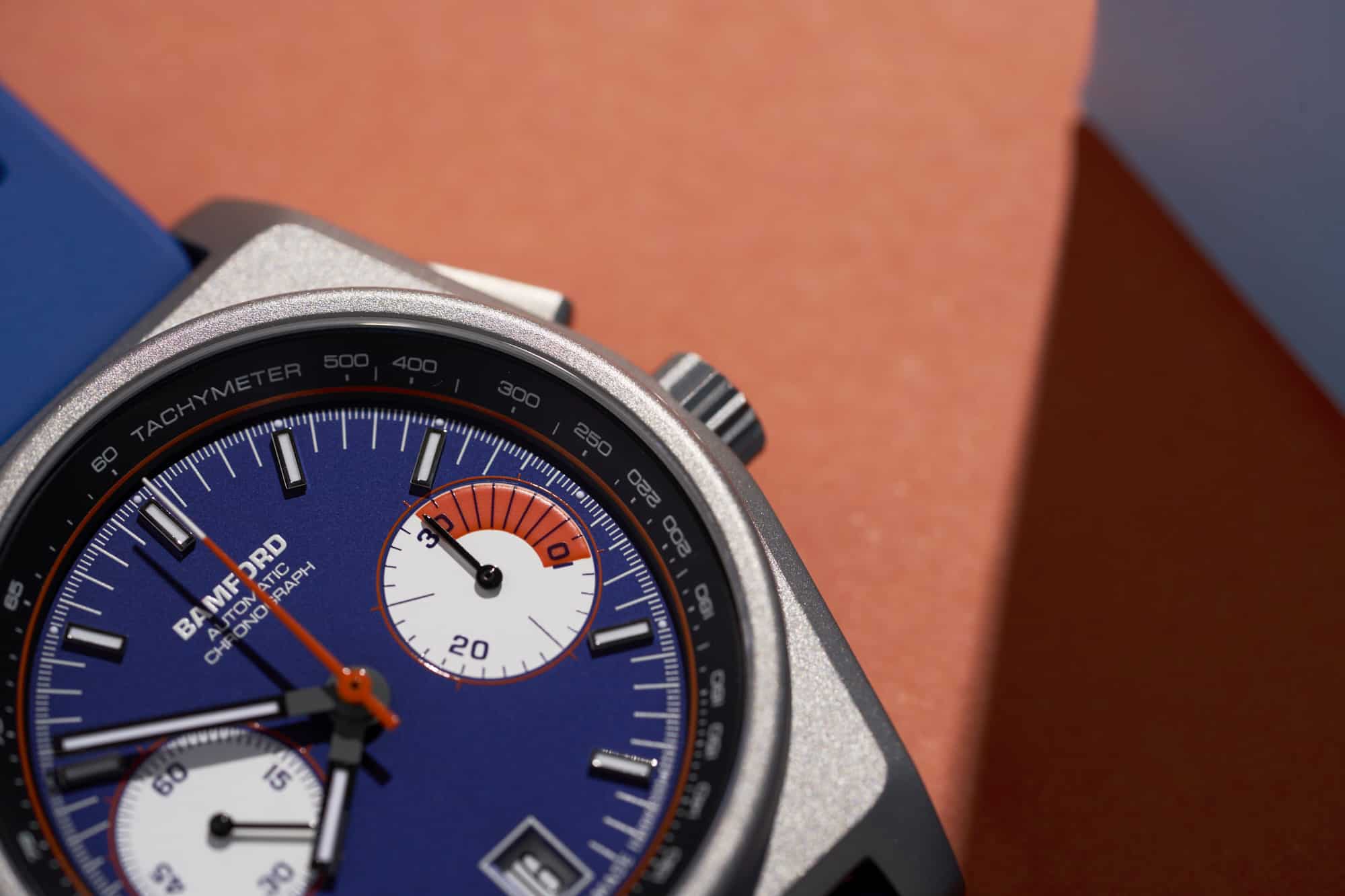
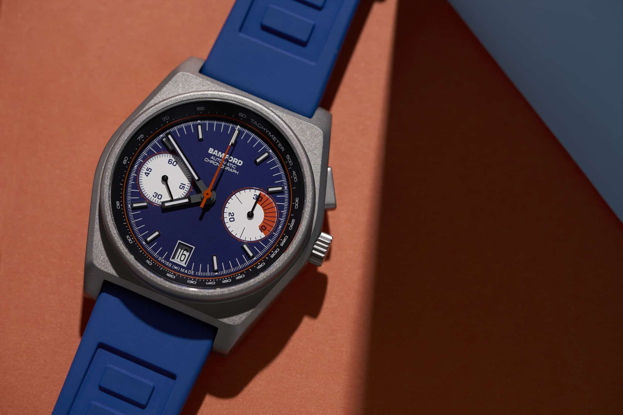
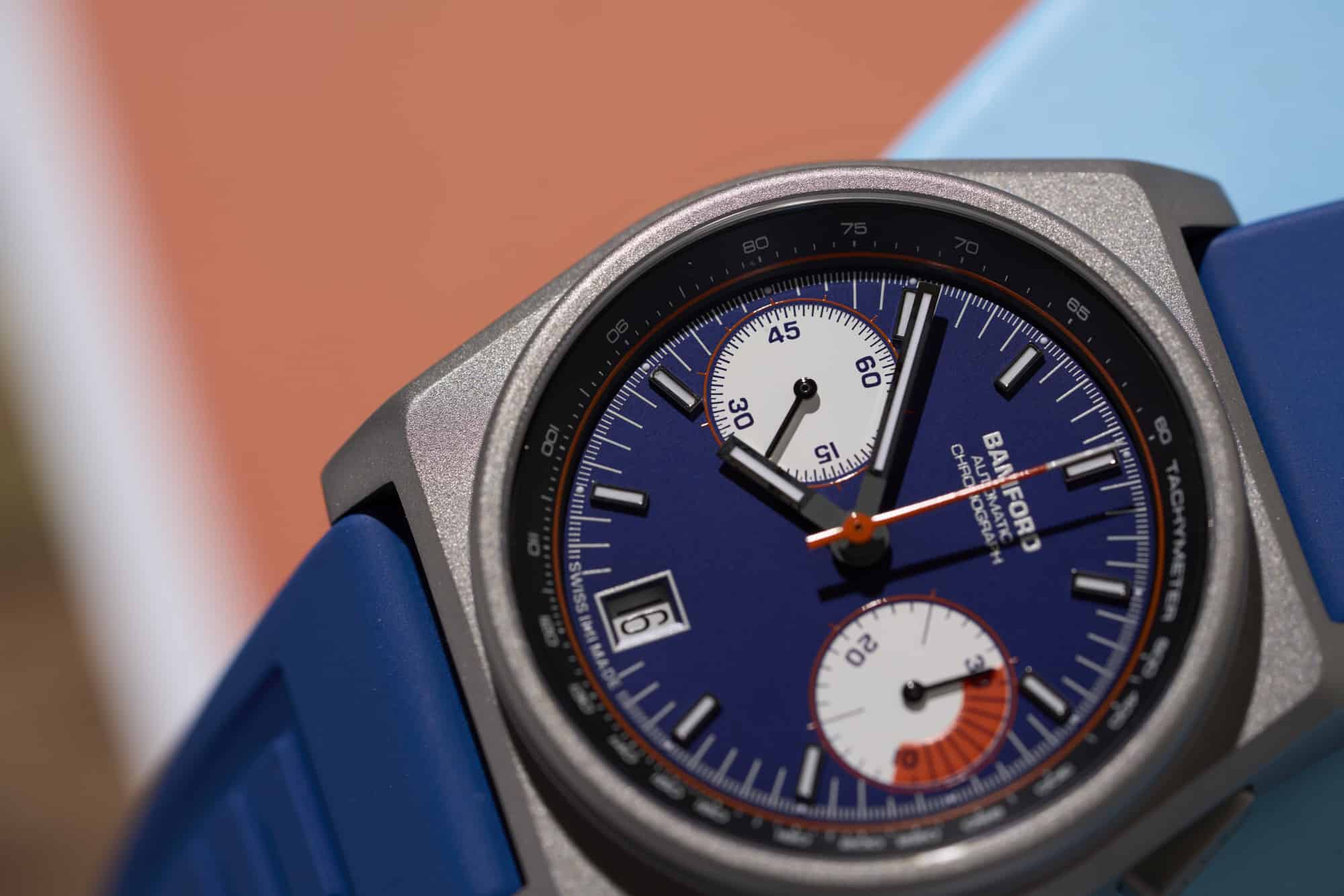
Now, I’ll admit, I kind of missed it when these were first released. Despite being monopushers with aggressive 80’s styling, which is very up my alley conceptually, they somehow didn’t sink their teeth into my psyche. Well, not until a few months ago when Bamford released a second version of the B347 with a titanium case. Oddly enough, the first series was made out of the decidedly more esoteric forged carbon. A material that seems to vacillate in the zeitgeist from fancy plastic to a precious exotic substance depending on which brand uses it and what they are charging, it universally does one thing quite poorly, show up in photos. Mostly matte, dark, and muted, it can look very flat when doomscrolling Instagram for watch shots.

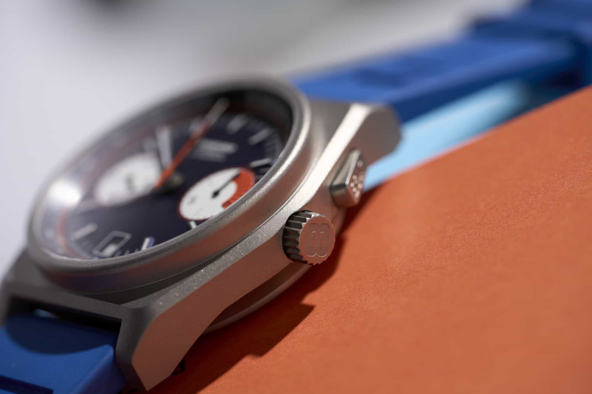
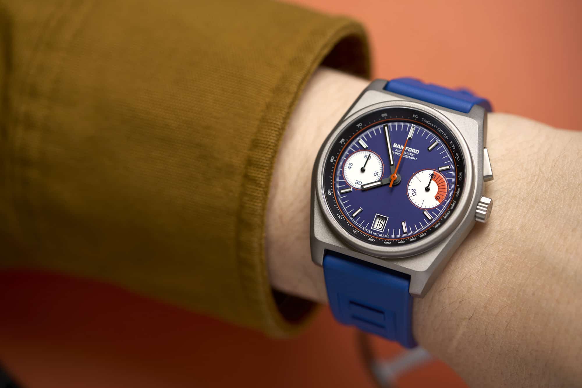
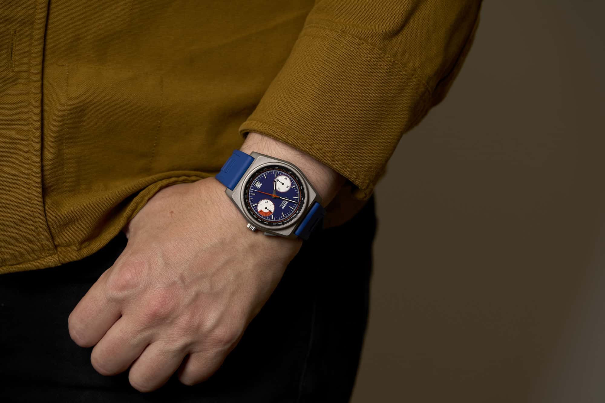
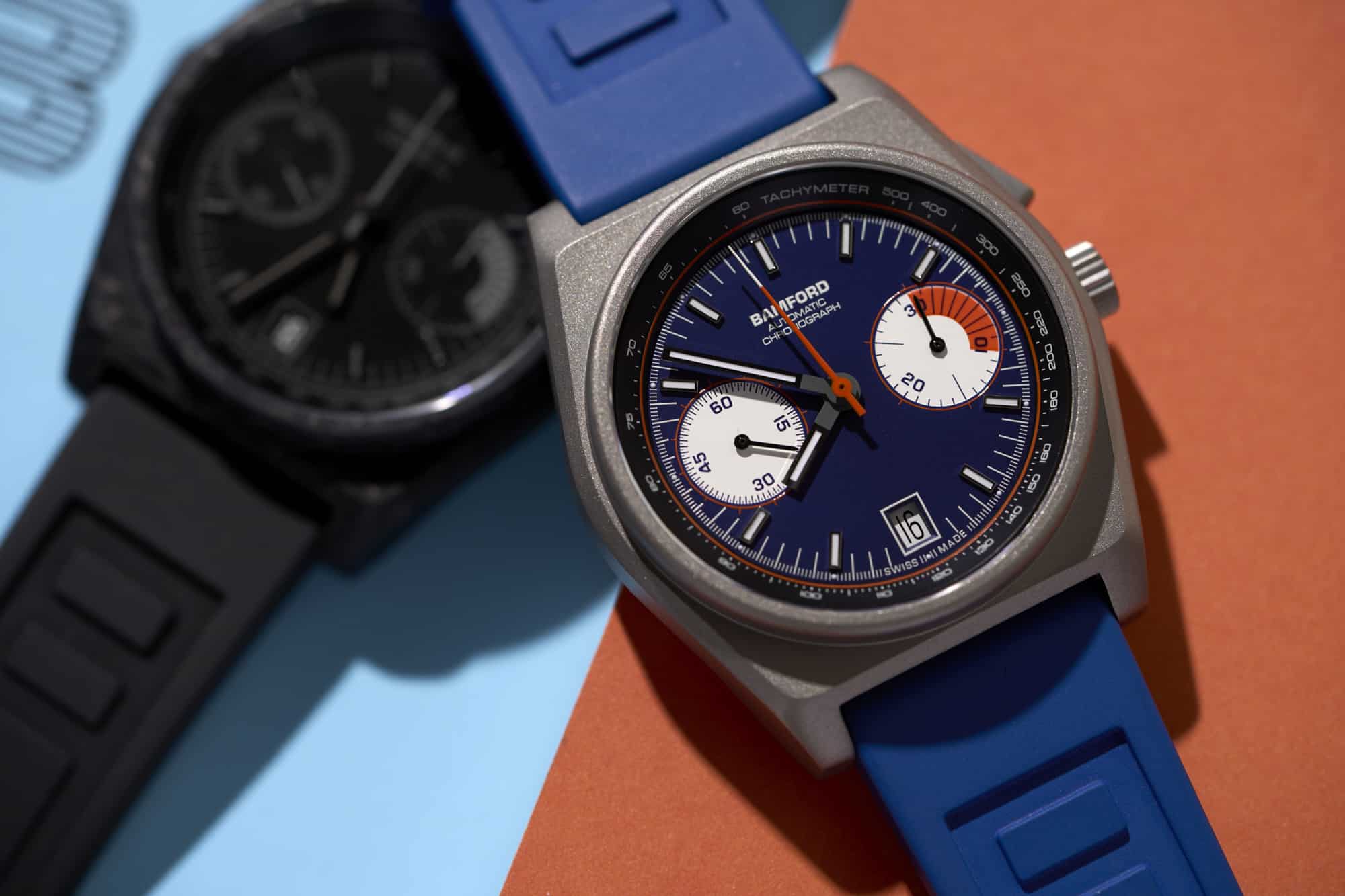
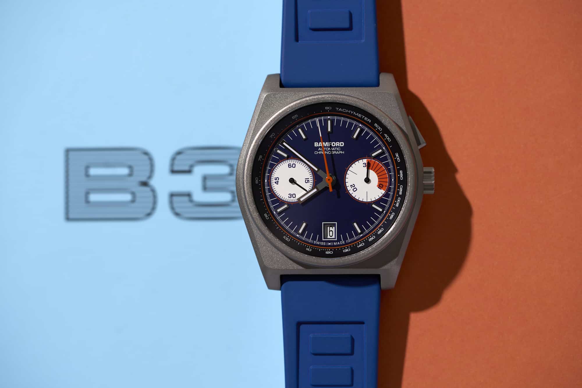
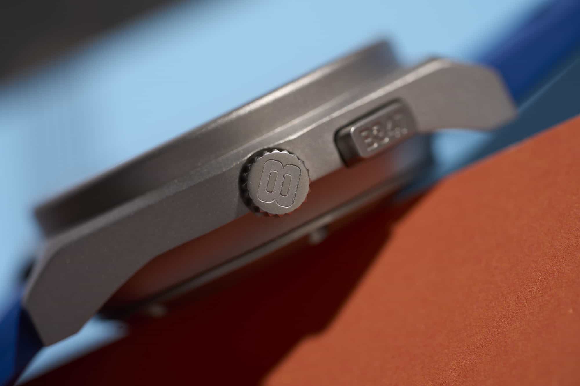
So, I think I sort of literally did not notice the B347 until they rinsed and repeated in titanium. But, once they did, I couldn’t shake it. The aggressive lines of the case, simple but retro dial, and that single, wide flat pusher made it stand out of a crowd where vintage-inspired chronographs are hardly rare. Additionally, the price seemed fairly reasonable for a Swiss-made monopusher at $2,950. I reached out to George Bamford who was nice enough to send both a titanium and forged carbon version over for a test drive, so let’s get to it.

Advertisement
$2949

Review: the Bamford B347 Monopusher Chronograph

Case
Forged Carbon or Titanium
Movement
Sellita SW510
Dial
Various
Lume
Yes
Lens
Sapphire
Strap
Rubber
Water Resistance
100m
Dimensions
41.5 x 48.5mm
Thickness
14.5mm
Lug Width
22mm
Crown
Screw-down
Warranty
yes
Price
$2949

Case

When you look through pages of vintage chronographs, perhaps on eBay or Watch Recon, it seems like there are more permutations of barrel-cased designs than anything else. All weird, these bold, and boisterous chunks of metal speak to a different time and place. Inspired by an emerging age of space travel, race and rally cars, and jet planes, these small industrial lumps feel intrinsically tied to the 60s, 70s, and 80s.

While there are many well-known barrel shapes from the Heuer Autavia to the Porsche Design Chronograph 1 to the Sinn 142 to the Citizen Bullhead to the Omega Flightmaster (ok, maybe I’m stretching “well known”), for the B347 Bamford chose a barrel design inspired by something extremely rare and short-lived. The Heuer Audi Sport is a mysterious chronograph from the early 80s with reported production numbers ranging from as low as 30 to a few hundred. Powered by the Lemania 5100, it featured a blocky barrel case with a flat top and short lugs for a brutalist style. For those interested, the best and seemingly most accurate recount of the Heuer Audi Sport and how it came to be can be found on Heuerville.

From that one time I saw an Audi Sport in person

As a source of inspiration, it’s a damn good one. Nearly forgotten, save by Heuer and Lemania nerds (I’m in the latter camp), it’s a design one is likely to only ever see in photos that has an attitude wrought of the era of Group B rally racing (I saw one once, and actually forgot about that). And, it certainly was never created in forged carbon, which seems like a fitting tribute, or titanium. Measuring 41.5mm x 48.5mm x 14.46mm, it’s a proper little brick. Stout, but not oversized, and tolerable from lug-to-lug.

From above, the flat surface of the mid-case is visually dominant. Featuring a nearly hexagonal shape, it cuts a strong figure. The tall cylindrical bezel at the center then creates a contrasting form. It’s all very 2-dimensional in an appealing way. The flat surface then flows into a wide bevel that sheers off to create lugs. From the side, the shapes don’t even quite make sense, with sudden harsh lines filling out the bottoms of the lugs to create the profile. A concave undercut that flows into a case back, accounting for a little over a third of the watch’s height, helps hide the thickness, a little.

On the right side is a fairly small, screw-down crown measuring 5.9mm x 3mm. By contrast, the single pusher at two feels quite large. 7.75mm wide by 3.5mm tall, it creates a substantial and inviting platform for pushing. On the flat edge of the pusher “B347” is written, which is the only place on the watch you’ll find it, apart from the back. Flipping the watch over, you’ll find a solid and relatively barren case-back with various details about the watch encircling an empty region. It’s worth noting that on the forged carbon model the crown, pusher, and case-back are PVD steel.

Its a funky case that is likely love it or leave it, but I find myself in the first camp. It’s not pretty or elegant. It’s not even particularly handsome. But, it does have a sort of “I’m cool but don’t care” kind of vibe. It’s like a VW Thing, or apparently Crocs (I’m not there yet). It has personality, chutzpah. Attitude. In other words, there’s sort of an intangible factor you either get or don’t.

Back to what matters – the two materials make a world of difference. First visually, the titanium version has much more defined lines. Though fully bead blasted, the shifts in light and shadow between the various surfaces create noticeable contrast. The top surface always stands apart from the beveled edge, etc. The surfaces on the forged carbon are far less defined. The edges in general are bit softer, but the dense, black material also just makes the shifts less noticeable.

The mottled coloration of the forged carbon, consisting of black and dark gray swirls, also dirsupts the sense of line and edge. Like the camo wraps they put on test cars, or “dazzle” camouflage, it distorts the form of the watch. That sounds like a bad thing, and likely partially leads to the watch looking flat in images, but in person has an undeniable, exotic appeal. It’s rare to have dynamic texturing on a case, making the whole watch feel more alive. There’s also a value in its randomness, as no two models will be alike.

While titanium is known for being light, which it is, it’s the heavier of the two versions, which is odd when you have them both in hand. Automatic chronographs are not known for being lightweight watches, so the fact that the forged carbon version is noticeably lighter than the Ti version probably puts it on the lighter side of toolish mechanical chronos in general, at least at the price point.

Dial

The dial of the B347 is appealingly blunt and straightforward. While the case might refer to something historical, the dial, to my knowledge, is a modern creation, though it suits the case perfectly reflecting its harsher lines. While we have two flavors present, Navy Blue/Flame Orange and Predator, they share the same layout. There is a main surface and a steep chapter ring.

The main surface consists of an index of relatively small, applied lume-filled rectangular markers at the hours, save three, six, and nine. Underneath these markers is a minute/chrono-seconds index consisting of long, thin lines per minute/second, and much shorter lines for ⅕ seconds. “Swiss Made” is gently nestled within the ⅕ seconds at six, almost invisible to the eye. Simple, legible, no fuss.

The sub-dials at three and nine are more stylized, adding some personality to the dial while maintaining an overall sober aesthetic. Interestingly, both are printed flat on the dial, eskewing the commonly seen sunken sub-dial. The result is a flatness that plays off of the case surfaces. The 30-minute counter at three features markers per minute, with numerals at 10, 20, and 30, as well as longer lines at 15 and 25, balancing the layout. There are two uncommon details, however. First is a bounding circle that features small lines projecting outwards. This is more pronounced on the Navy Blue/Flame Orange model, as the line is a contrasting orange.

The second, and more visually impactful detail, is the bold arc of color from 0 – 10. Breaking from the otherwise fairly conservative array of fine lines and numerals, this is a bold detail that pulls attention to the sub-dial, and breaks the otherwise perceived symmetry. I liken this to a “big eye” chronograph, which obviously uses scale to emphasize one sub-dial over others. It’s the most unique element of the dial, and it works.

At nine is the active seconds sub-dial which features numerals at 15, 30, 45, and 60, and very fine lines between them. They are honestly too fine to read at a glance, but that’s unlikely to be an issue. The bounding circle is repeated here, giving an easier reference for five-second intervals. At six is a date window that is almost perfectly in line with the applied markers for a balanced look. It also maintains the balance of the three-nine sub-dial layout.

Lastly, you’ll find the Bamford logo under the 12 markers, along with “automatic chronograph.” There is actually a surprising lack of text on the dial, at least above six. While part of me thinks that even flavor text like “automatic chronograph” is completely unnecessary, in this instance, I kind of wish they had put it above the date to spread the text out a bit and avoid the slightly out of balance feel. Perhaps having just “Bamford” would have also worked as well.

Along the edge of the dial is the chapter ring, which features a classic tachymeter scale with numerals positioned radially around the dial. The point of intrigue here is the circle towards the inside of the ring. It’s sort of odd to see an uninterrupted circle on a chapter ring but I like how it frames the main surface, creating a sharp break in the regions. On many versions of the watch, this line is also in a contrast color, matching the bounding lines of the sub-dials, creating a motif of circles. When in a contrast color, it creates an even bolder frame.

The hour and minute hands are wide rectangles correspond to the applied markers and continue the overall blunt look of the watch. The chrono-seconds and sub-dial hands are all thin sticks in contrast colors.

In terms of colors, the Navy Blue/Flame Orange and Predator are quite different. The former, which is only available in the titanium case, mixes a rich blue dial surface with punchy orange highlights, white sub-dials for a “panda” effect, and white markers for contrast. The chapter ring, oddly, is black. It’s not a subtle use of color, but if blue and orange are your thing, then it’s probably up your alley.

The Predator is Bamford’s take on the blacked-out, or “murdered out” (if you’re into that kind thing), watch. Only available with the forged carbon case, it’s perhaps the nicest and most legible blacked-out dial I’ve come across. A style that I generally feel is more of a novelty than anything else, they abandon legibility for the undeniably sleek and cool look of all black. Well, Bamford’s version isn’t quite all black, which is why it works. Rather, they go with dark gray on the black surfaces, allowing for just enough contrast for a relatively easy read. The black and gray also works particularly well with the swirls of the forged carbon case. The one drawback is that the white-on-black date wheel feels a bit too contrasty by comparison.

Advertisement

Movement

Ticking away inside of the B347 is the Sellita SW510 MP a. As weird as it is to type this, the SW510 is becoming the industry standard monopusher (weird because monopushers used to be quite rare), which is a cool thing. An ETA 7750 clone, it features 27-jewels, a frequency of 28,800 bph, 62 hours of power reserve, date at six, and chronograph functionality. It’s considered to be, and in my experience is a reliable movement.

Obviously, the interesting aspect is the monopusher chronograph. For those unfamiliar with the concept, the pusher at two controls the all functions of the chronograph: start, stop, and reset. Pushing the button will execute said functions in that order. While not as convenient as a two-pusher design which allows for one to stop and restart the chronograph, their is a certain novelty to a monopusher. Perhaps it acknowledges the lack of a real “need” for a chronograph, but as a wat to distinguish one chrono from another, it does the job.

Straps and Wearability

The B347s come mounted to custom 22mm rubber straps with quick-release spring bars. The blue/orange model comes with your choice of strap color, but the Predator comes on just black. They are fairly straight cut, tapering 2mm from the lug to the buckle. They are also fairly flat, featuring an indented area that adds some decoration but no texturing or other detailing. The material is pleasantly pliable, and they are comfortable out of the box. Overall, I think they suit the watch well enough, but they aren’t particularly exciting on their own. Also, as someone who doesn’t love wearing rubber straps in general, I did find them fatiguing because of the amount of skin contact.

On the wrist, the B347 wears like the blocky, brutal watch it is. That’s not to say it wears poorly, it’s actually quite enjoyable, but it’s not subtle. The flat sides and cylindrical bezel don’t hide the height of the watch, perhaps even accentuating it. The generally flat shape doesn’t add an ergonomic sleekness. Nope, it’s a chunk of either titanium or forged carbon sitting on top of your wrist. But, it’s not huge either, and if you are into the looks of the watch, the way it wears is not surprising. Plus, it’s not obnoxiously heavy either thanks to the case materials.

So, I dug it. It’s fun, weird, and kind of awkward like barrel-cased chronographs from the 60s, 70s, and 80s usually are. More importantly, though, it’s different. This isn’t a watch that you’re likely to have something similar to already unless you happen to have a Heuer Audi Sport kicking around in your watch box. As I said before, it has personality to spare. Worn with a leather or denim jacket, it will fit right in. The Predator in particular clicked with me with its swirling carbon case and muted dial.

Advertisement

Conclusion

Though it might have taken a second round of releases for me to take notice of the Bamford B347 Monopusher Chronographs, it’s very much a watch worthy of attention. On a basic level, they are just well-made, unique chronographs with good movements and tolerable price tags. Can’t argue there. More specifically, they are funky, brutal blocks of material that nod at an obscure historical reference, for those who care, and will stand out in a collection. While the titanium pulled me in, the forged carbon option adds another level of distinctiveness and is pleasantly light on the wrist for a chunky watch.

While I looked at two models, there are many more dial options available, should these ones not click. There’s the a great purple called “claret”, an appealing “winter green”, as well as various shades of blue. But perhaps my favorite, and the one I would go for, would be the reverse panda in forged carbon. While not an obscure colorway, the use of a contrasting white chapter ring makes the dial look like it’s jumping out of the forged carbon case, making it even more aggressive. Bamford

Images from this post:
Related Reviews
Zach is the Co-Founder and Executive Editor of Worn & Wound. Before diving headfirst into the world of watches, he spent his days as a product and graphic designer. Zach views watches as the perfect synergy of 2D and 3D design: the place where form, function, fashion and mechanical wonderment come together.
wornandwound zsw
Categories: