Review: the Farer Markham World Timer

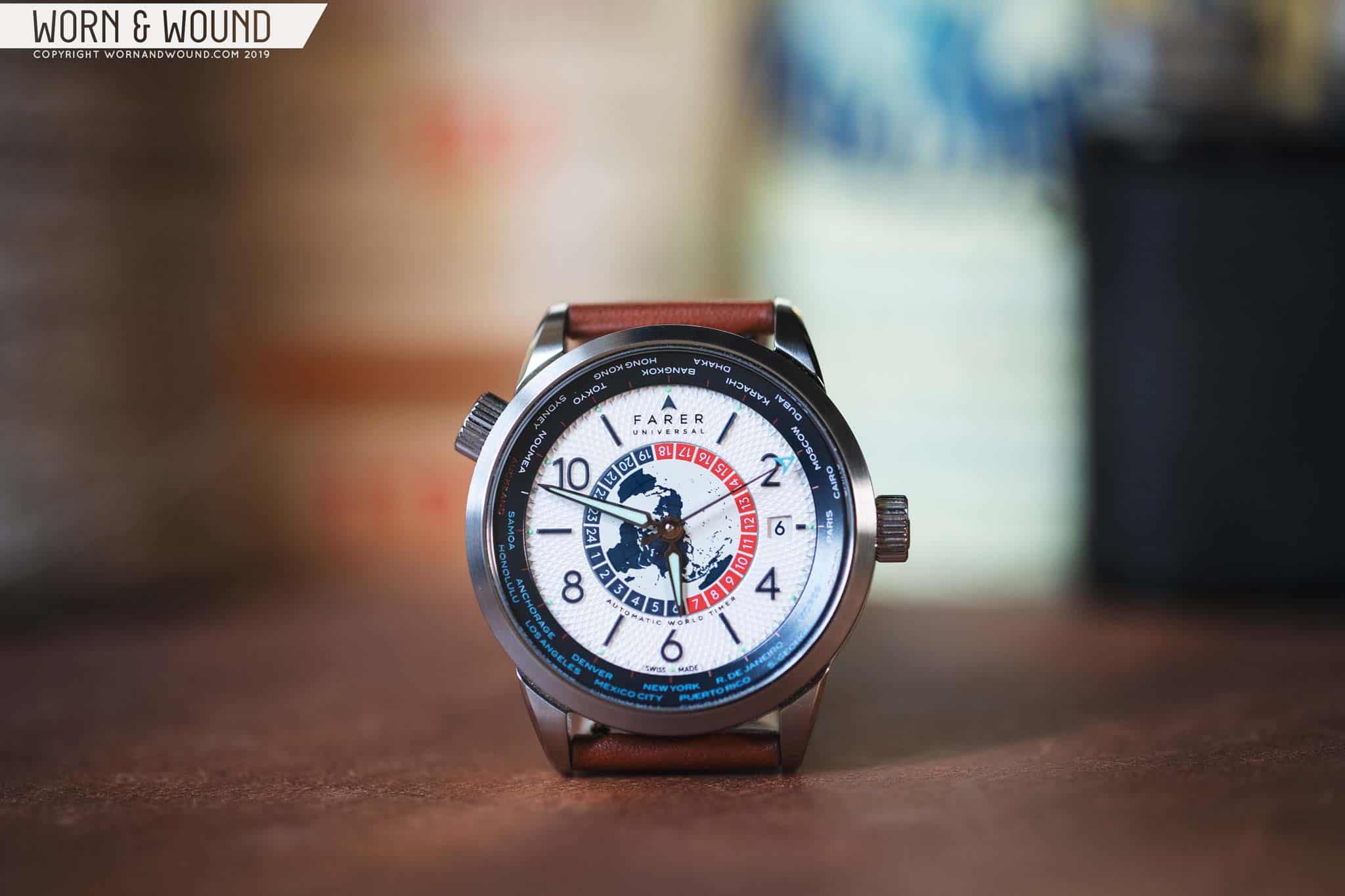
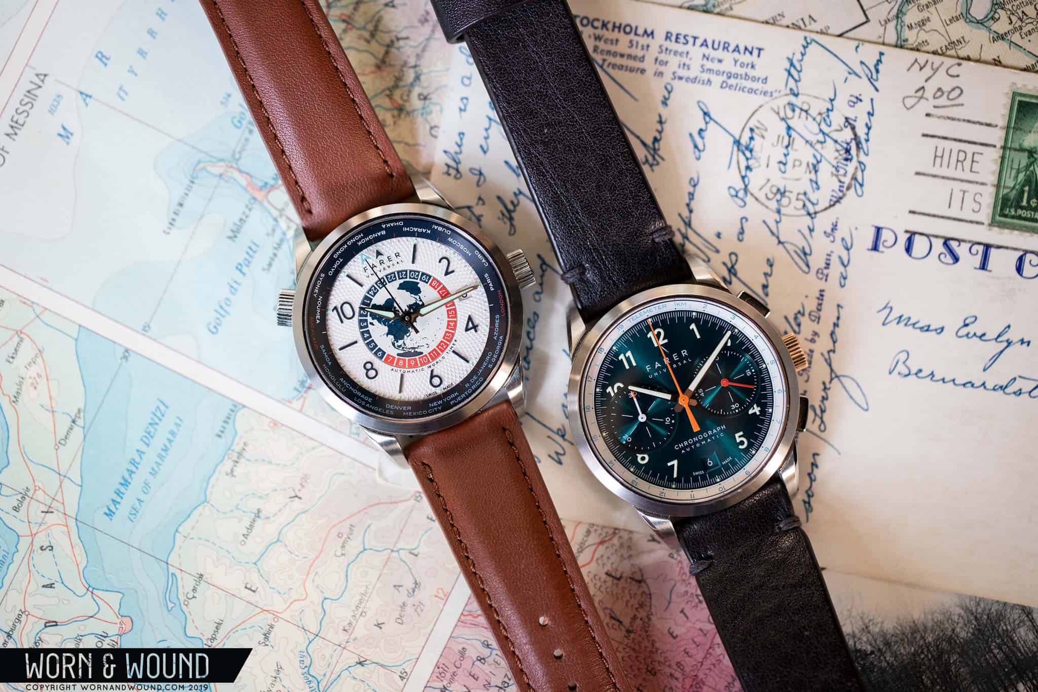
I feel like it was just a few weeks ago that we published my review of the Farer Bernina chronograph, one of three exciting hand-wound chronographs the UK based outfit had just released. Unique, a solid value and universally well-received, they were another hit for the relatively young brand. Then, much to my pleasant surprise (ok, I kind of knew in advance) Farer dropped another, totally new series on day one of Windup Watch Fair NYC 2019, a trio of mechanical World Timers. Dubbed the Aldrich, Markham, and Roché, they are a very welcome addition to Farer’s growing catalog of mechanical timepieces that seem to satisfy a spot in their lineup for something more traditional.

A curious complication, they imply a certain lifestyle for their wearers that then implies a certain level of affluence. Not satisfied with merely tracking one or two time zones, a World Timer can track all 24 major (some parts of the world have half or even quarter-hour time zones) simultaneously while also indicating a major city or capital in said zone. Avid travelers, jet-set business types, cartographers and captains of industry alike, can really make use of such function. As such, the watches that typically have this complication tend to be more luxe and a bit on the fussy side. Movements that, out of the box, correctly display world time are also very uncommon, further pushing the watches up-market.

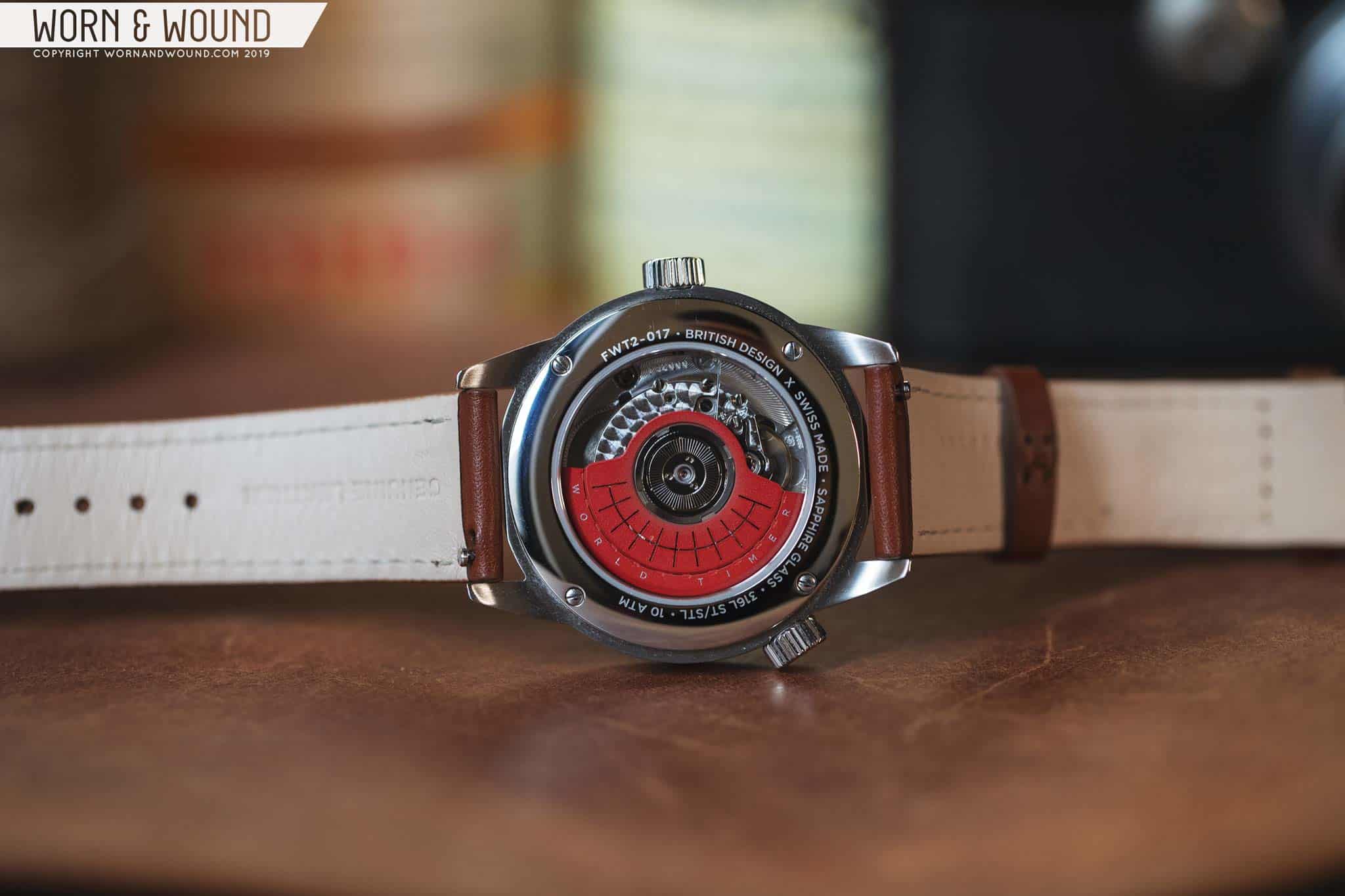
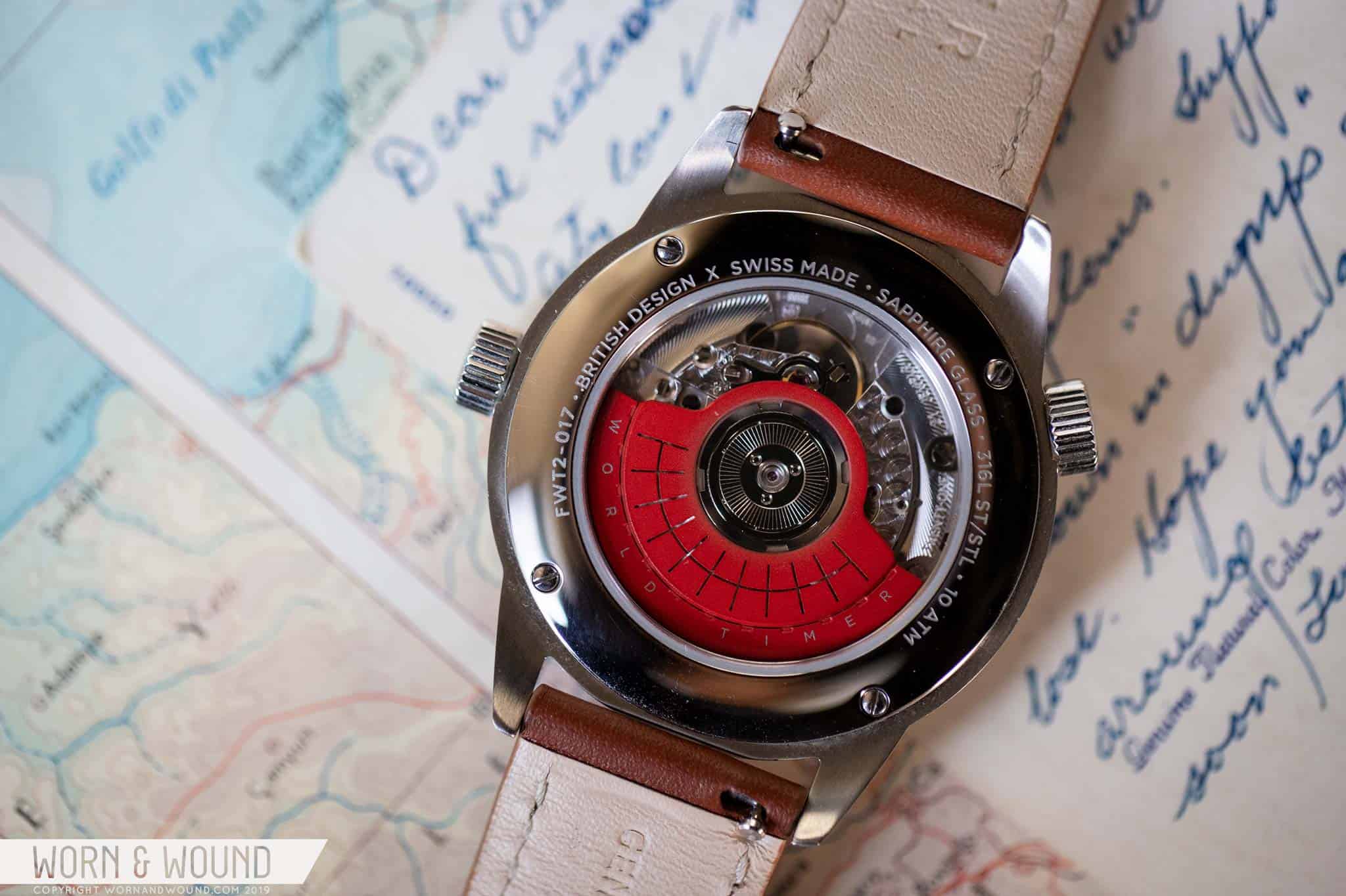
That said, World Timers did have a bit of an affordable “moment” a few years back, where a handful entered the market, a trend that has since waned. This left a nice opportunity for a brand willing to take a bit of a risk, as well as source the correct movements, to revive the genre. Clearly, Farer was up for the challenge, and with a supply of ETA 2893-1s, which function like their GMT sibling, the 2893-2, but with a disk beneath the other hands rather than a fourth hand, allowed them to create their new trilogy.

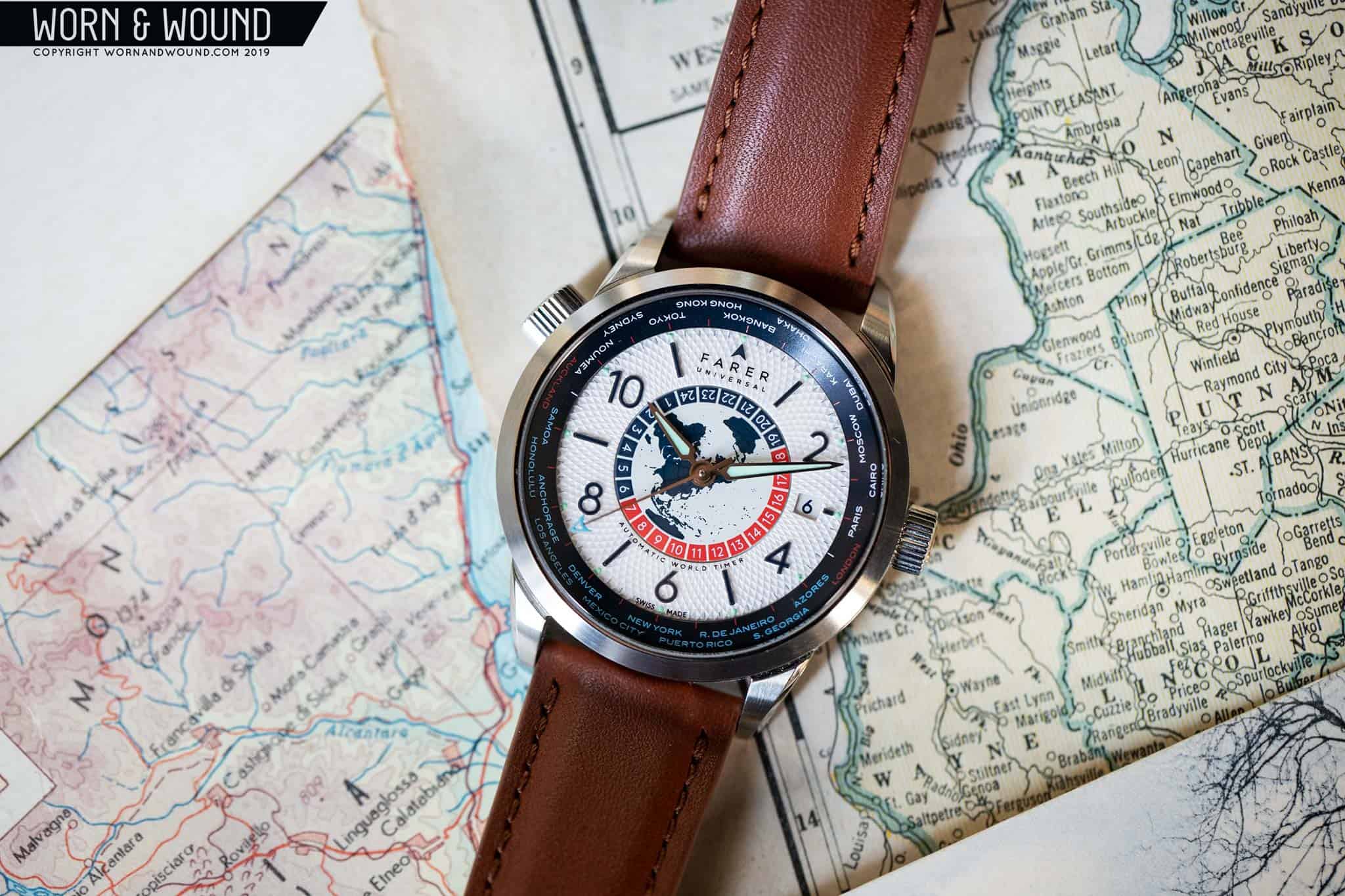
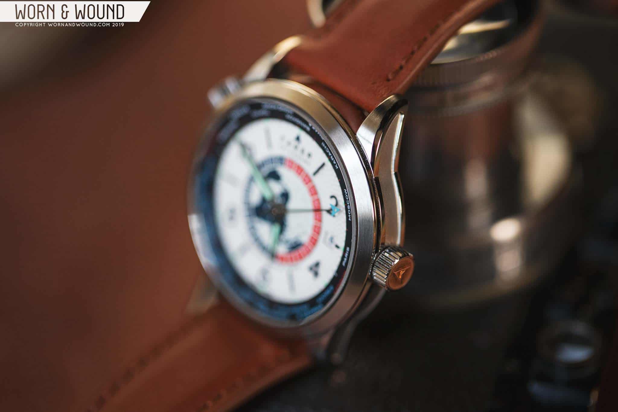
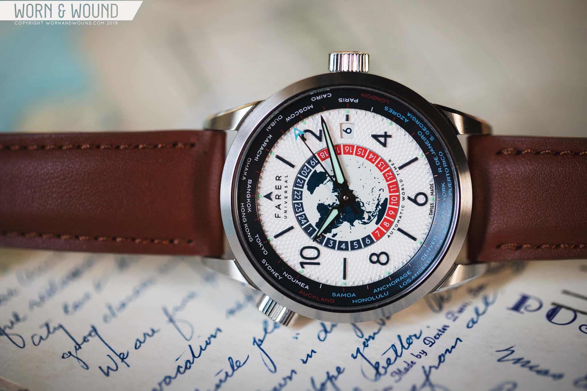
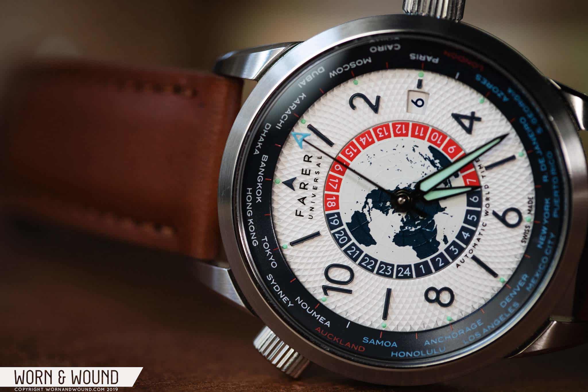
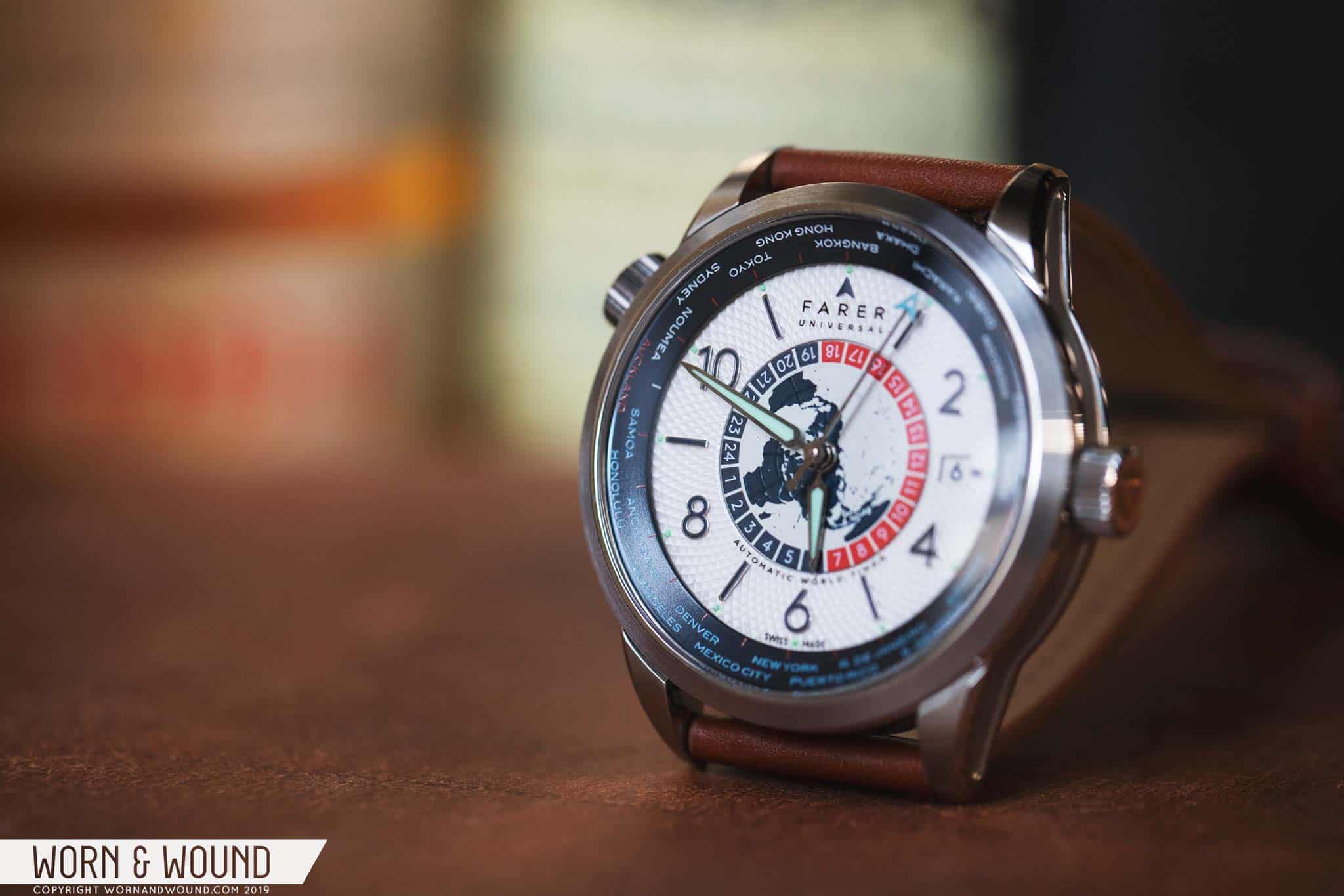
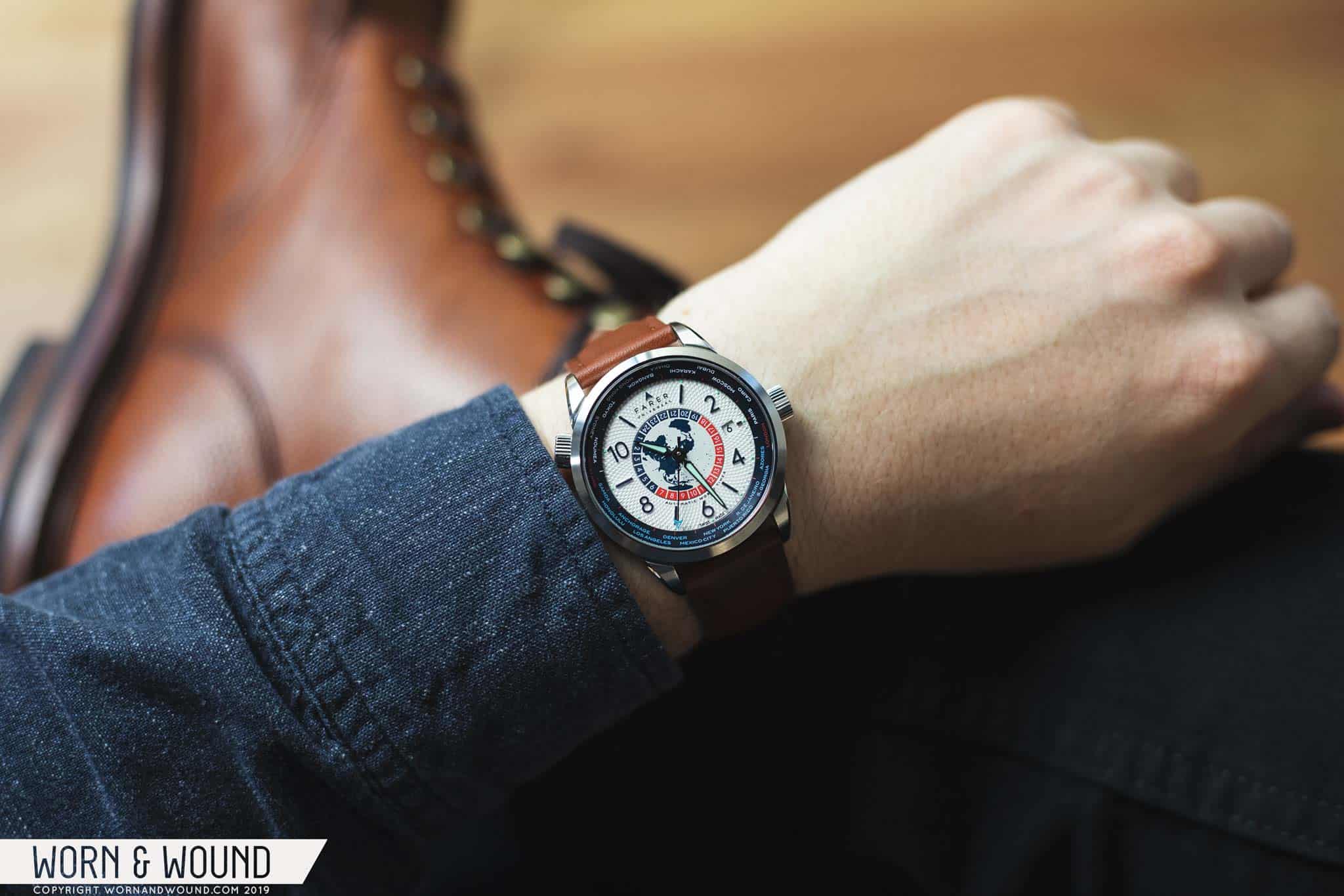
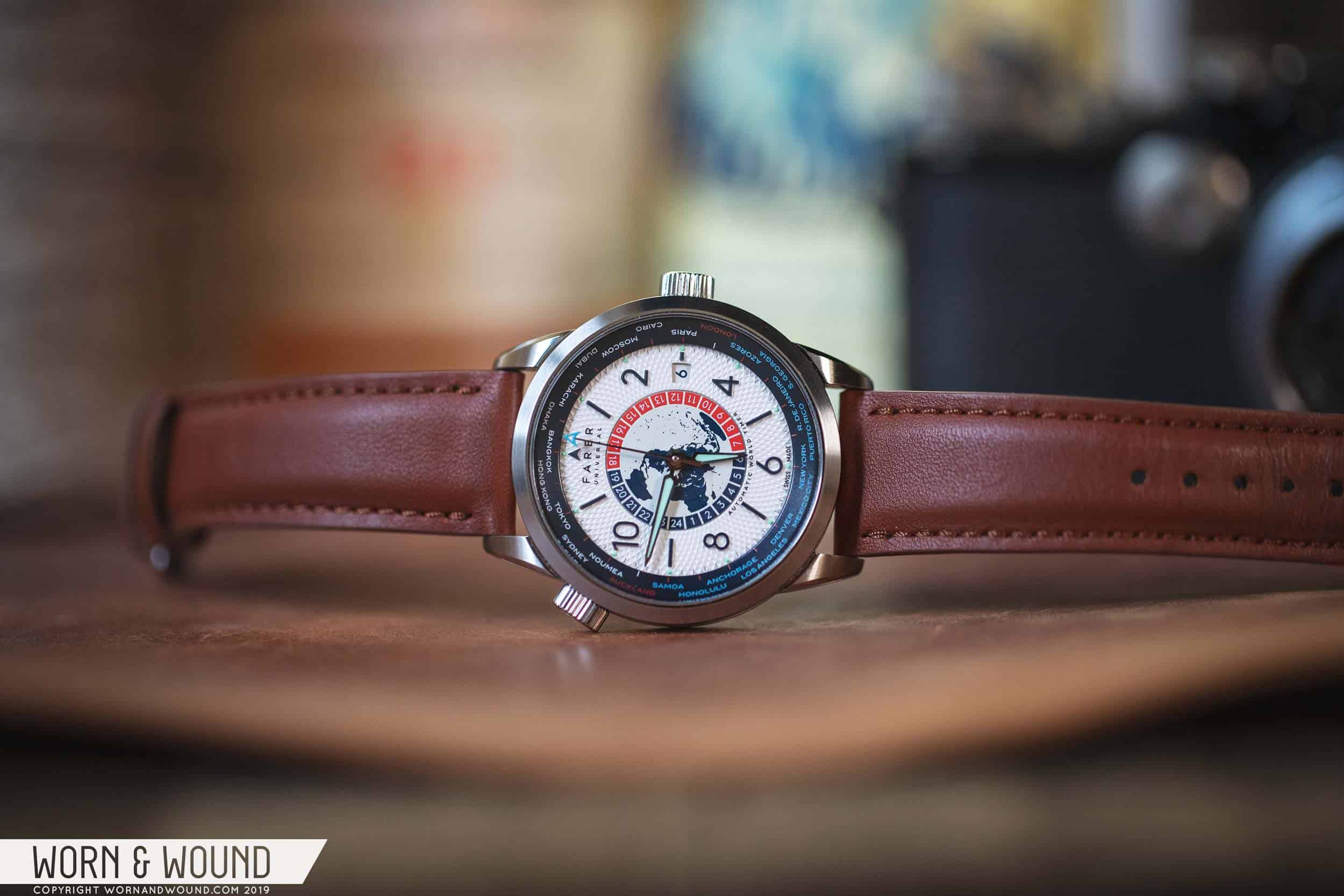
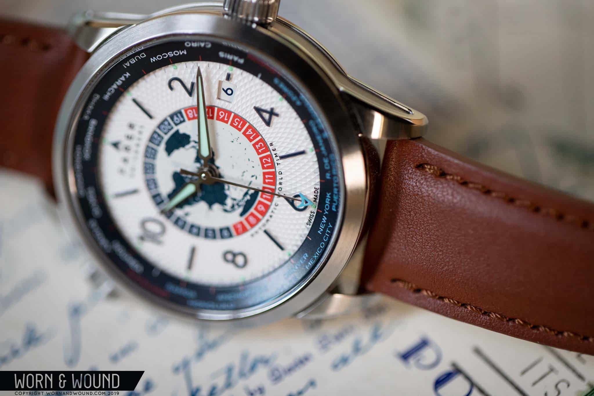
While Farer stayed mostly true to their concept of releasing three unique watches under the new genre, the World Timers are the most similar group they’ve released, sharing a common layout, if different executions. All feature rotating 24-disks at the center of their dials with illustrated maps and block hours, wide internal rotating bezels around the perimeter of their dials to coordinate the city with with world time disk, and all have a similar layout for their hour index, with bold numerals for the even hours alternating with batons for the odds. Colors and textures change, but all seem to have the same modern, masculine attitude. Today, I’ll be looking at the Markham, which stands out from the three with its pronounced white, textured dial.

Advertisement
$1550

Review: the Farer Markham World Timer

Case
Stainless Steel
Movement
ETA 2893-1 Top Grade
Dial
Textured White
Lume
Yes
Lens
Sapphire
Strap
Leather
Water Resistance
10ATM
Dimensions
39 x 45mm
Thickness
11mm
Lug Width
20mm
Crown
Push-pull
Warranty
5-year on movement
Price
$1550

Case

For the World Timers, Farer created a sort-of new case. They took the general design of the case found on their automatic chronographs – same 39mm width, same 45mm lug-to-lug, same matte-blasted cut-ins on the sides, same drop lugs, etc – but slimmed it down to 11mm, and swapped the pushers for a second crown at ten. This was a good idea, as this case design, which is unique to Farer is also the most formal in their collection. It’s highly detailed with an emphasis on finishing, mixing beautiful brushing with sharp polished bevels, some clever undercuts, and the aforementioned matte cut-ins. The quality is worth a shout-out here, easily being on par with Swiss luxury brands at a higher price point (think Baume and Mercier, Montblanc or Tudor).

Exceptional finishing
World Time Crown
Bronze-cap

The crown at ten is used to turn the inner bezel, which features 24 cities, one per time zone. It’s not a small crown, matching the crown at three, making it easy to grasp and turn, engaging the bi-directional bezel mechanism. Decorating the crown is a graphic of concentric circles and intersecting lines, indicating it as the “world time” crown. It’s pretty stiff and “pops” into place per city, so no concern about things not being aligned or accidentally changing. While functionally successful, I do wonder if something more subtle would have sufficed. Given that the internal bezel will likely only be turned on rare occasions (once the initial phase of playing with it has ended), having something less visually aggressive would have been nice, as the rest of the watch feels more elegant.

While on the topic of crowns, you might have noticed that Farer’s signature bronze crown is missing, rather replaced with a bronze-capped, steel crown. They’ve done this before, though only on their hand-wound models, given the increased wear. A divisive detail on their watches, I’ve always been a fan of it, and have really enjoyed seeing it age and patina on my Lander Chrono. Nothing wrong with the crown used here, in fact, it will probably be more well-liked, but I wish they stuck to their guns and went full bronze on the World Timers as well.

Dial

While Farer’s cases are always well-executed, it’s their dials that really make them stand out as a brand. The Markham dial, according to Farer, features 40 individual processes to make, which is entirely believable given its complexity. Typically, color drives Farer’s dials, but here it’s texture. A sort of refined sibling of the Stanhope I previously reviewed, the Markham features a white surface with a guiloché-esque pattern of twisting and intersecting lines. The execution is remarkable, at once looking like raised lines, and like cut in diamonds of thousands of different sizes. And while heavily textured, still has an even gloss sheen, almost like there is a layer of lacquer over the whole thing – which there very well might, as various printing on top of this surface doesn’t appear affected by the pattern.

On top of this surface are applied markers for the hour index consisting of an ultra-thin polished container with near-black fill. I say “near” because according to Farer’s site, it’s actually dark blue – could have fooled me. Regardless, they add yet another layer of texture to the dial, yet pop out very clearly, making the time easy to read. Additionally, around the perimeter of this surface you’ll find little lume dots per hour, and silver lines per minute that are only visible if the light hits them just right.

At three is a date window featuring black numerals on a white surface. The numerals are, thankfully, customized to Farer’s choice of type, making it coherent with the dial. A detail here I really love though is that the window has a key-stone shape, rather than a box, making it fit more naturally into the curves of the dial. As far as I can recall, this is a first for Farer.

Gorgeous texture
Elegant, yet bold
Easy-to-read city bezel
Complicated, but works

At the center of the dial is the world time disk, which is technically part of the movement. Here, you’ll find a globe with the northern pole at the center of the dial, with land in blue, water in white, and gloss longitude and latitude lines appearing at certain angles. Around the map are then 24 boxes, split between red and blue, each filled with an hour numeral. All three of the World Timers features this map/24-hour disk, in differing colors. The hours are easy to read, the map, well, seems a bit on the nose for a World Timer. I get it, it’s a World Timer, but one version without the map might have been a good idea as it is kind of a distracting graphic element.

Around the edge of the dial is a wide internal bezel used for setting the reference city, and thus reading the time around the world. On the Markham, it’s that same near-black blue as found in the markers, with text and lines in red, white and light blue, broken up to indicate 12-hr spans. The different colors make it easier to read as well, breaking up the information into smaller groups.

Reading and setting the World Timer is actually quite easy, which is atypical for this complication. Basically, set your home time on the main dial, then rotate the internal bezel so that the city that represents your time zone is at six. Then adjust the 24-hour disk so that the time reads correctly at the six position for your home time, i.e. if it’s 6pm in your town, set it to 18. And that’s it, now you can read the time in any of the 24 time zones by referencing the bezel against the disk.

The last element of the dial to discuss is the hands. For the hour and minute, Farer went with a sort of trowel shape in polished steel with lume fill. The seconds is then their sort-of-signature long-seconds hand with a Farer “A” arrow in blue on the tip. The hour and minute hand functionally work well, but I can’t help but feel like they are a bit weak or out of place for the dial. Perhaps I’ve gotten too used to the hands on the Lander chrono, which are strong, modern monoliths with lume strips, but the World Timer hands just don’t hold up as well against the textures, and colors beneath, and feel like they are for a watch with a more early 20th-century aesthetic.

Advertisement

Movement

Inside of the Farer World Timers is the ETA 2893-1. As mentioned before, the 2893-1 is essentially like the 2893-2, which you’re likely familiar with from most GMTs, but instead of a 4th hand, has a flat disk beneath the other hands. Otherwise, it operates the same way. In first position, turn the crown away from you to turn the disk clockwise, toward you to change the date. Pull the crown out fully to change the local time.

For the World Timers, Farer went with top-grade movements with custom rotors. Looking through the display case back, you’ll find perlage, graining, polished screws and a bright red rotor. Definitely the coolest detail, and another area where Farer punches above their weight/price point, the rotor is matte red with linear cut-outs reminiscent of longitude/latitude lines and the words “world timer” printed in white. Though it doesn’t make a difference to the functionality of the watch, it’s the kind of extra that makes the watch more special and a better value.

Straps and Wearability

The Markham is available with a choice of eight different straps, four in Barenia leather, four in Horween – the watch is shown here on the tan Barenia. They are all very well-made, solid straps, so it’s really a matter of taste. Barenia leather is softer, like glove leather, with even color, where Horween is rugged, like boot leather, with more depth of color due to the oils. I prefer the look of the latter, but the feel of the former.

On the wrist, the Markham really comes together. Despite the complexity and almost-ornate level of detailing, it has a very strong, masculine appearance, veering on sporty. It’s also one of the “biggest” 39mm watches you’ll ever wear, thanks to the wide bezel and substantial lugs, which isn’t to say it wears poorly, quite the opposite, just that it has substantial presence. It’s also thin and light enough to be easily worn for extended periods.

The dial similarly mixes elegant and masculine details to a great effect. The patterned surface is ornate, and hints at more traditional watch design. The numerals, date, 24-hour disk and internal bezel, all are far more bold and modern. The effect, in particular, of the near-black/dark-blue around the white center surface is striking, giving the watch an unexpected aggressive edge.

Advertisement

Conclusion

It’s very easy to make an argument for the Farer World Timers. They are handsome, unique, exceptionally well-executed, and put an uncommon complication into the spotlight. What’s better, at a price of $1,550, they are a great value. Not cheap, not overpriced, the price belies the level of finishing. It also helps that the complication is quite rare. For travelers, tycoons and those who simply enjoy complex dials, any of the three will do you quite well. For Farer, the World Timer rounds out what has become a very impressive catalog in near-record time.

Same case, very different watches

The Markham, in particular, is a curious and unique offering. I have to admit, initially it didn’t quite click for me, rather grew on me while wearing it. A bit ornate, a bit over-complicated for my tastes (as are all World Timers), I had to get used to how the varying elements played together. Once they did, which occurred just by seeing it on my wrist over a few days, I grew to really enjoy it. It doesn’t feel like other Farers I’ve tried, which tend to be fun or playful spins on something more classic. The Markham is much closer to a traditional, luxury watch. It’s serious and mature, which is befitting its functionality. For fans of Farer who have been on the fence (say that five times fast) due to the inherent quirkiness of their aesthetic, the World Timers might be the watches to push you over the edge. Farer

Images from this post:
Related Reviews
Zach is the Co-Founder and Executive Editor of Worn & Wound. Before diving headfirst into the world of watches, he spent his days as a product and graphic designer. Zach views watches as the perfect synergy of 2D and 3D design: the place where form, function, fashion and mechanical wonderment come together.
wornandwound zsw
Categories: