Review: the Tornek-Rayville TR-660

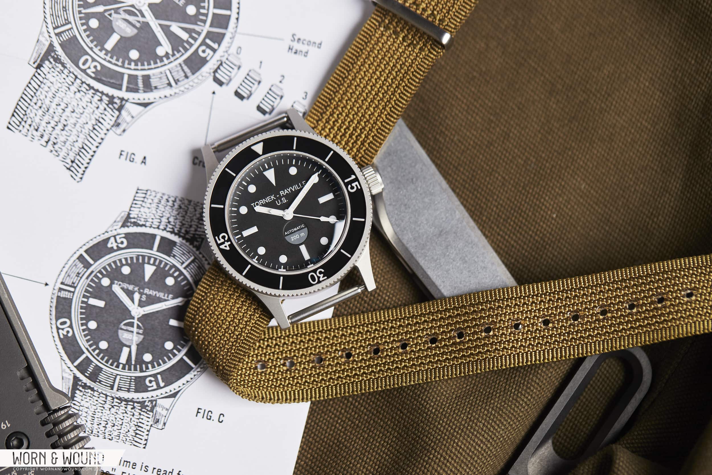
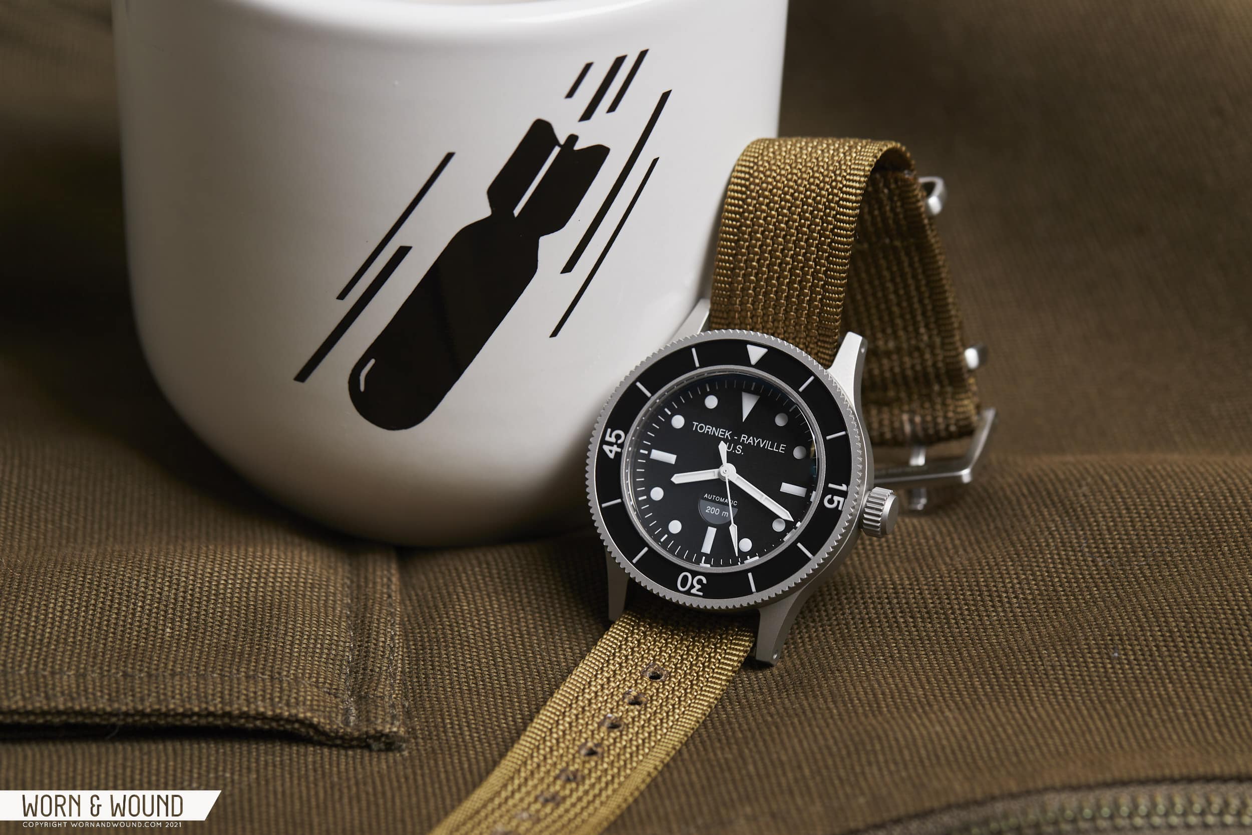
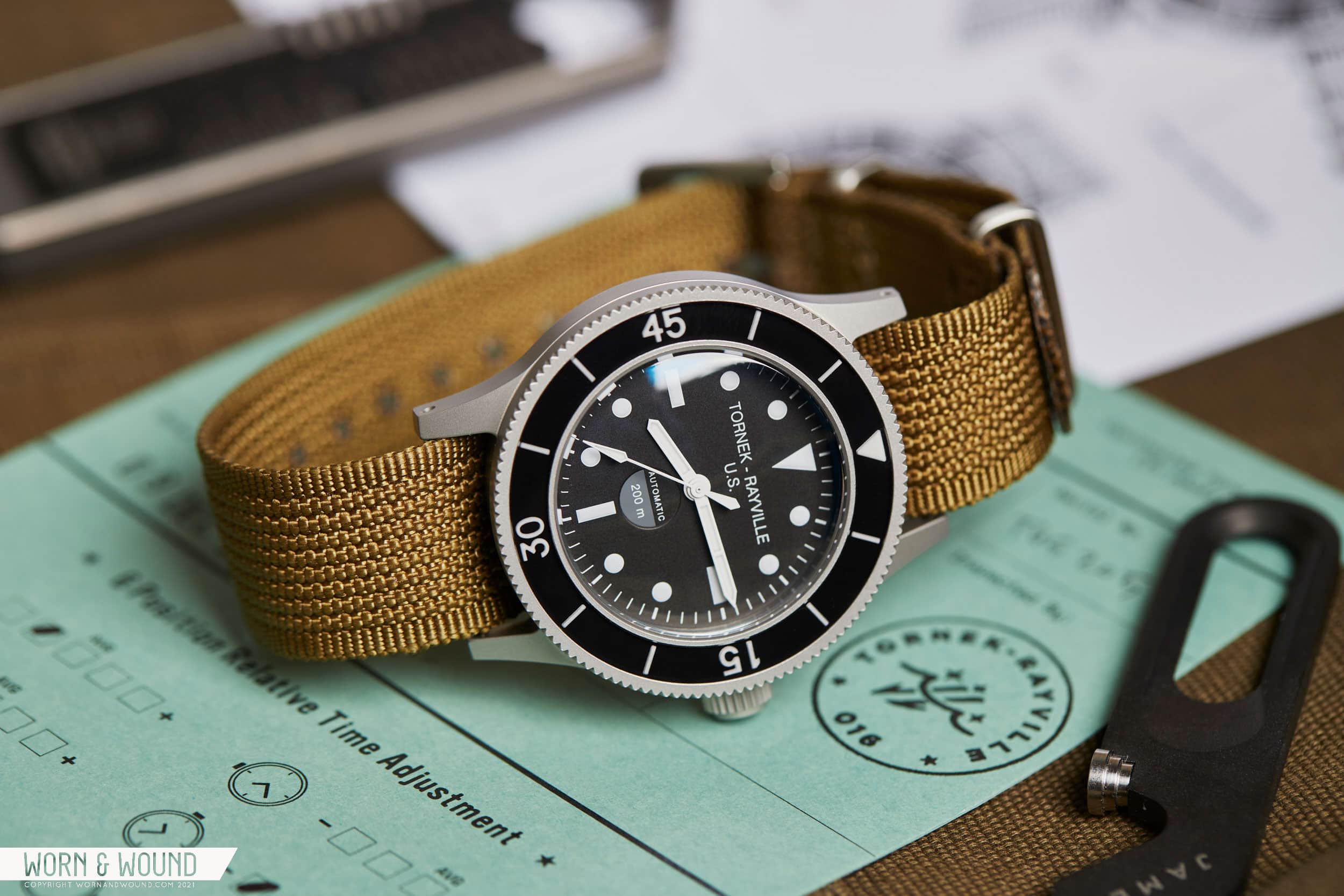
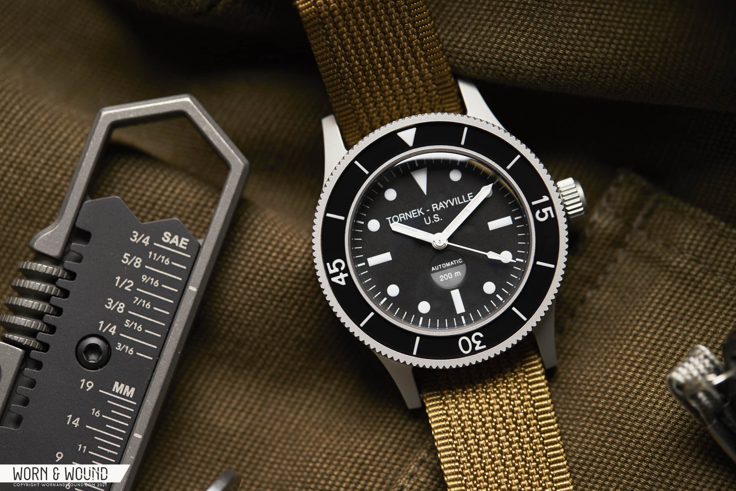
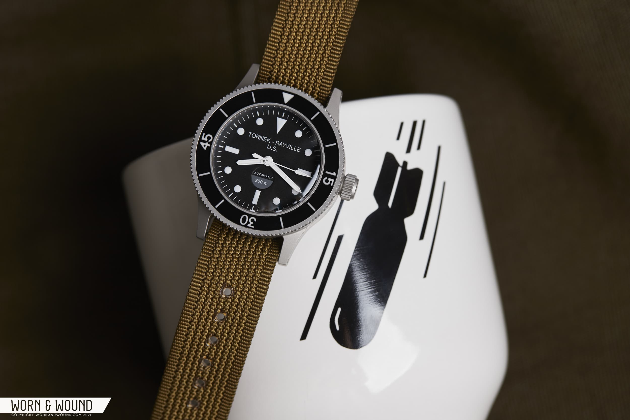
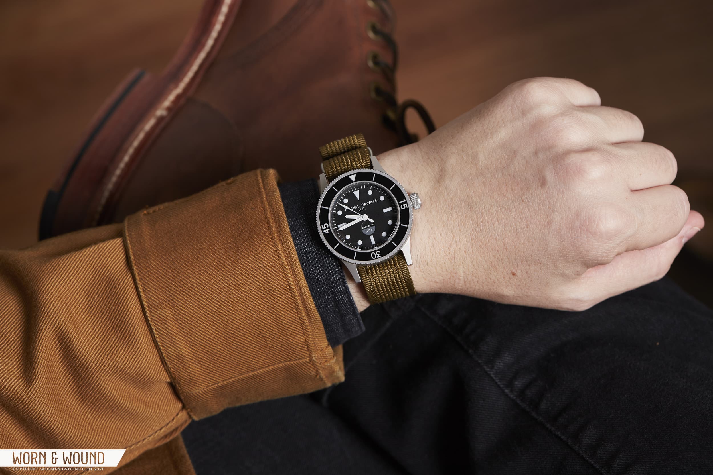
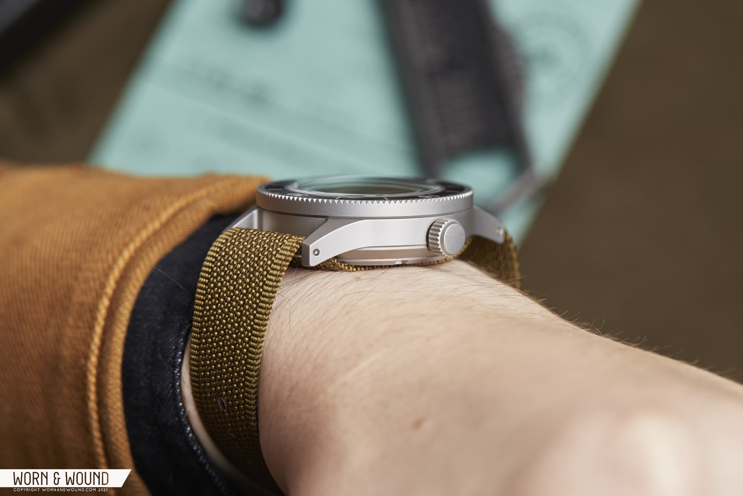
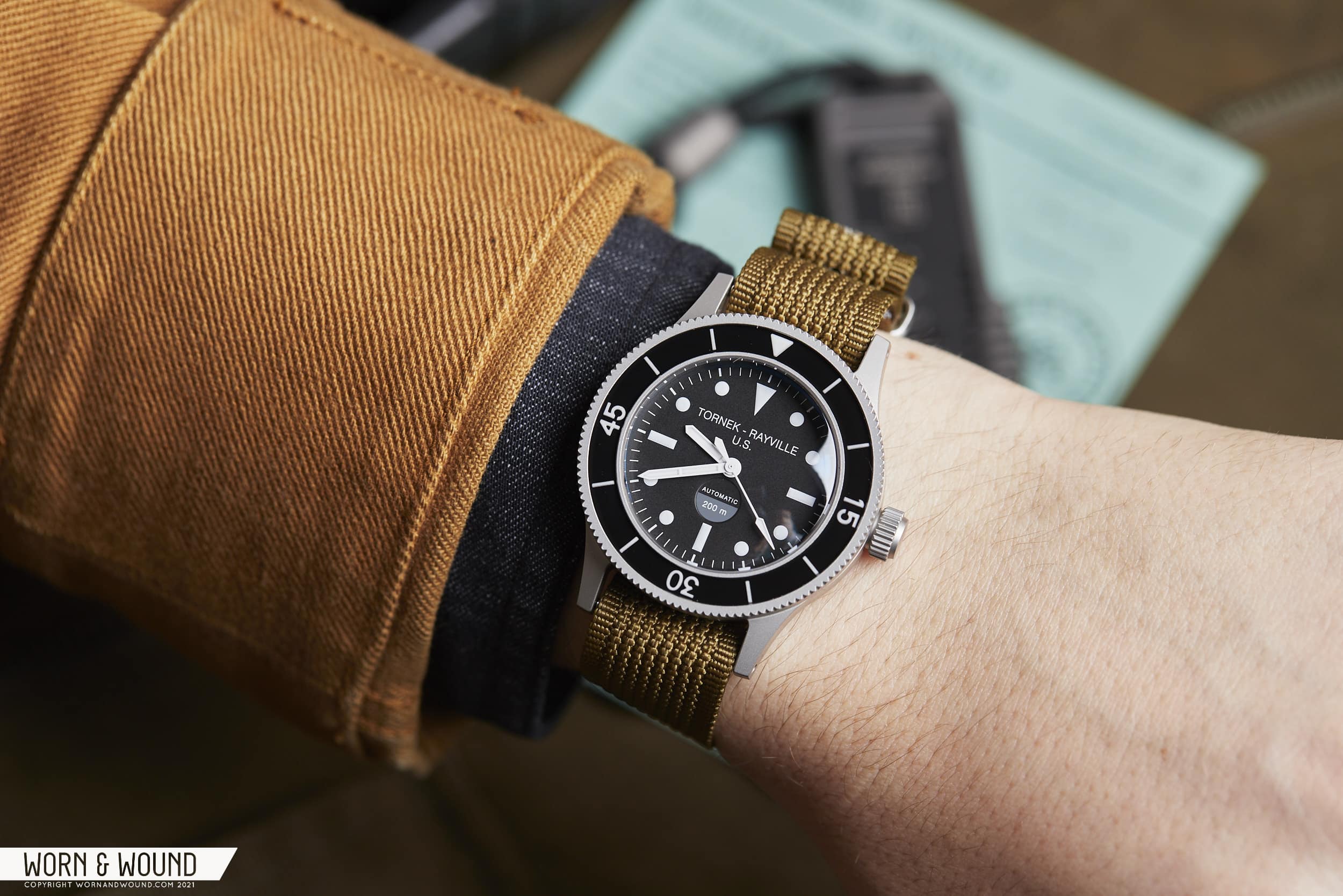
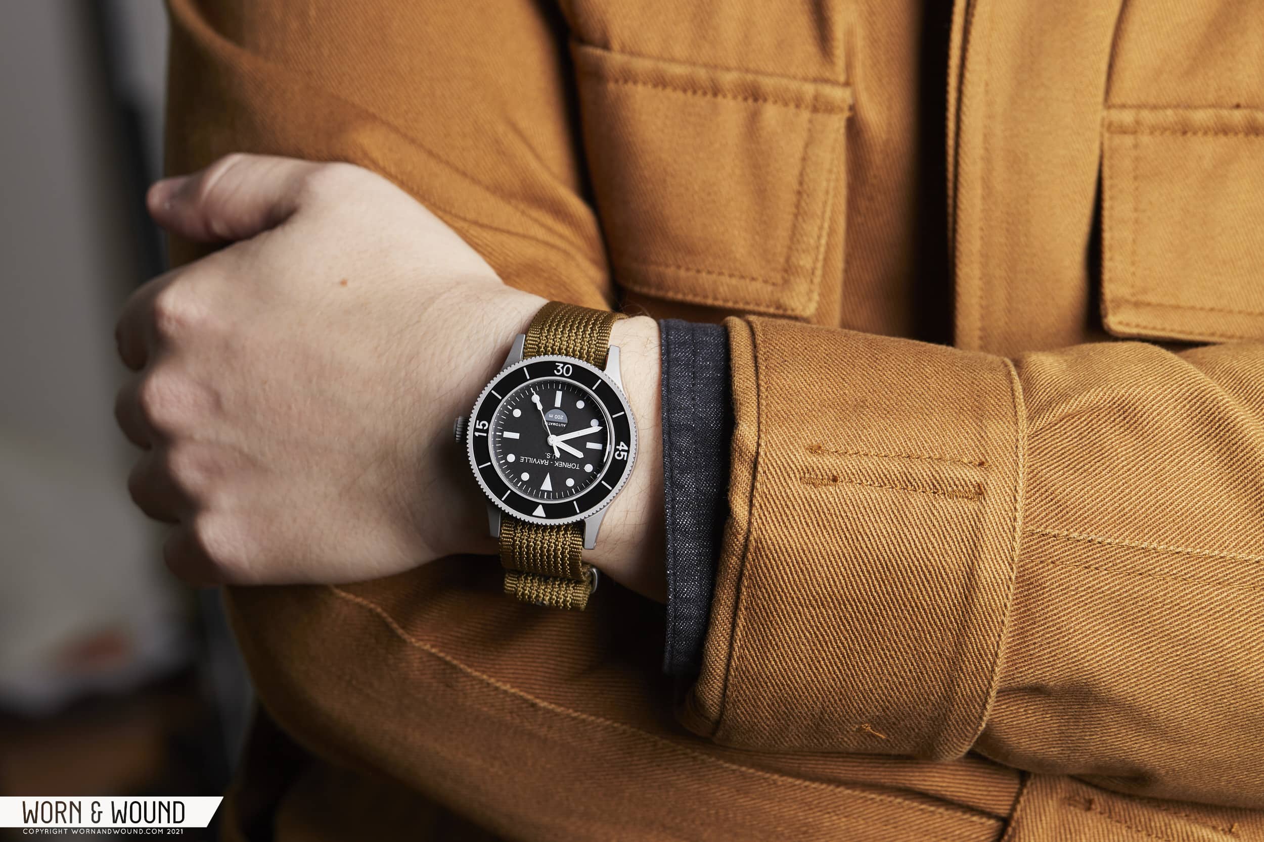
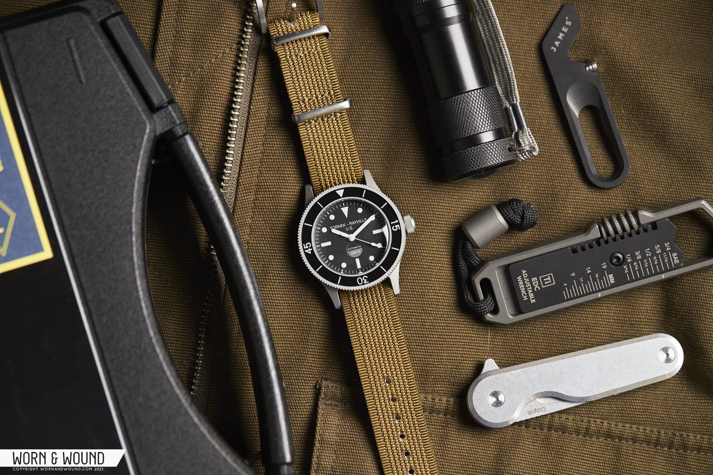
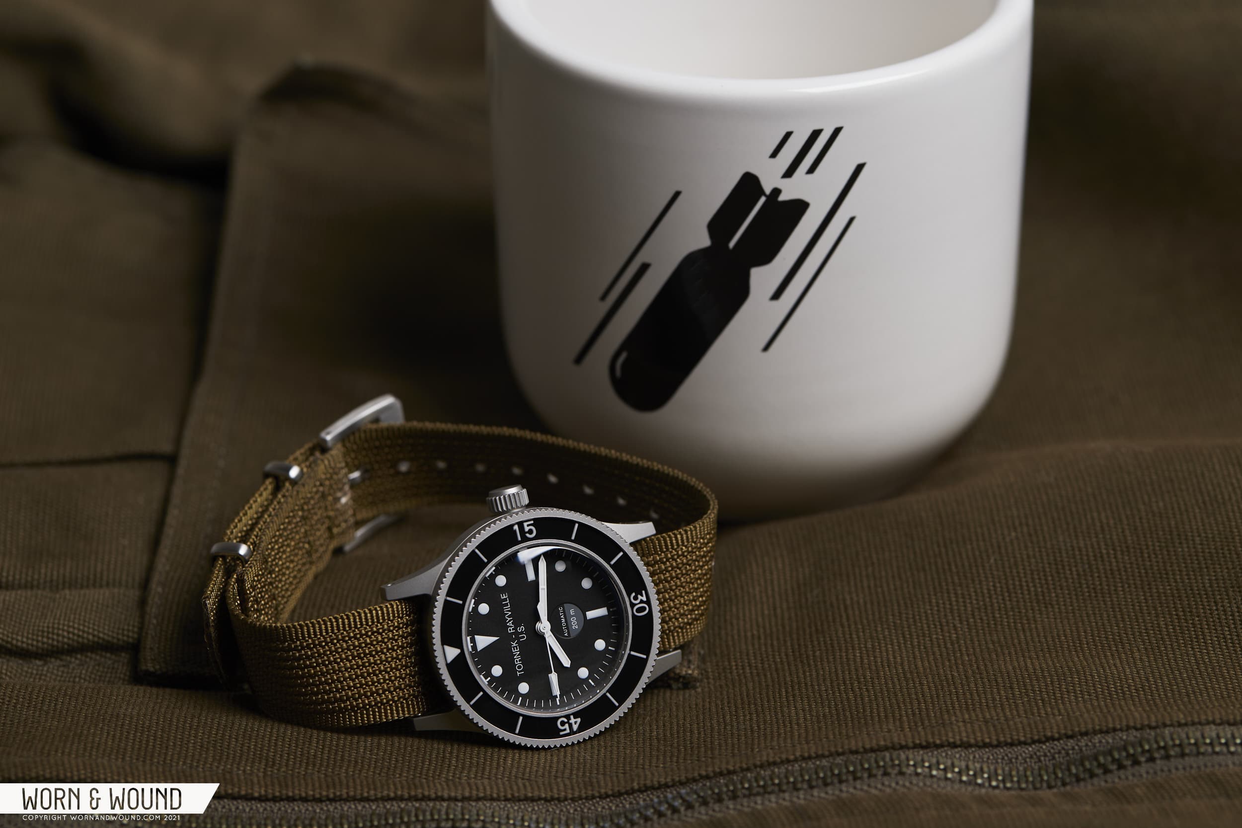
Sometimes, it’s hard to even know where to begin when reviewing a watch. Do you start with the brand? The history? The watch itself? The hype it has created? They’re all “ins”, and yet, none feel quite right for the Tornek-Rayville TR-660. While on its surface, one could describe the TR-660 as merely an homage (in the classic sense) to a historical watch by a resurrected brand name, after recently speaking to Bill Yao of MKII, and now Tornek-Rayville fame, I’m fairly certain that would do this watch a disservice. What matters isn’t the what here, it’s the why. Why remake this watch? Why do it in a certain way, paying close attention to some details, while changing lanes on others? Why bring back a brand that only existed for a moment at all? If you’re looking for a pure TR-900 homage, this isn’t it. Rather, this is the start of a new life for a brand that barely existed in the first place.

Ok, I guess some context is needed. Blake Buettner did an excellent job at telling the story of the original Tornek-Rayville, the TR-900, when this new version was launched earlier this year. Check that out here, but here’s the tl;dr – in the 1950s Blancpain’s Fifty-Fathoms outperformed other notable brands in testing by the U.S. Navy. Fast forward a bit, and the Vietnam war is in full effect. Watches are needed for the Navy’s experimental divers and demolition teams, and the Fifty-Fathoms is a great choice, except for the fact that it’s Swiss. A clever Blancpain distributor named Allen V. Tornek devised a plan to work around the “Buy American Act” by rebadging Blancpains as Tornek-Rayville and replacing some parts with locally sourced versions (evidence of which is hard to come by).

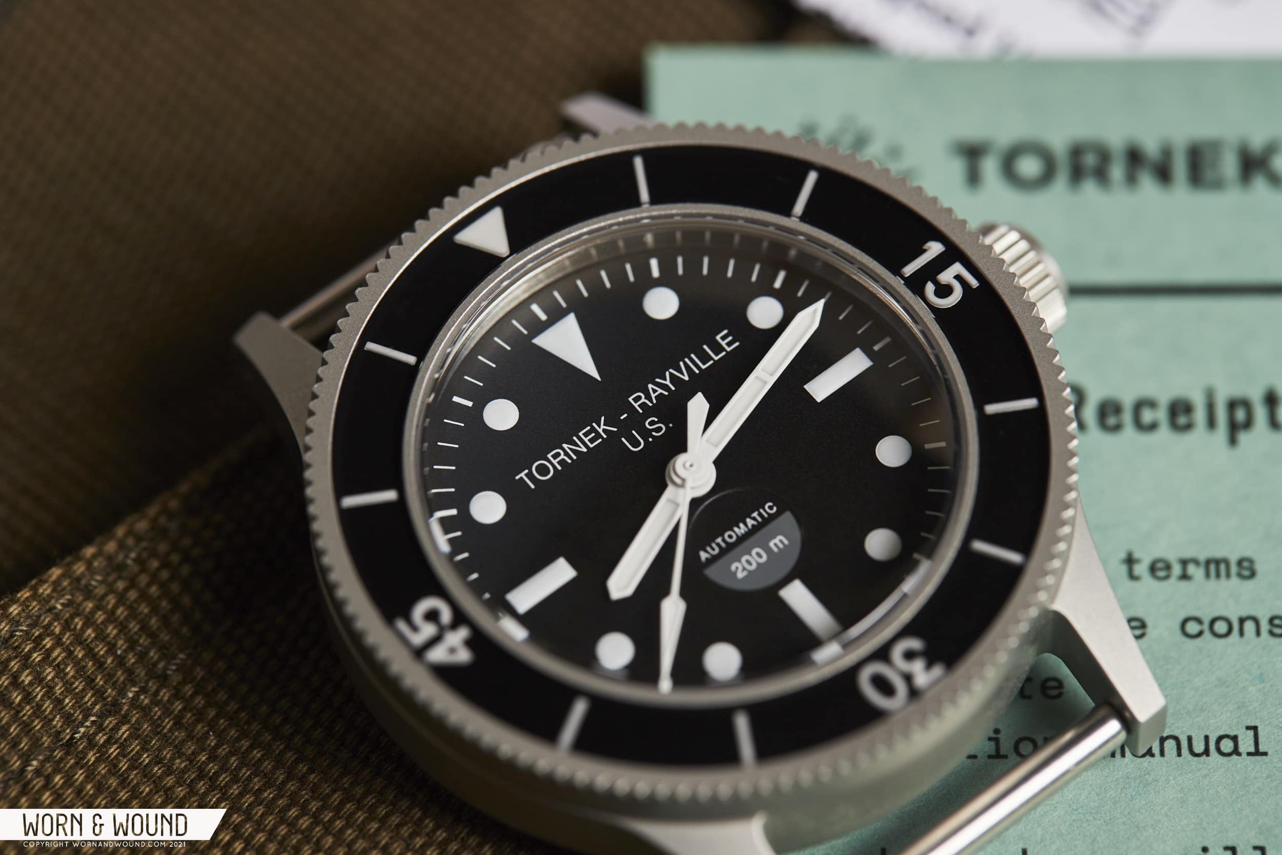
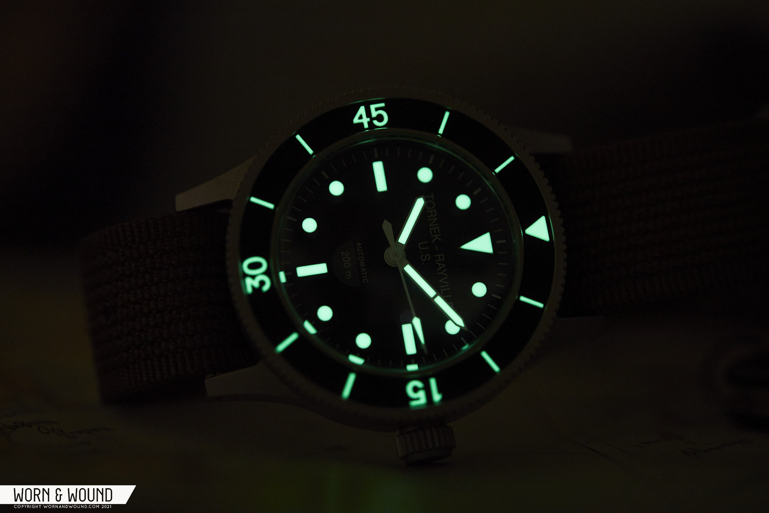
The real story is more complicated, as these things tend to be. Conveniently, Bill Yao isn’t just the owner of the Tornek-Rayville name, he’s also thoroughly a nerd for military watches, so here’s some interesting tid-bits I learned. These weren’t just rebadged watches, they were essentially made from scratch to fit a demanding military spec. Part of MIL-W-22176A was for the watches to be nonmagnetic (the back of TR-900s are labeled as such) – which is different from anti-magnetic. The watch itself, and all materials it was made from, could have no magnetic signature. So, the watches were made from special Swedish steel, the hairspring and balance wheel were nonmagnetic as well, and other components too. The lume on the dials wasn’t your standard tritium or radium either, rather it was Promethium 147, which has a half-life of only two years.

Around 1,000 of these watches were made and delivered in two batches, and few survived to this day, likely because many were destroyed once they were returned (“IF FOUND RETURN TO NEAREST MILITARY FACILITY” is emblazoned on the back). Some digging around will lead you to “sterile dial” versions, which according to MWR threads, were likely Navy-refinished TR dials, with the intent to remove the dangerous material. Regardless, vintage TR-900s fetch huge prices from the high five-figures, and even into the low six-figures (I was actually listening in to an auction at Skinner a few years ago where a TR-900 achieved a new record price. You could genuinely hear the shock in the voice of the auctioneer when the final price was settled. I was there for a Speedmaster “Holy Grail” that quickly went beyond my means).

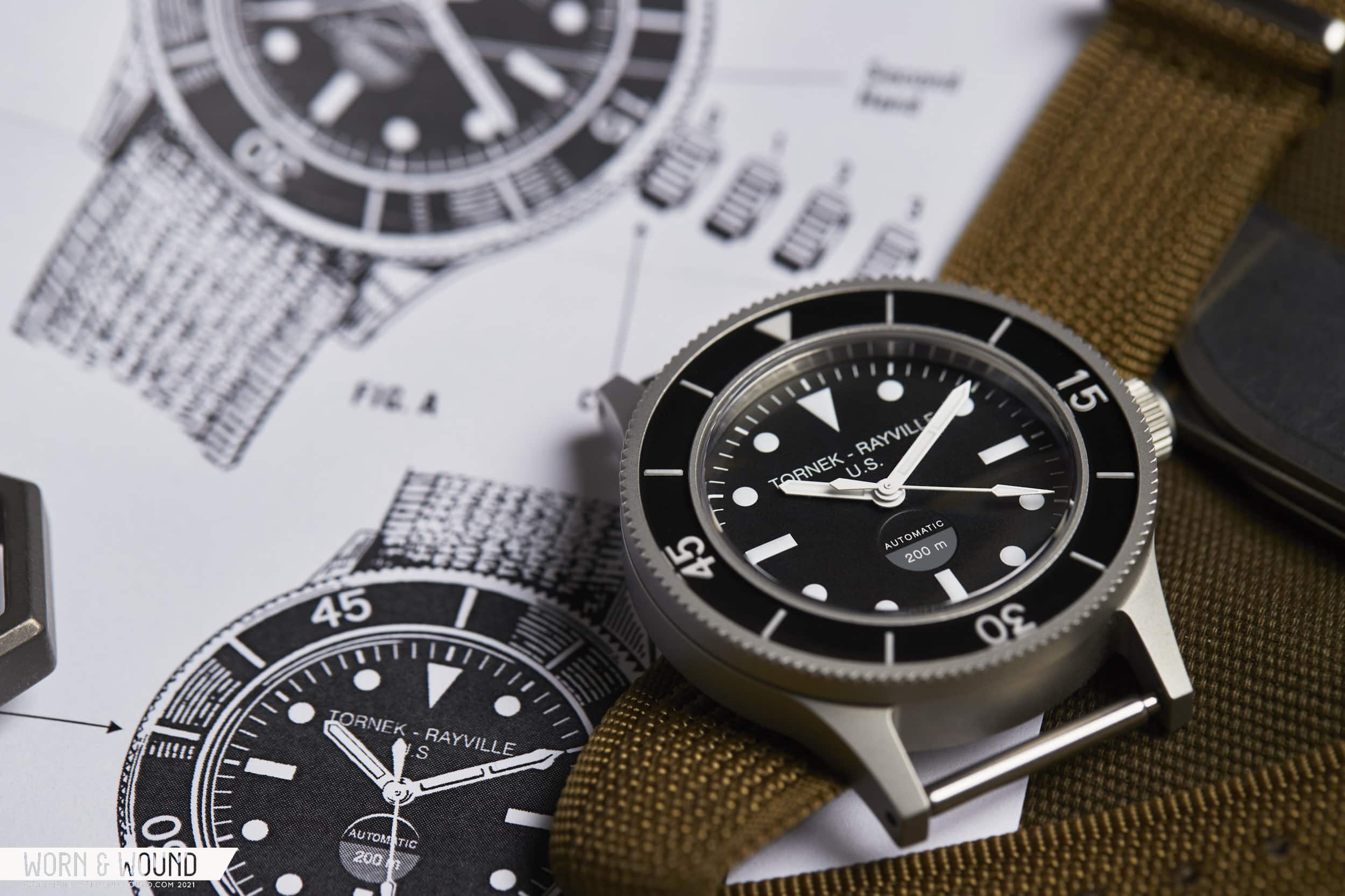
So, what’s the point I’m getting at? Well, the TR-900 is often very closely aligned with Blancpain, for obvious reasons. Yet, while the TR-900 shared a formal language with what was at the time the peak of dive watch design (and to the mil-spec), it was built differently. It was a different watch, and it wasn’t meant to be cherished. It was meant to be used as part of a series of specific equipment that was and for specific tasks and then disposed of. It was military equipment. Hell, it was dangerous. In other words, it wasn’t luxurious, and it wasn’t a luxury product. The brand only existed to make these watches, which were never available to the public. In 2010, Bill Yao released around ten 42mm MKII Stingrays with Tornek-Rayville dials (hence why the TR-660 is “Series 3”), but otherwise, the name collected dust until July 2021.

A lot of lore and mythology gets built up around historic watches. I know as Worn & Wound is part of that process. There is something undeniably fascinating about these stories. About the experimental age of watches that led us to the fairly benign, over-specced watches we wear now. These watches are historically significant. Perhaps their five and six-figure price tags are warranted as such – that’s hard to decipher. But when they were created, the goal wasn’t to be breaking auction-house records half a century later. It was to get a job done, and, one would assume, keep the soldier it was strapped to alive in the process. Moreover, it was used by soldiers from all walks of life, not just those who could afford them. This last point, frankly, is what’s most important to the Tornek-Rayville of today.

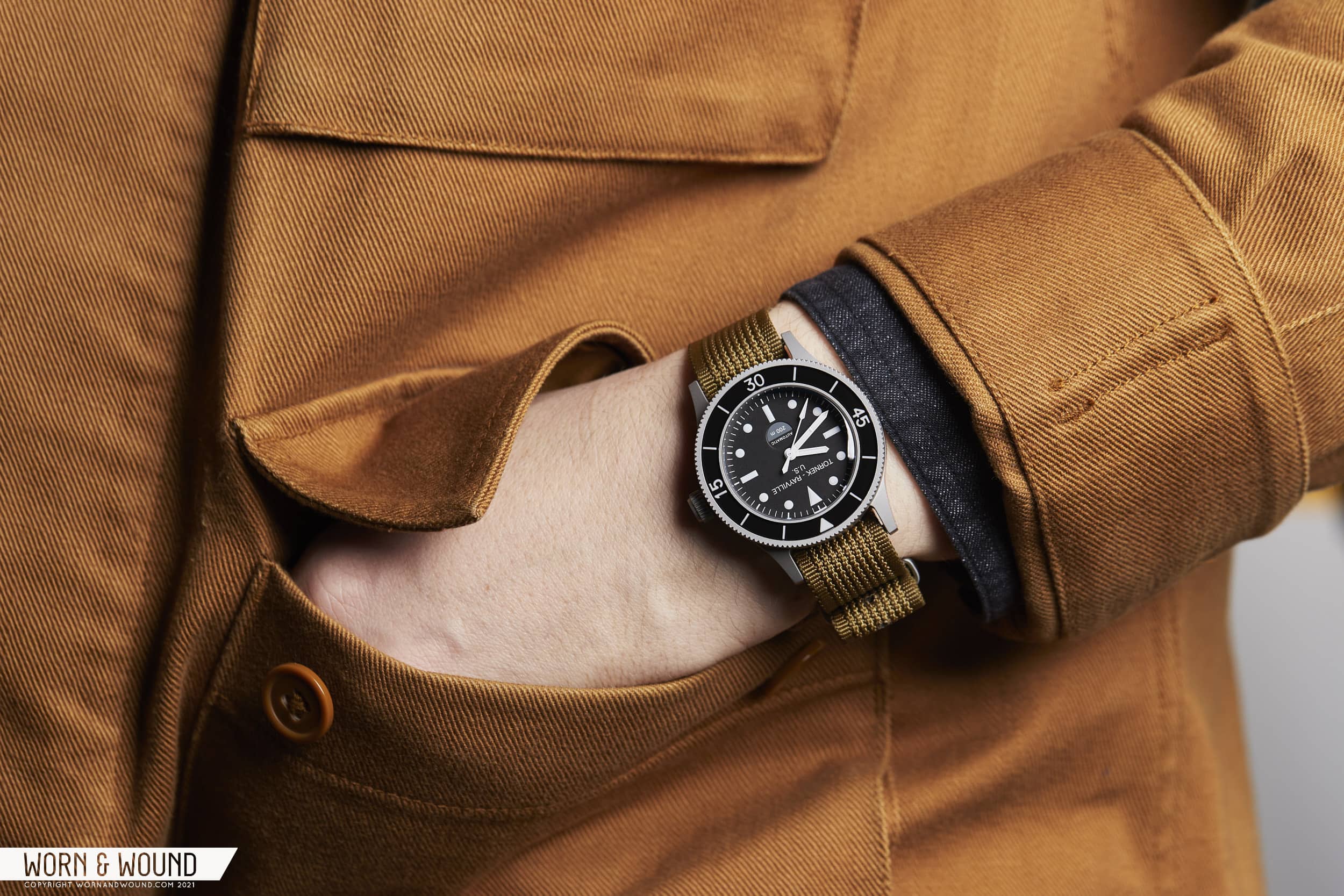
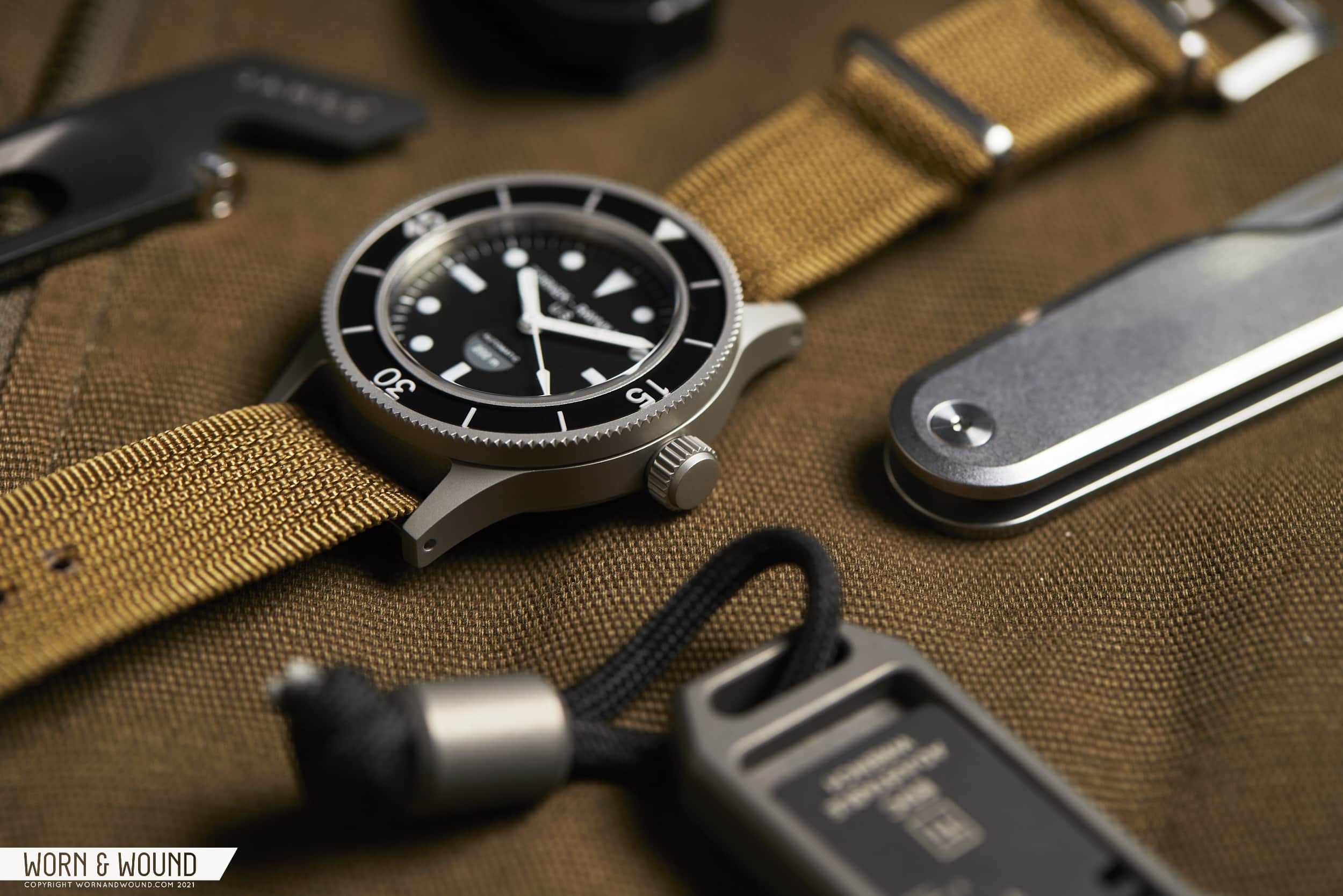
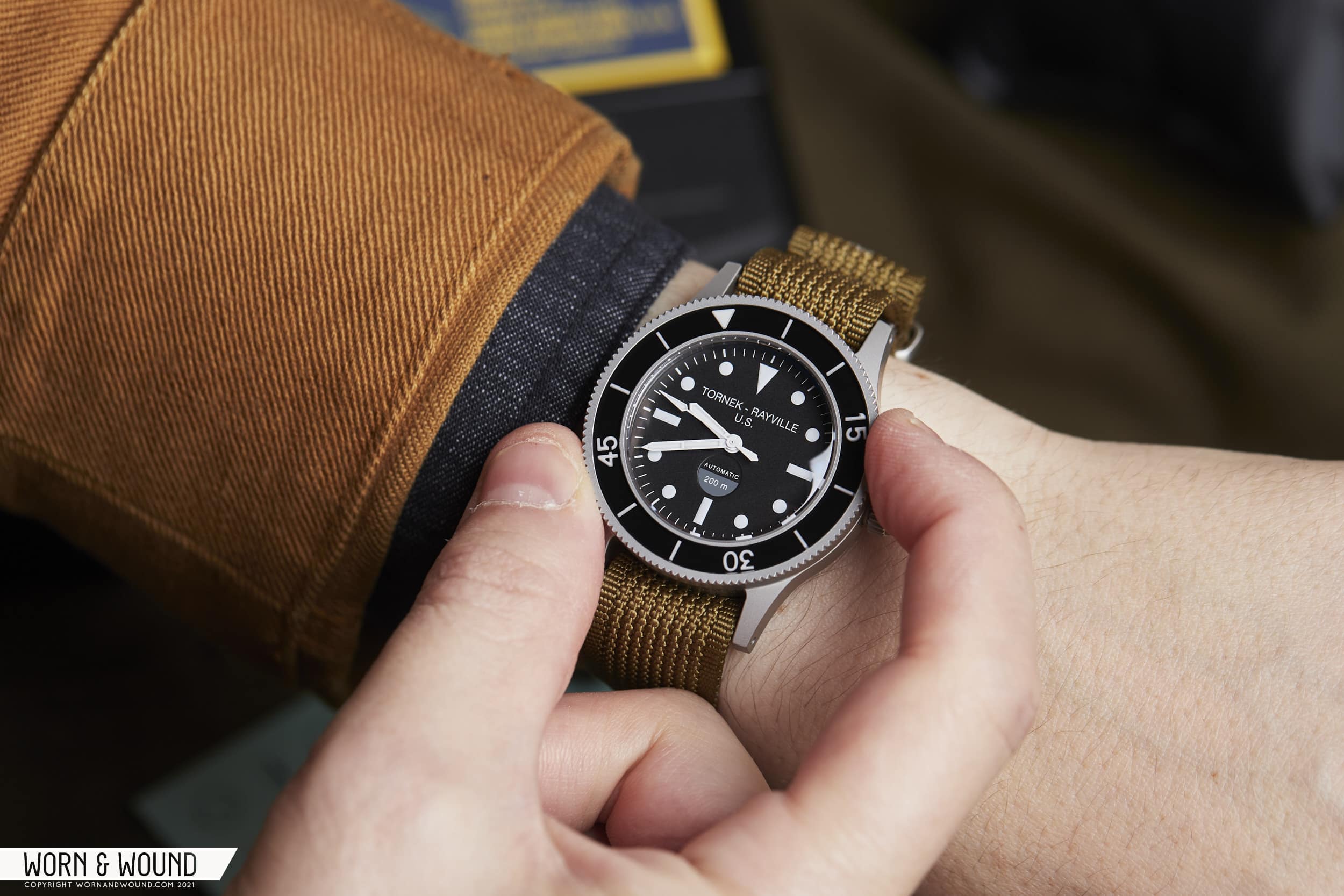
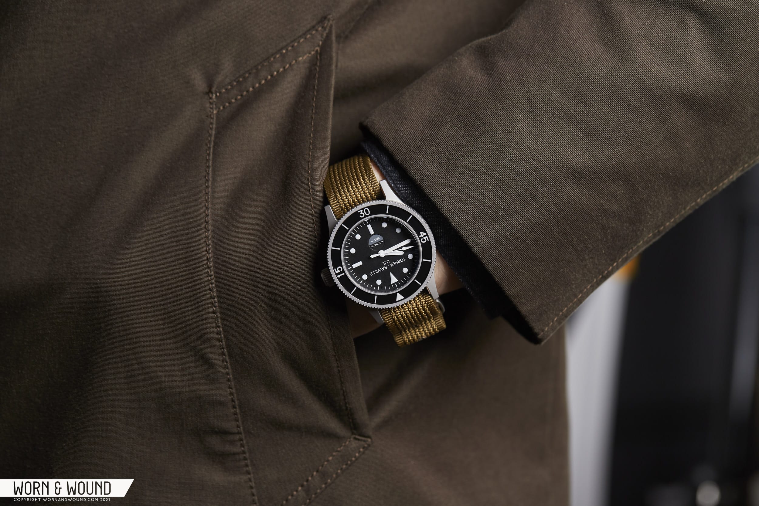
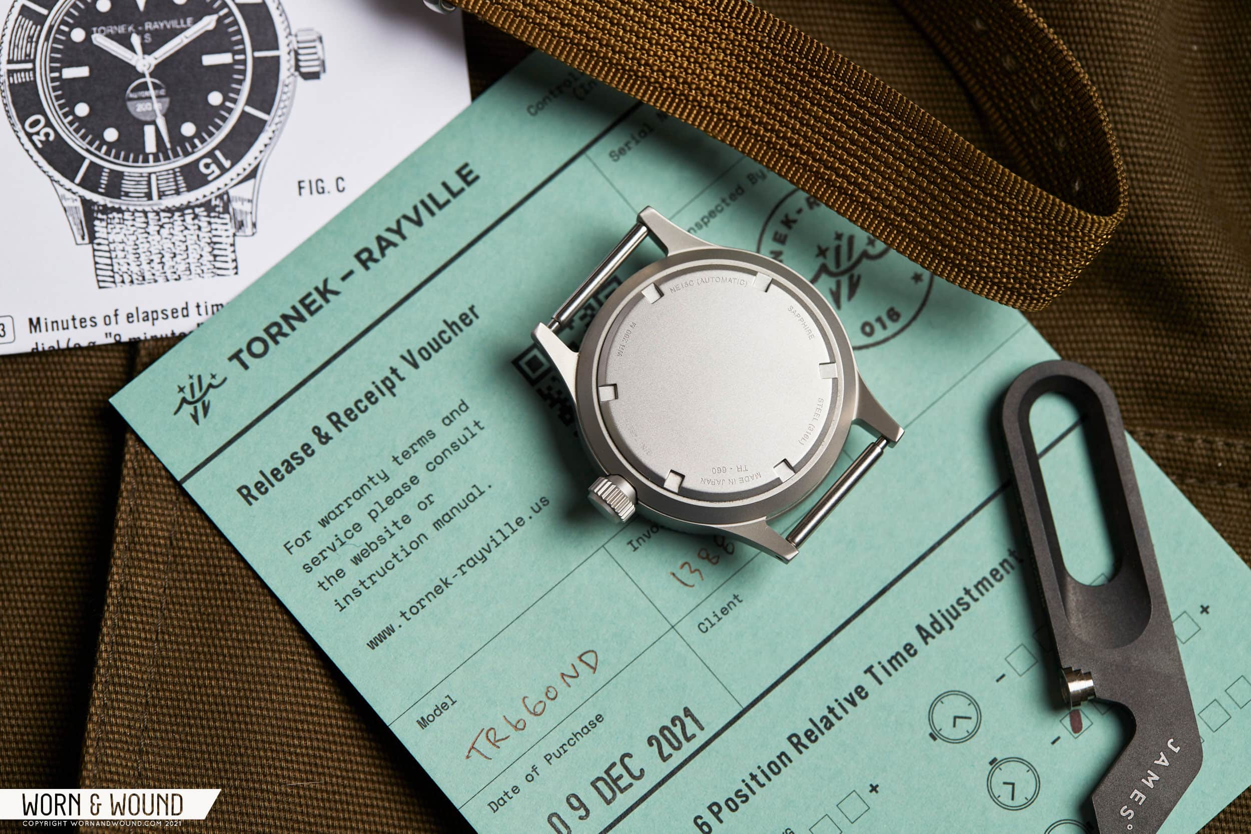
Where the Fifty Fathoms has become a luxury dive watch with a price to match, the TR-660 has remained a tool and, to quote Bill, is “only as expensive as it needs to be.” It’s meant to be reasonably accessible so that people, like the soldiers who were originally issued the TR-900, from different backgrounds can buy, wear, and actually use it. At just under $1,000, in the scheme of watches, it achieves that goal. That establishes the why, but also responds to the fact that when launched, some decried that it was made in Japan and used a Seiko NE15 caliber, rather than European manufacturing and movements.

While Swiss vs Japanese is a larger argument that doesn’t belong here (this is supposed to be a watch review, after all), those who know Bill Yao’s work know he doesn’t “cheap out”. In fact, he’s notoriously deliberate (errr, slow going) in his efforts to create the best watches possible at the price. Additionally, this isn’t a TR-900. It isn’t a replica intended to just give you the “experience” of a historic watch. It’s new. It’s building on the past, which is clear in the design (perhaps not always to its benefit), but meant to be a fresh start for the brand. One that is directed by Bill and the team – informed by the past, but not bound to it. If that doesn’t work for you, at this point there are so many brands with similar stories from Benrus to Bulova to Blancpain, that you can find what you’re looking for.

Congratulations if you made it through that intro. Now, let’s look at the damn watch.

Advertisement
$895

Review: the Tornek-Rayville TR-660

Case
Bead-Blasted Steel
Movement
Seiko NE15C
Dial
Matte Black
Lume
Arclite Super LumiNova
Lens
Domed Sapphire
Strap
Nylon or Rubber
Water Resistance
200m
Dimensions
40 x 48.5mm
Thickness
14.7mm
Lug Width
20mm
Crown
screw-down
Warranty
1 year
Price
$895

Case

You know the watch. You know the look. While not quite as recognizable as a Sub, the Fifty Fathoms and those watches born of that DNA are easy to tell apart. The TR-660 is part of that lineage but isn’t trying to trick anyone into thinking it’s its grandfather (a generation or two might have been skipped).

Starting with the case, at 40mm x 48.5mm x 14.7mm (including the gently domed crystal), it’s nicely sized, tough, stout, and a bit smaller, I believe, than the TR-900. Smaller. What a world we live in. The 48.5mm lug-to-lug goes a long way towards making it fit the wrist well, and helps balance a fairly thick profile. An interesting note here – one of the elements that got a full reconsideration was the case-back, which is a piece of solid steel that screws in via tool grips and has been given a gentle dome. This is Bill Yao adding some of his experience and design philosophies into the mix. The dome comes at the cost of increased thickness on paper, but is meant to add comfort, and lets the watch sit “in” the wrist a bit more, thus riding lower in action.

Another Bill addition can be found in the crown construction. A quick search for TR-900 images will show you that they didn’t feature seemingly very substantial crowns. They look quite diminutive in fact and exposed to the elements. For the TR-660, they went the tanky route, and I’m all for it. Measuring 7mm in diameter, it protrudes up to 4.25mm from the case but is actually sunken into the case as well. A portion of the crown screws into a recess in the mid-case, providing additional strength and protection. In other words, it’s a very robust crown.

The case is evenly bead-blasted all around for a no-fuss, but appealing finish. A brushed version would be welcome as well for those who want a less utilitarian look. It isn’t military issued anymore, after all. The lugs are drilled, and the lug width has been bumped up to 20mm from 19mm. Both of these are good calls for a commercial watch. Fixed bars are a pain (sorry Tudor), and 20mm straps are far more available. I also think the slightly wider strap adds to the overall athletic feel of the watch. One cool detail here is that the watch comes with two sets of spring bars, one “fat” shoulderless pair at 2.5mm thick, and one standard set at 1.8mm. The idea is that for pass-through straps, one would use the thicker bars, which provide a more robust platform (and won’t stretch out leather straps).

What I like about the TR-660 is also what I would criticize. It’s a severe design. The sides are flat and meet flush with the cylindrical bezel which ends with a 90-degree angle into a flat bezel. There are no bevels and the curves of the lugs almost seem like a begrudged addition because straight lugs just would have been dangerous. It’s a tool watch that’s more tool than watch.

That’s part of its charm, its look, but it also anchors it in the past. While the TR-660 isn’t meant to pass as a vintage watch, it’s not fully modernized either. It’s sort of an in-between step for the Tornek-Rayville as they bring the brand up to the future (this is my assumption, at least). Perhaps no element better shows this than the acrylic bezel insert. While an aluminum option was available, the acrylic provides a bakelite-esque charm, perhaps leaving the decision of modern vs vintage up to the customer. This is highlighted even further by being adjacent to the double domed sapphire crystal, which while likely the best choice for the watch, isn’t as accurate as an acrylic dome would have been. For the record, I like the sapphire they went with as it is optically clear from edge to edge giving a full view of the dial.

And with that said, it is simply one of the best executed bezel inserts of this type I have come across. Though simple, featuring the same reduced series of markings with numerals at 15, 30, and 45 found on the TR-900, the depth is remarkable. At an angle, you can see the sides of the lume-filled engraved regions, which adds a cool 3D effect. It also glows very well.

Regardless of the insert, the bezel features a 120-click mechanism with a decidedly smooth feel. Where some bezels feel like they pop into place, this feels more like it slides in. That’s not a knock either, in fact, I find it quite pleasant, but it’s not designed to be the loudest, poppiest bezel. Functionally, it seemed to work well in a non-dive setting. It takes just enough effort to push, and lines up with just a hint of back play.

Dial

Like the case, the dial rides between old and new. However, unlike cases, manufacturing improvements aside, the fundamentals of dive watch dials have hardly changed since the ‘60s. Dots, bars, triangles, done. Thus, in terms of the basic elements, the TR-660 is the same as the TR-900. The dial surface is flat and matte black. The main hour index consists of lumed dots alternating with bars at the cardinal points and a triangle at 12. Something I’ve always found appealing about Fifty Fathoms’ and its brethren, the TR-660 included, is the proportions of the markers. They are a touch small and thin, at least compared to Submariners, giving the dial a little more breathing room.

Around the edge of the dial is a minutes/seconds index of small white dashes that are thicker at intervals of five. Pretty standard stuff. Just below twelve in an intentionally generic type is the Tornek logo/stamp with “US” on a second line. The overly wide and plain logo is part of the charm of the TR-900, should you find it charming that is. This seems like the right choice for the first new watch from the brand, but I do wonder if a more subtle and appealing logo would be good moving forward (there is actually a second logo/design in use on their site, but I’ll get to that later).

Above six, things get a bit more complicated. On the TR-900, as per the mil-spec, was a circular moisture indicator. For various reasons, not the least of which is that atmospheric moisture does get into watches and can affect an indicator, this feature was left out of the TR-660. In its place is a circular depression that is blank on one half, and filled with a cool gray tone on the other. In the top region, “automatic” is printed, while “200 M” is printed on the gray (as though submerged in water).

I find myself quite conflicted by this whole thing. I’m glad the moisture indicator isn’t there. As something on a vintage mil-spec watch, it’s a neat part of the story. On a modern watch, it’s a novelty (this isn’t Sinn’s capsule which actually removes moisture, after all). So to sort of half-suggest it is odd to me. On one hand, they are nodding to the TR-900, which a certain customer definitely might like. On the other, had the moisture indicator not been on the TR-900, this is not how they would have put that text there. The circle serves no real purpose and sort of clutters the lower half of the dial. Like aspects of the case, it feels stuck in between homage and moving forward, and thus indecisive.

Moving on to the hands, you’ll find a set of fence posts for the hour and minute that stay very true to the original. Thin, and rendered in white, they are function-first in an appealing way. Like other mil-spec dive watches, the minute hand features a split line, which becomes more apparent in the dark. The seconds hand, also in white, is a bit more decorative with a long arrow tip and a flared counterweight.

Despite my conceptual concerns around the graphics at six, I do think this is an effective and well-executed dial. While the harshness of the case might lead to a less ergonomic experience, the severity, and crispness of the dial work towards better legibility. While a well-printed dial is hardly rare these days, when compared to the globbed-on paint of the TR-900s, the TR-660 does look decidedly more new. Also, the choice of “Arclite” Super-LumiNova, which is ever-so-slightly off-white, was the right choice. Though I’m not opposed to fauxtina lume, it would have been too fake in this context.

Advertisement

Movement

Inside of the TR-660 is the SII (Seiko Instruments Inc.) NE15C Japan-made automatic movement. Featuring 24-jewels, hacking seconds, date (not in use), hand-winding, a power reserve of around 50 hours, and a frequency of 21,600 bph. The NE15C is essentially the private label version of the 6R15. Though sometimes shrugged off as less accurate than 2824s and the like with a -15/+25 sec/day from the factory, it’s important to note that Tornek-Rayville adjusts each movement individually to their own spec and sends a card with time adjustments noted. They also note that it is superior in power reserve and accuracy to that which was found in the TR-900s, which is hardly a surprise.

Straps and Accoutrements

The TR-660 comes with a “Nytex Type I-M2” strap of the brand’s own creation. Inspired by a mil-spec from the ‘60s, it’s a woven nylon with a pronounced pattern, cut in a single-pass style. The one on the watch reviewed was in a “khaki” that sort of rides the line between beige and olive (British khaki). After years of pretty flat nylon straps, seeing one with a strong weave pattern is very appealing. That said, it’s not particularly soft nylon, at times irritating my wrist, and it’s a touch under 20mm, leaving just a hair of spring bar visible, which I don’t love either.

Additionally, the watch comes in a plastic case with a foam insert that can accommodate up to three watches, as well as the spring bars mentioned earlier, and some printed materials. The latter are the most interesting part. Printed in black on green card stock is Tornek’s “Controlled form S 1088” which is essentially their version of a warranty card. It has some info about the watch, the date it was purchased, customer name, etc, as well timing adjustment information in 6 positions. It’s a nice alternative to the plastic warranty cards you often find with a watch, look at for a second, then shut in the box for all eternity.

Perhaps the more fun doc is the “operating instructions” which are a spiritual recreation of what would have come with the TR-900 (as seen here). It’s a basic set of instructions with some amusing copy, particularly about NOT being radioactive, and includes a series of detailed illustrations that were recreated based on the originals, including their semi-wonky sense of perspective.

As mentioned before, one thing you’ll also find on these documents as well as on the Tornek-Rayville site, and their strap buckle, is a curious symbol that is being used as a type of logo. An adaptation of the non-magnetic symbol found on the back of the TR-900 case, which is a Mu symbol with an arrow through it, the new logo is a set of waves with two arrows cutting through, and stars above. The idea is that it’s meant to represent what the watch was originally used for, with two divers submerging in the water during the night for covert purposes. It’s simple, elegant, tells the story and riffs on part of the original watch. To me, this represents the right approach for the future of the brand – interpretation, not recreation.

Wearability

Despite a lack of ergonomics or much in the way of curves, the TR-660 is enjoyable on the wrist. It’s unabashedly a tool, as already determined, and looks it. It’s a matte metal cylinder that just stands up and off the wrist. Yet, it’s fairly well-sized, so it doesn’t over-extend or cause any discomfort on my 7” wrist. That said, the thickness is noticeable, particularly under a sleeve in the fall/winter, and on pass-through straps that raise the watch up even more.

But, let’s be honest, this, and likely any other mid-century-styled diver isn’t a watch you’re looking at for comfort first. It’s about the looks. And this watch looks great. The severity of the lines, the darkness of the bead-blasted metal, the depth of the gloss bezel, it’s striking on the wrist, if still completely understated. It has the purposefulness of a military timepiece with the cool-factor of a vintage diver. On the Nytex strap it comes with or a rugged leather strap, it has an undeniable style. To be honest, I think it would look awesome dressed up a bit too.

Conclusion

I probably made this review a lot harder to write than I needed to. It could have been as simple as this: if you know what a TR-900 is, can’t get one (naturally), and want a watch you can actually wear outside or underwater, the Tornek-Rayville TR-660 is what you want. It’s updated just enough for durability and practicality while holding on to elements that will keep the brand’s history still present. It’s very well-priced at $895, well built, has the “right” name on the dial, and looks good. Fin

But, I can’t help myself. While the above is certainly true, I’m also interested in this as the first step for a new brand. A brand that never sold a watch to the public until now (more or less). A brand that was as insider as it gets, now moving more mainstream. While the TR-660 is a great start, I do wonder how the brand and watches with this DNA will evolve. Can they step away from the past and become more of their own thing?

I can’t help but think about the Seiko SPB149, and how it reinterpreted the 62MAS as a modern watch. Cues are there if you’re looking for them, but someone who approaches that watch without prior knowledge can like it as a contemporary diver. I’d like to challenge Tornek-Rayville to think in these terms, as there have been many revived brands over the last few years, but very few seem to be able to think past their archives. And, simply put, I’d like to see them succeed where others have not or yet to.

But, as for the Tornek-Rayville TR-660, to put a bow on it, for those of you who are likely waiting on your watch to arrive who bought it sight unseen, you’re going to be happy with what you get. For those debating the TR-660 vs the plethora of other military and vintage-inspired divers, I think it’s a compelling option, if you’re looking for something in this style, and are willing to wait for it to be in stock. Tornek-Rayville


Recommended reading:
In-Depth: Diving with a Vintage Tornek-Rayville by Jason Heaton
Autopsy of a Cult Watch: The Tornek-Rayville by Amanico

Images from this post:
Related Reviews
Zach is the Co-Founder and Executive Editor of Worn & Wound. Before diving headfirst into the world of watches, he spent his days as a product and graphic designer. Zach views watches as the perfect synergy of 2D and 3D design: the place where form, function, fashion and mechanical wonderment come together.
wornandwound zsw