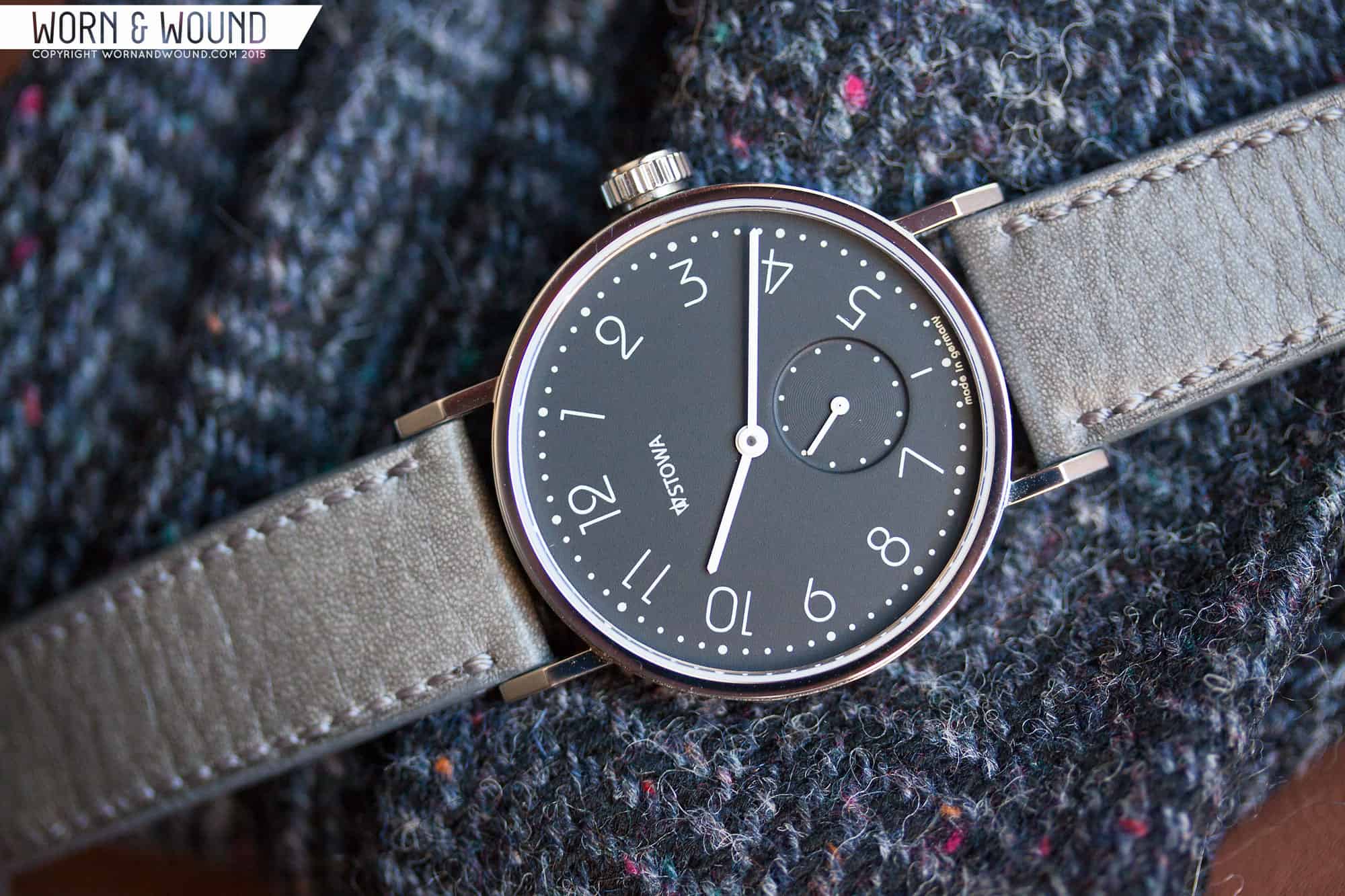
Stowa Antea Back to Bauhaus Review

Around this time last year, Stowa released the Antea “back to bauhaus” series. The “b2b” was an offshoot of the classic Antea line, which itself pulls inspiration from a watch Stowa first produced in the 1920s. The b2b was yet another product born of the collaboration between Stowa and famed German designer, Hartmut Esslinger, who also designed the Rana and Stowa’s new logo.

The b2b series was not without controversy, however. Some longtime Stowa fans were puzzled by the release, questioning Schauer’s direction for a brand that had for nearly 20 years produced timepieces based on tried-and-true designs from its historical catalogue. The trepidation online was also likely compounded by the fact that Stowa had recently made other changes that proved to be divisive, with the most obvious example being the aforementioned logo redesign.

STOWA_ANTEA_B2B_DIAL8

Others–and I include myself in that group–were intrigued by the release. Few reservations aside, I liked the concept on paper, especially the myriad of color options and the dial redesign, but I have to admit that the press release photos left a lot to be desired. Nevertheless, as a huge fan of both Stowa and Mr. Schauer, I wanted to reserve judgment until I saw the collection in person. That was finally realized at Baselworld 2015, and with the watches on wrist, any lingering concerns quickly dissipated. We knew that we had to get one in for review.

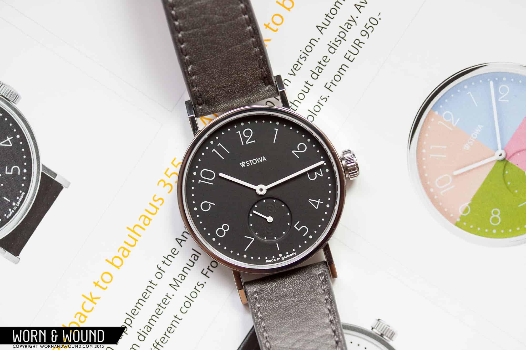
The b2b series comes in three primary styles: the 355 features a 35.5mm stainless steel case and is powered by an ETA/Peseux 7001 top grade movement, and both the 365 (36.5mm case) and the 390 (39mm case) variants come equipped with an ETA 2824-2 top grade movement available with or without date. All three styles exist in 6 distinct colors: black, white, brown, green, blue, and pink. The watch being reviewed today is the black 355 currently available from Stowa for €950, or €798,32 (approximately $850) excluding V.A.T. for those of us outside the European Union. Let’s take a closer look.
Advertisement
$850

Stowa Antea Back to Bauhaus Review

Case
Stainless Steel
Movement
Peseux/ETA 7001 “top-grade”
Dial
Matte Black
Lume
N/A
Lens
Flat Sapphire Crystal with AR
Strap
Leather
Water Resistance
30M
Dimensions
35.5 X 44.6mm
Thickness
6.8mm
Lug Width
18mm
Crown
Pull Out
Warranty
2 Years
Price
$850

Case

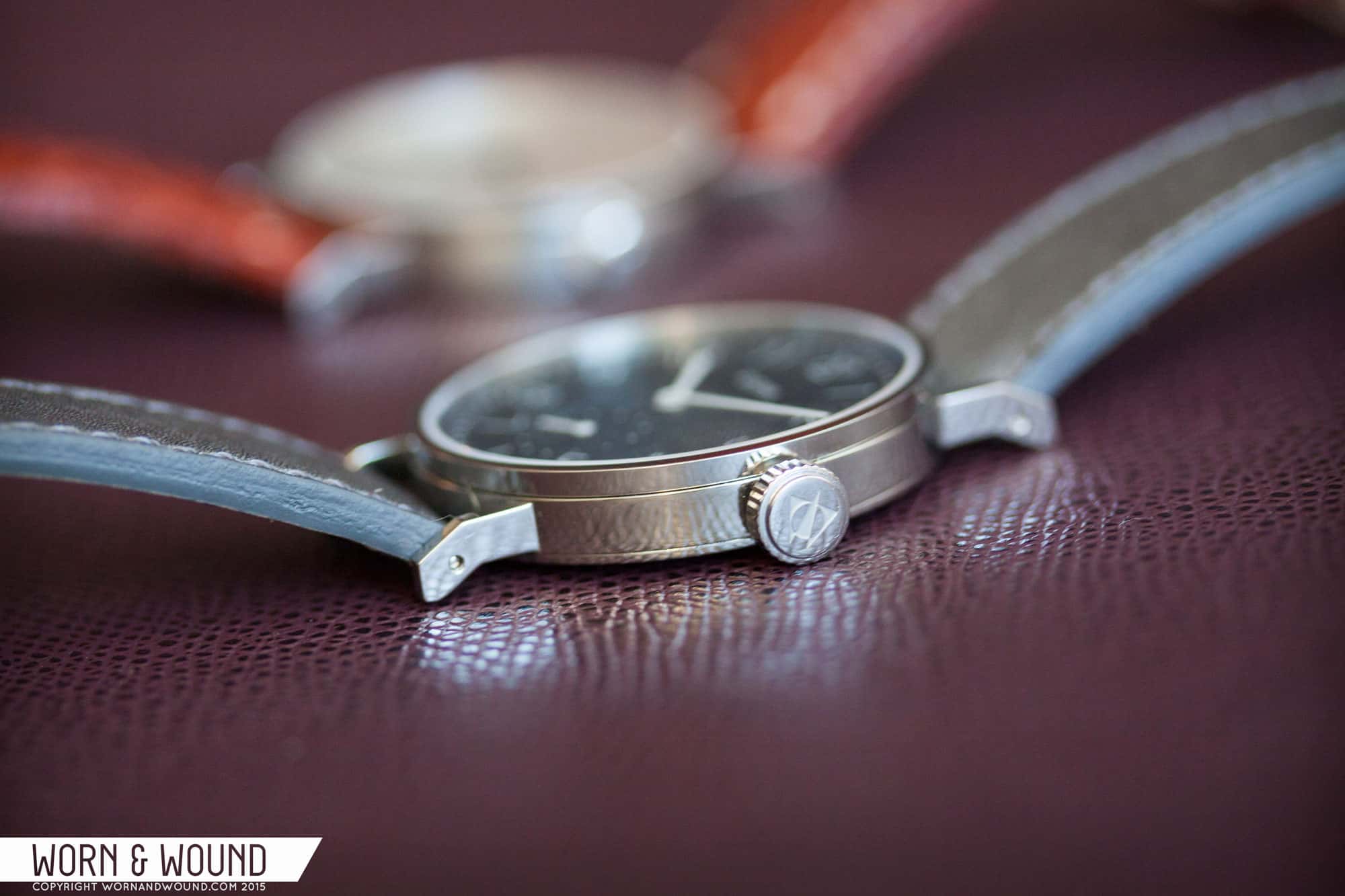
Esslinger left the Antea case largely intact, so it’s basically the same one you’d find on the classic Antea KS model, which comes in at 35.5mm wide with a height of 6.8mm and a lug-to-lug length of approximately 44.6mm. In my review of the Antea KS, I wrote:

“…the Antea KS is a masterclass in minimalist design. Eschewing many modern design cues, the Antea instead favors straight lines and hard angles: the sides of the case go straight down, the flat sapphire crystal is enclosed by a level bezel that is slightly narrower than the mid-case, and the lugs are angled batons jutting out from the sides of the case. From the top down, the case forms a perfect circle (lugs aside). From the side, the angled lugs emphasize the severity and intricacy of the design. All elements of the 3-piece stainless steel case come together seamlessly and are anchored by a beautiful high polish finish.”

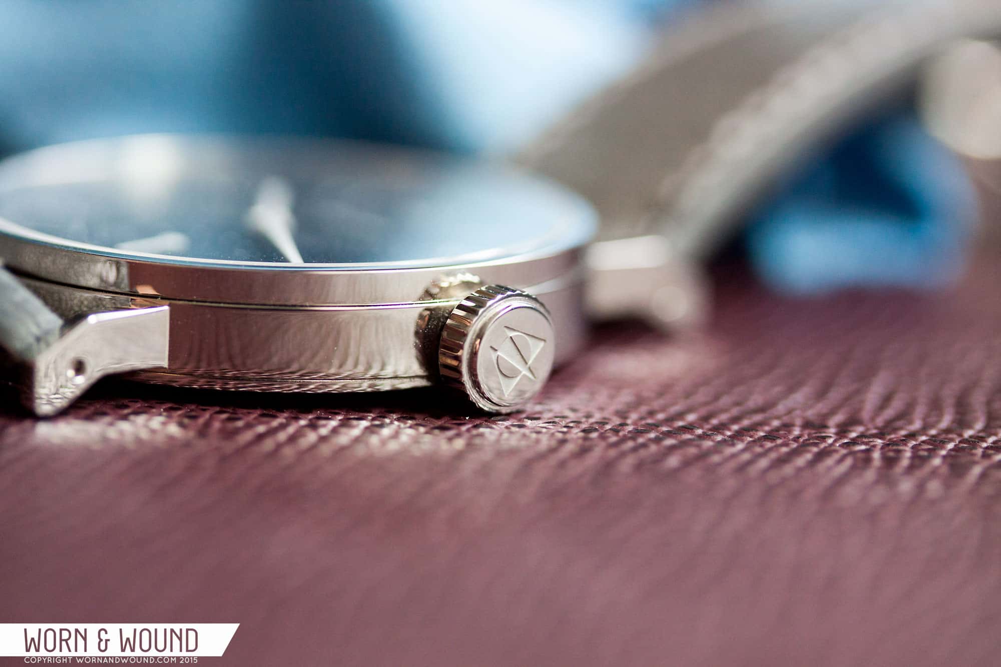
My assessment when Stowa first released the b2b line was that it needed a different case, perhaps something a touch softer to match the new dial. But in person, the contrast between case and dial works exceptionally well, giving the watch a modern touch while firmly grounding it in the brand’s storied roots. In retrospect, I am glad Stowa left the case as is. With that said, there is one significant change: the crown. Stowa has included a larger crown on the 355 for easier grip when winding, and they intend to standardize it across the Antea and Partitio lines.

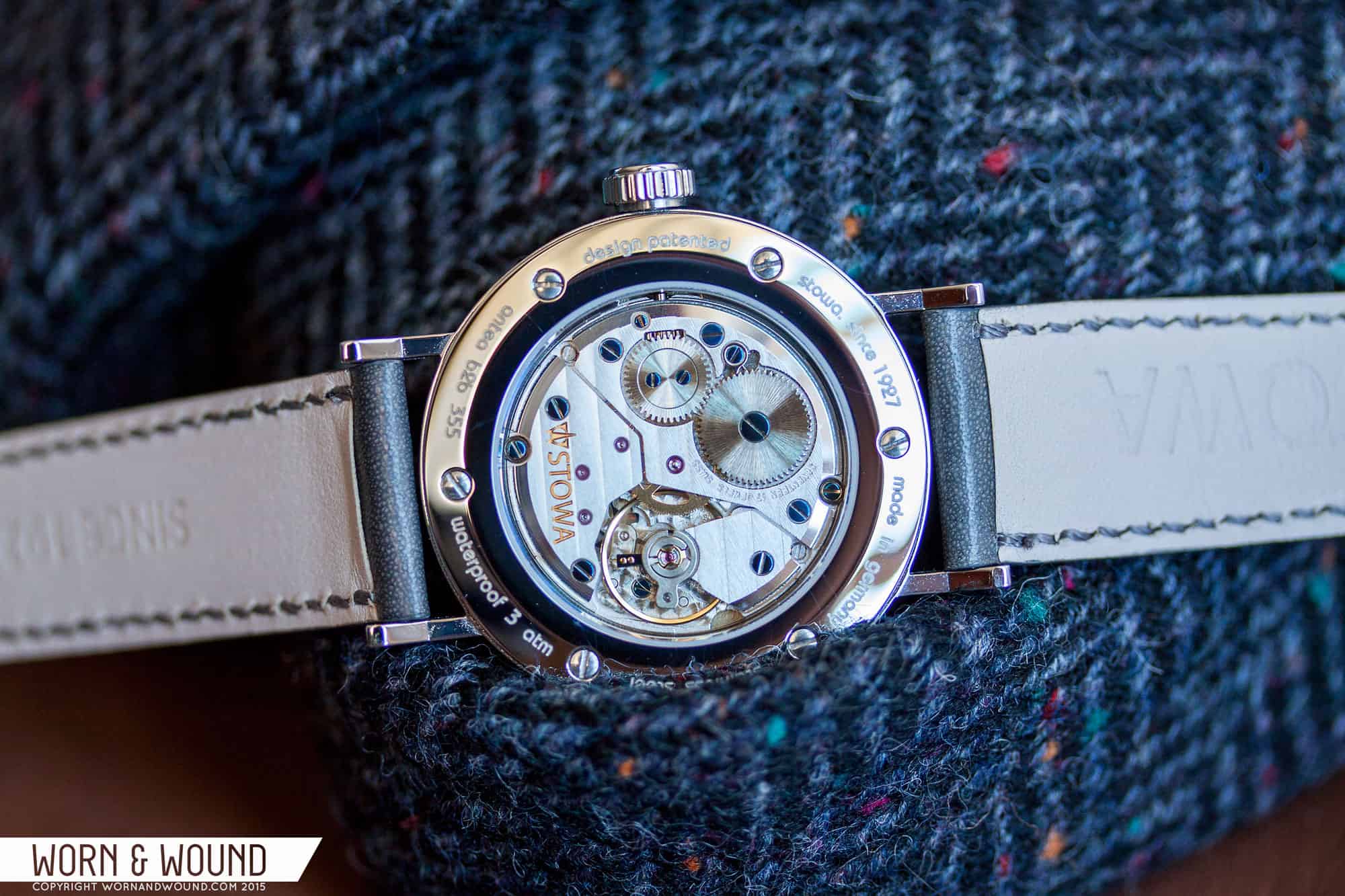
Flipping the watch around, the case back lays out all the specs and features a sapphire crystal showcasing the finely finished ETA/Peseux 7001 movement. This is the same movement used by Nomos before they developed their alpha caliber based largely on the design and architecture of the 7001. The case back is secured with 6 small screws.

Dial

As I previously mentioned, the initial announcement of the “b2b” series was met with some trepidation, with the sticking point obviously being the dial. Indeed, at first glance the redesign–with its quirky numerals and the enthusiastic use of color–does appear to be a huge departure for a brand that has been historically conservative. But the more I thought about it, the more the move made sense, and finally after handling the watches and spending a few weeks wearing one I grew to love the b2b series.

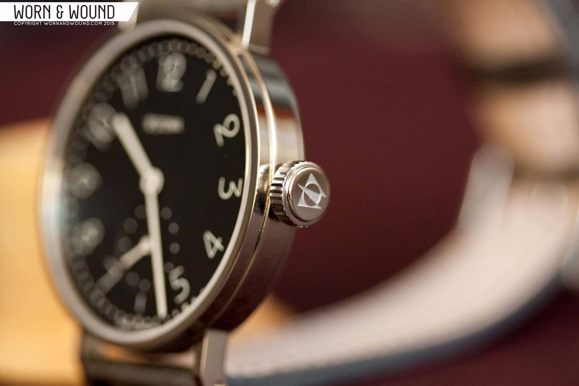
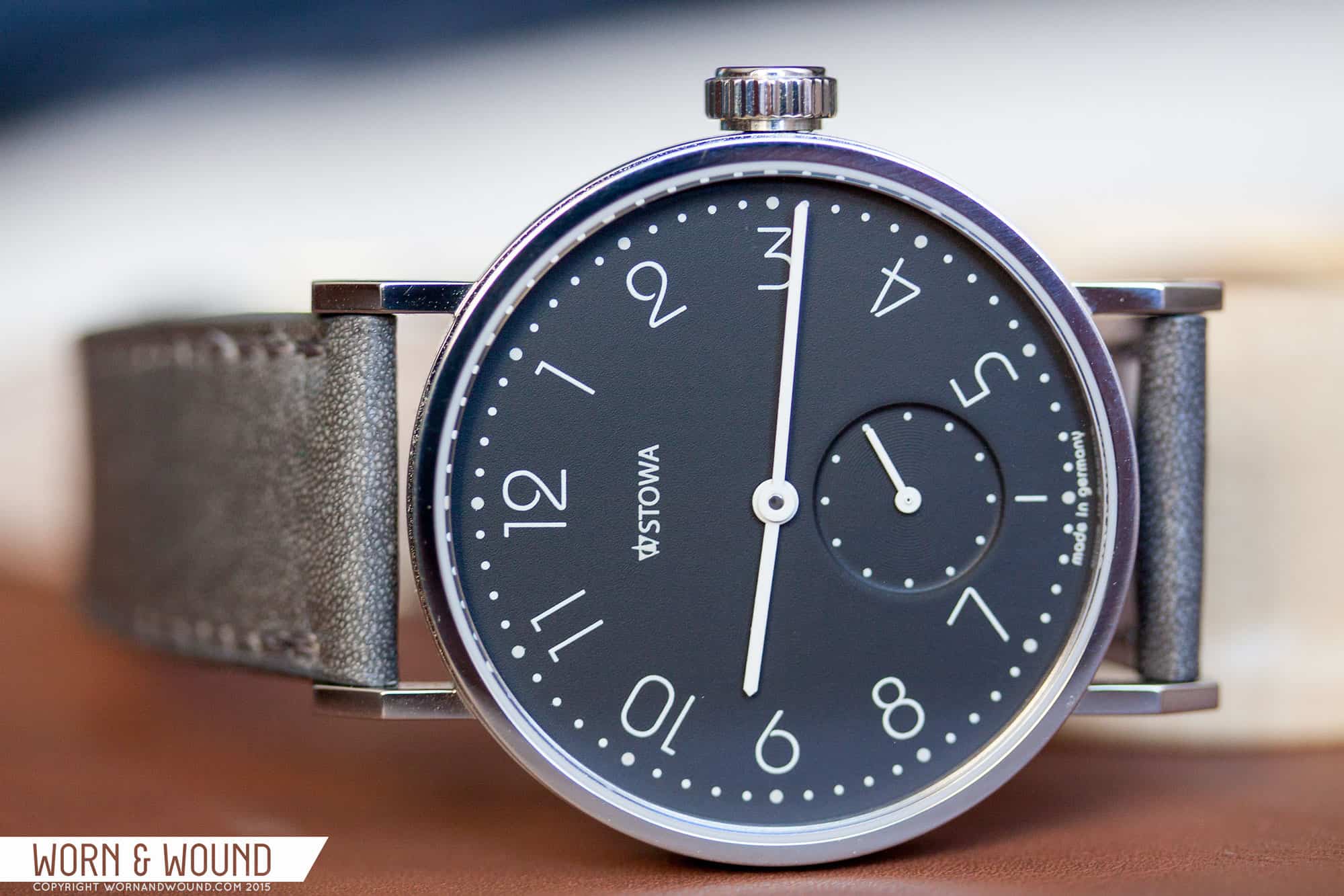
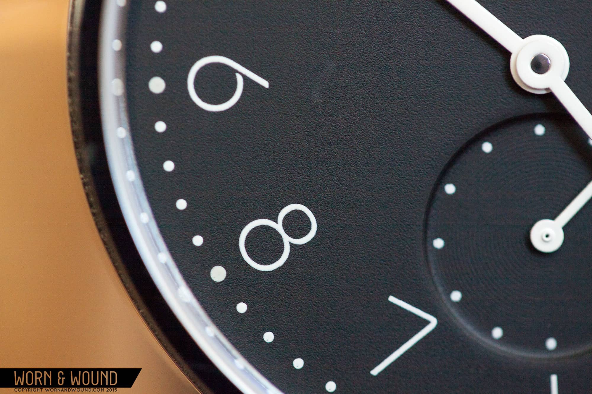
The face is practically all dial, accentuated by the narrow bezel and flat case design. The first thing that pulls in your eye is the typeface Esslinger chose, aptly named Bauhaus STD. Designed by Ed Benguiat and Victor Caruso in 1975, Bauhaus STD is based on an older iconic typeface created by Herbert Bayer in the mid-20s. Conceptually, Esslinger saw his choice as a return to a design that could have originally been part of the historic Antea line, hence the name, “back to bauhaus.” History aside, the Bauhaus STD typeface gives the watch a playful and whimsical feel, and I personally love the overall airiness of it (note the wide loops on the “2”). It also has the added benefit of distancing the series from the rest of the Antea line, as well as competitors like Nomos and other German brands producing similar Bauhaus-inspired watches.

The layout of the dial is rather simple and representative of the typical 7001 arrangement. There is a seconds sub-dial right over the 6 o’clock marker, with the minutes and hours hands centrally mounted. Like on the classic Antea, there is a radial flip of the hour markers (note how the numbers are read from the inside of the dial from 9 to 3, then from the outside between 4 and 8). There is an outer minutes index represented via a series of dots, with the dot at every 5-minute interval larger than the rest. This motif is carried over to the sub-dial, with dots at every 5-second interval. The hands are a simple baton style painted white, and the contrast between the matte black dial and white hands and markers is quite striking. It should be noted that the printing is impeccable, as is usually the case with Stowa watches.

Let us briefly discuss the logo. There has been a lot of commotion over the redesign. Hyperbole sprinkled across Internet forums would have you believe that the logo is the downfall of the brand. Now, I would be lying if I said I didn’t prefer the older logo myself, but with that said, the new logo is not at all offensive in person. In fact, you hardly even notice it; it sort of blends inconspicuously into the dial, which is somewhat preferable when it comes to branding. My one thought, and this is more of a musing than it is a critique, is that it would have been cool to have “STOWA” displayed in the same Bauhaus STD typeface found on the rest of the watch.

Advertisement

Movement

Powering the Stowa “back to bauhaus” series are two movements: the top grade Peseux/ETA 7001 in the 355 model, and the top grade 2824-2 in the 365 and 390 variants. It goes without saying that they’re both high-quality movements with superb components and finishing, which includes Geneva stripes, blued screws, and perlage along the base plate. The automatic models come with custom rotors made of German silver engraved with “back to bauhaus.”

I have some long-term experience with the 7001 and it has held up quite well. Though it has a BPH of 21,600 and does not hack, the 7001 is capable of extreme accuracy when adjusted properly, as is the case with the Antea.

Straps and Wearability

As much as I love Stowa, I have never been a fan of their OEM straps–until now, that is. Stowa finally stepped it up a notch with their new line of handmade German straps, which feel light years ahead of their previous offerings. The leather is immediately soft and supple and comes in a variety of attractive hues. There isn’t a lot of information about the straps on their website, so when you’re putting in an order reach out to Stowa to discuss options. Of course, the watch would look great on many different straps. Shell cordovan is a no-brainer, and in the summer months a nylon slip-through should do the trick.

STOWA_ANTEA_B2B_WRIST1

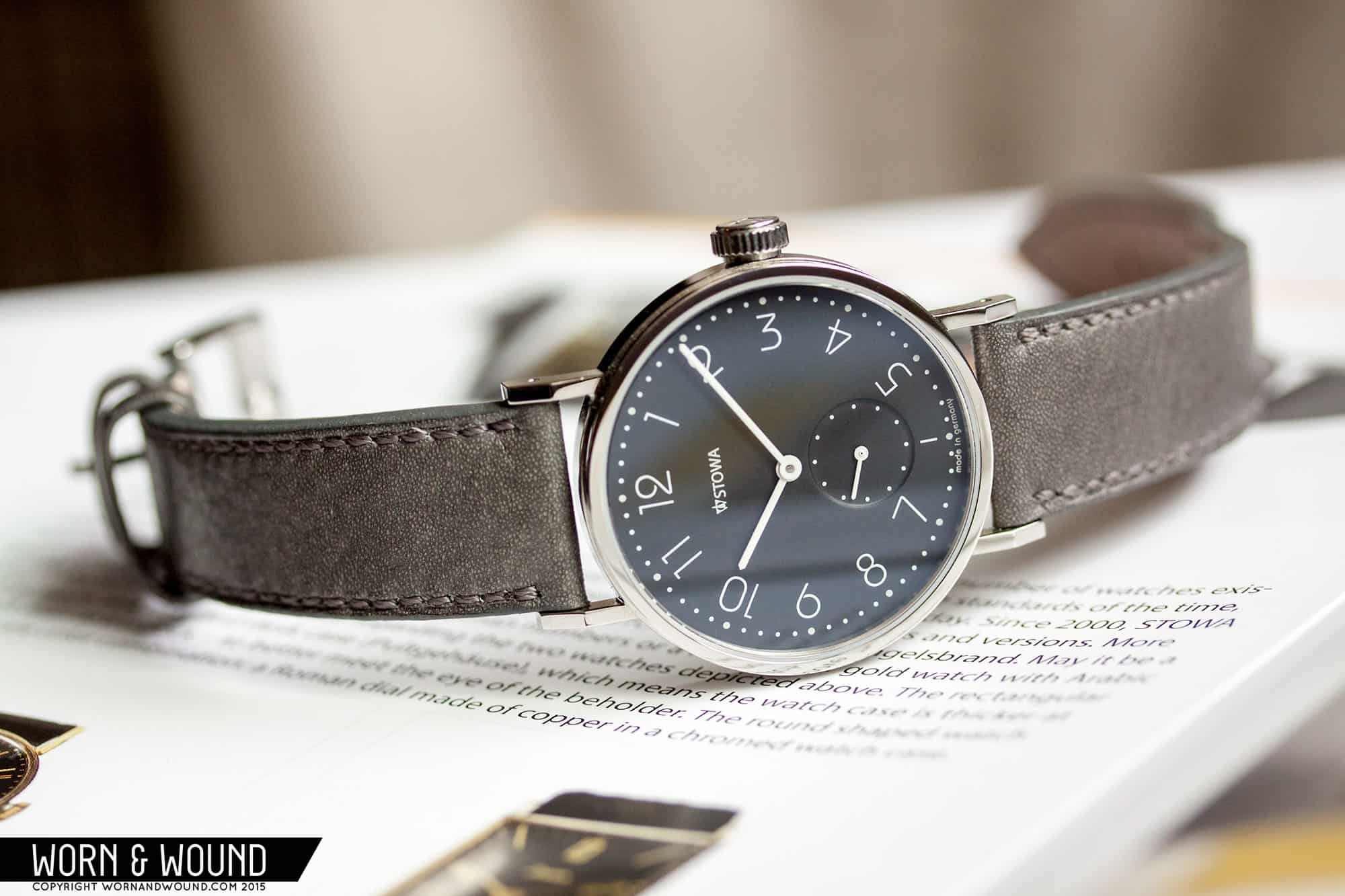
Much like the Antea KS, the Antea “back to Bauhaus” 355 wears ever-so-slightly larger than its dimensions, a feat made possible by the narrow bezel and the elongated lugs. Seeing as how the watch is also quite narrow, it provides for a comfortable fit that hugs the wrists and slips comfortably under a sleeve cuff.

Conclusion

It’s hard to effectively gauge any watch with just a few photos on the Internet, especially when those photos are product shots provided by the brand. Rarely do these images give an accurate portrayal or feel of any watch, and unfortunately the b2b line falls victim to this. As a proud owner of the Stowa Antea KS, I fully endorse the new addition to the Antea series and would love to one day own the 355. I likely won’t convince the most ardent of naysayers that this watch is worth their money, but for those on the fence, I recommend it wholeheartedly. And despite prices steadily creeping upwards across the watch industry, Stowa still offers an incredible value in their timepieces, and the b2b series is no exception.

Images from this post:
Related Reviews
Ilya is Worn & Wound's Managing Editor and Video Producer. He believes that when it comes to watches, quality, simplicity and functionality are king. This may very well explain his love for German and military-inspired watches. In addition to watches, Ilya brings an encyclopedic knowledge of leather, denim and all things related to menswear.
ryvini

12 responses to “Stowa Antea Back to Bauhaus Review”

  1. Stephan Chan says:

    whats your wrist size?

  2. Никита says:

    Absolutely gorgeous watch. Stowa with the help of Esslinger has found its definitive place in the new wave of Bauhaus watches. The font, hands, texture of the dial and printing – all play together so well. I was also skeptical about the case, but no longer, after seeing your live photos. The finishing of the movement and case, dial quality- everything is amazing, even the strap looks special. The only little issue is that “STOWA” could be written in matching Bauhaus STD font, as you have mentioned. But its not a dealbreaker for me. I put Stowa b2b on the second best place for Bauhaus watches, just after Nomos Metro; but regarding the bang for the $, it is clear winner.

  3. Tatsache says:

    For me, as a german, with bauhaus inspired watches on every corner, is the “back to bauhaus” thing ridiculous.

    • I’m not sure how you interpret it, but to me, it means they are going back to their Bauhaus roots for design inspiration. Not sure how the fact that there is a Bauhaus watch on every corner makes that ridiculous.

  4. wshandling says:

    “My one thought, and this is more of a musing than it is a critique, is that it would have been cool to have “STOWA” displayed in the same Bauhaus STD typeface found on the rest of the watch.”

    This is not a reasonable criticism. The typeface is just as much a part of the logo as the logomark itself. No competent brand would *ever* change the typeface in its logo just to match the typeface used elsewhere in the design.

    • Ilya Ryvin says:

      And that’s why it is a musing and not a critique. Though this is not unheard of when it comes to special editions and such.

  5. TodayYourLove TomorrowTheWorld says:

    It looks good, but I feel like Nomos does this style better.

  6. Andrew Smith says:

    this is a great looking watch! nice review

  7. Michael Barrientos says:

    Where to buy in the US? The site I found was in another language, so I just wanted to be sure I’d be purchasing from an authentic site.