Straton Speciale Chronograph Review

It’s always fun to see a brand mature over time, finding a unique voice and direction as they go. Over the last two years we’ve seen four models from Straton Watch Co., each progressively refining their ’70s-era automotive chronograph theme and gaining more character. Their newest watch, the Speciale, is by far their most daring, but it’s also their most successful, featuring a love-it-or-leave-it cushion/TV case and an unabashedly ’70s dial. It’s fun, quirky, but more importantly, it’s well-executed.

Straton has always been into offering a lot of options, and with the Speciale they continued this trend. There are a total 20 variations of the watch, including five color ways, two finishes and two movement options. The latter option is the most interesting, as the watch will be available with either a Seiko Meca-Quartz VK67 or a Valjoux 7750 automatic chronograph, for $499 and $1199 respectively. This is a good way to not exclude customers (and to get around the inevitable “make it automatic” comments), but is also a good value for either, especially the 7750.

Advertisement
$499

Straton Speciale Chronograph Review

Case
DLC Steel
Movement
Vk67 or 7750
Dial
Various
Lume
Yes
Lens
Sapphire
Strap
Leather
Water Resistance
100 M
Dimensions
41 x 42mm
Thickness
15.5mm
Lug Width
22mm
Crown
7.5 x 4 screwdown
Warranty
Yes
Price
$499

Case

The aesthetic of the Speciale is largely defined by the shape of the case. At 41mm x 42mm x 13mm (VK67)/ 15.5mm (7750), it’s a funky, squat form that honestly, before seeing in person, I thought would be too out-there and too big. In person, however, it’s actually spot on and wears very well. If there was one aspect of the design that Straton nailed over all, it’s simply proportions. Everything is in its right place and correctly sized with the whole in mind.

The case geometry is really interesting in person as well. It hints at something Heuer-esque, a hybrid of the Silverstone and Monaco perhaps, or perhaps it even hints at the Hamilton Fontainebleau. Either way, it is its own shape. It’s a rectangle (nearly a square), with a flat top and bottom and rounded sides. From the side, things get really intriguing as the case is pyramidal tapering up as well as down. This does two things: from above, there is a solid amount of metal around the dial, compressing everything like a bezel and making the watch appear small. The other is ergonomic, as the undercut of the case makes it more comfortable on the wrist. It’s a strange looking case, but it’s quite clever and grows on you (or it did for me, at least) quickly.

In terms of finishing, the case comes in polished steel with a brushed top surface, or full matte. Both are visually appealing, though I admittedly haven’t seen the steel version in matte, just the black, but I did find the polished version to be a fingerprint magnet to an annoying degree. There’s just a lot of polished area, and because of the case shape the sides point up to you, making a thumb print very noticeable. One cool feature of the steel models is that they will have a clear DLC coating, which will make them far more scratch resistant than normal steel.

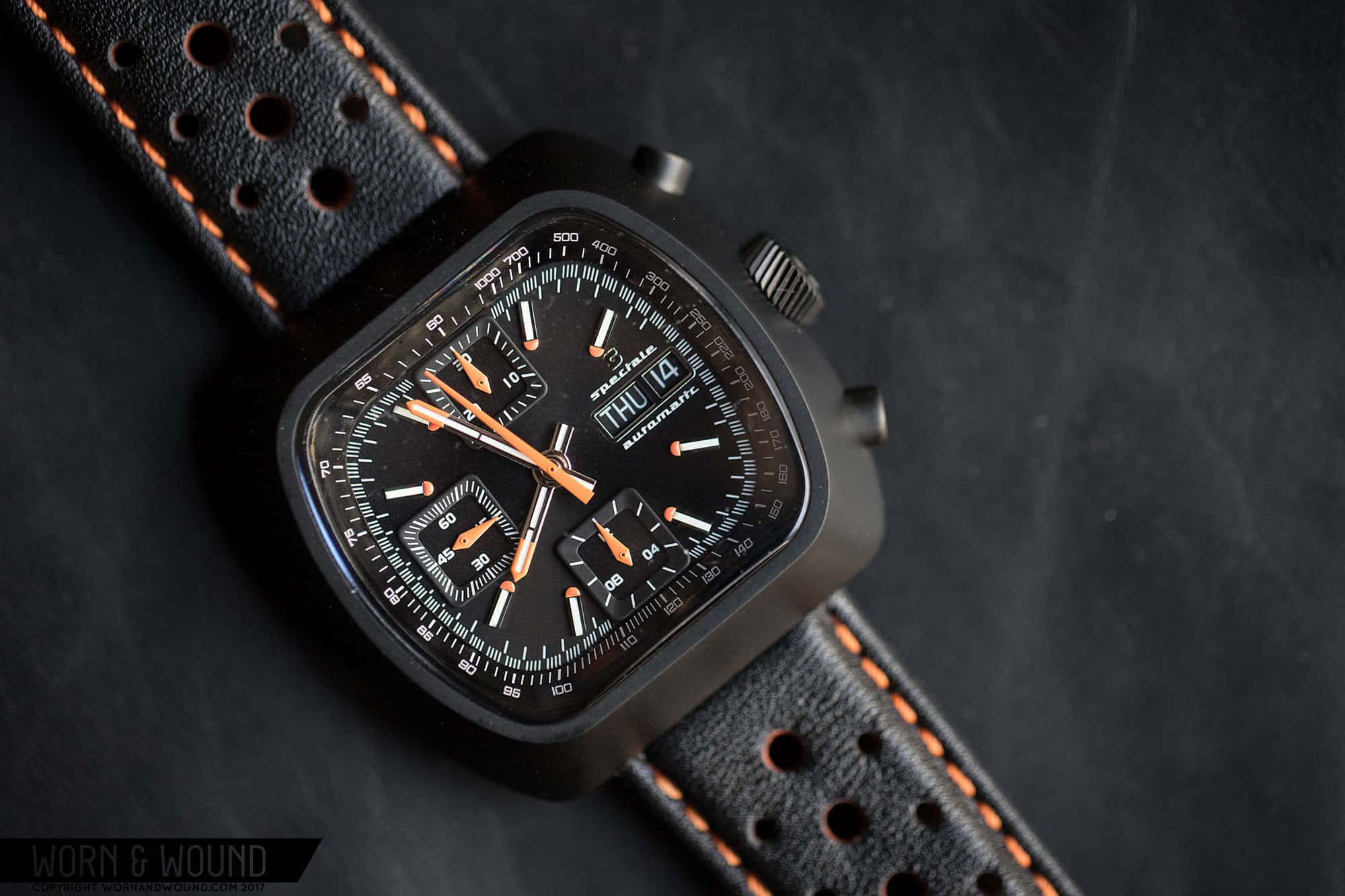
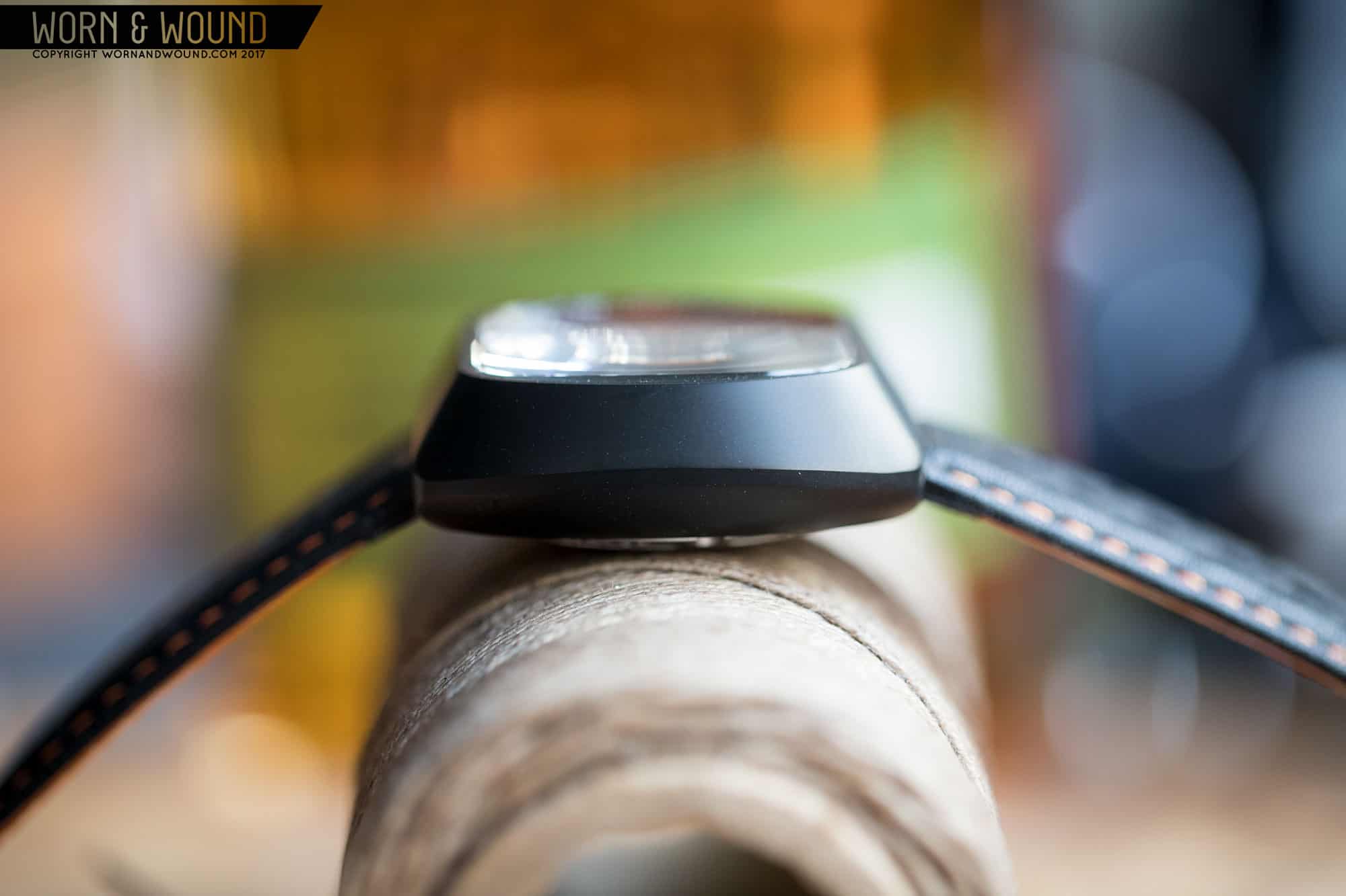
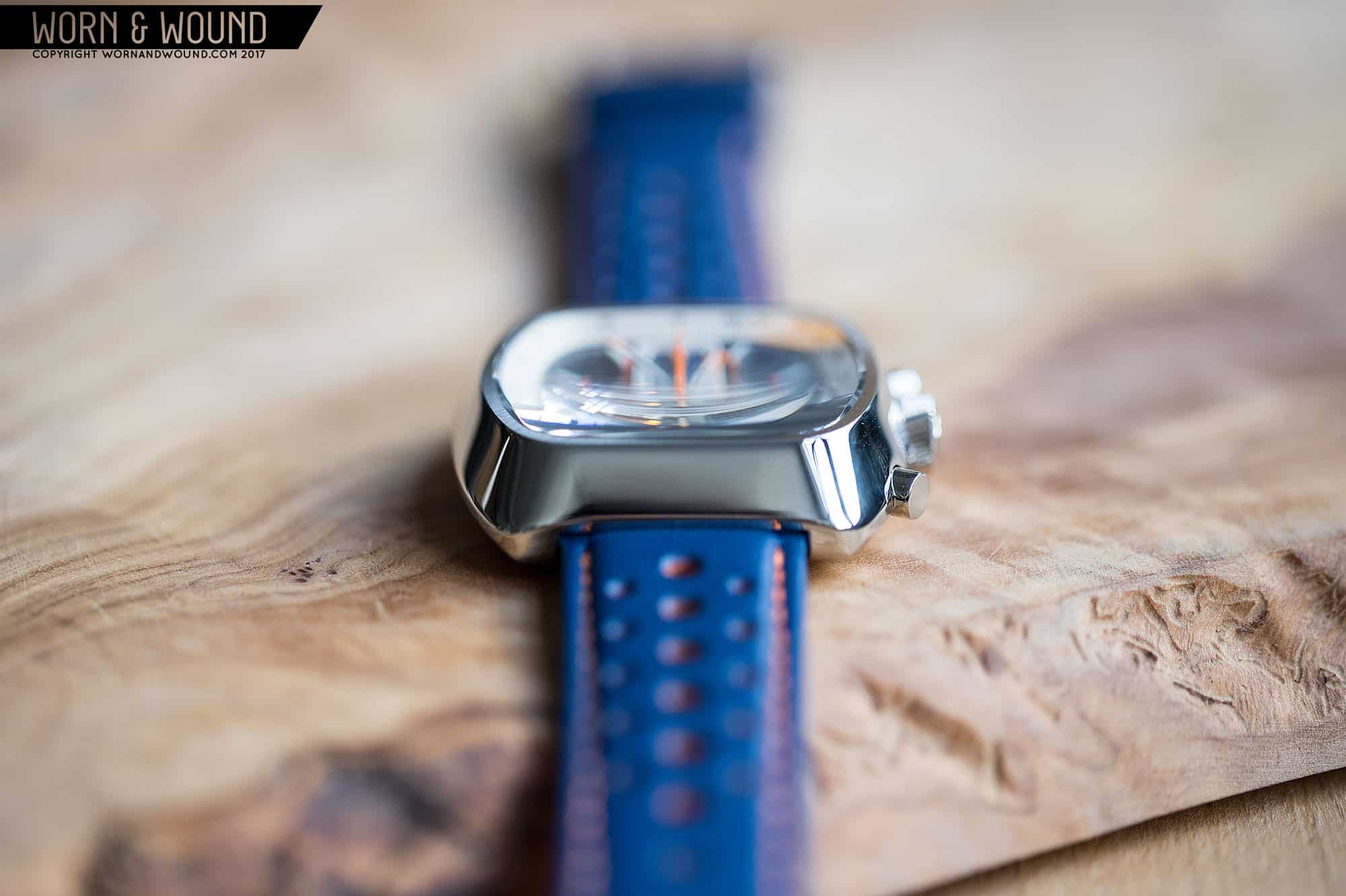
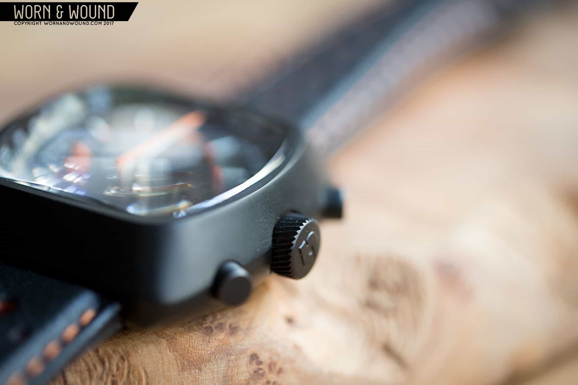
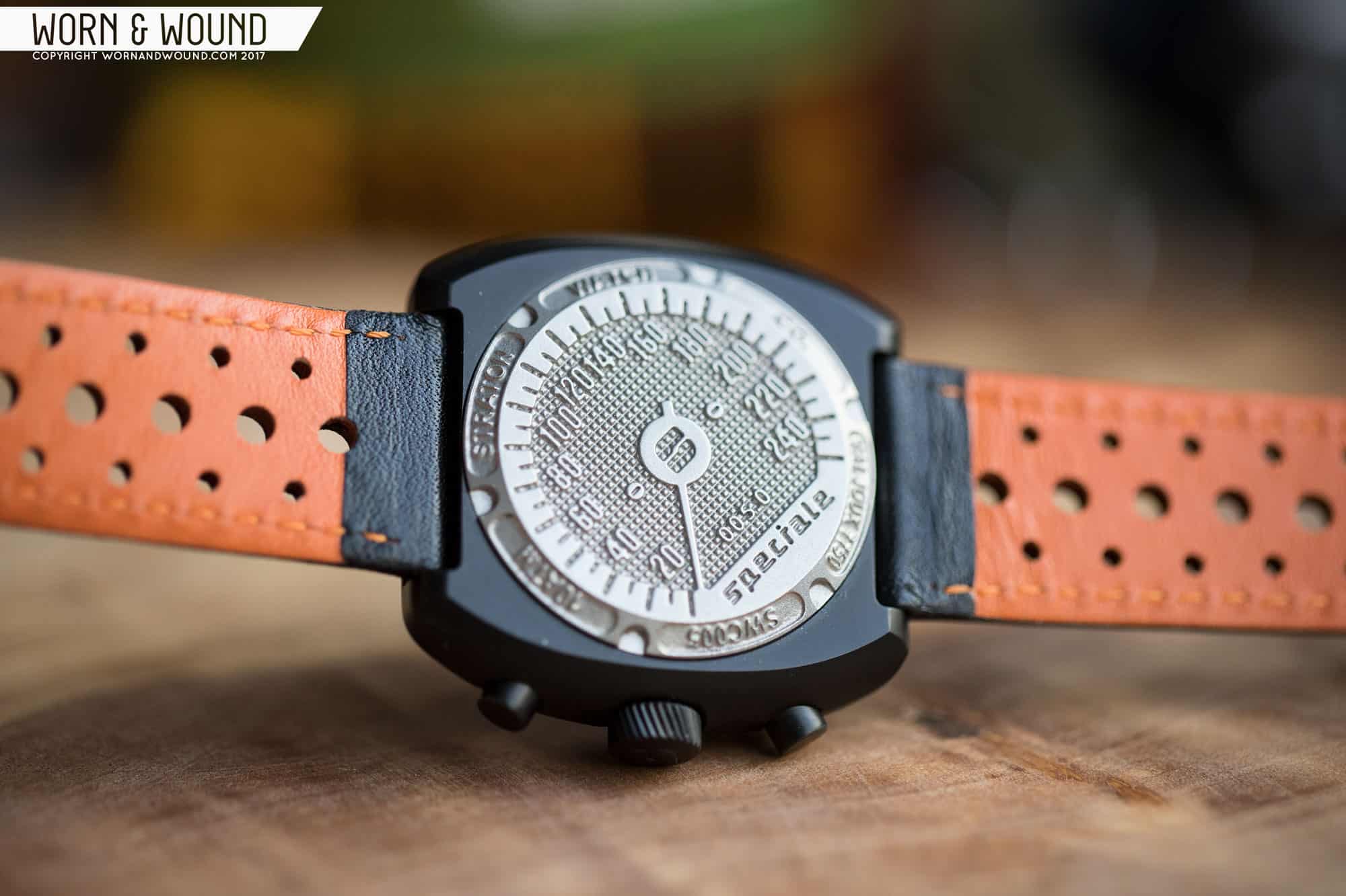
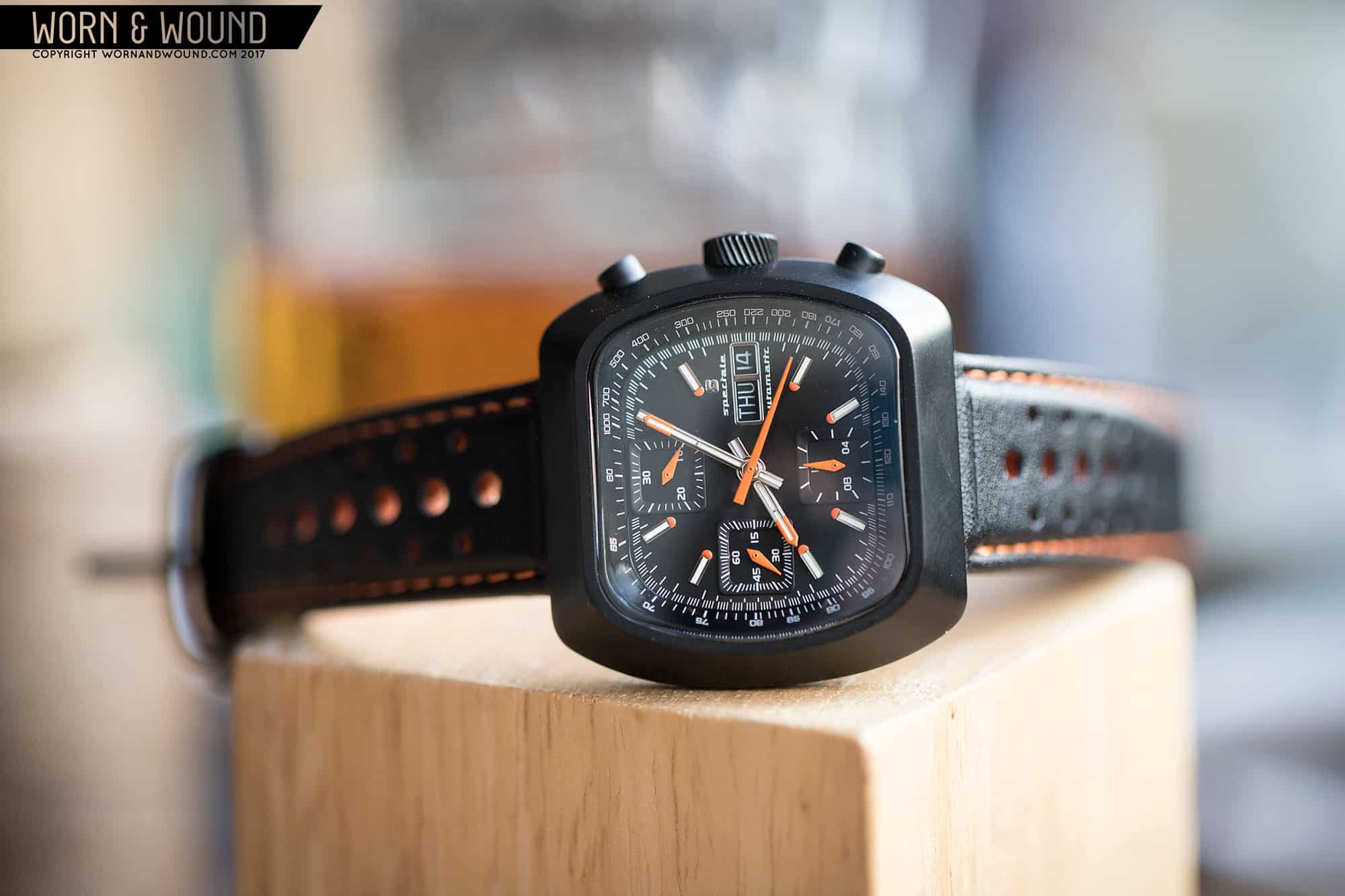
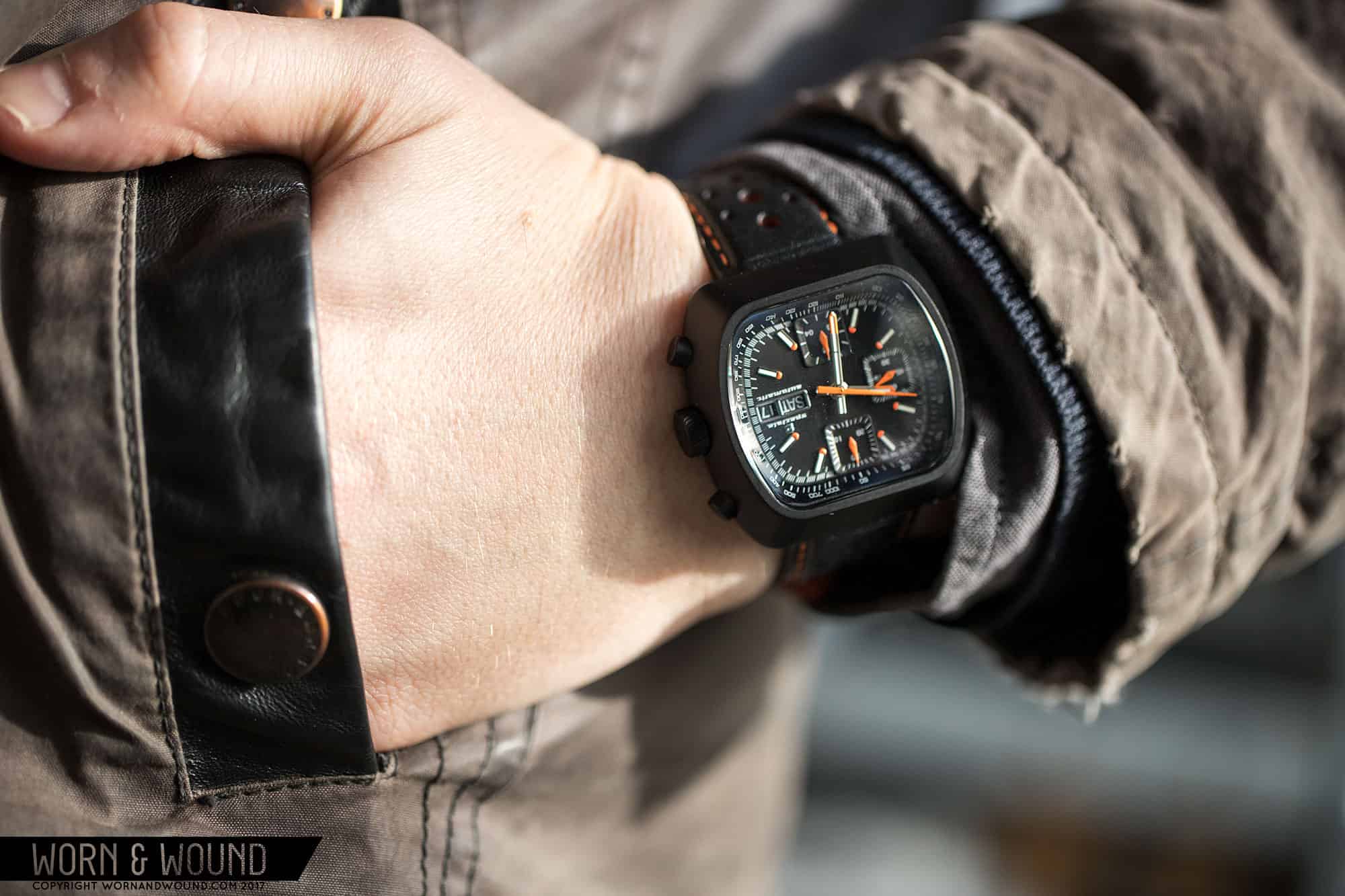
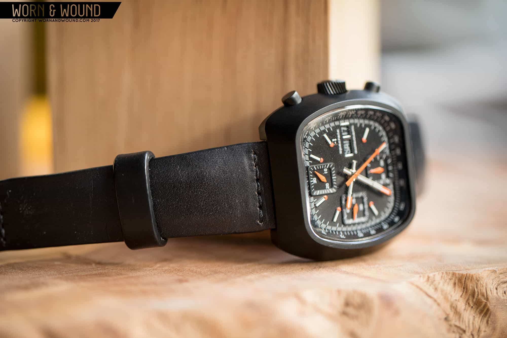
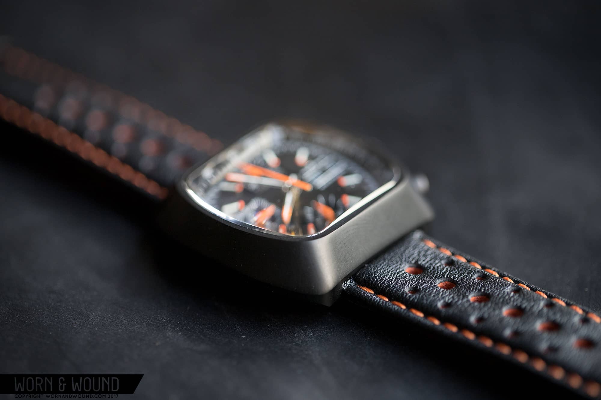
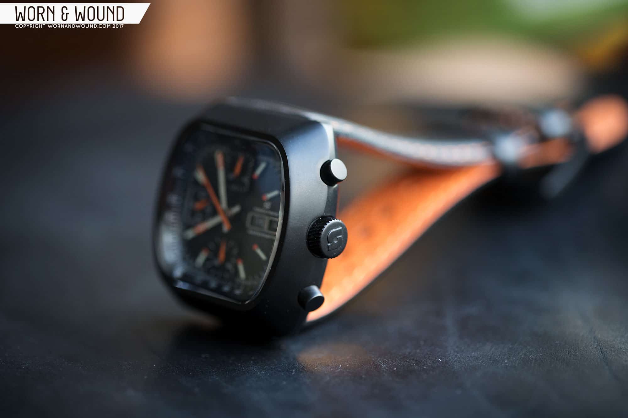
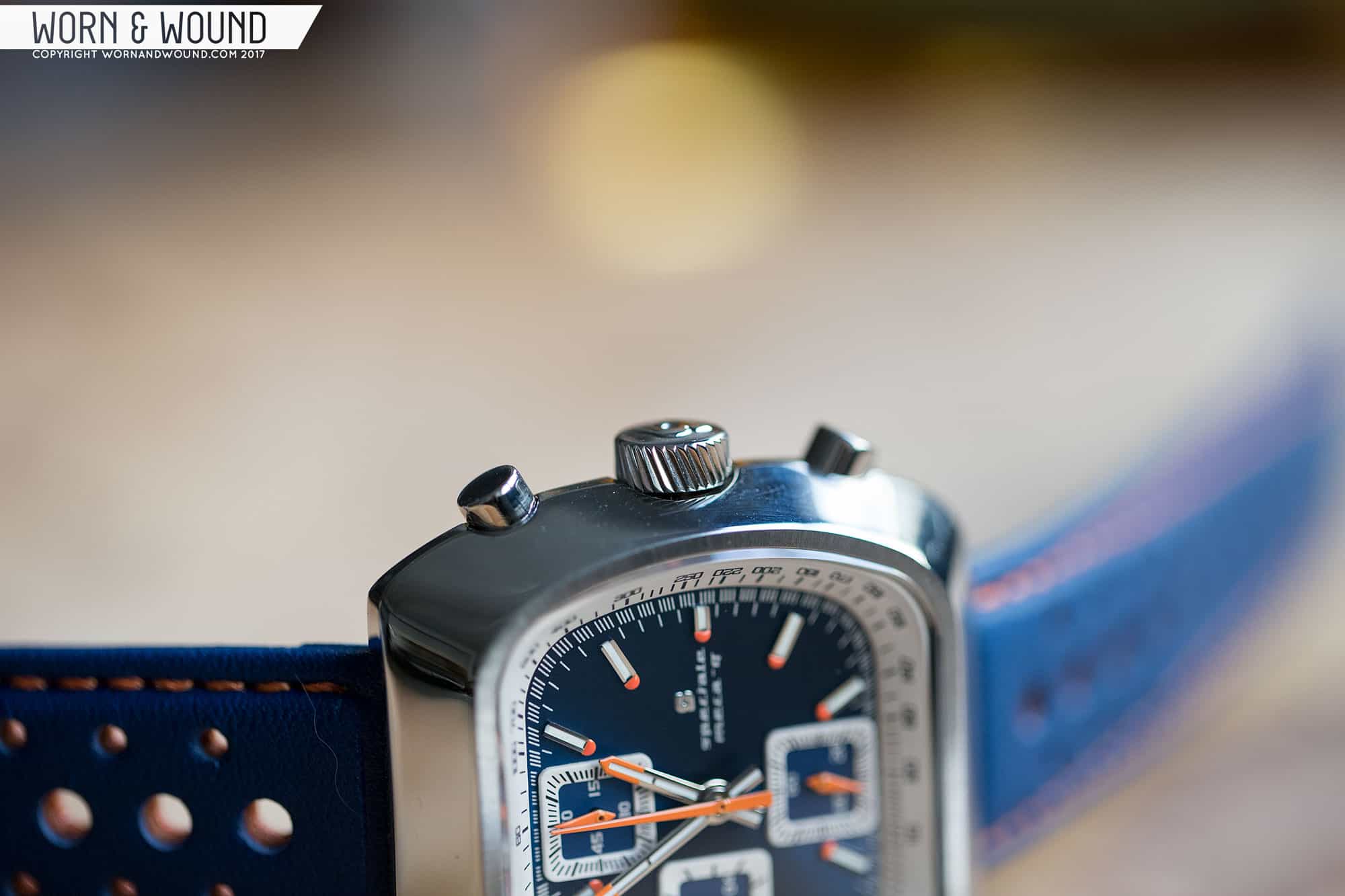
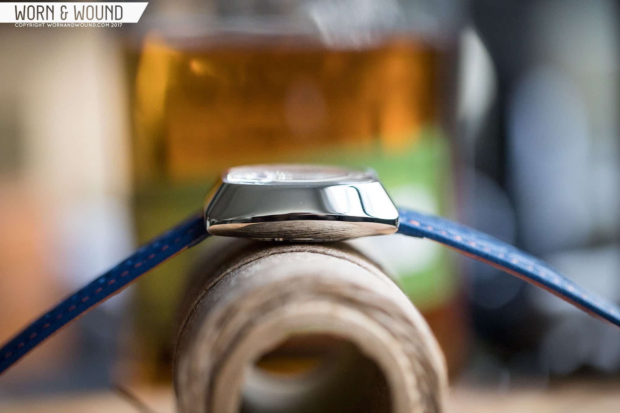
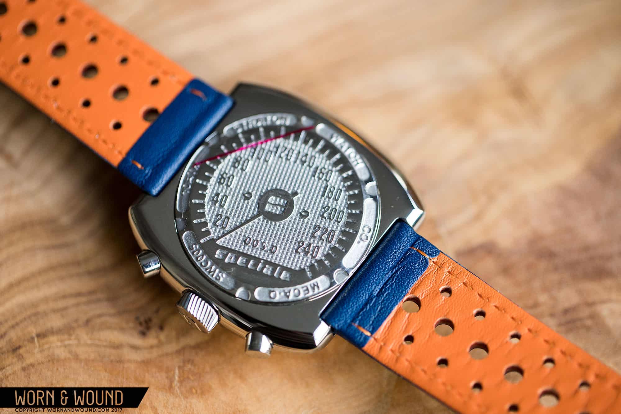
On the right side of the watch you’ll find two cylindrical pushers for the chronograph—no surprises there—and a big crown. The crown is 7.5mm x 4mm. It has angled coining, which nicely adds to the grip, and it screws down, nestling slightly within the case side. Flipping the watch over, you’ll find an ornate case back with a lot of etching. The center is heavily textured and designed to look like a speedometer with various watch details around its edge. It’s fun, and I always like to see a well-designed solid case back, but there is perhaps a bit too much texture, making the design a little busy and hard to read.

Dial

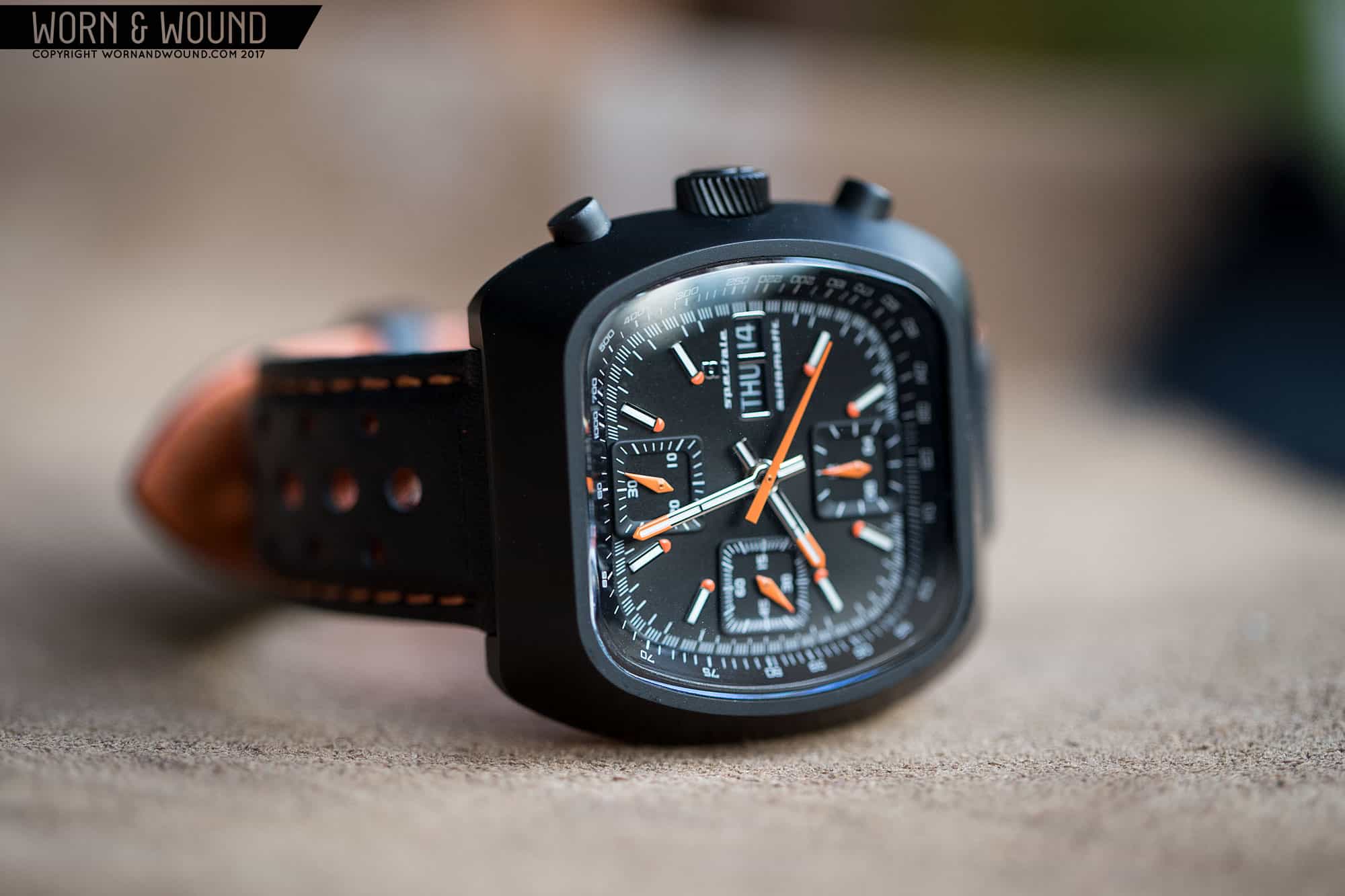
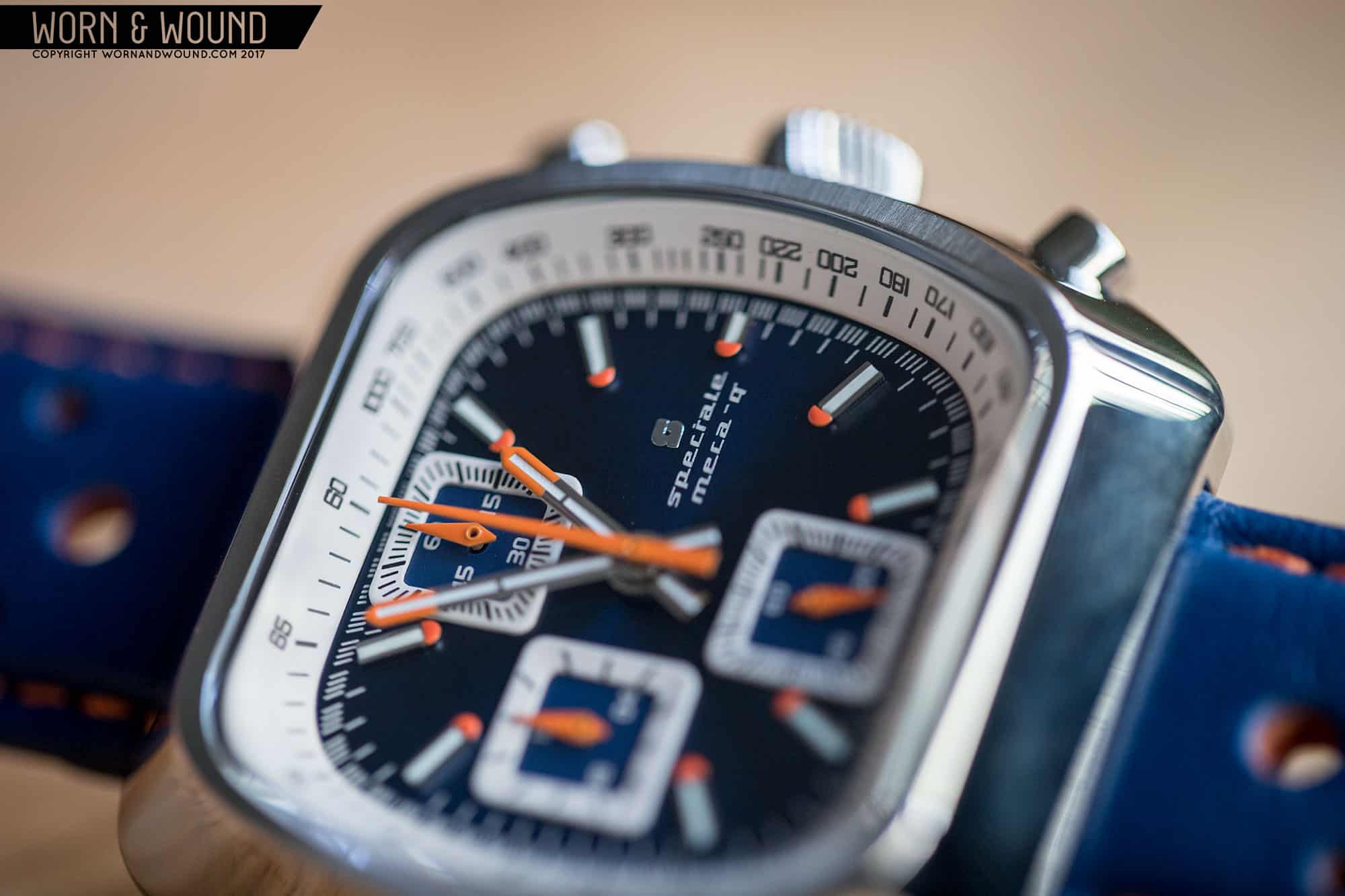
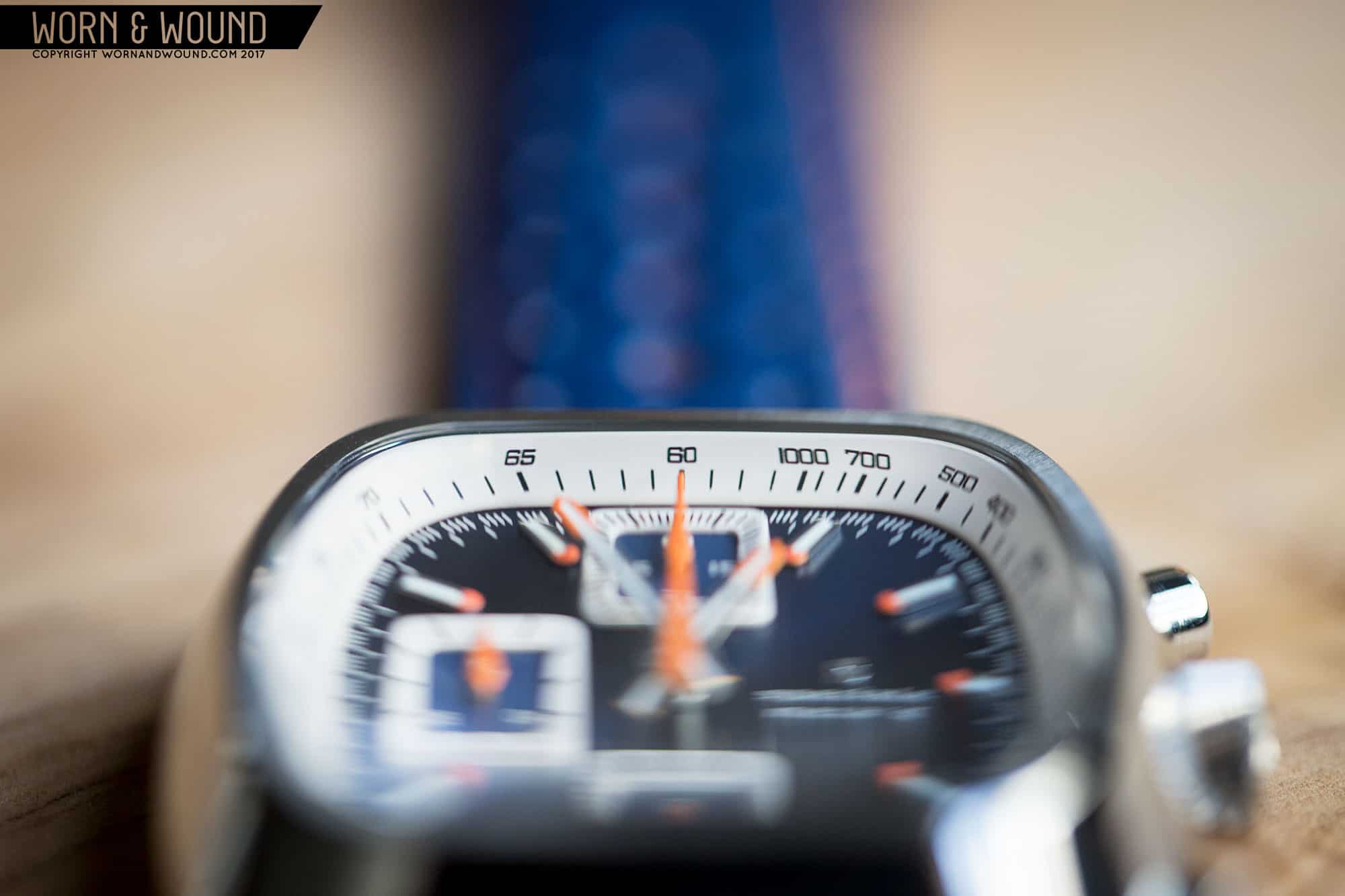
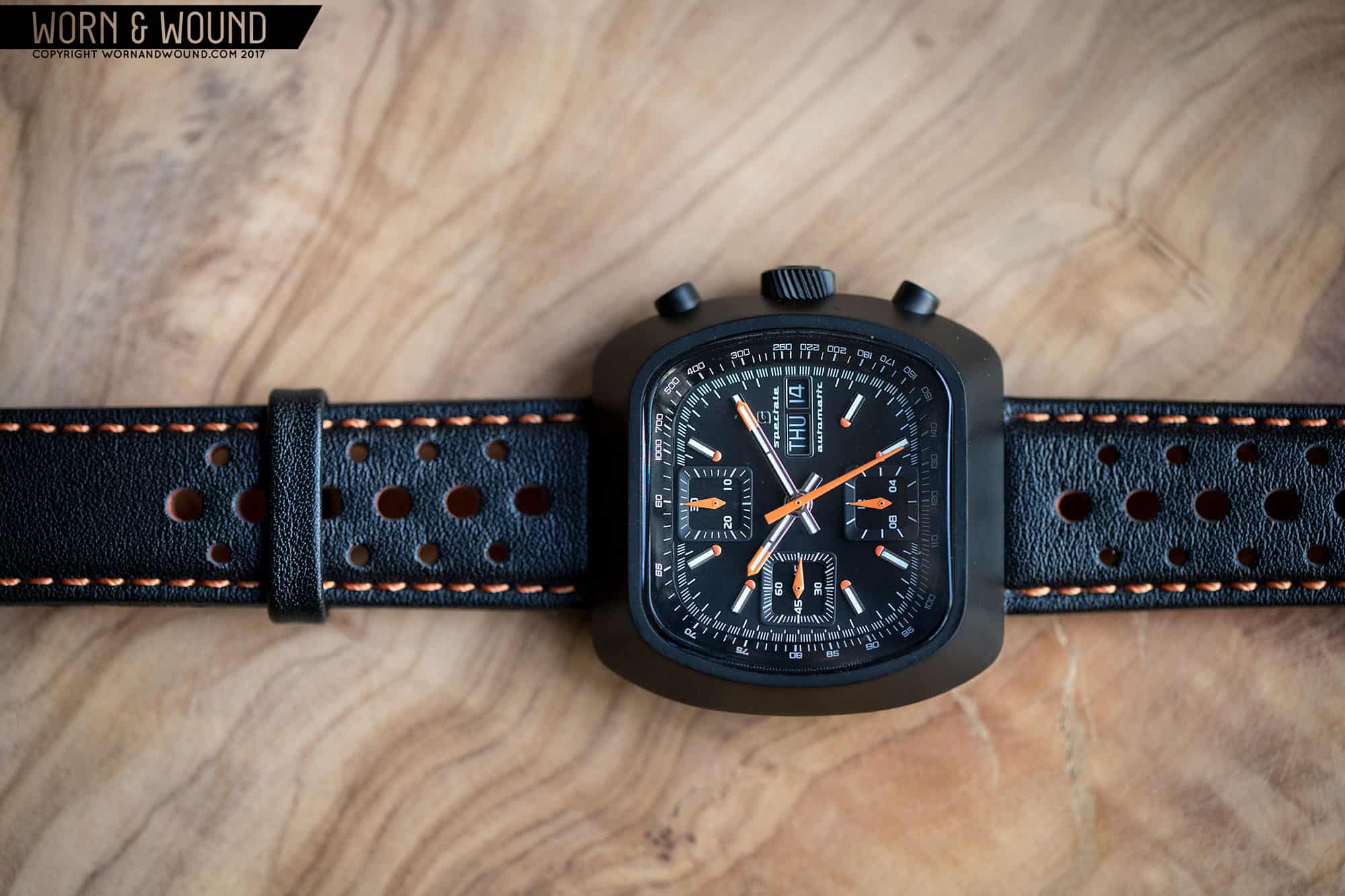
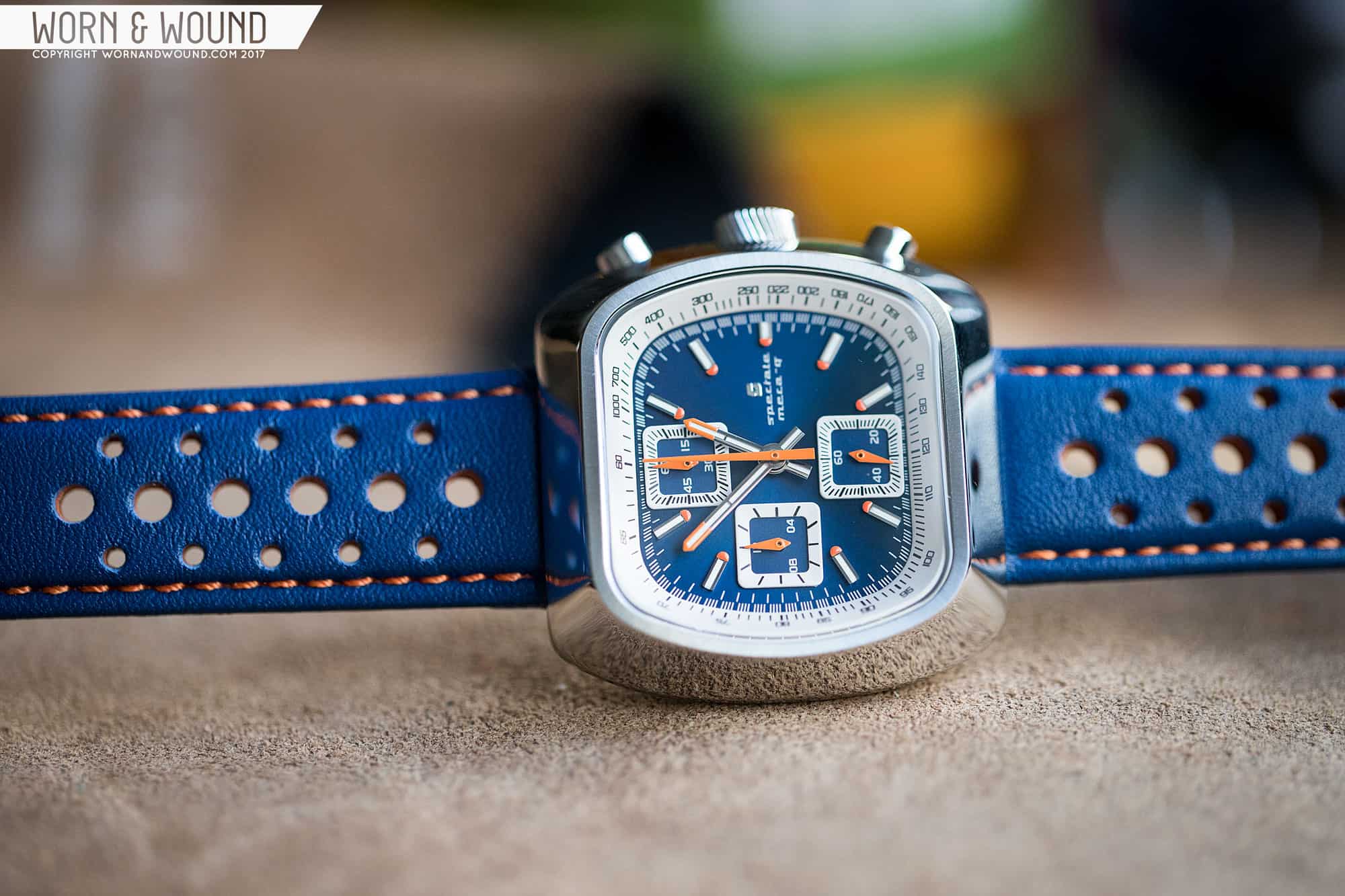
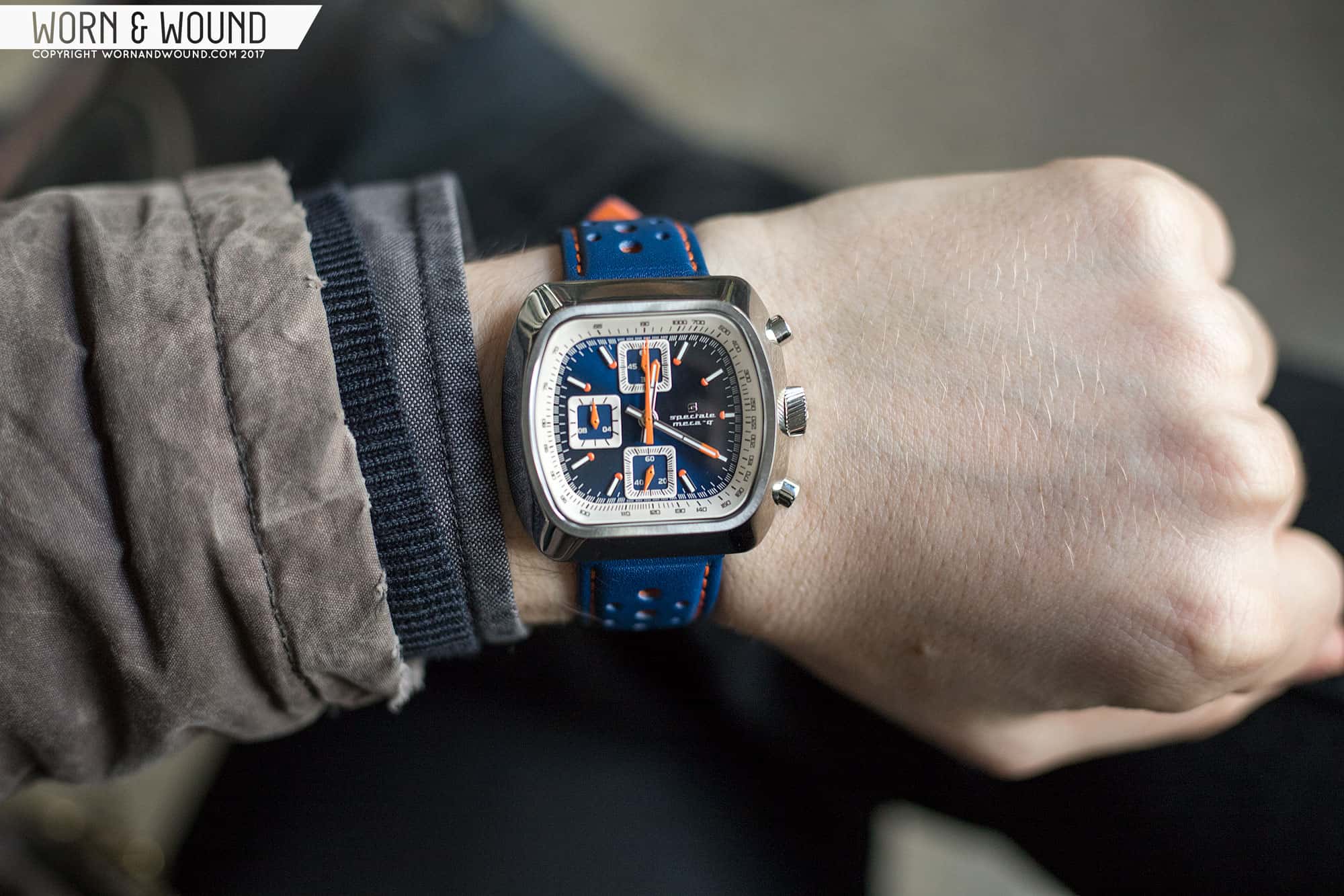
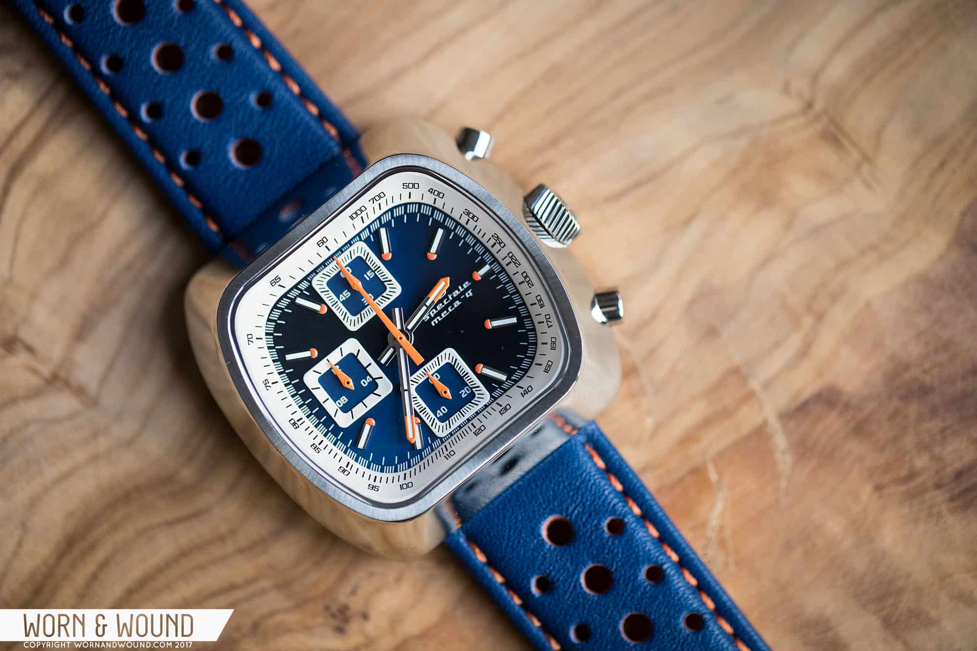
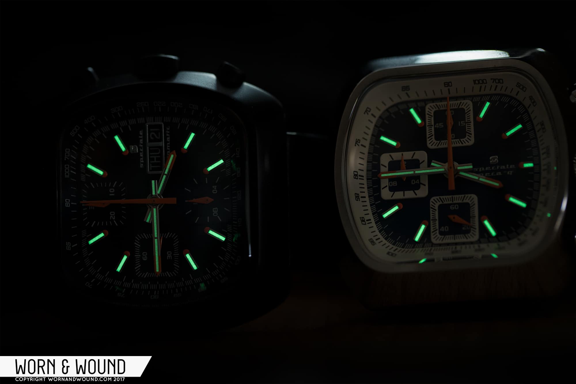
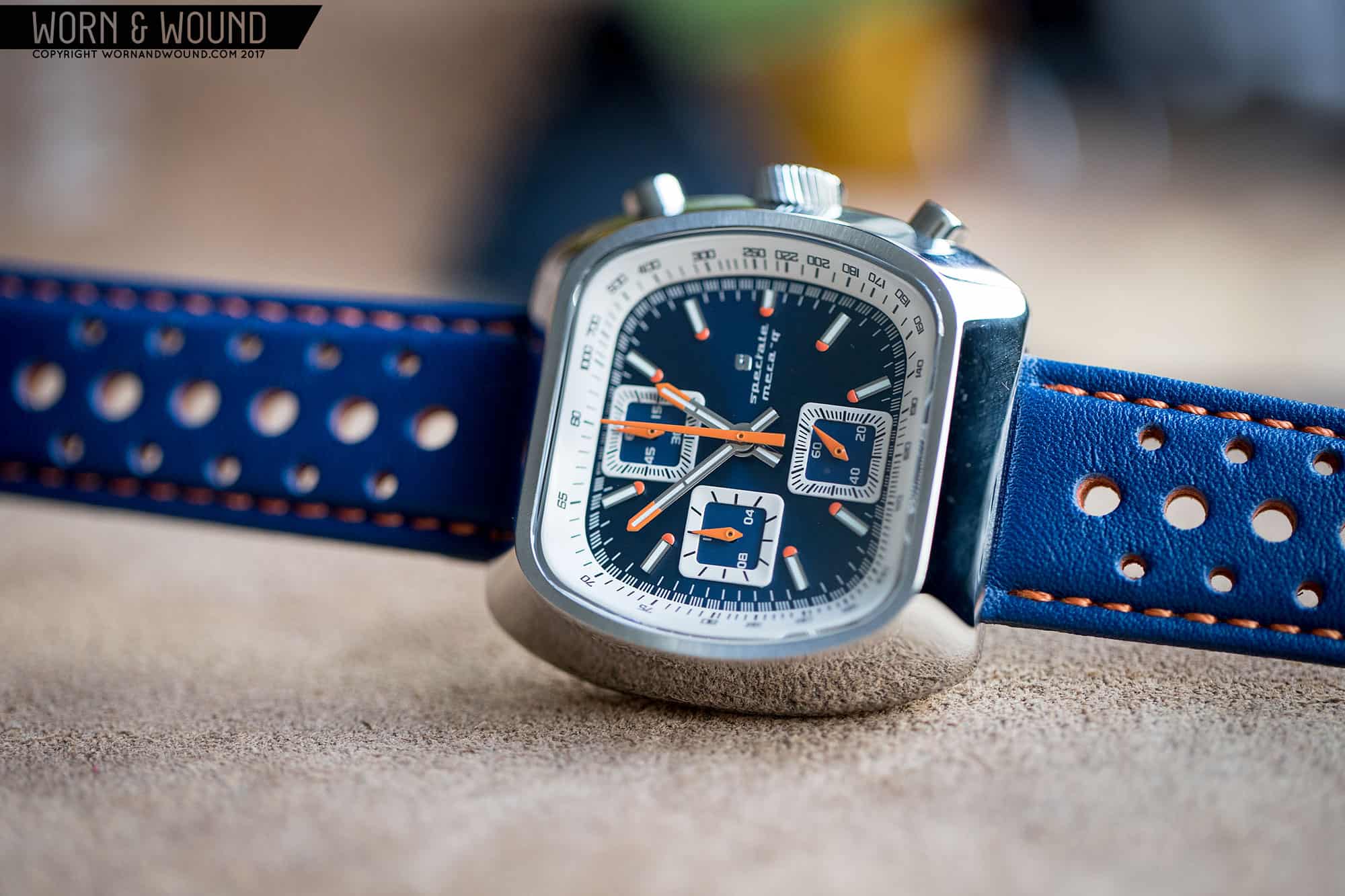
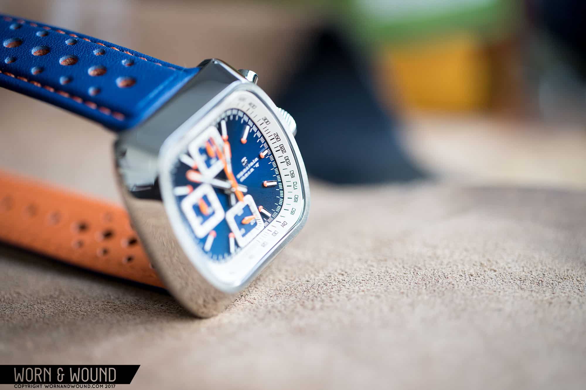
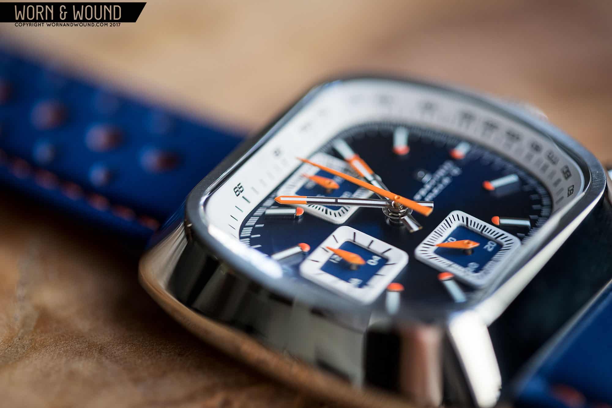
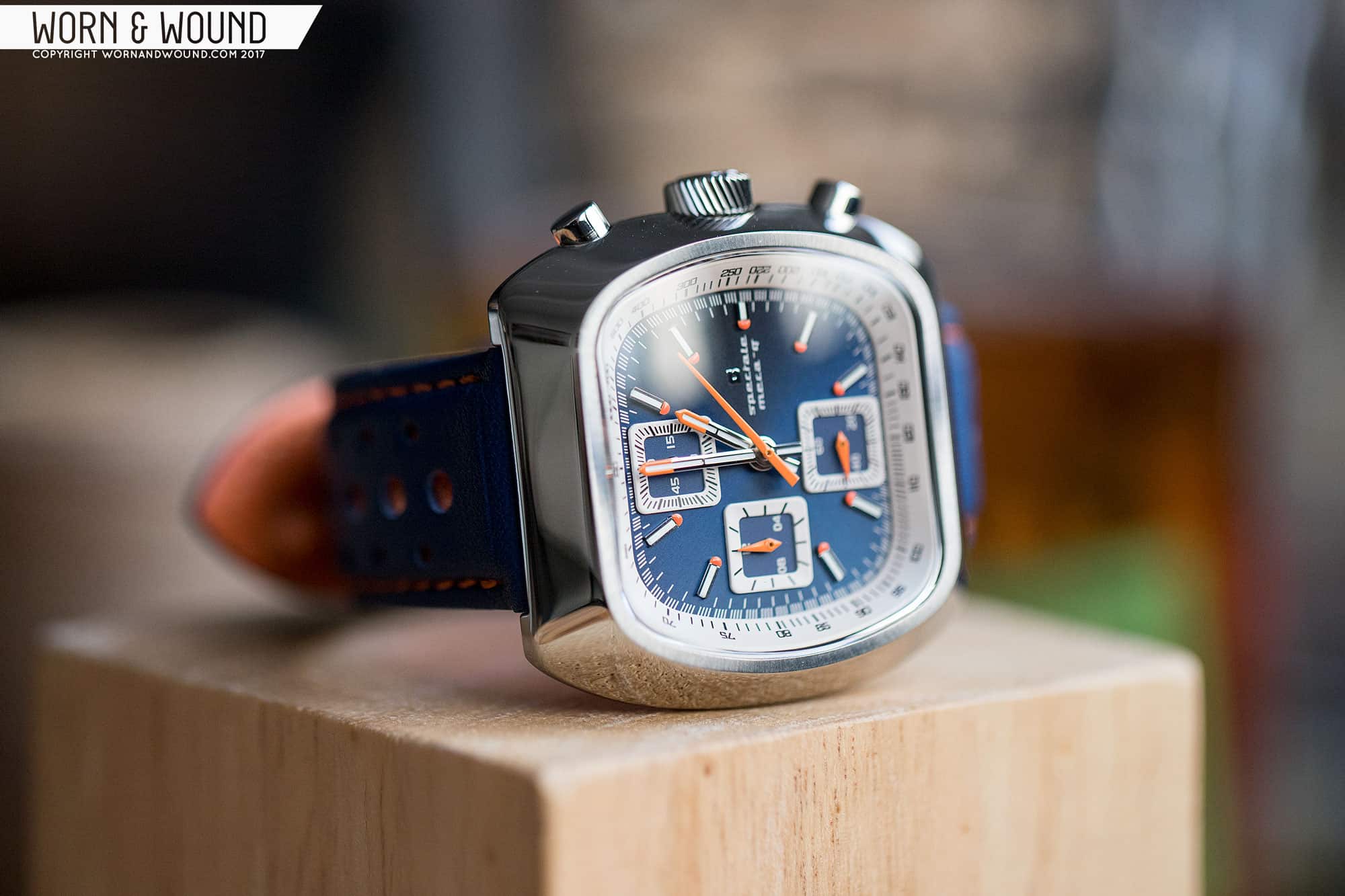
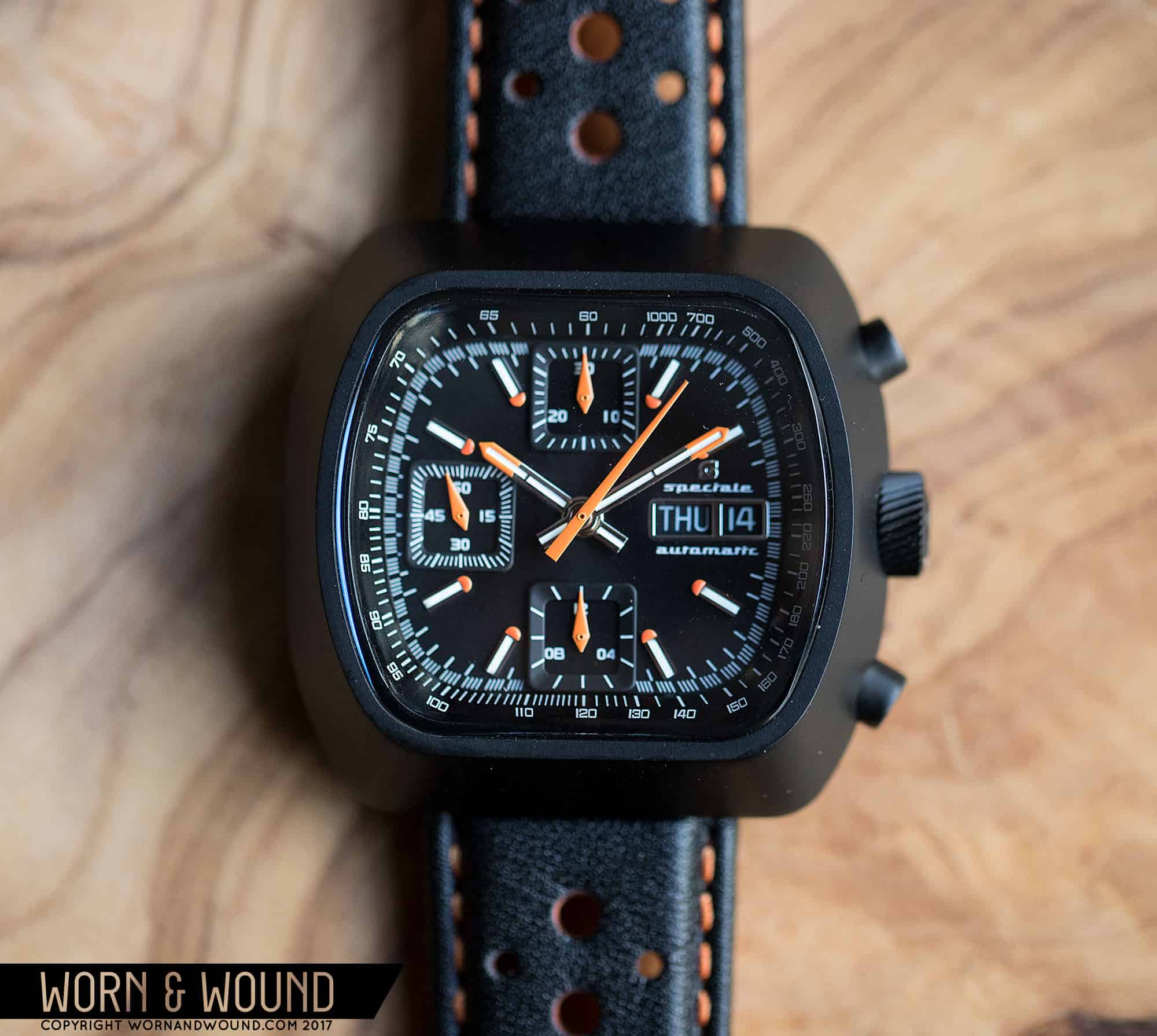
Moving on to the dial, the Speciale manages to balance a lot of elements in a small and oddly shaped space. The hour index consists of applied markers with lume strips down their centers, and large orange half-spheres on their tips. This latter detail I really like. They look almost like hand painted elements, but are cleanly executed and add a nice pop of color. Around the edge of the dial you’ll then find a minute/chronograph seconds index with staggered lines, giving it that distinct racing chronograph look.

Outside of this, you’ll find a wide and steeply angled chapter ring with a tachymeter printed on it. I quite like how the tachymeter looks, adapted to the strange shape of the case. Moving back in, at 12, six and nine you’ll find sub-dials for the chrono and active seconds functions. Rather than the oft used sunken sub-dial, Straton went for applied square frames. This works nicely with the overall shape of the watch, and helps to break up the dial surface. At three you’ll then find a day/date with Straton’s “S” logo and some text on the 7750 version, and on the VK67 version just the logo and flavor text.

While it’s a dense dial with a lot going on, it somehow works out. The various elements are separate enough from each other to maintain legibility. The different colorways of the Speciale treat some elements of the dial differently. The black dial is all black, save the orange elements. The other dials have contrasting sub-dial frames and tachymeters, adding another layer to the design. On the blue version I got to try, the creamy accents worked very nicely with the blue and orange elements. It makes it a touch busier, but it’s not going overboard.

For hands, Straton went with fence posts for the hour and minute in polished steel with lume strips down their centers, a little break line about half way down and orange painted tips. They are very well executed and feel like a not totally obvious, but very appropriate choice for the watch. The chrono seconds hand is then a tapering stick in orange, classic, and the sub-dials have little orange dauphine hands that look particularly good. I was glad to see they did something other than the typical stick there.

Wearability

The best and perhaps most surprising aspect of the Speciale is how well it wears. Since it’s basically a square, there is no risk of over hang, and the watch sits nice and center on the wrist. Then the undercuts that I mentioned before make it comfortable when flexing your wrist. And while at 41mm it seems like a large watch with all that metal from the case, it looks small—like it could have just been an over-sized watch from the ’70s rather than a “modernized” vintage style.

And it just looks damn cool. Sure, it’s not for everyone. I’m even a bit surprised that I like it as much as I do. Certainly not everyone in the office was so fond of it, but perhaps its divisiveness is part of its appeal. Either it’s really going to work for you, or it won’t at all. The matte black DLC automatic model just clicked for me, especially when I changed the strap. The watches are available with a rally strap, a canvas two-piece strap and a bracelet, of which I only got to try the former. It’s a decently made strap, and a logical choice, but it’s loaded up with orange thread and backing leather, adding too much color for me. On a solid black strap, the watch took on a meaner, more toned down look.

Conclusion

With the Straton Speciale, the brand has really hit their stride. These are their most unique watches to date, and their best executed. With more and more micro-brands popping up, and with more and more vintage and automotive inspired chronographs coming out, only those that have something unique to offer will stay relevant. Straton is carving out a sub-niche with their more bombastic, ’70s-inspired designs that will keep them safe from becoming generic. As said, it’s not a watch for everyone, but for those who like the style, it’s going to be a winner.

And the value is solid, too. Both models are well-priced, with the 7750 model being an exceptional value. Better still, through their currently running Kickstarter campaign (ends January 4th 2018) the models can be had for $324 for the quartz and $811 for the automatic. So if you’re itching for something different, something a bit out there yet stylish, be sure to pick one up while the campaign is still live.


For more information, head to Straton Watch Co’s website.

Images from this post:
Related Reviews
Zach is the Co-Founder and Executive Editor of Worn & Wound. Before diving headfirst into the world of watches, he spent his days as a product and graphic designer. Zach views watches as the perfect synergy of 2D and 3D design: the place where form, function, fashion and mechanical wonderment come together.
wornandwound zsw