


 Featured Videos


You can’t love ’em all. Nope, for each and everyone of us, there are likely a handful of watches we just don’t like. Watches that we see get talked about by adoring fans that leave a bitter flavor in our mouths. Call it chemistry, taste or what have you… these watches will just never click with us. Perhaps even more than what watches we adore, what watches we don’t like is very personal. So, today we asked the w&w team:
“what watch just doesn’t do it for you and why?”
Keep in mind, these aren’t judgements of whether a watch is “good or bad” so much as just the reality that we don’t like ’em. Like a certain body part, these are opinions and we all have them. Surely there are watches that don’t make the cut for you too, so let us know your response in the comments. Enjoy, and keep in mind, this is all just fun.
Zach Weiss
Oh man, about to lose some friends… The watch that just doesn’t cut it for me is the Tudor Heritage Black Bay. I actually think most of their watches miss the mark, but that the Pelagos, at least pre 4-line-super-berry-blue models, sort of makes up for that fact. At the same time, it’s the success of the Pelagos’ design that emphasizes what doesn’t work for me on the Black Bay. The Pelagos is an almost brilliant evolution of the Snowflake Sub. It took a classic and revered design and brought it into the 21st century, maintaining the tool watch values of the original, enough of the original’s style, but thoroughly modernizing the execution. Compared to a modern Rolex Sub, it was a breath of non-pretentious fresh air. Compared to the Black Bay, it’s conceptually taut.
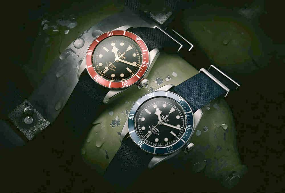
The Black Bay feels like it doesn’t know what it wants to be. A throw back Sub? It is a part of their “Heritage” series after all… Well, that would be awesome… but why is it 41mm? Why is it so tall? Why are the sides slab? Why does the dial look so close to the crystal? Compared to an original Tudor Sub, whether a 60’s Snowflake or a later 90’s model, it is just bulky and unrefined, losing all of its charm. It also would have made more sense in the line if it had been smaller. The Pelagos, being the modern diver, works at 42, while the Black Bay, as a heritage piece, would have killed at 38-40. 41mm just isn’t different enough visually, and frankly it’s an imperceivable difference on the wrist.
Then you get to the dial…the mishmash of different Sub references… I get the idea, but it just doesn’t work for me. Snowflake hands don’t belong with applied circular markers…they don’t respond to each other. It looks like an odd homage watch from an enthusiast brand…. Well, it basically is a homage watch, just with the original credentials. Had it been from an homage brand, I think it wouldn’t bother me as much. Think about a brand like Raven. They are all about taking different pieces of various Rollie references to create new, hybrid pieces for enthusiasts. They are quirky experiments that are meant to be fun and succeed as such. The Black Bay is taken oh-so-seriously… probably because of its relation to the crown, which just makes the discord of the shapes all the more frustrating.
Oh, and that Black Bay One for Only Watch just makes it worse, because that dial does make sense…and is utterly gorgeous. But just making one is a cruel tease.
Mark McArthur Christie
‘Classic.’ It’s one of the most overused tropes in Watchland. It’s become empty, all meaning scrubbed away by indiscriminate overuse. Today, it seems to be ‘something that had design integrity but has been primped to death by the marketing department’. And when that happens to a watch – when it becomes a parody – it ceases to be interesting.
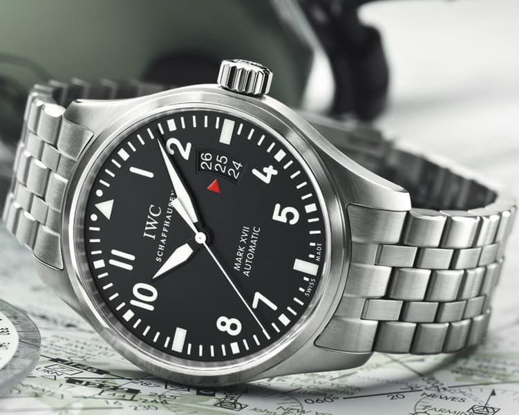
An example? The IWC MkXVII. The problem with it is summed up in the blurb; “A classic pilot’s watch… IWC’s designers have modified the date window to make it look more like the instruments found in a cockpit…” In the 1970s kids modified their bicycles with cardboard fairings to make them look more like Barry Sheene’s RG500 XR14.
Contrast that with the IWC MkX and MkXI. These were real pilots’ watches used by real pilots and navigators. They were intended as practical flight instruments and no-one gave a damn about what their date window looked like (they didn’t even have a date). And that’s what made them beautiful; the way their form was completely dictated by their function.
The MkXVII’s form is determined by market research and, probably, a few focus groups. That’s not its fault. Most modern ‘plane cockpits have enough hardwired kit to make a wristwatch redundant. But the resulting compromise of function means it can never be a great watch in the way its forebears were. Instead, it’s marketing-driven precision jewelry.
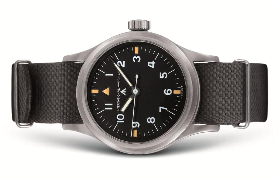
The Mk X and XI with their innovative cal. 83 and cal. 89 movements were designed to do a job, and a tough one at that. They were designed to survive aerial combat, not look nice. They ended up being beautiful because they were good at the job they were designed to do. The MK XVII with its modded ETA 2892? It’s designed to survive nothing more serious than a business risk meeting. And that makes it about as interesting as watching snail racing.
The Watch Curmudgeon
If you want to see a watchaholic get teary-eyed, profusely perspire, develop a twitch, and possibly dance a little jig, mention the brand Grand Seiko. To accentuate those symptoms, specify the SBGR collection. We’re on Holy turf here!
Well, not given to blasphemy, I have to admit that I, too, like these watches. But you won’t find me melting into a little puddle. Yeah, the case, with all its nifty angles is neat, especially the way it meets the crystal. The beautifully shaped hands are probably scalpel sharp. And the movement is undoubtedly better than 98% of everything coming out of Switzerland.
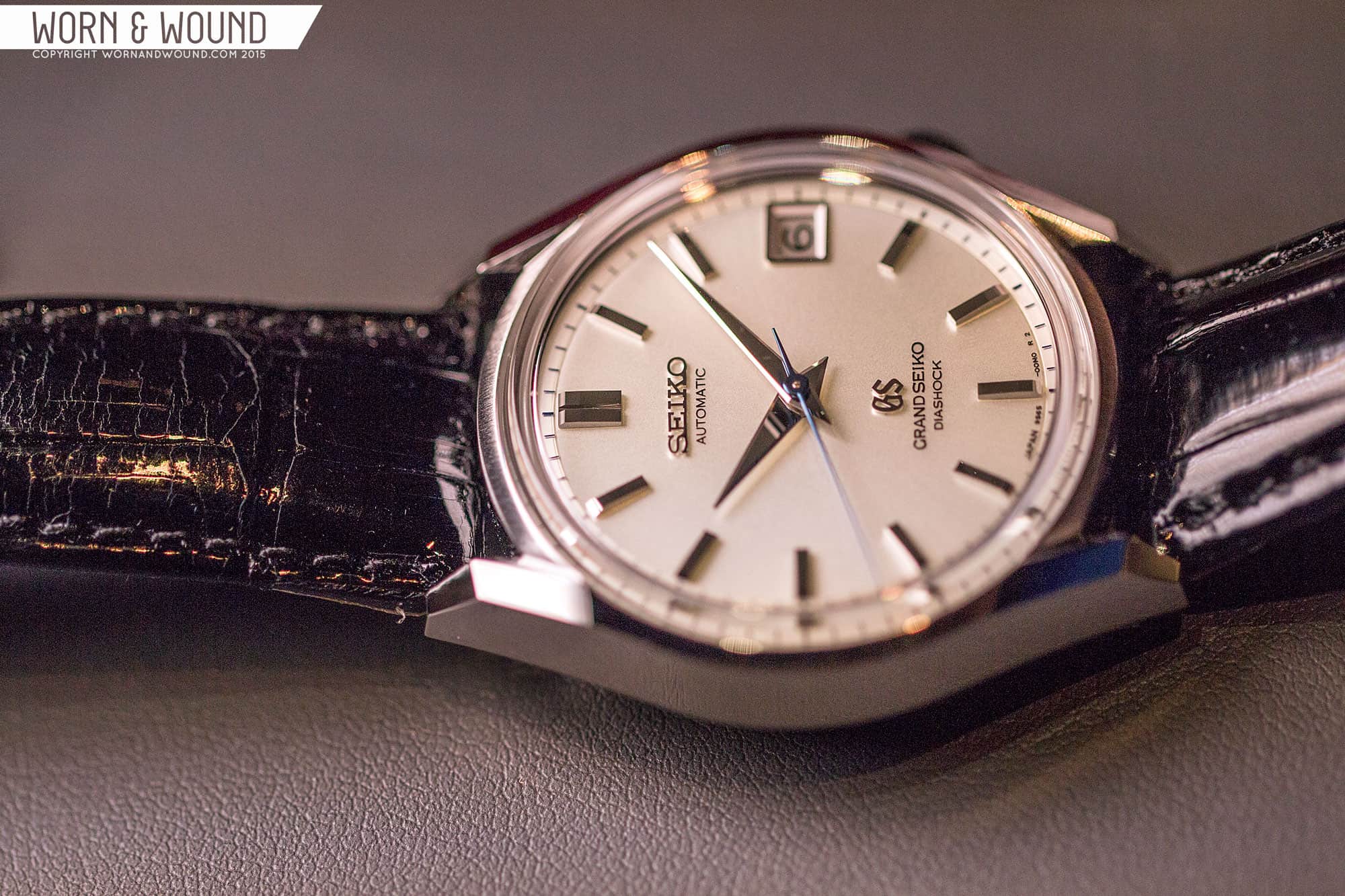
So what’s my problem? It all boils down to a price/value conundrum, a matter of subjectivity driven by brand image perception. In other words, I don’t think an all-steel Seiko with the most common watch functions should cost around $5000. Maybe $2000. at the most. I mean you can get a spectacular Seiko tool diver for around 2K. And those are built to perfection. So why pay $5000 for a Seiko that does so much less?
Look at it this way, if a rich uncle gave you 5K that “must be spent” on a watch, would you run out and buy a Five Grand Seiko? As for me, I’d buy two Sinns or maybe one Sinn and a Nomos. Or…….I’d find a vintage Rolex DateJust in perfect condition with change left over for a W&W strap. In my humble, purely subjective opinion, no Seiko is going to have the panache of a Rolex.
James Enloe
We frequently (and mostly) discuss watches we like, not just here on worn&wound but pretty much everywhere. For the most part, the watch community is a polite pleasant bunch (yes, save the occasional troll). That is what makes this topic so much fun, we get to spend a few minutes on the opposite end of the spectrum. Since it’s release in 2005 I have never understood the appeal of the Hublot Big Bang. From the original debut piece to every iteration since I cannot find an ounce of interest for it. I find the case shape, with the extra growth on the 9 o’clock side unattractive and unbalanced. The lugs with the screw completely undesirable. Every photo I’ve seen shows the screws on the bezel and lugs aligned in different positions which looks sloppy. The carbon fiber models are just an eyesore along with the large Hublot “H” at the end of the seconds hand. Credit to Hublot for giving their brand a kick in the ass, but frankly this is one piece I’d like to kick to the curb.

Brandon Cripps
There are plenty of watches that are popular to the general public that really don’t make sense to me: 99% of Fossil, every bit of Hublot, every Invicta since 1991, Michael Damn Kors. But saying any of those don’t do it for me doesn’t really say much at all, since a majority of watch people would probably agree with me. There are, however, a few watches that watch nerds – newbies and lifers alike – fawn over that I just never made a connection with (and not for lack of trying). At the top of that list is a pair from watch design darling Gérald Genta. Watch nerds will already assume I must be talking about the Audemars Piguet Royal Oak and the Patek Phillippe Nautilus. And they would be correct.
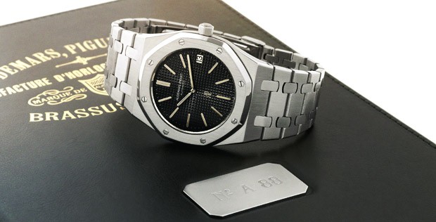
The Royal Oak and the Nautilus get so much lustful attention from the watch world, and for the life of me, I don’t get it. I can get there in my head – I understand the impact both had on the high-end mechanical watch market during the crash of the quartz wave, being slim and sporty and perfectly engineered – but my heart never catches up. And this isn’t a case of, “Oh, well you really need to wear one to understand…,” as I’ve worn both (including an A Series RO and a Nautilus so well loved it has its own hashtag), and the magic still didn’t happen. Yes, they’re both unique, with their angular bezels, highly textured dials, and integrated bracelets.
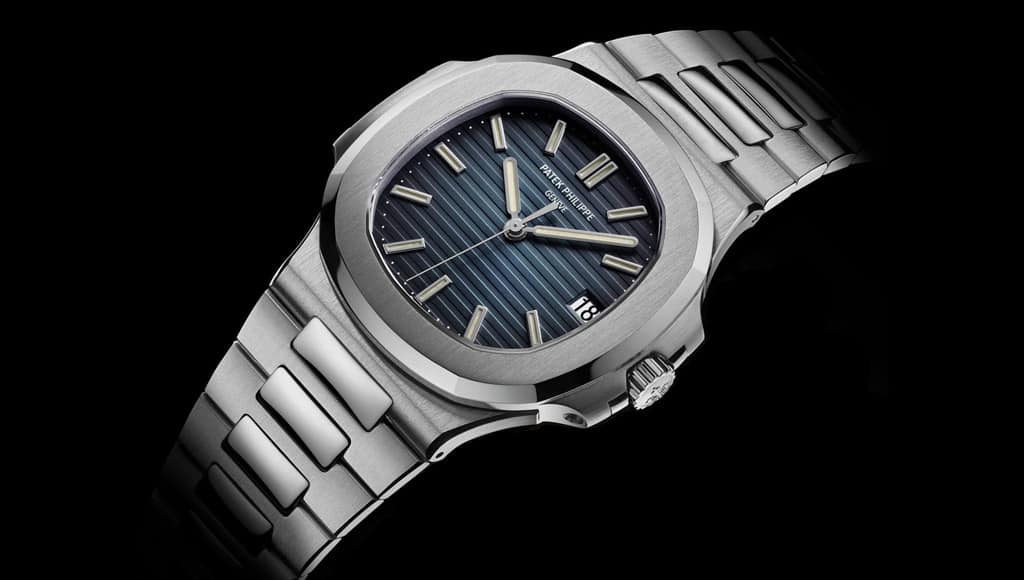
But in the end, both fall almost totally flat for me. (Or at least “meh” enough that I can’t begin to understand their placement among the “best watches ever” and the absurd prices they command.) Maybe I’m biased, having grown up seeing other watches whose designs were derived from these two; but it’s like watching a classic, groundbreaking movie: as amazing as it may have been in its time, it seems boring after seeing its descendants first. Or maybe I just like a watch to look like a watch and not like a boat.
Sean Lorentzen
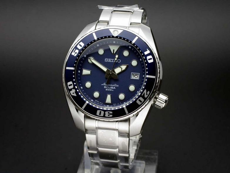
Seiko is, in a lot of ways, the single greatest watch brand on Earth. I’ve had nothing but love for the Seikos in my collection (a 6139-6005 and a 6138-8039), and their combination of quality, in-house mass manufacture, and great value for money is virtually unbeatable. That said, I’ve got a little secret. Almost none of the modern Seiko diver range, bar the SKX lines and the MM300, appeal to me whatsoever. The Sumo, Samurai, Sea Urchin, and especially the Monster are all just a little… off. The Sumo, fine watch though it is, has a clunky bezel insert that doesn’t mesh with the rest of the design at all, the Sea Urchin looks cheap, the Samurai is almost too angular, and I understand that part of the charm of the Monster is its ugliness but it’s not something that wins me over. None of them are anything I’d want to own at all.
Ilya Ryvin
I’m almost ashamed to admit this, but I have to go with the Seiko Marine Master Professional 300m Diver SBDX001. I know, I know, but hear me out before you ready the torches and pitchforks. Now don’t get me wrong, the SBDX001 is a fantastic watch with a lot to like, so I can see why it appeals to others. It has a solid monobloc case with great finishing. The dial and hands are immediately attractive, with enough Seiko quirkiness to give it some major style points. And internally, there’s an undecorated Grand Seiko movement beating away. And of course, this entire package comes in at under $2,000, which is practically a steal when you consider all the great specs and how little the competition offers at the same price point. So, you may be asking, “What’s not to like?”
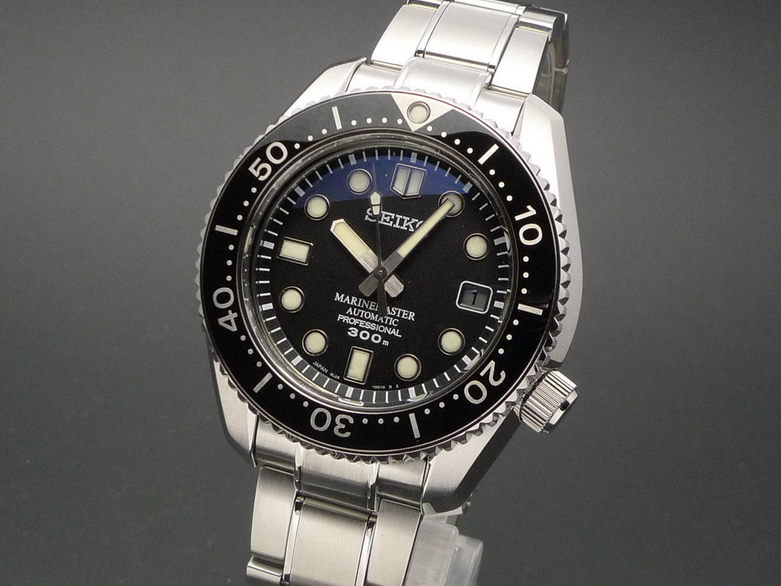
On paper, I love the SBDX001. Heck, when I see other people wearing one I often get hit with pangs of jealousy. But every time I have the opportunity to try one on, I am left a little cold. I don’t really like the way it wears, and being that it is quite thick it sits a bit higher than I like on the wrist. It’s also a heavy watch, which I’m not really fond of. It may be that I’m just gravitating toward smaller watches, as I’ve had similar reactions with other popular large divers (I’m talking to you, Sinn U1.) I guess I’ll just stick to my trusty 007.
Li Wang
Admittedly, when first tasked with finding a popular watch to criticize I wanted to tear into the Christopher Ward C60 Trident 300, with its wavy patterned dial, wacky trident seconds hand, and of course the name shortened to Chr. Ward, like a certain Normcore middle management clothier Jos. A. Banks. But I took a look at the lineup once again to remind myself of the those visual cues I just couldn’t warm up to, and I just couldn’t deny that if you like the style, the Trident Pro offers a lot of quality features for the price, which is something that the Worn&Wound editorial team can always appreciate.
Therefore I turned my attention to the current iteration of the Omega Seamaster Diver 300 model with the skeleton hands, helium release valve, scalloped bezel and very detailed bracelet, the version that became popularized with Pierce Brosnan’s 007 in the 1990s.
It currently retails at $4,400 (and can be had for much less at grey market prices of course), which puts it into a price range where you can pick up a very nice vintage Speedmaster or start saving for recently released vintage-inspired Seamaster 300 co-axial, which is one my favorite watches. The reason I feel such disdain for this particular standard Seamaster is that it’s quite often recommended for a watch enthusiast’s first “real” watch.

First of all, the scalloped bezel is just plain difficult to operate. That’s a deal breaker for me, especially when so many budget divers have crisp bezel action. The Omega literature states the bezel is meant to evoke the undulations of the ocean, but its function and form lack authority. The skeletonized sword hands also fall victim to the same pitfalls of the bezel, where form and function are both compromised. The smooth crown guards also look wimpy, as if they are too lazy to really protect the crown.
The nine-row bracelet with shiny bits is just another instance where there is a lot of detail that over-complicates the entire look.
Patterned dial watches are also hit-or-miss for me, but many of these Seamaster Pros have a wavy dial, that Mr. Chr. Ward also likes, that just cause the watch to offer an unnecessary detail. The protruding helium escape valve at 10′ o’clock is another detail I could do without, but when I’ve seen the Seamasters with the filled sword hands, rectangular dial markers and standard three-link bracelet, the overall look and feel is much improved.
Don’t even get me started on the Bond 50th anniversary version, where tiny 007s are printed on the dial.
Christoph McNeill
Man, what a great task! Pick a watch that everyone moons over that I don’t like. Well, as it turns out, there happen to be lots of popular watches and brands that I simply don’t “get”. Now, maybe that’s because I’m somewhat…opinionated and occasionally cynical, but let’s just call it “personal taste” for the purpose of this discussion. I could have gone with the likes of Hublot or Breitling, or maybe with something more ubiquitous like the Casio G-Shock. In the end, I chose the Patek Philippe Nautilus. Now, of course this isn’t a watch that most people can afford, but it is one that I see near-universal praise and love for. Personally, I find most of the PP designs to be kind of boring, but I can definitely appreciate the history and quality of the brand.

That said, I find the Nautilus to be really just….not a good looking watch at all. As if the oddly shaped case and gigantor flat bezel weren’t bad enough, the straight up 80’s textured dial and paddle shaped hands just really look garish to me. Now, I know that it was designed by the great Gerald Genta, but the Nautilus can’t hold a candle to the brilliance of the Universal Geneve Polerouter design…now THAT’S beauty. I know that people fawn over PP, and rightfully so in some cases, but I just don’t see the appeal of the Nautilus. And remember, this is just the ranting of one cynical, opinionated old (-ish) man, so I hope no offense will be taken by the PP Nautilus fans out there…well, maybe just a little offense…;-).
