[VIDEO] Owner’s Review: the Fears Brunswick Aurora

I’ve never really thought of myself as someone who jumps on trends. When it comes to music, movies, and other things I enjoy, I don’t pay much attention to whatever is in the zeitgeist at the moment. Or, more accurately, I don’t let whatever that is define my taste. I tend to be somewhat skeptical of whatever is becoming hyper popular at the moment.

In watches, it’s fairly easy to spot a trend when it’s happening, but a bit more difficult to figure out what’s going to take hold before it actually happens. Jumping onto a trend in watches always seemed particularly silly to me. Watches have an heir of permanence embedded into them, so a “trend” in this hobby is anachronistic to what watch ownership is all about, and what a “good watch,” or one that ultimately stands the test of time, really is. Being trendy in watches carries a larger risk that you’ll wind up with regrets. Example: I don’t feel bad at all that I got really into Canadian post-rock when it had a moment during my college years. Twenty years later, it’s passed, but I still get excited when a new Godspeed You Black Emperor record is announced. Will watch enthusiasts who have collected every MoonSwatch variant still lose their minds over plastic watches a decade from now? Maybe, but it seems unlikely. 

Advertisement

I’m not naive to the fact that we’re experiencing a trend with respect to mother of pearl and stone dials. It’s quite possible that at this very moment we might actually be on the tail end of that trend. You don’t have to look much further than recent episodes of the Worn & Wound podcast to hear our very own Devin Pennypacker give voice to the inevitable MOP and stone dial backlash. It’s quite possible that enthusiasts, for the most part, have had their fill of exotic dials for now, and that the moment might be coming to an end. It was fun while it lasted, for sure. Maybe we flew a little too close to the sun. 

For me, the current MOP moment began when the Fears Brunswick “Aurora,” a watch that debuted in October 2023, came on my radar. I saw it in person soon after its unveiling at the Windup Watch Fair in New York – it was one of those watches that I found myself walking back to the Fears booth whenever I had a few minutes to spare to see again. It was immediately transfixing, and a watch that wormed its way into my head very early on in the way a new watch sometimes can, becoming an object of obsession to the point where an acquisition becomes an inevitability rather quickly. 

$4250

[VIDEO] Owner’s Review: the Fears Brunswick Aurora

Case
Stainless steel
Movement
La Joux-Perret G101
Dial
Mother of Pearl
Lume
None
Lens
Sapphire
Strap
Stainless steel bracelet
Water Resistance
150 meters
Dimensions
40 x 46.5mm
Thickness
11.9mm
Lug Width
20mm
Crown
Screw down
Warranty
Yes
Price
$4250

It all kind of lined up for me with the Aurora. I had admired Fears for some time, a brand that I was actively looking for a way to support from the first time I met their Managing Director Nicholas Bowman-Scargill. I’m far from the first person to point it out, but Nicholas truly is in that “nicest people in watches” club. He is, of course, a great ambassador for his brand, and the way he enthusiastically tells the Fears story when you meet him in person, follow him on social media, or hear him on a podcast, is infectious. But he’s also down to earth, approachable, and authentic in a way that I think really helps people connect to the watches themselves.

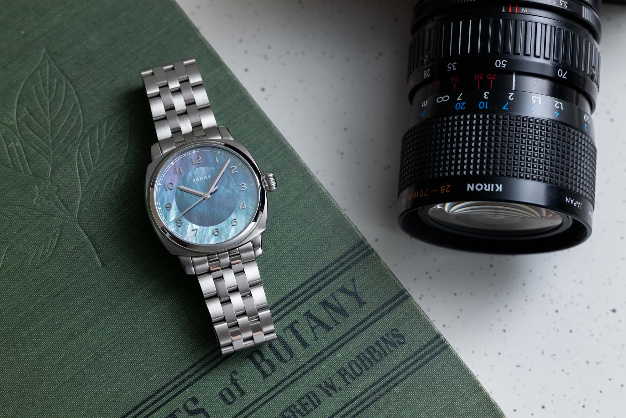
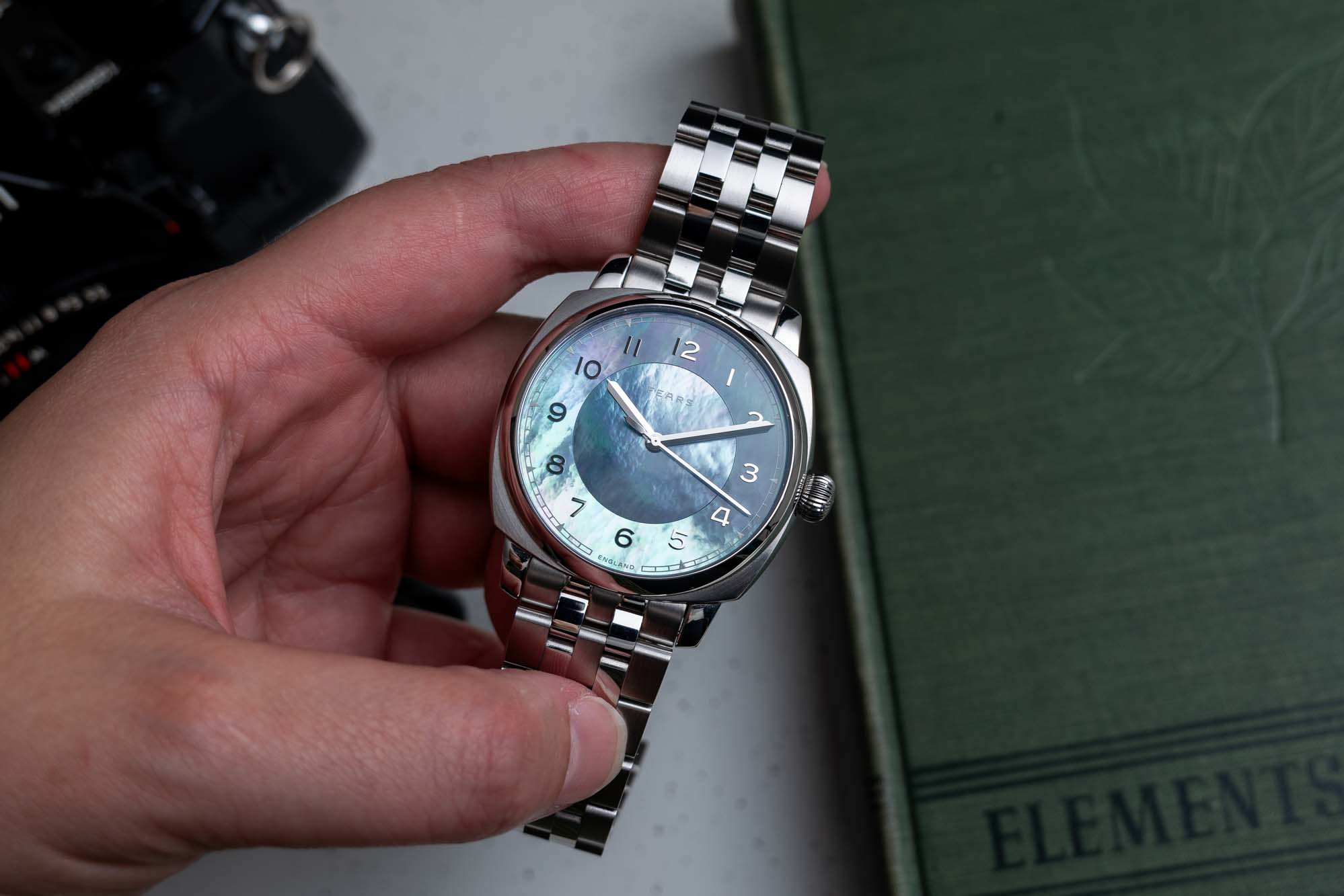
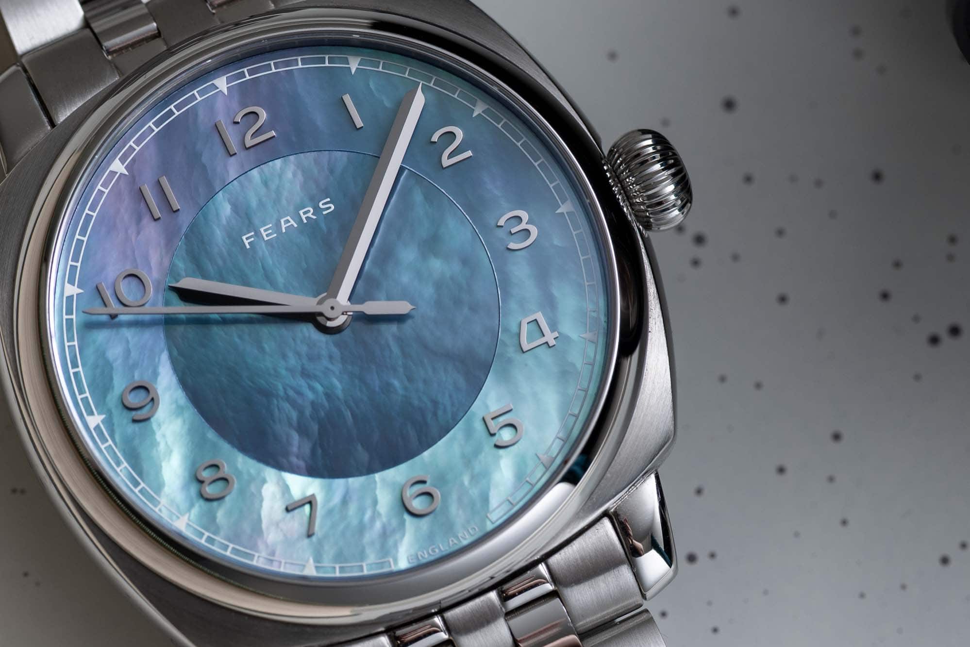
The Aurora specifically struck me as a special watch. At the time, it felt like a departure for Fears to use mother of pearl at all, and the specific execution of the Aurora forces you to rethink what a mother of pearl dial can be. For years, most of us have been conditioned by the watch industry to understand mother of pearl as a feature of watches made for women. It’s (usually) lighter in color and, more importantly, purely decorative. There’s no functional reason to use mother of pearl – it’s a thin and relatively delicate material. It doesn’t make a lot of sense in what we’d normally think of as a tool watch. And so like diamonds, gems, and stone dials more broadly, MOP has been a pretty niche interest among enthusiasts. 

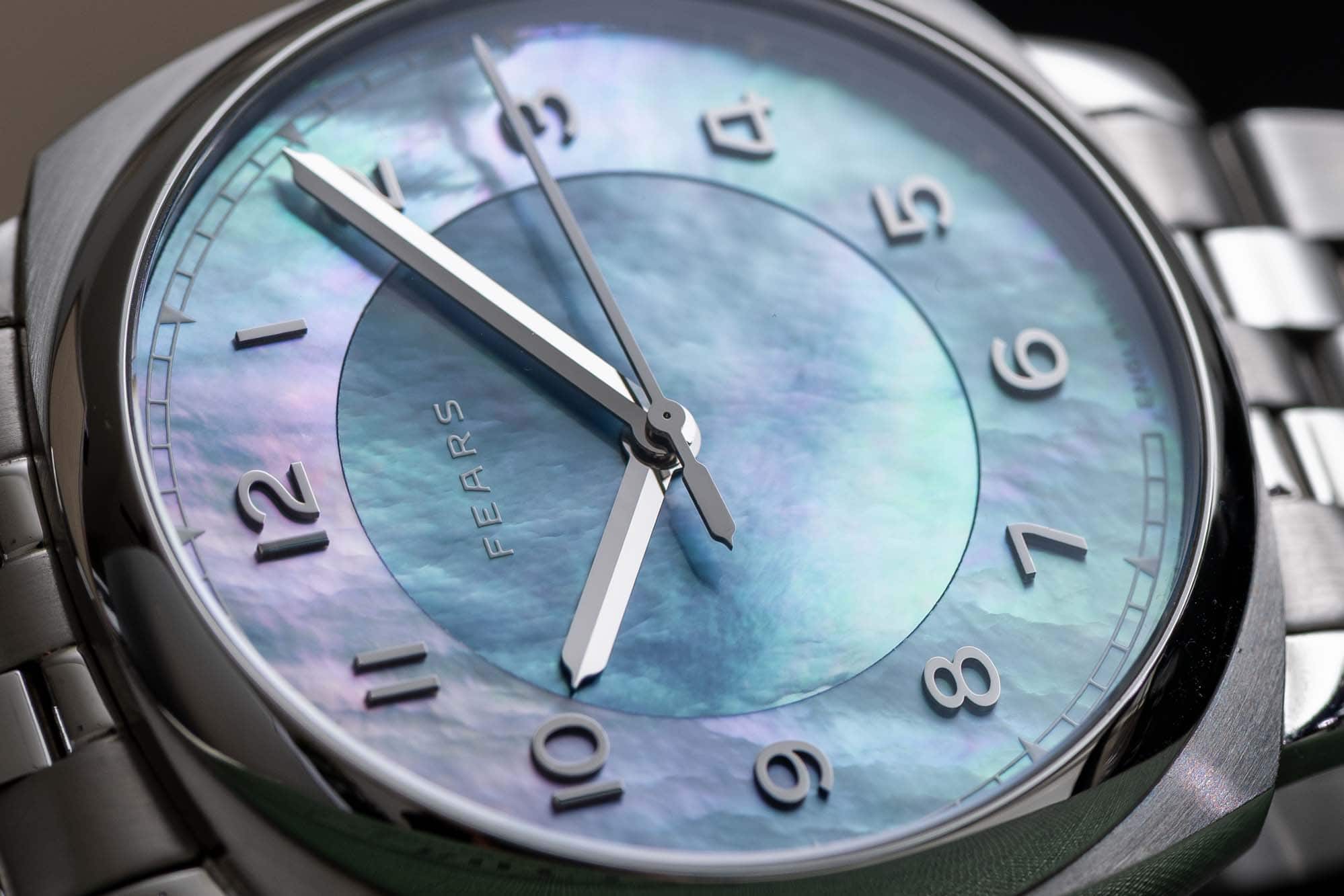
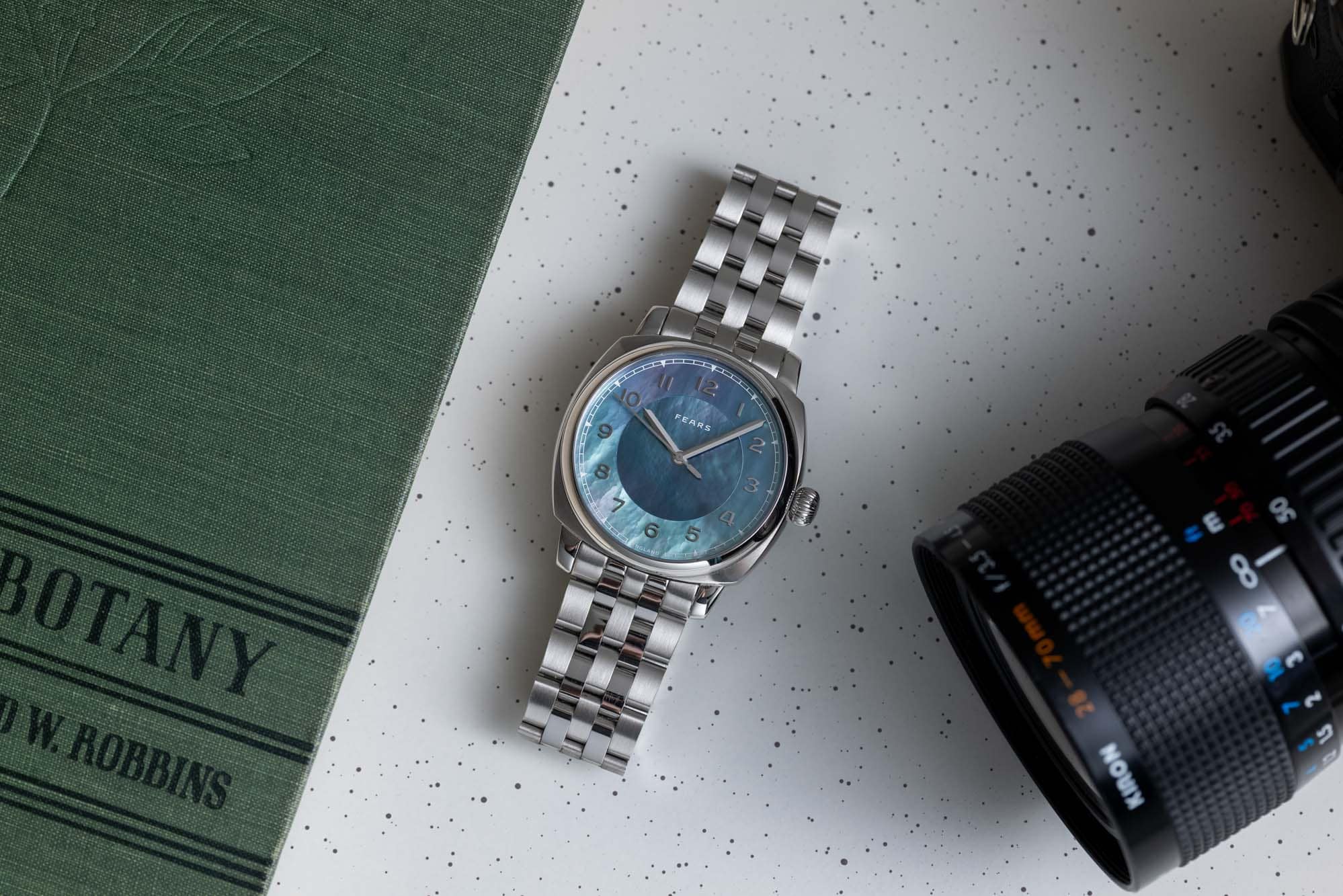
The Aurora’s dial is made up of two pieces of mother of pearl that are dominated by blue tones, but of course shift dramatically in the light and when viewed from any number of angles. The combination of the multi piece dial (with a center section ringed by an outer sector) and the irrepressibly dynamic slabs of mother of pearl create a dial that feels like it’s constantly in motion. The name of the watch is the key to its inspiration: the northern lights are certainly a solid reference point. But more often than not when I admire the dial I feel like I’m looking at tropical waters or rapidly moving clouds, or perhaps clouds reflected in tropical waters. All of the reference points, though, are rooted in the natural world, which of course makes sense given the natural material that the dial is constructed from. 

In the time I’ve owned the Brunswick Aurora I have not grown tired of the unique effect of this mother of pearl dial, and I’ve had plenty of chances to handle many other MOP dials in the last year or so as the use of the material has really caught on. While many mother of pearl dials we’ve seen from brands roughly in the same pricing tier as Fears look very nice and have a ton of charm, I can’t think of one that has such a strong, almost psychedelic effect. Many brands seem to use mother of pearl as a subtle accent, but the way Fears uses it on the Aurora is anything but. It’s as in your face, in a way, as the orange found on a Seiko Monster. I’ve found that part of what makes it appealing to me, and a watch I’m happy to wear day to day, is the fact that it’s so bold. I’ve been gravitating more toward watches that at least attempt to make some kind of aesthetic statement, and that’s something the Aurora does incredibly well. 

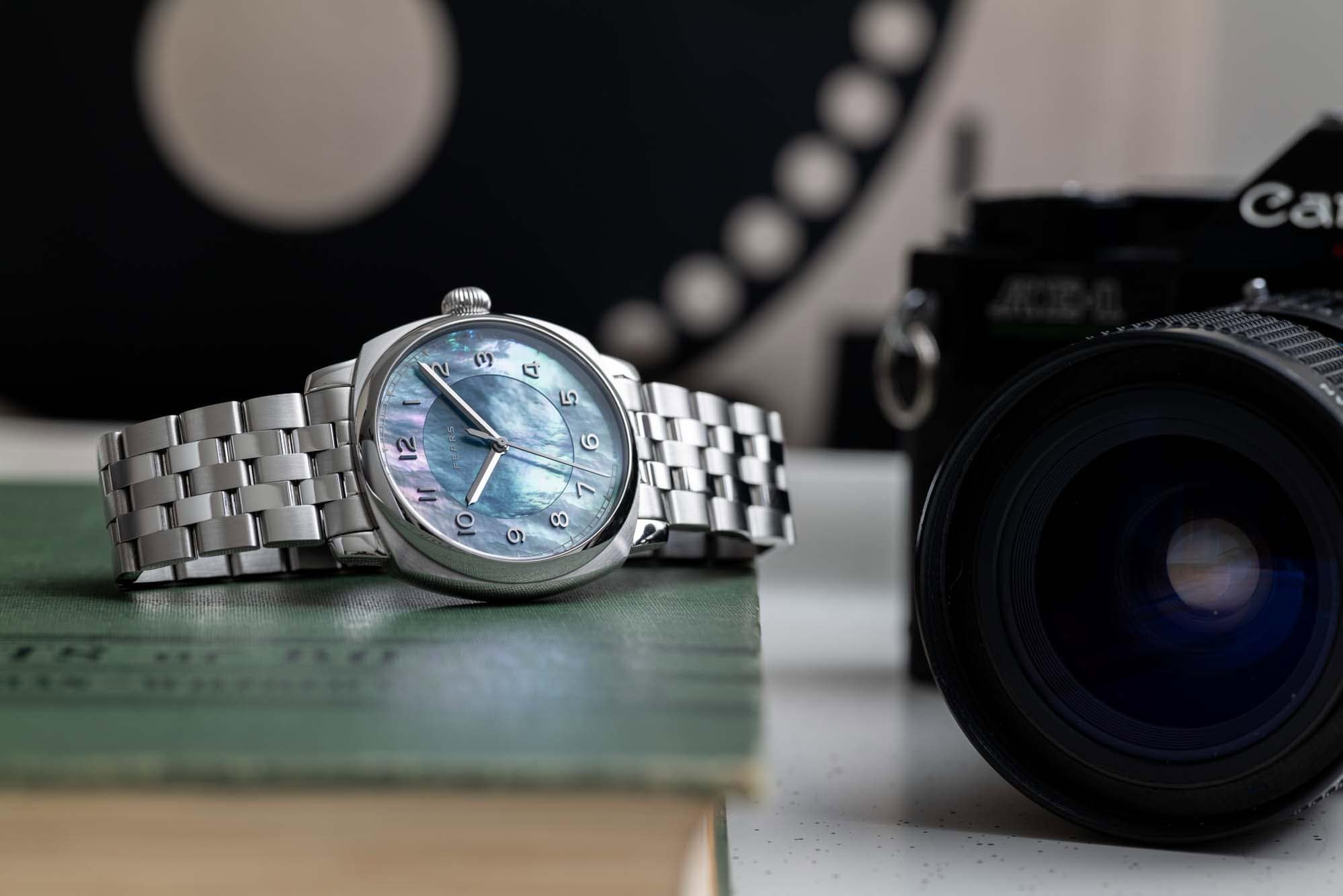
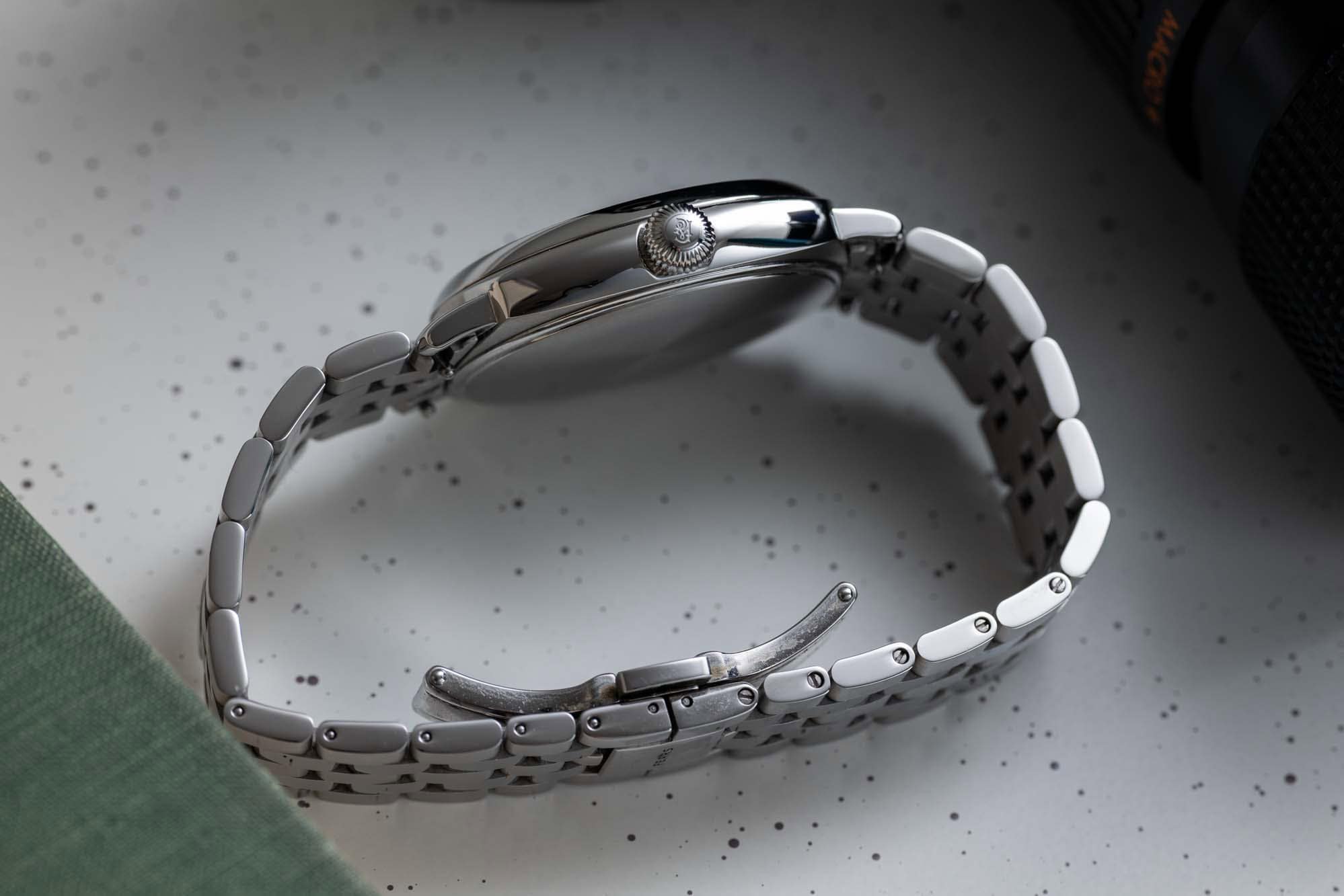
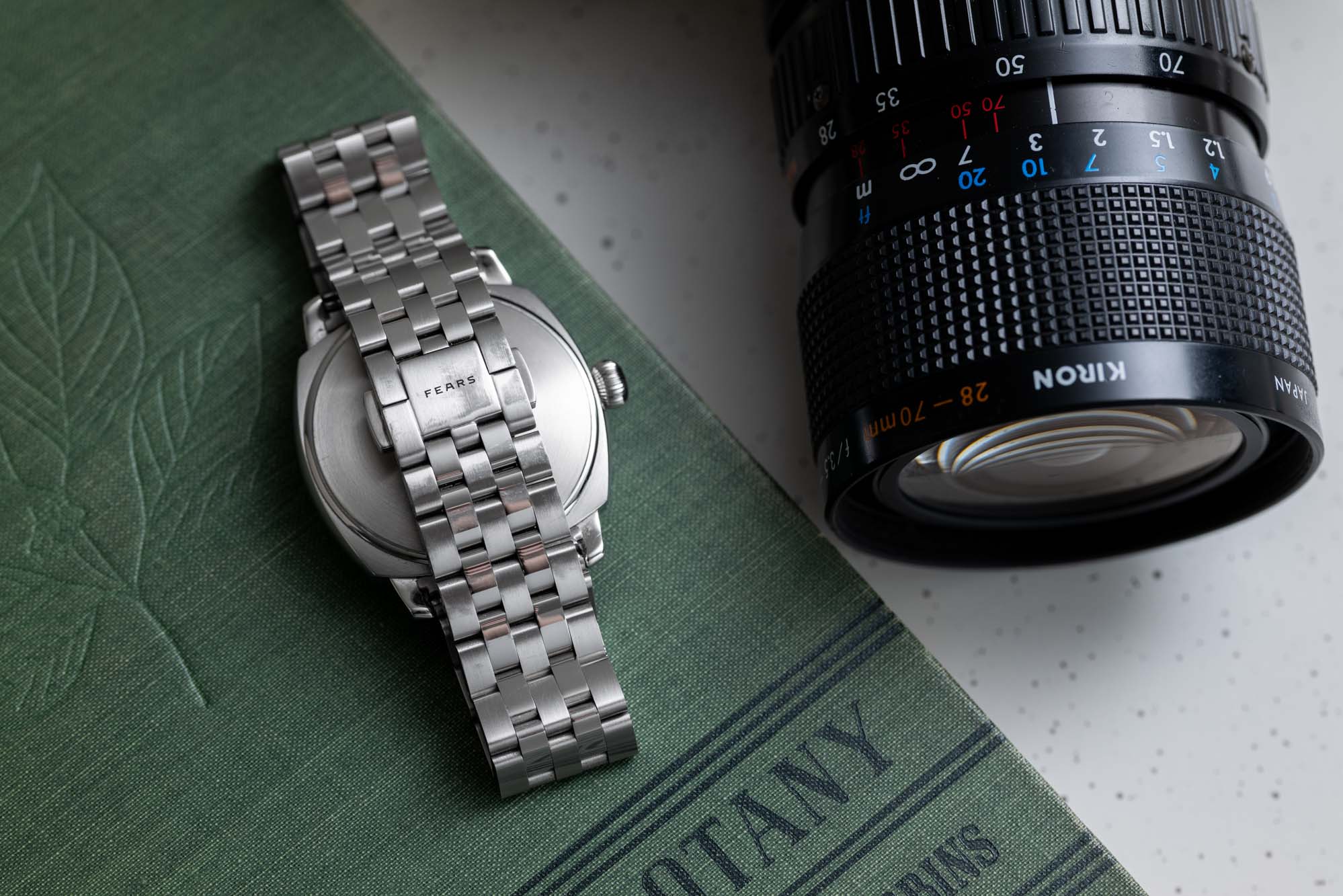
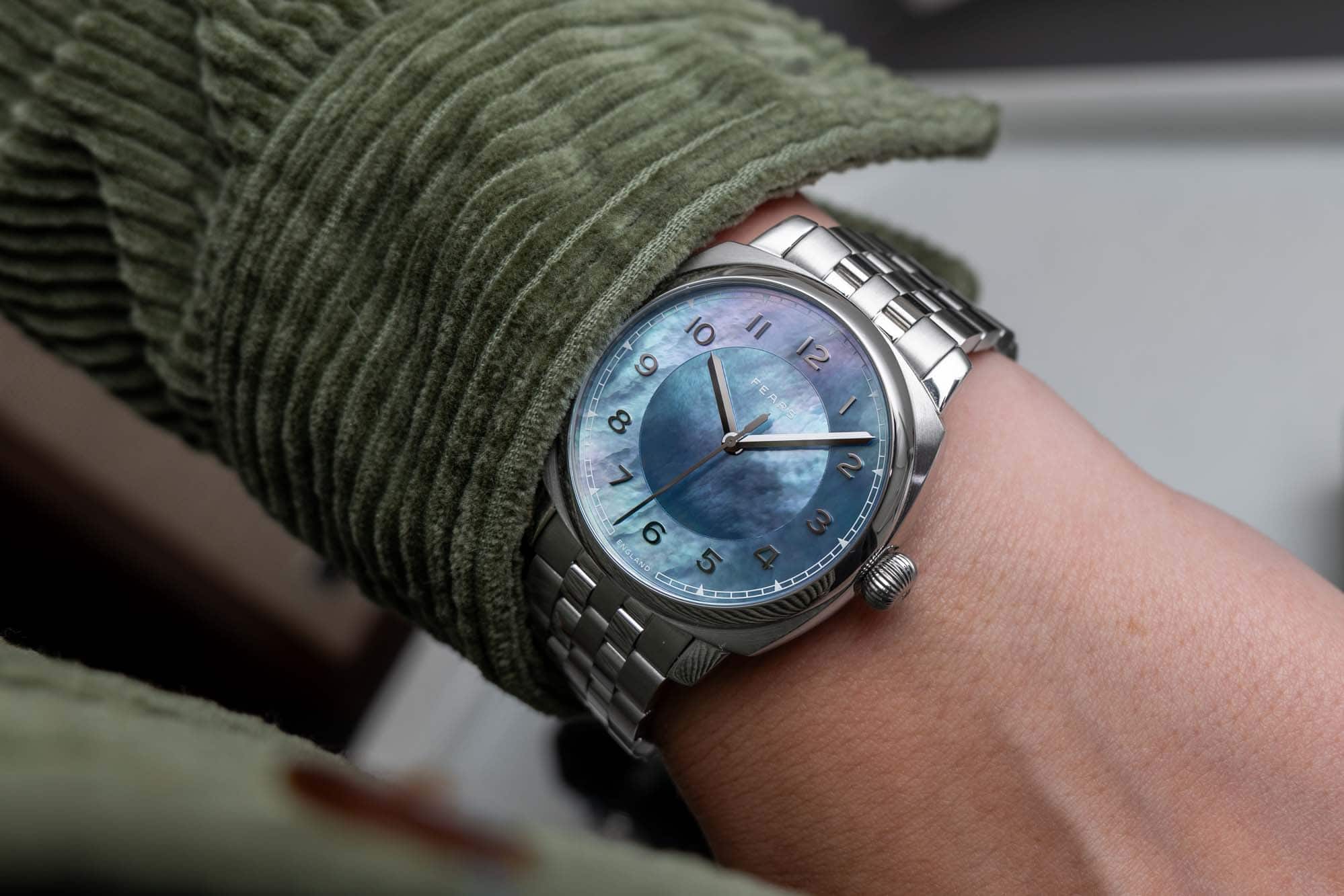
And I do like to wear it as a daily driver. While the dial might not technically complement much of what I might wear day to day, the 40mm Brunswick case is incredibly comfortable on my 7.5 inch wrist, and the wearing experience itself is always easy. Much has been made since the Brunswick’s debut of the case’s similarity to that of the Panerai Radiomir. Of course it’s impossible not to see the general similarity in shape, but I’ve always found the comparison, and the implication that Fears is somehow aping or paying homage to Panerai, to be, how can I put this…kinda dumb. It’s a lazy critique that is as meaningful as saying any number of generic divers are Submariner clones because they have circular and lumed hour markers. Not to mention that looking at the brands themselves, it would be pretty hard to find two that have sensibilities more different than Panerai and Fears. I’ll just leave it at that. 

In any event, I think the case is quite handsome and evokes a certain amount of elegance that is appropriate for a watch with a dial like this. The Brunswick has always been positioned as a watch on the sporty end of the Fears catalog (it does have a screw down crown and 150 meters of water resistance) but this is far from a burly adventure watch. In fact, at this very moment it might be the closest thing in my watch box to a “dress” watch, although that’s not the right category for it either. It’s relatively thin, though, at 11.9mm tall, and has a shorter than expected lug to lug thanks to the cushion case design (46.5mm). I guess the way I’d put it is that this is the kind of watch you might end up with if you walked into a department store in the 1960s and just wanted a watch, not one that would be fit for astronauts, racecar drivers, or divers, and not one that requires you to dress up like the Monopoly man for it to look appropriate (although I think he wore a pocket watch…). It’s just a watch with a case that can be worn by normal people, everyday, and never really look out of place. That might seem like the simplest concept in the world, but I have a hunch that making a watch that can literally be any watch is on the more challenging side. Regardless, the Brunswick case in 40mm is a great example of how to do exactly that. 

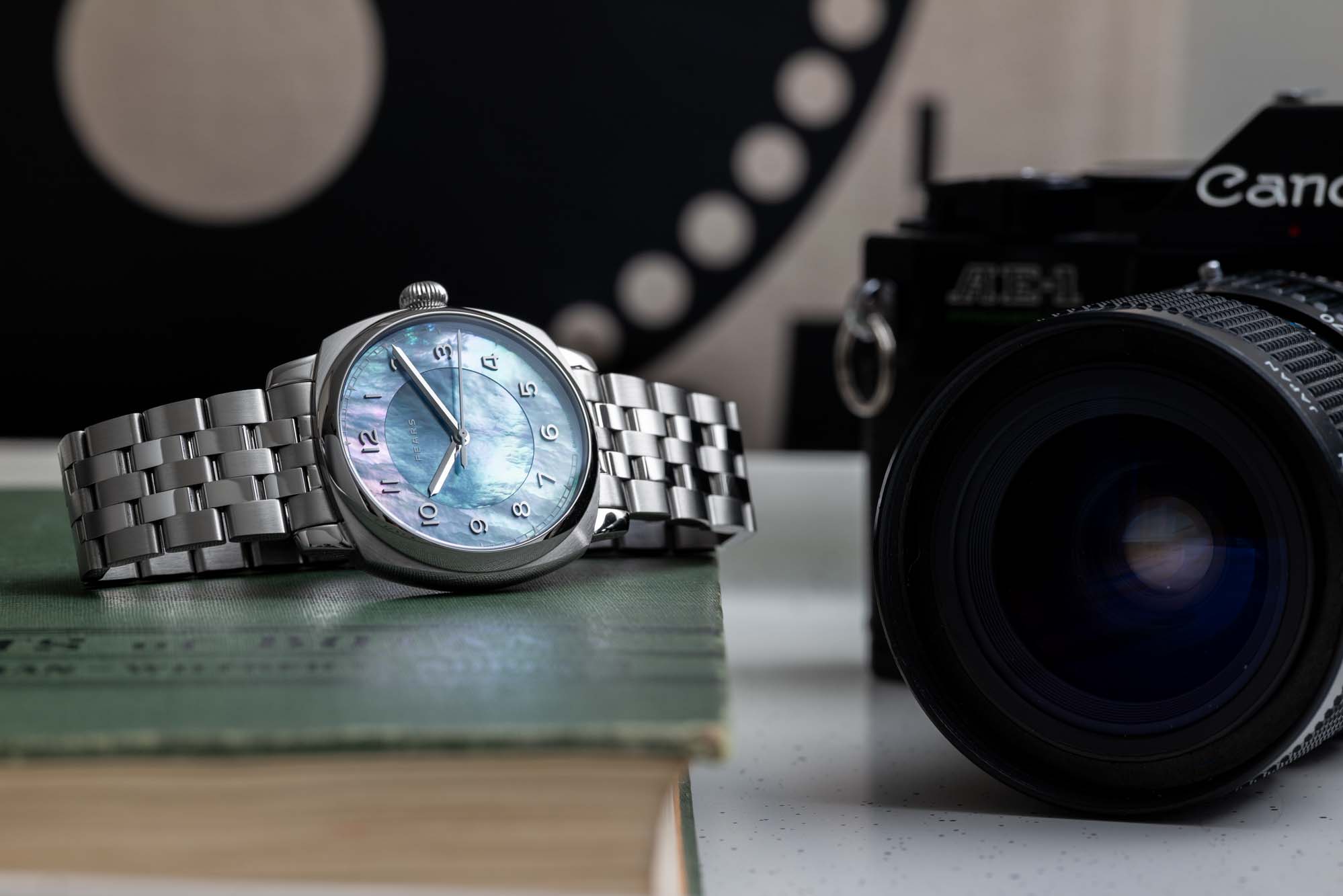
But let’s not kid ourselves here: the primary objective of the Brunswick case in this particular instance is to be a vessel for the mother of pearl dial. The dial is the reason I love this watch, and I have a feeling I’d love it equally if it, or something like it, came in a Fears Redcliff or a Fears Arnos case (the latter is actually a pretty interesting idea and one that I hope Nicholas and his team eventually get to). Because the thing about mother of pearl that can’t be understated and that makes this watch so incredibly rewarding to wear is that it actually feels like about five different dials in one. It can appear radically different depending on the viewing angle, and of course the light. I wrote above that the dial reminds me, at times, of clouds, and there’s a certain poetry to how in dark environments one gets the impression of storm clouds, but in bright sunlight it looks like a perfect summer sky.

Because of the way the dial seems to change all the time, it’s a watch that I’ve enjoyed photographing quite a bit in the time that I’ve had it. Kat’s photos here do a great job of showcasing much of the dial’s dynamism, but trust me when I say that living with it for a year reveals much more than be discovered in any single studio session. As someone with a growing interest in photography but still very much an amateur hobbyist at absolute best, I’ve gotten a lot out of pixel peeping my shots of this watch, revealing dial textures, colors, and patterns that I’d never see with the naked eye alone. If my photography has improved even a little bit over the course of the last year, I owe at least some of that to this watch, which is both a challenge and a pleasure to shoot. 

I’m never as happy to wear the Aurora, though, as I am on a sunny day when I know I’ll be spending some time outside. This is where the watch really shines and the dial is at its absolute best. There is an ethereal quality to it that makes it look almost fake, like it’s some kind of simulation of a MOP dial created by ChatGPT without any guardrails at all. This is when the watch is at its least subtle and makes its greatest statement. 

It’s worth noting that while the mother of pearl material is certainly the star of the show, the applied numerals are also gorgeously executed and serve to lift the dial up, so to speak, creating a subtle sense of depth and adding not insignificantly to the drama. Each numeral is milled from a block of solid brass before being polished and given a coating that makes them incredibly legible in all lighting conditions. They have a real visual heft to them, especially when viewed from the side where you can see their full height and shape. They are ultimately a small detail, but add a lot of character to the Aurora. It might have been tempting for Fears to forego the numerals entirely and let the dial’s material and texture speak for itself, but I’m glad they’re here as they draw a link to other pieces in the Fears collection (the typeface is a Fears hallmark and a callback to the brand’s earliest days). 

If I have a small gripe with anything pertaining to the dial’s layout it’s with the minute track at the perimeter. It’s rendered in white, I think to keep from drawing too much attention to it, but that makes it quite hard to read in certain conditions, particularly in areas where the tone of the MOP is a bit lighter as well. Every dial will be a little bit different, so some might not have much of an issue here at all if they are darker at the outer edge, but on my particular watch there are times when this track becomes a bit of an eye chart. I say this is a small gripe because, in practice, I don’t have much of a need to read the time to the exact minute. It’s mostly a hindrance when I’m attempting to set the watch to an exact time after starting it from a dead stop. Still, I wonder if removing the minute track entirely would have made more sense. 

I have mostly worn the Aurora on the stock five-link bracelet. This bracelet has a bit of a Jubilee-style flair to it, which I think is appropriate for the Aurora’s particular flavor of casual elegance. It closes with a butterfly clasp and I’ve found it to be very comfortable thanks to the easy articulation of each individual link. Some might bemoan the lack of micro adjustment on the clasp, a factor which has not made a bit of difference in my experience with the watch, but I was able to dial in a fit that feels just about perfect. This watch, I think, is a good example of one where the wearing experience might have been disrupted by a thicker or larger clasp with micro adjustment built in. To make this watch bulkier in any way would really sour it. As it is, the bracelet is nice and thin and drapes incredibly well. From time to time I’ve worn the Aurora on various straps, and it never looks bad, but I think I prefer the neutrality of steel with this dial. 

The Aurora sparked a real mother of pearl interest in me, and in the time since I’ve owned this watch I’ve added another with a MOP dial to the collection, a Louis Erard x Stefan Kudoke Regulator. I’ve found that the Louis Erard’s MOP dial has a very different impact than that of the Fears. It’s a lot more subtle, and I think a more traditional take on the material. Still, it has a similar dynamic effect, and like the Fears I’m kind of addicted to getting it into the light and seeing how the tone of the dial shifts and changes with the environment. 


View this post on Instagram


A post shared by Zach Kazan (@zkazan)

After taking delivery of the Louis Erard, I remember remarking to a friend (another watch collector) that maybe every dial should be made of mother of pearl? An overzealous statement for sure, but I’ve got to say, I’ve seen a lot of ink spilled over the years on watches with all kinds of gradients and finishing effects that enthusiasts have been fond of characterizing as dynamic or having a complexity in their color. It’s actually a pretty major watch writing cliche to remark on how a dial comes alive in the light – I mean, of course it does. But few do what a nice piece of mother of pearl can do, which is to give you the sense that the dial is actually alive.

A few years ago I wrote about how owning an Arcanaut Arc II Fordite changed the way I thought about value, originality, and independence in affordable and attainable watches, and I think my experience with the Aurora is similar, or perhaps an extension of that idea. Like the Arcanaut, the Aurora feels to me like a fully realized original idea. It’s not as zany or avant-garde as a watch with a Fordite dial, but the way it tweaks a very traditional accent material, turning it into something completely unexpected, makes for a weirdly similar ownership experience. This is the reason, ultimately, that I think the Aurora transcends whatever mother of pearl or stone dial trend might be happening at the moment. Like all of my favorite watches, it’s a reminder of the potential for creativity in this hobby. Fears

Images from this post:
Related Reviews
Zach is a native of New Hampshire, and he has been interested in watches since the age of 13, when he walked into Macy’s and bought a gaudy, quartz, two-tone Citizen chronograph with his hard earned Bar Mitzvah money. It was lost in a move years ago, but he continues to hunt for a similar piece on eBay. Zach loves a wide variety of watches, but leans toward classic designs and proportions that have stood the test of time. He is currently obsessed with Grand Seiko.
zkazan
Categories:
Tags: