[Video Review] The Farer Stanhope Gets A Sequel Worth The Wait

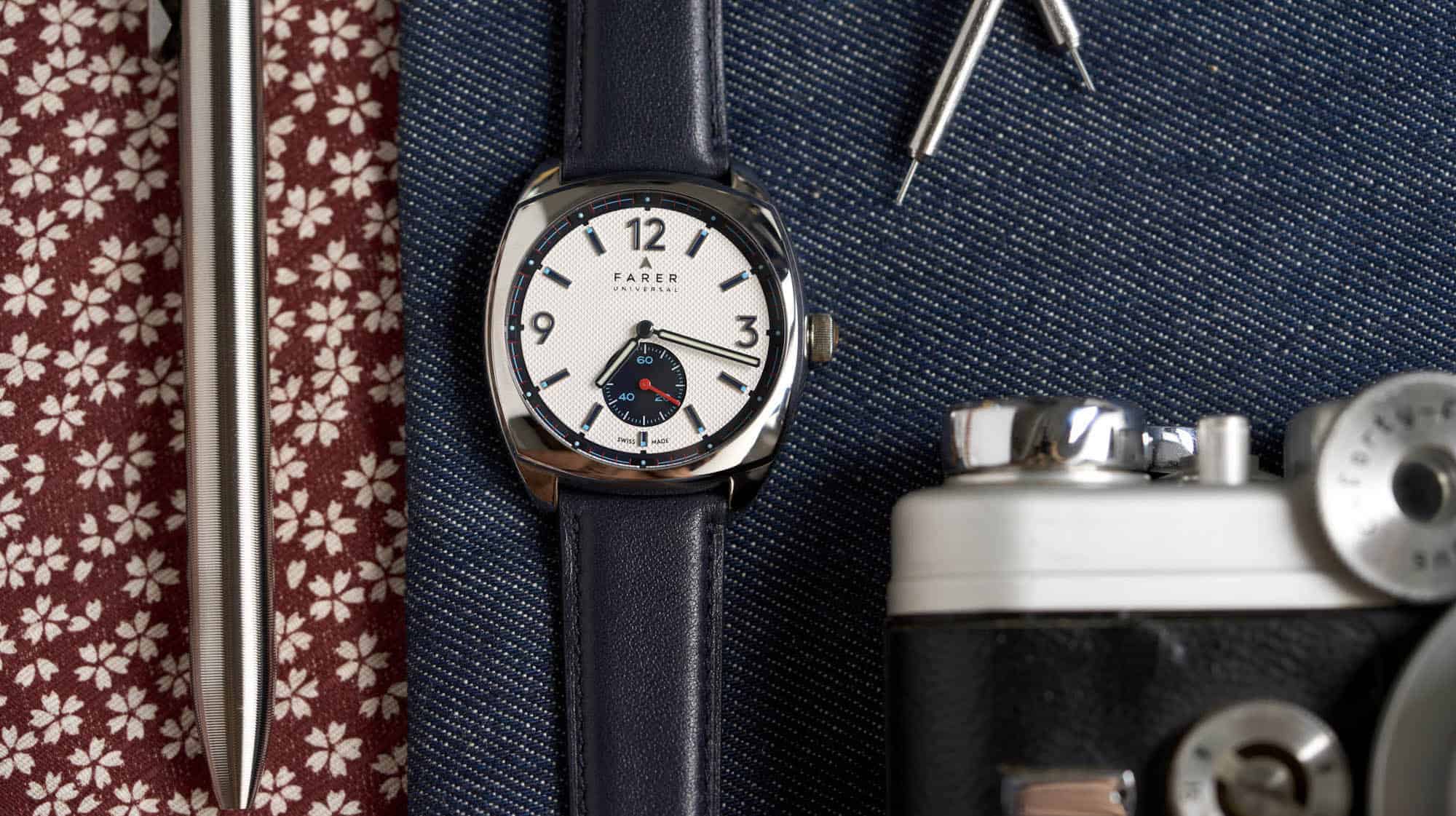
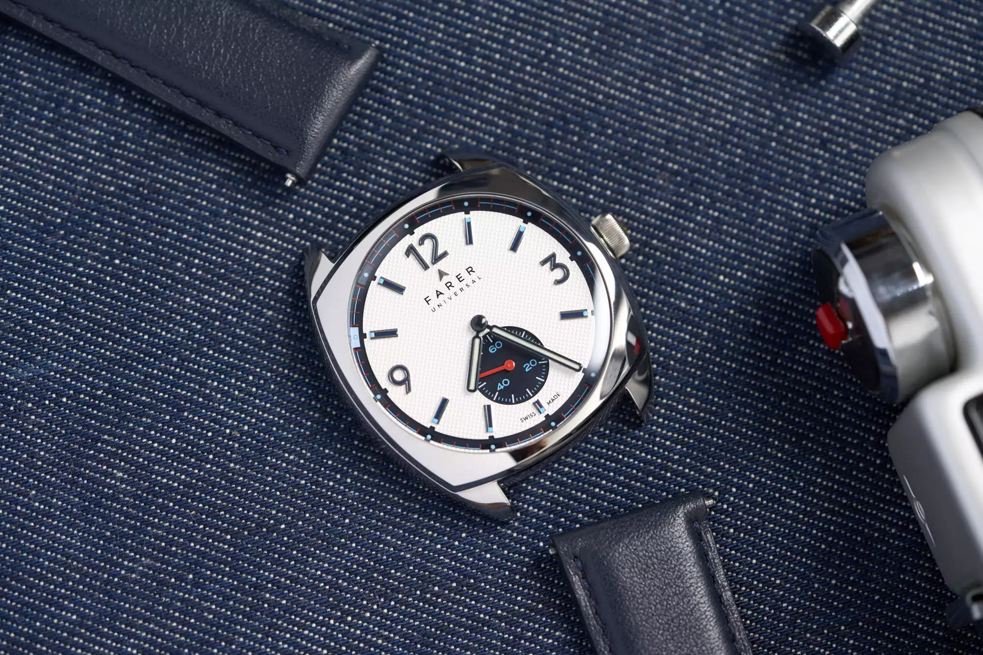
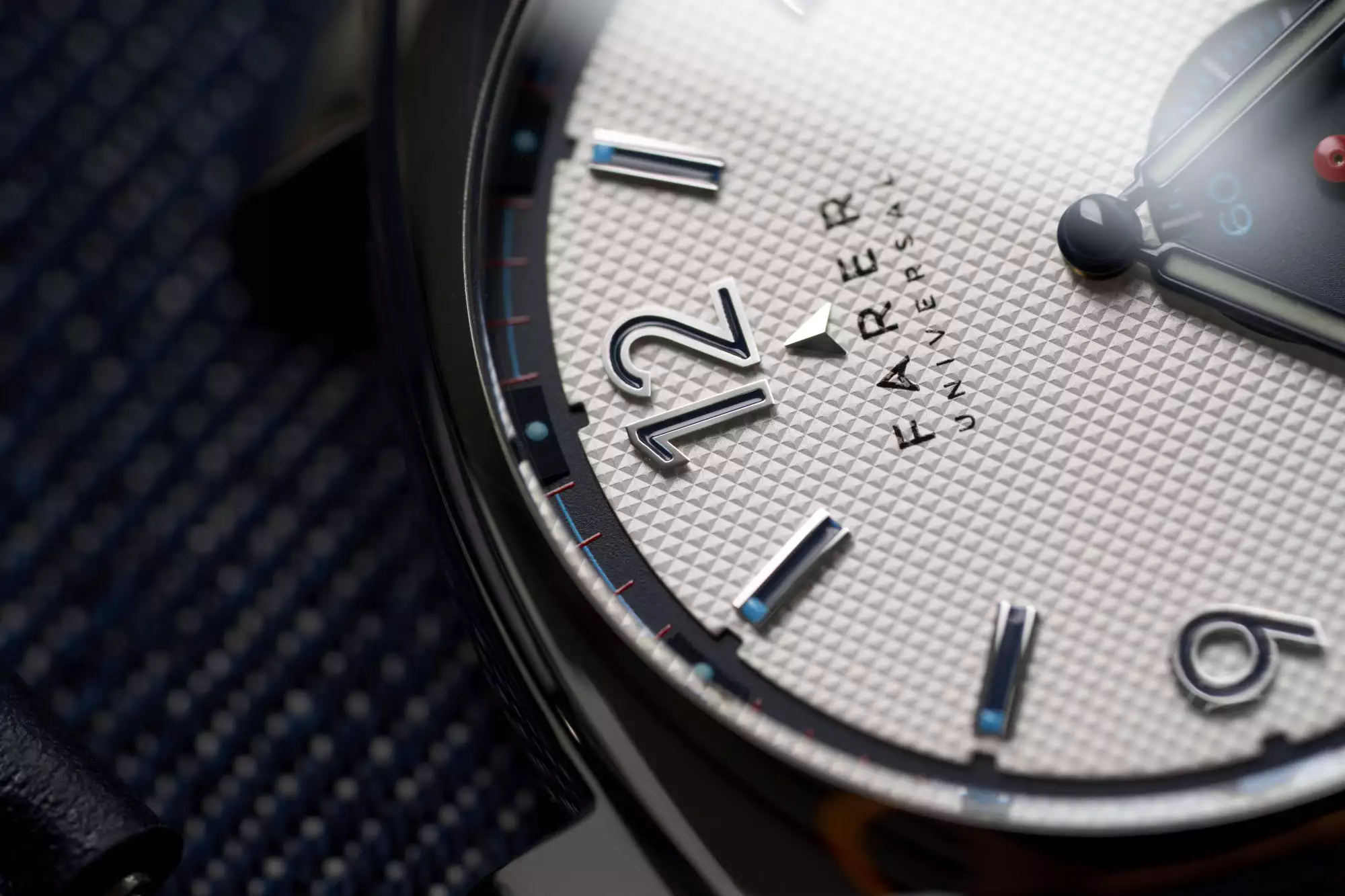
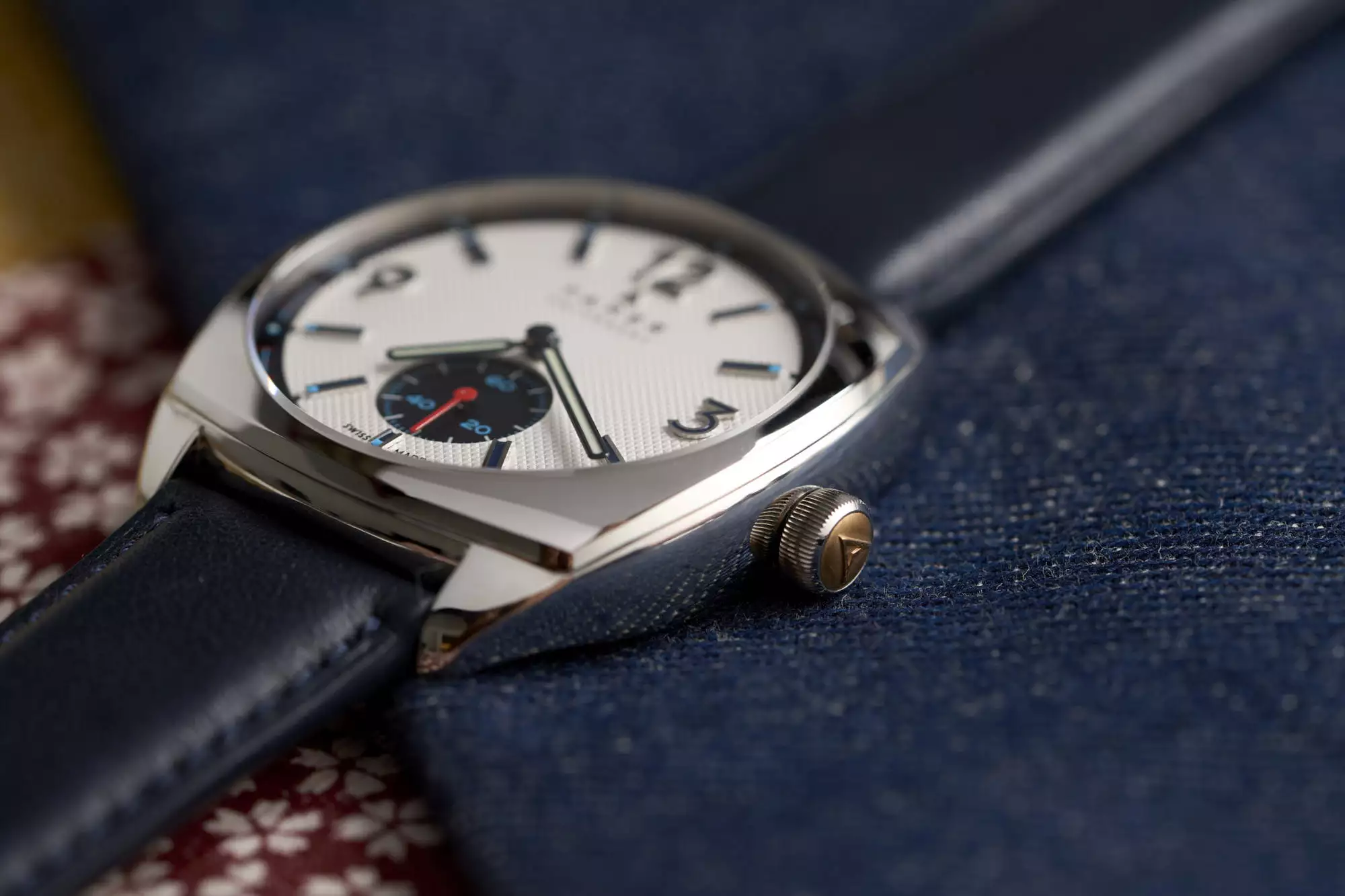
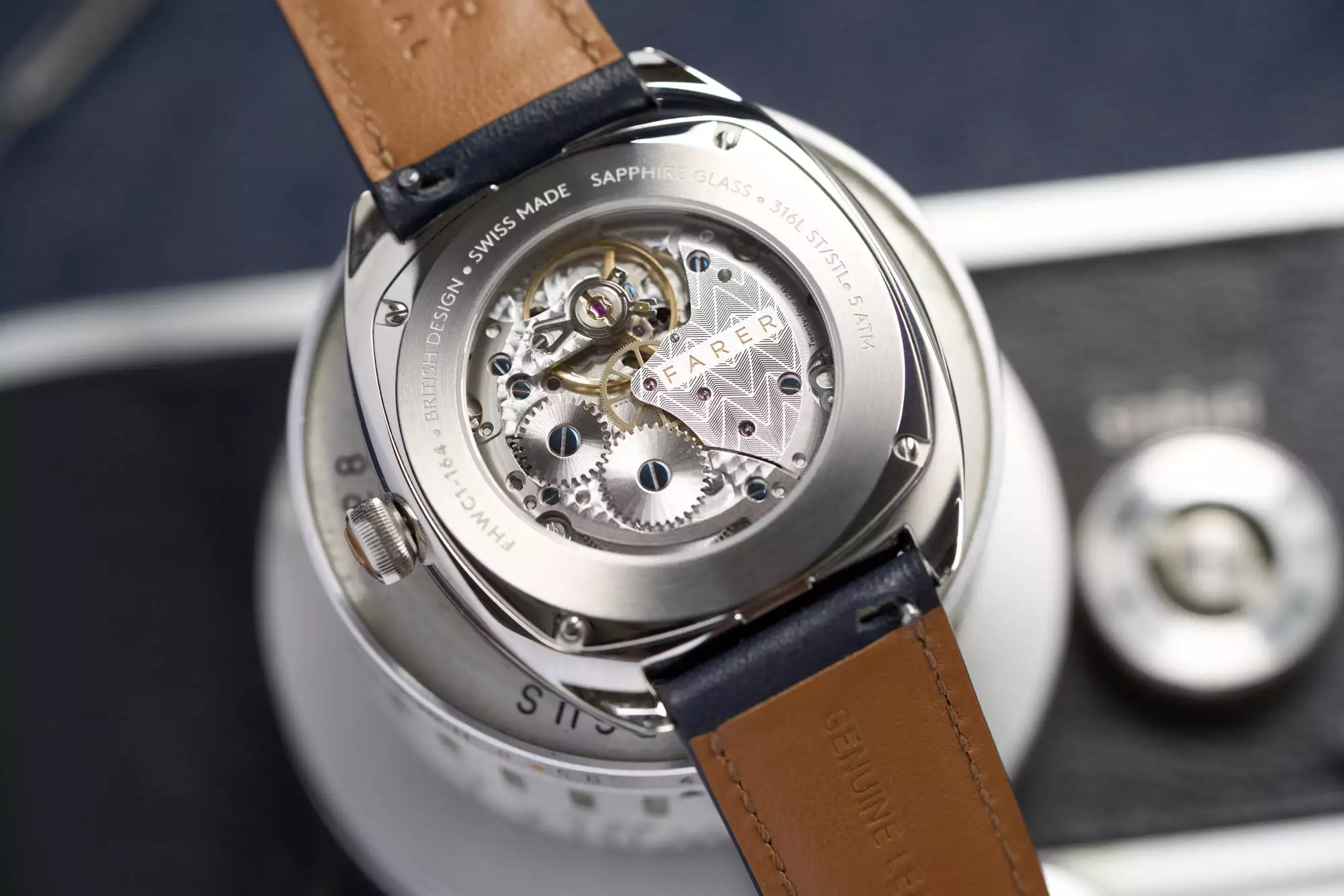
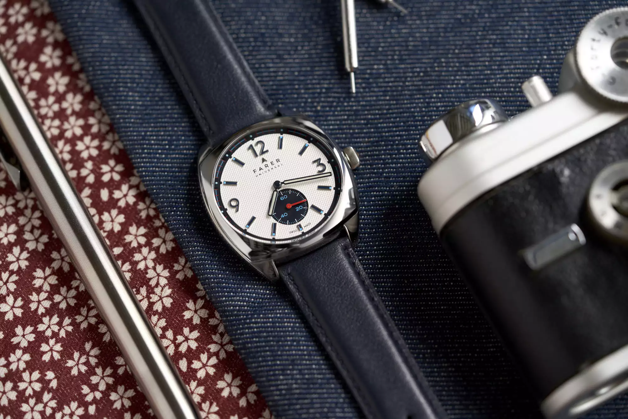
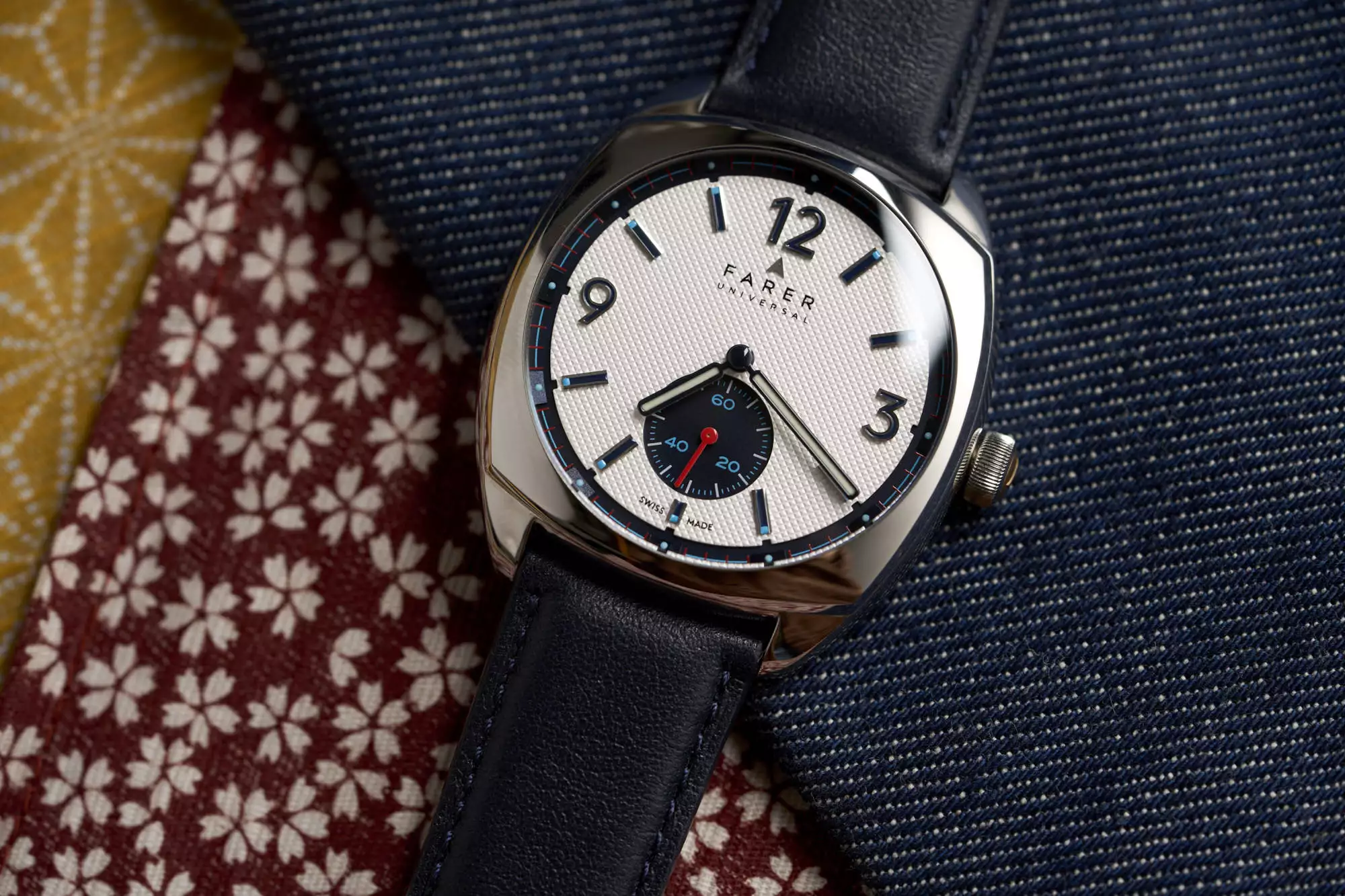
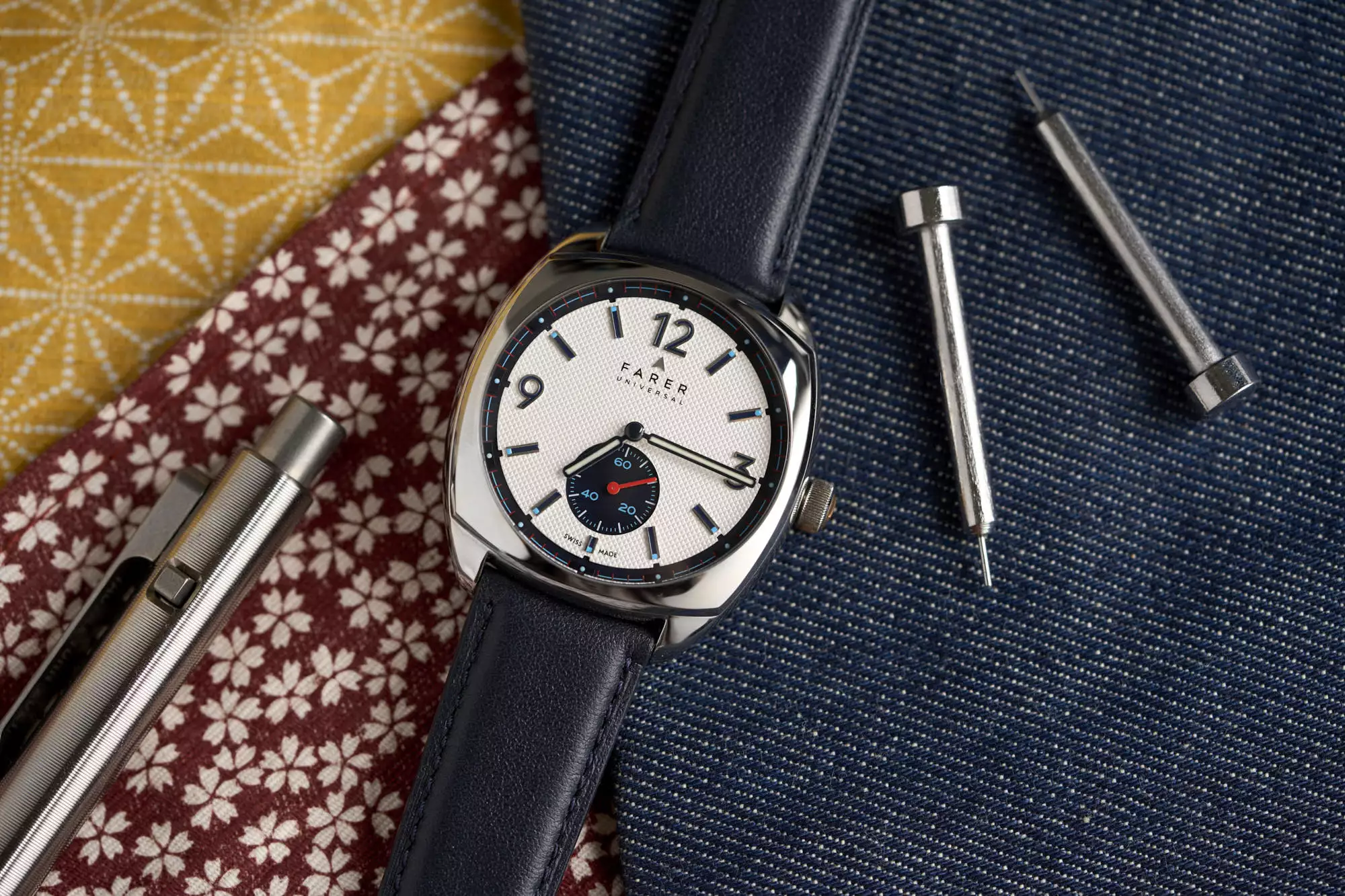
There’s something about summer that lends itself to the sequel. Things are relaxed, you’re taking time off of work, and your brain is shut off – there’s something comforting about returning to a world you’re familiar with. You know that you’re not going to be overly challenged by Top Gun: Maverick, but you’ll be entertained, and the instant familiarity with the characters, plot points, and musical cues will surely release endorphins. It’s the same with watches, right? At least it feels that way with the new Stanhope II by Farer, a sequel of sorts to the original Stanhope that was a hit in the brand’s early days. The new version is a whole lot like the first one aesthetically, and the changes made are subtle as opposed to a major reworking, but unlike the typical movie sequel, it would be hard to argue that the second Stanhope isn’t an improvement on the original. We’re in Godfather Part II territory here. 

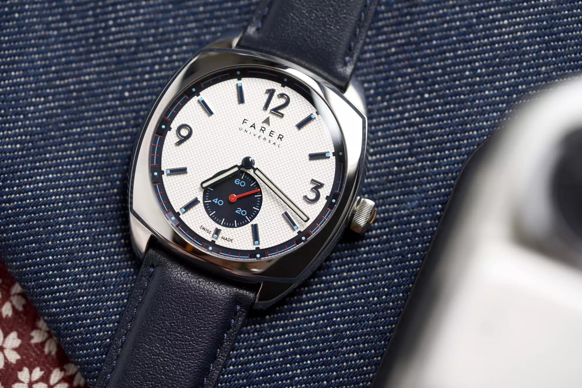
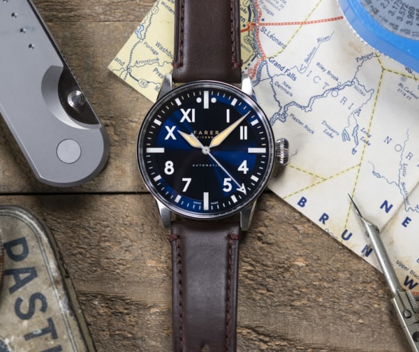
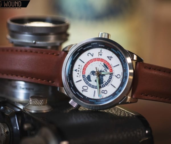
Farer is a brand that makes somewhat non-traditional watches. Their designs are led by unexpected color combinations, usually in sporty cases, and sometimes with unusual complications and movement selections. There is a boldness that’s built into their design language at this point, and I think when people consider the brand, it’s usually in the context of a loud color choice. The Stanhope, then, is atypical for Farer, but perhaps more traditional compared to other contemporary watches that also draw from vaguely vintage design prompts.

Advertisement
$995

[Video Review] The Farer Stanhope Gets A Sequel Worth The Wait

Case
Stainless Steel
Movement
SELLITA SW216-1 Elaboré Grade
Dial
Piqué textured off-white
Lume
Super-LumiNova
Lens
Curved sapphire crystal with multi-layer anti-reflection coating
Strap
St Venere leather
Water Resistance
5ATM
Dimensions
38.5×43.8mm
Thickness
10.5mm
Lug Width
20mm
Crown
Push/Pull
Warranty
5 Yrs
Price
$995

The Stanhope is a reminder that you don’t have to go bold with Farer. In fact, they’re pretty good about giving you the option to skew more conservative if that’s your thing. The brand’s typical release strategy will usually involve a trio of similar models, often seeing two with fairly “normal” color choices (striking combinations, but nothing too avant garde) while a third is truly off the wall. The Discovery, for example, with its deep crimson dial, or the Bernina hand wound chronograph, a nearly albino take on the traditional racing chrono. The Stanhope and its sequel are quite sedate compared to other watches in the Farer catalog that are truly boundary pushing. 

Dial

That isn’t to say that there aren’t little hints throughout the Stanhope II’s design that reveal it as a true Farer, they are just pushed, almost literally, a little under the surface. The dial here has multiple tiers, with a minute track and subsidiary seconds dial at 6:00 that are both sunken. These are the spots where those Farer color combos show up in notable ways, but because of the decreased real estate, we get this effect in a considerably smaller dose. The numerals and second markers in the sub register at 6:00 are rendered in bright red and a soft blue, respectively, while the minute markers around the outside of the dial are red to match the second hand. The colors work well here, but what’s really appreciated is the small amount of dimensionality that the sunken seconds and minute scale provide. It’s not a crazy amount of depth, but just enough to make the dial feel dynamic. Imagining a perfectly flat dialed version of this watch, it just seems like it would be fairly boring in comparison.

The large main section of the dial is an off-white surface that’s been given a printed diamond pattern throughout. I like the contrast here between the fun and funky vibe that Farer brings to all of their watches with something more classic. But still, this isn’t a traditional guilloche pattern or an attempt to replicate one – it still has a modern sensibility about it but adds a considerable amount of visual interest. The fact that the black subsidiary seconds register does not have a pattern or texture to speak of helps here, and allows the patterned section to really stand on its own. 

Legibility on the Stanhope II is a breeze thanks to high contrast hour markers and hands and large Arabic numerals at 12, 3, and 9. It was smart of Farer to black-fill the applied hour markers and numerals, and even smarter of them to outline the lume filled hour and minute hands with a solid black ring. This really helps them stand out against the white dial complements not only the subsidiary seconds scale but the outer minute ring nicely.

This is certainly not the most vivid Farer dial in their expanding catalog, but as I wore the watch over the course of my time with it I really started to appreciate its relative simplicity, and that it’s not loaded with big design swings that can be hit or miss. When those swings hit, they’re great, and can be a lot of fun, but when they miss, they can really miss badly. The funny thing though is that with these unusual color palettes, even the great ones can be tough to wear day in and day out. Because the dominant colors on the Stanhope II’s dial are white and black, it’s very versatile, and is certainly a “daily watch” candidate, if that’s what you’re after.

Case

The Stanhope’s case gets more significant changes than what can be seen on the dial. It’s quite a bit more complex, and while I can’t make any statements about it being easier to wear than the original Stanhope as I’ve never handled one (check out Zach’s review of that watch here, though, for his impressions), I can say without a doubt that the new version is both comfortable and aesthetically pleasing, while really going for a different look altogether. 

Farer describes the Stanhope II as having a three piece case design, with a caseback, midcase, and a square shaped bezel that’s been perfectly set into the case body. The bezel is the most significant change from the original Stanhope. On the II, it really gives the dial room to breathe, and creates some interesting geometry where it meets the lugs. The roughly square shape of the bezel matched with the circular dial is a classic combination and very appealing.  

The other notable change from the original Stanhope is in the lug design. The II has, as Farer founder Paul Sweetenham puts it, “Bat ear lugs.” Take a look at the photos, and imagine the caped crusader’s helmet, and you’ll start to see it. This is absolutely an improvement over the original, as it provides a real body to the case, and clearly defines it within the “cushion” category. The case now has a broadness to it that suits it in my opinion, but is no less elegant.

If I have a gripe about the case, it’s probably going to be with the finishing, as it’s polished all around and highly reflective. The polishing is well executed and it’s done to a high standard, but I can’t help but feel like this case would have benefitted from a brushed surface somewhere, perhaps on the bezel surface. It’s an interesting thought experiment to consider where you’d place the brushed finish if you were to design this watch again (Stanhope III?), because the essence of it is so simple, you’d really have to commit to a significant portion of it being brushed. The case flanks are highly curved and meet the bezel cleanly without a bevel, giving the watch its curvy shape. Any additional facets would impact that curviness and you’d have something much more angular and architectural to deal with. In that light, Farer might have nailed the finishing here perfectly for this exact watch, but I suppose I just have a personal preference for seeing those brushed to polished transitions. 

Wearability & Straps

Cushion cases are generally very easy to wear as a result of the small or minimal presence of traditional lugs. If a cushion cased watch is sized right, it will sit comfortably atop the wrist, planted and in proportion. These watches don’t “hug” the wrist (a term of art created by watch writers that rarely makes much sense to the large wristed among us) so much as ride alongside it. That’s not very appealing in a watch with long, straight lugs, but for a watch like the Stanhope II, which is pleasingly diminutive, it works out just fine.

Let’s talk about measurements. The Stanhope II is 38.5mm in diameter, and 10.5mm thick. The lug to lug measurement, which is especially crucial for a cushion cased watch, is 43.8mm. That makes for a remarkably tidy presence on my 7.5 inch wrist, which can comfortably handle watches with lug to lug measurements approaching the 50mm mark (even if those watches aren’t aesthetically pleasing to me, I concede that they do, in real terms, fit). Because the watch is fairly thin in addition to not being overly long, it is incredibly easy to wear. 

At least some of the reason for the Stanhope II’s comfort level has to be the flatness of the caseback, and the way the very short lugs extend pretty much straight out, curving down only a little toward their tips. This allows for the watch to wear very low – it would easily slide underneath a shirt cuff, and I think this would be a fun alternative to a more formal dress watch for someone who doesn’t need to be suited up all that much.

Advertisement

There’s an aerodynamic quality to the Stanhope II that is almost reminiscent of a vintage sports car. The lines really flow together and what initially, to me, looked like a somewhat aggressive design thanks to that squared off bezel, is actually quite refined. I particularly enjoy the view of the watch from the 6:00 position, which shows off just how much the case sides and lugs pinch together at each end of the case, and it’s a strange optical trick that this isn’t readily apparent from a top down view. 

In terms of straps, the Stanhope II should be fairly versatile. My sample came on a navy leather strap that is of a higher quality than most straps that ship with watches at this price point, but swapping it out for another color could really change the character of the watch, and I think a prospective owner would have a wide variety of options that would work really well. Neutral colors will be an easy match, but you could easily choose to go bold and pick up the red seconds hand or blue numerals in the subsidiary seconds dial. 

Movement

The movement powering the Stanhope II is the Sellita SW216-1. It’s a hand wound movement, and Farer has selected the Elaboré Grade version. It has 45 hours of power reserve, and Farer has customized the most prominent bridge by embossing their brand name over a graphic pattern. For a movement found in a watch at a price point less than $1,000, it’s very nice looking. 

I think a hand wound movement is without a doubt the right choice for the Stanhope II. It keeps the watch on the thin side, and it’s also just a charming way to interact with a watch that has so many curious design details. It feels like something of an enthusiast’s choice for a watch that’s a little odd, but not too odd. An automatic movement would have likely changed the dimensions of the case significantly, and, let’s face it, made the watch a little more generic. Manually wound watches, particularly when executed really well, and with purpose, are still uniquely special things. All the romantic notions of interacting with your watch on a daily basis still very much hold true when the design works and you actually want to wear the watch in question.

Conclusion 


The Stanhope II could easily be classified as a “neutral” Farer. It doesn’t immediately announce itself with the brand’s signature boldness, but if you spend a little time with it and look for it, you’ll find that it’s there in somewhat unexpected places. The dial is far more complex than it initially lets on, and the case has a graceful casualness about it that very much feels like the brand’s core vibe. It’s the opposite of stuffy, but it’s still kind if quiet. 

I think it’s important to contextualize the Stanhope II as the second version of an earlier watch. This is core to what Farer does, and to my mind underscores why the brand has such a strong reputation with enthusiasts and micro-brand fans. They often go back to early designs and make them better, changing things based on the feedback of their customer base, or simply correcting aspects of a watch that could have been done differently the first time around. Watches like the Stanhope II feel like an admission that nothing has been perfected yet, and that lack of arrogance is welcome in the watch space, and sorely needed. Farer.

Related Reviews
Zach is a native of New Hampshire, and he has been interested in watches since the age of 13, when he walked into Macy’s and bought a gaudy, quartz, two-tone Citizen chronograph with his hard earned Bar Mitzvah money. It was lost in a move years ago, but he continues to hunt for a similar piece on eBay. Zach loves a wide variety of watches, but leans toward classic designs and proportions that have stood the test of time. He is currently obsessed with Grand Seiko.
Categories: