[VIDEO] Review: the Sublimely Sage Ressence Type 8S

There is a big difference between seeing a watch at a trade show, meetup, or boutique and living with one. In the former experiences, it’s very easy to be immediately taken with something. The energy of the environment, the thrill of trying on watches, perhaps a champagne or two, create a level of excitement that overlays everything you touch and see. As such, the watches we get to experience in these shows need to be taken out into the less flattering light of the real world to truly know if that excitement was genuine, or just a by-product of the situation in which they were introduced.

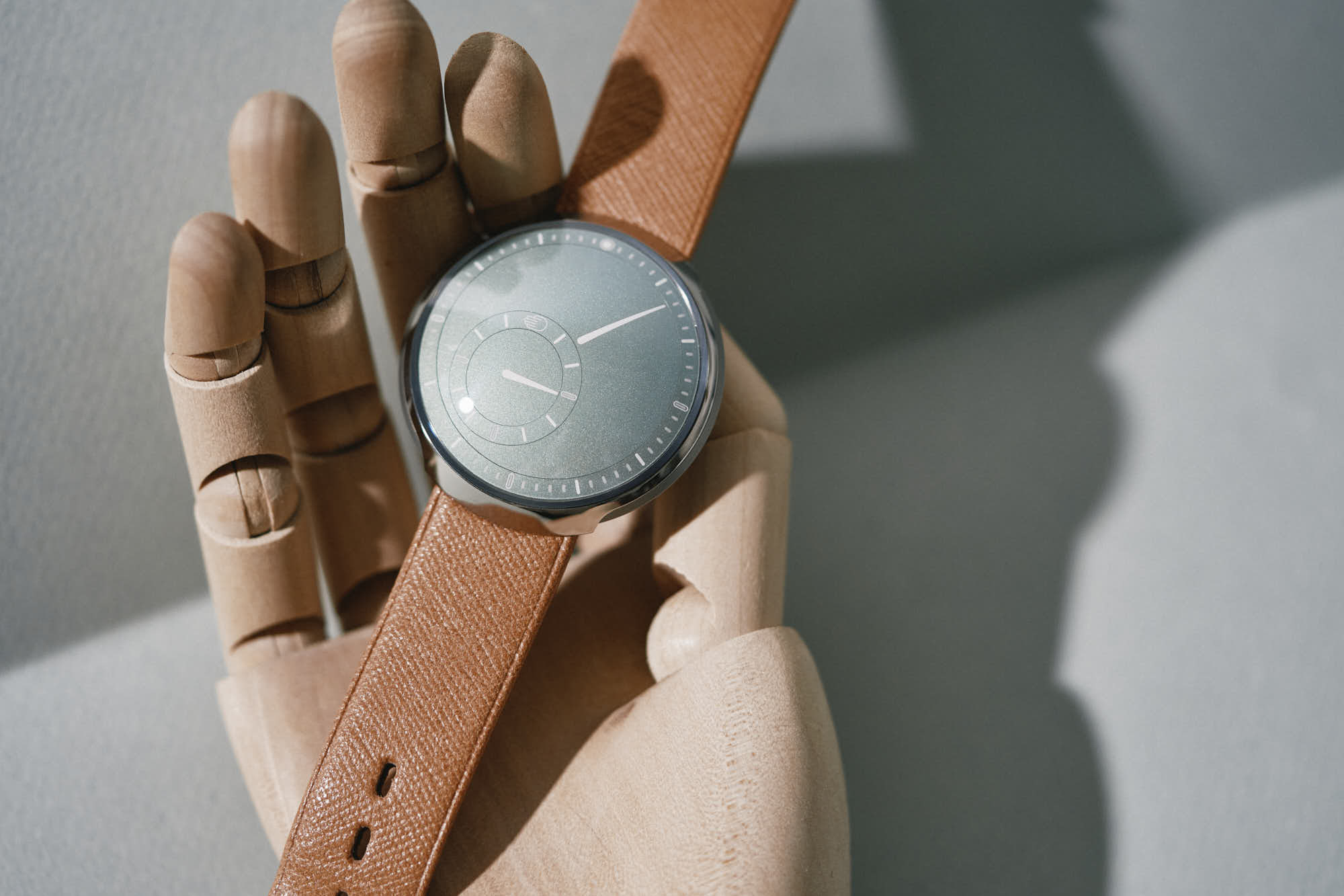
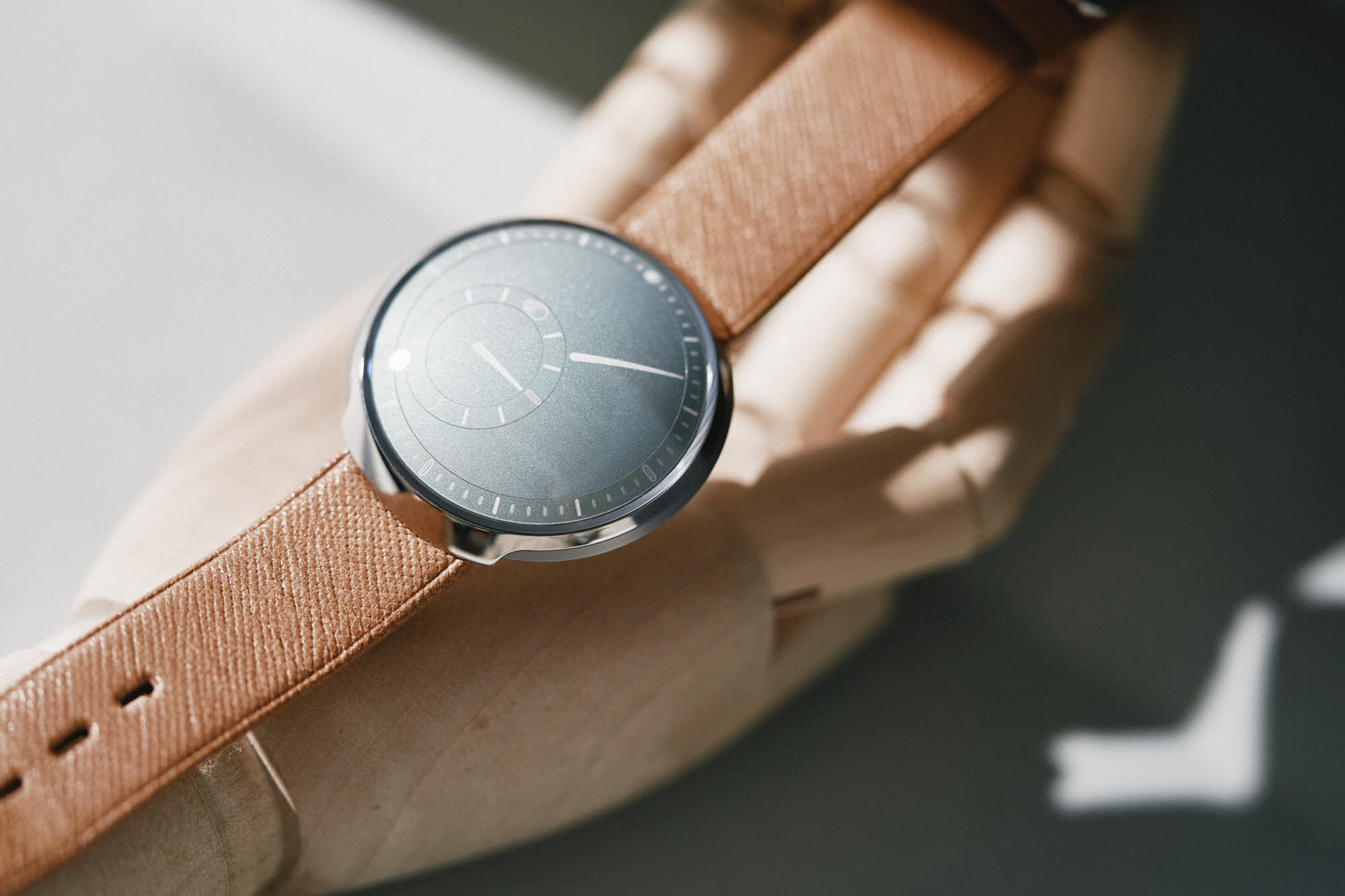
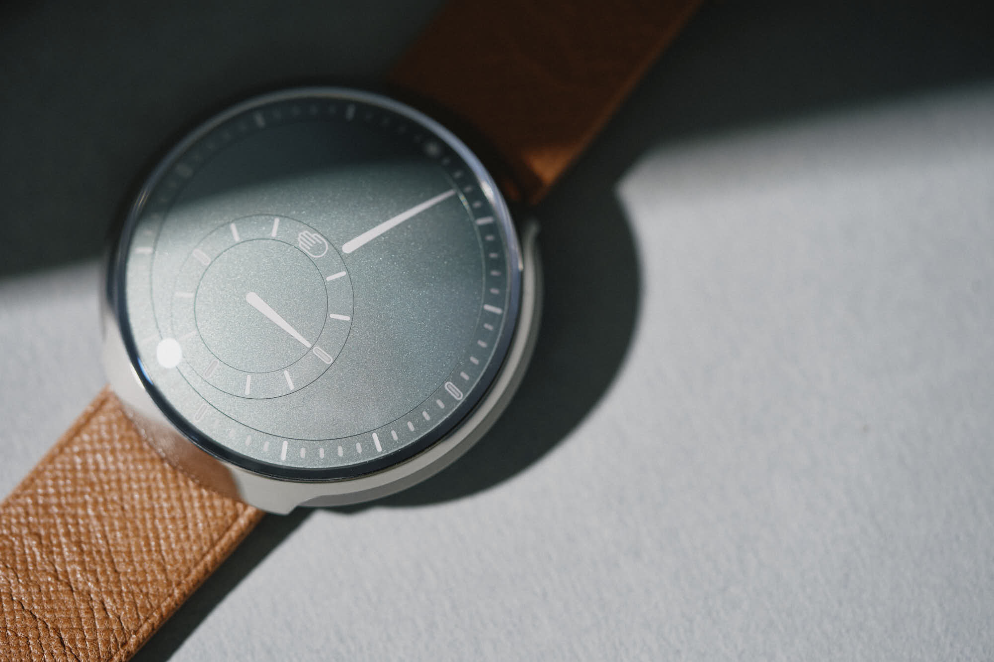
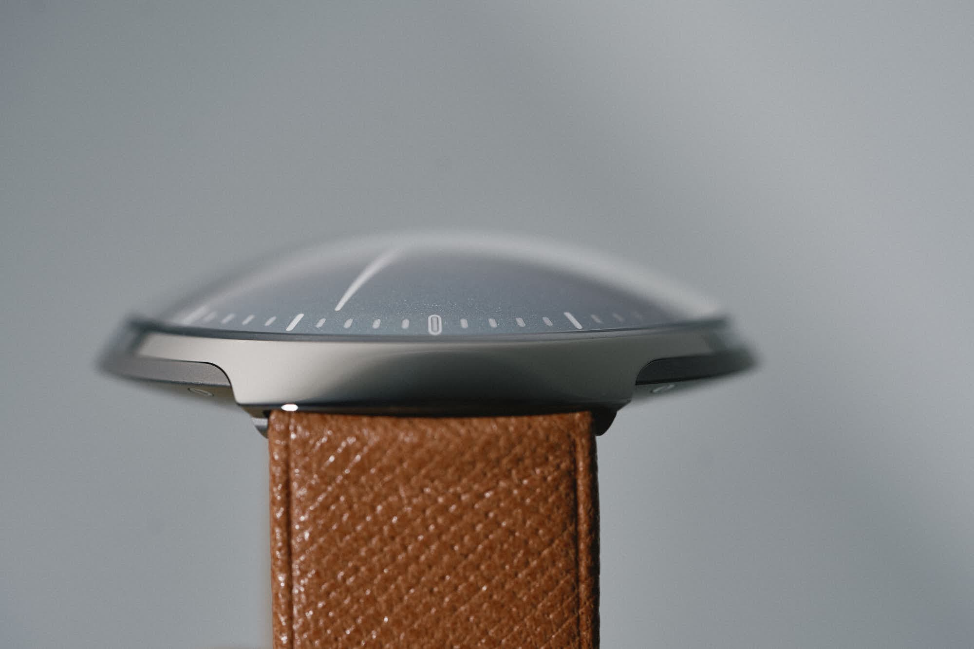
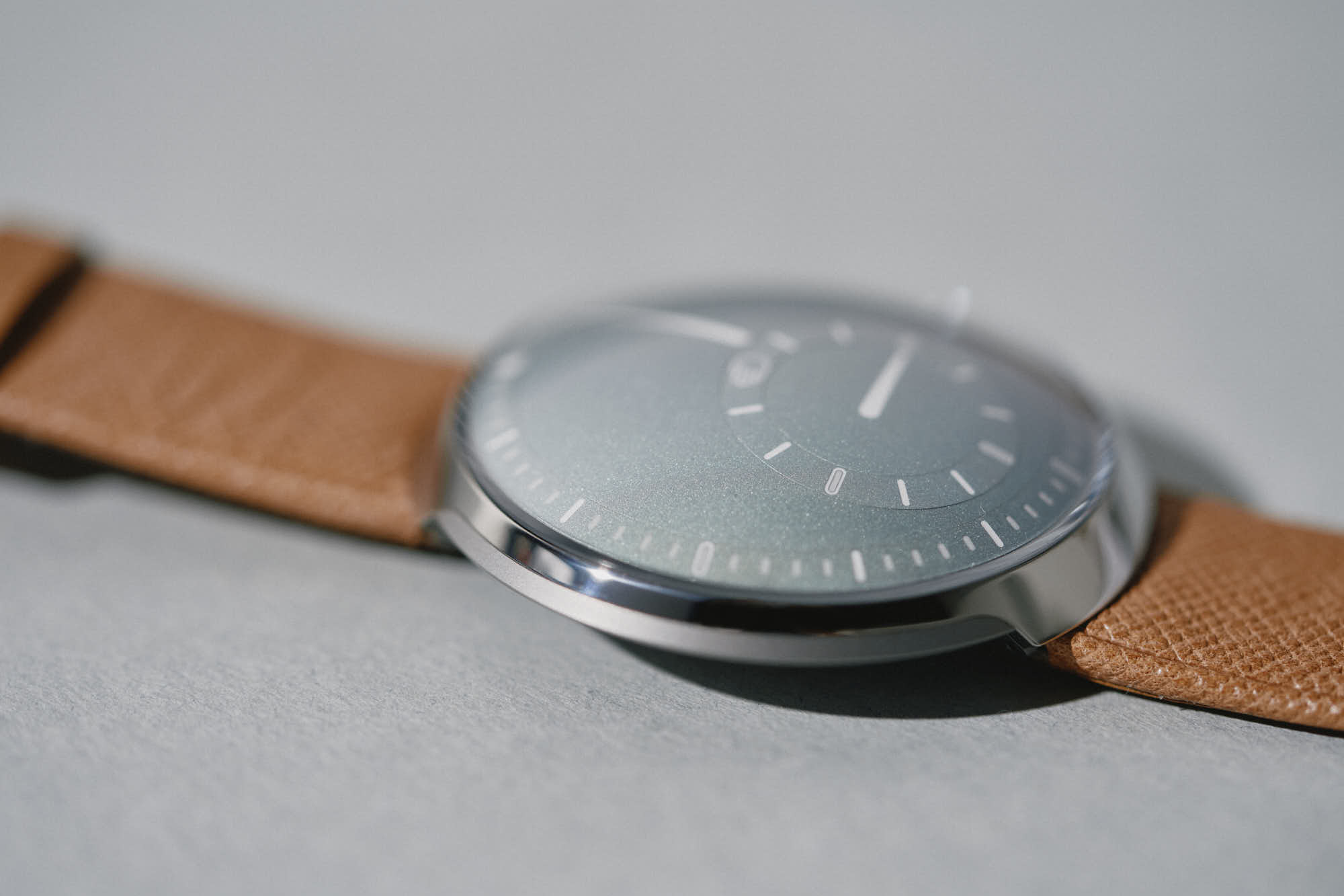
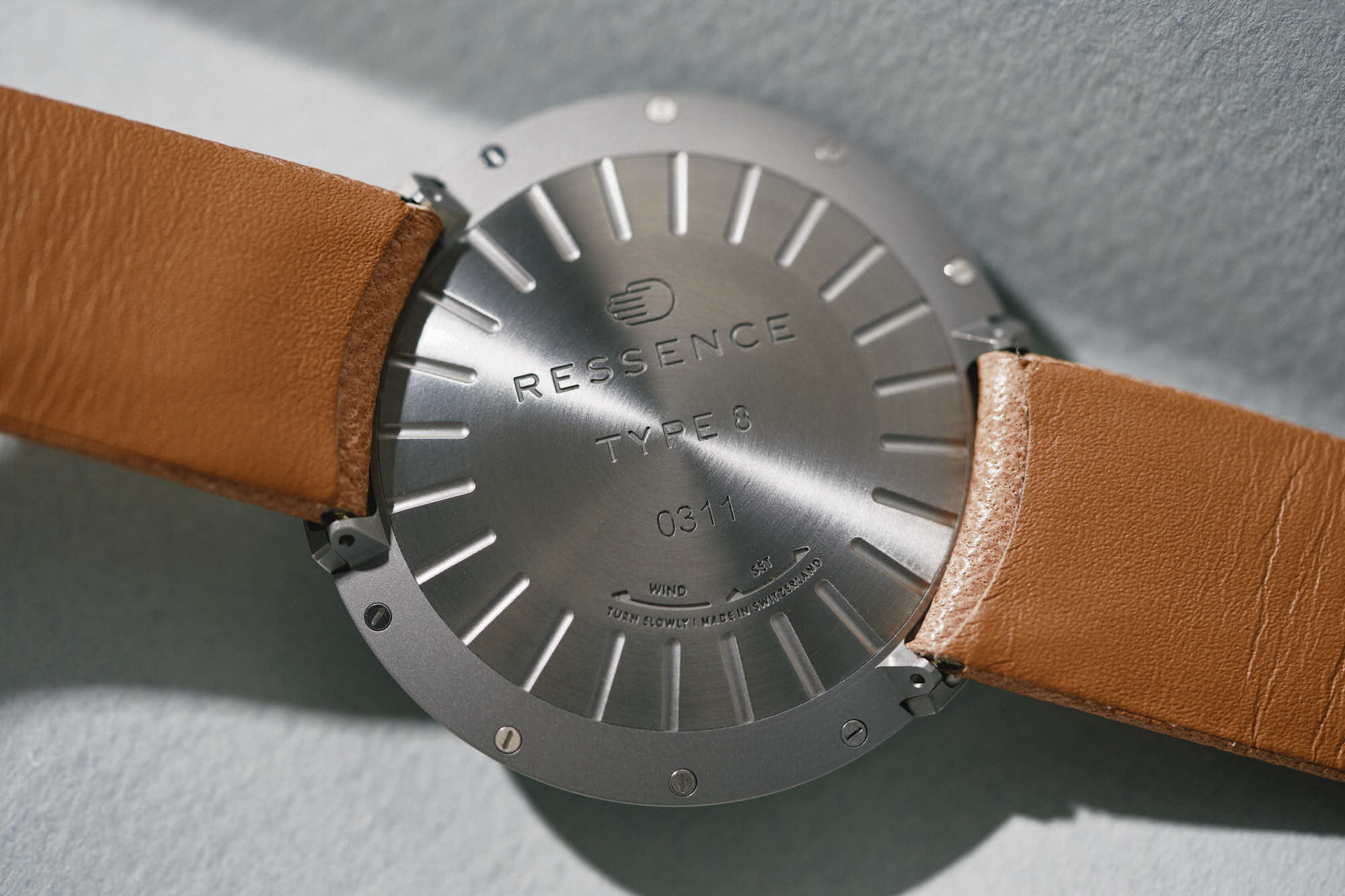
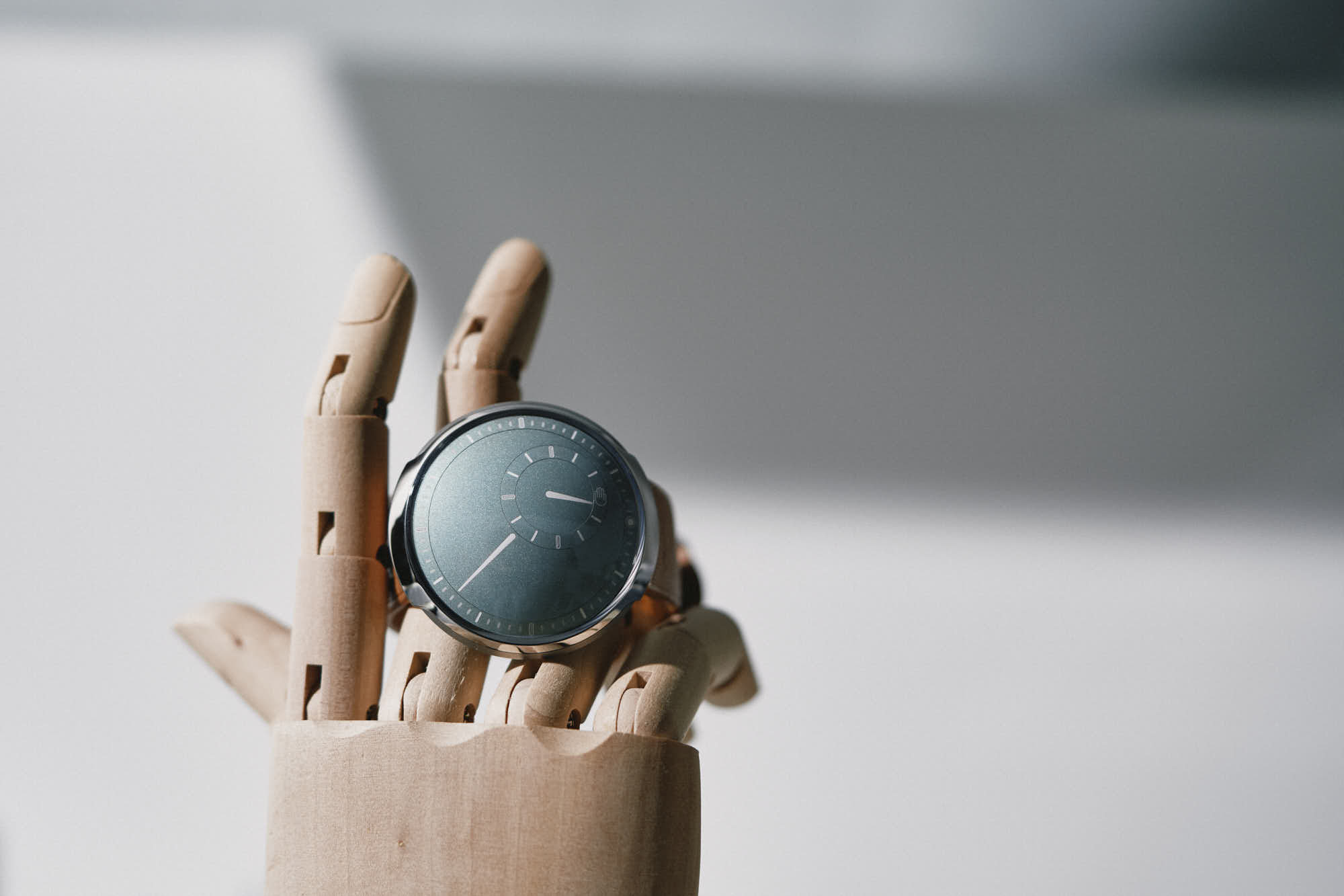
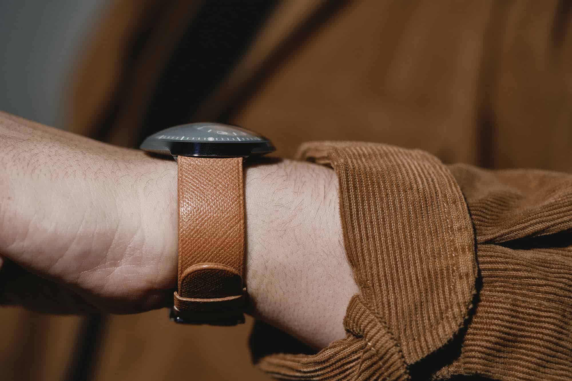
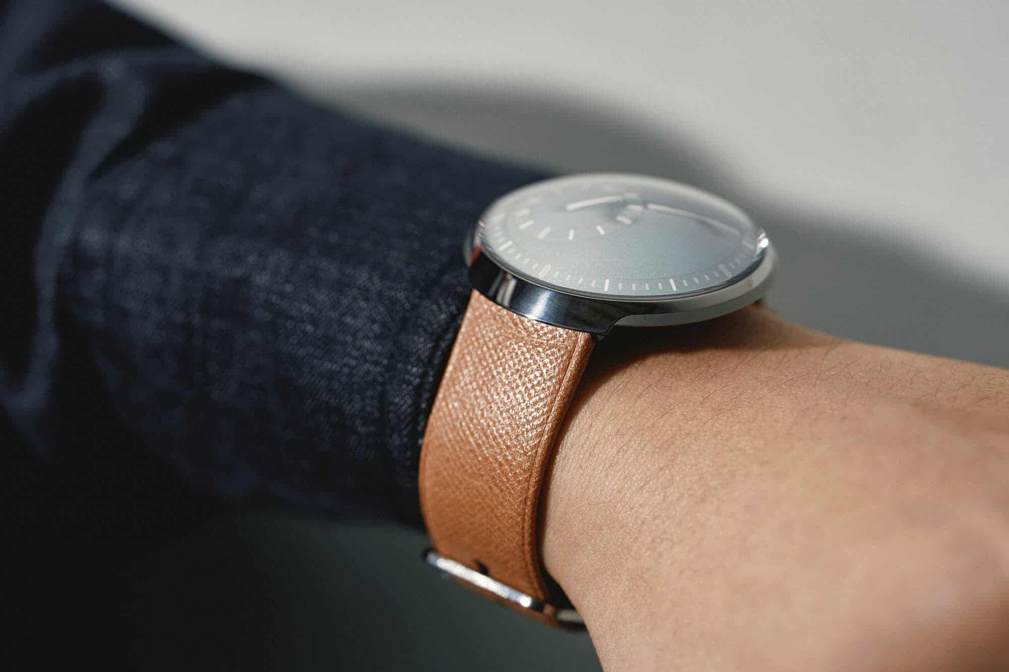
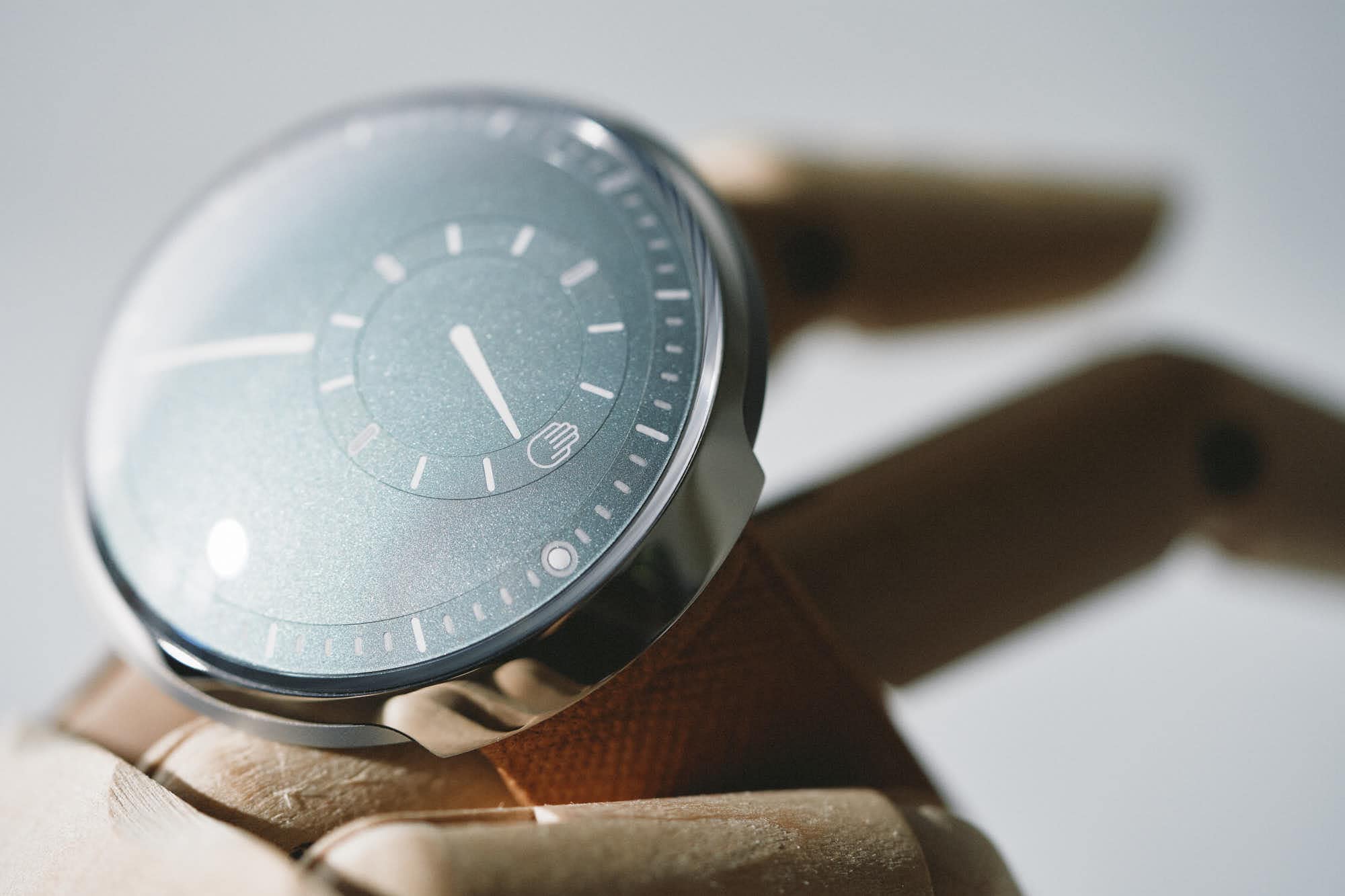
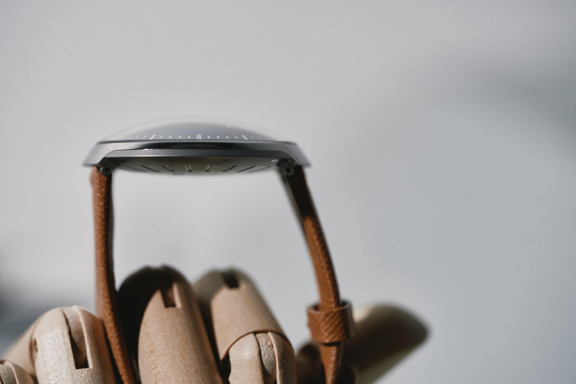
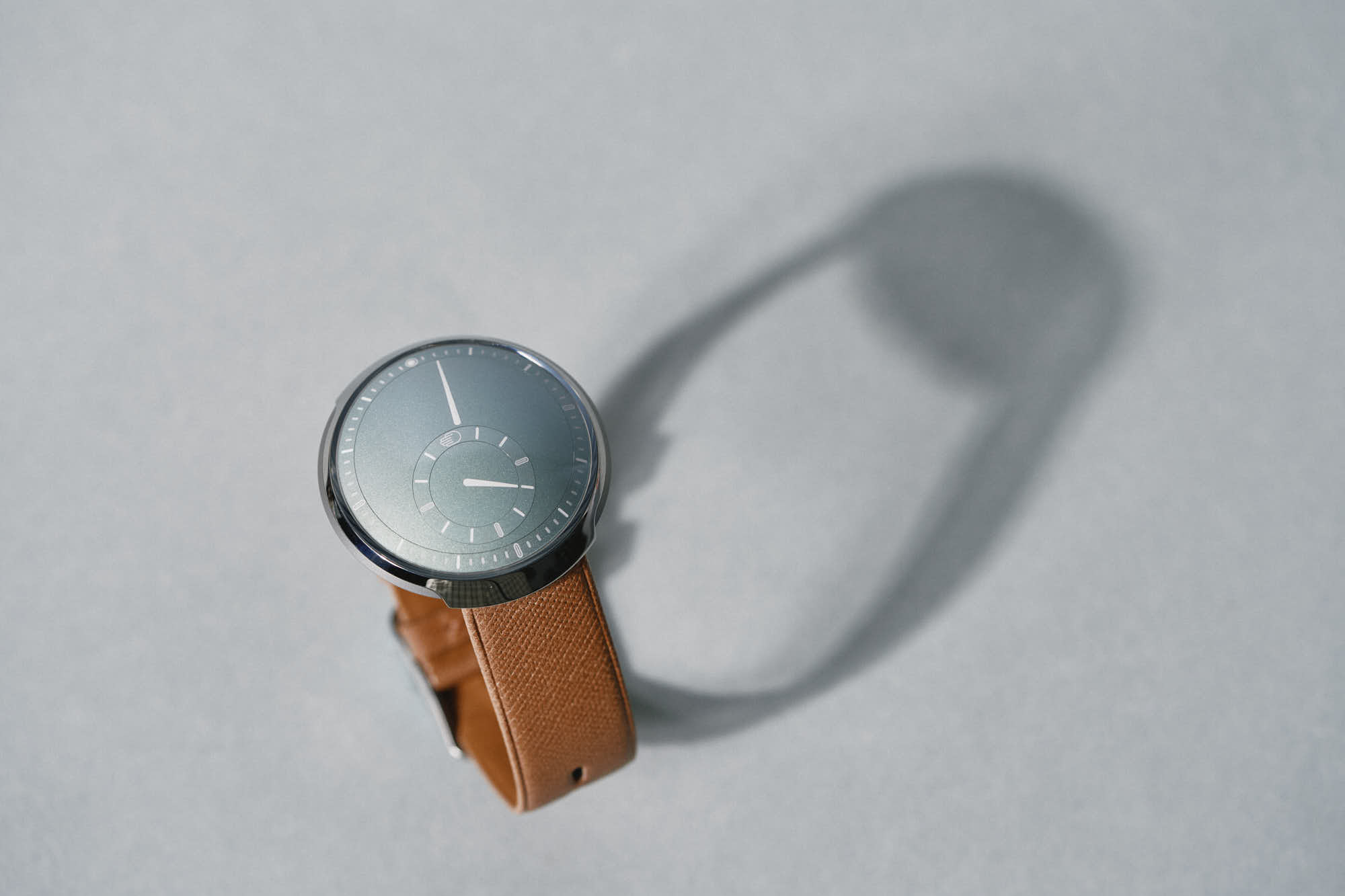
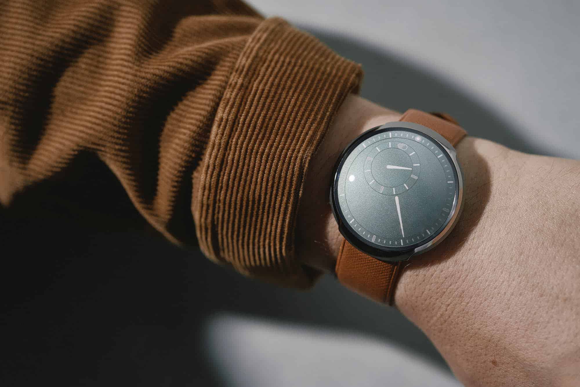
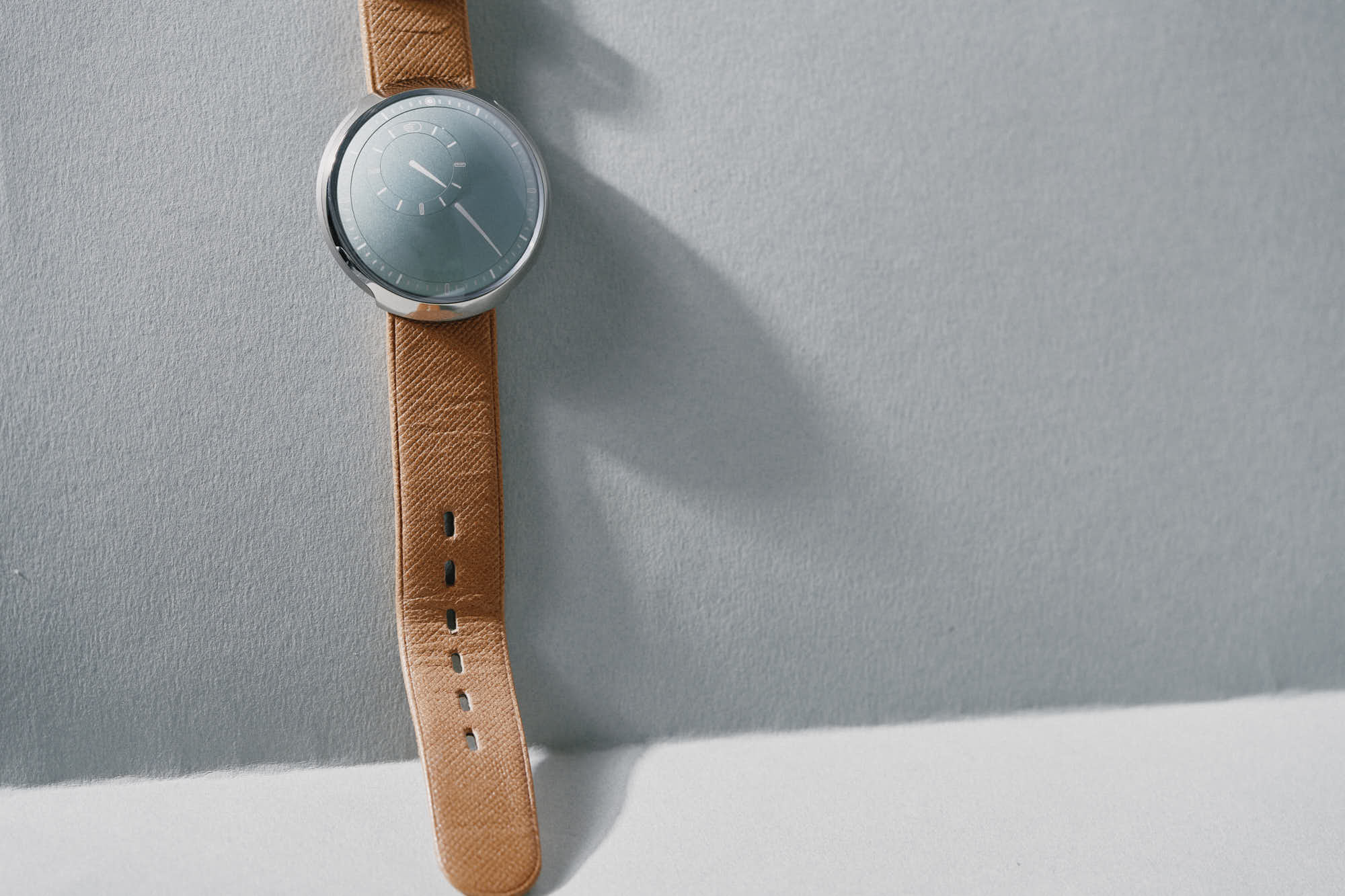
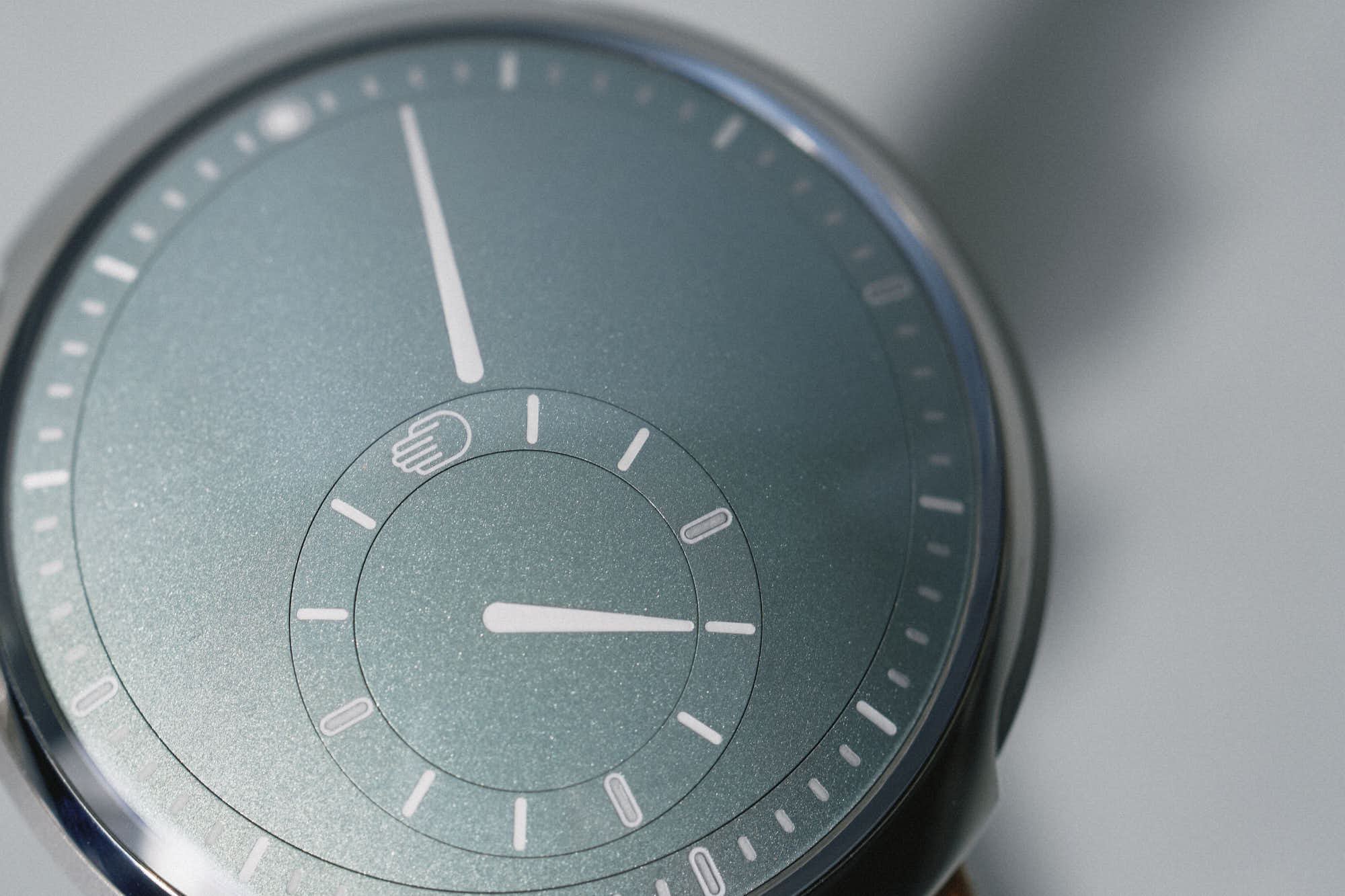
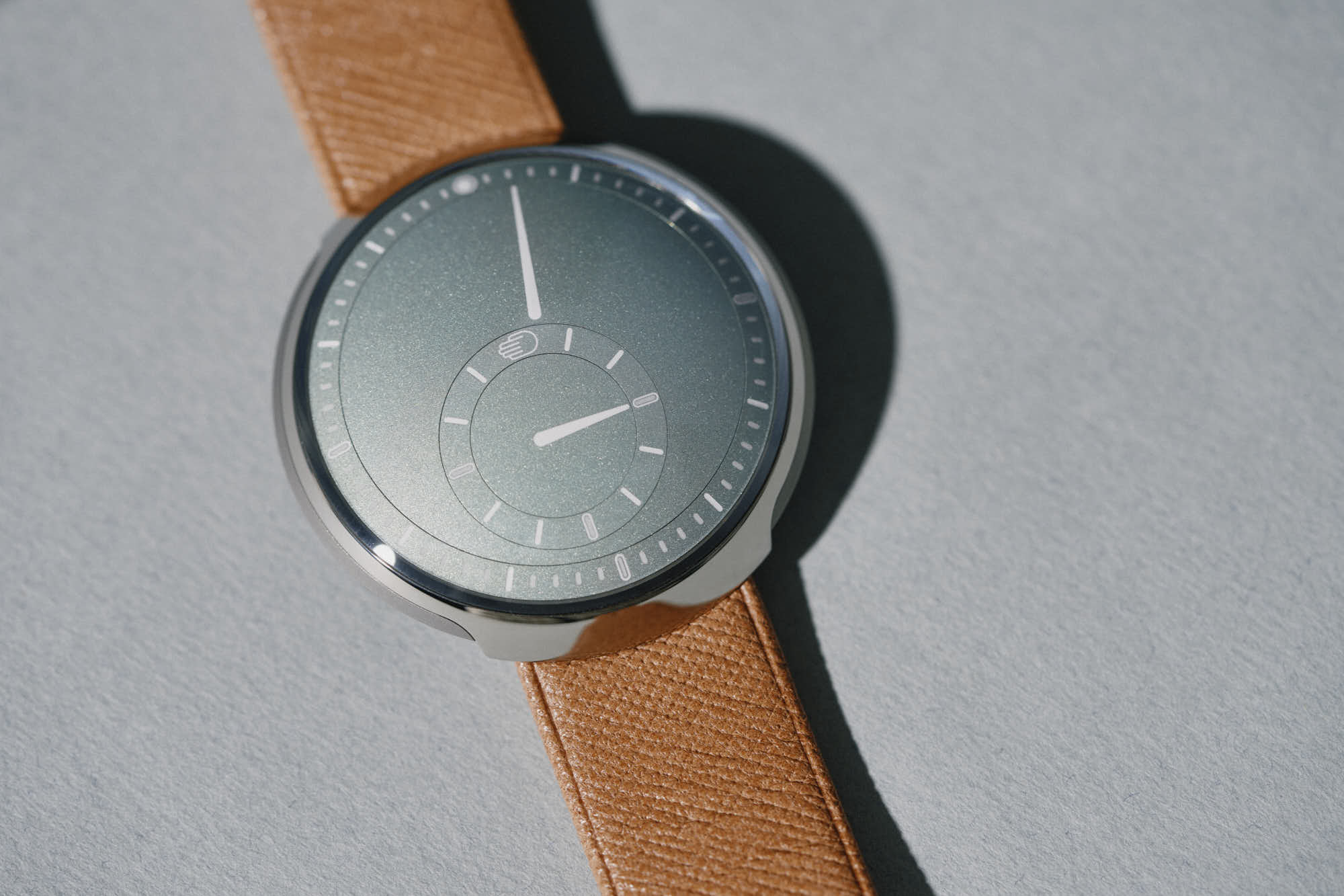
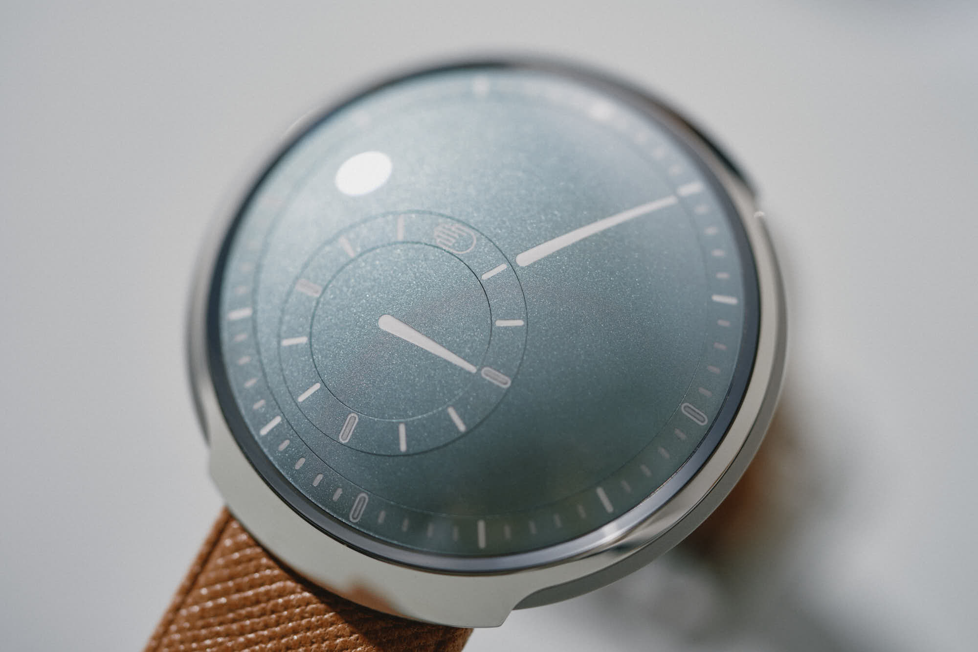
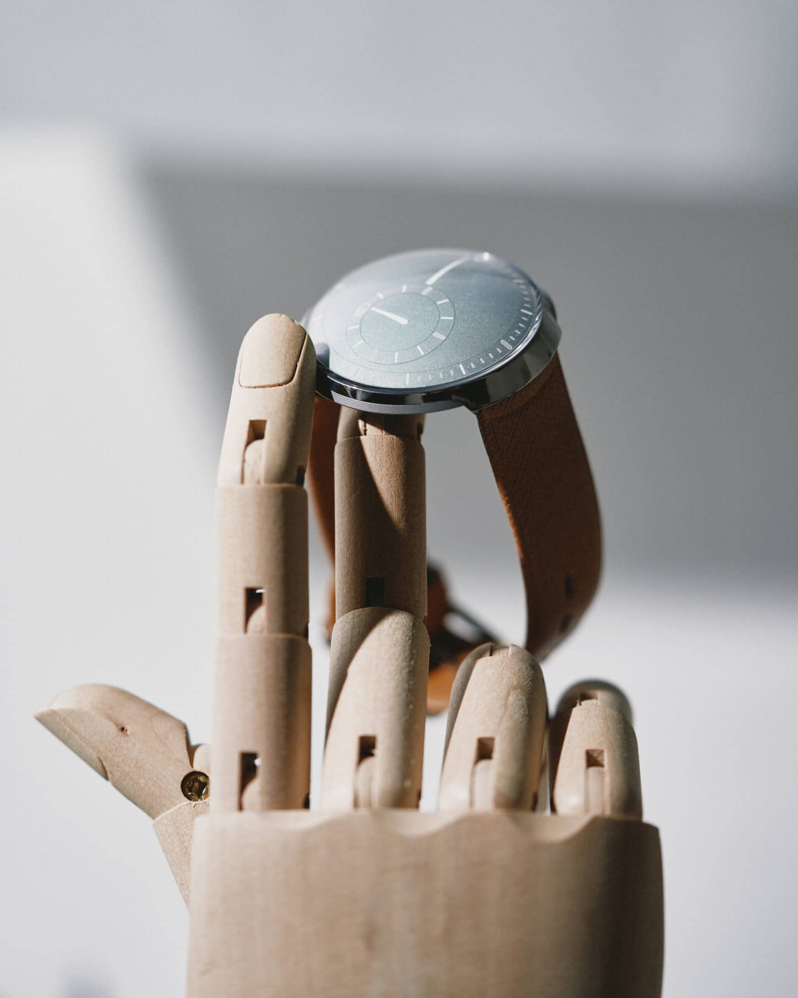
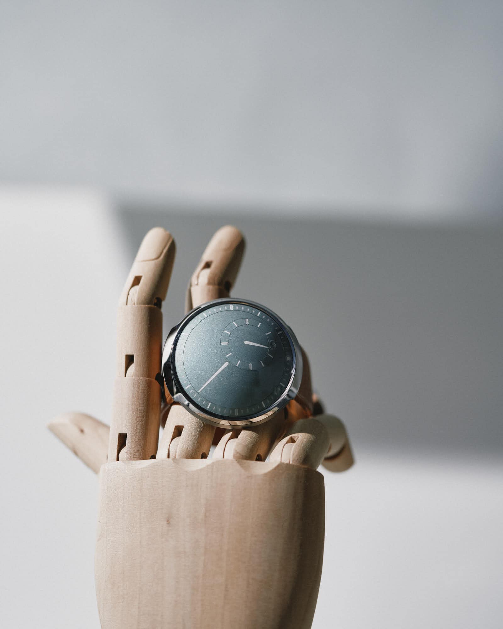
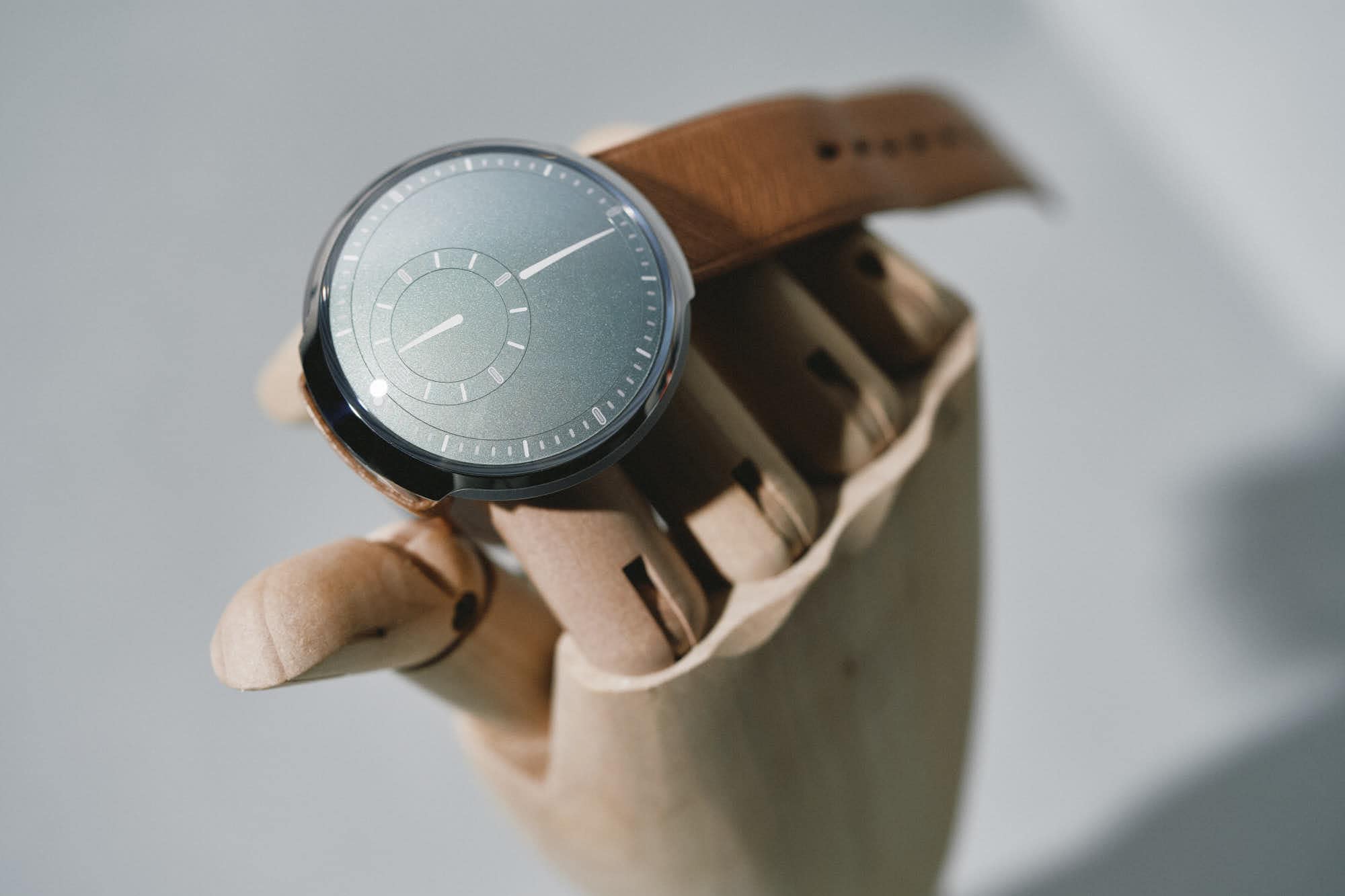
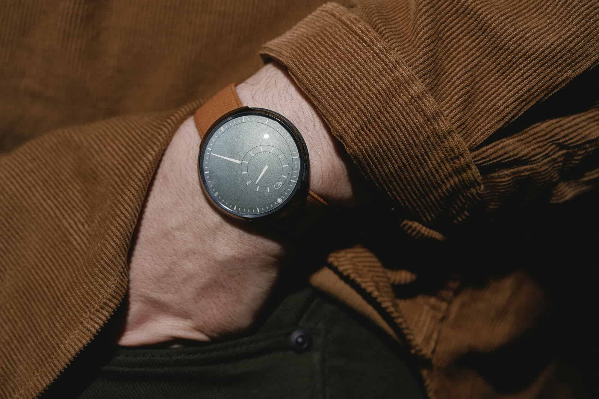
One brand I’ve always been very taken with, especially when I’ve gotten to handle their wares at Watches and Wonders, is Ressence. For those unfamiliar with the Haute-independent brand, it was founded by Benoît Mintiens in 2010 with the goal of rethinking how a watch displays time. The solution found didn’t recreate the wheel, though it did heavily modify it. Utilizing a patented module design called the Ressence Orbital Convex System or ROCS, Mintiens, an industrial designer by trade, eliminated the use of classic hands. Instead, the whole dial becomes an active surface for telling the time with satellite sub-registers floating within a larger, always-in-motion, display.

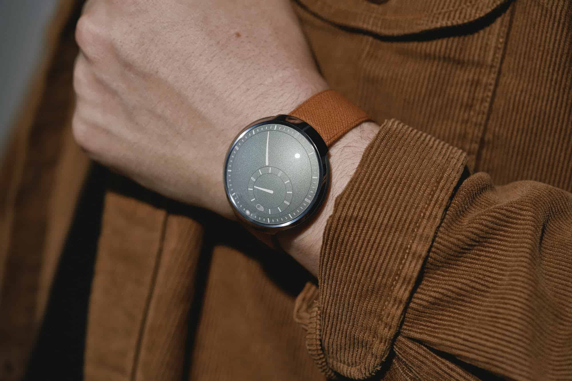
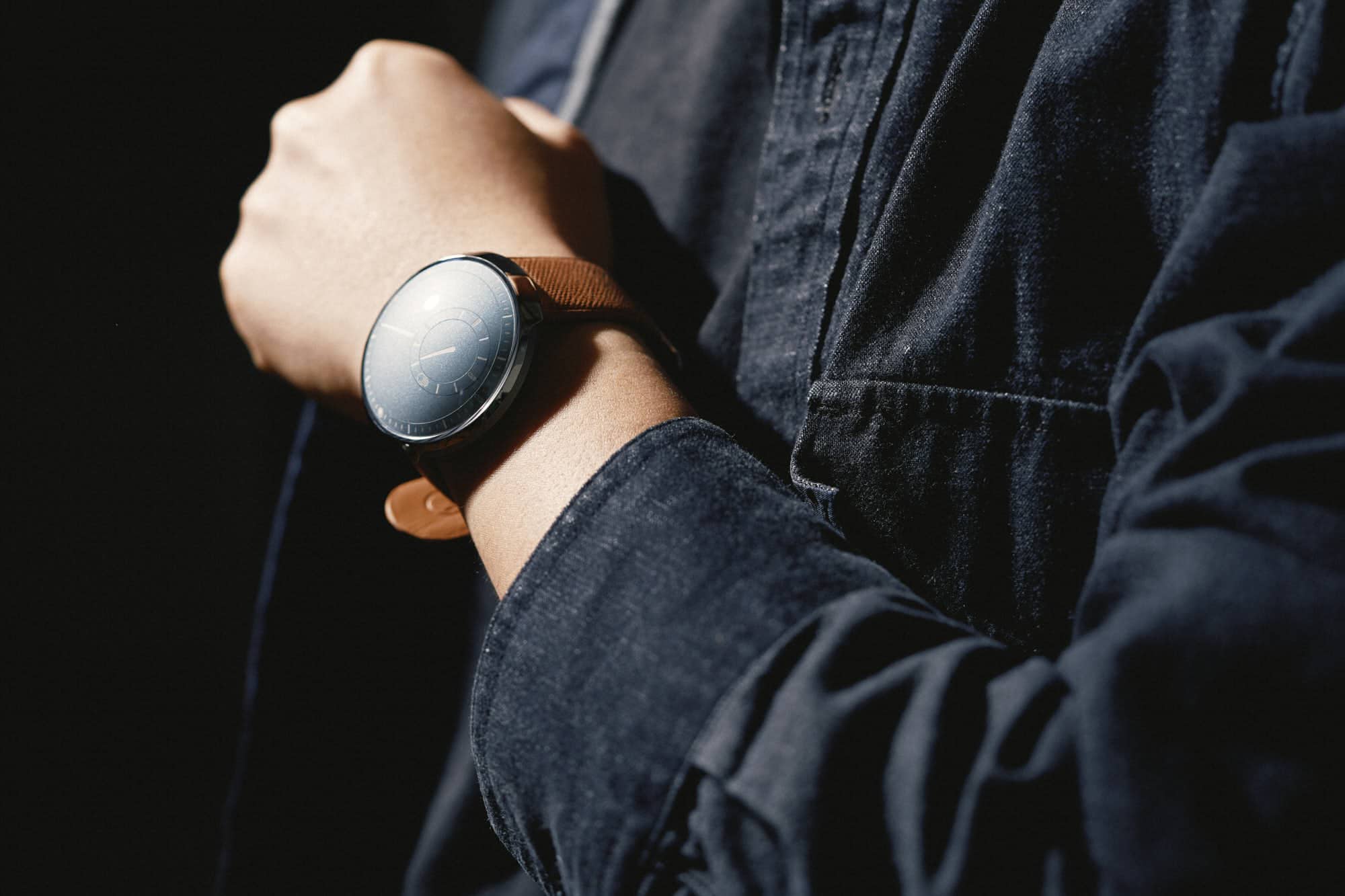
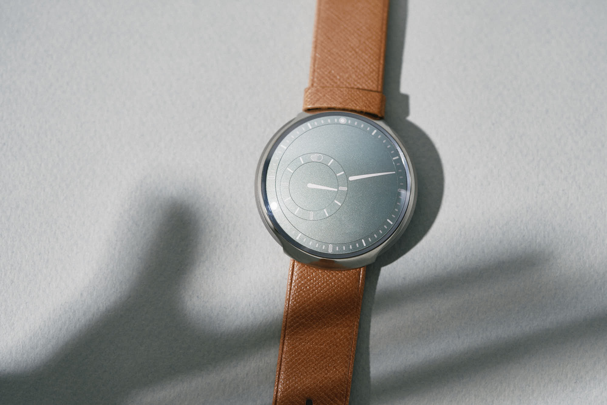
In 2022 they unveiled the Type 8, their simplest and lowest-priced model. The following year, they introduced it in a lovely, pale green and called it the Type 8S, for sage. Both years I left their booth a bit giddy (as seen in these videos – 2022 + 2023). After looking at oodles of traditional, high-end watches, the innovative, futuristic, design-centric creations of Ressence seem all the more profound. Additionally, they are a brand whose work I’ve admired since first getting into this treacherous hobby.

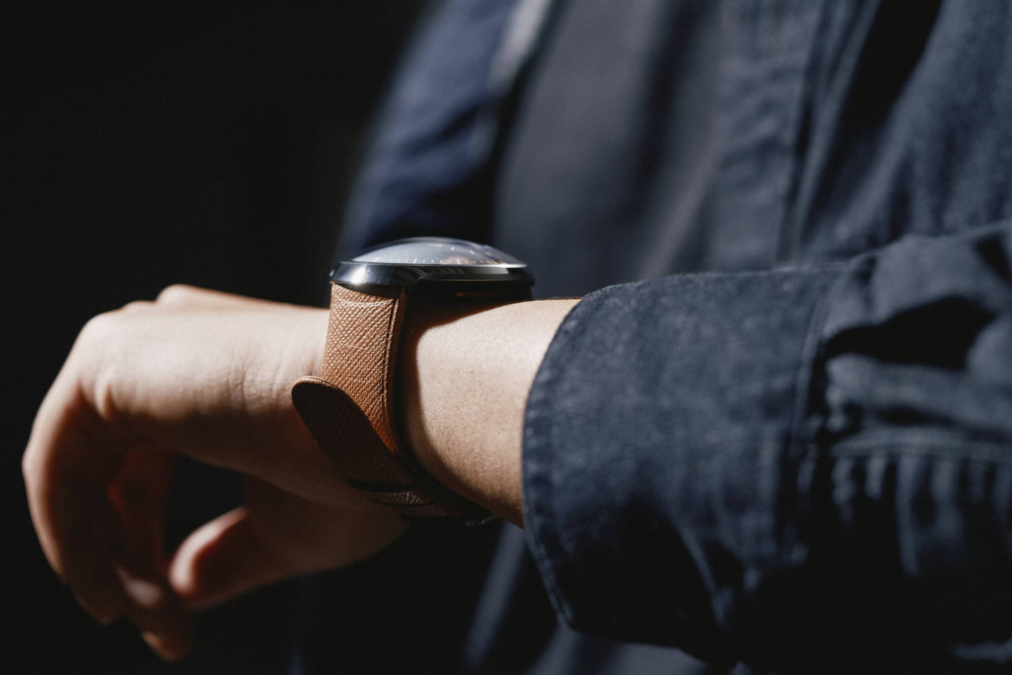
The release of the Type 8, a watch that while still expensive by any rational, non-watch world standards, created a new entry to the brand at $14,500. Far from my regular consideration, given the brand and my appreciation for what they do, the Type 8 spawned many “what if” scenarios in my head (like, what if I sell most of my watches), making it all the more exciting upon release. The question I’ve had, of course, is – would it be worth it? Would a watch with just an hour-and-minute display and none of the typical bells and whistles found at this price point be, well, enough?

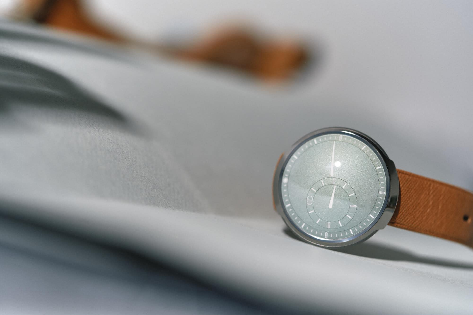
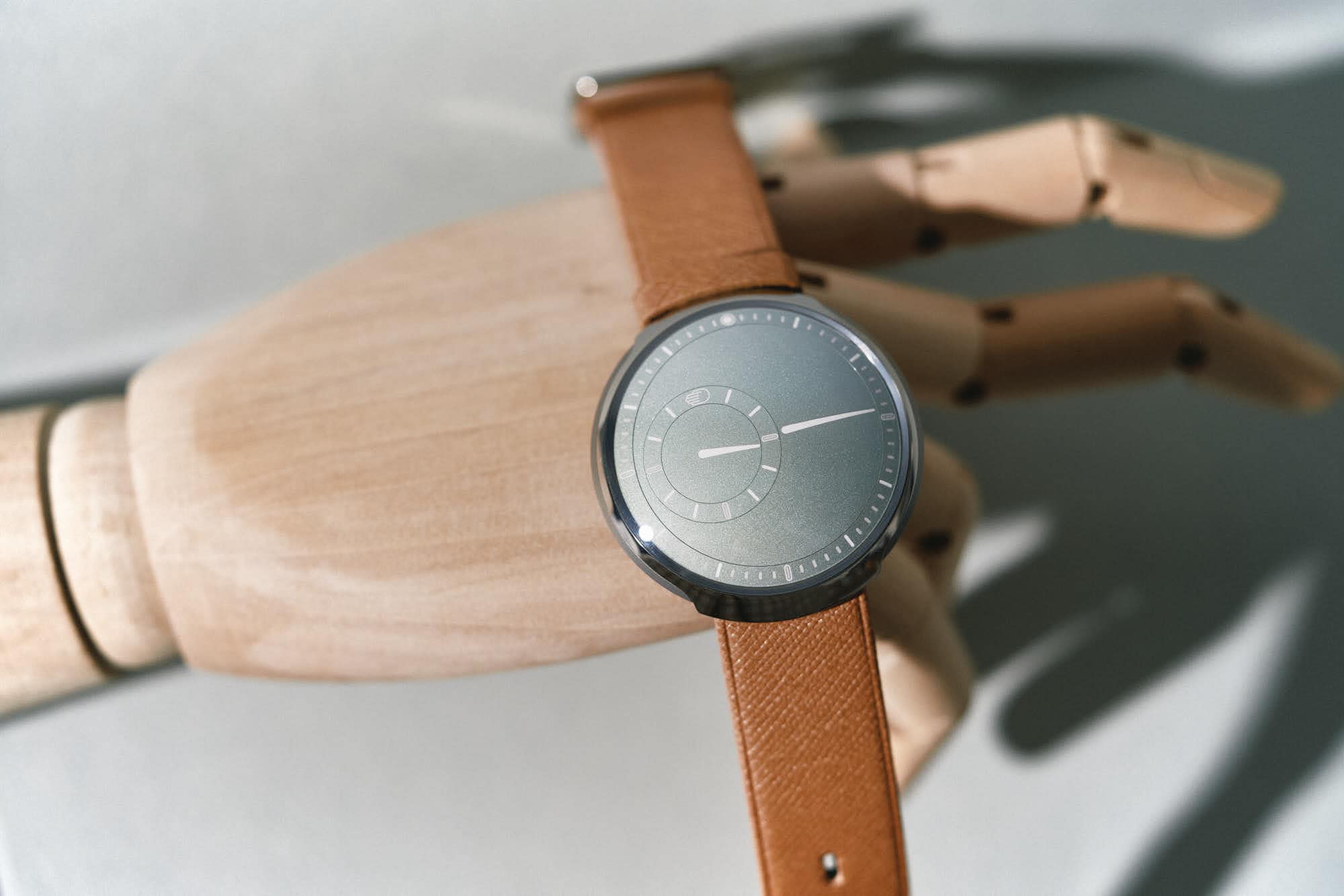
Luckily, I was able to borrow a Type 8S from Ressence to try out for a few weeks to attempt to answer this clearly, burning question.

Advertisement
$14500

[VIDEO] Review: the Sublimely Sage Ressence Type 8S

Case
Grade 5 Titanium
Movement
ROCS 8 w/ ETA 2892 Base
Dial
Sage Green
Lume
NA
Lens
Domed Sapphire
Strap
Cognac Leather
Water Resistance
10M
Dimensions
42 x 44.9mm
Thickness
11mm
Lug Width
20mm
Crown
Turning Case-back
Warranty
Yes
Price
$14500

Before getting into the experience of wearing it, it’s worth going over the design of Type 8S, as it’s quite unlike other watches in any way. The case is fully made of titanium and measures 42mm x 44.9mm x 11mm tall. It’s basically a circle with a bezel that elongates on the top and bottom creating hooded lugs. It features a “sandwich” construction with both matte and polished surfaces fusing together. There’s nothing classical about it.

From the side, the shape becomes even more dramatic. The case domes in both directions, coming to a sharp edge along the middle, and features a sapphire crystal that accounts for nearly half of its 11mm height. But unlike a dive watch, the crystal isn’t just a thick, solid bubble, rather the dial rides along it on the inside. So much so, you can actually see the dial from the side of the watch. It’s gorgeous, if odd, and a bit alien-looking.

Continuing the theme, the case has no crown, in the traditional sense. Rather, the center of the case back is rotated to adjust the time. The benefit here, in addition to sheer sleek novelty, is a lack of any protrusions on the case. This allows for uninterrupted case lines, as well as ambidextrous wearing. The downside is that it’s a bit awkward to use.

As there’s nothing to grasp, you basically need to smush your fingers against the back to get traction. But since you need to look at the dial in order to properly set the time, you also have to hold it upright. Once you get a hang of the positioning, it’s doable, but can still be a bit tedious if you need to cycle through many hours. Also, while I’m unsure if the rotating case back is the main contributing factor, the water resistance of the Type 8 is only 1 ATM, or “splash-proof” as they put it.

The last feature worth noting about the case is its weight or lack thereof. At 42 grams, it’s light as a feather, which seems to belie the size and apparent complexity of what’s within. I typically celebrate titanium for how light it is, and how that translates to watches that are more comfortable to wear, but I almost wonder if the Type 8 is too light. Not in terms of comfort, but in terms of perception.

A little weight could have made it feel a bit more luxe or substantial in the hand. Perhaps that’s a “me thing” as I don’t typically wear watches at this price point, so when I do I want them to have a certain feeling that is hard to describe. Perhaps “pull” or “gravity” is a way of thinking about it, a sense of weight, attraction, and importance on a universal level. If you’ve ever held a platinum Lange, you know what I mean.

The focal point of the Type 8S is, unsurprisingly, the dial. Just in terms of proportions, it’s massive. Like, the whole visible watch from above is basically a dial. That said, it’s not meant to be loud or ostentatious. Rather, it’s quite serene. Minimal is an overused word these days, though it does apply, but restrained feels even more appropriate. Though the dial is in fact part of the complex ROCS module, it doesn’t feel like there are any unnecessary marks or, more importantly, words.

As an aside, like the weight question before, I personally believe that with luxury price points should come increased refinement and taste. Words on a dial are more often than not remnants of marketing or feel that way. Once I own a watch, I don’t need to know it’s automatic, or a chronometer, the model name, depth rating, etc. These features won’t ruin a watch for me, as I have plenty with all of the mentioned copy on the dial (even simultaneously), but there’s a line where it goes from an accepted idiosyncrasy to an irritation. As such, on the Type 8S, the sole branding is a hand icon (Ressence’s logo) at the 12 position on the hour index. All other Empty space is left open and unspoiled.

The “simplest” of the Ressence models, the Type 8 only indicates the hour and minute. From the outside in, there is a fixed index for reading the minutes followed by the main rotating disk. Here you will find a large graphic pointer that works as a minute pointer. The hour is indicated on a satellite dial within the minute disk, on the side opposite from the minute pointer. Here you will find an hour index that rotates about the dial, yet retains a fixed position for the hours, thus always being readable in a normal fashion. While the whole dial is magic, the self-correcting hour index is perhaps the most magic element of all. Lastly is the hour disk and pointer.

This is all rendered in a subtle and delightful sage green. I’m a fan of green, so I find this color particularly beautiful and compellingly different from other greens on the market. That said, it’s certainly on the softer side. It’s not an assertive, attention-grabbing green, but rather an understated and modest one. This actually highlights something quite interesting about the Type 8. While being a high-end and exotic watch, it’s also reserved, in its own way.

In terms of reading the dial, while it might seem so different as to be confusing, it really only takes a little to get used to. It’s really just a regulator at heart. Yes, the hour moves around, but you find it instantly and read it as you would any other watch. What the dial really provides is a different and novel experience. It’s always in flux, so it’s a little different every time you look down. You either enjoy that or you don’t.

And that brings me to what wearing the Type 8S for a little while is actually like. Simply, it’s different but enjoyable. It’s unlike any other watch I’ve worn, which is almost a reason to exist unto itself. From the unique dial to the futuristic, double-domed case, nothing about the Type 8 is like what I’m used to. As such, it takes a little getting used to.

Advertisement

The case shape and how light it is, in particular, as the stiffness of the strap actually made it levitate off my wrist at first, like a little UFO. As the strap broke in a bit, that calmed down, but it never really felt quite like a typical watch as the midline, where the top and bottom domes meet, is always above the surface of your wrist. All part of the futuristic appeal, I suppose.

The dial is just gorgeous in practice. It’s huge, and lovely to look at. Minimal (there, I said it) but dynamic, as it’s ever-shifting. The color, to my eyes at least, is just bliss. It’s a soothing hue, which when coupled with the lack of visible motion is almost a calming, meditative experience. And, obviously, it just doesn’t look like anything else. The more I am in this hobby/obsession, the more I look for new experiences in my watches and the Type 8 provides.

The design comes together to be aesthetically pleasing – if you’re into it in the first place. Clearly, I am in that camp. Though lacking in any of the classical cues or proportions I am so used to on wristwatches, its clean, flowing lines, muted tones, and cautious use of markings gave it a style that did resonate with my own. It’s a watch I would wear practically for work and normal day-to-day life. It would also be a fun accent to more formal attire, though it would stand out more in that context. The only times I wouldn’t wear it would be when a tool or sport watch is better suited given the low water resistance, and, frankly, price.

Which is as good of a time as any to broach the topic. While the Type 8 represents the entry into the world of Ressence, it is still $14,500. And, I suppose the biggest question might be, well, why? Many similarly priced watches have highly decorated, in-house movements, complications, or perhaps even a touch of gold (less common, admittedly). The Type 8 is a well-finished watch, but there is also nothing special about the level of case or dial finishing. There is no movement to see, and the one that is there does have an ETA 2892 base, which has admittedly been very highly modified and built upon.

Rather, the Type 8 hides its complexity within. All of the magic is under the hood, so to speak, and not flashy in the traditional sense. Ressence is all about its proprietary tech – the precision, research, and development that go into its pieces. The seemingly effortless dance of satellite dials around a curved surface is far from simple to achieve. When speaking with Benôit at Watches and Wonders, the conversation quickly turns to microns as even a change in color can affect the tolerances required for Ressence watches to work.

There are other factors as well, such as the size of the brand, the limited amount of pieces produced, and the sheer labor in assembly, but they are not unique to Ressence. And sure, there is likely an element of brand positioning in there as well, but that’s hard or impossible to factor that in with any watch or product. So, like the look of the watches, you either accept that, or you don’t. You have a degree of faith in the value. Or, like many luxury buyers, perhaps don’t really care so long as the outcome is to your liking.

But, with a high price does come high expectations, and there was one area where the Type 8 fell a bit short for me. The rotor was surprisingly loud. Perhaps this is because of the thickness of the titanium walls of the case, which are likely quite thin given the watch’s weight, but I couldn’t help but find it a bit inelegant and in stark contrast to the sense of serenity that the rest of the watch provides. Call me fussy, but if I were to spend this amount of money, I would find that irritating. Maybe that’s just me? Am I a Karen?

So, what have I learned in my time with the Ressence Type 8S? Well, I do really like their watches, that hasn’t changed. I like their looks, I like the clever way in which they work, and I like the feeling of wearing one, even if it’s quite different than what I’ve come to expect. Would I buy a Type 8S? While I’m not sure if that’s even the point of reviewing a watch so much as to provide a first-hand account for those who might be, and entertainment for the rest, the answer is more complicated.

While I’ve learned that I would enjoy owning a Ressence immensely, assuming I could figure out how to buy one (what does a kidney go for these days?), I think the Type 8 has convinced me that the Type 1 Round would actually be the way to go. Yes, it costs around $5k more, but the addition of wire lugs, the flatter dome of the crystal (is it vain to think about photography when buying a watch?), the flip-down lever on the case back, the additional complications (seconds and day of the week) would come together to make it feel more substantial, and, frankly, just a touch more traditional. Ironically, perhaps the Type 8 is a Ressence you work your way towards, rather than begin with, as it challenges your notion of how a watch should wear. Ressence

Advertisement
Images from this post:
Related Reviews
Zach is the Co-Founder and Executive Editor of Worn & Wound. Before diving headfirst into the world of watches, he spent his days as a product and graphic designer. Zach views watches as the perfect synergy of 2D and 3D design: the place where form, function, fashion and mechanical wonderment come together.
wornandwound zsw
Categories:
Tags: