w&w’s Top Picks from SIHH 2017

SIHH has come and gone, and though we didn’t partake in one of the watch industry’s most grandiose affairs, it was certainly fun to sit back and watch the coverage as it came in. Before SIHH kicked off, we wondered how the industry’s current hardships might temper this year’s show. Given what we have seen—with many of the presenting firms coming in strong and proud—you would have never guessed that the industry was in the midst of what some have called a slump, others the start of a crisis. Granted, SIHH isn’t exactly a fair cross-section of the industry and its many market segments, with the show skewed toward higher-end luxury, and whether this year’s novelties show viability on the market remains to be seen.

With that out of the way, let’s get to the horological eye candy. There was certainly a lot to lust over this year, so we tapped members of our editorial team to each pick one watch that stood out to them. As always, let us know what caught your eye in the comments section below. Enjoy!

Christian Alexandersen – Ressence Type 1 Squared

Ressence continues to push watchmaking forward through breathtaking design and incredible technology with the creation of its newest watch. It elevates the design from its previous watches by making the now square case smaller, thinner and from stainless steel instead of titanium.

The bold black and white dial has been replaced with four dial color options–silver, ruthenium, night blue, and champagne. The watch can be wound by a lever that folds out from the back of the watch. The improvements now provide a quick-set mechanism for the day of the week.
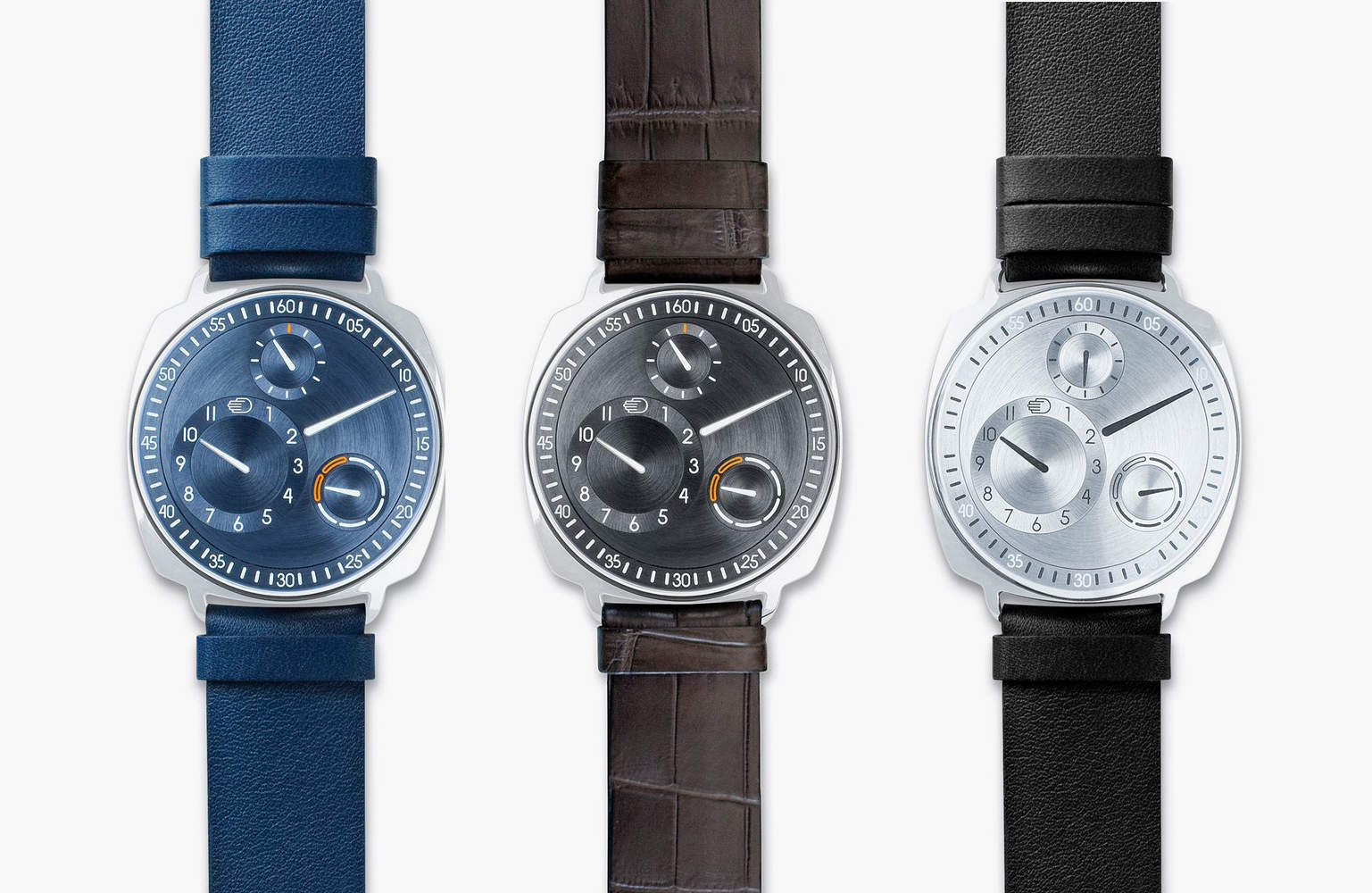
Ressence Type 1 Squared SIHH 2017While the watch is a change from other models, the Ressence Type 1 Squared retains its eye-catching orbital time display. Unlike other brands, Ressence continues to impress with new models and improvements that are progressing watchmaking.

The watch’s newly refined aesthetic drew me to the Type 1 Squared immediately. I didn’t think Ressence could improve on its orbital display, but they did. The new dials are as slick as previous models, but Ressence made them feel more mechanical than tech. A real piece of watchmaking art.
Advertisement

Hung Doan – Audemars Piguet Royal Oak “Frosted Gold”

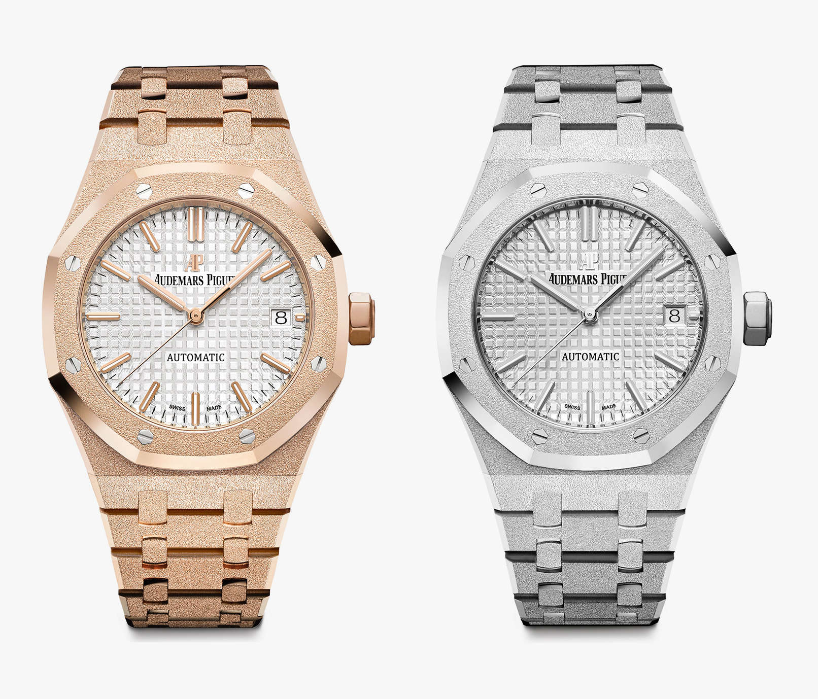
For the 2017 SIHH, Audemars Piguet introduced a new variant of the Royal Oak for women with a new sparkling finish dubbed “Frosted Gold.” Commemorating the 40th anniversary of the ladies Royal Oak, this update is a new collaboration between Italian-born, London-based designer Carolina Bucci and AP.

Ditching the traditional approach of placing diamonds on ladies’ watches, AP employed Bucci’s signature gold finish using the “Florentine technique.” Gold is hammered by hand with a diamond-tipped tool to create a tactile, sparkly finish. It is a labor-intensive approach that creates highly unique individual pieces. No two AP Royal Oak Frosted Gold watches will be alike due to the process. I like this latest from AP because there is usually little emphasis on women’s watches, both from brands and press. These are surprisingly fresh, and something I’d want for my wife. Audemars-Piguet-Royal-Oak-Frosted-Gold-SIHH-2017The watches come in 33mm and 37mm, the latter having an automatic Caliber 3120 and the former powered by a quartz Calibre 2713. There are also two metal options–rose and white gold. Other specifications include a rhodium-toned dial with “Grande Tapisserie” pattern, white gold applied hour-markers and Royal Oak hands with luminescent coating, 50 meters of water resistance, and a glare-proofed sapphire crystal.

Mark McArthur-Christie – H. Moser Swiss Mad Watch

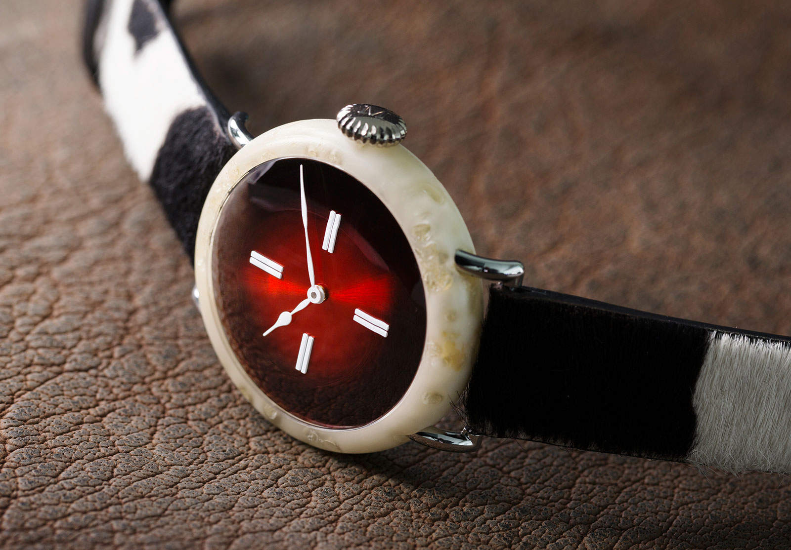
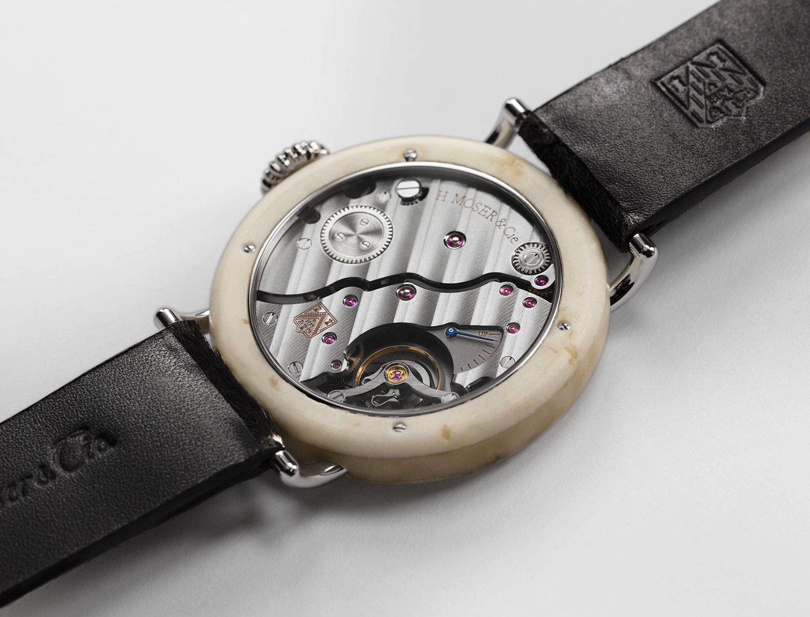
Swiss watchmakers aren’t known for their nonconformity–at least, as far as their professional lives go. That makes Moser et Cie, the maker from Neuhausen am Rheinfal, stand out even more. Last year, they offered the well-monikered “Alp Watch”–a stunner of a mechanical watch with more than a passing resemblance to a certain well-known wrist computer. There’s now a gorgeous minute retrograde version.H.-Moser-Cie-Swiss-Watch-SIHH-2017Now that changes in legislation mean that a “Swiss Watch,” Moser’s Edouard Meylan has taken a stand; he’s removed the “Swiss Made” label from his watches. And this year at SIHH, Moser has launched a watch with a case made from Swiss cheese (and, to be fair, composite) to point out that the “Swiss Made” label has lost credibility.

Backed up with a Star Wars-style scrolling opening, the brand’s video for the 100% in house “Swiss Mad Watch” pitches them as “a band of rebel watchmakers” determined to “make Swiss Made great again.” We’re not sure how many takers there will be for the limited edition of just 50 at $1,000,000 each but, as the video says, “may the constant force be with them.”H.-Moser-Cie-Swiss-Movement-SIHH-2017

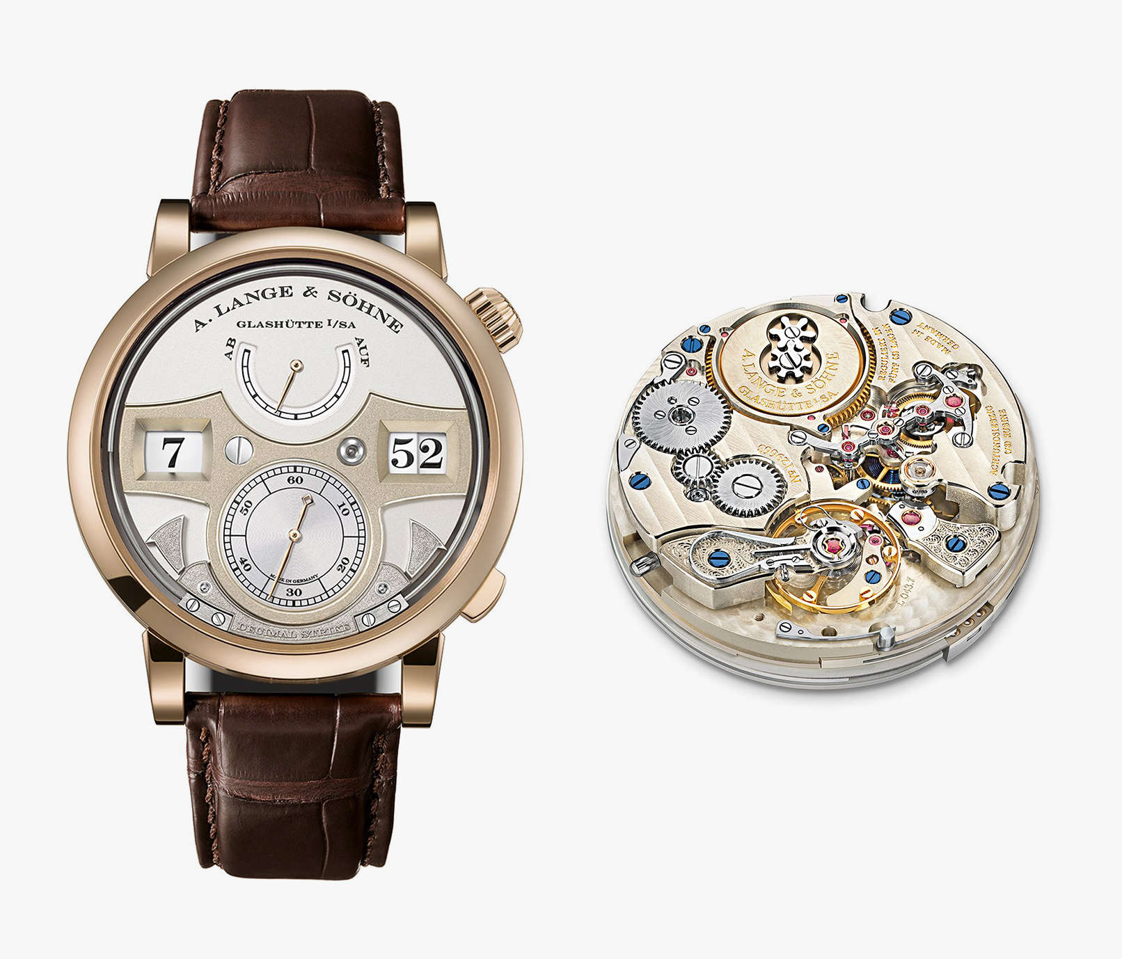
Christoph McNeil – A Lange & Söhne Zeitwerk Decimal Strike

While I can certainly appreciate all the crazy complications and fancy doodads associated with the wild haute horology debuting at SIHH, it is not something that really grabs or holds my attention. The reality is that I will most likely never own any of these watches, so they’re more of an abstraction than anything else. However, there is one brand that always makes me drool and scheme to find a way to make owning one a reality: A Lange & Söhne. This year my favorite watch from SIHH is easily the Zeitwerk Decimal Strike. The stupendously amazing Zeitwerk digital readout watch has been out for some time now, including the Striking Time (chimes on the hour and quarter hour) and Minute Repeater variations. This year Lange has introduced a new one that has two different chimes, one that chimes the hour in a lower pitch, and one that chimes on the 10s in a higher pitch.A-Lange-Sohne-Decimal-Strike-SIHH-2017Now, this may seem like an odd complication, something between the Striking Time and the Minute Repeater, but it actually really works with the digital time display. It adds a musical element to the dial when you have two disks (ones and tens) switching over at the same time every ten minutes. Of course, while not a useful complication, it is just flat out cool. The Decimal Strike is a limited edition of 100 and comes in the Lange proprietary “Honey Gold” color which, according to those that have seen it in person, is stunning. And like all Lange watches, the back is see-through so you can admire the incredible work of art that is the movement. Offered at a mere $127,000, if I had money to burn, this is where I would start the fire.

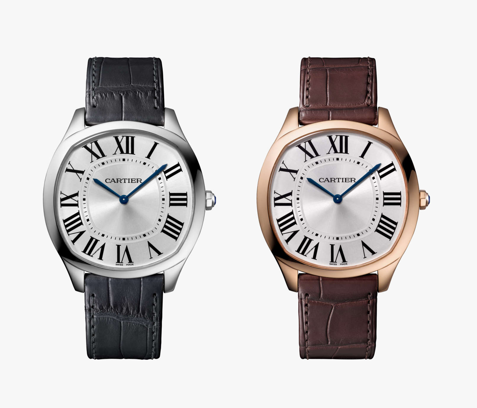
Ilya Ryvin – Drive de Cartier Extra Flat

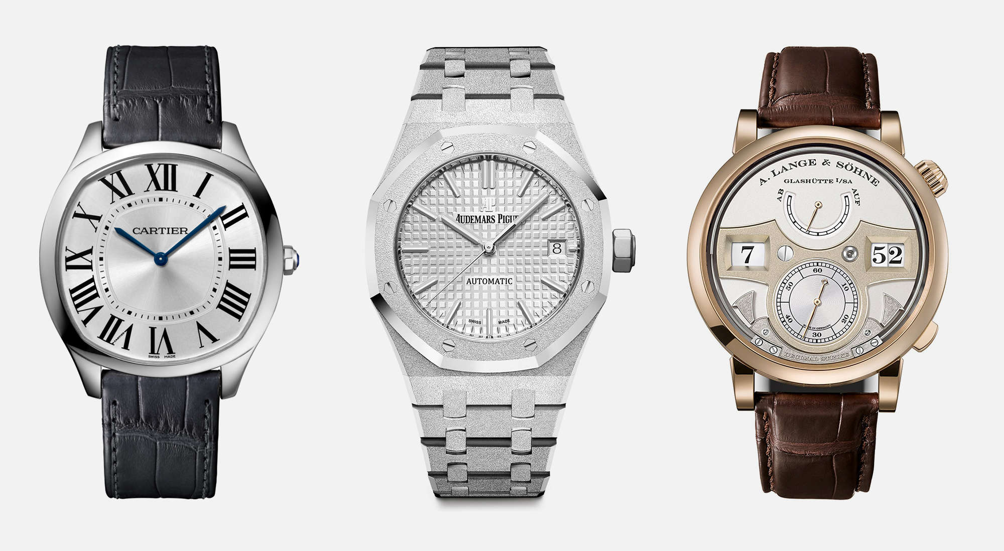
Last year, Cartier came out with the Drive de Cartier, a stunning design that took the brand’s conservative aesthetic and modernized it in a way that refreshed what I now think when I hear Cartier. It wasn’t groundbreaking in terms mechanical developments, but it was definitely a watch that I could see myself wearing for years should I be so lucky to own one someday. Drive-de-Cartier-SIHH-2017For 2017, Cartier unveiled the Drive de Cartier Extra Flat, a stripped-down, thinner and ever-so-slightly smaller addendum to the Drive line. I really love the cleaner, almost timeless aesthetic paired with a modern case (now 39mm versus the 40mm of the first Drive). The less-cluttered dial also works here, as it does away with some of the extraneous embellishments of the freshman piece. Technically, it’s no slouch, either. Inside is a Piaget hand wind caliber. My only caveat? The Drive Extra Flat is only available in gold. Given the overwhelmingly positive reaction to the design, I hope a stainless steel version is not too far behind.

Advertisement

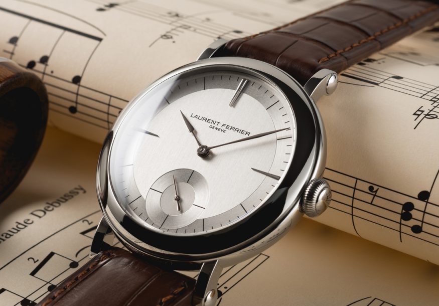
Zach Weiss – Laurent Ferrier Galet Micro Rotor “Montre Ecole”

Sometimes, it seems like there is an inverse relationship between money and taste. The more a thing costs, or the more money a person has, the less taste is present. I mean, just look at some of the world’s most expensive timepieces. They might be mechanically brilliant, but I honestly wouldn’t be caught dead with one on my wrist (I’m looking at you, world’s lightest tourbillon split-second). So, when a luxury watch comes along that is restrained, stylish and simply well-designed, as odd as it sounds, it’s refreshing.Laurent Ferrier Montre Ecole DialOne brand that seems to routinely do the impossible and make tasteful–albeit five-figure–watches is Laurent Ferrier. This year they out did themselves with the Galet Micro Rotor “Montre Ecole” (school watch), featuring a new case design and a simply gorgeous dial. The watch was inspired by the first watch Mr. Ferrier made in school. The 40mm case features a rounded, pebble-like center with a flowing domed bezel that is meant to speak to 19th century pocket watches. The central form is contrasted by straight lugs that further speak to these classical roots.Laurent Ferrier_Montre Ecole_SIDEWhile the case is attractive, it’s the dial that really does it for me. All metal with some simple printed graphics and a couple of applied markers, it does more finishing than most dials do with tons of bells and whistles. There are three primary areas: the central surface, chapter ring and sub-seconds. The central surface has vertical brushing, the chapter ring has radial, and the sub-seconds a mix of radial and concentric circle graining. Simple textural shifts change how light casts on them, creating visually distinct areas.

The primary index consists of black lines the length of the width of the chapter ring for the hour and smaller lines for the minutes. And three, nine and twelve are nail-like applied markers that cut from the edge of the dial into the central area (similar markers can be found on the Galet Square) . These add some personality to the watch, reminding of something from the era of streamline/art deco design. The sub-seconds then features just four lines at the quarter minute. The proportioning of the sub-dial is perfect. It’s large, but not overwhelming, and just nearly kisses the bottom of the dial, leaving just enough room for the “swiss” text. Finishing it off are LF’s signature Assegai-shaped hands, which suit the dial perfectly. Overall, the dial has something raw about it and industrial. It’s not a fussy luxury-watch dial, it’s just the right dial for the design.Laurent Ferrier MovementOf course, you can’t talk about Laurent Ferrier without mentioning the movement, which is ultimately the most beautiful feature of the watch. LF’s movement design speaks to the same restrained and tasteful aesthetic. The 35-jewel micro-rotor automatic has gorgeous, arcing lines, with large decorated plates with beveled edges and polished bridges. The off-center gold micro-rotor with it’s eccentric snail-shell shape stands as a visual centerpiece of the design. For the “Montre Ecole” the movement is decorated “rougher” to speak the prototyping materials LF used on the watch that inspired this model. Starting at $38k for the steel model, it’s unlikely to grace my wrist any day soon, but hopefully brands can take inspiration from this dial, which shows how much you can do with simple tools.

Related Posts
This is the house account for Worn & Wound. We use it on general articles about us, the site and our products.
Categories: