


 Featured Videos


Last year at Basel (2015), Bremont introduced the new ALT1-ZT, a more modern and graphic spin on their ALT1 chronograph line. Having once reviewed the ALT1-B, I found the cleaner design of the ZT to be refreshing, more legible and more unique. Well with Basel World 2016 just around the corner, Bremont has announced a new version of the ZT that might just be one of their sexiest designs to date.
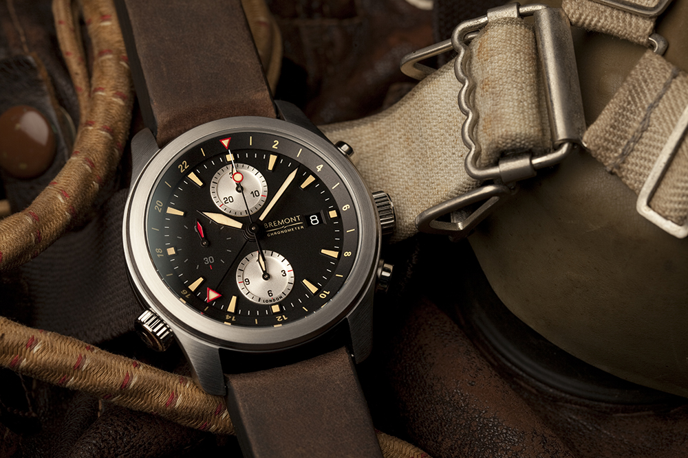
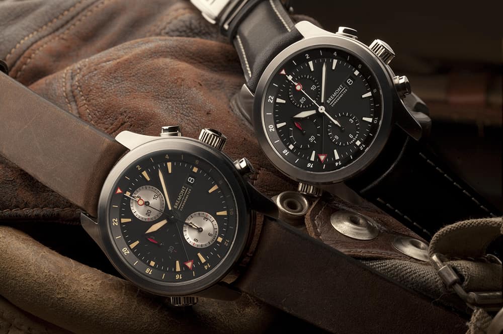
The ALT1-ZT/51 takes the ZT and gives it a stylized overhaul vis-a-vis their limited edition and highly coveted P-51 chronograph. The P-51 is, in my eyes, the coolest watch Bremont has ever produced. One of their earlier forays into using historical material in a watch, the P-51 featured pieces of its namesake plane, but more over a design that oozed style and personality. The 3-6-9 dial featured a contrast 30-minute counter at 12, a hidden seconds-dial at 9 with a propeller hand and no hour counter, giving it the appearance of a single register chronograph. The hour markers are all small applied circles, save the three larger numerals, all with an acid yellow/orange giving it an aged, but aggressive look. The dial also cleverly hid a 24hr index in gray with a stealthy hand, adding functionality without over complicating the dial. The hour hand is then one of the coolest hour hands I’ve seen on a vintage inspired military watch. It’s almost Gothic in styling, and while ornate, just works. It all came to together to be gorgeous and utterly unique.
Unfortunately, it has long been sold out, unavailable and is a watch its owners aren’t looking to sell. And until now, Bremont hasn’t made anything to appease people who have longed for that watch. The ALT1-ZT/51 essentially takes the palette of the P-51 and applies it to the ZT’s design. So, the dial stays black, the sub-dials at 12 and 6 become silver, and the sub-dial at 9 stays black, and loses its applied index, giving the watch the feeling of being a two-register design. It then keeps the red accents of the ZT, with highlights on the GMT hand, chrono-second lollipop, 24/0hr on the 24-hr inner bezel and a few markers through out the dial.
The change that creates the biggest impact is the use of a “boutique” Super-Luminova with an aged, creamy yellow color. Though they imply it is a color made for them, it’s clearly very similar to the old radium lume we have seen on other vintage inspired pilot and military watches. Regardless, it works beautifully on the watch, adding a soft, warmer element that works the theme. It’s also a much more stylized choice for the brand, going for personality over function, with I think helps set this one apart from their line and other brands at the price point.
The hands stay the same as the ZT’s, save the change in color. I do wish the hour hand from the P-51 had made it over too… that would have just been the cherry on top, but the hands as is do fit the design. Overall, it’s a great looking watch that hopefully suggests a new and more aesthetic approach from the brand. While their tech and execution has always been great, their watches can at times be a bit bland. The ALT1-ZT/51 simply has an appeal and an edge their other watches don’t. The original ZT was about $6,600, so I expect the ZT/51 will be about the same.
