Hands-on with The Daily by Richardt Mejer

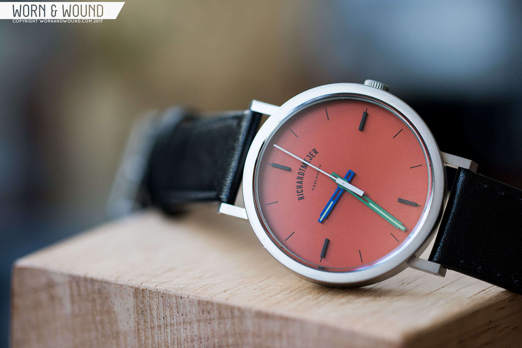
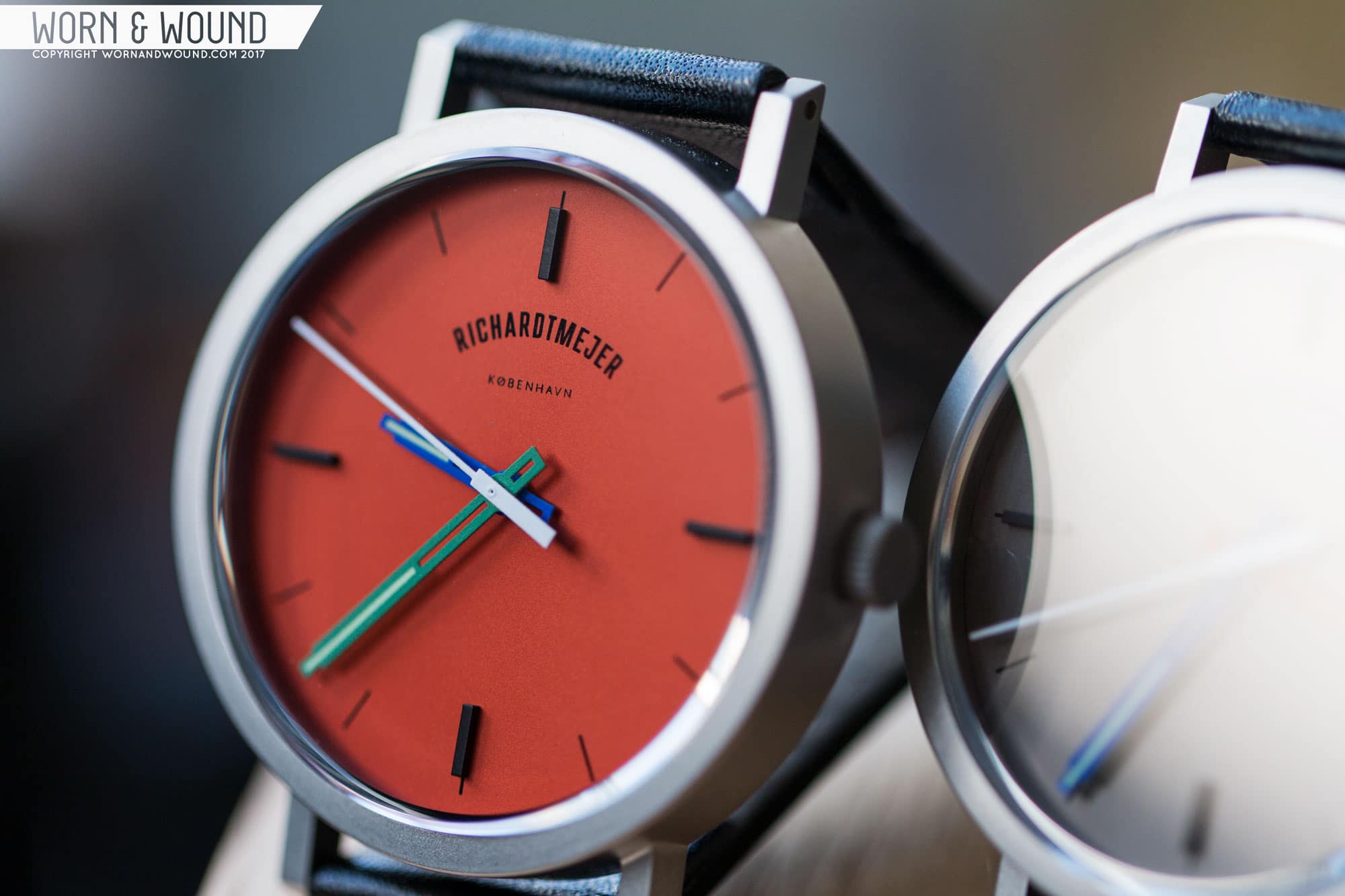
The last time we took a look at Richardt Mejer, it was in our review of their Signature collection. As the name suggests, that watch had a distinctive look that played off the brand’s Danish roots, speaking to Scandinavian design. It was a divisive watch, eliciting a love it or leave it response. As someone in the former camp, I found it a refreshing take on a design-focused watch (versus a more classically-inspired timepiece) that offered a lot of style at a decent price.

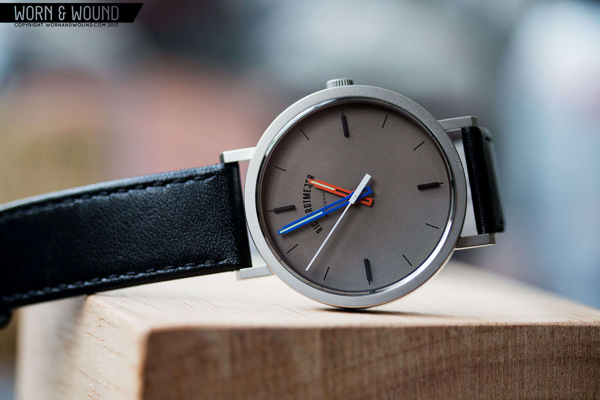
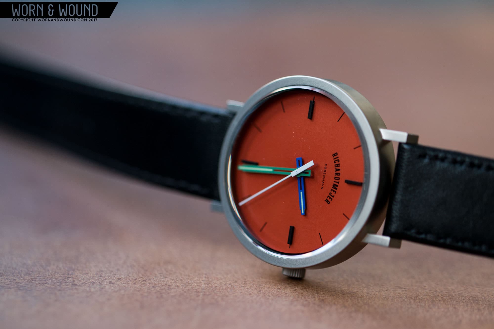
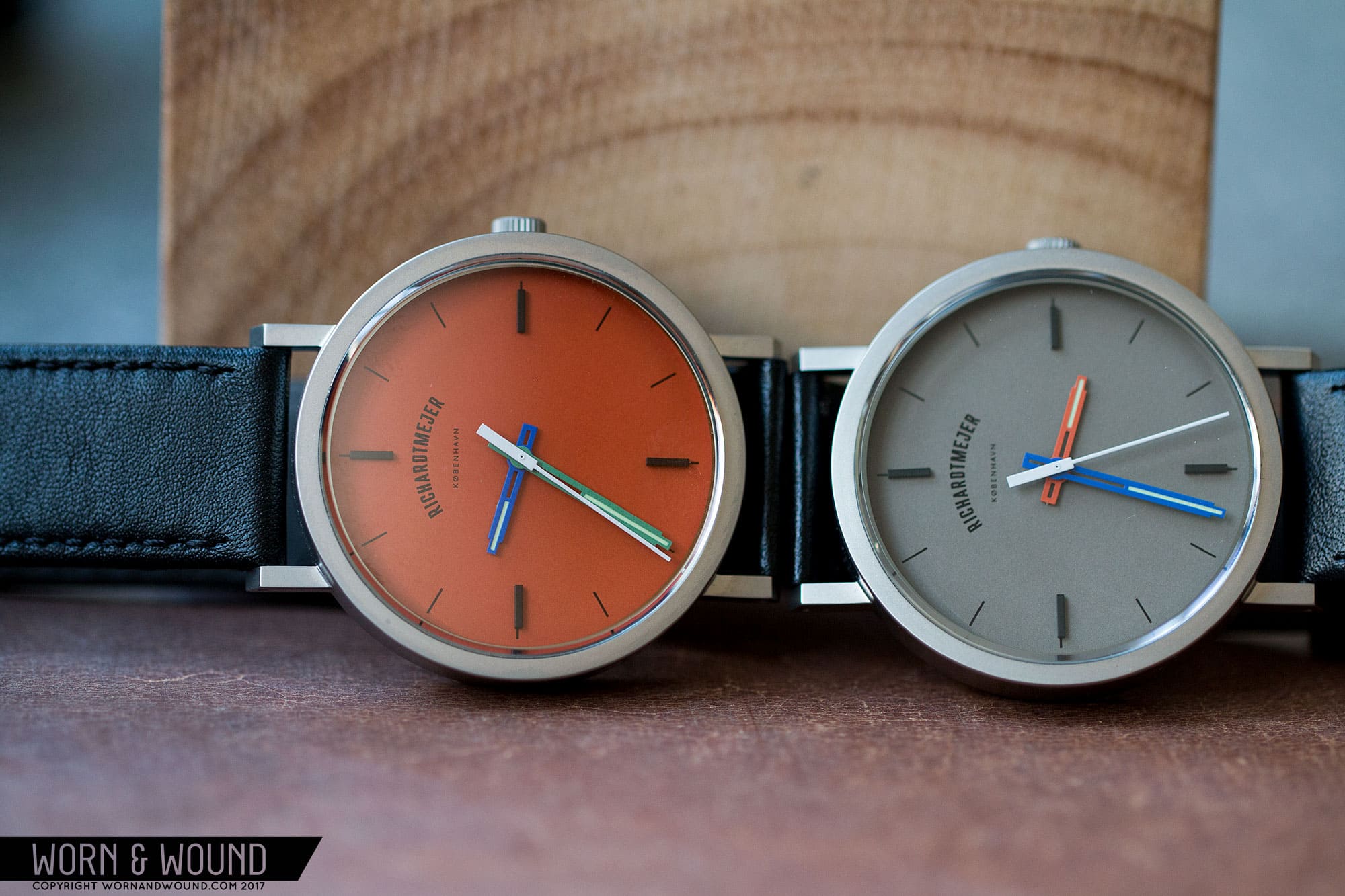
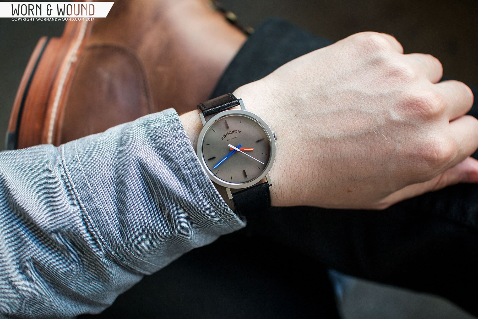
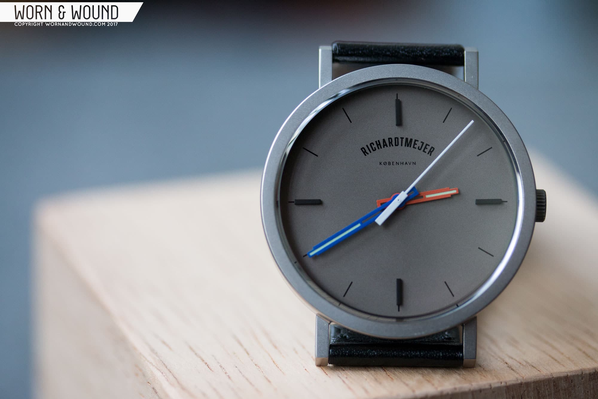
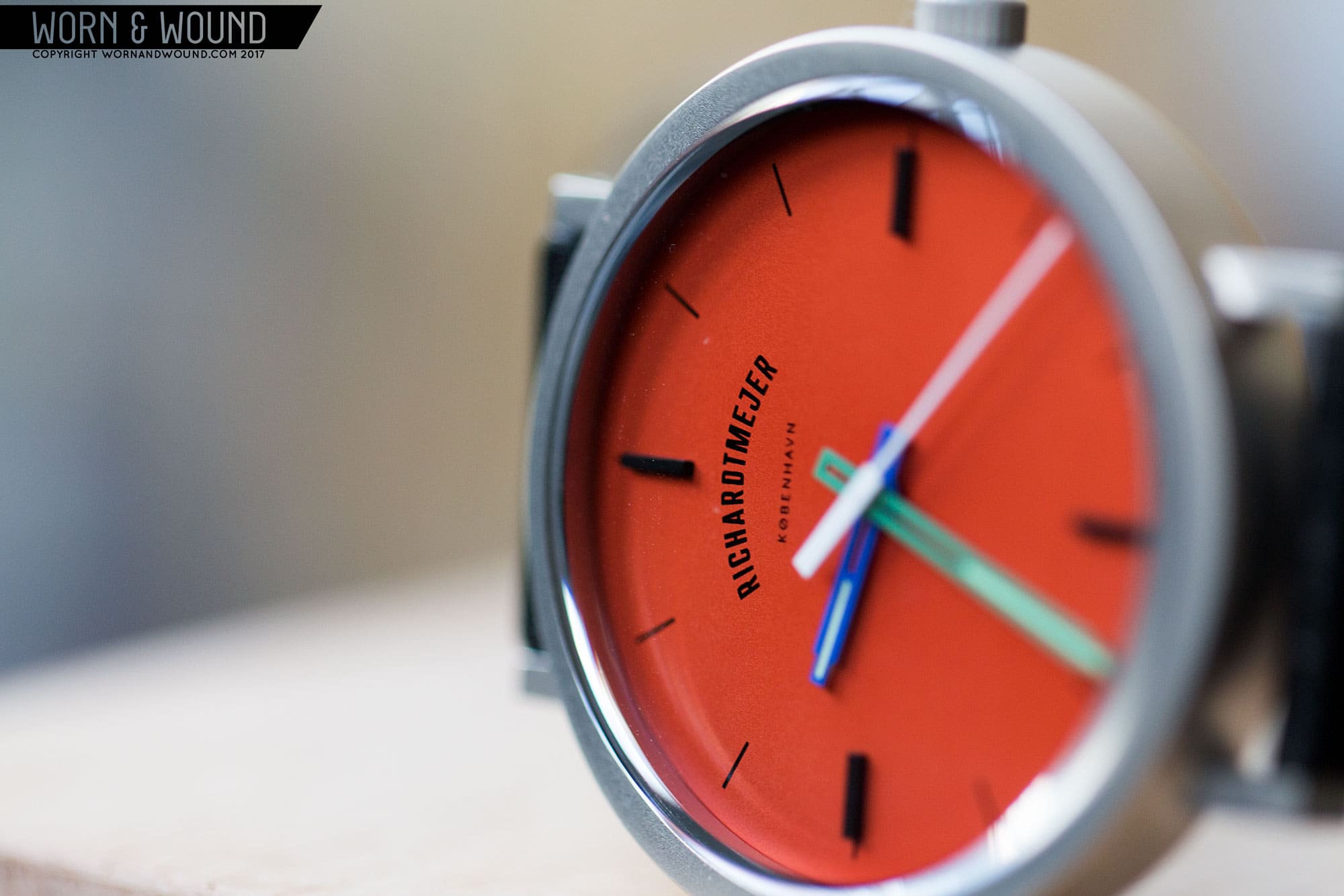
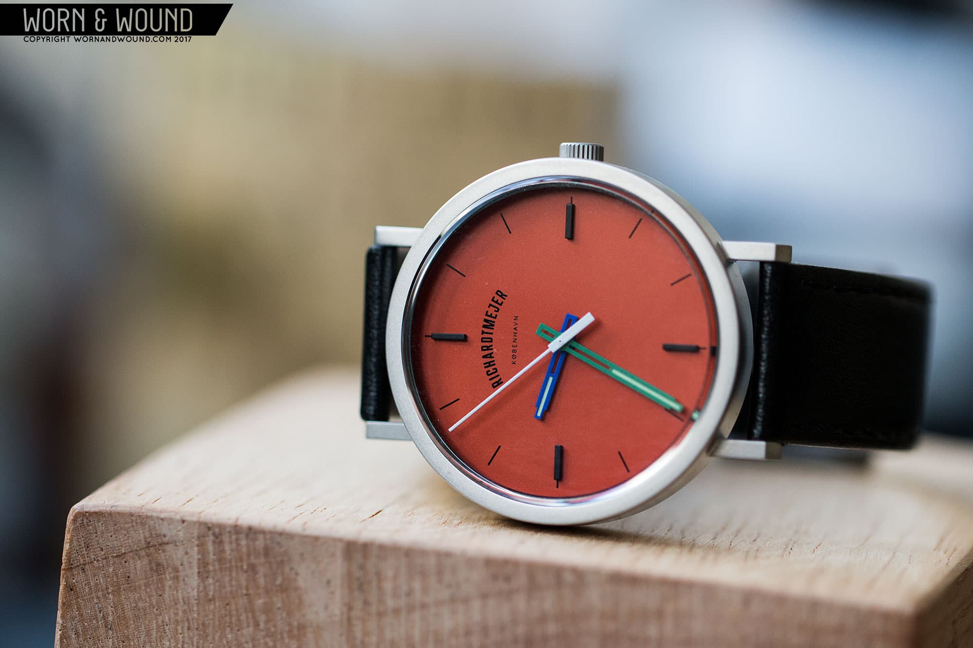
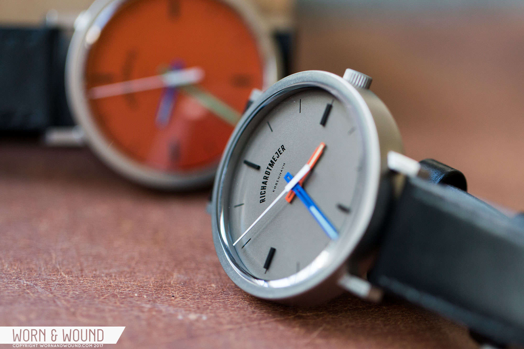
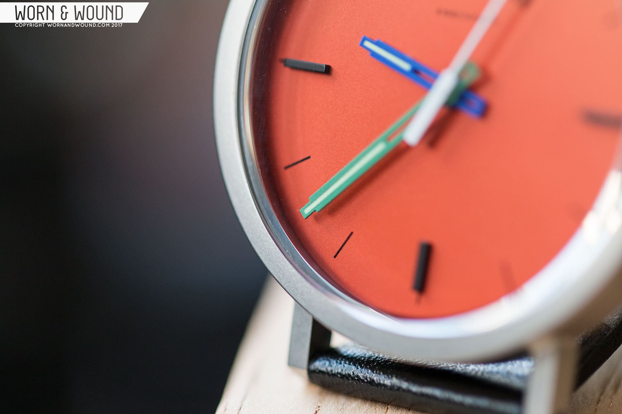
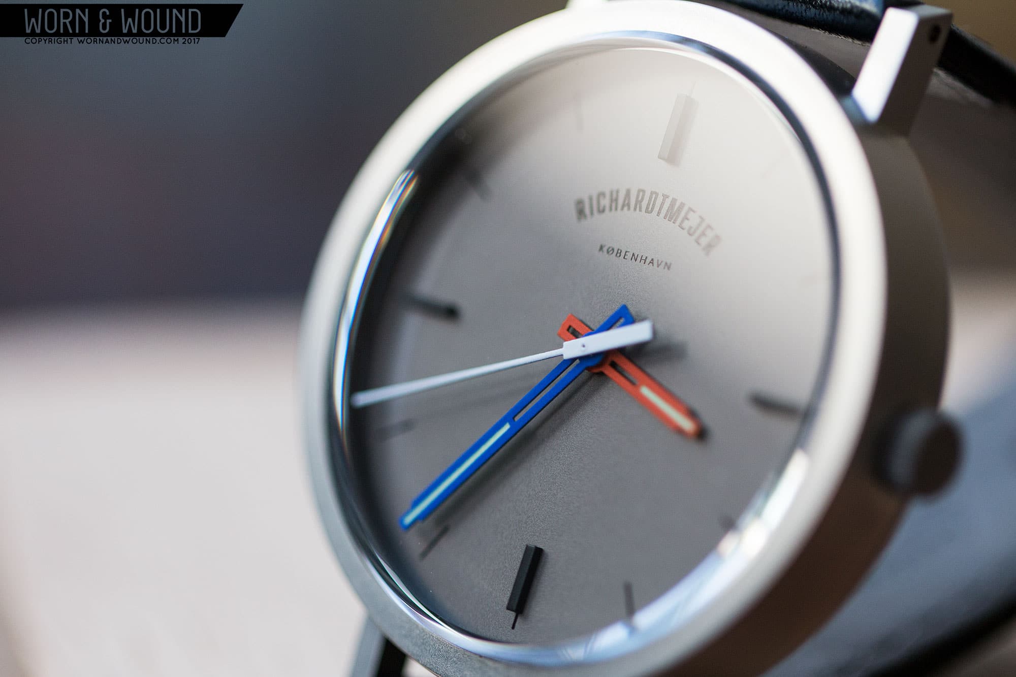
To follow up the Signature, Richardt Mejer released a watch simply called the Daily. As the name suggests, this time around it’s an everyday watch, which is to say it’s a bit less controversial in its design and a bit more “normal.” And that it is. It’s smaller, with a more classic case shape, yet it still retains some of Richardt Mejer’s style, making it a clear relative of the Signature.

Save

Save

Save

Save

Advertisement
$210

Hands-on with The Daily by Richardt Mejer

Case
Steel
Movement
Ronda Quartz
Dial
Matte
Lume
On Hands
Lens
Sapphire
Strap
Leather
Water Resistance
NA
Dimensions
37 x 43mm
Thickness
9mm
Lug Width
18mm
Crown
push-Pull
Warranty
yes
Price
$210

Still quartz powered, The Daily is now a 37 x 43 x 9mm watch with what appears to be a classic, Bauhaus case shape at first glance. The mid-case has a cylindrical shape with straight, flat lugs protruding out. At lower angles, some interesting geometry emerges. Rather than having a flat top edge around the sapphire crystal, the surface undulates up and down, essentially changing the thickness of the mid-case, getting thinnest between the lugs and tallest above the crown.

This was a detail that was also found on the stranger Signature case that I was very happy to see here. As simple as it is, it gives the essential forms of the watch come motion and complexity that add a lot of character. Had the watch had a flat bezel, it might have been too stiff and too common feeling. Furthermore, on the samples received, the cases are matte/satin, giving them a flatter look to begin with. The short lugs are spaced at 18mm, which is sensible on a 37mm case, and they are nicely balanced with the thickness of the mid-case.

The dial of the Daily uses a similar vocabulary as that of the Signature, but it is stripped down giving you just the essentials, and it introduces some unexpected color. The two samples we received featured Gray and Orange matte dials. First, the use of a matte dial is a departure from the Signature, which had sunray dials. The matte has a nice effect, giving the watches an intentionally more casual feeling overall.

Save

Save

Save

Save

The dials then feature a single simple index consisting of very thin black lines per hour, with larger applied black markers at 12, three, six and nine. It’s clean, clear and gets the job done for a casual watch. The use of applied markers add some texture and depth to the design, also playing off of the Signature’s design. I really like that the applied markers are matte black too, as something metallic or polished would have felt too blingy in this setting. Other than the index, there is just a Richardt Mejer logo under 12–no date or any other disruption.

The hands are the same style as found on the Signature, with a partially skeletonized design and thin strip of lume. The seconds hand is then a thin stick with a large rectangular counterweight. The hour and minute hand are also where the watch plays a bit more with color. The gray dial–which is a smokey, charcoal color–features an orange hour hand and blue minute hand. The orange dial–which is a deep, burnt hue–features a blue hour hand and a green minute hand.

The color combos are a bit odd and unexpected. On one hand, I like that the color adds something fun and playful to the watch. Like the oscillating top edge surface, it keeps the watch from being too formal. On the other, the color choices are a bit strange and a tad off to me. I wouldn’t personally put blue and orange on top of a gray dial; it’s just a bit too much contrast. Likewise, I wouldn’t add any color to a fully orange dial, as that already is very intense. It feels almost like a watch where you get to customize the hand colors from a large palette, and I received someone else’s choices. But perhaps it’s the just quirky detail the watch needs to appeal to a broader audience.

Save

Save

Save

Save

Gray on the wrist (Boots courtesy of Grant Stone Shoes)
Orange on the wrist

On the wrist the Daily wears very well, as any daily watch should. The 37mm feels larger than it sounds thanks to the thick walls of the case, but it’s still on the modest side for a modern watch. The short lug-to-lug and thin lugs also center the watch on top of the wrist, making it suitable for smaller wrists as well. The 9mm height gives it a pleasantly thin profile, adding to the overall comfort. Simply put, they achieved their goal of making a good everyday watch that is easy to wear.

Aesthetically, the Daily is a nice balance of fun and taught design. Like the Signature, it’s something between a watch and a designed-object in style. From the two-piece construction to the wave-form case, it pulls as much from watch design as it does from small home or office goods and architecture, creating a language that is simple, but surprisingly refreshing. The clean dials are then appealing in their openness and balance. Obviously, the orange-dial version is more casual and playful than the gray, but despite its use of color it doesn’t feel too loud. The gray dial is more subtle and my speed, and though I don’t love the orange and blue hands, I do like that there is some color to liven it up.

At around $200, Richardt Mejer has another successful design on their hands with the Daily. Given the tedium of Daniel Wellington, Kimono, Nixon and other brands you’ll find at about the same price filling the watch sections of men’s fashion stores, Richardt Mejer is well poised to introduce something more thoughtful and nuanced into the mix. The Daily is what it seeks to be, a good casual watch that still manages to be unique.

Save

Save

Save

Save

Images from this post:

Save

Save

Related Reviews
Zach is the Co-Founder and Executive Editor of Worn & Wound. Before diving headfirst into the world of watches, he spent his days as a product and graphic designer. Zach views watches as the perfect synergy of 2D and 3D design: the place where form, function, fashion and mechanical wonderment come together.
wornandwound zsw