


 Featured Videos


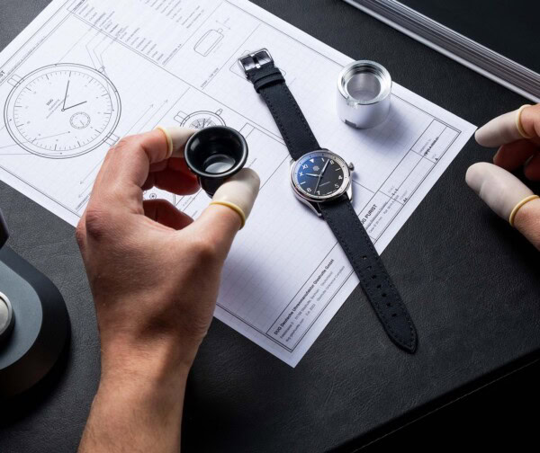
Occasionally, things come together in a product, like stars aligning, that elevate it above and beyond what is expected. When Jonathan of Page&Cooper told me he was working on a collaboration with Squale, during a conversation that took place at Basel 2013, I was immediately intrigued. It’s always interesting when a retailer and brand work together to create something different, as they tend to take more risks, but they don’t always turn out for the best. Knowing Page&Cooper, which is a model of what internet based watch retailers should be, as well as Squale, a brand everyone should know (for a succinct history, check out our review of their 50 Atmos model), I had a strong feeling these would not just be successful, they’d be exceptional.

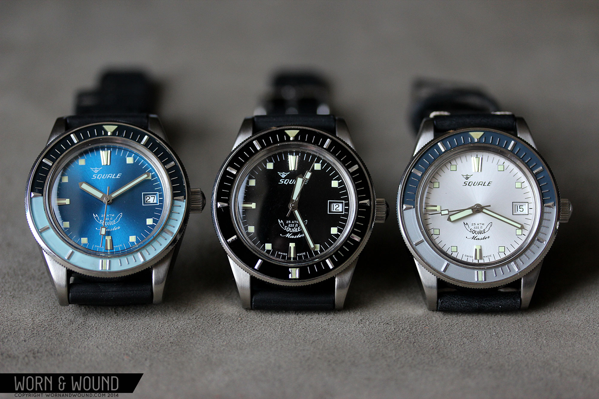
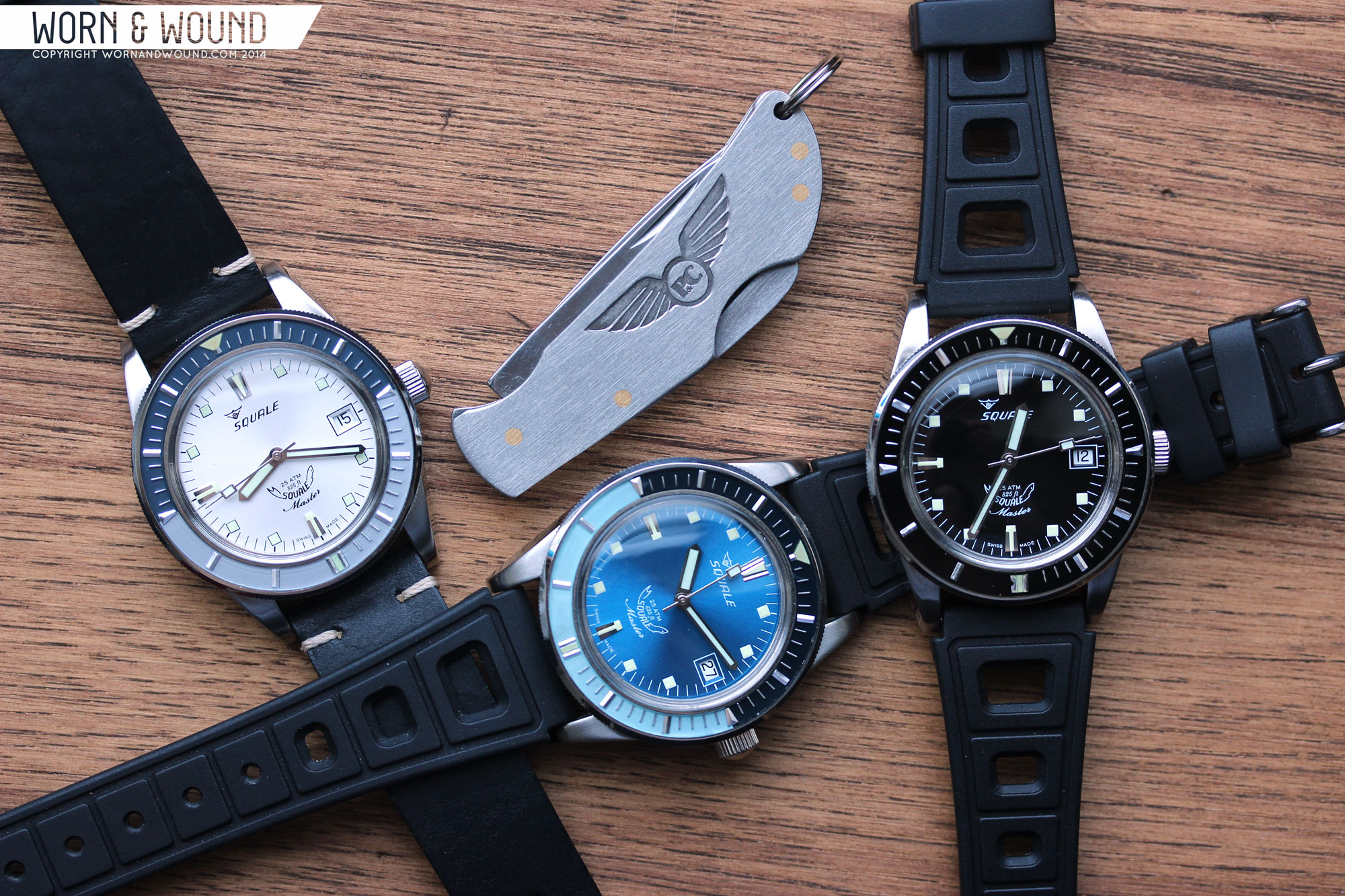
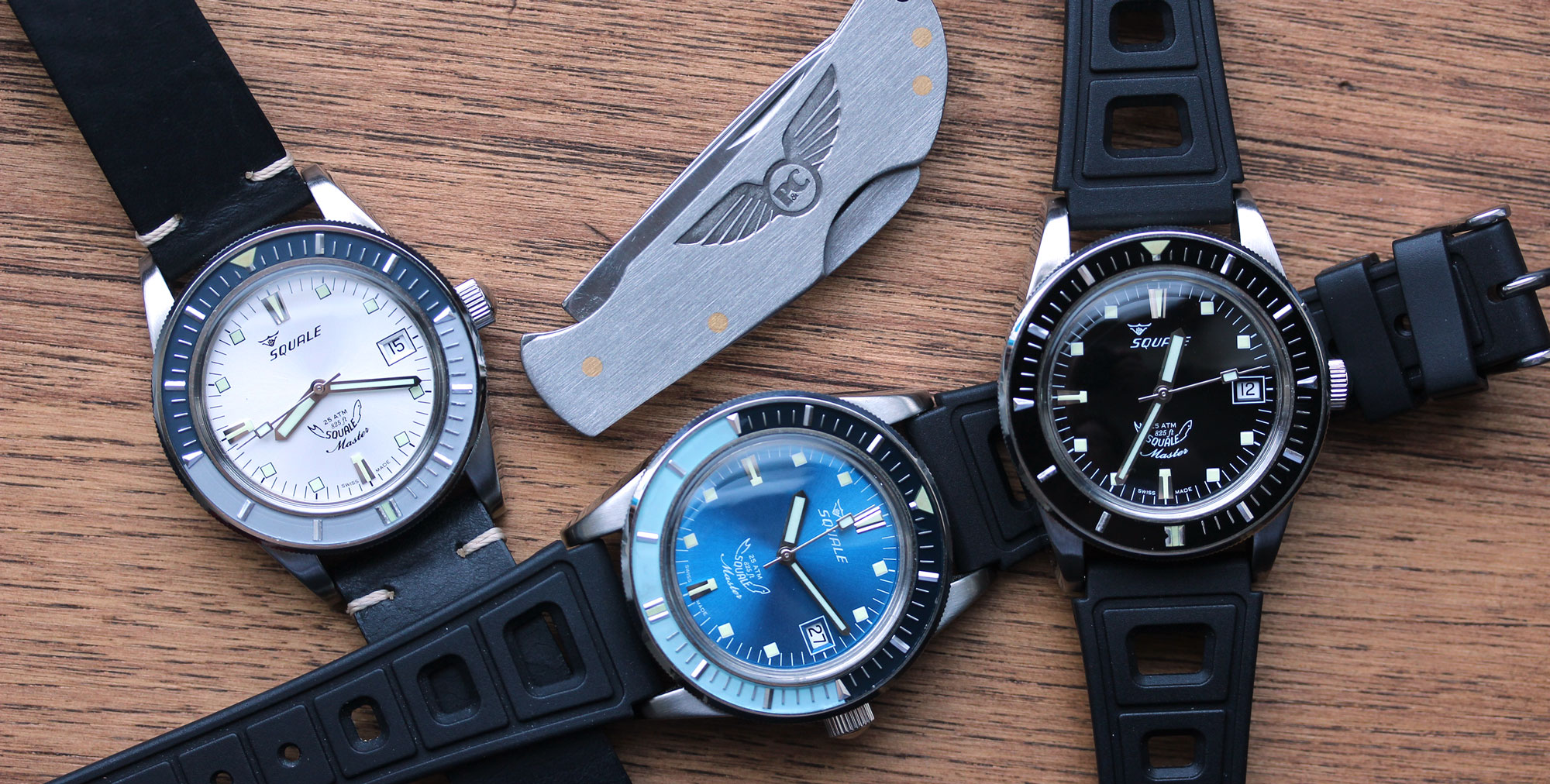
Slowly details dripped in on the watch and my excitement grew regularly until the great reveal. The Squale X Page&Cooper Vintage Master LE; a series of 60 watches broken up into 3 styles; silver/black, azure blue/black and all black, a mere 20 of each. The watch, a recreation of an early 60’s Squale model, would feature NOS bezels that had been found in the Squale archives, just waiting to see the light of day. These bezels, which are the star of the show though with a strong supporting cast, define “they don’t make ’em like they used to,” but we’ll get more into that later. They also defined the scale of the watch, limiting it to a delightful, comfortable and proportionally appropriate 39mm.
With this, the challenge was set for Squale and Page&Cooper. Not only did they want to use the NOS bezels, they wanted to bring back, in the best of their abilities, a watch that has long since been available. So they created new 39mm cases in a style that would suit the period, outfitted them with domed acrylic crystals and achieved a 250m water resistance. Though they could have used sapphire to modernize, acrylic was very intentionally chosen to stay true to the heritage of the watch, and proved to be a difficult task to make, especially at the small quantity they were ordering. They, along with much the rest of the watch, ended up being made in Neuchâtel, Switzerland, in many of the same factories that produced the original Master watches, by many of the same skilled craftsmen. In fact, the final assembly is executed by Squale’s most experienced watchmaker, Franco, who is retiring once this project is complete.
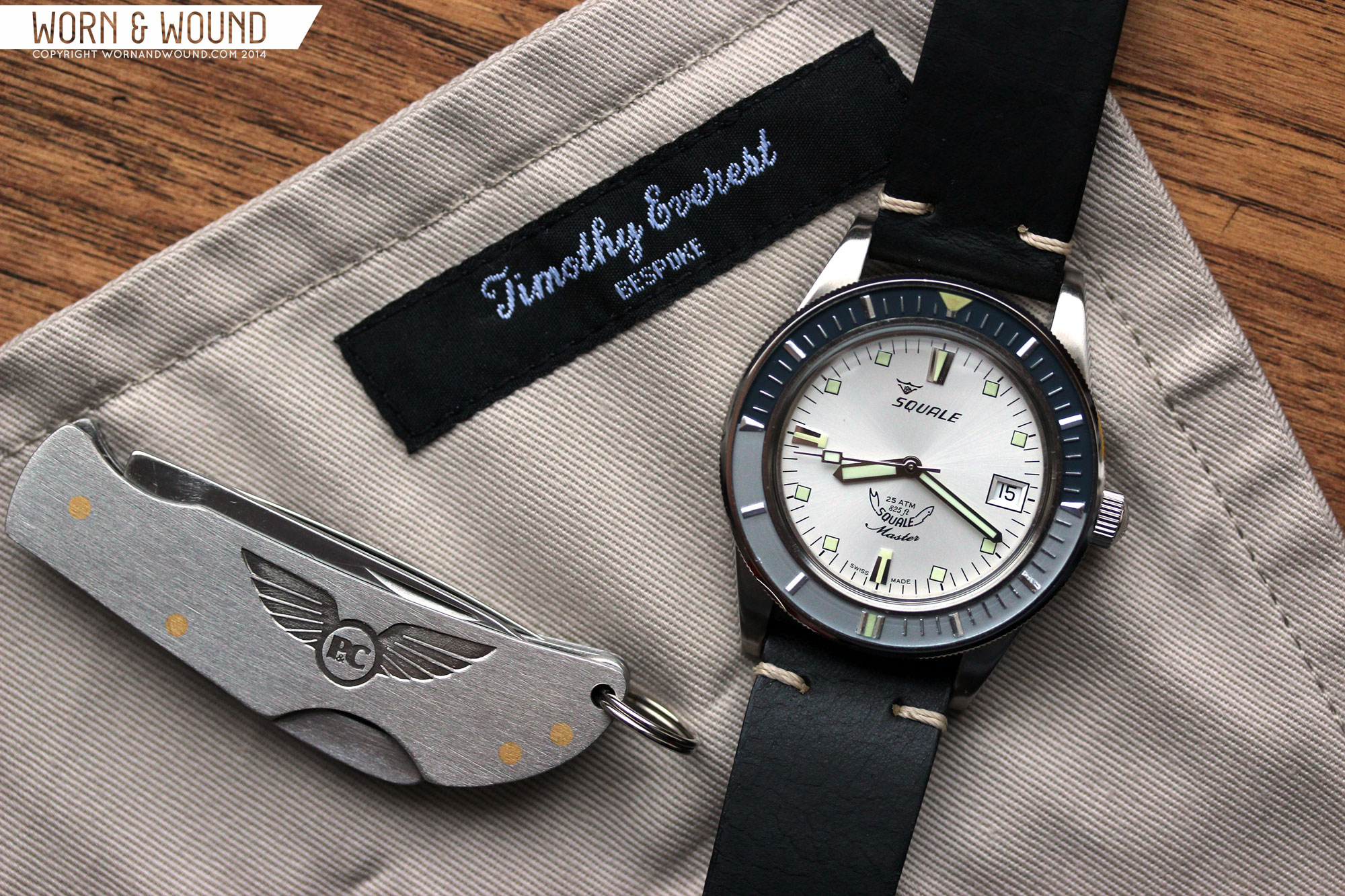
While the style and some components are vintage, the top grade 2824-2 movement inside is thoroughly modern. Accompanying the watch are 2 perfectly chose straps, a cloth “Diver’s Roll” made by Saville Row tailor Timothy Everest, and a pocket knife by Joseph Rodgers, an old and prestigious british cutlery brand. Considering the scarcity (the blue is already sold out), extras and historical components, the asking price of £1,099 or about $1,880 seems like a fair price. Big thanks to Jonathan for giving us the opportunity for an exclusive hands-on review of the Squale X Page&Cooper Vintage Master, so let’s get to it.
Squale x Page&Cooper Vintage Master Review
 Case: Steel
Movement: ETA 2824-2
Dial: Black, Blue, Silver
Lume: Yes
Lens: Acrylic
Strap: Leather + Rubber
Water Res.: 250M
Dimensions: 39 x 47.7mm
Thickness: 13.6 mm
Lug Width: 22 mm
Crown: 6 x 4 mm
Warranty: Yes
Price: £1,099 / $1,880
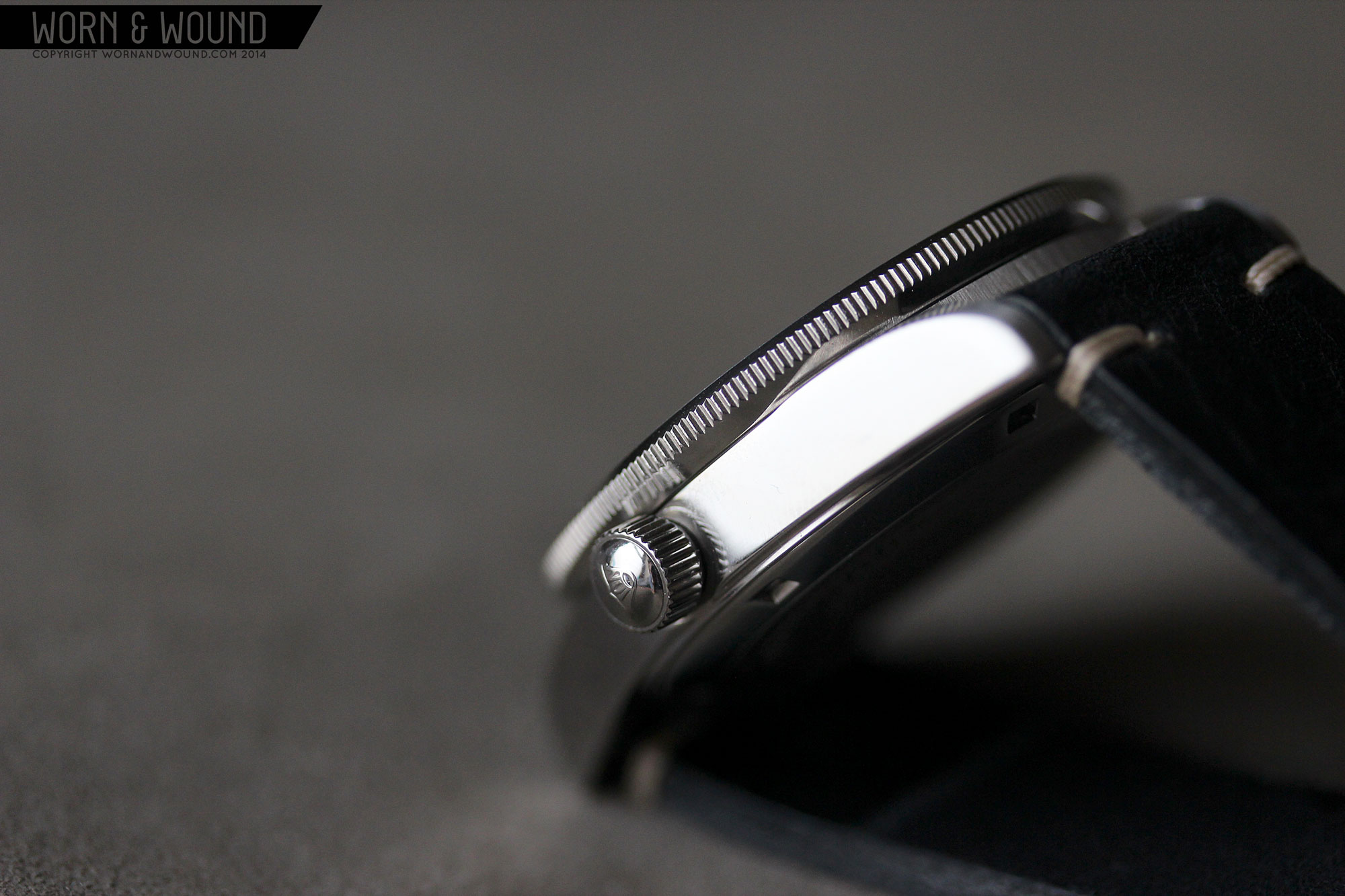
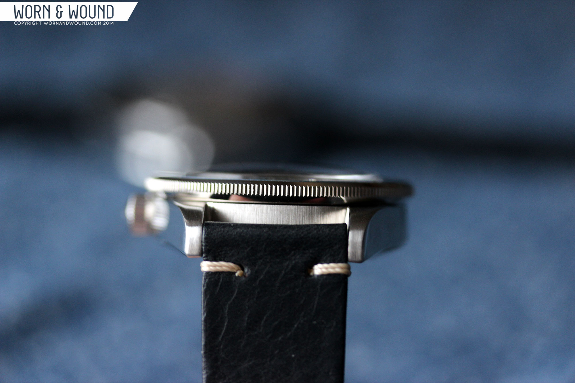
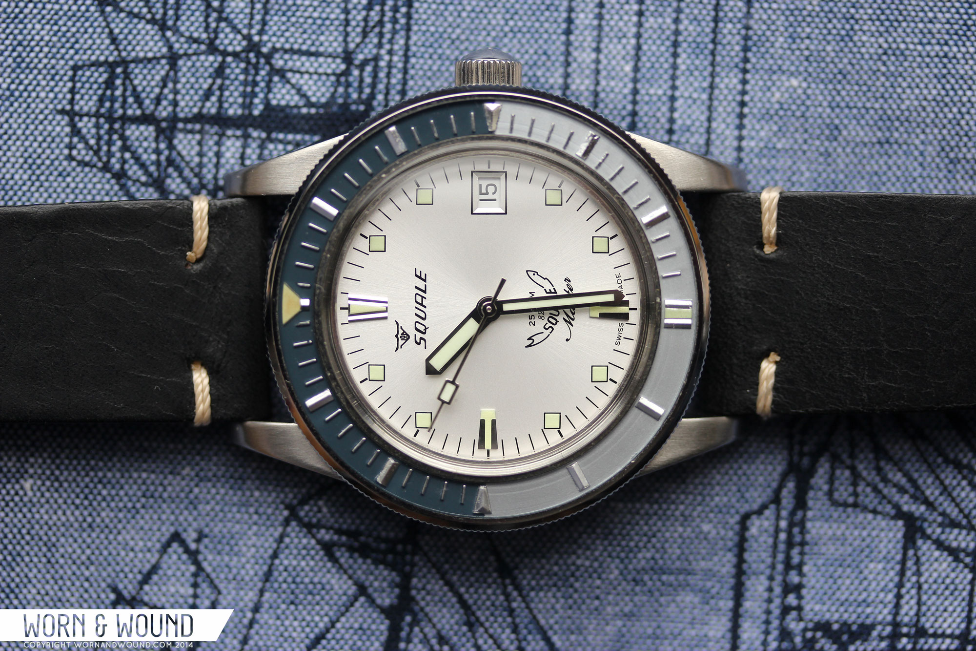
Case
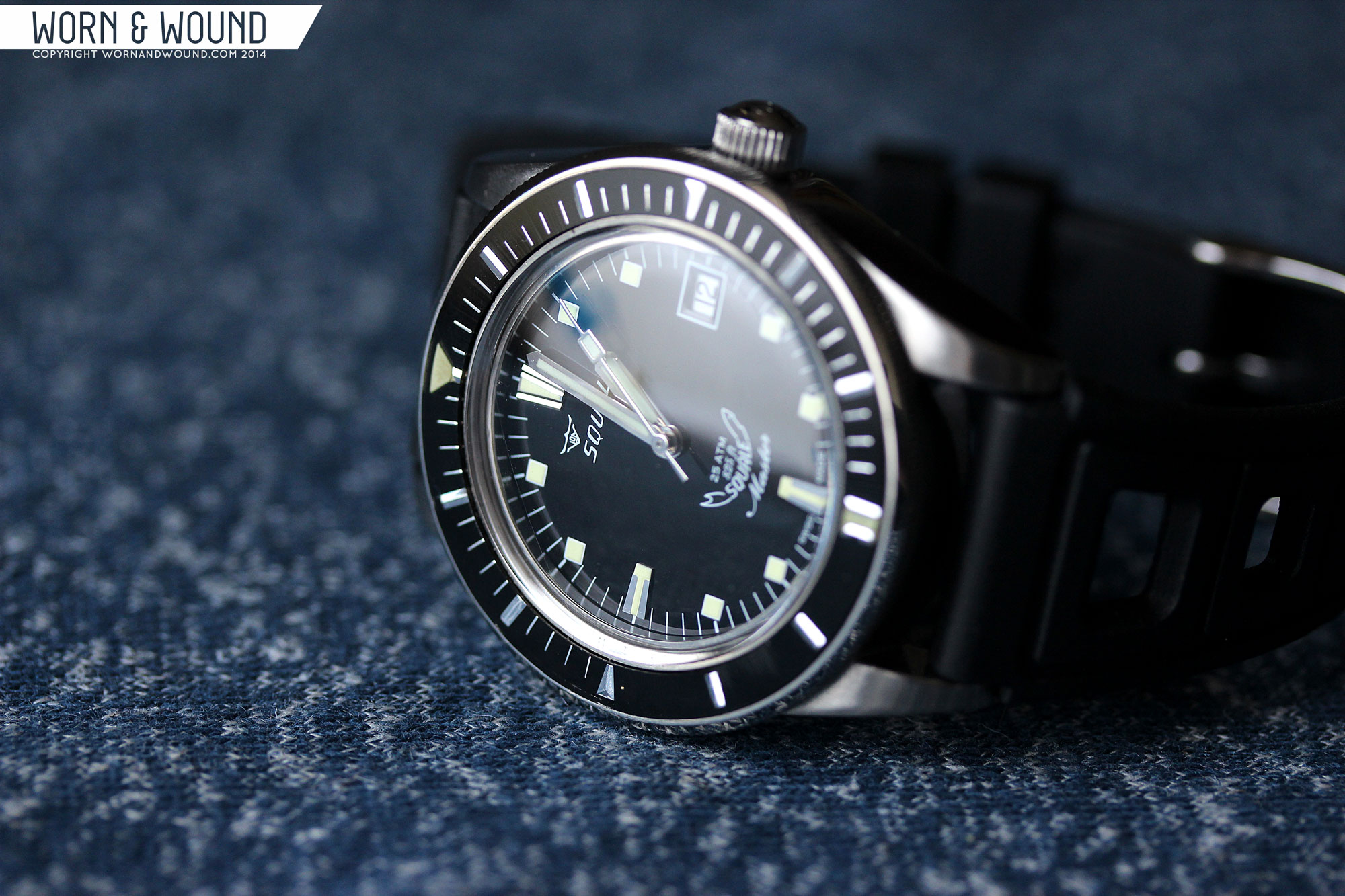
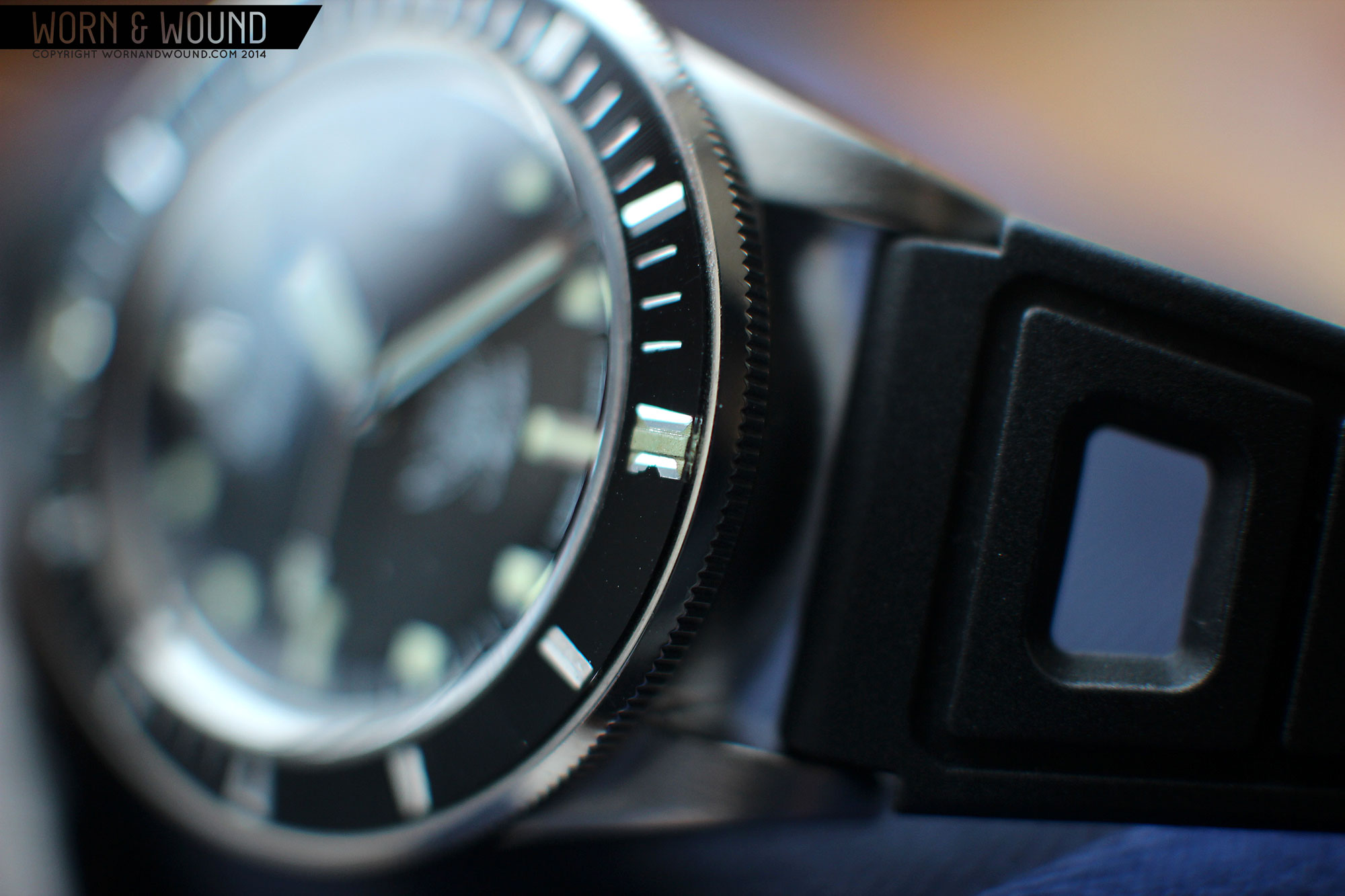
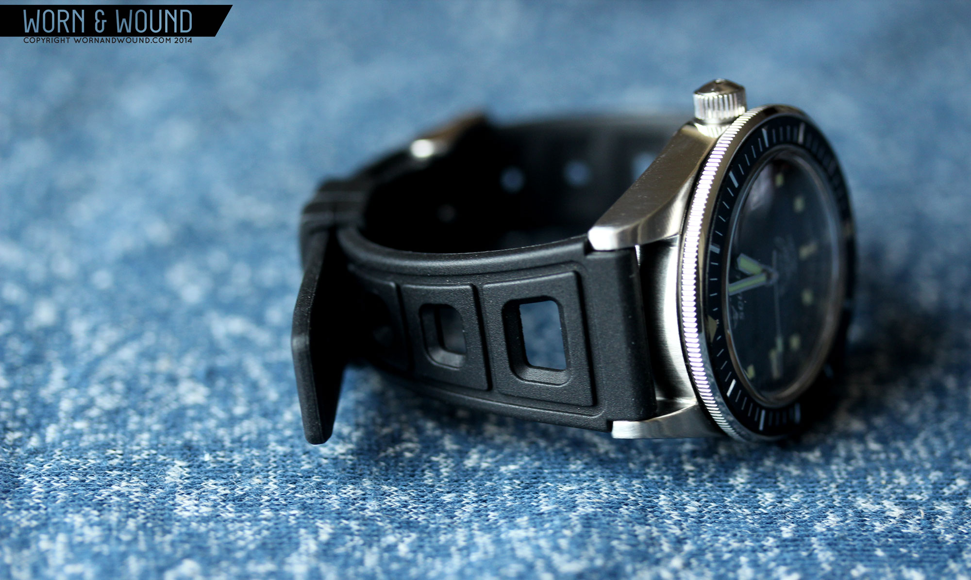
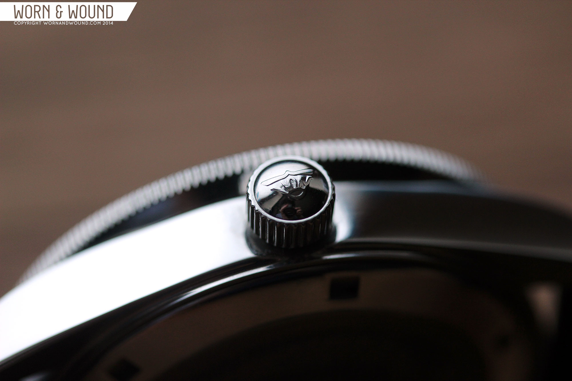
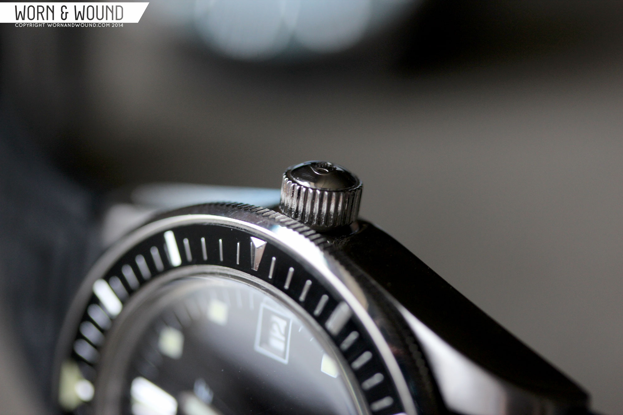
Measuring 39 x 47.8 x 13.6mm (to the top of the dome) with 20mm lugs, the Vintage Master is a refreshing departure from today’s bloated divers. The case is slight and elegant, with simple forms and sharp edges, relating more to what we’d associate with modern casual than tool designs. From above, the bezel has a commanding presence, followed by long, slender tapering lugs. One distinctly vintage detail is the lack of crown guards surrounding the screw-down Von Buren signed crown, which is accurate to the early 60’s. Aesthetically, it keeps the mass of the watch down a bit, and emphasizes the bezel.
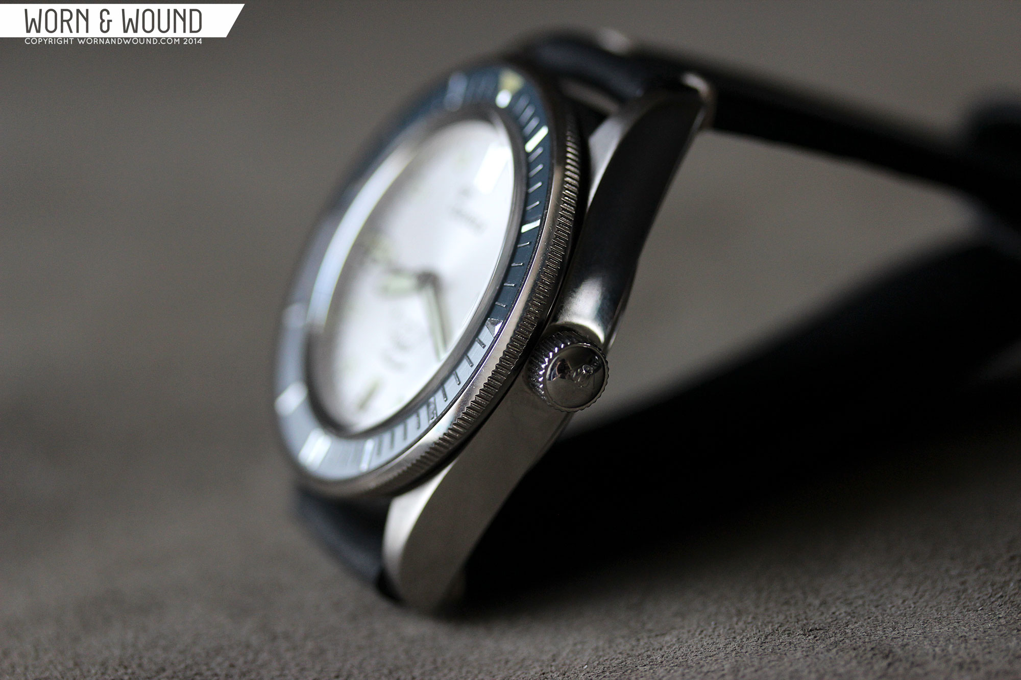
Though the geometry of the case appears very simple, there are some subtle points of interest. When looking down the case, one can see that the sides, though flat, taper in towards the top of the watch. This makes the bezel protrude out farther, making it easier to grasp, without actually being much wider than 39mm. The profile of the case itself is quite simple, being nearly flat with a slight turn down by the lugs to contour with the wrist. Finishing is also straightforward, but well executed, with brushing along the top surfaces and polished sides.

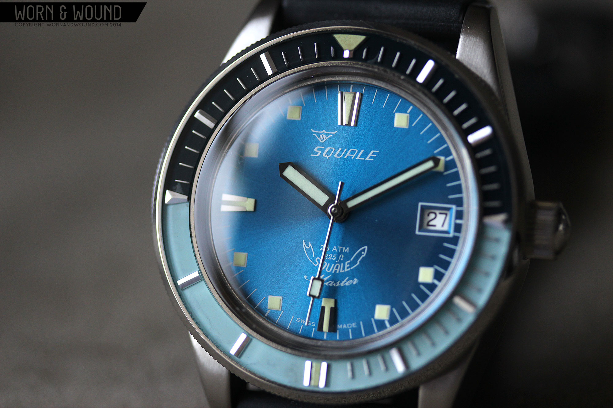
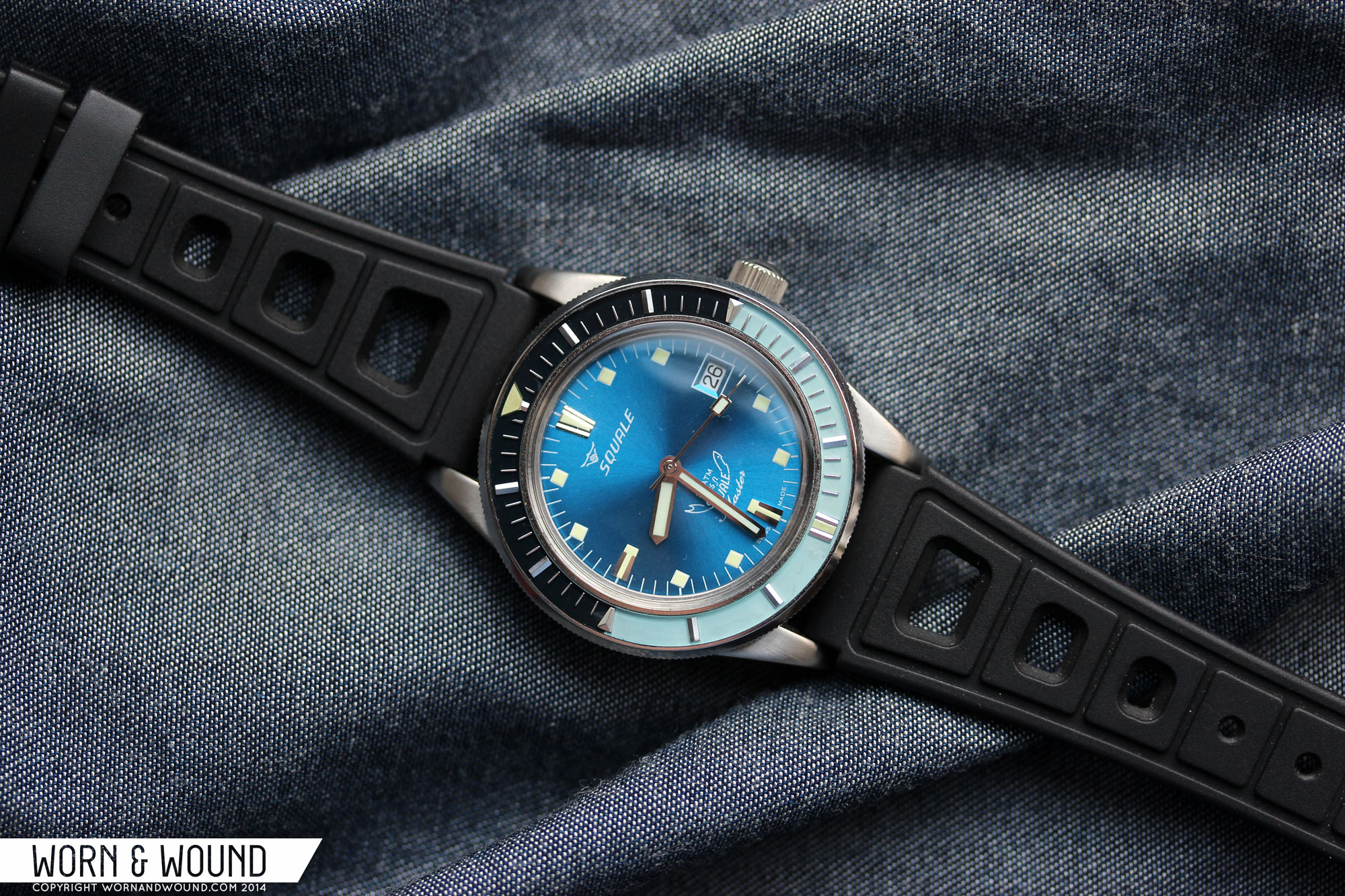
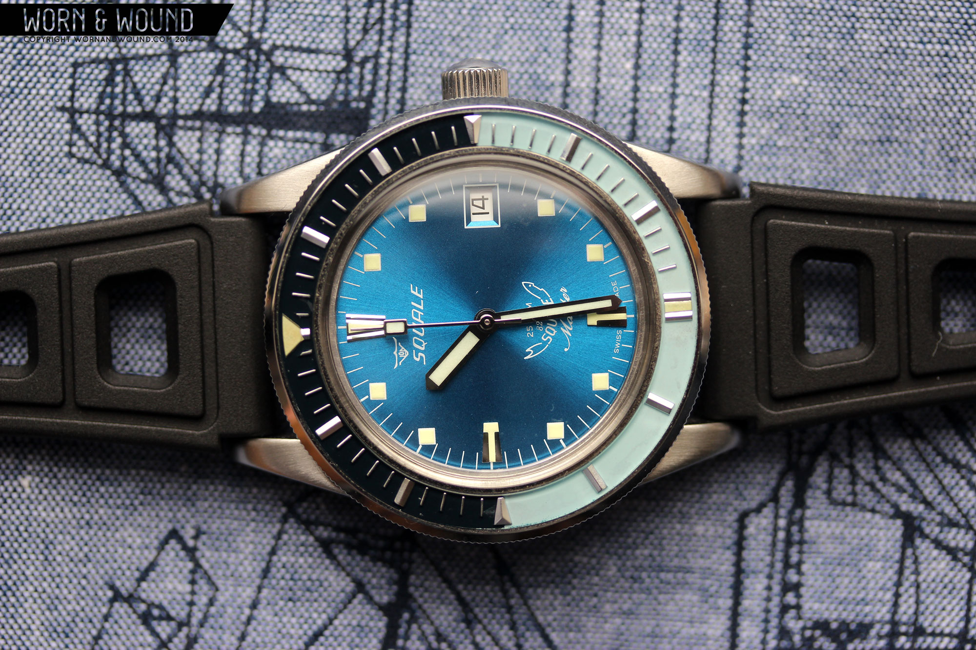
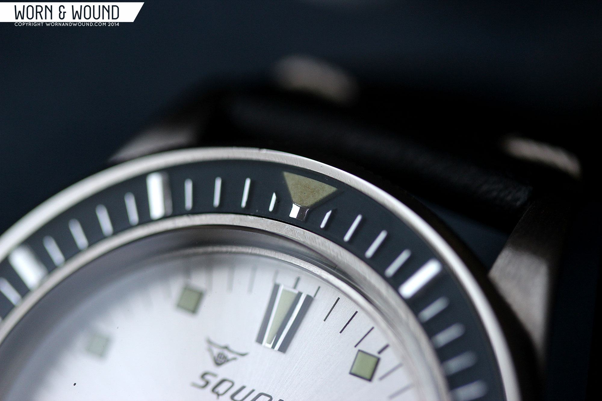
Of course, you might not notice any of that, as you are likely to get stuck looking at just the gorgeous old stock bezels. What makes these cool isn’t just that they are old, but rather how they were made. Dimensional steel markers were applied on a painted surface, and then the whole thing was filled in with epoxy. This creates the look of a tactile, 3-dimensional surface that more resembles a dial than a bezel, and has a formal elegance that is unexpected on a dive watch. On top of that are the moments of patina found randomly where the colors have faded or the tritium has turned, creating something unique and textured.
Unlike modern divers, it is a bi-directional friction bezel. This means that rather than having a ratcheting/locking mechanism, it is essentially free spinning, just with a tight fit. It’s tight enough that it doesn’t move on its own, and would have to be bumped pretty hard to spin. As this watch is more of a tribute to a brand and time period than a hardcore diver’s watch, I don’t see this as an issue. Especially since they went out of their way to try to keep things original. Modifying the bezels to accept a ratcheting mechanism would have betrayed the concept.
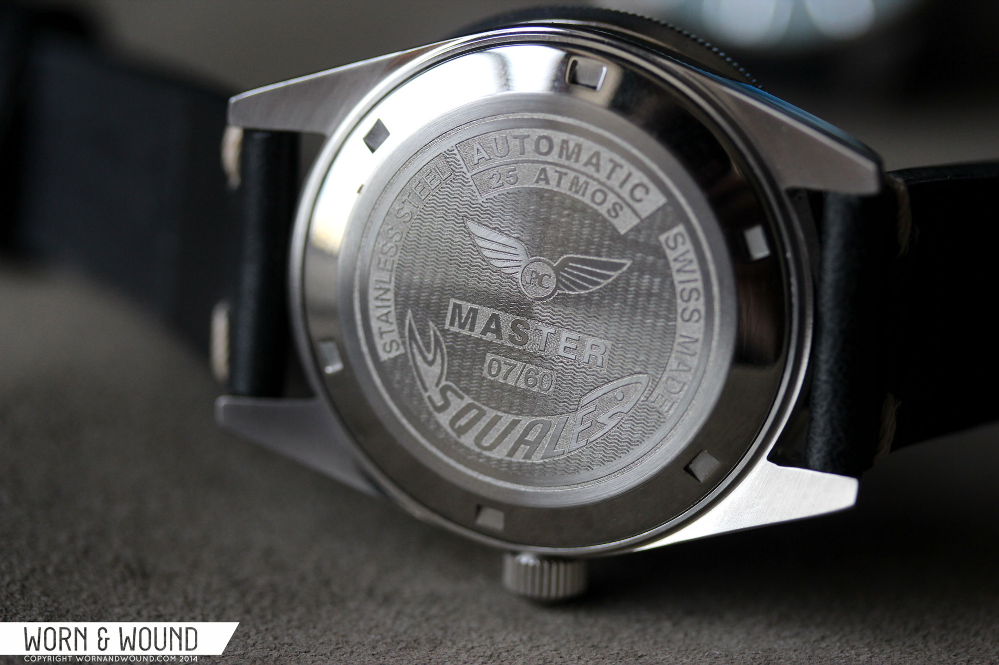
Similarly, the domed acrylic crystal ties the watch together. Though they had to go out of their way to make it, it was the right choice for the watch. It’s authentic to the design and period, and adds a greasy sheen that is unique to plastics, thus relating to the epoxy bezel surface. Flipping the watch over reveals a nicely decorated screw down case back. The plate features an etching with various details on top of a wave pattern. It has both Squale and Page&Cooper logos as well as the edition number of the watch out of the 60 made.
Dial
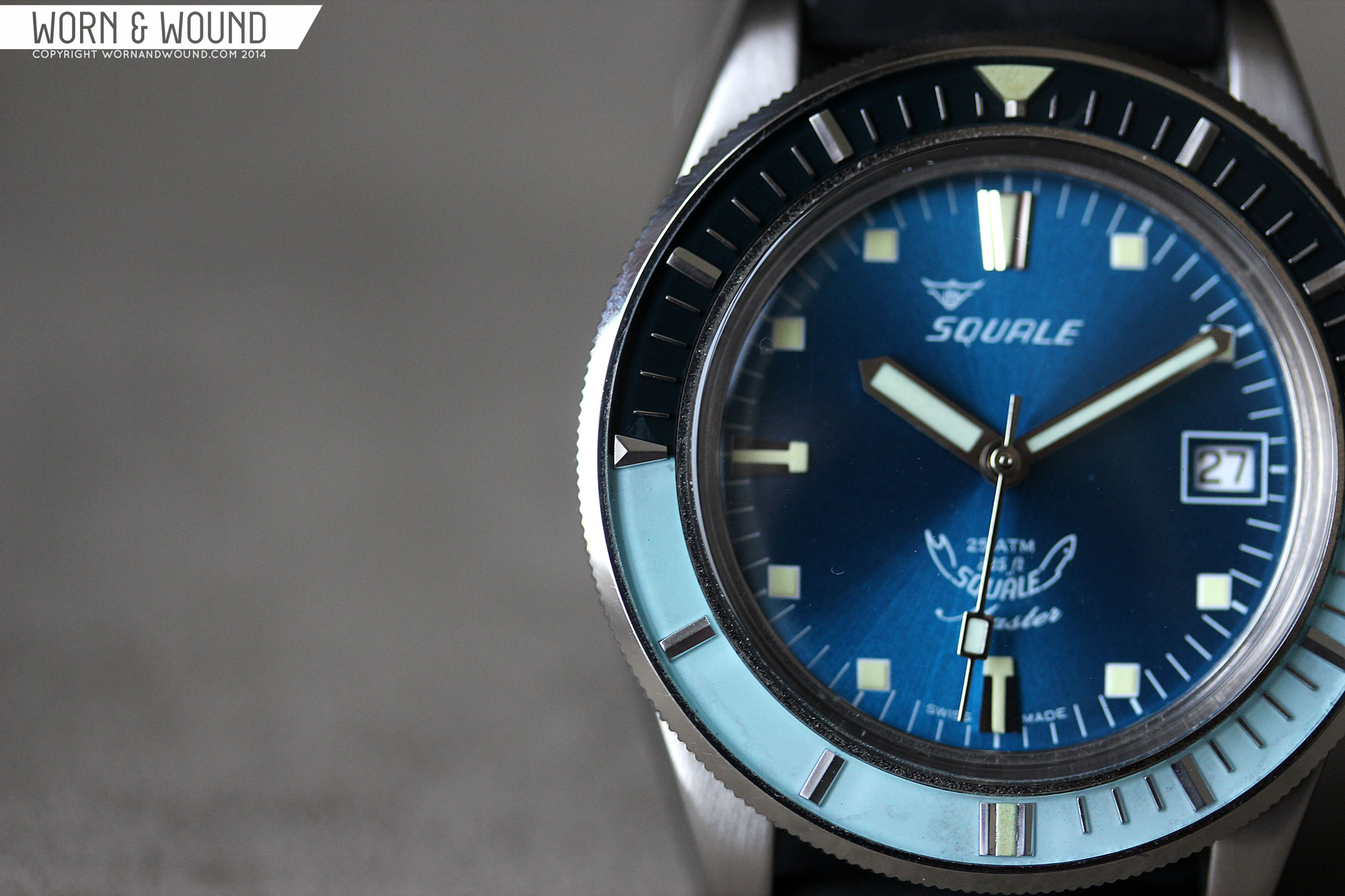
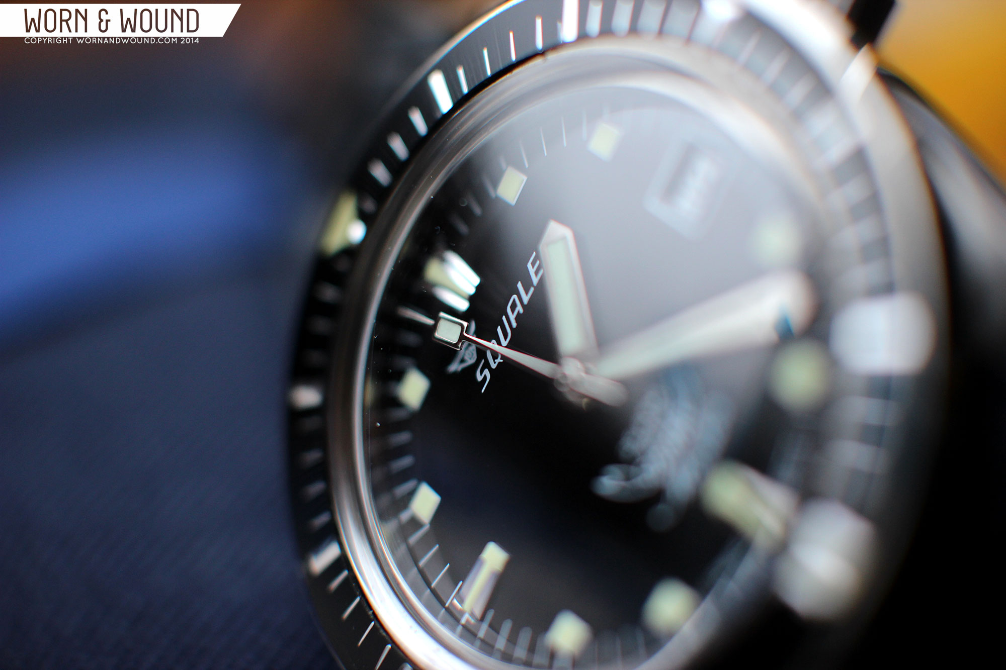
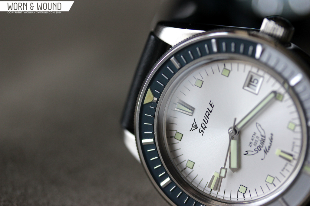
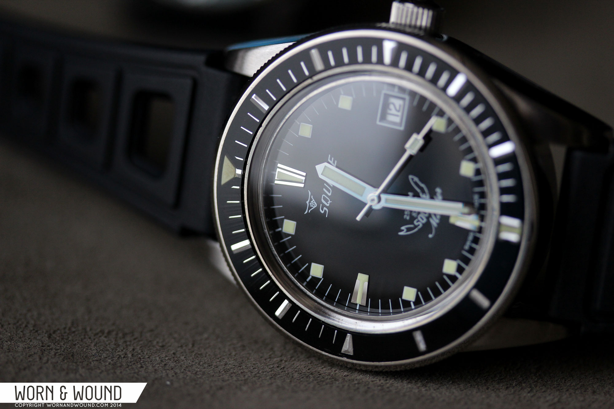
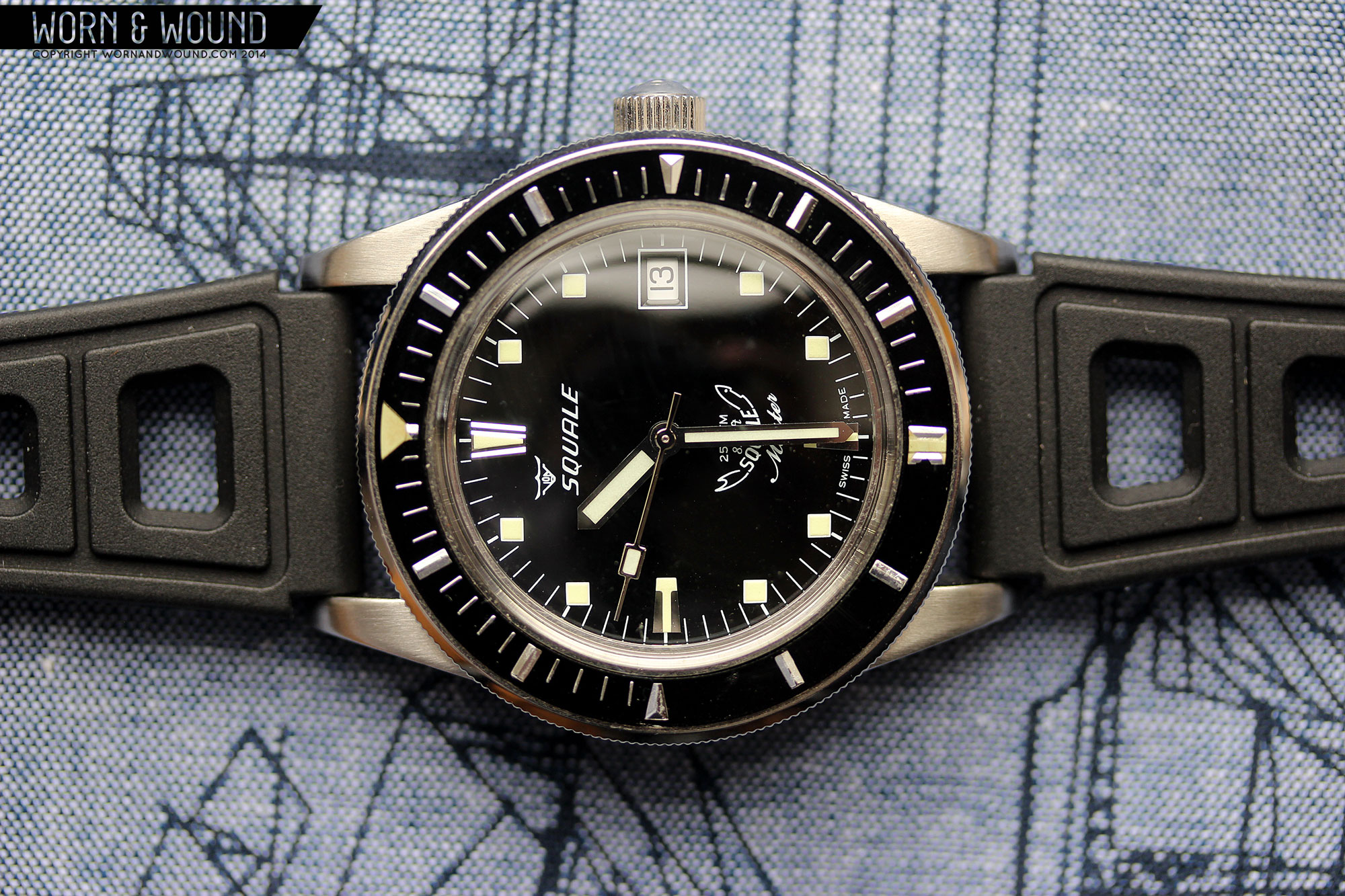
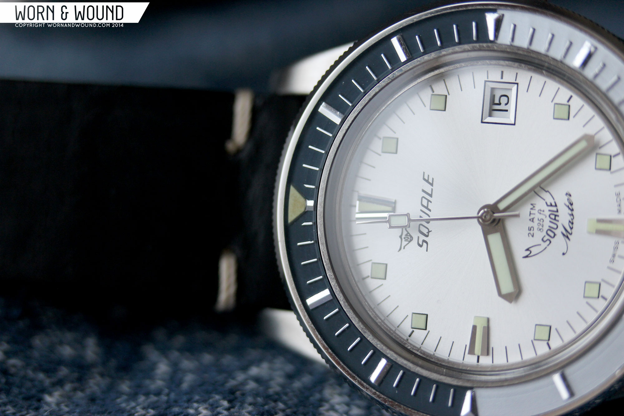
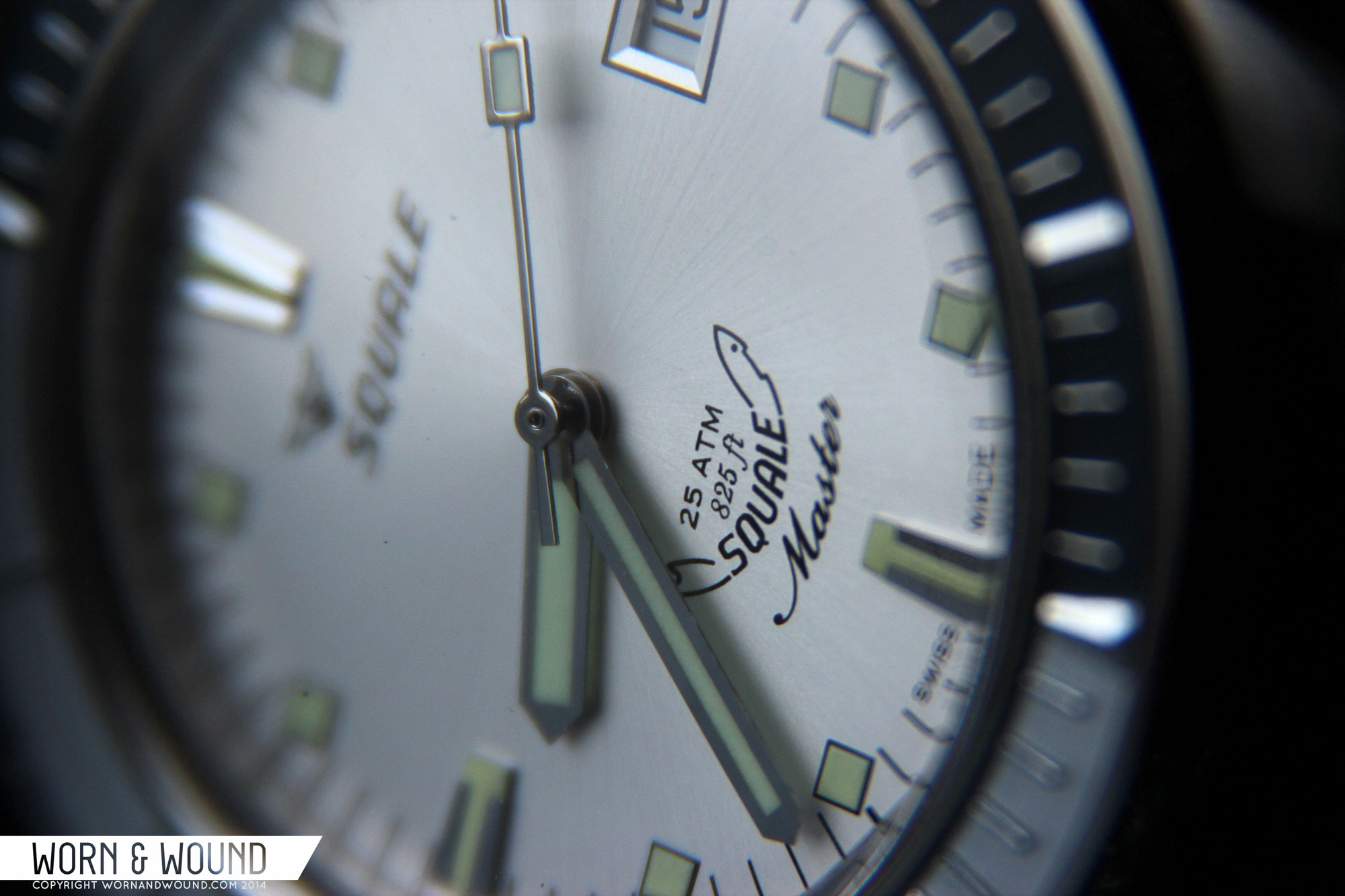
The dials of the vintage masters are new, but were designed in accordance to the originals. As such, you have an interesting mix of elements that speak to early dive watch concepts. There are 3 different dial colors, each chosen to emphasize one of the bezel variations, but we’ll look at that in a moment. The basic layout consists of a main index of applied lume filled steel markers at 12, 6 and 9, lumed squares for the other hours and a date window at 3. The markers all feel very mid-century. The applied markers in particular feel like a transplant from a dress watch, but in doing so add character one seeks out in vintage pieces. Similarly, the lume squares stay in one position rather than rotate with the angle of the hour, which is quirky, but cool looking. Between the markers are white or black lines (dial color depending) for the minute/second.
Squale watches tend to have a lot of text/logos on their dials, and the Vintage Master is no different. Below twelve is the Von Buren Squale logo and above 6 is a small cluster of things. In small type it reads 25 ATM above 825 ft, nestled in the curving Squale shark logo. Beneath that it reads Master in a script font that, too, has a slight curve. For the hands, they went with a simple and classic straight sword in polished steel with lume filling and a stick seconds with a lumed block. No complaints about these here, they look right on the watch, are easy to read, and have surprisingly strong lume.
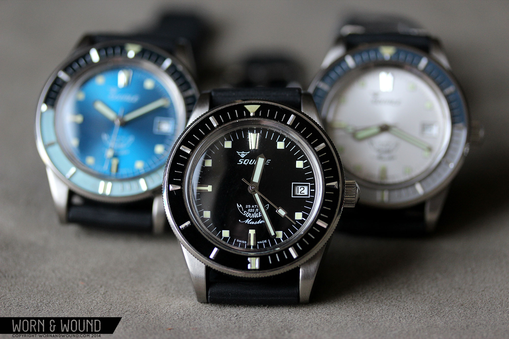
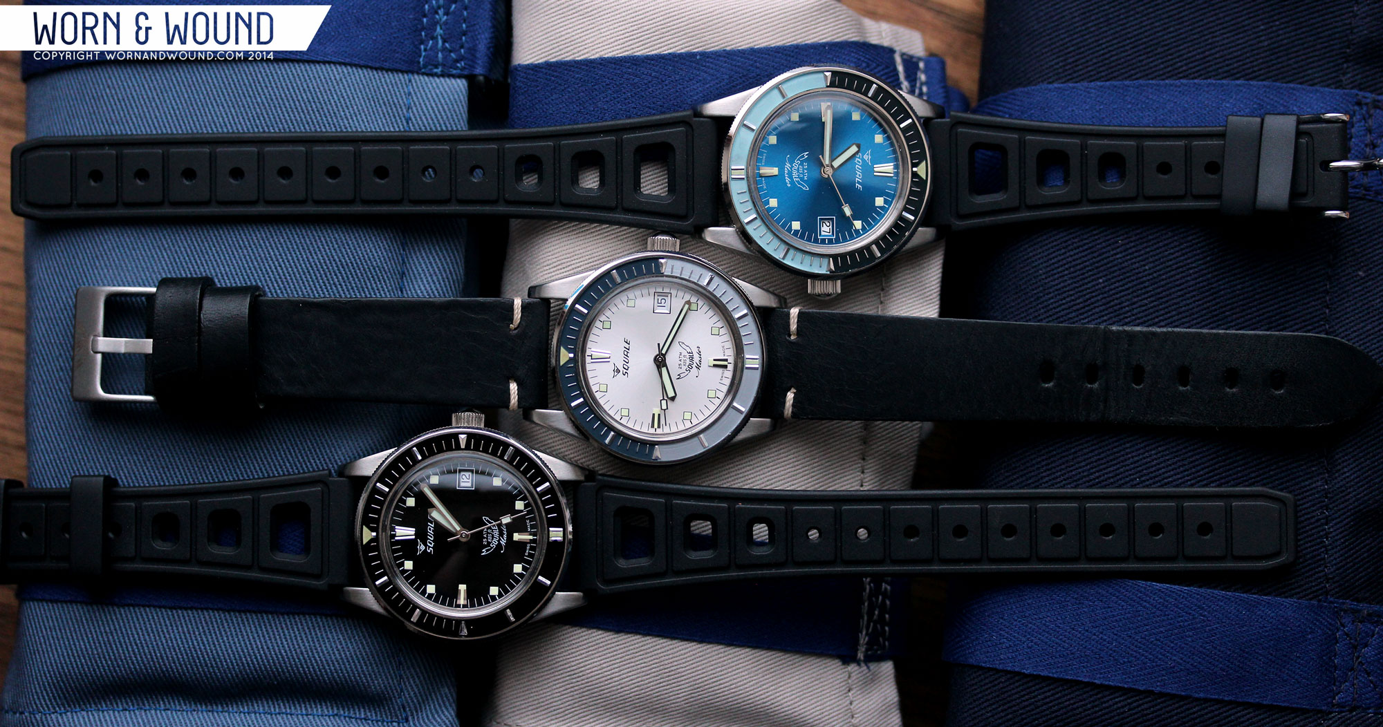
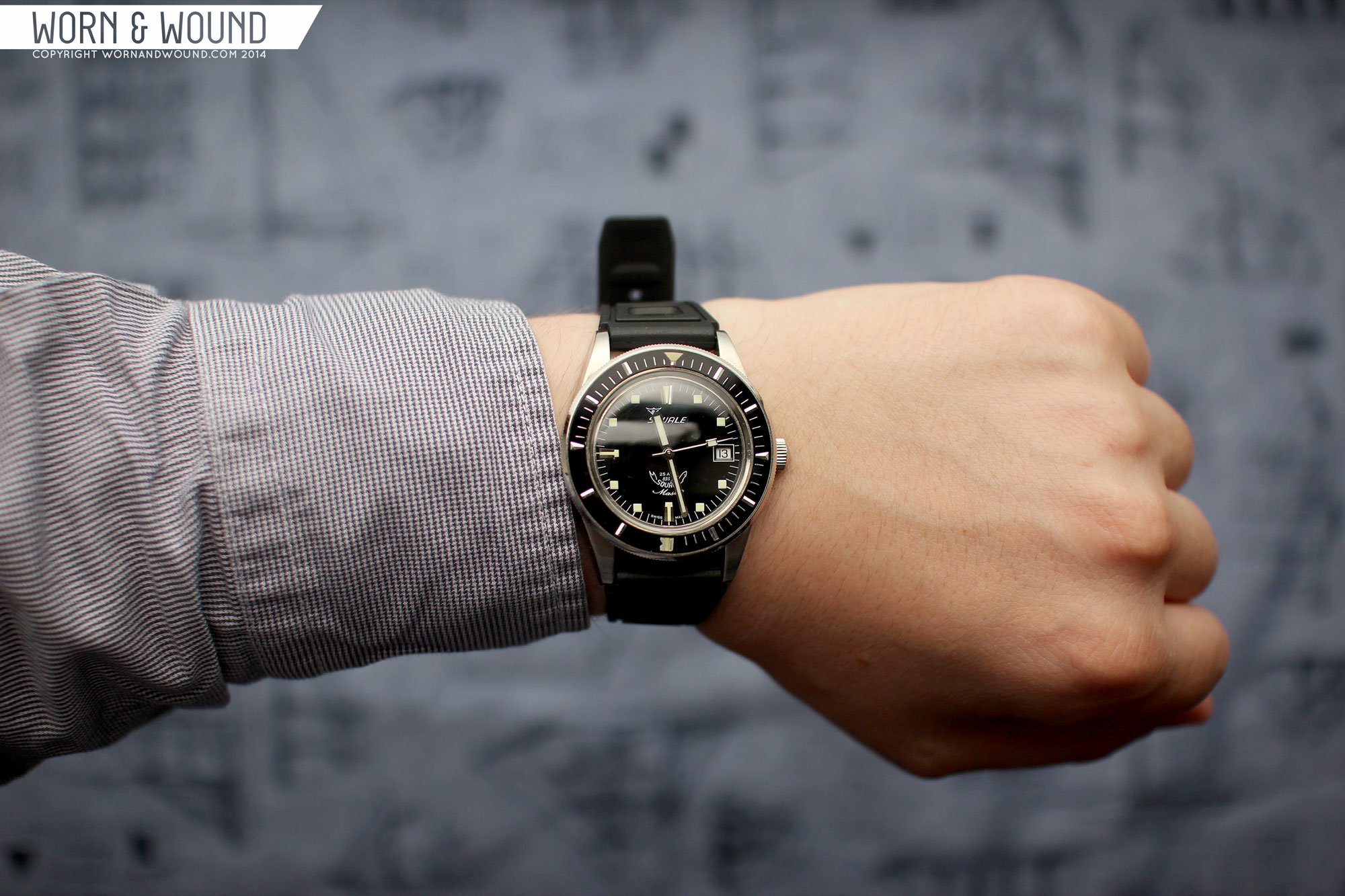
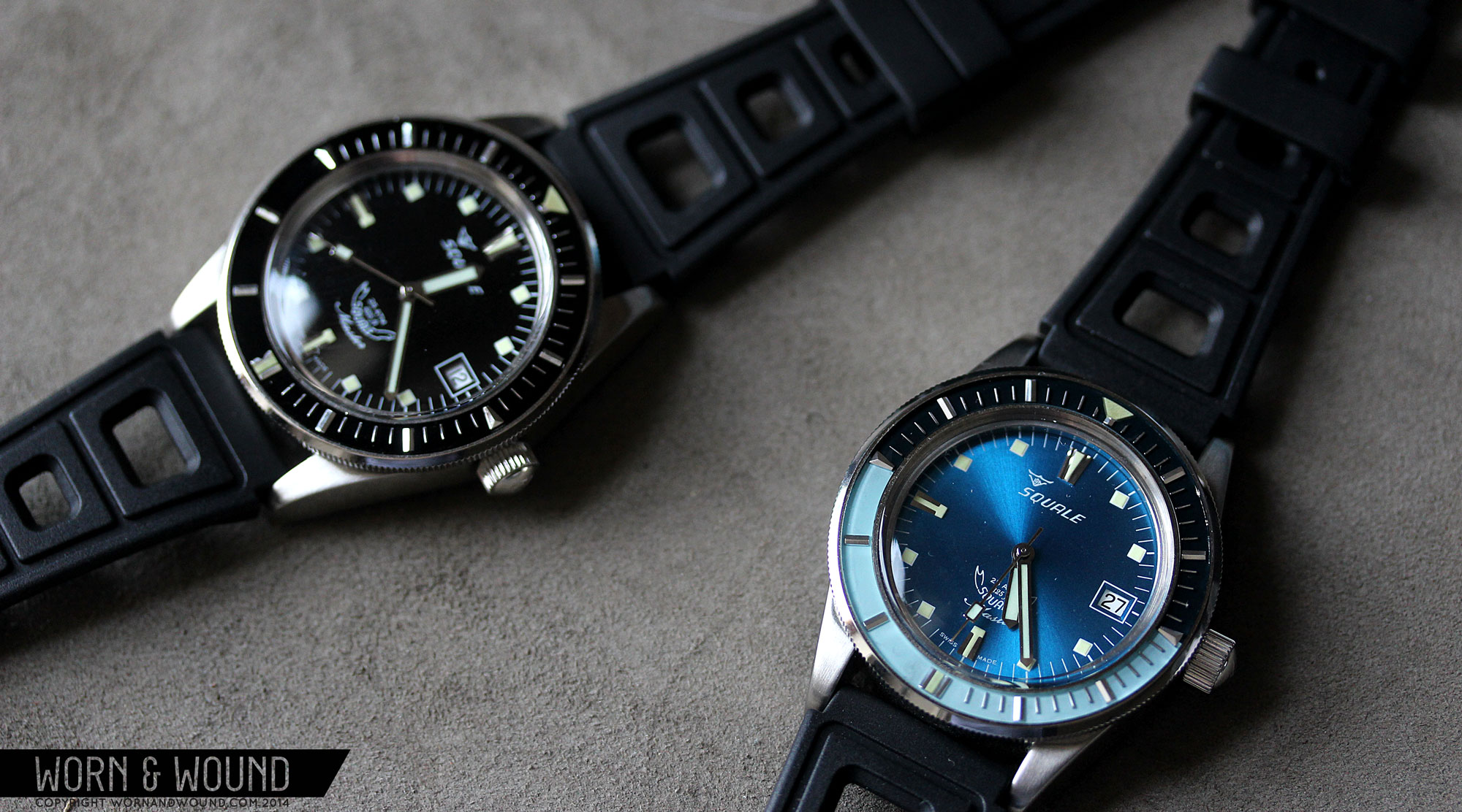
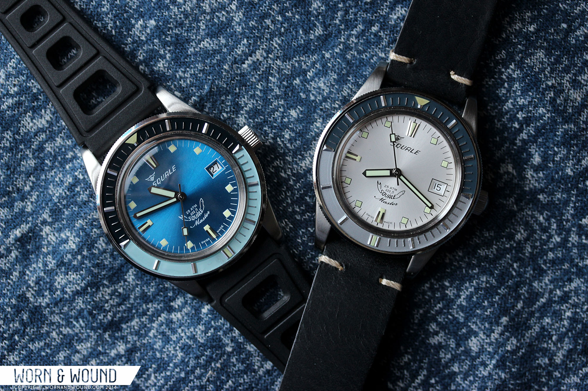
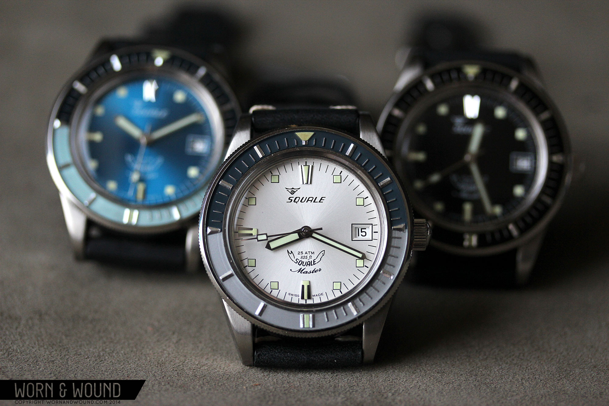
The color combinations take the three watches in different directions. Starting with the simplest, the black dial / black bezel combo is clean, sporty and sober. The dial here is matte black, making the markers stand out very clear, with a lot of contrast. Similarly the black bezel surface emphasizes the steel markers applied on it. Though this model has the least immediate wow factor, and perhaps looks a bit more modern, it has grown on me the most of the group, simply because of its versatility.
The silver dial model is immediately very different, with more going on overall. The dial is a light silver sunburst, giving it a metallic and more formal appearance. Instead of white, text and markers on black on this dial for contrast. Similarly, the lumed squares have been outlined in black to give them a little more pop. The bezel is particularly nice, with two shades of cool grey under the applied markers. The top half is a dark graphite with a hint of teal while the bottom half is more of a neutral gray though with hints of blue. Together, the dial and 2 bezel tones come together for a very nice harmony. Of the group, this one to me feels the least like a dive watch and the most like a general sporty/casual design.
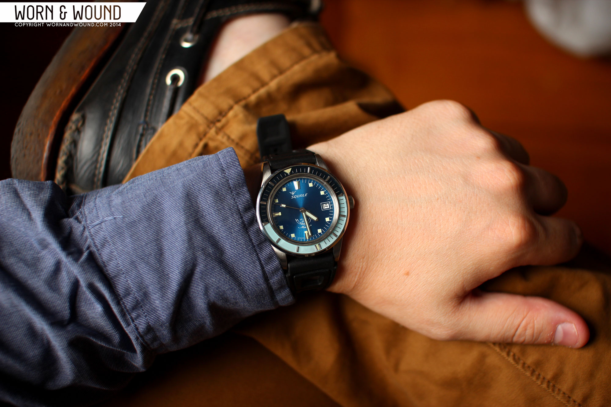
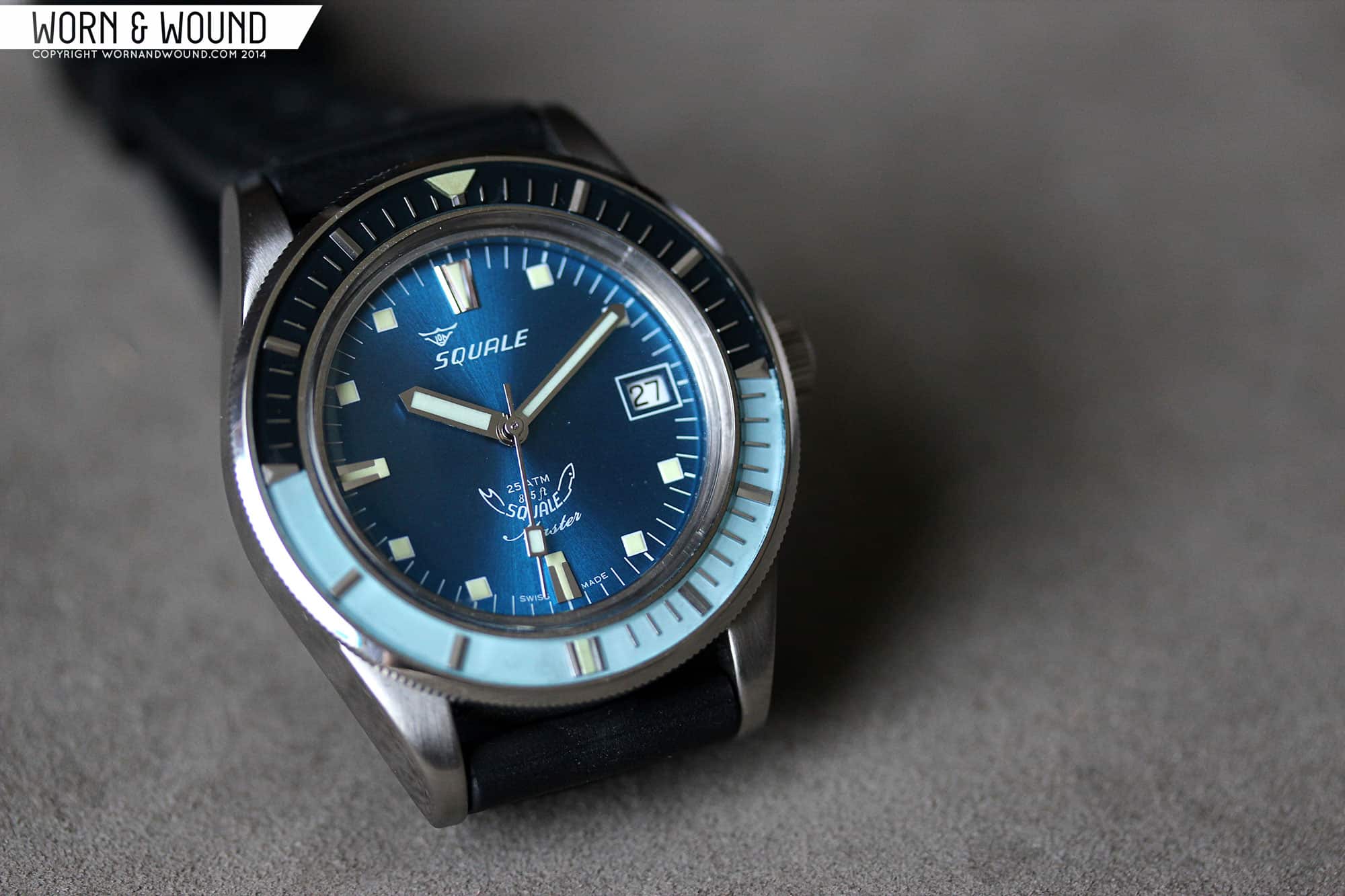
Lastly, is the already sold out blue dial / bezel combo. I’m not surprised that this model was the most popular, as it is unique, and the most retro of the choices. The dial is a rich, medium blue sunburst that is bright and eye catching. All of the markings pop off of it, making it very legible. The bezel hits a perfect mid-century note with a near black teal top half (darker than on the silver dial) and a sea-foam blue/green lower half (what Page&Cooper refer to as “azure blue”). Together, the three colors are energetic and playful, clearly speaking to diving and the summer.
Straps and Wearability
The Vintage Master’s come paired with 2 well-chosen 20mm straps, one for sport, one for fashion, but both very wearable. First you have a vintage style leather strap, with a tapered design. It’s a thick piece of stiff leather, vegetable tanned I would presume, that is not filled with foam, rather is straight leather. There is no stitching running down the side, but there are contrast stitches by the lugs and buckle. The buckle is cool too, with a aft profile that looks very mid-century. These are good looking and easy to wear straps that give the watches a bit of added rugged style.
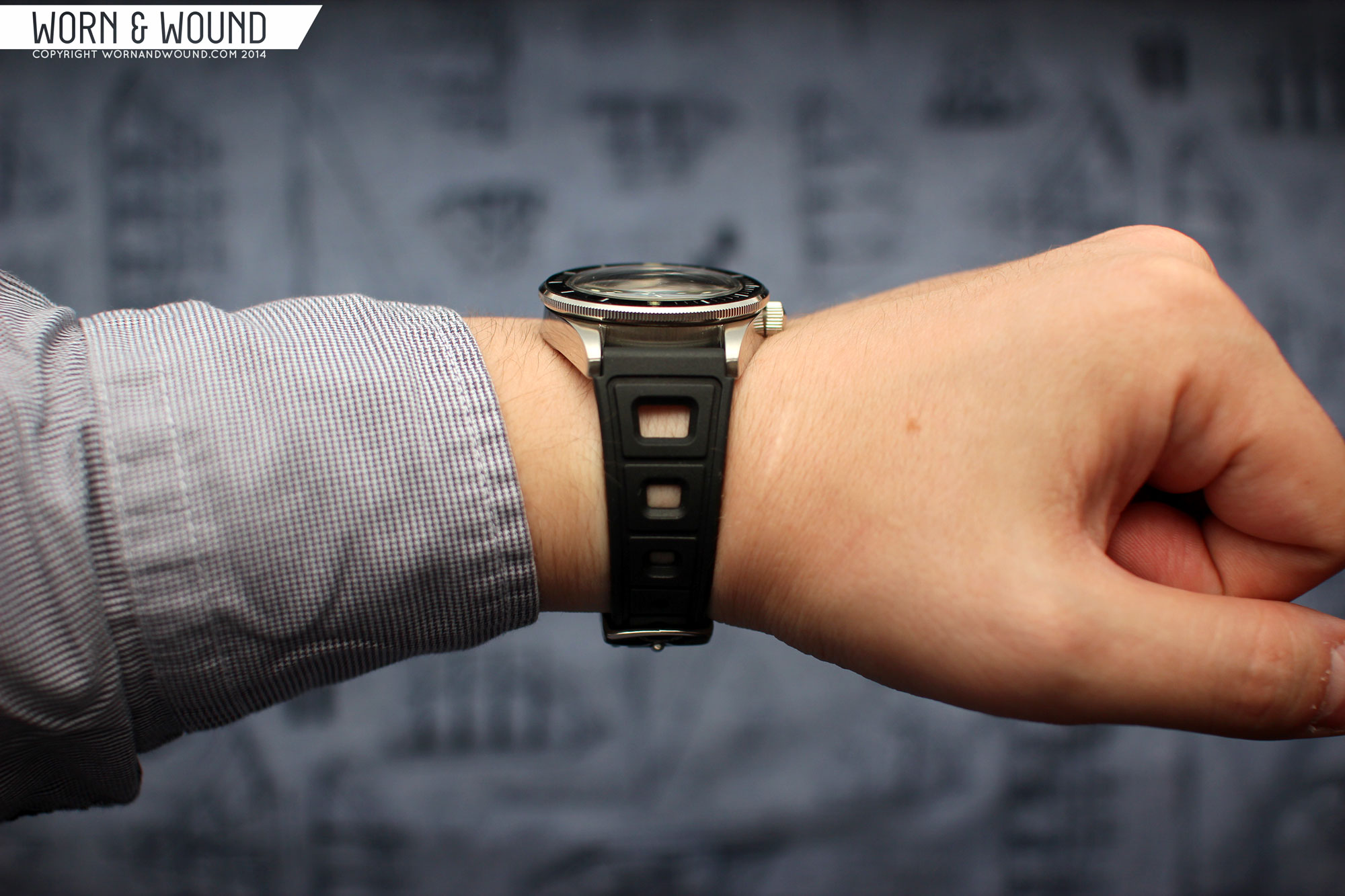
The other strap is a vintage styled rubber that is, honestly, the coolest rubber strap I’ve encountered. It has a notched design by the lugs, giving it extra width that allows for a smooth flow from the case in to the dramatically tapering design, which goes from 22mm to 16mm. The strap has a 3-dimensional top side, with channels running around the sizing holes and 3 large holes by the lug, akin to a rally strap. It looks very aggressive and sporty, while also speaking to the vintage aspects of the design. The rubber is also pleasantly thin at just about 2mm, making for a very comfortable strap.
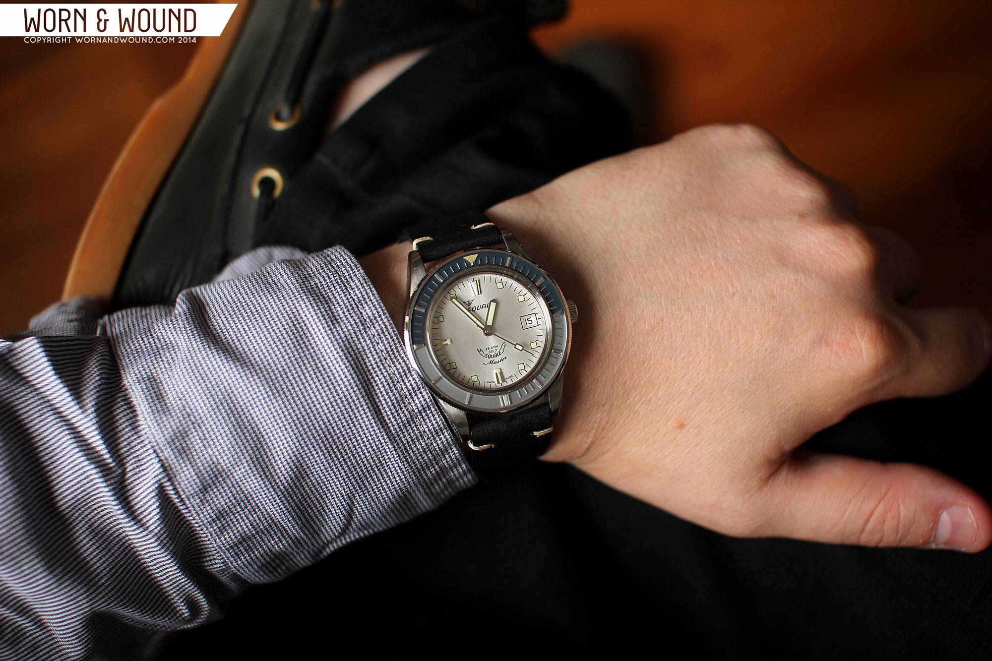
On the wrist, the Vintage Masters wear wonderfully. They remind you of how nice a smaller sport watch is. Actually, not just nice, but ideal. The watches don’t wear or feel small, rather they are well proportioned, compact and sturdy. Since they are divers, and the bezels are particularly eye-catching, they have an “all-dial” feel, which makes them be perceived as larger. In the end, they fit nicely on my 7″ wrist and will fit wrists of many other sizes well too.
In terms of looks… well, if you like dive watches, vintage watches, vintage dive watches, etc… they will be immediately very appealing. The mix of new and old components creates something dynamic that looks like one but feels like the other. The touch of patina and irregularity in the bezels gives you that character and story one seeks in a vintage piece, but the rest is very robust, so it can be worn like any other watch. Because of the smaller case and more formal elements in the design, these work as sport watches, casual watches and if dressed up properly, could be a fun watch to wear with a suit. Though I didn’t have one around to try, I bet a Milanese bracelet would look amazing on any of these.
Packaging and Accessories
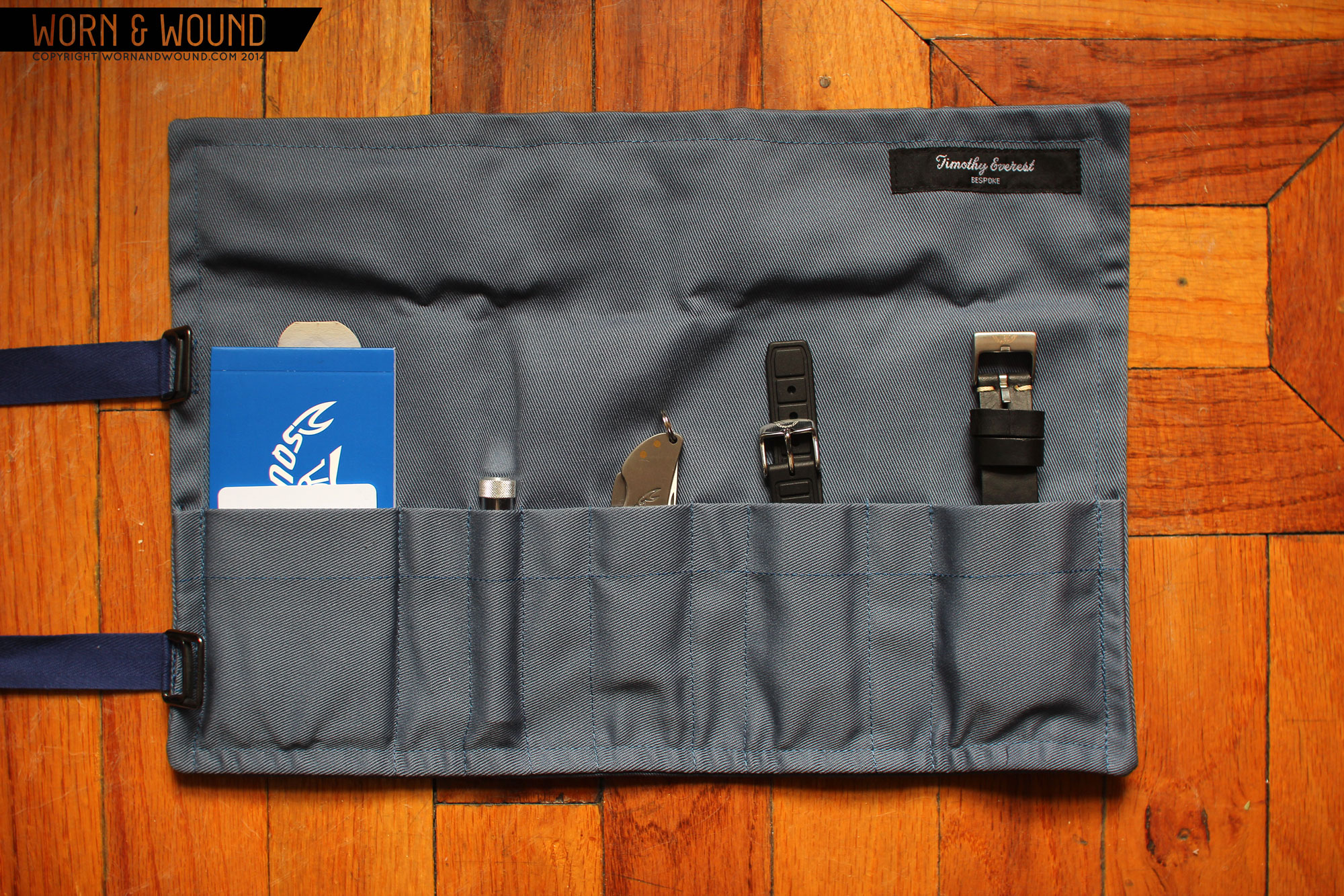
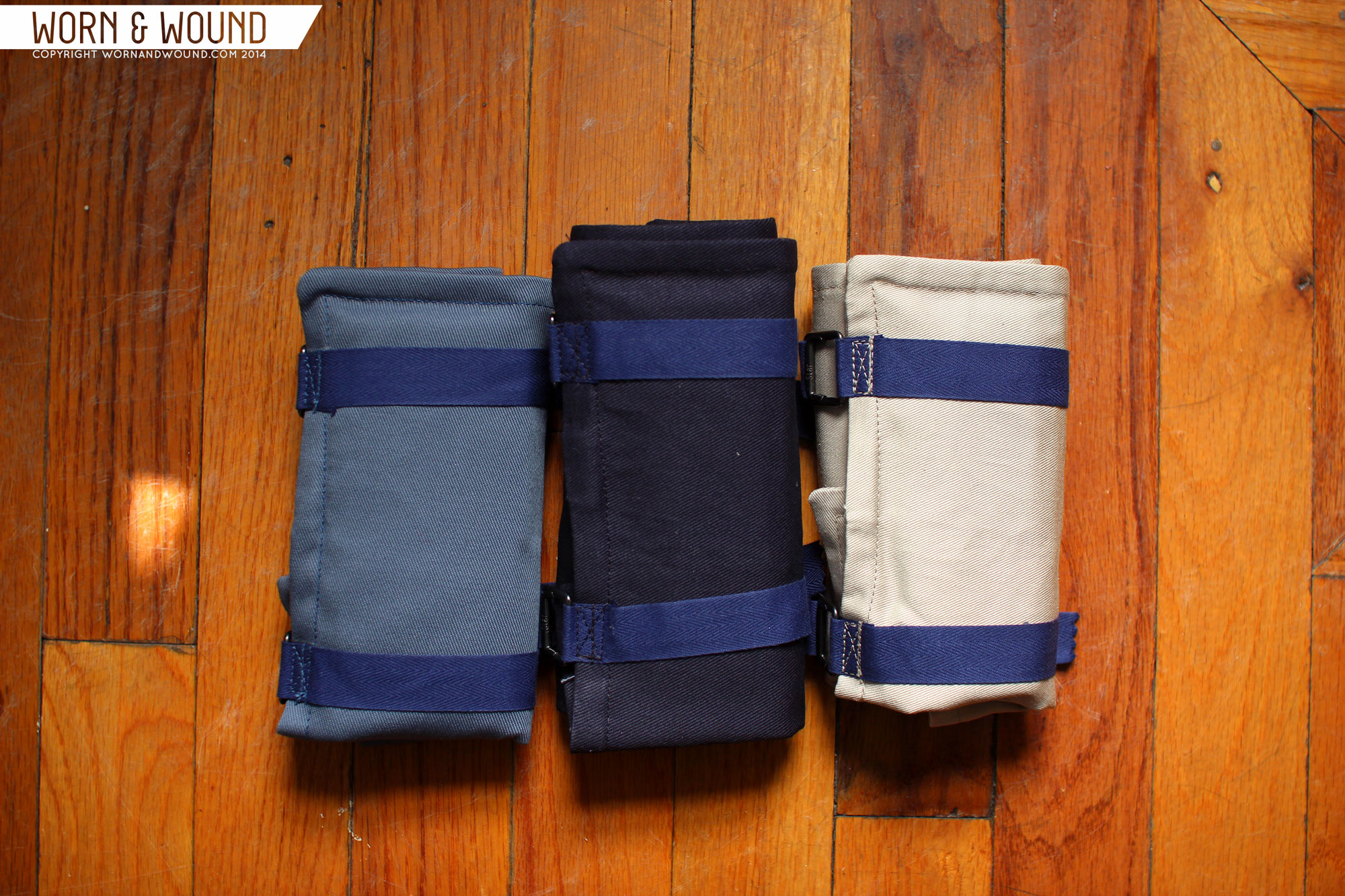
To tie the whole project together, Page&Cooper went above and beyond with the extras, bringing a bit of British heritage into the project as well. First, you have the outer box, which might look very plain, but is in fact a specially chosen archival box with brass staples. Open it up, and you are presented with one of three fabric dive rolls, made specially for this project by Timothy Everest of Saville Row, a highly revered tailoring house that has made suits for films and celebrities. You will also find a specially made booklet telling the story of the watches from the finding of the bezels through
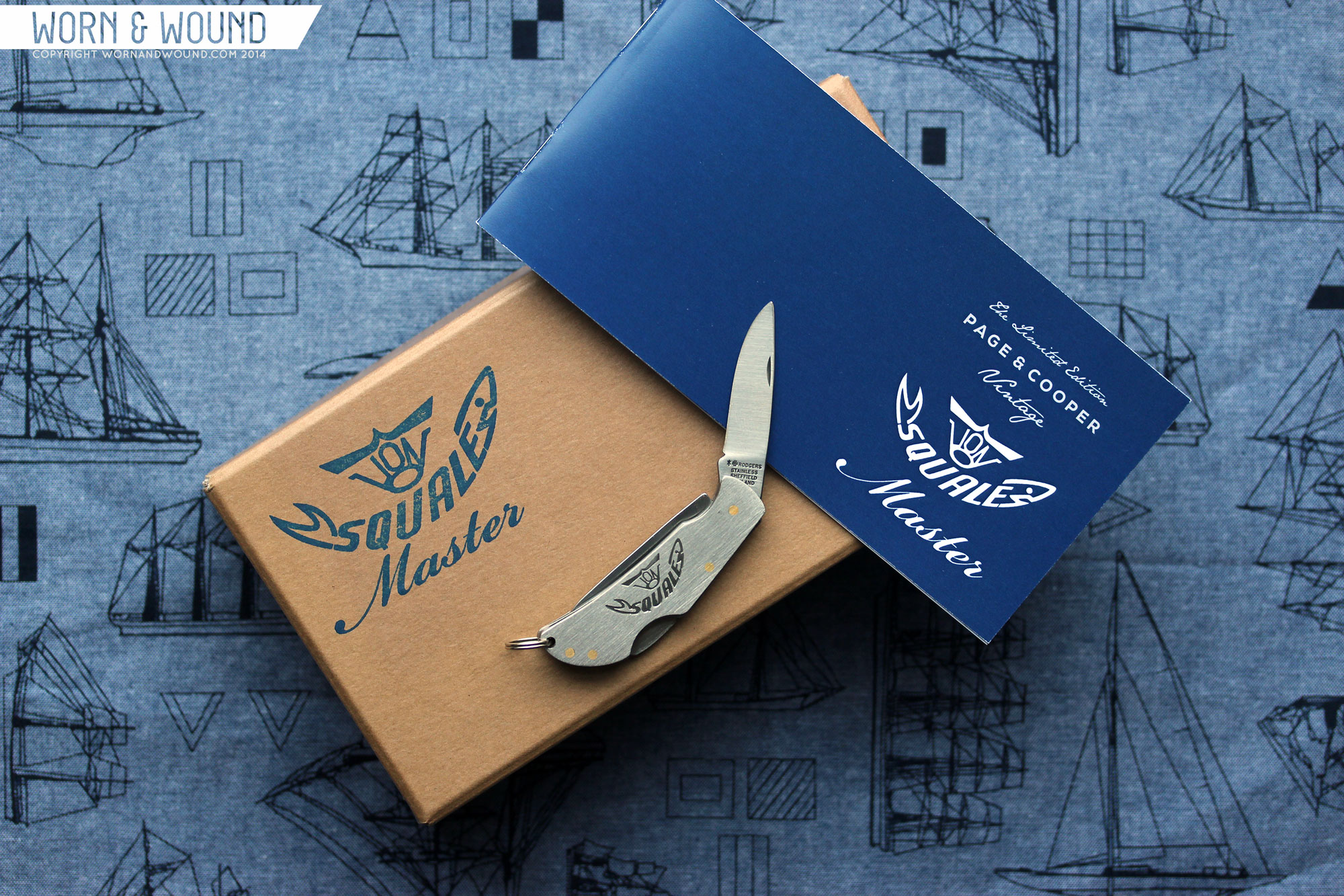
The rolls come in bone white, denim blue or dark blue, all with royal blue straps that hold them together. This isn’t a watch roll, in the sense that it is not designed to hold several watches for travel, rather it is meant to keep one Vintage Master and it’s accompanying goods together. So inside you have a few slots, one for a warranty card, one for a spring bar tool, one for the Joseph Rogers pocket knife, one for an extra strap and lastly, one for the watch. The rolls are gorgeous, and certainly where you would keep the watch when not on your wrist or in a winder.
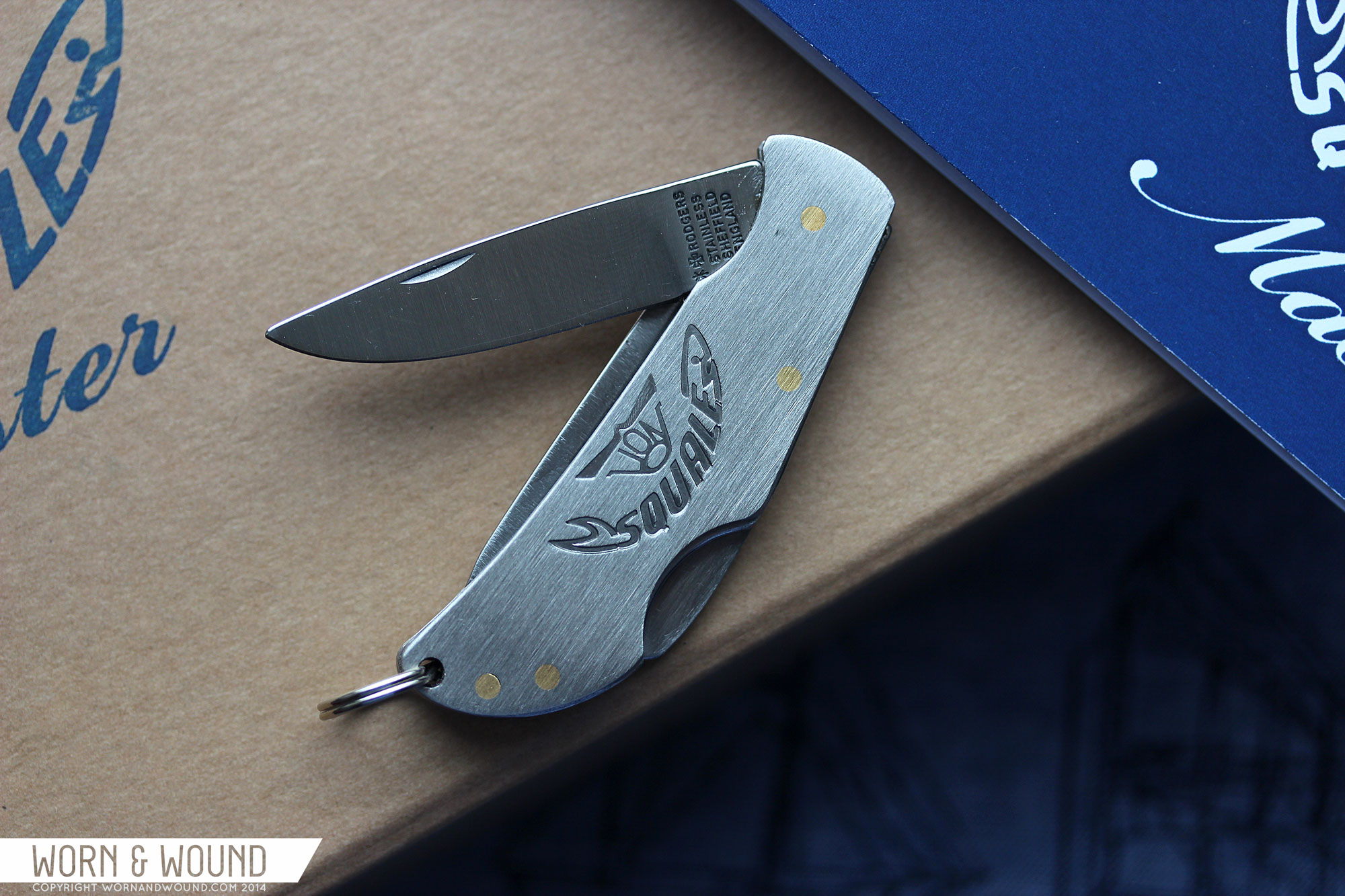
The last piece of kit is the aforementioned Joseph Rodgers pocket knife. Founded in 1682, Joseph Rodgers is an old English brand with a rich history. Now owned by the Egginton group, their knives are still manufactured in Sheffield. This simple pocket knife is all steel with brass rivets, featuring both brands logos, one of each side. It features, a non-locking knife and a locking bottle opener. It’s a cool little perk that builds on the story, and works as a keepsake for this special project.

Conclusion
All in all, the Squale x Page&Cooper Vintage Masters are a hit. They look great, are fun to wear, but more importantly, they tell a story. They celebrate the history of a great and under discussed brand, Squale, and the promise of a fairly new and exciting brand, Page&Cooper. Yes, P&C are our friends, so that is biased, but what other on-line retailers are taking risks on cool and unique projects like this?
At £1,099 or about $1,880 these aren’t pocket money inexpensive, but are fairly priced for such limited pieces, especially ones with old stock components. The accessories that come with them add value and make them all the more special and fun to own. The fact that a new, top grade ETA 2824-2 is moving the hands doesn’t hurt either. So, if you’re a dive watch enthusiast, a vintage watch collector, a fan of Squale and/or Page&Cooper, I have a feeling you’re going to want to seriously consider these. Just don’t take too long as they are going fast. I also have a feeling owners will hang onto these, so don’t expect them to popup on forums any day soon.
by Zach Weiss

I absolutely love the silver dial version. Amazing looking watches.
really nice looking – am i right in understanding they machined a case specifically for the bezel? fantastic! I recently saw Page and Cooper’s colab with Sinn – really fun to see them pairing up with awesome brands. i’m really looking forward to seeing what else they come up with.
i can’t make up my mind if i’m bothered by the double logo on the dial. anyone else thinking the same? it’s so nice they named it twice, i guess.
Finally! Been waiting for the next video.
Nice watch.
This is one classy looking watch. I love the no-crown-guard look and the story behind this collaboration.
confused between this and MKII nassau? :S
MKII is just another sub-lookalike. This one has a much more original look, specially with the bezel.
I would love to see a review of the new Squale 30 ATMOS Black GMT Ceramica.